7,609 search results
(0.015 seconds)
- P22 Glaser Babyfat by P22 Type Foundry,
$24.95 Milton Glaser on designing Babyfat: “This is the first alphabet I ever designed. For some inexplicable reason I called it Babyfat. Because I’m not a type designer, most of my alphabets are actually novelties or graphic ideas expressed typographically. Here the idea was to take a gothic letter and view it simultaneously from two sides. It started out as a rather esoteric letterform; it ended up being used in supermarkets for ‘Sale’ signs.” This forced perspective 3-D font has appeared on many LP covers and posters from the mid 1960s onward. This revival includes the original lowercase for the first time in digital form. Besides the three original styles (Outline, Shaded, and Black) made for photo typesetting, the new P22 Glaser Babyfat introduces six additional variations to allow the user to easily colorize the type as Glaser envisioned. The Keyline, Fill, Glyph, Left, Right, and Down font styles give the user nearly infinite options to create dynamic chromatic effects. P22 Glaser Babyfat was based on original drawings and phototype proofs from the Milton Glaser Studios archives. Typographic punctuation and sorts were imagined by James Grieshaber to work with Glaser’s design, as well as diacritics to accommodate most European languages. Over the years there have been many typefaces that borrowed heavily from the Glaser designs, but these are the only official fonts approved by Milton Glaser Studio and the Estate of Milton Glaser.
 - Soho by Monotype,
$29.99 Soho is the latest addition to the growing range of typefaces from Sebastian Lester. This grand opus of a project resulted in a typeface that comprises nine weights and five widths of precision engineered OpenType. 40 fonts, 32,668 characters and 24 OpenType features. Hot on the heels of the popular Neo Sans and Neo Tech range, and his first typeface release Scene, Soho represents three years of work by Lester. As a type designer I'm preoccupied with finding ways in which I can address modern problems like good legibility in modern media, and create fonts that work precisely and efficiently in the most technically demanding of corporate and publishing environments." Slab serif typefaces are enjoying something of a renaissance, offering versatility whether for corporate identity, product branding, text or display use. With 40 weights to choose from Soho gives designers endless possibilities from the ultra chic lines conveyed by the lighter weights to the rock solid statement made by the heavier weights. Soho is cross-platform compatible. The Pro version provides extended language support for Central European languages. Used in conjunction with software applications that support OpenType many useful features like "stylistic sets" can be leveraged -- in which a wide variety of alternative characters can be introduced at the click of a mouse button giving one font several "tones of voice" from conservative to cutting edge. The wide range of glyphs includes ligatures and small caps."
 - Mi Negra by Letritas,
$25.00 Mi negra is a funny and hilarious typography designed especially for children, thought and created by Isabel de Gregorio. It could be described as an original combination between a semi-handwright and semi sans-serif font. Thanks to its structure and nice endings "Mi Negra" is recommended for composing short texts (logotypes, packing, posters, etc.). It may similarly be used for illustrations and comics, as well as in printing press works for children from 6 to 13 years old for instance. Mi Negra has been conceived to be a useful support in all kinds of illustrations works (please note that Isabel, the type designer, considers herself primarily an illustrator). The font designer of Mi Negra tells that every time she needed to provide some text data (i.e. in children infographies) and needed to make them more understandable and suitable for children, she used this typography. The former idea was than to create a font who could be a second option to comic sans, but as the project started to reveal its forms, it was clear that it was revealing another connotation and its own character. In this way, Mi Negra went on modifying its forms and the more it developed, the more it was showing its new characteristics and concepts. The family is composed of three weighs: Light, regular and black. It provides also interesting functional ligatures. It also includes a dingbat with nice doggies. It has 434 characters and can work with 208 languages.
 - Gabardina - Personal use only

- Quebrada - 100% free

- Super Blues by Gatype,
$14.00 Super Blues elegant font designed when in a creative mood and perfect shape, inspired by the bold, natural look of serifs so beautiful for today's fashion. bold, balanced and varied, born for luxury and beauty. including uppercase letters, numbers, and various kinds of punctuation Super Blues is perfect for invitations, logos & branding, photography, advertising, watermarks, social media posts, product packaging, product designs, labels, wedding designs, stationery, special events or anything else needed to create a theme. Super Blues is built with OpenType features and includes initial and ending language styles, alternative characters for most lowercase letters, numbers, punctuation, alternatives, endings, and also supports other languages. Hope you enjoy our fonts and if you have any questions, feel free to message & I'll be happy to help :)
 - Joane by W Type Foundry,
$25.00 Joane mixes the elegancy of French didones, calligraphic endings and glyphic serifs, thus its features convey a warm unique style. Moreover, its curves have been beautifully designed, and it also comes with both and engraved and deco versions, which add more versatility to the way it can be used. Joanes is perfectly suited for magazines, branding, advertising, labels, web and packaging. Joane is my first typeface to be published worldwide. To achieve this goal, I received essential help from W team and friends. I personally want to say thanks to Diego Aravena for the patience, good will and learning; for the friendship and support to Franco Jonas and Raúl Meza. Because of their help I could find the treasures at the end of the process. Ale Navarro
 - Austin Signature font by alphArt,
$21.00 Austin is a natural Stylish signature font with signature font style, also the best natural Stylish signature font that we have ever created. If you want a logo with a natural signature font style, this signature font is the right choice for you. A long stroke at the end of the word that looks like the preview image is really looks like a professional signature, we also add dot in the end of name to make it really natural style. However this signature font is great for your next creative project such as watermark on photography, album cover, logo, business card, and many other design project. This signature font comes with uppercase letters, lowercase letters, alternate lowercase letters, multi lingual support, numbers and punctuation.
 - Hello Crimsons by Gilar Studio,
$16.00 HELLO CRIMSONS was inspired by a recent trip to London, England where I happened upon a bustling pub with beautiful typographic signage. HELLO CRIMSONS delivers a multitude of Opentype features, For a number of capital and lowercase letters, large swashes expand above and below the characters. Contextual swashes are also applied to some characters when placed at the beginning or end of a word. This font is made in a modern style with a very beautiful beginning and ending.elegantly,very casual and suitable for your various design needs I'ts.Perfect for logo,branding, tittle, social media posts, advertisements, product packaging, product designs, label, photography, watermark, special event,magazine,web design. Included: multilingual support beginning and ending swash Check my other Font here https://gilarstudio.com/
 - Apocalypso by Barnbrook Fonts,
$30.00 Apocalypso is a pictogram font for the end of the world. The name Apocalypso is a portmanteau of the words apocalypse (end of the world) and calypso (joyful improvised music), with a meaning analogous to the idiom ‘fiddling while Rome burns’. The Apocalypso family is more of an art project than a practical font and contains a series of crosses and pictograms. The crosses add decorative detailing to typographic layouts, whilst the pictograms can be deployed to express the forthcoming apocalypse. Apocalypso was originally published in 1997, a few years before the turn of the millennium. It is both a document of the ideas of the time and a scarily prophetic vision of a possible world that has now largely come to pass.
 - Ganache by Laura Worthington,
$35.00 Ganache is a smart, intricate, fun, and deceptively simple font. This distinctive hybrid is a unique blend of script, Roman, and italic. My fascination with letter-fitting makes this an intriguing exercise in negative space. The uppercase letters are boldly stylish, and here some of the counters display unexpected shapes. Between some letters, the negative space is transformed into a type of swash itself. Customize your design with Ganache’s 185 swashes and alternates and 10 ornaments. *NOTE* Basic versions DO NOT include swashes, alternates or ornaments See what’s included! http://bit.ly/2bUfPmt These fonts have been specially coded for access of all the swashes, alternates and ornaments without the need for professional design software! Info and instructions here: http://lauraworthingtontype.com/faqs/
 - Crepe Paper JNL by Jeff Levine,
$29.00 Crepe Paper JNL is an alphabet-only novelty font that creates a wavy ribbon headline with a vintage wood type alphabet that somewhat resembles an unfurled stretch of crepe paper. The upper case A-Z keys will produce a white ribbon banner with black letters, while the lower case a-z keys are white letters on a black background. The end caps for the white banner are on the left and right parenthesis keys, while the end caps for the black banner are on the bracket keys. A blank space is located on the period key for the white banner and on the comma key for the black banner. This will allow for a continuous text banner without an open break due to using the space key.
 - Festival Script Pro by Sudtipos,
$69.00 Festival Script is a logical evolution within the deco script territory previously explored by Koziupa and Paul in efforts like Aranjuez, Bellas Artes, Heraldica and Tanguera. In Festival Script, strong bilinear contrast and ornamental swashes combine to convey a sense of modern luxury. This combination echoes the current trend in consumer goods of elevating simple, everyday products to objects of desire. Festival’s basic structure is the familiar Koziupa aesthetic of tapering stems and sharp endings, but this time informed by a more geometric sensibility. A wide variety of thin, ribbonlike strokes add a beautifully ornamental feel, evoking Argentine “filete” motifs. Almost every letterform includes multiple alternates, providing design possibilities from minimal to exuberant. Festival Script Pro is loaded with alternates, swashes, endings and Latin-based language support.
 - Shinthink by alphArt,
$15.00 Shinthink is a handwritten script font with a simple and natural style and is great for your next creative projects such as watermark on photography, quotes, album cover, logo, business card, and many other design project. Shinthink comes with uppercase letters, lowercase letters, lowercase alternative letters, numbers, punctuation, ligature and multi-lingual support. To use alternative end text is just block end letters and select alternative letters on glyphs option. It may be used in almost any program by using your Operating System’s utilities (CharacterMap for Windows and Font Book for Mac.), as well as Illustrator, Photoshop CC 2017 and several other applications. We hope you enjoy this font. If you have any questions please don't hesitate to drop me a message :) Thank you, Best regards alphArt
 - Mestika Arabic by Boharat Cairo,
$20.00 Mestika is a resinous spice, in Arabic means gum, the name is Mestika cause the mestika has a mixture of sharp edges and cursive connections, that mixture gives the typeface an edge to stand out, a low contrast sharp design with 9 weights making it works well with text and headlines. The design is a collaboration with the Iranian designer Kamyab Jafari, The typeface is a modern design, and has a wide range of ligatures and features for better justifications. The typeface comes with 9 weights, and works in variable axes, the typeface now supports only Arabic-based languages, but in the near future, it would support Latin-based languages, the Typeface is based on Naskh calligraphy, something in between the Iranian and the Arabic styles.
 - Wittenberger Fraktur by Monotype,
$29.99One of the earliest Monotype faces, issued about 1906 in two weights, normal and semibold. Based on Schelter & Giesecke's School Fraktur which was in turn based on type favored by early 16th century printers in Wittenberg. It was the door of the Schlosskirche in Wittenberg on which Luther nailed his 95 theses. For this reason, types similar to Wittenberger Fraktur are particularly associated with Lutheran theology. There are two s versions in the DFR-layout. They enable you to typeset the old way, where the long s with the form like an f is used in the beginning and middle of a syllable or word and the typical round s, also called final s, is used at the end of syllable and end of words. - Liquorice Twist by Scrowleyfonts,
$14.00 Liquorice Twist is a light-hearted fun font which developed from some hand drawn text designed to accompany and be integrated with some ‘Zen Doodling’ art that someone had drawn. It is very informal and unconventional, with the glyphs created using unusual and loose ‘rules’. The font has a set of stylistic alternates with equal height lower-case letters. It also has the option of alternate initial capitals and alternate ending lower case letters accessible via contextual alternates. I hope you will enjoy using it and if you have any further requirements please don't hesitate to contact me. Myfonts does not render the starting and ending swashes correctly. If you wish to see how any word will appear with contextual alternates selected please let me know.
 - Furniture Type by Forme Type,
$19.99 Forme Furniture Type Em and Furniture Type En Designed by using the pieces of letterpress furniture usually hidden, to create letter shapes. The square nature of the type means it could be used as a low resolution type. Forme Furniture Type Em – Low resolution type. Designed using *Furniture and **Em quads from letterpress printing. *Furniture: Pieces of wood or metal placed around or between metal type to make blank spaces and fasten the printed matter in the chase. ** Quads: (originally quadrat) is a metal spacer used in letterpress typesetting. An em quad is a space that is one em wide and one em high. Also available as Em Shadow to be used as a headline or display font. Forme Furniture Type En – Low resolution type. Designed by using *Leads and ** En quads from letterpress printing. *Lead or Reglet is a piece of Lead or wooden spacing material used in letterpress typesetting, to provide spacing between paragraphs. **An En quad is a space that is one En wide half the width of an Em quad, and the same height as the typeface. Also available as En Shadow to be used as a headline or display font.
 - Sterling Script by Canada Type,
$54.95 Sterling Script was initially meant to a be digitization/reinterpretation of a copperplate script widely used during what effectively became the last decade of metal type: Stephenson Blake's Youthline, from 1952. The years from 1945 to 1960 saw a heightened demand for copperplate faces, due to post-war market optimism, as well as the banking and insurance industries booming like never before, which triggered the need for design elements that express formal elegance and luxury. The name Sterling Script is a tip of our hat to England, the Stephenson Blake foundry's country of origin. It is also a historical hint about copperplate scripts having been used mainly for banking and bonds in the 19th century. Originally we just wanted to resurrect a gorgeous metal type from the ashes of forgotten history. But after the main font was done we saw that the original s really needed an alternate. We made one. But we felt sorry for the original s and didn't want to see it dropped from use altogether, so we saved it by building a set of ligatures that solve the minor connection problem with the s at large sizes. Before the completion of the ligatures, a few different alternates were also drawn, and we were faced by the fact that the single font we set out to do was now a much larger set than we anticipated. While thinking about how to split up our unexpected bundle of large characters, we drew a few more alternates and some swashes. This abundance "problem" reached a certain point where there was no looking back, so we just decided to go all the way with this font. We added many more alternates, swashes, ligatures, and two full sets of each beginning and ending lowercase letter. The result is over 750 characters of sheer elegance. Sterling Script has many features that set it above and beyond other copperplate scripts: - It has 2 beginning and 2 ending alternates for every single lowercase character. The beginning and ending variants on the vowels are also available in accented form in the appropriate cells of the character map. - Sterling Script is the ultimate elegant font choice for luxury design. Very elegant, but not too soft. Its strong and confident shapes convey a message that is real, comforting and assuring. - One of the eventual purposes of expanding Sterling Script this extensively was to create a script that finds the middle ground between formal and informal without compromising either trait, a script where the degree of formality can be gauged, tweaked, cranked up or toned down depending on the layout's needs. Aside from beginnings and endings, there are multiple variations for the majority of the basic characters. This is a formal script on steroids, where twirls and swashes can be set to come out unexpectedly from any place in the word, which is great for reducing the inherent rigidity of words set in copperplate scripts and "humanizing" them whenever needed. This is especially useful for wedding, postcard and invitation design, where not every viewer of the collateral material has something to do with banking or insurance. - With such an extensive character set, a designer can easily set a word or a sentence in 10 or more different ways, and choose the perfect one for the task at hand. This is particularly useful for work where details are of utmost importance, like logos, slogans, or elegant engravings that consist of one to three words. Let those swashes and twirls intertwine for maximum elegance. The Sterling Script complete package consists of 7 fonts: Sterling Script, Alternates, Beginnings, Endings, Swashes, Swash Alternates, and Ligatures. Sterling Script is available in five different purchase options and price ranges. But with such a massive offering of variation, the Sterling Script complete package is definitely the most value-laden set in its class. Once you use Sterling Script, you will never want to go back to other copperplates.
 - AS Palmer by Andrey Sharonov,
$24.00 AS Palmer Script & Sans This pair was inspired by the spirit of the past, when manual labor was common, and technology was just beginning to develop. It was crafted by hand specially for traditional typography lovers and anyone who want to add natural handmade feeling in brand identity. It comes with Regular and Aged versions that expands its posibilities in use. Opentype features Script font has 151 stylistic alternates and 3 variations of end-swashes with about 10 lengths of each style. Stylistic Alternates. The easiest way to get alternate character is to add number for example 2, 3 or 4 after any Uppercase. Each of them has from two up to five alternates. This combination works with activated Standard Ligatures option in Opentype panel (Photoshop / Illustrator). End-swashes. AS Palmer Script has 3 variants of end-swashes and about 10 lengths of each style. It works like Stylistic Alternates with activated Standard Ligatures in Opentype panel. Just add special combination at the end of the word, to get needed swash element and its length. Underscore, double underscore or slash is swash style. Number is length. For example: _3, __5, /6. Just try, it's easy. AS Palmer Sans - different Double letters. This feature work automatically with activated Contextual Alternates in Opentype panel. Note, that this features are not available in Miscrosof Word. Palmer is very good looking in logo, labels, t-shirt prints, product packaging, invitations, advertising and others. I've designed some examples, so you can see how it can be used. Multilingual support (Western European characters). English, Danish, Dutch, Estonian, Faroese, Filipino, Finnish, French, German, Hungarian, Icelandic, Irish, Italian, Norwegian, Polish, Portuguese, Spanish, Swedish, Turkish.
 - "RaveParty Narrow" by Three Mile Island stands out in the realm of typography as a font that captures the electrifying essence of music and dance culture. Its design, shaped with narrow, elongated ch...
- Lila Pro by Eurotypo,
$42.00 Lila Pro has all the advantages of OpenType technology that allows a variety of combinations: standard ligatures, contextual alternates, discretional ligatures, word ending and tails. Specially designed for creating logos for products and packaging, this font can also be used as body text for its good legibility and accurate kerning.
 - Dolmengi by Ask Foundry,
$30.00 Introducing [Dolmengi]—a sleek slab serif font with refined edges, balancing solidity and softness. From the elegant 'Thin' to the bold 'Extra Bold,' it offers 8 versatile weights for visual hierarchy. Designed for clarity, Dolmen features generous letter spacing, lowercase figures, and ligatures. Elevate your design with this comprehensive font family!
 - Garamold by E-phemera,
$20.00Garamold and Garamold Italic are inspired by specimens of classic French type. At smaller sizes, the rough edges give it a very organic feel. The font contains classic ligatures and the long s for authentic vintage typography. Automatic long s substitution is accessible through the historical or titling alternates OpenType features. - Partial Eclipse JNL by Jeff Levine,
$29.00 Take a classic wood type design, add some white panels to parts of the letters and numbers and you end up with Partial Eclipse JNL, a novelty display font that adds a clean, yet unique look to your digital or print project. A little experimentation can go a long way!
 - TB Alva Titan by stiplinestudios,
$15.00 Hello there.. Its a nice to present TB Alva Titan, a fresh handwritten font with ending swash and extra underline ready to use for any design needs. And recomended for daily quotes, custom logo, title, poster, headline, social media post, invitation, packaging and other design projects. Your Support - Stipline Studios
 - Signalist by Melvastype,
$35.00 Signalist is a dynamic and energetic brush script. Tight spacing, narrow letters and sharp edges gives Signalist it distinctive looks and character. It is suitable for designs that needs a script with a contemporary feel. You can use it on logos, t-shirts, packages, as a title font... you name it!
 - Miralight by Herofonts,
$39.00 Miralight™ is a fresh and casual script. It will give a fresh and trendy touch to your artwork. Modern and stylish, Miralight™ also comes with fancy alternate characters like ending swashes and tales.The font has an extended character set supporting most Central European and Eastern European languages. Enjoy :)
 - Badger Pro by Red Rooster Collection,
$60.00 Badger Pro has been completely redrawn and remastered by Steve Jackaman and Ashley Muir. The new Badger Pro family has been fleshed out with a glyph set that is over 40% larger than the original Badger release, and contains all the high-end features expected in a quality OpenType Pro font.
 - Bumpo by Graphite,
$24.00 Bumpo is a chunky and a fun display typeface. With an extra heavy but friendly personality, Bumpo works well for posters, food packaging, children’s products and books, or any communications which needs to be friendly, fun, casual or loud. There is also a version of Bumpo with softer edges – Bumpo Soft
 - HU Garaetteok KR by Heummdesign,
$25.00 It is a cute headline font with straight strokes and rounded ends, giving it a rice cake feel. The initial and final consonants 'ㄹ' were designed differently to give a fun sense of rhythm, and the straight strokes and lively curves added personality to the writing. It contains Hangul, Korean.
 - Headson by Garisman Studio,
$20.00 Introducing Headson Headson combines attractive curves with a fresh urban edge; delivering a stylish script which is guaranteed to add an eye-catching appeal to your logo designs, brand imagery, quotes, product packaging, merchandise & social media posts. - Simple installation - Work for PC and MAC - Multilingual Support Thank You! GRSMN Std. 2012
 - Mandolin by Hanoded,
$15.00 Mandolin is a handmade 'Didone-ish' font with a bit of a rough edge. Mandolin was created using a wonderful (and expensive) pen I found in Canterbury, England. I am aware that this information isn't too relevant, but I thought I'd share it with you nonetheless… Mandolin comes with all diacritics.
 - Oh Chewy by Motokiwo,
$23.00 Oh Chewy... a sweet bold script font with alternates and lovely swashes. It has fat strokes and smooth edge, that's great for food branding, retro style, and eye-catching logo. Feature: Uppercase Lowercase Numeral & Punctuation Special Character (Standard Multilingual) Stylistic Alternates Stylistic Set (SS01 & SS02) Swash Access All Alternates PUA Encoded
 - Glasgow Pro by Red Rooster Collection,
$60.00 Glasgow Pro has been completely redrawn and remastered by Steve Jackaman and Ashley Muir. The new Glasgow Pro family has been fleshed out with a glyph set that is over 40% larger than the original Glasgow release, and contains all the high-end features expected in a quality OpenType Pro font.
 - Florid Renaissance by Celebrity Fontz,
$24.99 Florid Renaissance is digital revival of a classic and ornate historical alphabet. The font face is dressed in a repeating diamond-pattern faÁade, and the edges are adorned with grape leaves, flowing scrolls, and flourishes, evoking the apex of Italian Renaissance design. The font includes a full set of accented characters.
 - Biff Bam Boom by Comicraft,
$19.00 Thrown from the pages of Spider-Man, Daredevil and Hulk comes BIFF BAM BOOM! Inspired by the Legendary Lettering Legerdemain of comics’ Silver Age, Biff Bam Boom is a font you can’t take a swing at without ending up with a broken nose. If you have any sense, duck and cover!
 - Gelyti by Balpirick,
$15.00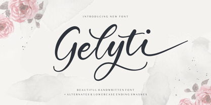 Gelyti is a Beautiful Handwritten Font. Gelyti is perfect for product packaging, branding project, megazine, social media, wedding, or just used to express words above the background. Gelyti also multilingual support. Alternates & Lowercase Ending Swashes. Enjoy the font, feel free to comment or feedback, send me PM or email. Thank you!
 - Aiguille by Hanoded,
$15.00 An "Aiguille" is a sharp pinnacle of rock in a mountain range. Aiguille font is a beautiful handwritten connected script font. I thought it was a good way to start off the new year! Aiguille comes with a whole bunch of alternate glyphs, ligatures and even ‘end-of-word’ alternates.
 - Lettera by Resistenza,
$39.00 Lettera – Delivering 20th-century penmanship vibes, this monoline script font accomplished with rounded nib carries the soul of a romantic naive hand. Connected letterforms Illustrate a charming revival of handwriting. With 400 glyphs including alternates, swashes and ending forms, this typeface is perfect to create beautiful decorative custom headlines and wordmarks.

