10,000 search results
(0.033 seconds)
- Empire State Deco by Comicraft,
$19.00 Every face tells a story but this font is 77 stories high (1,046 feet with antenna included)! A lofty companion to Empire State Gothic , Empire State Deco is a tall, stately font containing four different styles, sometimes contradictory, united by the desire to be modern. Those familiar with the Exposition Internationale des Arts Décoratifs et Industriels Modernes will notice a post-postmodernism combined with the fine craftsmanship and rich materials for which those awfully nice chaps at Comicraft are known. During its Art Deco heyday, Comicraft represented luxury, glamour, exuberance, and faith in social and technological progress -- this new font recaptures those halcyon days in letter form.
 - 1792 La Marseillaise by GLC,
$42.00 This font, was created -- inspired from the original manuscript of the French revolutionary song “La Marseillaise”, becoming later the French national anthem, composed in one night (1792 April 25th) by the 32 year old French captain, Rouget de Lisle. It is a “Pro” font containing Western (including Celtic) and Northern European, Icelandic, Baltic, Eastern, Central European and Turkish diacritics. The numerous alternates and ligatures make the font look as close as possible to the real historic hand. Using an OTF software, the features allow variations of each character without anything to do but to select contextual alternates and standard ligatures and/or stylistic alternates options.
 - Mostaza by Eurotypo,
$30.00 Mostaza is a new lettering font designed by Carine de Wandeleer. The Open Type features include 164 alternates, also in capital letters, and 100 ligatures. All this makes the text lively and bouncy, without the monotony of obviously repeated letterforms. In addition, we have included some ornaments designed to support the font, some were specially designed to be combined with the letters for a "more calligraphic" effect (access to them through the glyphs palette). Mostaza is doing very well to create titles, logos and posters for brand and packaging, invitations, greeting cards, magazines and book covers, children's material, fashion and wherever you want. Enjoy it!
 - Rabigail by Sensatype Studio,
$15.00 Rabigail is an unique and very elegant font for brand and logo design. Based on our experience as a graphic designer who works for a lot of companies, we often are requested to design a logo in a unique style but with an elegant shape. So, we try to brainstorming and create this font to make the idea is going out. This is perfect for BRANDING and LOGO DESIGN. You will get classy, elegant, and certainly unique logos with this font. To make it look more unique, here we prepared some ligatures: ab ah am an ar ak ap at oo cb ch ck cm cn cr ct eb eh ek em en ep er ub uh uk um un up ur st tb th tk tm tn tp tr tu ty fl fi ff ft oo cra ee ga gi it UPDATE v2 - New Additional Ligatures: ob oh om on op or Wish You enjoy it. :) Rabigail is also included full set of: uppercase and lowercase letters multilingual symbols numerals punctuation Wish you enjoy our font and if you have a question, don't hesitate to drop message & I'm happy to help :)
 - Tequendama by JVB Fonts,
$30.00 A display fontface for titles inspired on Latin America, Ethnic, Native, Tribal, Mysthical, Handmade, Aboriginal, Pre-Hispanic, Pre-Columbian, Textured. By mid-1997 I was developed the early type edition was called «Muisca Sans» as my work for the degree in Graphic Design (Universidad Nacional de Colombia), based on the concept of pre-Columbian figures characteristics within some of the very few visual elements recovered from the Muisca culture, ancient pre-Columbian tribe disappeared before the arrival of the Spaniards in what is now central Colombia. In fact, the name of the capital Bogotá (the capital of Colombia) goes back to Bacatá as primary or village downtown of what was once the imperial capital of tribe Muisca. Although this unfinished early typographic project has not yet been published, Tequendama is the evolution of the first one. Tequendama reminds the myth of Muisca culture and religion of this tribe. The god Bochica, a wise old man with a white beard heard the cries of his tribe suffered against flooding of their land losing harvests before the divine punishment resulted by the offended god Chibchacun. However Bochica appeared wearing a white robe sitting on a huge rainbow and he broken the mountain towards the southwest wise old man with a golden staff broke the mountain to drain the flooded savanna. This emblematic and iconic place would later be called as «Salto de Tequendama». Tequendama name also been adopted to a nearby province to Bogotá.
 - Cabrito by insigne,
$24.00 After my son was born, I found myself reading him a lot of books. A LOT of books. Some were good, some were great, but I found myself wanting to develop something using my skills and interests to make something that only I could make. In short, I realized my son needed to be indoctrinated—I mean, introduced into the wonderfully wild world of fonts. So, I set about to make a board book to teach about typography, called “The Clothes Letters Wear.” You can learn more about the book here. I’ve made the captivating illustrations bright and colorful, and the use of different letter forms makes for a fascinating read to delight ages young and young at heart. And, as an added bonus, this children’s book has a custom designed font. I’m always looking for an excuse to design a new font, and this book created the perfect alibi. Drum roll, please. I now give you … Cabrito (“little goat” en Español). This new serif typeface incorporates the latest research on typographic legibility for children, features to make it—well, extra legible. A little background: studies show that Bookman Old Style is one of the most readable typefaces, and as a consequence or perhaps the reason why, it is used thoroughly for children’s books. This font became my initial inspiration for the typeface. Then, I found more legibility research saying that (brace yourselves) Comic Sans is also very legible for beginning readers, much due to the large x-height and softer, easily recognizable forms. In addition, forms that are closer to handwriting also seem to be more legible. Once I threw all that into my cauldron and stewed it a bit, the result was a pleasantly rounded typeface that includes not-so-strictly geometric, handwriting-inspired forms for the b, d, p, and q. Es guapo! Cabrito’s slender weights are simple and fun, with extras that turn any “bah humbug” into a smile. Add lighter touches to your project with the typeface’s included sparkles or rainbows (not included). Splash a little more color on the page with the firmer look of the thicker weights. Cabrito’s upright variations across all weights are matched by optically altered italics, too, giving you even more variety with the font family. This modern typeface’s bundle of alternates can be accessed in any OpenType-enabled software. The fashionable options involve a significant team of alternates, swashes, and meticulously refined aspects with ball terminals and alternate titling caps to decorate the font. Also bundled are swash alternates, old style figures, and small caps. Peruse the PDF brochure to check out these options in motion. OpenType-enabled applications like the Adobe suite or Quark allows comprehensive control of ligatures and alternates. This font family also provides the glyphs to aid a variety of languages. Cabrito is a welcoming, everyday font family by Jeremy Dooley. Use it to convey warmth and friendliness on anything from candy and food packages to children’s toys, company IDs or run-of-the-mill promotional material. Cabrito’s unique appearance and high legibility make it equally at home in print as it is on a screen.
 - Victory Speech by Comicraft,
$49.00 It's that time of year again, isn't it? And yes, we're speaking rhetorically, because our true intent is to rouse voters into action, claim a significant gain in support over our nearest rivals and lead the nation, perhaps The World, into a new era of prosperity, one in which our once proud nation can become great yet again! An era of Hope, a time of peace and an end to war! Because never, in the field of human conflict, have so many, given so much and gained so little so that the have nots can reward themselves and those that have and-and... Victory, and Hope, and Greatnessness! Related font: Victory Speech Lower
 - Ashemore by insigne,
$34.99 Ashemore developed as a result of my visits to Barcelona, Spain and to Germany, followed soon after by a visit to Asheville, North Carolina. Blending the styles of art and architecture from these three areas may seem initially to result in an unusual formula, but the distinct and flamboyant style of Art Nouveau and the Arts and Crafts style combined with the more strict rules of a sans serif transfer well into a beautiful and very usable blend of these individually eccentric forms. The resulting font retains the Art Nouveau and Craftsman style flavors, which shine through the typeface despite its geometric base. One of the font’s defining characteristics is the unique terminators of its C, G and S. This face’s texture and rhythm also moves well in longer texts. These and other features give Ashemore a restrained bohemian vibe that seems particularly appropriate for a coffee house or an art gallery. The Ashemore family has a full range of six weights from thin to black and includes condensed and extended options for a total of 36 fonts. The typeface also includes some unique OpenType alternates that make the superfamily even more versatile. Ashemore is equipped for complex professional typography, including alternates, small caps and many alternate characters. The face also has a number of numeral sets, including tabular figures, fractions, old-style, lining figures and superiors and inferiors. OpenType-capable applications such as Quark or the Adobe Suite can take full advantage of automatic ligatures and alternates. You can find these features demonstrated in the .pdf brochure. Ashemore also includes the glyphs to support a wide range of languages, including Central, Eastern and Western European languages. In all, Ashemore supports over 40 languages that use the extended Latin script, making the new addition a great choice for multi-lingual publications and packaging. Ashemore was designed by Jeremy Dooley with production assistance from Lucas Azevedo and Marcelo Magalhaes. Kerning assistance from iKern.
 - JAF Lapture by Just Another Foundry,
$59.00 Lapture is based on the Leipziger Antiqua by Albert Kapr, released in 1971 by the East German foundry Typoart. It has been extended and carefully redesigned by Tim Ahrens in 2002-05. The strong calligraphic characteristics are a result of the design process: "The size of the counters and the width of individual characters at small optical sizes were analysed with a steel pen while the letter shapes were designed in larger size with a specially trimmed reed pen. Sometimes the hand is more innovative than the head alone," says Kapr. A unique feature of this font is the introduction of gothic shapes into a latin typeface. "The basic concept is to string together narrow white hexagons as counters and inter-letter spaces, defined by vertical stems and triangular serifs. The interior spaces are at least as important as the strokes that make up the characters." Lapture is an ideal choice if a reference to gothic style is desired, as true black letter types are often too eye-catching and not as legible as latin fonts for unfamiliar readers. "The last few years have seen a number of very elegant typefaces based on the mellow and feminine renaissance model. However, sometimes we require a font that is strong and robust, harmonic yet rigid," says designer Tim Ahrens. JAF Lapture is provided in OpenType format. Each font contains more than 600 glyphs, including true small caps, nine sorts of figures, contextual and stylistic alternates and accented characters. This means that you only need to purchase one font whereas in other families you would have to buy two or three fonts in order to get the same. Technically, they follow the Adobe Pro fonts and provide the same glyph set and OpenType functionality. JAF Lapture Basic is provided in OpenType format. Each font contains the standard sets of both MacOS and Windows. In contrast to JAF Lapture they do not provide any advanced OpenType features and no extended glyph set.
 - Caligari Pro by Elsner+Flake,
$99.00 The silent film »The Cabinet of Dr. Caligari« (1920) is undoubtedly one of the breathtaking milestones within the German Expressionist Movement, a time of extraordinarily creative works of art as a reaction to a world in rapid change. The original intertitles of Caligari were worked out by the set designers (and painters) Walter Reimann, Walter Röhrig, and Hermann Warm, using a unique expressionistic language of form for dramatic and iconic lettering. When in 2010 KOMA AMOK’s Joerg Ewald Meißner and Gerd Sebastian Jakob were commissioned by the Institut Mathildenhöhe Darmstadt and publisher Hatje Cantz to design the catalog for the exhibition »The Total Artwork in Expressionism«—showing works of art, architecture, film, literature, theater, and dance—it was soon perfectly clear that a new typeface, inspired by the Caligari intertitles, should speak for all the expressionistic arts. An intense process of research and analysis began. The original letters of the Caligari intertitles were individuals on their own. Furthermore, each of the three title designers had added his specific approach to the basic Caligari type style. From hundreds of different As to Zs a choice had to be made, which should be THE characteristic Caligari letter for a digital typesetting font. Finally the chosen letters were cut and drawn again, missing letters were added according to the formal priniciples, all-in-all 1000 glyphs were digitised to complete a usefull OpenType font ready for use. When in the autumn of 2010 the exhibition started successfully with great media interest, the posters all over Darmstadt announced »You must become Caligari!« – set in the brandnew typeface. The font Caligari Pro offers alternative forms for every letter and a whole bunch of ligatures, thus creating an expressive, individual image of headlines and text. By using included Stylistic Alternates the image will get even more vivid. Caligari comes with a complete set of expressionist ornaments and true old style figures—thus the heyday of the Expressionist Movement and the era of the silent films can be revived typographically by the means of today: »Express Yourself!«.
 - Captain Podd - 100% free

- Pumpkin Soup by Hanoded,
$20.00 Pumpkin Soup is delicious! And so is the font. 'Nuf said!
 - IM FELL French Canon - Unknown license

- Frutiger by Linotype,
$42.99 In 1968, Adrian Frutiger was commissioned to develop a sign and directional system for the new Charles de Gaulle Airport in Paris. Though everyone thought he would want to use his successful Univers font family, Frutiger decided instead to make a new sans serif typeface that would be suitable for the specific legibility requirements of airport signage: easy recognition from the distances and angles of driving and walking. The resulting font was in accord with the modern architecture of the airport. In 1976, he expanded and completed the family for D. Stempel AG in conjunction with Linotype, and it was named Frutiger. The Frutiger™ family is neither strictly geometric nor humanistic in construction; its forms are designed so that each individual character is quickly and easily recognized. Such distinctness makes it good for signage and display work. Although it was originally intended for the large scale of an airport, the full family has a warmth and subtlety that have, in recent years, made it popular for the smaller scale of body text in magazines and booklets. The family has 14 weights and 14 companion fonts with Central European characters and accents. Another 14 Cyrillic companion fonts are available as well. See also the new revised version Frutiger Next from the Linotype Platinum Collection. Featured in: Best Fonts for Logos
 - Teen Years JNL by Jeff Levine,
$29.00 Teen Years JNL was inspired by the hand lettered name for the Joyce Records label (circa 1956) which first recorded the New York doo-wop group The Crests (of “16 Candles” fame). The type design is a block sans serif, and is available in both regular and oblique versions.
 - Tough Stuff JNL by Jeff Levine,
$29.00Tough Stuff JNL is a solid version of Jeff Levine's Tough Guy JNL [an outline font with a cast shadow]. In this version, the bold lettering shows off its "hand-made" look, and is perfect for posters, fliers or ads that need to grab attention without looking too formal. - Aneloma by Raditya Type,
$16.00 Aneloma is a neat 2 style blackletter font, perfect for use in a paragraph sentence. And headlines too. There are two styles that you can get here, clean and rough. A beautiful blackletter typeface. Aneloma is perfect for many projects, for branding, Instagram, print posters, magazines, fashion, whatever.
 - Extra C Variable by Tipastype,
$56.00 It is an Extra Condensed, Extra Light, Extra experimental and Extra display font. Extra C is a fun font that doesn't take itself too seriously. Ideal for those who need a font with great character and personality but at the same time a delicate touch in their graphic pieces.
 - Chicago Doodles by Outside the Line,
$19.00 Armchair travel to the Windy City with Chicago Doodles. 31 illustrations of buildings, skylines, transportation, food, Chicago landmarks, signs and a script word Chicago. For other city, state and country doodles take a look at Paris, London, Waikiki and New Orleans Doodles. Also Cowboy and Lake Vacation Doodles too.
 - Whoa Nelly NF by Nick's Fonts,
$10.00In his book of Showcard Alphabets, Dan X. Solo called this one Funhouse, and we couldn't agree more. Wild, wacky and slightly tacky, but suitable for the whole family. The Opentype version of this font supports Unicode 1250 (Central European) languages, as well as Unicode 1252 (Latin) languages. - Ysleta NF by Nick's Fonts,
$10.00Here's a faithful rendering of an old face from the James Conner's Sons specimen catalog of 1888, alternately known as Aetna or Painter's Gothic. Its compact descenders allow for tightly-spaced headlines. Both versions of the font contain the complete Unicode Latin 1252 and Central European 1250 character sets. - Ponte Vecchio NF by Nick's Fonts,
$10.00An elegant typeface from the turn of the last century named "Venezia", issued by Karl Brendler and Son of Vienna, provided the inspiration for this little gem, with hints of the exotic. Both versions of this font include the complete Unicode Latin 1252 and Central European 1250 character sets. - Arcandias Downtown by BlackLotus,
$20.00 Arcandias Downtown is a serif with high contrast combined with alternates so that it can match projects created using this font with trends in modern times.This font is made with precision for each character so as to create a quality font that is beautiful to look at. Arcandias Downtown can be used in various projects, both Magazine Titles, Posters, Newspapers, and others. This font has a variety of alternatives, so that any project that uses this font will look striking, beautiful, and modern.
 - Farmer's Marker by Citrus Branding,
$3.99 Farmer's Marker is an ode to the hobby-farmer and their honest and hardworking (but not too serious) lifestyle. The font reflects a vision of a farmer who quickly scrawls down her produce (72 Eggs + 20L of Milk + 2kg Honey) before she heads off to the market to do her best to sell what she has farmed. It is a casual, freehand, marker script that doesn't take itself too seriously. It is hand drawn by me, then meticulously perfected in Illustrator while leaving in just enough small imperfections that the font retains it's humanistic, hand-drawn and personal feel. The font will lend itself perfectly to rustic restaurant menu's, organic branding and packaging, social media content, child-centric design, travel posters, humanitarian organisations and much more.
 - ITC Manhattan by ITC,
$29.99Manhattan was designed in 1970 for ITC by Tom Carnase, who also created Avant Garde Gothic. The distinguishing characteristic of this designer's work is found in the emphasis on the thick-thin constrast. In this case, Carnase approached the border of the impossible. The heavy vertical strokes stand opposite the finest of lines and the thick columns dominate the overall look. The basic forms are strictly constructed, as are those of Morris F. Benton's Broadway of 1925, to which many parallels can be found. Manhattan is best used for applications which will not be placed too far from the viewer, as at too great a distance the fine lines can no longer be seen. It should be used exclusively for headlines in medium point sizes. - Lovely Flowers by Fargun Studio,
$14.00 Lovely Flowers is modern script that perfect for photography, branding, signature. It is so beautiful and classy for your projects. This font has given PUA code (specially coded fonts). So that all the alternate characters can easily be accessed in full by a craftsman or designer.
 - Yellow House by Ef Studio,
$15.00 Yellow House is a hybrid typeface, combining a bubbly display with a serious serif. It gives a contemporary and quirky feel to any design you wish to add it to. This font is so versatile, perfect for branding, poster design, editorial design, logotype, packaging, and so on.
 - Vanities by Solotype,
$19.95A Victorian type which, like so many others, was originally offered without a lowercase. As we do so often, we designed a matching lowercase for it. We also added a shaded version of the caps, figures and points of our earlier Vanities font. A nice companion face. - Hamdany by Fargun Studio,
$16.00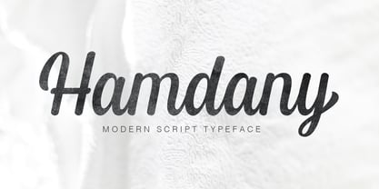 Hamdany is modern script typeface that perfect for photography, branding, signature. It is so beautiful and classy for your projects. This Font has given PUA code (specially coded fonts). So that all the alternate characters can easily be accessed in full by a craftsman or designer.
 - Hanthem Script by Fargun Studio,
$14.00 Hanthem Script is modern script that perfect for photography, branding, signature. It is so beautiful and classy for your projects. This Font has given PUA code (specially coded fonts). So that all the alternate characters can easily be accessed in full by a craftsman or designer.
 - AJ Quadrata by Adam Jagosz,
$25.00 Once, Blackletter was a calligraphy style. Full of ligatures, with letters bumping into each other to create an unapologetic picket-fence pattern. Some even claimed that the regularity improved legibility! But then Blackletter was cast into metal, and only a handful of established ligatures survived, while most interletter connections were disentangled. Everyone since followed suit, and hundreds of years later, digital Blackletter fonts were modelled mostly on the metal fonts that prevailed rather than the original handwriting. Up until now! AJ Quadrata is an authentic revival of the textura quadrata hand, and its major inspiration is a 15th-century Latin manuscript of the Bible from Zwolle, the Netherlands. The typeface is delivered in two flavors. The default cut is a modern take on textura quadrata that can be useful for today and tomorrow. The standard ligatures feature employs nearly all letters. The tittle of i retains its original, hasty squiggle form (except for the Turkish localization). Discretionary ligatures include medieval ligatures da, de, do, pa, pe, po (and their mixed-case counterparts!). Stylistic sets allow to use historic letter variants such as long s and rotunda r, closed-counter a, and alternate capitals. AJ Quadrata Medieval is perfect for setting Latin. Default forms of capital F, H and O are swapped with the alternates. The squiggles above i only appear for disamibiguation nearby m, n or u, as in original manuscripts. Discretionary ligatures and historic variants are promoted to the standard ligatures feature to make room in the discretionary ligatures feature for a variety of scribal abbreviations. Dedicated stylistic sets include medieval punctuation and justification alternates — glyphs with elongated terminals used for lengthening lines that end up too short. The Rubrum styles can be layered and colored to create the illuminated effect on the capital letters. Besides a faithful rendition of extended Latin including Vietnamese, numerous synthetic additions are included: polytonic Greek, Armenian, and Cyrillic (with Bulgarian and Serbian/Macedonian localizations). Both flavors of the typeface can be considered a starting point that can be further customized using OpenType features, including Stylistic Sets (some features differ between AJ Quadrata and AJ Quadrata Medieval): ss01 Alt E ss02 Descending F / Roman F ss03 Uncial H / Roman H ss04 Angular O / Round O ss05 Contextual closed-counter a ss06 Diamond-dot i j / Always dotted i, j ss07 Contextual rotunda r / No r rotunda ss08 Contextual long s / No long s ss09 Dotless y ss10 Serbian Cyrillic ss11 Alt Cyrillic de ss12 Alt Cyrillic zhe ss13 Alt Cyrillic sha ss14-ss17 [reserved for future use] ss18 Scribal punctuation ss19 Alt linking hyphen ss20 Justification alternates
 - Classi MF by Masterfont,
$59.00 High contrast serif font, so elegant, keeping the ethnic look and feel.
 - Joyful Heart by Azetype,
$12.00 Have you ever used a handwritten font on your design project? Have you ever felt bored or dissatisfied with its glyphs style that looks stiff and doesn't flow even doesn't really characterize the peculiarities of a handwritten font? Or fonts that don't have alternative glyphs so they look monotonous in a word or even sentence. And in the end, it makes your projects so far from your expectations, even your clients. It's so frustrating, isn't it? Just wake up from your dissatisfaction and this is your time to make a good choice for your design project. So, we have a solution to fix it. We introduce 'Joyful Heart' just for you. This is a font that really characterizes from the handwritten style. This font is crafted carefully in every its single scratch, created to look as close to a natural handwritten font so that it can create the perfect combination on each glyph. Happy Creating www.azetypestudios.com
 - The Bubble font embodies a playful, cheerful, and jovinally whimsical aesthetic, making it a popular choice for designs that aim to spread joy, evoke childhood nostalgia, or simply stand out with a p...
- Gloriz Vintage by Mans Greback,
$59.00 Gloriz Vintage is the bold and distinctive retro serif font that adds a touch of rustic charm to any project. Designed by Mans Greback in 2023, this font features rounded edges and a heavy, printed appearance that will give your work a vintage look. Perfect for headlines and logotypes, Gloriz Vintage is the perfect choice for designers looking to add a touch of personality to their work. Don’t miss out on this one-of-a-kind family! The Gloriz Vintage family consists of six high-quality fonts: The three weights Regular, Light and Bold, are each provided as both Upright and Italic styles. The font is built with advanced OpenType functionality and has a guaranteed top-notch quality, containing stylistic and contextual alternates, ligatures and more features; all to give you full control and customizability. It has extensive language support, covering all Latin-based languages, from Northern Europe to South Africa, from America to South-East Asia. It contains all characters and symbols you’ll ever need, including all punctuation and numbers.
 - CemeteryWalk by Ingrimayne Type,
$5.00 I created CemeteryWalk in 2018 to illustrate a program for a local cemetery walk. CemeteryWalk places letters on pictures of gravestones. In 2022 I expanded the family by placing three different sets of letters on the gravestones. Each of the four different sets of letters on gravestones has two styles, one with black letters on white gravestones and the other with white letters on black markers (the bold style). The bold style can be placed beneath the plain style to add color or texture. All eight styles are caps only, with the lower-case letters having different shapes for the tombstones but the same letters as in the upper case. There is only one set of accented characters and it is where the upper-case letters are found. Each also has an alternate set of characters that are somewhat similar in appearance and it can be accessed using the OpenType feature of stylistic sets. A final typeface in the family is a picture font of items that may be found on old tombstones.
 - Zarlino by Patricia Lillie,
$29.00 Zarlino is an original typeface in the Blackletter style. It does not solidly adhere to any of the historical Blackletter classifications, but draws from all of them, with some characters owing more to the Roman than the Fraktur. Zarlino Delux includes three complete sets of upper case, ranging from the simple to the embellished to the even more embellished, two complete sets of lower case, and two more sets of embellished alternates for selected lower case characters. These alternates are available through Stylisitic Sets in OpenType aware applications. For use in non-OpenType aware applications, Zarlino Delux comes with a set of separate, standard fonts, one for each style. These standard fonts are also available for individual purchase. Zarlino was named by my cousin, a musician. Gioseffo Zarlino was a sixteenth century composer and musical theorist. Among other things, he offered detailed advice on the setting of words to music. With its blends of the old and the new, the simple and the ornate, Zarlino is suitable for many uses, from the elegant to the aggressive.
 - Filmstrip BF by Bomparte's Fonts,
$29.00 Imagine words and letters, all caps, cut out of 35mm film. Then imagine Filmstrip BF —a font of film and movie-related catchphrases. They’re all ordered in more or less alphabetical order as seen in a glyph palette, beginning with “A”, which is accessible by typing a number (#) symbol. Numerals zero through nine, however, are mapped to their usual keyboard locations. For a better fit between numbers, be sure to enable the Ligature feature in an OpenType-capable application. All catchwords contained in this font are listed as shown, across the three posters in the slide carousel above. For future reference, you might select and copy all of the glyphs indicated below, paste into your application document, then convert them to Filmstrip BF. This would display all content. #$%&’()*+,./0123456789:;=>?@ABCDEFHIJKLNOPQRSTUVWXYZ[\]^_`abdefghijklmnopqrstuvwxyz{|}~ÄÅÇÉÑÖÜáàâäãåçéèêëíìîïñóòôöõúùûü†°¢£§•ß®©™´¨≠ÆØ∞±≤≥¥∂∑∏πªºæø¿¡¬√≈«»…ÀÃÕŒœ–—“”‘’÷ÿŸ⁄€‹›fifl‡·‚„‰ÂÊÁËÈÍÎÏÌÓÔÒÚÛÙıˆ˜¯˘˙˚¸˝˛ˇÐðŁ¹¼łŠš³¾² When used in a creative way, Filmstrip BF can be successfully incorporated into a variety of projects such as product packaging, logos, posters, signage, headlines and more.
 - Kuma by L'île Foundry,
$35.00 In Ancient Greek, Kuma means wave. This wavy, dynamic and poetic all-caps display typeface is useful for headlines or short texts. Kuma is the result of a graphic and perceptual game that, using experimentation as a working method, explores the possibilities of writing as an image. This grid-based typeface creates different shapes and directions, never predictable. There are different types of waves created by the wind. That's why there are three different versions of Kuma: Kuma, Kuma Rounded and Kuma Square. Each version is available in seven weights which can be combined together. In their black and white rhythm, they guarantee global readability and balance. Kuma was designed by Jérémy Ruiz. Supported languages: Afrikaans, Albanian, Basque, Bosnian, Breton, Catalan, Croatian, Czech, Danish, Dutch, English, Esperanto, Estonian, Faroese, Fijian, Finnish, Flemish, French, Frisian, German, Greenlandic, Hawaiian, Hungarian, Icelandic, Indonesian, Irish, Italian, Latin, Latvian, Lithuanian, Malay, Maltese, Maori, Moldavian, Norwegian, Polish, Portuguese, Provençal, Romanian, Romany, Sámi (Inari), Sámi (Luli), Sámi (Northern), Sámi (Southern), Samoan, Scottish Gaelic, Slovak, Slovenian, Sorbian, Spanish, Swahili, Swedish, Tagalog, Turkish, Welsh.
 - Nagel by ParaType,
$40.00 Nagel is a contemporary uniwidth display sans serif for headlines and short texts. It’s a closed low-contrast typeface with an emphasis on stroke joints. The length of the line set in Nagel remains the same in all weights. Nagel has all the advantages of monospaced typeface graphics, but none of their functional disadvantages. Characters in Nagel are made monospace-like wide, as opposed to traditionally narrow characters of proportional fonts, and often have slab serifs. Letters of monospaced fonts that have to be narrowed down considerably, have the usual width here. The scope of Nagel is branding and identity of IT companies, infographics, scientific and technical documentation — any areas where a technical, modern typeface with distinctive graphics may be required. The typeface includes three upright styles — Regular, Medium, Bold; two sets of 11 and 18 slanting degrees and a variable version with two axes: Weight and Slant. The character set includes extended Cyrillic and Latin alphabets, arrows, triangular bullets, index numbers and fractions. Designed by Alexander Lubovenko.

