10,000 search results
(0.027 seconds)
- Hero Sandwich Pro by Comicraft,
$19.00 As comic book readers know all too well, team ups are every super hero’s bread and butter... when the brave and the bold are in a pickle, and super villains are running onion rings around them, here’s how they roll: They Meat! They Team-Up with your taste buds! They Fight Hunger! Our original Hero Sandwich font has become a go-to for video game and app graphics, due to its easy readability and friendly demeanor. The new Pro version adds nine weights from Thin to Heavy, with matching italics, plus a versatile Variable Font to dial in your preferred combination of weight and italic slant. Each weight includes four numbering options and support for 222 languages, including Cyrillics. So take a footlong bite out of crime, and make the subways safe again with our mouthwatering Hero Sandwich! Prepared with care and plastic gloves by those awfully nice chaps at the Comicraft deli.
 - Signsurfers Script by Learning Kiddos,
$18.99 Signsurfer is a unique retro font - a signpainter font, handwritten by me. Inspired by the golden ages of handlettering, this script font highlights: - a bouncy baseline - tight spacing - and full Latin support --- Lots of really cool catchwords & shapes (you will get all the catchwords & shapes seen in the preview pics), five alternates and 37 ligatures help you to really get creative with this one. --- What you can use it for: - branding - logotype - poster - t-shirt designs - all kind of labels - greeting cards - wedding invitations ...and so much more --- This font also works great as a running text, too. = ) --- Process behind it: first I drew all of those fancy letters & catchwords with a brush on paper. I then carefully traced all of those letters & catchwords in Illustrator and transferred them into my Font Creator program. This helped getting the unique sign painters flow. --- Note: You will a need program that support OpenType Features for accessing the alternative glyphs.
 - Subway Circle by Hanoded,
$15.00 My eldest son Sam always wanted to visit Japan and he has been saving up for a ticket for years now. We should have traveled there this year, but due to the pandemic, that was impossible. We’re now trying to go next year. Sam and I did make some kind of itinerary and I told him how we were going to get around, as I have been to Japan many times. I told him about the Shinkansen trains, the cute Tram in Nagasaki and the immense subway system in Tokyo. One of the lines in Tokyo is the so-called Yamanote Circle Line, which I have used on numerous occasions. A new font name was born and it stuck to this particular font! Subway Circle is a 100% handmade font. It is rounded, slightly slanted and comes with a sunny disposition. I am sure that, when you use it, you will find your 生きがい… ;-)
 - Bourton by Kimmy Design,
$10.00 Bourton is the sans-serif cousin to Burford. In addition to a new look, it boasts more layering options, stylistic alternatives, graphic extras and even comes with its own script font! For a hand-drawn look, check out Bourton Hand Okay… so here’s everything you get with Bourton! Bourton Layering Fonts • 6 Base Layer Fonts (Base, Inline, Marquee, Stripes A, Stripes B, Stripes C) • 6 Top Layer Fonts (Base Drop, Dots, Line Light, Outline Light, Outline Medium, Outline Bold) • 6 Extrude Fonts (Extrude, Outline, Shade A, Shade B, Shade C, Shadow) • 5 Drop Shadow Fonts + 5 solo styles (Drop Shadow, Drop Extrude, Drop Line, Drop Stripes A, Drop Stripes B) • 2 Line Fonts for secondary text (Line Medium, Line Bold) Bourton Script • Light • Bold Bourton Extras Ornaments, banners, frames, borders, flags and line break (OTF, EPS, AI with User Guide for OTS) Flourishes (OTF, EPS, AI with User Guide for OTS). Happy Creating!
 - Brecksville by OzType.,
$15.00 Brecksville is a condensed grotesk typeface that takes inspiration from early German designs of the mid-19th century. It was designed as part of my current research into grotesk typefaces and different letterforms, as part of my dissertation research, “Perfected Letters: German Grotesk in the Nineteenth Century”, which focuses on the role of German design in typography. The Brecksville font family provides a wide range of weights, ranging from light to bold for both its rounded display style and more rugged sharp style. Both its styles feature the same horizontal proportions and metrics so they can freely be combined with no spacing issues. Brecksville's visually punchy condensed style and sharp edges, allows it to stand out on the screen – at almost any size. Its black composition also brings out the details needed in magazine and tabloid headlines, while maintaining readability throughout. The rounded display version is ideal for posters and other uses where you want something eye catching but not too hard on the eyes.
 - Trivia Humanist by Storm Type Foundry,
$53.00 I decided to draw the Regular style of Trivia Humanist not too light and the Bold not too dark. Delicate anatomy and moderate contrasts of serifed humanist typefaces aren’t usually born by interpolating between extremes, but rather by meticulous care for each individual letter. A delicious blend of a trace of punchcutter’s tool and calligrapher’s hand with as few historical reminiscences as possible. It stays away from any strong aesthetic colorations as well, which is a common feature of the Trivia family system. I wanted a clear and majestic typeface for book jackets, LP cover designs, posters, exhibition catalogues and shorter texts. But at the end it turned out excellent for largest books as well.
 - Radical Fortune by Hanoded,
$15.00 One day my kids asked me: ‘would you rather be healthy and poor or super rich and sick?’ Without a doubt I answered: ‘healthy and poor’. Having money is nice, but it is not what life is about. At least, that is what I believe. Radical Fortune is a font I made after a period in my life that could have ended with a really nice sum of money in my hands - but which I didn’t take. I had to give up too much of myself and that just didn’t feel right. I made Radical Fortune to keep me from thinking too much - and, symbolically, I used a really old and cheap marker pen to draw out the glyphs!
 - Valienta Script by Colllab Studio,
$19.00 "Hi there, thank you for passing by. Colllab Studio is here. We crafted best collection of typefaces in a variety of styles to keep you covered for any project that comes your way! Fonts never fit your designs ? They’re just not flexible enough, not modern enough or too old-fashioned? And you’re too busy to keep looking for a font that fits the bill, right? The market is flooded with all kinds of fonts, but none of them is simple and elegant. Valienta Script is what you’re looking for. It’s an elegant typeface created to make your designs stand out from the crowd, and to add a touch of luxury. A Million Thanks www.colllabstudio.com
 - Konya by 38-lineart,
$12.00 Konya is a signature script-style font with a very luxurious look. It can look very soft and very firm in an elegant frame, high but not too towering, and flat but not too low. Its appearing with a balance like dervish whirling around in ‘Konya town’ with two hands stretched, one hand facing to the sky and the other hand facing to the earth. This font is perfect for branding, as we equipped it with a number of alternatives that allow you to make it a feminine and masculine logo, and some swash to add to the firmness of signature. This font also has ligatures to present a natural handwritten impression.
 - Lincoln Road by District 62 Studio,
$29.00 Introducing our new Lincoln Road Font Collection. Deco, but not too Deco. A Lincoln Road is a family of 9 fonts including 2 weights of Deco and 6 weights of a coordinating Sans and an Elements font that contains the frames and elements you see used in the previews. Each Deco weight has a corresponding Sans weight. Lincoln Road was inspired by art Deco styles, but is a modern interpretation - in other words - not too deco. It works for modern projects that need a hint of a decorative look and can also be used for a more vintage vibe. Check out the previews to see some of the ways you can use this family.
 - Quintton by TypoBureau Studio,
$15.00 Quintton script is a casual clean brush stroke font, perfect for logo design, branding, invitations, t-shirts print, mock up, magazines, signage and so much more. With its handmade feel, Quintton is perfect for your upcoming projects so don't miss out.
 - Lovely Rose by Namara Creative Studio,
$14.00 Lovely Rose Romantic calligraphy script font inspired by lovely valentines themes. This font is suitable for greeting card, wedding invitation, instagram post, quotes and so on. Feel free to follow, like and share. Thanks so much for checking out my shop!
 - Ganz Egal, masterfully crafted by the enigmatic designer Nihilschiz, is not just a font; it's an adventure in typography that refuses to take itself too seriously. Picture this: if fonts were people,...
- Steagal by insigne,
$24.75 I love geometric sans serifs, their crispness and rationality. Le Havre taps into this style, but for a while, I've wanted to create a font recalling the printed Futura of the 1940s, which seems to have an elusive quality all its own. After seeing an old manual on a World War II ship, I developed a plan for "Le Havre Metal" but chose to shelve the project due to Le Havre's small x-height. That's where Steagal comes in. When Robbie de Villiers and I began the Chatype project in early 2012 (a project which led one publication to label me the Edward Johnston of Chattanooga!), we started closely studying the vernacular lettering of Chattanooga. During that time, I also visited Switzerland, where I saw how designers were using a new, handmade aesthetic with a geometric base. I was motivated to make a new face combining some of these same influences. The primary inspiration for the new design came from the hand-lettering of sign painters in the United States, circa 1930s through 1950s. My Chatype research turned up a poster from the Tennessee Valley Authority in Chattanooga, Tennessee, which exhibited a number of quirks from the unique hand and style of one of these sign artists. Completing the first draft of Steagal, however, I found that the face appeared somewhat European in character. I turned then to the work of Morris Fuller Benton for a distinctly American take and discovered a number of features that would help define Steagal as a "1930s American" vernacular typeface--features I later learned also inspired Morris Fuller Benton's Eagle. The overall development of Steagal was surprisingly difficult, knowing when to deliberately distort optical artifacts and when to keep them in place. Part of type design is correcting optical illusions, and I found myself absentmindedly adjusting the optical effects. In the end, though, I was able to draw inspiration from period signs, inscriptions, period posters, and architecture while retaining just enough of the naive sensibility. Steagal has softened edges, which simulate brush strokes and retain the feeling of the human hand. The standard version has unique quirks that are not too intrusive. Overshoots have almost been eliminated, and joins have minimal corrections. The rounded forms are mathematically perfect, geometric figures without optical corrections. As a variation to the standard, the “Rough” version stands as the "bad signpainter" version with plenty of character. Steagal Regular comes in five weights and is packed with OpenType features. Steagal includes three Art Deco Alternate sets, optically compensated rounded forms, a monospaced variant, and numerous other features. In all, there are over 200 alternate characters. To see these features in action, please see the informative .pdf brochure. OpenType capable applications such as Quark or the Adobe Creative suite can take full advantage of the automatically replacing ligatures and alternates. Steagal also includes support for all Western European languages. Steagal is a great way to subtly draw attention to your work. Its unique quirks grab the eye with a authority that few typefaces possess. Embrace its vernacular, hand-brushed look, and see what this geometric sans serif can do for you.
 - Gigantic by Eclectotype,
$40.00 Gigantic, as the name suggests, should be set large. The type is spaced "tight-not-touching" so you really don't want to go under 72 points. The font is intended to be used to create an impact - a chunk of text will have a graphic aesthetic while maintaining legibility. Because it's so bold, it's a great face to use with images showing through. Ideal for magazine headlines and posters, not so ideal for setting novels.
 - Montire by Craft Supply Co,
$20.00 Introducing Montire – Strong Serif Font Robust Masculinity Let’s delve into the world of Montire, a font that embodies robust masculinity. With its bold and powerful appearance, it unquestionably demands attention and respect. Industrial Edge Montire carries an industrial edge that imparts a rugged, mechanical quality to your designs. It’s the ideal choice for projects seeking an edgy and forceful statement. Powerful Typography Montire’s typography wields an inherent strength that elevates your message to a bolder and more impactful level, making it suitable for a wide range of design projects. Uncompromising Strength When it comes to strength, Montire doesn’t compromise. Its bold serifs and sturdy lines exude unwavering power, ensuring that your content leaves an indelible mark. In Conclusion In summary, Montire – Strong Serif Font is your solution for designs that demand robust, masculine, and industrial aesthetics. It’s the font that elevates your message, making it strong, impactful, and impossible to overlook. Whether it’s for branding, posters, or any design endeavor, Montire guarantees that your content carries the unmistakable stamp of strength and unwavering confidence.
 - Stager by Ahmad Jamaludin,
$15.00 Fresh artsy and classy serif, so we present to you, Stager! Stager - A stylish serif with an artistic and classy touch so brings us to the nostalgic era. Thin letter anatomy collaborate with unique alternates and beautiful ligature so makes any project seem chic, luxurious, unique, artistic and little retro vibes Stager - Come with italic version, so perfectly suitable for creating elegant, simple, retro design such as branding, poster design, books, fashion, social media design, logos, etc. What you get Letters, numbers, punctuation, multilingual support, alternates, and beautiful ligatures Regular and Italic version Come and say hello over on Instagram! https://www.instagram.com/dharmas.studio/ Dharmas Studio
 - Liontin by Fargun Studio,
$12.00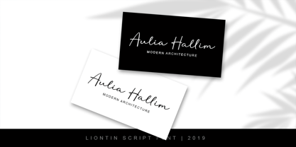 Liontin is modern script, perfect for photography, branding, signature. It is so beautiful and classy for your projects. This Font has given PUA code (specially coded fonts) so that all the alternate characters can easily be accessed by a craftsman or designer.
 - Metal as in Heavy - Unknown license

- Dale Kids by AdultHumanMale,
$12.00 DaleKids is a fun kiddie style font, a little bit picture book and a little bit comic book too. The font is available in two styles regular and italic. Designed to be playful it looks great on birthday cards and long tome like monologues of cute speak.
 - English Script Hand by Autographis,
$39.50 This is the classic English Script. Completely drawn by hand with a classic pen and then scanned and worked over just enough to keep that handmade touch. I didn't want this to look perfect, there are enough versions of this font that are way too slick.
 - Augusta Torino Ornaments by Intellecta Design,
$10.00 Intellecta Design, in partnership with Monocracy Types (Paulo W) launches Augusta Torino Ornaments. Classic art deco ornaments digitized from the font catalogues of "Società Augusta Torino", also Nebiolo Fundicion, one of the most important european extinct typefoundry from last century. Soon, more fonts of that collection.
 - Werk by Wilton Foundry,
$19.00 Because we all need a "werk" horse font that is simple, useful and with just enough character not to be too dominant. Werk, as a family, attempts to meet that need with plenty of weights ranging from light to bold plus light condensed through bold condensed.
 - Flapstick by PizzaDude.dk,
$19.00 Flapstick is a straight forward and fun sans-serif font. It's 100% handmade and is ready for your "get well soon" cards, children's books, posters of all kinds and anything that needs an authentic handmade look! Multilingual support and alternate versions of a, g and y!
 - Monotype Broadway by Monotype,
$29.99For many type lovers, Broadway is the quintessential Art Deco typeface. Designed as an all-caps typeface in 1927 by Morris Fuller Benton for ATF, it was expanded two years later with a lower case designed by Sol Hess, who also drew the inline version, Broadway Engraved. - Funboo by ZetDesign,
$14.00 Funboo is a horror-themed font, the shape of the letter resembles a ghost image but still funny. This font is suitable for Halloween decoration and design with a horror theme and can be applied to various media according to your wishes. stay cute and boo!!! ..... Thanks ....
 - Nostagila by Forberas Club,
$16.00 This font is made based on memories from the past. Where is writing in a diary that tells about everyday stories. Are you ready to write a story with this font? or did you want to make a crafty item, this font will do it too.
 - Ela by Wiescher Design,
$39.50 Ela is the typeface I originally designed for the business of my second wife and mother of my two sons, her name is of course Michaela. Ela the typeface is suitable for magazines, newspapers, posters, advertiments, books, text, documentation/business reports, business correspondence, multimedia, and corporate design.
 - Dolina Script by Tour De Force,
$25.00 Ingredients: 1) Dusan's right hand; 2) The eye of the Cobra, leg from the dragon, software from the Bill; 3) Elliott Smith (TM) playing in the background; 4) Old grandmother to tell you not to spice it too much; 5) Empty label for your jar/ box/ product...
 - Lush Script by Positype,
$59.00 Lush was a formal script until it had a few too many drinks and, as a result, loosened up a little bit. Harkening back to the handlettering of the 40s and 50s, Lush has evolved into a casual, but well-dressed script that maintains a rather aggressive rhythm. Transitions often whip back quickly, forcing the letters to reel from the movement and resolve efficiently. It is not as warm as some scripts, intentionally so, so as to distinguish it from its predecessors. Type and lettering fans will revel in the options afforded to each character—in some cases there are up to 15 different variations with multiple glyph recipes available to produce the most unique and fluid lettering combinations possible. An often overlooked segment of contemporary script fonts, the uppercase letters have at least 3 options to work with that mesh well with the 36 ornamental flourishes to add even further embellishment. In total, there are over 1,650 glyphs in the typeface that includes these OpenType options: Stylistic Alternates, Contextual Alternates, Swashes, Titling, Historical Forms, Initial Forms, Oldstyle Numerals and 3 additional Stylistic Sets. With this release, I have tried to provide as much flexibility and 'forgiveness' within the typeface so the lettering enthusiast can have fun and explore thousands of iterations… and it's pretty easy math to figure this out: with over 970 alternates and 270 ligatures, I intended this typeface to be one that keeps on giving. One important fact to note… this marks the first release of a smooth, non-brushed, non-textured script from me—but it won't be the last. That said, I will have to admit that the brush has influenced many of the characters and their construction. Enjoy :)
 - Midon by Khoir,
$15.00 Midon font type is a thick serif with an elegant appearance. Having a personality that dares to create feelings and expressions that are firm but gentle so that they can be used as work tools so that the communication conveyed will easily feel beautiful. Midon Uppercase 75+ Language Alternate & Ligature So what are you waiting for? immediately purchase this font, feel free to comment, or send me my PM or email at khoirtypework@gmail.com Thank you for seeing
 - Cedora by Lafontype,
$19.00 Cedora is a humanist sans serif designed with a playful appearance. Cedora comes in 14 styles with 7 weights ranging from thin to black each of which represents multiple languages allowing you to do editorial activities. In the terminal section the size is made a little thinner so that the shape doesn't look so sharp and the x-height and open counter have been taken into account so that it is good enough for a small text size.
 - Sweet Girls by Haksen,
$12.00 Hello all, I will introduce my new font with the name “Sweet Girls” “Sweet Girls” is the form of letters that many variation and look very beautiful. available over than 50 glyphs for alternative letters that will make this font look so cute, funny, beautiful and fascinating. What's Included : Sweet Girls OTF Sweet Girls Slant OTF Sweet Girls Icons OTF Thanks so much for checking out my shop! Hope You enjoy it so much All the best, Haksen
 - Ah, Bubblii, the font that seems to dance right off the page! Designed by the ever-imaginative Philip Lanier, it's the typographical equivalent of a bubble bath — fun, light, and so effervescent, you...
- Allegroost by 38-lineart,
$14.00 Allegroost is a handwritten font that uses a large brush in a horizontal position, so that the brush strokes vertically make the size large, opposite the horizontal strokes the size becomes small. To add to the natural impression, we complete many ligatures that adjust handwriting such as: ob, oc, od, og, oh, oi, oj, ok, ol, om, on, oo, op, oq, or, os, ot, ou , ov, ow, ox, oy, oz, bo, bd, bg, bi, br, bu, by, ee, ii, ll, tt, th, tl, lt, it, ti, iti, ld, ts, st , mm, nn This unique handwriting is perfect for logos, quotes, posters, fun letters, for clothing, or any design project. Equipped with 28 language support makes your brand can appear in various parts of the world
 - Hot Streak PB by Pink Broccoli,
$19.00 If you're looking for something offbeat and animated with an attitude, well, you've found it! Hot Streak is a retro font inspired by an old pulp paperback called Sin on Wheels, and it gives what started as a simple title a lot of life. Let Hot Streak turn up the heat on your designs! You'll find the Standard Ligatures feature changes up double letter combinations, the Stylistic Alternates feature raises up all of the smallcaps to align at the top of the capitals, and the Contextual Alternates feature turns on an automatic bounce feature that brings eve more life and attitude to an already spunky font.
 - Greuceanu by DePlictis Types,
$36.00 “Greuceanu” is the the name of a brave romanian fairy tale character and his mission was to eliberate de Sun and the Moon that were stolen by some Dragon like creatures that in romanian folklore they are called “ Zmei”. It inspired me to create this decorative uppercase display typeface with strong influences from old cyrillic writing and also a touch of fun and geometrical construction explorations. Besides Extended Latin Support it includes also Cyrillic and Greek alphabets as you already can expect from most of DePlictis Types releases. This decorative typeface goes well for use in book covers and headlines and only your creativity is the limit of its usability.
 - PGF Orqquidea by PeGGO Fonts,
$29.00 For usage details feel free to download the technical Specimen document https://peggofonts.com/pdf/PGF-Orqquidea-Manuscrita_Specimen.pdf PGF Orqquidea Manuscrita is a font mainly based on the calligraphy hand- made by the Chilean designer, calligra- pher and teacher Marcela Aguilera (Lanascribe) complemented by the il- lustration and type design work made by Pedro González (Peggo FontsTM). As part of the creation of the “Orqquidea family”, which contains a Sans, a Script, complemented with an ornaments and decorations sets, in addition to a huge set of typographic resources de- signed to enrichyour layouts in the cre- ation of graphic pieces such as labels , packaging, editorial work, retail graph- ics and branding design.
 - Indigena by Latinotype,
$29.00 Mapuche means ‘man of the land’ and it is also the name of a group of indigenous inhabitants in South America. During the southern Winter solstice, between June 21 and June 24, the We Tripantu, the Mapuche New Year fest, takes place with a magical rite in the middle of the nature. Indigena is a dingbat font that remakes the artistic expression of the Mapuche people in Chile, recovering the handmade stroke they used in textiles and ceramics, but with a fresh look. This dingbat is based on pre-Columbian iconographic drawings shown in the book Dibujos Indígenas de Chile (1929) by chilean art teacher Abel Gutiérrez.
 - Caturrita by Armasen,
$12.00 Caturrita is a versatile family for use in both long texts, and can be used in titles. The characters have fluidity, contemplating the principle of continuity. It has structural strength of the glyphs to be drawn by considering aspects calligraphy. The name comes from the similarity between the characteristics of the bird well known in southern Brazil: drawing the loose, fluid that resembles a flying bird. Moreover, a clear reminder that some of the glyphs are the serifs beak of the animal. Prize Winner Bornancini - Porto Alegre RS - Academic Category Selected Project Muestra de Estudiantes for the Ibero-American Biennial of Design - Madrid - Spain
