10,000 search results
(0.027 seconds)
- Libra by Bitstream,
$29.99
- Gravira by RMU,
$35.00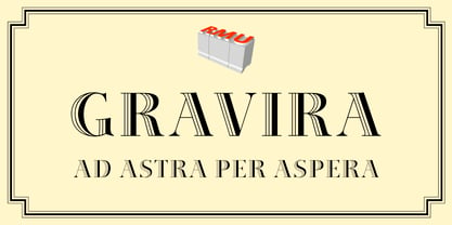
- Rennie Mackintosh Renaissance by CRMFontCo,
$35.00 - The Only Exception by Kimberly Geswein,
$5.00
- Maplehurst JNL by Jeff Levine,
$29.00 - Blocky Shape by Cititype,
$12.00
- Southern Flight by Intellecta Design,
$9.00 - STM Lovebug by Ziwoosoft,
$33.00
- Piranesi by Bitstream,
$29.99 - Commercial Script No2 by SoftMaker,
$9.99
- Ballpoint Signature by Viswell,
$18.00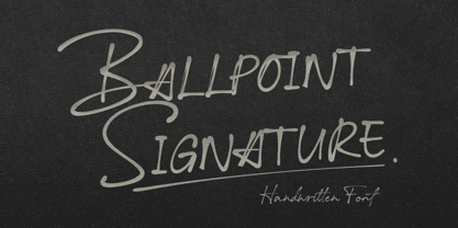
- Radiac by Stereo Type Haus,
$25.00
- Nacho Rough by RodrigoTypo,
$25.00
- Kaufmann by Bitstream,
$29.99
- Letterhead by Coffee Bin Fonts,
$20.00 - Schadow by Bitstream,
$29.99
- Artemisia NF by Nick's Fonts,
$10.00 - flutSaus by JOEBOB graphics,
$-
- Brion by The Northern Block,
$12.80
- Prima Sans Mono by Bitstream,
$29.99 - Switched On by Type Innovations,
$39.00
- Anha Queen VMF - Personal use only

- Kaya - Personal use only

- the EV$NT - Personal use only

- La chata - 100% free

- MONACO - Personal use only

- Share-Regular - Unknown license

- Steelplate Textura - Personal use only

- Promenadenmischung - Personal use only

- j.d. - Unknown license

- MCF bad manners ww - 100% free

- CarrickGroovy - Unknown license

- Gizmo - Unknown license

- ITC Eras by ITC,
$40.99
- Inlove by Sudtipos,
$29.00
- Bitmap by Tipos do aCASO,
$22.90 - Propagate by Graptail,
$15.00
- Lehmann by ParaType,
$30.00
- Antiqua Florenz by RMU,
$40.00
- Stencil Punch JNL by Jeff Levine,
$29.00


