2,346 search results
(0.027 seconds)
- Smooth Sailing JNL by Jeff Levine,
$29.00 Songs of the early 1900s were anything but the status quo in topic or style. Excessively long titles, novelty tunes and "foreign themes" permeated the piles of sheet music in the local music shops. 1916's "Oh How She Could Yacki Hacki Wicki Wacki Woo (That's Love in Honolu)" covered a number of these quirks within one publication. This Hawaiian-tinged song evoked the mysterious ways of the South Seas islands, despite the abridging of Honolulu to "Honolu". Nonetheless, the hand lettered title of this particular piece of sheet music featured an Art Nouveau-influenced bold block letter with rounded corners. It's now available digitally as Smooth Sailing JNL, in both regular and oblique versions.
 - Nouveau Artiste JNL by Jeff Levine,
$29.00 A sheet music edition of an early 1900s song entitled "You Taught Me How to Love You, Now Teach Me to Forget" was hand lettered in a free-form Art Nouveau style that combined varying line widths and character shapes. This unrestricted style of lettering was popularly embraced and revived by the hippie counterculture of the mid-1960s through the mid-1970s through their rock concert posters, record album covers and tee shirt graphics. It is now available digitally as Nouveau Artiste JNL. As a side note, a 1940s reprint of the sheet music was done in a popular metal typeface, which was also redrawn digitally and available as Elite Resort JNL [in both regular and oblique versions].
 - Intruder Alert, designed by the enigmatic and creative entity known as Starving-4, is not merely a font but a symphony of design that speaks volumes of its creator's ingenuity. This artistic endeavor...
- Fundstueck by Ingo,
$12.00 Inspired by a find a coarse but decorative font was created. "Fundstueck" ist the German term for it. Fonts can be so simple. That is what I was thinking as my attention was turned to this rusty piece of metal. Only a few centimeters in size, I couldn’t imagine which purpose it might truly serve. But my eyes also saw an E, even a well-proportioned E: a width to height ratio of approximately 2/3, black and fine strokes with a 1/2 proportion — could I create more characters on this basis? Thought it, did it. The form is based on a 5mm unit. The strikingly thick middle stroke of E suggests that the emphasis is not necessarily placed on the typical stroke, and likewise with the other characters. But if the font is going to be somewhat legible, then you cannot leave out slanted strokes completely. Eventually I found enough varying solutions for all letters of the alphabet and figures. A font designed in this way doesn’t really have to be extremely legible, which is why I forwent creating lower case letters. Nevertheless, Fundstueck still contains some diverse forms in the layout of upper and lower case letters. Thus, the typeface is a bit richer in variety. By the way — the “lower” letters with accents and umlauts stay between the baseline and cap height. And with that, you get wonderful ribbon-type lines.
 - Solitude JNL by Jeff Levine,
$29.00 A piece of vintage sheet music with the hand lettered title "Solitude" is the namesake and inspiration for Solitude JNL. Purely Art Deco in its typographic curves and angles of the period, this typeface typifies the "Streamline" style that permeated designs of the 30s and 40s.
 - Eccentric by Solotype,
$19.95Here's another old-timer that needed a lowercase, so we drew one. Originally issued as a caps-only type by The American Type Founders Company about 1898, this font found its way into Craftsman period design. It was the inspiration for Galadriel, a dry transfer sheet alphabet. - Meadowlark JNL by Jeff Levine,
$29.00 The cover of the 1908 sheet music for "When the Meadow-Larks Are Calling, Annie Laurie" has the title hand lettered in a semi-formal Art Nouveau Roman type design with gentle spurs. This is now available as Meadowlark JNL in both regular and oblique versions.
 - Nouveau Vaudeville by Jeff Levine,
$29.00 On the cover of the 1926 sheet music for “There Ain’t No Maybe in My Baby’s Eyes”, the title is rendered in Art Nouveau hand lettering; pen-drawn with rounded ends. The type design is now available as Nouveau Vaudeville JNL, in both regular and oblique versions.
 - Techno Retro JNL by Jeff Levine,
$29.00 Techno Retro JNL looks like a design straight out of the 1980s, but it actually appeared as hand lettering on a sheet music cover for the circa-1940s edition of the song "To You Sweetheart, Aloha", proving the old saying that "everything old is new again".
 - Elite Resort JNL by Jeff Levine,
$29.00 A 1940s sheet music edition of an early 1900s song entitled "You Taught Me How to Love You, Now Teach Me to Forget" was set in a popular metal type slab serif face. It is presented digitally as Elite Resort JNL, in both regular and oblique versions.
 - Nouveau Titling JNL by Jeff Levine,
$29.00 Sheet music for 1907's "Just A Little Fond Affection" had the song title hand lettered in a simple sans serif design with influences from the then-current Art Nouveau movement. This is now available as Nouveau Titling JNL; available in both regular and oblique versions.
 - Reveler JNL by Jeff Levine,
$29.00 The sheet music for "Good Night Angel" from the 1937 motion picture "Radio City Revels", had the movie's title hand lettered in a free form Art Deco sans serif design. This has been recreated digitally as Reveler JNL, which is available in both regular and oblique versions.
 - Musical Prelude JNL by Jeff Levine,
$29.00 Musical Prelude JNL is a thin Art Deco typeface with some interesting character shapes, and was inspired by the hand lettering on the cover of the 1933 sheet music for "Blue Prelude" by Gordon Jenkins and Joe Bishop. It is available in both regular and oblique versions.
 - Basic Nouveau JNL by Jeff Levine,
$29.00 The 1913 sheet music for "You’ll Be Welcome When You Get Back Home" had its title hand lettered in a simple, yet attractive Art Nouveau sans serif design which has been preserved as digital type. Basic Nouveau JNL is available in both regular and oblique versions.
 - Chocolate Bar JNL by Jeff Levine,
$29.00 Chocolate Bar JNL emulates hand-lettering on the sheet music for a song selection called "Shoe Shine Boy" from Connie's Hot Chocolates of 1936 (an all-black musical revue). The lettering was not found in the song's title, but rather in the name of the show itself.
 - Condensed Chamfer JNL by Jeff Levine,
$29.00 Sheet music published in the 1860s for "The Soldier’s Chorus" [from the Gounod opera "Faust"] had the title and the arranger’s name hand lettered in a bold, condensed chamfer font. This was the basis for Condensed Chamfer JNL, which is available in both regular and oblique versions.
 - Burdigala X Serif by Asgeir Pedersen,
$24.99 Burdigala X Serif is an open and spacious typeface inspired by the classic Didones. The X Serif is ideal for larger amounts of (printed) texts in brochures, magazines and books. Being wider than usual, it works especially well in media intended for on-screen reading, such as in Pdf-documents and e-books etc. Burdigala is the ancient Roman name of the city of Bordeaux France.
 - Bashington by Motokiwo,
$15.00 Cute and sweet script font, this is Bashington. The expression of a sweet personality delightfully presented by Bashington, lets you transform type into an exciting and beautiful piece of work. It works perfectly for weddings, food, e-commerce brands, trend blogs, boutiques or any business that wants to appear upscale and sweet. Features: Uppercase & Lowercase Standard Ligatures Numerals & Punctuations (OpenType Standard) Multilingual characters (AÀÁÂÃÄÅÇEÈÉÊËIÌÍÎÏNÑOØÒÓÔÕÖUÙÜÚÛÝŸÆŒß) PUA Encoded
 - Planet Gamers by Sarid Ezra,
$17.00 Introducing, Planet Gamers, a serif logo font with unique ligatures! Planet Gamers is a serif based font with unique and carefully crafted ligatures that will make your logo stand out clean and modern. You can use this font for any purpose, especially to make logotype. This font is suitable for e-sport logo, game, or hi-tech company logo. This font also support multilingual.
 - Art Museum JNL by Jeff Levine,
$29.00 Art Museum JNL is yet another take on the classic Art Deco "solid letter" fonts that emulate the style of Futura Black. This version comes to you through the courtesy of a vintage WPA (Works Progress Administration) poster promoting national parks and Winter sports. Take note of the unusual inverted middle crossbar on the 'E' and 'F' as inspired by the poster's hand lettering.
 - Hellobello by Fargun Studio,
$12.00 Hellobello! is a marker font with regular, alternate, and swashes. Hellobello! characters are perfect for logos, name tags, handwritten quotes, product packaging, merchandise, social media, greeting cards and much more. Features Uppercase & lowercase Punctuation & numerals Multi-language characters Designed by Fargun Studio 2017 © Need help? If you need help or advice, please contact me by e-mail "fargunstudio@gmail.com" Thank you for your purchase!
 - Kiti Cuties by Dikas Studio,
$15.00 Hi, i want to introduce my newest font Kiti Cuties. Kiti Cuties is a playful sans serif font, Kiti Cuties is a allcaps font with 4 variations letter in lowercase e,h,o,u that makes your design looks more cheerfull. Kiti cuties is made to help you create a kids and fun theme design such as birthday card, baby shower card, greeting card and many more.
 - Rebil Script by Realtype,
$10.00 Introducing Rebil Script. Rebil is a modern script calligraphy fonts. It is clean, feminine and friendly also fashionable. Rebil Script will work perfectly for fashion, e-commerce brands, trend blogs, tagline, title, holiday poster, logos, nametags, wedding cards, invitations, signboards, wedding sign, birthday card, t-shirt design and print, etc. The lowercase has a swashes beginning and ending to compliment your creative design needs.
 - Bintaro by Rhd Studio,
$24.00 BINTARO is a clean and powerful serif font with a bold, rounded shape. It comes with two regular styles, and outline. BINTARO is a good choice for a variety of projects such as logos & branding, invitations, stationery, social media posts, clothing, advertising, product packaging, product design, labels, photography, watermarks, special events or whatever. WHAT IS INCLUDED: Multilingual support Alternatives A, B, E, F, P, R PUA Encoded
 - Schreibmeister by RMU,
$30.00 Schreibmeister is my interpretation of Arno Drescher’s design for Ludwig Wagner, Leipzig, completed in 1958. The letters X and x were improved as well as some ligatures. The letter E has an alternative, and the small d comes with two alternatives, of which one form can be reached by typing the partial different key. Generally it is recommended to activate both Standard and Discretionary ligatures.
 - Esencia by CastleType,
$59.00 Esencia, a CastleType original, was inspired by a Spanish stock certificate from 1941 with 11 beautiful art deco style letters for the words "PERFUMES y ESENCIAS". Slender, elegant, with a Spanish flare. Uppercase only with numerals and punctuation. Supports all European languages that use the Latin alphabet, as well as modern Greek and most languages that use the Cyrillic alphabet. Includes alternate E, F, and S.
 - Geonica by Struvictory.art,
$16.00 Geonica is minimalistic geometric sans serif font with different line width. Geonica is suitable for the design on the theme of architecture, game industry, minimalism ect. Geonica includes stylistic alternates for symbols: A, E, K, M, O, Q, T, V, W, g. There are also ligatures: AA, AJ, AM, LA, LM, MA, MM, OO, VV, fi, gg, gi, gj, oo, ri, rr, ti, vv, yy.
 - Cabarga Cursiva by ITC,
$29.00Cabarga Cursiva is the work of the father and son team of Demetrio E. Cabarga and Leslie Cabarga, both New York designers. The details of the sharp strokes almost give the impression of a knife blade, whether straight or curved like a scimitar. The capitals should be used only as initials and are complemented by a robust lower case alphabet as well as alternate forms and ligatures. - Girly Love by Letterfreshstudio,
$12.00 Girly Love is modern handwritten script with dancing up and down the baseline, and comes with lovely alternates. It works perfectly for logos, fashion, stationery, letterpress, magazines, menus, books, invitations, wedding and greeting cards, packaging, labels, apparel, marketing and more. Girly Love also includes alternates, ligatures and multiple language support. If you need help or advice, please contact me by e-mail letterfreshstudio@gmail.com.
 - Retroyal by Mega Type,
$13.00 Retroyal is an sans serif typeface that boasts beautiful lines & minimalis style. With 7 weights plus matching italics. Simple geometry and with humanist nuance that adds warmth. t’s a perfect choice for branding, magazines, posters, advertising, packaging, headlines, logos, web, print etc. If you need help or have any questions, please contact me by e-mail "megatype04@gmail.com" I'm happy to help :) Thanks & Happy Designing!
 - Duffy’s Tavern NF by Nick's Fonts,
$10.00Originally presented as an alphabet suitable for movie title cards, this font is based on a 1920 work by showcard artist E. C. Matthews, and named after the eponymous 1940s radio show about a local saloon and its never-present owner. Both versions of this font contain the Unicode 1252 (Latin) and Unicode 1250 (Central European) character sets, with localization for Romanian and Moldovan. - Pragmata by FSD,
$59.00 2001 description: No monospaced typeface I used for coding development or just plain e-mail correspondance satisfied me in aliased mode. All common monospaced fonts have hinting imperfections from 9 to 12 points and above. All but Pragmata. 2021 description: Pragmata is still a good font for graphic design. Take a look at Pragmata Pro if you looking for a perfect and complete antialiasing coding font
 - Tme by bb-bureau,
$65.00 Tme, new lineal — Tme is an update of Sl (T = S + 1, m = l + 1 and e for natural logarithm), drawn in 2006 for the University of Arts Saint-Luc de Tournai. Its geometrical drawing is based on the directions of the hexagon, a scrupulously followed constraint which confers on some glyphs a very particular drawing. in light, regular and bold language: all latin glyphs
 - Komu by DizajnDesign,
$39.00 Komu is the revival of a style of letters frequently used on billboards during the socialist period in the former Czechoslovakia. These were usually uppercase letters made of paper and covered with a layer of aluminum foil. People just had to pick the letters (that included a variety of widths and sizes) out from a box and pin them up on a styrofoam billboard, thus making it easy to announce any event. Komu consists of two styles. Version A is rather squarish and includes some weird characters (K, 5, narrow E, strange diacritics) while version B is more rounded with most letters equally wide (with the exception of E, F and L, which look really wide next to the rest). The optical disparity of the original letters was kept, so that some of them look slightly darker than the others. Komu is intended to be used on posters, books and other products about Socialism in our region and includes full support for languages based on latin script.
 - Sickle by Eclectotype,
$20.00 The Wild West meets Russia and India in this heavy duty display face. Although it's uppercase only, most of the characters vary between the uppercase and lowercase alphabets, so it's easy to give your text a hand-made feel by mixing up your cases. OpenType savvy applications can really exploit the extra features of this font. Engage contextual alternates, and G, C, L and alternate form of E will change when placed before a letter with a crossbar to create some cool effects (see the CK and LE combinations in the poster). There are standard ligatures for ff and FF combinations, and discretionary ligatures for 'and', 'the', 'No', 'Mc' and 'Co'. Engage stylistic alternates for a reversed 3 version of E, and the obligatory backwards R for that faux-Russian effect. Also included in the font is a host of ornaments. This font is perfect for wanted posters, heavy metal band logos, Communist propaganda leaflets and no doubt a load of other things too.
 - Maiers Nr 42 Pro by Ingo,
$42.00 A handwritten decorative font with brush characteristics This attractive decorative script is found in a pamphlet of script samples from around 1900 which was issued by Otto Maier publishing house in Ravensburg/Germany. The forms and flow of Maier’s Nr. 42 are obviously influenced by Art Nouveau. In the original sample, only the Latin alphabet appears. All other characters, especially the Greek and Cyrillic letters, were modeled on elements of the original. A typeface can first reveal a true "handmade" character when the letter forms do not continually repeat themselves – a completely normal occurrence with handwriting. Thanks to OpenType, some key letters of Maier’s Nr. 42 appear in various alternative forms depending on the combination of letters. For example, the difference is obvious between an e followed by i and an e followed by l. Using this principle, a number of letter combinations are presented with alternative character forms so that overall a very lively impression is created.
 - Absentia Slab by DR Fonts,
$19.00 Conceived as a slab serif companion to the Absentia Sans family, this typeface complements its sibling with charisma and style. Built on the same geometric framework, they combine and harmonize gracefully. Yet Absentia Slab stands on its own as a novel alternative to conventional options. Anchored by blocky serifs, it presents an appearance of stability and steadiness. Its audacious design integrates unique features such as vertical terminals in glyphs ‘a’, ‘e’ and ‘6’. To make optimal use of available space, one-sided serifs (and in some cases, simple strokes without any serifs) help maintain an airy, uncluttered footprint as seen in letters ‘m’, ‘E’ and ‘N’. This forward-looking typeface is well suited for a variety of projects: understated yet spirited, technical yet welcoming. It has a modernist appeal, while reminiscent of XIXth Century woodblock lettering. Designed by Daniel Robichaud, Absentia Slab is available in ten weights with matching italics and two variable fonts.
 - Hadriano by Monotype,
$29.99When traveling in Paris, American designer Frederic W. Goudy did a rubbing of a second century marble inscription he found in the Louvre. After ruminating on these letterforms for several years, he drew a titling typeface in 1918, all around the letters P, R, and E. He called the new face Hadriano" as that name was in the original inscription. Robert Wiebking cut the matrices, and the Continental Typefounders Association released the font. Goudy designed a lowercase at the request of Monotype in 1930, though he didn't really like the idea of adding lowercase to an inscriptional letterform. The lowercase looks much like some of Goudy's other Roman faces. Compugraphic added more weights in the late 1970s, and made the shapes more cohesive. Hadriano has nicely cupped serifs and sturdy, generous body shapes. Distinctive individual letters include the cap A and Q, and the lowercase e, g, and z. Hadriano™ is an excellent choice for impressive headings and vigorous display lines." - Worthington Arcade by Device,
$39.00 Worthington Arcade is a classically-proportioned capitals-only type incorporating a selection of ligatures and alternates. It loosely resembles the hand-painted architectural lettering of the 30s to the 50s, exemplified by the likes of Percy Smith’s interior signage for the BBC or George Mansell’s lettering for the University of London and the signs found on London’s bridges. However, rather than a slavish copy of any historical model, it is more an examination and evocation of certain idiosyncratic quirks of civic lettering of the period, and an attempt to create a peculiarly English titling typeface. The round letters, for example the O, Q and C, are wider than the perfect circle usually found in such designs, while the straight-sided characters, usually drawn on a square, are narrower. This lends the whole a subtle elegance that is also emphasized by the raised crossbars on the H, E and F and extended lower leg of the E. Includes old-style numerals.
 - Christoper Brothers by Timurtype,
$14.00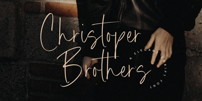 Introducing by Timur type Proudly Present, Christoper Brothers Christoper Brothers A Handwritten Font Christoper Brothers is perfect for product packaging, branding project, megazine, social media, wedding, or just used to express words above the background. This Smiley Hamster font includes: -Full Set of standard alphabet and punctuation & symbol -Extra set Alternate ending lowercase -multilingual support. Embelish your designs with our original fonts.Enjoy the font, Thank you!