10,000 search results
(0.035 seconds)
- Linotype Constitution by Linotype,
$29.99Frank Marciuliano designed the basic forms of Linotype Constitution around those of the swash alphabets of the 18th century. While the capitals are generously designed, the lower case letters have more reserved forms and are narrower. The characters of Constitution seem to have been set to paper with a feather and ink. The marked stroke contrast and elegant forms makes it a dynamic and sentimental font. The capitals can be used as initials mixed with other fonts, but Constitution is also good for texts which should give a feeling of nostalgia. - Camping Holiday by Hanoded,
$15.00 My family and I are off to England for a camping holiday this summer. I have booked some small, basic campsites which are close to nature. The kids love to camp, especially since we can have a campfire at night! I was thinking about this when I worked on Camping Holiday font. It is a cute sans serif ‘book cover’ font. That doesn’t mean that you cannot use it for something else; fancy a poster? No problem. Need a font for your website? Go ahead! It’s yours for the taking!
 - Saudagar by Sensatype Studio,
$15.00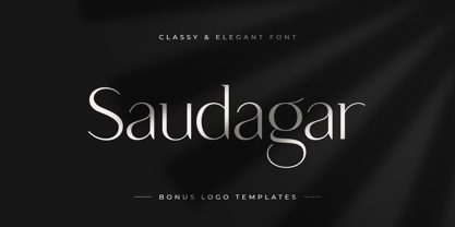 Saudagar is a stylish modern calligraphy font with casual chic flair. It is perfect for branding, wedding invites and cards, and maybe for some project. Saudagar includes a full set of gorgeous uppercase and lowercase letters, numerals, and alternates. In order to use the beautiful alternates, you need a program that supports OpenType features such as Adobe Illustrator CS, Adobe Photoshop CC, Adobe Indesign, and Corel Draw. but if your software doesn't have Glyphs panel, you can install additional alternates font files: Thanks and have a wonderful day
 - Gatinlose by Zeenesia Studio,
$15.00 Introducing our new font Gatinlose Gatinlose is a Handwritten font in a modern and coarse script style. This font is made with a rough brush to produce handwritten textured. Gatinlose can be used for various projects such as stationery invitations, social media, logos, weddings, branding, graphic design to support the project you want to work on. We hope you enjoy the font, please feel free to comment if you have any thoughts or feedback. Or simply send me a PM or email me at zeenesia@gmail.com. Thanks for purchasing and have fun!
 - Stanley Union by Ironbird Creative,
$15.00 Stanley Union is a font bundle consisting of serif, sans serif, extended sans and dingbats which is organic and hand-drawn and comes with regular and stamp styles. This typefaces is perfect for people looking for vintage aesthetic and organic feel. What Will You Get : Stanley Union Serif Regular & Stamp Stanley Union Sans Regular & Stamp Stanley Union Extended Sans Regular & Stamp Stanley Union Dingbats We hope you enjoy the font, please feel free to comment if you have any thoughts or feedback. Thanks for purchasing and have fun!
 - Garoa by Just in Type,
$20.00 Inspired by the 70's design, specially on Herb Lubalin's work, the typeface Garoa is a rounded mechanical display font without optical compensations, ideal for large bodies. The medium weight has lower case for short texts, and the Bold versions have singular upper case glyphs, with some alternates (at least one alternate per letter – some with OpenType features some using caps on the keyboard). The Garoa Hacker Clube Bold version is free and contains no OpenType features, but the glyphs have the same design as on Garoa Bold.
 - Blarks by Zamjump,
$12.00 Blarks is a unique font with a strong character. The inspiration for making this font is from several e-sport and typography logos that I have seen on various websites, where I found ideas to make fonts that could be applied without having to use another application to change it. Blarks is ideal for logos, event titles, quotes, product packaging, clothing, or anything that requires a turbo typographic boost. It is perfect for titles and logos. Type any a-z using this font, and you will get a unique font arrangement and strong character.
 - Donna Bodoni by Wiescher Design,
$39.50 DonnaBodoni was inspired by David Farey. He once wrote, somebody should honor the widow of Giambattista Bodoni the brave Signora Paola Margherita Dall 'Aglio for her effort to have the Manuale tipografico di Giambattista Bodoni published after his death. Since I have redesigned a good deal of Bodoni’s work and added some of my own, I thought it was my duty to do at least this for Bodoni’s unknown widow. Here is my 3-cut script in her honor. The design is remotely based on Bodoni’s English-Initials. Your honorable Gert Wiescher
 - Zaystack by Ergibi Studio,
$20.00 Zaystack is a handwriting with brush effect that comes with a style that seems real. This font style inspired by luxury goods and branded makes in many ways for your latest project. Zaystack is perfect for logos & branding, photography, invitations, watermarks, advertisements, product designs, stationery, wedding designs, labels, product packaging, special events or anything that requires handwritten content. Zaystack Also available for some lowercase characters that have swash, as well as multilingual. This can be accessed easily via opentype in Photoshop / Illustrator. if you have any questions, don’t hesitate to contact us Ergibi Studio
 - Supaduper PB by Pink Broccoli,
$16.00 Supaduper PB is a font inspired by some wonderfully funky hand-lettered greeting cards from the 1980's. The delightfully awkward and animated playfulness of this lettering style was maintained throughout the fleshing out from the original specimens - and I think you're going to have a lot of fun typing with this. Even if you haven't seen these old greeting cards, the lettering style has a familiar visual to it. Bring back a little nostalgia, add a little wonkiness, or just have fun typing with Supaduper PB today!
 - Gogobig by Bogusky 2,
$25.00I have always been frustrated when looking for a bold condensed face. The choices were the usual? Helvetica Bold Condensed, Univers Bold Condensed or Alternate Gothic #2... all rather dated. I was looking for a really unique, clean, uncluttered sans serif face, so I decided to design one. I have since adapted it to many logo designs. So, in my terms and conditions, I decided to permit the modification of the letter forms for logos and monograms, but logos and monograms only, not the typeface in normal usage. - Anjani Script by Letterhend,
$14.00 Anjani is a modern calligraphy script with a romantic feel. The natural hand writing script is suitable for you who needs a typeface for headline, logotype, apparel, invitation, branding, packaging, advertising etc. This typeface is comes in uppercase, lowercase, punctuations, symbols and numerals, stylistic set alternate, ligatures, etc also support multilingual and already PUA encoded. We hope you enjoy the font, please feel free to comment if you have any thoughts or feedback. Or simply send me a PM or email me at letterhend@gmail.com Thanks for purchasing and have fun!
 - Nisse by Typoforge Studio,
$30.00 Say hello to a new Typoforge member! Nisse is a display font family that consists of 4 styles (including italics). The regular and rough versions differ in the amount of wear. It’s inspired by Rex typeface first published by „The Jan Idzikowski and Co. Foundry“ in 1930. Nisse has a high amount of detail making it ideal for large prints and poster design. It is specified by a huge amount of automatic alternates. Each basic latin letter has five versions, the numbers have thee versions and extended latin letters have two versions.
 - Durazno y Amor by Ocha Puyaber,
$10.00 Durazno y Amor is a cursive font family. It is inspired by love, hearts, and Chilean script. It can be written in Aymara, Mapuche and Rapa Nui from Chile. It can also be written in Dutch, Maltese, and other languages. This font family is cute and fun. It has many heart decorations. The strokes are drawn with a round cap tool, with no contrast. The form is upright. Parts A have capitals with high starts. Parts B have capitals with low starts. Parts F are Final forms. Parts U are love line Unions.
 - Bittergrace Script by Letterhend,
$15.00 Introducing Bittergrace, a romantic modern script with a twist of fun! The natural hand writing script is suitable for you who needs a typeface for headline, logotype, apparel, invitation, branding, packaging, advertising and others. This typeface comes with uppercase, lowercase, punctuations, symbols and numerals, stylistic alternate set, ligatures, and mor and also has multilingual support. It also already PUA Encoded. We hope you enjoy the font, please feel free to comment if you have any thoughts or feedback. Or simply send me a PM or email at letterhend@gmail.com Thanks for purchasing and have fun!
 - Frank Flowers by Wiescher Design,
$15.00 Frank Flowers are fonts with flowery embellishments. They are useful for all kinds of celebrations, but they also have lots of impact. There are only uppercase letters even on the lowercase keys. Uppercase and lowercase look different, so you can mix them. You can even mix the two sets, it'll look great. I had a lot of fun doing these fonts and I want you to have some fun as well. That's why I sell them very, very cheap, even cheaper if you buy the pair! -Your typedesigner for unusual solutions Gert Wiescher
 - Florati by Proportional Lime,
$19.99 Can you imagine the delight that the printers of the Incunabula era would have had if they had such a tool as this font with a hundred and fifty glyphs of decorative capitals. The printers of that era were lucky to have more than a handful such delights. These Decorated initials and drop caps are all based on early period exemplars, dating to prior to 1525, from a wide range of printers such as Thomas de Blavis to Günther Zainer. Every Proportional Lime Font comes equipped with a complete character map.
 - HWT Catchwords by Hamilton Wood Type Collection,
$24.95 Catchwords have always been offered alongside standard alphabets in wood type catalogs and so often appear on posters as a decorative punch that they have become part of the wood type vernacular. Words like 'The', 'And', 'To', 'For', and less common abbreviations could be inserted into a design along with decorative ornaments or stars when space was tight or to add variety in the design. HWT Catchwords features over 80 words based directly on designs offered by Hamilton and other wood type manufacturers of the 19th and early 20th Century.
 - Wee Todd by Typadelic,
$19.95 Wee Todd is a well-connected script font in the rough style of a lefty. Several of my closest friends are lefties and I, over the years, have carefully observed their writing style. For the most part they have unique, interesting handwriting and Wee Todd is a reflection of that style. Notice how Wee Todd’s characters connect. I’ve designed additional ligatures and characters into the typeface so that characters are substituted as you type (in OpenType savvy applications), giving the appearance of natural, spontaneous handwriting. Try it and see!
 - Chemistry by MJB Letters,
$15.00 Chemistry is a stylish monoline script with a natural flow and beautiful and elegant characters, you can use this font to design wedding invitations, labels, logos, branding, craft project, quotes, and more. In order to use the beautiful swashes, you need a program that supports OpenType features such as Adobe Illustrator CS, Adobe Photoshop CC, Adobe Indesign, and Corel Draw. but if your software doesn't have Glyphs panel, you can install additional swash font files: if you have questions about the latest fonts, please provide a short message to us Thank You! MJB Letters
 - Funback by RGB Studio,
$18.00 Funback Script Inspired by Life style with trend typography. I'm combine with my Hand Lettering style. made with personality touch every single curve. I hope this can make inspire you from your work. and a very bouncy baseline It has a perfectly paired complimentary marker font , and a super handy set of bonus Swash. Ideal for logos, handwritten quotes, product packaging, header, poster, merchandise, social media & greeting cards. Files Include : Basic Latin A-Z and a-z Numbers Symbols PUA Encode Multilanguage Support In order to use the beautiful swashes, you need a program that supports OpenType features such as Adobe Illustrator CS, Adobe Photoshop CC, Adobe Indesign and Corel Draw. but if your software doesn't have Glyphs panel, you can install additional swashes font files: Thanks and have a wonderful day, If you have any questions, please get in touch with us Don't forget to check out our other products.
 - Woodley by Masinong Studio,
$12.00 Woodley Script is a modern calligraphy font with the current handwriting style, this font is perfect for branding, wedding invites, magazines, mugs, business cards, quotes, posters, and more. Woodley Script is equipped with 589 glyphs. and by having many of these glyphs there will be able to choose the letters according to your likes, lots of variations and options for each letter, so you can customize on your design choices. To access the variety of OpenType features you can use applications such as Adobe Photoshop Cs / Adobe Photoshop CC, Adobe Illustrator CS / Adobe Illustrator CC, Adobe Indesign and Corel Draw. If you do not have a program that supports OpenType, you can access all the alternate glyphs using Font Book (Mac) or Character Map (Windows) If you have any question, do not hesitate to contact me by email masinong.studio@gmail.com Thanks and happy designing :-)
 - Afrile Script by Masinong Studio,
$15.00 Afrile Script is a modern calligraphy font with the current handwriting style. This font is perfect for branding, wedding invites, magazines, mugs, business cards, quotes, posters, and more. Afrile Script is equipped with 462 glyphs. and by having many of these glyphs there will be able to choose the letters according to your likes, lots of variations and options for each letter, so you can customize on your design choices. To access the variety of OpenType features you can use applications such as Adobe Photoshop Cs / Adobe Photoshop CC, Adobe Illustrator CS / Adobe Illustrator CC, Adobe Indesign and Corel Draw. If you do not have a program that supports OpenType, you can access all the alternate glyphs using Font Book (Mac) or Character Map (Windows) If you have any question, do not hesitate to contact me by email masinong.studio@gmail.com Thanks and happy designing :-)
 - Lemonite by Typotheticals,
$3.00 Lemonite (Regular and Expanded) is a self examination in whether, after five years without attempting to design any new fonts, I was still capable of creation. Lemonite is the result, and even though its plain, it showed me I could still work. I have made two of the face free to anyone who wishes to have a look, so please feel free, no obligations, to take them and use them if you have a use. Why so long ? Well, we do age, and with age comes the usual benefits, like Glaucoma and a touch of Arthritis in the old digits, and that's made computer work a little… interesting for me over the past couple of years. Anyway, if you don't find my humble offering of any use, please search the fontbase on Myfonts, and you will sure to find a suitable font from one of the fantastic designers there.
 - Ultra System by Set Sail Studios,
$14.00 Introducing Ultra System; A modern exploration of 8 fonts, each carefully designed to naturally compliment one another. With 6 clean sans fonts and 2 textured script fonts, Ultra System gives you a variety of ways to combine and arrange each font, allowing you to create striking & modern typographic designs. This typeface collection consists of 8 fonts; Ultra System Script • A textured, bouncy & flowing marker script font containing upper & lowercase characters, numerals, and a large range of punctuation. Ultra System Script Alt • This is a second version of Ultra System Script, with a completely new set of both upper and lowercase characters. If you wanted to avoid letters looking the same each time to recreate a custom-made style, or try a different word shape, simply switch to this font for an additional layout option. Ultra System Sans • A wide, bold sans font containing uppercase only characters, numerals, and a large range of punctuation. Ultra System Sans Line One • A thick outlined version of Ultra System Sans, pair this with other Ultra System Sans fonts to add emphasis to words or phrases. Ultra System Sans Line Two • A thin outlined version of Ultra System Sans, pair this with other Ultra System Sans fonts to add emphasis to words or phrases. Ultra System Sans Italic • Italic variations are included for all 3 Ultra System Sans fonts. FAQs; Accessing Ligatures • Ligatures are supported by most desktop graphics & text software (not just the fancy ones!), including Photoshop, Illustrator, InDesign, Word, Pages & Keynote. Many programs will automatically have this feature switched on for you, but if you need any help accessing then please feel free to drop me a message. Language Support • All Ultra System fonts support the following languages; English, French, Italian, Spanish, Portuguese, German, Swedish, Norwegian, Danish, Dutch, Finnish, Indonesian, Malay, Hungarian, Polish, Croatian, Turkish, Romanian, Czech, Latvian, Lithuanian, Slovak, Slovenian
 - Gegor by Balibilly Design,
$17.00 Say Hello to Gegor, an experimental serif display font. Gegor is freedom of our hand when creating the letterform without many references. We try to let the pen tool flow and dancing according to our imagination. The characters of this typeface are adopted from the letter "r". She was born and influence each other. The simple shape on the shoulder are slightly pointy at a thick weight and curves at a thin weight have a big influence on other letters. The unique form of letter "r" takes us to further development to get achieve a distinct harmony as a display typefaces. If you look at the teaser images and get an idea, we are in line. Gegor consists of 14 families from thin to black, and 1 outline style in black weight equipped with discretionary ligatures, case-sensitive forms, ordinals, small capital, and fractions. Consists of multilingual support including Western European, Central European, and Southeastern European. Gegor is perfect for posters, logos, branding, magazines, websites, and more. Gegor will give a unique vibe to your works. Supports languages: Afrikaans, Albanian, Asu, Basque, Bemba, Bena, Bosnian, Catalan, Cebuano, Chiga, Colognian, Cornish, Corsican, Croatian, Czech, Danish, Dutch, English, Estonian, Faroese, Filipino, Finnish, French, Friulian, Galician, Ganda, German, Gusii, Hungarian, Icelandic, Ido, Inari Sami, Indonesian, Interlingua, Irish, Italian, Javanese, Jju, Jola-Fonyi, Kabuverdianu, Kalaallisut, Kalenjin, Kinyarwanda, Kurdish, Latvian, Lithuanian, Lojban, Low German, Lower Sorbian, Luo, Luxembourgish, Luyia, Machame, Makhuwa-Meetto, Makonde, Malagasy, Malay, Maltese, Manx, Maori, Morisyen, North Ndebele, Northern Sami, Northern Sotho, Norwegian Bokmål, Norwegian Nynorsk, Nyanja, Nyankole, Occitan, Oromo, Polish, Portuguese, Romanian, Romansh, Rombo, Rundi, Rwa, Samburu, Sango, Sangu, Sardinian, Scottish Gaelic, Sena, Shambala, Shona, Slovak, Slovenian, Soga, Somali, South Ndebele, Southern Sotho, Spanish, Swahili, Swati, Swedish, Swiss German, Taita, Taroko, Teso, Tsonga, Tswana, Turkish, Turkmen, Upper Sorbian, Vunjo, Walloon, Welsh, Western Frisian, Wolof, Xhosa, Zulu
 - Givry by TypeTogether,
$49.00 The bâtarde flamande is a style of writing used predominantly in France and present-day Belgium in the 15th century. The style shares an ancestry with other writing styles traditionally grouped as blackletter— fraktur, textura, rotunda, and schwabacher. It had evolved, however, into an æsthetic far removed from its relatives. While high-contrast in nature, the bâtarde flamande is more delicate and dynamic than the austere and condensed fraktur and textura. Quick curves lack the rigidity of the schwabacher and rotunda. Flair through swashes is thematic, as are the variations in letterforms. The flowing rhythm, achieved through a letterform axis that is overall slightly rightward, is most noticable in the hallmark f and long s. Round forms are fused together for economy of space. It is a writing hand that, with its syncopation and fluidity, produces a vibrance uncharacteristic of other blackletters. Givry has been created in the spirit of the bâtarde flamande. It melds the particular traits compiled from the works of the style’s prominent scribes—Jean Fouquet, Loyset Liédet, and Jean Bourdichon. While suitable as an elegant and energetic display face, Givry was conceived for setting continuous text. The result of many refinements and adjustments is the preservation of the style’s irregular nature, as well as a consistency that continuous-text typography requires. Carefully researched and developed in OpenType format for a wealth of typographic features and support for more than forty languages, Givry is neither derivative nor experimental, but historically accurate. Of the many blackletter digital typefaces available, fraktur and all its connotations have become representative. In contrast, the bâtarde flamande is essentially non-existent in digital form, and has until now been overlooked. Givry provides designers and anyone searching for typographic expression a lively, delicate, and striking side to blackletter.
 - Turquoise by Resistenza,
$59.00 Many calligraphers agree that Roman Capitals is one of the most beautiful yet difficult hands to master. Its beauty lies in its simplicity of form and structure, yet understanding and applying these skillfully can take years of mindful practice. My goal was to design Roman Capitals that were smoothly designed with a brush, not carved. The main concept was based on the fundamental strokes that are commonly studied when you practice Roman letters. That’s why many Serifs have these unfinished terminal serifs. I created the Turquoise typeface based on my Capitalis Romana practice with a flexible broad edged brush and gouache. During the lowercase process I was still following Foundational calligraphy with a flat brush. My Turquoise Capitals were then adjusted and redesigned at the Tipobrda calligraphy workshop in Slovenia. Turquoise contains small caps, many discretionary ligatures, ornaments, swashes as well as several brushy nature-inspired ornaments, accessible via OpenType. Ideally suited for headlines or body text in advertising, packaging and visual identities, its delicate shapes, curves and endings give projects a harmonious elegance and stylistic feel in unique Turquoise style. My inspiration for this font showcase is one of the richest islands in the Mediterranean, the place where my parents are from, Sicily. This southern Italian region has so many unique spots: Stromboli, part of the Aeolian Islands, and the Pelagie Islands is one of my favorite places in Sicily. The pictures I used were taken there this year. So enjoy the sun, the serifs, the water and its Turquoise colors. The brush is mightier than the sword. Opentype Features: https://www.rsztype.com/article/how-to-use-opentype-features-adobe-microsoft-pages Turquoise works very well with Nautica Check also Turquoise Inline
 - Rafaella by Lián Types,
$37.00 To Rafaella, a menina dos cachos. We, designers, have grown accustomed to seeing that lowercase letters—not only in calligraphy but also in typography (1)—may be very playful and decorative. Almost every part of them can become a potential swash, ligature or decorative accolade (2) if the designer has some expertise regarding this matter. However, since we are living in an era that elevates the status of handcrafts, lettering has gained a lot of ground in different kinds of mediums, and with it there’s a sort of overuse of capitals. This may be due to the reason that lettering pieces need a high impact to convey their messages and many times why big capitals are the only solution. With this in mind, I started Rafaella: A font consisting entirely of capitals which go from unadorned to very decorative. Rafaella has ductus and forms vaguely based on the 1970s Bookman-like styled fonts. The presence and behaviour of serifs and ball terminals in this style were the perfect excuse to make really attractive aternates which the user can choose from the glyphs panel. The result is a font full of life. Able to be both very playful and formal due to its roman style which can be combined with (and between) a wide range of other styles of expressive scripts or geometric fonts with nice results (3). Also try Rafaella Shade Solo combined with Rafaella or Rafaella Bold for a layer effect to emphasize any given word or phrase. NOTES (1) See my fonts Erotica from 2013 or Dream from 2014. (2) Accolades is a wonderful word that refers to the ornaments made around the words in the spencerian style of calligraphy (3) Combinations often seen in different pieces of lettering were usually a contrast of style is wanted.
 - Loyolliams by Eyad Al-Samman,
$5.00 “Loyolliams” is my first designed Latin typeface which has special meanings and unforgettable memories for me. The font's name, Loyolliams, consists of two mixed syllables stand for two different names. The first syllable is derived from the name “Loyola” and the second syllable is derived from the last five letters of the name “Williams.” These two names are related to “Concordia University”—located in Montreal in Canada—where I studied at a short academic term and spent in a very special period of my life in the late 2005. This renowned Canadian academic institution was created following the 1974 merger of “Loyola College” (1896) and “Sir George Williams University” (1926). This conglomeration formed “Concordia University” and the name Concordia itself was taken from the motto of the city of Montreal, Concordia salus (meaning ‘well-being through harmony’). This font comes in two different weights; light and regular. “Loyolliams” is a square, geometric, techno, and modern font. It is suitable for T-shirts, books' covers, websites’ addresses, advertisement light boards, and titles in technical, artistic, and other types of magazines and signboards. “Loyolliams” can be used also in posters, surfaces of electrical and electronic tools, digital devices and chips, geometrical machines, trucks, tractors, calculators, mobile phones, watches, laptops, personal computers, power equipments, digital cameras, technical magazines, and other digital and electronic tools. This fonts can be effectively used in titles especially when its uppercase and lowercase letters are mixed together and when it is used in its italic mode. "Loyolliams" is suitable for writing and printing small textual paragraphs in cards, magazines advertisements, and also posters. The main characteristic of "Loyolliams" Typeface is its non-curve style in most of its alphanumeric letters. The characters are deliberately designed to have only angular and square shapes.
 - Adelle by TypeTogether,
$52.00 While Adelle is a slab serif typeface conceived by Veronika Burian and José Scaglione specifically for intensive editorial use, mainly in newspapers, magazines, and online, its personality and flexibility make it a true multipurpose typeface. Adelle’s superior screen rendering and cross-platform consistency has also made it one of our most popular webfonts. The intermediate weights deliver a neutral look when used in text sizes, providing the usual robustness expected in a newspaper font. The unobtrusive appearance, excellent texture, and slightly dark colour allow it to behave flawlessly in continuous text, even in the most unforgiving editorial applications. As it becomes larger in print, Adelle shows its personality through a series of measured particularities which make it easy to remember and identify. Its energetic character, so inherent to slab serif fonts, becomes evident when used for subheadings and headlines. A condensed series of seven weights with matching italics expand Adelle’s possibilities. This extension provides flexible solutions in situations where saving space is vital but losing legibility is not an option. The new condensed series shares the same personality, proportions, and skeleton of the Adelle family, creating an harmonious texture when combined. Be sure to check out the companion to Adelle, Adelle Sans, to complete the look of your design with the intended personality and flexibility. Awards – Third prize for Latin text typeface in the 2009 Granshan Type Design Competition – Won Gold for Original Typeface in the 2010 European Design Awards – Selected in the first Ukrainian typeface competition in 2010 – Exhibited at the Rutenia Calligraphy & Typography Festival (http://rutenia.org.ua/en/index_u.html) in Kyiv, 2010 – Selected in the 2011 Type Directors Club Tokyo Exhibition – Selected in Communication Arts 2011 Typography Annual – Selected in Yearbook of Type I, 2013 – Part of the exhibition «Call for Type» and subsequent book Neue Schriften (New Typefaces)
 - IM FELL FLOWERS 1 - Unknown license

- Fresh Lemons by Yumna Type,
$15.00 Your font choice is important because without the right font, you have a higher risk of failure to attract the audience's attention resulting in having a big trouble competing with competitors. A good font shows characters of your projects and makes them more prominent than the others. Therefore, Fresh Lemons is here to be the perfect, eye-catching font option. Fresh Lemons is a visually amazing display font with thin lines suitably applied for a more elegant, modern looking display. In addition, such a font shows professional, high quality nuances on your designs due to the simple forms and consistent proportions to be legible enough. You will receive a clipart as a bonus and you can also enjoy the available features here. Features: Ligatures Multilingual Supports PUA Encoded Numerals and Punctuations Fresh Lemons fits best for various design projects, such as brandings, posters, banners, headings, magazine covers, quotes, invitations, name cards, printed products, merchandise, social media, etc. Find out more ways to use this font by taking a look at the font preview. Thanks for purchasing our fonts. Hopefully, you have a great time using our font. Feel free to contact us anytime for further information or when you have trouble with the font. Thanks a lot and happy designing.
 - Analogue Pro by Ingo,
$42.00 very traditional forms strongly slanted italic consistant proportions extraordinary ligatures swashes alternate letters alternate figures lower case l with a hooked “foot” Believe it or not, there are hardly any sans serif fonts in which the lower case letter l also has the hooked form of an l. Instead, we readers have to constantly distinguish whether we are seeing an uppercase I or a lower case l — just take a look at the word “Illinois”... The ingoFont Analogue was developed for exactly this reason. The intent: To create a pretty much »ordinary«, even classical font with its most striking characteristic being the inclusion of the “crooked l.” As a model, I used the »mother of all sans serifs«, Akzidenz Grotesk from Berthold, with its beginnings going back to the 19th century. Analogue is so to say a new interpretation of Akzidenz Grotesk from ingoFonts. All characters — following the model — have been newly designed. And if you want to emphasize the shape of the hooked foot even more, you can also activate the alternate styles for d, h, m, n (Style Set 1). Conversely, the alternate a somewhat softens the “hooked” impression (Style Set 2). The slanted versions — it isn’t truly a real cursive font — are noticeably stronger with 13° than the italics in comparable fonts, and were given a round e with a mind of its own which distinguishes itself considerably compared to the upright characters in the overall appearance of the font. More modern and formal solutions in detail were chosen for some of the characters, for example the M was given lightly slanted sides; the a reflects the curves of the s; the “feet” of a, l and t match; the flared legs of K and R became a “foot”, too. General proportions were carried over almost completely with no changes from Akzidenz Grotesk as well as the slanted trimming on the open forms of a, c, e, s; in comparison, C, G and S were given straight endings. Analogue contains many ligatures, even discretional ligatures, plus proportional, old style as well as tabular figures. All in all, at first sight Analogue brings back memories of the charm of its well-known predecessor; and yet, many small differences give Analogue an unmistakable certain something...
 - Banks and Miles by K-Type,
$20.00 K-Type’s ‘Banks & Miles’ fonts are inspired by the geometric monoline lettering created for the British Post Office in 1970 by London design company Banks & Miles, a project initiated and supervised by partner John Miles, and which included ‘Double Line’ and ‘Single Line’ alphabets. The new digital typeface is a reworking and extension of both alphabets. Banks & Miles Double Line is provided in three weights – Light, Regular and Dark – variations achieved by adjusting the width of the inline. Banks & Miles Single Line develops the less used companion sans into a three weight family – Regular, Medium and Bold – each with an optically corrected oblique. Although the ‘Banks & Miles Double Line’ and ‘Banks & Miles Single Line’ fonts are based on the original Post Office letterforms, glyphs have been drawn from scratch and include numerous adjustments and impertinent alterations, such as narrowing the overly wide Z and shortening the leg of the K. Several disparities exist between the Post Office Double and Single Line styles, and K-Type has attempted to secure greater consistency between the two. For instance, a wide apex on the Double Line’s lowercase w is made pointed to match the uppercase W and the Single Line’s W/w. Also, the gently sloping hook of Single Line’s lowercase j is adopted for both families. The original Single Line’s R and k, which were incongruously simplified, are drawn in their more remarkable Double Line forms, and whilst the new Single Line fonts are modestly condensed where appropriate, rounded letters retain the essentially circular form of the Double Line. Many characters that were not part of the original project, such as @, ß, #, and currency symbols, have been designed afresh, and a full set of Latin Extended-A characters is included. The new fonts are a celebration of distinctive features like the delightful teardrop-shaped bowl of a,b,d,g,p and q, and a general level of elegance not always achieved by inline typefaces. The Post Office Double Line alphabet was used from the early 1970s, in different colours to denote the various parts of the Post Office business which included telecommunications, counter services and the Royal Mail. Even after the Post Office was split into separate businesses in the 1980s, Post Office Counters and Royal Mail continued use of the lettering, and a version can still be seen within the Royal Mail cruciform logo.
 - 24hourbauer - Unknown license

- Kitami by Talbot Type,
$19.50Talbot Type Kitami is a minimal, geometric, stencil display font, inspired by Herbert Bayer’s Universal Typeface, created at the Bauhaus in the 1920s. Each character is created from a single continuous stroke, or combination of strokes. - Herold - Unknown license

- TypographerTextur - Unknown license

- Ironside Crosses by MADType,
$29.00 The Cross has a rich history and various meanings in many different cultures around the Globe. This font contains 178 cross symbols. Most of the designs have both a rectangular and square version.)


