7,778 search results
(0.018 seconds)
- Undercover by Aminmario Studio,
$20.00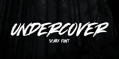 This is a supercharged font, with natural brush, quick strokes and sharp details. Perfect for challenging jobs, titles, movie,logos, apparel, t-shirts, hoodies, quotes, product packaging, or anything that needs a typographic turbo-boost and a typographic unique style. Thanks for checking out this font. I hope you enjoy it!
 - Vatican by Alan Meeks,
$45.00 Vatican is a calligraphic face. The lower case is influenced by the lettering of Arthur Baker but the caps are more formal, the shape of the Cap V reminded me of a Bishops Mitre which led eventually to the name. The lighter weight works particually well in small text pieces
 - Mastrin by Aminmario Studio,
$20.00 This is a supercharged font, with natural brush, quick strokes and sharp details. Perfect for challenging jobs, titles, movie,logos, apparel, t-shirts, hoodies, quotes, product packaging, or anything that needs a typographic turbo-boost and a typographic unique style. Thanks for checking out this font. I hope you enjoy it!
 - Monitero by Aminmario Studio,
$20.00 This is a supercharged font, with natural brush, quick strokes and sharp details. Perfect for challenging jobs, titles, movie,logos, apparel, t-shirts, hoodies, quotes, product packaging, or anything that needs a typographic turbo-boost and a typographic unique style. Thanks for checking out this font. I hope you enjoy it!
 - Black Rider by Hanzel Space,
$25.00 Black Rider is a supercharged street brush font full of energy. With extra attention to quick strokes and sharp detail, Black Rider is guaranteed to deliver a very loud & fast message; ideal for logos, clothing, quotes, product packaging, movie titles, book covers or anything else that needs a typography turbo-boost.
 - Graph by Pasternak,
$4.00 The Graph is a Slab Serif font. The unique body of each letter without roundness makes it a pretty technical font. Similar letters often are used in coding or any tech frameworks. Currently, the font exists only in regular style. Strict and sharp, this font is designed for specific projects.
 - Sabinka by Patria Ari,
$15.00 Sabinka, a fun condensed fantasy font with bouncy clean shapes. Sabinka is an all-caps font that easy to use as the decoration to make design more beautiful. Sabinka suitable for children's merchandise, t-shirt, books, poster, title, quotes, and many more! Fonts featured : All caps - Numbers - Punctuation & symbols - Accented characters
 - Moon Dream by Eotype,
$12.00 Moon Dream is a wide sans serif display font that has beautiful curves. Each end is made slightly rounded giving the impression of a comfortable and friendly. Moon dream provides a collection of glyphs with unique shapes. With alternative styles and ligature features, this font is perfect for complementing various projects.
 - Edangu by Twinletter,
$15.00 Edangu Arabic display font is a new typeface inspired by the oriental fonts used in Arabic calligraphy and other Middle Eastern architectural features. This font features a Kufic version that has beautiful and neatly arranged shapes. This font will make your design elegant, especially designs that carry the middle eastern theme.
 - Dangerline by Aminmario Studio,
$50.00 This is a supercharged font, with natural brush, quick strokes and sharp details. Perfect for challenging jobs, titles, movie,logos, apparel, t-shirts, hoodies, quotes, product packaging, or anything that needs a typographic turbo-boost and a typographic unique style. Thanks for checking out this font. I hope you enjoy it!
 - Mono Polz by Four Lines Std,
$15.00 "Mono Polz" takes its inspiration from the zany and eccentric world of cartoons. Every letter is an explosion of creativity, with bold lines and playful shapes that'll make your designs pop right off the page. It's the perfect font to add a touch of comic mischief to your projects. - Uppercase
 - Balcon Round by Tour De Force,
$25.00 Balcon is condensed sans family designed to be your first web font choice. Contains 5 weights: Light, Regular, Bold, ExtraBold and Black, it fits perfect into any project, from editorial editions to packages, labels, posters. If you're looking for "sharp" version of this family, feel free to check Balcon sans family.
 - Iron Ranger by Aminmario Studio,
$30.00 This is a supercharged font, with natural brush, quick strokes and sharp details. Perfect for challenging jobs, titles, movie,logos, apparel, t-shirts, hoodies, quotes, product packaging, or anything that needs a typographic turbo-boost and a typographic unique style. Thanks for checking out this font. I hope you enjoy it!
 - Massimo by Borutta Group,
$29.00 Massimo is a semi-serif geometric type family. For as long as I can remember, I've admired the visual style of New York – its architecture, fashion, design, and typography. After spending two weeks in Manhattan this summer, I wanted to prepare a sharp and modern typeface in Big Apple style.
 - Aguero Serif by Craft Supply Co,
$15.00 Aguero Serif – Clean & Elegant Serif Font is a modern serif font family whose design refers us to the style of transitional serifs. The distinctive features of Aguero Serif – Clean & Elegant Serif Font are the relatively low contrast of strokes, the slightly squarish shapes of round characters and the emphasized businesslike nature.
 - Blacker Pro by Zetafonts,
$39.00 Blacker Pro is the revised and extended version of the original wedge serif type family designed by Cosimo Lorenzo Pancini and Andrea Tartarelli in 2017. Blacker was developed as a take on the style that Jeremiah Shoaf has defined as the "evil serif" genre: typefaces with high contrast, oldstyle or modern serif proportions and sharp, blade-like triangular serifs. Due to the high contrast in the design - slightly reminescent of didone typefaces - Blacker has been developed in two optical subfamilies. The display version offers tighter tracking, higher contrast and sharper corners for maximum effect at big sizes, while the text variant offers better readability and screen rendering at smaller sizes, with lower contrast and looser spacing. In the pro version, two additional condensed variant families have been added (condensed display and condensed text) allowing for more freedom and versatility in typesetting where space constraints are present. Also, three titling uppercase-only variants have been added, with a slightly extended feel, and two decorative subfamilies (inline and diamond). Each of these seven variants has been developed in six weights from light to heavy, with matching italics, for a total of 69 styles covering a wide range of editorial and advertising uses. All Blacker Pro feature a revised and extended character set covering over two hundred languages using the latin, cyrillic and greek alphabets. Open type features include small caps, positional numerals, fractions, superior & inferior figures, alternate forms, and an extended set of standard and discretionary ligatures. With its bold personality, Blacker aims to be a modern classic used for bold statements and self-conscious brands, making your text look great both on paper and on the screens.
 - Rush by Canada Type,
$24.95Follow us to the future. It is in your face. It is fashionable. It is friendly. It is fly, far-out, funkadelic, fun. But first of all, the future is fast and full. Named after the most famous Canadian rock group of all, Rush is a typeface that wants your full attention. It is square like a bodybuilder's jaw, round like a football player's muscles, and tight like an abdomen after a thousand sit-ups. It gives you plenty of attitude. It commands your respect and lets you know that if you've been thinking of giving up on macho in this brave new world, think again. It tells you that everything has an underlying engine, that every engine hums clockwise, that adrenaline is the name of the game, and if you don't like it, get your sensitive self back to your silly scripts. Rush comes in two fully interchangeable variations: Rush One and Rush Two. While Rush Two is the somewhat predictable, determined pedal-to-the-metal contemporary brute, Rush One is sharper, smarter and more sophisticated in the way it affects a design. While Rush Two's message is a straight-forward one of strength and speed belonging in an overall design, Rush One calls attention to itself first then turns on the wonder about everything surrounding it. Expertly mixing shapes from both fonts in the same word or line can achieve just that perfect form a design needs for its message. Such flexibility and distinction in character design and degree of message relay makes Rush the perfect font package for any design that has anything to do with speed, strength, and proud pursuit of adrenaline. - Sync by Peter Huschka,
$28.99 The Sync font family is a layered system for chromatic typesetting. With its stylistic variety it enables a wide range of eye-catching combinations with colors and patterns. The very first sketches were inspired by some hand-painted characters on a weathered beach sign at the French Côte d’Argent and currently the font family comes with a total of 28 single fonts. The primary font »Sync Base« is a powerful, condensed Sans Serif. Sharp cut edges, narrow wedge-shaped counters and low ascenders and descenders make the compact character of the typeface. In perfect sync with the primary font, the family includes the retro styles Lines, Engravings, Stripes and Shadows and the texture styles Invisible and Jungle. Each one of them with multiple fonts. As all Sync fonts have the same metrics, they can easily be layered in different colors to create the desired effects by using graphic applications that allow utilizing layers. Sync fonts work especially well in larger sizes and were designed for large display purposes, covers, branding, packaging, headlines, editorials, advertising, posters and the like. Check the gallery for examples. By the way, the graphics in some of the visuals come from the Linotype »Picture Yourself™« collection designed by Karin Huschka and Peter Huschka. Sync & enjoy!
 - Crispy Thunder by Vishnu Sathyan,
$9.00 Introducing Crispy Thunder, a bold and electrifying font that will make your designs stand out with its unique and powerful look. Inspired by the raw energy and force of thunder, Crispy Thunder is a reimagining of this natural phenomenon with sharp, crisp lines that add a touch of modernity to the design. The result is a font that captures the essence of thunder with its strong, geometric shapes and a crisp design that gives it a cutting-edge feel. Every letter is crafted with care to reflect the power and intensity of a thunderstorm, making Crispy Thunder the perfect choice for designs that need a touch of drama and excitement. With its modern and futuristic look, Crispy Thunder is ideal for a range of applications, from branding and advertising to digital and print media. Its clean and minimalist design ensures that it is both easy to read and visually striking, making it a versatile font for any project. So whether you're looking to add a touch of thunderous energy to your next design project or simply want to make a bold statement, Crispy Thunder is the font for you. Download it now and experience the power of thunder in your designs.
 - Couture Facile by Nathatype,
$29.00 Adding some beauty touches and perfect, unique styles to your designs, without which your designs will be incomplete and ignored, may be tough work and time-consuming. Therefore, Couture Facile is here to help you. Couture Facile is a handwriting-like script font to add combinations of beauty and styles to your designs properly. Its dissimilar, more natural shapes looking spontaneously written are the font’s main characters. In addition, its letters’ details show high contrasts in curvy, sharp scratches on the letters’ edges. Couture Facile shows personal, elegant, creative impressions to the designs and is suitable to apply for either big or small text sizes due to its great legibility. You can also enjoy the available features here. Features: Stylistic Sets Ligatures Multilingual Supports PUA Encoded Numerals and Punctuations Couture Facile fits best for various design projects, such as brandings, headings, magazine covers, quotes, invitations, greeting cards, printed products, merchandise, social media, etc. Find out more ways to use this font by taking a look at the font preview. Thanks for purchasing our fonts. Hopefully, you have a great time using our font. Feel free to contact us anytime for further information or when you have trouble with the font. Thanks a lot and happy designing.
 - Karmina by TypeTogether,
$49.00 Karmina is a text typeface developed mainly for pocket books and budget editions. It was built to withstand the worst printing conditions: low quality papers, high printing speed with web presses and variations in the ink level of the printing press. Some of Karmina's most representative features are the rather large serifs, intended to work perfectly in small reproduction sizes, the sharpness of the shapes, including some calligraphic reminiscences, and the large and yet graceful ink traps in the acute connections. Structurally, Karmina combines a significantly large x-height with relatively compressed letterforms. The result of these features grants Karmina outstanding legibility and economy. Karmina features four weights and 800 characters per weight, including small caps, discretionary ligatures, fractions and a complete range of numerals for every use. It also supports over 40 languages that use the latin extended alphabet. Karmina was selected in the text typography category at the Letras Latinas exhibition 2006 and won a merit in the European-wide ED-Awards competition 2007. Karmina Basic is a reduced version of Karmina. It is still an OT-font but without any particular features except of a set of ligatures, class-kerning and language support including CE and Baltic.
 - Berryfield by Missy Meyer,
$12.00 Berryfield started as an experiment: making a font entirely out of geometric shapes. It started with a couple of circles and a couple of rectangles, and was constructed entirely from those parts, and parts made from those parts! For the uppercase, I took style inspiration from the heavy serif classics. But when it came time to create the lowercase set, I took a sharp turn and looked to fun unicase fonts, creating uppercase-height lowercase letters, in addition to uppercase alternates. When I finished Berryfield Regular, I liked it so much I made a lighter version (almost like a typewriter font), and a heavier version, to give you even more variety! Each font in the family contains over 520 characters, including over 300 extended Latin characters for language support. There are also a number of alternate letters to choose from, as well as superscript ordinals (ST, ND, RD, and TH), all of which are PUA-encoded for easy access no matter what design program you're using. Berryfield was a ton of fun to make, and I hope you have a ton of fun using it! It's smooth and easy for both print and crafting; the uppercase alone is straightforward enough for a magazine headline, but combining in the lowercase makes it quirky and fun.
 - Idealista by Suitcase Type Foundry,
$39.00 Idealista directly responds to its other members, Nudista and Kulturista. It shares the same proportions and the same set of weights, yet it enriches the expression means of the two typefaces with new themes — the character set is smooth, even round, and it boasts a number of special details and perky moves. Most of all, Idealista relishes juicy magazine titles, typographic logotypes and propagandist posters. Unlike cold, technicist typefaces, it has great zest for life, so there's no wonder that in each of the letters, intuition wins over intellect. Owing to this, the text set in Idealista has a special voluptuous quality and unmistakable temperament — in a single typeface Idealista combines the best of sans-serif, slab-serif, as well as geometric and calligraphic construction principles, coming down to one impressive, expressive cocktail. Some letters have serifs, some do not, some are sharp, some are smooth, and all this results in the nice hip-hop beat of the line of text. The typeface has five weights and ten styles in total, so it can easily accommodate to the needs of complex texts, unlike many of its display counterparts. Idealista is valuable partner for the more text-suited Nudista and, if need for tiny sizes arises, to Kulturista as well.
 - Aviano Wedge by insigne,
$24.99 Firm and resolute, the sharp, triangular wedge serifs of the new Aviano Wedge stamps your copy with the confidence of late 19th century luxury, wealth, and power. Indicative of banknotes and financial strength, the large, elegant Aviano Wedge is composed in the Latin style. Aviano Wedge takes its original footing from period signage found on a building in Asheville, NC. While shaped largely by engraved faces, the elegant Aviano Wedge maintains the extra-wide comfort and ease found with the rest of the Aviano series. Aviano Wedge comes in six different weights and is packed with OpenType features. As a complement to these characters, Aviano Wedge includes 40 discretionary ligatures for artistic typographic compositions. To see these features in action, please see the informative .pdf brochure. OpenType capable applications such as Quark or the Adobe Creative suite can take full advantage of the automatically replacing ligatures and alternates. Aviano Wedge also includes support for all Western European languages. This new face has also been designed to pair well with the rest of the Aviano series, including our best-selling Aviano, Aviano Serif, Aviano Sans, Aviano Didone, Aviano Flare, Aviano Contrast, and Aviano Slab. Use it alone, or combine Aviano Wedge with any of these other fonts to build the strong presence you’re looking for.
 - Axalp Grotesk by ROHH,
$39.00 Axalp Grotesk™ is a post-Swiss-Style modernist sans serif type family characterized by the play between elegant rounded shapes and sharp angular details. It is minimal, legible, well balanced and charismatic. Its heavy weights deliver powerful yet friendly impact. Thin ones emanate elegance, fine lines and precision. The family has very versatile proportions and generous x-height allowing a successful use for user interfaces, all sorts of display and branding scenarios, as well as a paragraph text typeface. Contemporary minimalistic approach makes Axalp Grotesk an outstanding design tool for creating modern visual identities and user interfaces. A truly universal sans serif family where beautiful forms and proportion work together with careful spacing, kerning and hand-hinting. Axalp Grotesk is an attractive contemporary alternative to the classics of Swiss Design School such as Akzidenz-Grotesk, Univers and Helvetica. It is bright, crisp, modern and friendly in character, and features an alternative stylistic set for more minimalistic and neutral look, simplifying such characters as “Q”, “J”, “a” and “y”. The family has extended latin language support, as well as broad number of OpenType features, such as stylistic alternates, case sensitive forms, ligatures, contextual alternates, lining, oldstyle, tabular and circled figures, slashed zero, fractions, superscript and subscript, ordinals, currencies and symbols.
 - Kaat by ChrisNuijen.com,
$29.00 Kaat is a new type (2013). It was designed by Chris Nuijen and named after his daughter Kaat. It represents the period in which everyone has their face behind the latest mobile phone screen or interactive games console. "Kaat"is slick, modern and progressive, to reflect our busy immediate life style, whilst providing the essentials in a period where people can be judged on television. Kaat is here to stay and to evolve. Everyone wants to try to be that little bit different, but essentially we are all the same, with the same inherent needs, just like babies or children. We need to be fed, watered, nurtured and loved, the only difference is in today's world you can do all that from behind a screen. "Kaat" bridges that gap, transcending the basic needs of type, with the sophistication and fast paced sharpness of today, everyone wants to be different but we all stay the same, this is a reflection in the thickness and shape of each glyph. The font represents how we are molded and cast differently in yet we still stay the same, because we need the repetition! Everything needs to be done quicker, simpler and cheaper. We eat we sleep we communicate.
 - Activity by Arendxstudio,
$16.00 Activity is an energetic hand styled script. It is beautiful for wedding card design, logotype, website headers, fashion design and much more. It includes multi-lingual and swash characters. There it is! I really hope you enjoy it - comments and likes are always welcome and accepted. More importantly, don't hesitate to send a message if you have a problem or question. Now just read this, go there and make it happen :)
 - Mr Porter by Pelavin Fonts,
$20.00 A robust, mono-weight typeface with gently rounded slab serifs, Mr. Porter harkens back to celebrated roots in late 17th Century England. Not for the meek or faint-of-heart, it lends a nutty, chocolaty, toffee flavor to both a stout and pale variety, with lots of malty goodness. Rich and full-flavored with notes of coffee, licorice and molasses, it promises delightful pairings for an infinite variety of typographic solutions.
 - Dans Le Toilette by Latinotype,
$25.00 Dans le toilette is a fun dingbat inspired by things that happen fast in the bathroom every morning. You can use them on posters, covers, patterns, brands and all kind of image with a vintage touch. Dans le toilette is part of the dingbats series designed by Coto Mendoza including Dans le cuisine, Dans le jardin and Dans le Noël. Make your day with a fun morning Dans le toilette!
 - Gambado by Shinntype,
$39.00 ‘Bounced’ is the technical (!) term for a higgledy-piggledy style of lettering in which characters are shaken up by a combination of rotation and vertical displacement from the presumed norm of upright stance on a baseline. Now, by utilizing pseudo-random contextuality in the OpenType format, Nick Shinn has created complex, default bouncing automatically through the agency of a font, rather than letter-by-letter manual adjustments at the layout level.
 - ITC Beesknees by Monotype,
$29.00ITC Beesknees font is the work of David Farey. He credits a number of sources as inspirations for his work, including Pushpin Studio, Peter Max, Bob Zoell and the Marx Brothers, whose typographic titles he admired as much as their cinematic humor. He was going to name the font 'Horse Feathers' or 'Monkey Business' after Marx Brothers films, then the name got shortened to 'Business', which then got transformed to 'Beesknees'. ITC Beesknees font contains a capital and small caps alphabet. - Jazm by Arabetics,
$34.00 Jazm is an Arabetic typeface design with connected glyphs. Jazm was the earliest, pre-Islamic, script style of the modern Arabic script, before branching into Kufi and Naskh styles. The initial script had a lot less, position-dependent shapes and ligatures, and was not strictly connected. It occasionally included minuscule dots to distinguish identical shapes. This font family design is a modern visualization by the designer of the historical Jazm letter shapes following the guidelines of the Mutamathil Taqlidi type style with one glyph for every basic Arabic Unicode character or letter, as defined in Unicode Standards, and one additional final form glyph for each Arabic letter that can connect with other letters from both sides in traditional cursive Arabic strings. Jazm employs variable x-height values. It includes all required Lam-Alif ligatures and selected marks. Tatweel (or Kashida) glyph is a zero width space. Keying it before any glyph will display that glyph isolated form, if desired. Keying Tatweel before Alif Lam Lam Ha will display the Allah ligature. Jazm typeface family includes both Arabic and Arabic-Indic numerals; all required diacritic marks, in addition to Standard English keyboard punctuations and major currency symbols. Jazm is available in regular, bold, black, and corresponding italic (slated to the left) styles.
 - Broker by In-House International,
$5.00 Broker is an angular variable display type family that invites carefree experimentation, but is designed to make a statement. With twelve unique styles and variable controls for thickness, decoration, and shape, Broker is a versatile and expressive shape-shifter that adapts to fit your mood. It can go from slim, square mono-weight to edgy stressed angled styles, and full-on style with chunky serif heels. And because it’s drawn on a rectangular frame, it’s modular, making it particularly easy to lay out and stack. Inspired by DIY, cut paper lettering Broker isn’t delicate, elegant or precious—it’s a rough and tumble typeface to play with and make your own. Use the variable control to try different styles to give shape to your words. It’s perfect for creative projects, posters, funky packaging, flyers, cover art, motion displays, and fearless branding. The font family includes uppercase and lowercase alphabets, numbers, punctuation and latin diacritics—fully adaptable as a variable type (.ttf) for designers using compatible platforms. It’s also available as thirteen unique opentype (.otf) fonts that can be mixed and matched. Broker was designed by Alexander Wright and In-House International for the In-House International foundry and developed by Rodrigo Fuenzalida at FragType.
 - Med Splode - Unknown license

- Ligne Claire - 100% free

- New Alphabet - Unknown license

- DarkPix - Personal use only

- Pullchain - Personal use only

- Structurosa Script - Unknown license

- SlabStruct Too - Unknown license


