10,000 search results
(0.107 seconds)
- Castlena by Balpirick,
$15.00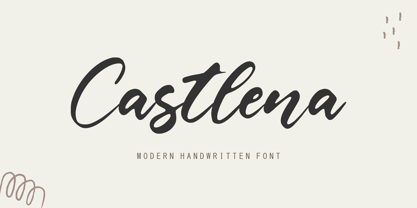 Castlena is a Modern Handwritten Font. Castlena is a flowing handwritten font, described by an elegant touch, perfect for your favorite projects. Fall in love with its incredibly distinct and timeless style and use it to create spectacular designs! Castlena also multilingual support. Enjoy the font, feel free to comment or feedback, send me PM or email. Thank you!
 - Hotel District JNL by Jeff Levine,
$29.00 The sans serif type style for the specialty font Nameplate JNL was given a serif treatment and is now Hotel District JNL complete with a full character set. Originally inspired by two Art Deco-era metal door signs saying "Men" and "Ladies", the thin lettering lends itself well to period pieces as well as contemporary design work.
 - Yourladies by Balpirick,
$15.00 Yourladies is a Modern Handwritten Font. Yourladies is a sweet and delicate handwritten font. Dainty and joyful, this font will be ideal for writing wedding invitations, cards or any other design that may need a romantic, personalized touch! Yourladies also multilingual support. Enjoy the font, feel free to comment or feedback, send me PM or email. Thank you!
 - Scandinavia Brush by Mans Greback,
$69.00 Scandinavia Brush is a wild calligraphy font by Mans Greback, inspired by the untamed beauty of Nordic nature. It captures a rugged essence, with each stroke reflecting the raw energy and grace of natural environments. This brush-painted typeface is perfect for logos, handwritten designs, and tattoo art with its active and streetwise feel. Designed with a professional touch and high-quality craftsmanship, Scandinavia Brush comes in six versatile styles: Regular, Upright, Bold, Italic, and the combinations Bold Italic and Bold Upright. The range of styles allows you to create unique, expressive designs that capture the spirit of adventure, speed, and beauty. Use underscores _ anywhere in a word to make an underline swash. Example: Nord___ic Bru_sh Ideal for designer and art projects, or high-end handcrafted products, Scandinavia Brush brings a bold, authentic, and captivating touch to your creative endeavors. The font is built with advanced OpenType functionality and has a guaranteed top-notch quality, containing stylistic and contextual alternates, ligatures, and more features; all to give you full control and customizability. It has extensive lingual support, covering all Latin-based languages, from Northern Europe to South Africa, from America to South-East Asia. It contains all characters and symbols you'll ever need, including all punctuation and numbers. Mans Greback is a Swedish typeface designer with a passion for creating unique and versatile fonts. With an extensive background in design and typography, Mans has built a reputation for his meticulous attention to detail and prolific craftsmanship. His many fonts are widely used by designers around the world, making his work synonymous with creativity and innovation.
 - Alunta by Attype Studio,
$13.00 Alunta is a layered script font with versatile style and use it to create spectacular designs Combine it with Alunta - Extrude & Ending Swash to make an amazing 3D effect on your letter! Alunta perfect for wedding promotion, branding, logo, invitation, stationery, social media post, product packaging, merchandise, blog design, game titles, cute style design, Book/Cover Title and more. What's Included : - Alunta Family Font - Multilingual Support - Made it into separated file to make it easier to use by beginner & separated file user can use the font with software which doesn't accept open type features. --- Hope you enjoy with our font! Attype Studio
 - ITC Lintball by ITC,
$29.99Eric Stevens's latest typeface, ITC Lintball, combines two unusual features: its letterforms are based on the serifless lettering inscribed in stone by the ancient Greeks, yet the wobbly edges of the strokes, and especially the slightly wider “lintballs” on the ends, suggest lettering done on paper with a modern felt-tip pen. The ball motif is carried through in the fat dot under the raised capital O, and in the similar dot used in place of a crossbar in the capital A. There's an angularity to many of the strokes, especially in the lowercase, that gives Lintball its distinctive character. - Quincy by Wiescher Design,
$12.00 »QUINCY« started as an art project. I was stitching roughly cutout letters together on a piece of wooden board, but I didn’t like the result! So I ended up with a font in three cutout styles. I thought it was so unusual and really beautifully ugly, that I finished it, adding flashes here and there. Now I am offering this absolutely unusual font as a packet of three for you to enjoy. Have at least as much fun working with it as I had designing the packet. The font is great for packaging or posters, or whatever comes to your imaginations.
 - Rhumba by Stiggy & Sands,
$24.00 A Lost Art Deco Style Reborn and Multiplied Rhumba began as a digitization of a film typeface from LetterGraphics in the early 70's known as "Barrio Lined". Originally only a single typeface, represented by our Rhumba Lined style, it was fun and offered more diversity to expand out the styles of this gem. Playing off the stylings of fonts like Prisma, Rhumba fills in gaps between the various lines of the original to offer 3 alternate looks. The Rhumba family contains 382 characters per font. A comprehensive character map preview is at the end of the poster graphics collection.
 - Solingen by Mysterylab,
$14.00 Solingen is an elegant display serif font well suited to logo design applications. The capital letter set features many unique double-letter pairings which serve as inspirational design features when creating posh, delicate, and luxurious logos. Suggested uses for Solingen might include high-end branding for boutique apparel, accessories, jewelry, or cosmetics; unique wedding invitation headlines; packaging for personal care items, and much more. In many applications, the ligatures feature is turned on by default as Standard Ligature alternates, but these can generally be easily overridden in the Glyphs panel when you prefer to use the standard characters instead.
 - Castile by Eyad Al-Samman,
$3.00 Castile is a central region of Spain that formed the core of the Kingdom of Castile, under which Spain was united in the 15th and 16th centuries. "Castile" is a Kufic modern Arabic typeface. It is suitable for books' covers, advertisement light boards, and titles in magazines and newspapers. It is very distinctive when used in black and white printout. It decorates colored pages and makes artworks more attractive. This font comes in three different weights. I adore Spain and the historical achievements of the Islamic civilization existed there in the past. By designing "Castile" Typeface, I wanted to refer to the Islamic civilization that Muslims had in Spain and especially in Andalusia. Today the name of Castile survives in two autonomous regions of Spain: Castile-La Mancha (capital city is Toledo) and Castile-Leon (capital city is Valladolid). The main characteristic of "Castile" Typeface is in its modern open-end style for some of its Arabic characters such as "Sad", "Dad", "Seen", "Sheen", "Qaf", "Faa", "Yaa" and others. The shape of the characters' "dot", "dots", and "point" is innovative; a triangle with a semi-circle shape. "Castile" Typeface is suitable for books' covers, advertisement light boards, and titles in magazines and newspapers. Its charactersí modern Kufic styles give the typeface more distinction when it is used also in posters, greeting cards, covers, exhibitionsí signboards and external or internal walls of malls or metroís exits and entrances. It can also be used in titles for Arabic news and advertisements appeared in different Arabic and foreign satellite channels.
 - Whiteblack by Fontador,
$24.99 Whiteblack is a slab serif with a soft touch, designed for contemporary typography and comes up with 6 weights for positive and negative settings plus handslanted obliques. In dark backgrounds, especially for signage and on screen, negative settings glow and appear heavier than positive settings. To avoid the „glow-effect“ the typeface contains special weights for an optimal balance between white and black. A large x-height and open apertures not only creates space for smaller sizes, but also lends Whiteblack a solid balanced and generous character for print and screen. Many OpenType features including 324 ligatures, contextuel alternates, and stylistic set built into all cuts. The font contains 1.076 glyphs with a wide range of flexibility for Latin language support for every typographical needs. Whiteblack brings elegance and a certain warmth wherever a contemporary slab serif typeface is needed, special for signage, brands, magazines and corporate design.
 - Rotola TH Pro by Elsner+Flake,
$40.00 Karl-Heinz Lange presented his first drafts of Rotola during a Typoart® type design competition in 1985 under the name "Boutique". A year later, Norbert du Vinage, former manager of the type design department, integrated "Boutique" in his production plan. Due the Fall of the Wall, it took about 18 years until Lange finished this font family in cooperation with Elsner+Flake. Karl-Heinz Lange was born on July 29, 1929 in Wiesenkirch in West Prussia. He was enrolled in the Humanistic Gymnasium at Elbing from 1939 to 1945 and changed to the Wernigerode High School after his family had to flee to central Germany. From 1949 to 1951, Karl-Heinz Lange studied at the Werkkunstschule Halle, where one of his teachers was Professor Post. After 1951, he continued his studies at the Hochschule for Grafik und Buchkunst in Leipzig with an emphasis on book design. He received his diploma in 1955 with distinction based on his design of a hot metal typeface. From 1956 to 1961, Karl-Heinz Lange worked as a lecturer for Type and Commercial Graphics at the Hochschule für Angewandte Kunst in Magdeburg. From 1961 to 1963, he taught at the Hochschule für Grafik und Buchkunst in Leipzig, and finally as a freelance commercial designer in Magdeburg. He worked on a variety of assignments, one of which was the design of trick films. From 1969 to 1976 he took the position of Artistic Director of the Henschelverlag, Berlin; from 1976 to 1994 he was Professor of Type and Typography at the Fachschule für Werbung und Gestaltung in Berlin; and, until 2004, he taught at various institutes for advanced professional education. From 2005 to 2007 he taught at the Fachhochschule Magdeburg/Stendal. Karl-Heinz Lange was awarded the second prize at the "International Type Design Contest 1971" for a headline typeface, and, in 1984, at the XI. Biannual of Graphic Design in Brno, he won a Silver Medal for the design of his typeface family Publica. He created the telephone book typeface Minima and re-designed the Typoart Super Grotesk® (Arno Drescher, 1930) as well as the Newspaper typeface Magna® by Herbert Thannhaeuser for the use on digital typesetting systems. To the day of his death on June 29, 2010, Karl-Heinz Lange lived and worked as a type designer. Among others, he closely followed the designs of the typefaces which were developed under his guidance for Typoart®: "Publica®", "Typoart Super Grotesk®" and "Minima®" which he launched as "Publicala", "Minimala" and "Superla" in 2009. In cooperation with Elsner+Flake, he developed the Typeface family "Rotola" between 2006 and 2009 as well as the script families of the "Viabella®" series. To the end, he followed the development of his first typeface, the "Diplom Antiqua", which he also wanted to bring to market together with Elsner+Flake.
 - Daily Routines by Fikryal,
$23.00 The “Daily Routines” Handwritten Display Font is a delightful and charismatic typeface that effortlessly captures the essence of casual elegance. With its carefully crafted strokes and artful imperfections, this font exudes a sense of handmade authenticity that is both inviting and versatile. Designed with meticulous attention to detail, “Daily Routines” showcases a harmonious blend of playful curves and well-balanced letterforms, making it a perfect choice for projects that seek to strike a harmonious balance between approachability and sophistication. Its smooth and flowing lines lend a sense of fluidity and ease, evoking a feeling of effortlessness and natural rhythm. The irregularities in each letter lend a unique charm, reminiscent of handwritten notes penned with care. The “Daily Routines” Handwritten Display Font is specifically tailored for projects that demand a warm and friendly touch, such as invitations, greeting cards, product packaging, and branding materials. It easily conveys a sense of personal connection, making it ideal for conveying heartfelt messages or highlighting the human element in design. Whether utilized for digital or print media, this font ensures legibility and readability, even in smaller sizes. Its captivating appearance adds a touch of personality to any text, making it stand out while retaining a sense of tasteful subtlety. Embrace the captivating allure of the “Daily Routines” Handwritten Display Font to infuse your designs with a genuine and endearing character, elevating them to new levels of aesthetic appeal and resonating with your audience on a profound level. If you have any questions please don’t hesitate to contact me follow my Instagram: fkryall Thank you
 - Neue Echo by RMU,
$30.00 Inspired by the former Schriftguss, Dresden, font Echo, this fresh-drawn und designed Neue Echo can be filled in many different ways, and makes it a great display font for labels, posters, headlines etc.
 - Samson Classic SG by Spiece Graphics,
$39.00 Here is another classic design by Robert Hunter Middleton for the Ludow Foundry in 1940. Samson Classic is a very heavy display face with a wonderful medley of thick-and-thins. Developed just before World War II, this sturdy, chunky style gained popularity in newspaper advertising work. It appears as though it was created using a broad pen and retains the angled stroke endings. Goes great on certificates and diplomas where just a hint of calligraphy is appropriate. Samson Classic is also available in the OpenType Std format. Some new characters including decorative ornaments for creating certificates have been added to this OpenType version. Advanced features currently work in Adobe Creative Suite InDesign, Creative Suite Illustrator, and Quark XPress 7. Check for OpenType advanced feature support in other applications as it gradually becomes available with upgrades.
 - Rival Slab by Mostardesign,
$25.00 A touch of modernism for all kinds of projects Like the rest of the family (Rival Sans and Rival Serif), Rival slab has round shapes with bevelled endings on certain letters such as G, Q or Z. These are the characteristics that make Rival Slab a contemporary cast iron for all kinds of projects. It provides advanced typographical support with features such as case sensitive forms, small caps, ligatures, alternate characters, fractions, slashed zero, circled, pro kerning…It comes also with a complete range of figure set options It comes in 16 weights with corresponding italics and it’s suited for multiple purposes including editorial use, web font, apps, digital ads, ebook, and also for advertising, long text, packaging and branding. As a modern sans serif font family, Rival Sans has true italics to give more style in long texts.
 - Monologous by Comicraft,
$49.00 From A to B, or not to Z: that is the question mark: whether 'tis nobler in the mind to kern with the left and right arrows of outrageous keyboards, or to take arms against a sea of ' thought bubbles,' and by opposing, burst them? To sigh, with those little fireflies: to sleep; No more; and by sleep that is to say we end each line of dialogue with 'zzzzz;' The heart-shapes and the thousand drops of sweat popping off my forehead that sight of flesh is sure to produce, 'tis a consummation devoutly to be letter'd. To die with still at least five balloons of dialogue, to sleep; perchance to flashback to a scene in a previous issue while a picture of my head floats in the corner of each panel: ay, there's the rub; 'Nuff Said.
 - Babyhome by Haksen,
$14.00 Babyhome Elegant Script If you are needing a touch of casual chic calligraphy for your designs, this font was created for you! Babyhome was built with OpenType features and includes beginning and ending swashes alternate characters for both lowercase letters, loads of different swash alternates for lowercase letters, numbers, punctuation, alternates, ligatures and it also supports other languages :) Accessing the swashes / opentype features / glyphs: This font works best in a program that supports OpenType features such as Adobe Indesign, Adobe Illustrator CS, or Adobe Photoshop CC. You can access the swashes and alternates from the 'Glyphs Panel' in these programs. More Questions? Here are some (potential) answers! You are not permitted to resell this font in any way. Multilingual Support is included for Western European Languages Also, the sans-serif font used in the preview images is Gotham :)
 - Achandria by Javatypestd,
$15.00 Introducing Achandria A Retro Font Inspired from retro typography from the 80's combine with bold typography style. Come with an open type feature with a lot of alternates and end swash, its helps you to make great lettering. Achandria best uses for Logotype, heading, cover, poster, logos, quotes, product packaging, header, merchandise, social media & greeting cards and many more. This font is also supports multi language. To access the alternate glyphs, you need a program that supports OpenType features such as Adobe Illustrator CS, Adobe Photoshop CC, Adobe Indesign and Corel Draw. What’s Included : - Standard glyphs - Ligature and Stylish Set - Works on PC & Mac - Simple installations - Accessible in Adobe Illustrator, Adobe Photoshop, Adobe InDesign, even work on Microsoft Word. - PUA Encoded Characters – Fully accessible without additional design software. - Fonts include multilingual support Thank you for your purchase! Hope you enjoy our font!
 - Rocksane Display by Andrey Sharonov,
$30.00 Rocksane Display is a modern hybrid font with fantastic decorative uppercase and strong serif lowercase for impressive and powerful look. This typeface works fine in big sizes and more suits for example in short tittles, logotypes, names, movie posters, books and music album covers. Rocksane includes 84 beautiful uppercase alternates except of basic set. You can easy get it with special combination like A1, A2, A3 etc. (This hot keys works with activated Standard Ligatures option). In addition, there are 11 End-swashes which harmoniously underline the words. You can quickly get it by the same way with combination like _1, _2, _3 up to _11 (underscore+number). This features works fine in Adobe Photoshop or Illustrator. You can use Rocksane for following languages: Danish, Dutch, English, Estonian, Faroese, Finnish, French, German, Hungarian, Icelandic, Italian, Norwegian, Polish, Portuguese, Slovene, Spanish, Swedish, Turkish.
 - Dear Gray by Redy Studio,
$17.00 Dear Gray – Modern Wedding Fonts Dear Gray is a beautiful, feminine, and modern calligraphy script for your wedding designs. Dear Gray includes a full set of uppercase and lowercase letters, numerals, punctuation, and common ligatures for a more harmonious look. With Opentype features and stylistic alternatives, Dear Gray gives you a lot of possibilities to make your design even more special. Following the trend of modern hand-drawn typography, Dear Gray is a friendly choice to convey your loving words. Dear Gray features: A full set of upper & lowercase characters Numbers & punctuation Ligatures Lowercase beginning swashes Lowercase ending swashes A ton of stylistic alternatives PUA Encoded Characters – Fully accessible without additional design software. Feel free to give me a message if you have a problem or question. Thank you so much for taking the time to look at one of our products.
 - Cachet by Monotype,
$50.99According to designer David Farey, Cachet is a monospaced, monostroke typeface -- that isn't."" Why the sleight of hand? Typefaces that are limited to a single character and stroke width suffer in terms of legibility. Farey's goal in drawing Cachet was to create a typeface that gives the illusion of monospacing, while delivering a subliminal dose of reader-friendliness. At first glance, Cachet appears to be constructed of straight and nearly-straight strokes. A closer look, however, reveals several subtleties. Curved strokes have an almost calligraphic spontaneity. Places where character strokes meet are tapered slightly, while stroke ends have been flared. These quiet deviations from geometric uniformity give the design a human, organic, and decidedly non-digital look. An added benefit is that the subtle design modulation benefits readability. Farey's subtle design modulation results in a legible and highly usable new typeface. - Rare Bird Specimen I by Rare Bird Font Foundry,
$100.00 RARE BIRD SPECIMEN I From the the doyenne of modern calligraphy - Maybelle Imasa-Stukuls - we bring you Specimen I, a charming script lettered in Ms. Imasa-Stukuls' signature hand. OBSERVATIONS Specimen I stands on its own. Its subtle nuances make it stand out in a flock of fonts. It is easily recognizable, but it is never one to be too showy. Give it plenty of white space, so every quirk and curve can be noted. DEFINING CHARACTERISTICS Opentype programming, old style numerals, in and out-stroked letter forms at beginning and end of words, six alternate lowercase t cross-strokes, Roman numerals, seamlessly connecting script ligatures, alternate lowercase letters, realistic double-letter ligatures, basic Latin encoding. POTENTIAL SIGHTINGS Book covers, children's literature, broadcast titling, unique product designs, website titles, logo designs, restaurant menus, and gourmet food labels.
 - Allow me to introduce you to the unsung hero of the typography world, Uecker, carefully crafted by the typographic maestro, Allen R. Walden. Imagine a font that decided to put on its Sunday best, but...
- Ollie by Eclectotype,
$40.00 Meet Ollie, a casual signage script whose friendly, bouncy exterior belies a heart of sophisticated OpenType programming. This font is designed to make the most of OpenType savvy applications, and as such is recommended for professional design use. Or to put it another way: Make sure that contextual alternates and ligatures are always turned on! Ollie includes about 900 glyphs, many of which are automagical substitutions to keep the text flowing smoothly, and to pseudo-randomly pick different glyphs to avoid repetition. With contextual alternates turned on (as they should be by default), most lowercase letters will alternate between at least two different forms. The powerful OpenType programming makes the font itself ‘look back’ (up to eight characters) on previously used letters; typing “banana” will give you three different a’s and two different n’s (the last a is a special ‘end form’ character). The calt feature controls many other ‘special effects’ which all add together to give a smooth-flowing, hand-lettered look. These effects include start and end forms (and indeed, ‘loner’ forms) of many letters, which are automatically substituted in at beginnings or ends of words, or when the previous or next letter doesn't connect. Another special feature tests to see if there is room for the crossbar of t (or tt ligature) to extend further over the previous or next letter, or both, as is often the case. The last main effect of the calt feature is to substitute certain letters typed before any ‘e’ character, to make for a more natural connection (see the pe combination in ‘Eclectotype’ in the first poster). Ligatures should be on by default, for a much nicer looking tt combination, and a few others besides. The swash feature should be used sparingly (one glyph at a time, really) to apply a more extravagant look to g,j and y in the lower case, and quite a few of the upper case too. Oldstyle figures are included, as well as the lining defaults. Now to delve into the stylistic alternates... These are all included in the salt feature, or for uses of applications that support them, separated into stylistic sets thus: ss01 - (with swash feature on) L and G swashes get even swashier. ss02 - standard s changes to a connected script s form. ss03 - r takes on a script form. ss04 - z also gets a scriptier look. [the previous three sets also change any versions of s, r or z with diacritics] ss05 - a useful underline function. When enabled, typing two or more underscores will extend a cool underline under the previous letters. More underscores = longer underline. ss06 - the Polish script lslash changes to its more standard form. ss07 - E, S and B change to a more top-heavy alternate form. ss08 - An alternate form for A characters. ss09 - Alterative rounder forms of M and N. ss10 - An alternate ampersand. That about wraps up the features. Now all that’s left is for you to license the font and get experimenting!
 - Winter Flowers by Great Studio,
$14.00 Winter Flowers, a font duo, is a unique and modern hand script that provides a large selection of alternative characters to choose from as well as ligatures that look natural and add to the authenticity of the letters. Winter Flowers is a modern handwritten font, loaded with awesome OpenType features, and a set of alternative characters for uppercase and lowercase letters. Make all the extra decorative and unique choices you wish with the included swashes, endings, and alternative letters. Designed to work harmoniously, Winter Flowers is also equipped with a sans font, to perfect your design. This font is perfect for branding, logos, web and editorial design, branding, prints, invitations, handicrafts, quotes, and more. Winter Flowers features OpenType stylistic alternates, ligatures and International support for most Western Languages is included. To enable the OpenType Stylistic alternates, you need a program that supports OpenType features such as Adobe Illustrator CS, Adobe Indesign & CorelDraw X6-X7, Microsoft Word 2010 or later versions. Winter Flowers is coded with PUA Unicode, which allows full access to all the extra characters without having special designing software. Mac users can use Font Book , and Windows users can use Character Map to view and copy any of the extra characters to paste into your favourite text editor/app. Need help? If you need help or advice, please contact me by e-mail Greatstudio92@gmail.com Thank you, Great Studio
 - Lovers Pro by Scholtz Fonts,
$35.00 Lovers is a romantic, elegant handwritten calligraphic script, with well over 300 additional characters, including standard and discretionary ligatures, swashes and stylistic alternatives. Use of its extensive OpenType features enable the designer to create text that constantly changes, giving the impression of genuine handwriting, but handwriting that has all the flair and styling of hand-done calligraphy produced towards the end of the twentieth century. Lovers is based on traditional calligraphic ideals, but I've combined these with my own brand of relaxed, handwritten spontaneity, to design a font that is formal yet free and accidental, traditional yet contemporary. The font’s extravagant curves and swashes make it perfect for valentine’s day and wedding media, book covers, greeting cards, and certificates, in fact for any design work that requires a romantic or opulently elegant look. The range of stylistic alternatives and swashes enable users to create a wide range of moods in their work. In many ways it is a calligraphy toolkit. Lovers contains the accented characters used in the major European languages. What sets it apart from most other calligraphic fonts is that it appears so genuinely handwritten and avoids the uptight formality that characterizes so many of the fonts in this genre. Try Lovers, enjoy its wealth of OpenType features and let its vigorous yet elegant exuberance delight you and enhance your creativity!
 - Elegise by Nathatype,
$29.00 Elegise is a captivating script font that gracefully captures the essence of cursive handwriting with a touch of elegance. This typeface exudes an air of sophistication and refinement, making it perfect for projects that require a stylish and polished look. Each letter in this font is meticulously crafted with high contrast, adding a dynamic and eye-catching quality to the font. The combination of thick and thin strokes creates a sense of fluidity and movement, adding a touch of liveliness to your typography. The long swinging endings in some letters of Elegise bring a sense of graceful flair and drama to the font. These charming details add a touch of elegance and uniqueness, making the script come to life with a sense of poise and grace. For the best legibility you can use this font in the bigger text sizes. Enjoy the available features here. Features: Stylistic Sets Ligatures Multilingual Supports PUA Encoded Numerals and Punctuations Elegise fits in headlines, logos, movie posters, flyers, invitations, greeting cards, branding materials, print media, editorial layouts, headers, and many more. Find out more ways to use this font by taking a look at the font preview. Thanks for purchasing our fonts. Hopefully, you have a great time using our font. Feel free to contact us anytime for further information or when you have trouble with the font. Thanks a lot and happy designing.
 - Levigate by Nathatype,
$29.00 Levigate is a graceful script font that beautifully captures the essence of cursive handwriting with a touch of sophistication. This typeface exudes an air of elegance and refinement, making it perfect for projects that require a stylish and polished look. Each letter in this font is meticulously crafted with high contrast, adding a dynamic and eye-catching quality to the font. The combination of thick and thin strokes creates a sense of fluidity and movement, adding a sense of energy and vibrancy to your typography. The swinging endings in some letters of Levigate bring a touch of whimsy and personality to the font. These charming details add a flourish of creativity and uniqueness, making the script come to life with a sense of playfulness. For the best legibility you can use this font in the bigger text sizes. Enjoy the available features here. Features: Stylistic Sets Ligatures Multilingual Supports PUA Encoded Numerals and Punctuations Levigate fits in headlines, logos, movie posters, flyers, invitations, greeting cards, branding materials, print media, editorial layouts, headers, and many more. Find out more ways to use this font by taking a look at the font preview. Thanks for purchasing our fonts. Hopefully, you have a great time using our font. Feel free to contact us anytime for further information or when you have trouble with the font. Thanks a lot and happy designing.
 - Jackalope LP by LetterPerfect,
$39.00 Jackalope is a new original script font from LetterPerfect Fonts. The design is a hybrid of pressure-pen calligraphy infused with whimsy and curlicue terminals. Letterforms are free-spirited and edges are rough, simulating spontaneous writing on rough paper. In addition to the full ANSI western character set, Jackalope includes a full set of small capitals, both lining and old-style numbers, and swash lowercase alternate characters that can be used as terminal letters at the ends of words for additional flourish. The genesis and realization of Jackalope was also a hybrid process. In 1996, LetterPerfect commissioned type designer Kathy Schinhofen to provide pen-written source material based on her commercial handwriting style and specifically on a logo she had designed for its "Viva la Fonts" line of script fonts. This work was digitized by LetterPerfect’s Garrett Boge and later fonticized by former Hallmark Cards type maven Myron McVay who unified the design and contributed additional characters. The design sat unfinished for over 12 years until Garrett Boge revived the project in 2010 filling out the extended character set. Jackalope is released in two versions: Jackalope LP Regular, which is the base font for continuous text setting; and Jackalope LP Expert, which includes swash variants, small capitals, and old-style numerals which can be swapped into text for extra flourish and effect.
 - Mountella by Kereatype,
$14.00 Mountella is a modern editorial serif font family that includes 18 fonts, uprights, italic, and 2 variable font from Extra Light to Black which has more than 500 characters, and still has all the nostalgic vibes!. Mountella is a beautiful serif family that includes many visual details, adding uniqueness that looks incredible in both large and small settings as a display and body text. Mountella can be used in high-end branding, logo designs, magazines, product packaging & invitations. One thing to note about Mountella is the letter spacing. It was intentionally for clean reading if you wanted to use it for the body type, so I recommended setting the spacing a little tighter for display use (around -10 to -50 should do!). Design Tips: combine the regular and italic, whether all in one word or body text for logo or quote. Adjust your letterspacing to add more groove! Tighter letterspacing for large headers.
 - Controwell by Alit Design,
$14.00 Visiting the end of 2018, we launched "Controwell Victorian Typeface" which adheres to Serif and Script style. Controwell Regular has 2 layers that give a cool metal effect. Besides that, there are many alternative character choices that suit your taste. This charming Controwell Script is very well suited combined with Controwell Serif Regular. the elegant and unique impression looks very hard. just like the serif font, this script also has many alternative character choices, up to "SS10" and 600 glyphs. You create designs with modern Victorian themes or classically themed themes that are suitable for collecting Controwell Victorian Typeface, in addition to many choices of your character is also very easy to use. just choose and change some characters, the design that you design is ready to be printed or published on social media. This font is very suitable for logotype design, packaging design, beer design, vodka, whiskey label, poster design, victorian book cover and design.
 - Hello Master by Alpha Bento,
$12.00 Hello Master Script Font DUO This type is a new modern script font with an irregular base line. Trendy and feminine style. Hello Master Script Font DUO looks beautiful in wedding invitations, thank you cards, quotes, greeting cards, logos, business cards, and more. Perfect for use in ink or watercolors. Including beginning and end letters, alternatives and support for many languages. To enable the OpenType Stylistic alternative, you need a program that supports OpenType features such as Adobe Illustrator CS, Adobe Indesign & CorelDraw X6-X7, Microsoft Word 2010 or newer versions. There are several additional ways to access alternatives / swashes, using Character Maps (Windows), Nexus Fonts (Windows), Font Books (Mac) or software programs such as PopChar (for Windows and Mac). How to access all alternative characters: - http://youtu.be/iptSFA7feQ0 - https://www.youtube.com/watch?v=Go9vacoYmBw Need help or have a question, let me know I am happy to help :) Thank you & Congratulations on Design! Best Regards, Alpha Bento
 - Shellion Script by Youngtype,
$14.00 Shellion Script is a modern typeface with a tasty flow. Shellion Script features alternate characters, including initials, end swashes terminals, ligatures and International support for most Western Languages is included. This one should make your designs instantly professional and jaw-dropping! Be a perfect professional in a minute and start creating modern designs like ads, sales, logos, branding, posters, social media text overlays today! To enable the OpenType Stylistic alternates, you need a program that supports OpenType features such as Adobe Illustrator CS, Adobe Indesign & CorelDraw X6-X7, Microsoft Word 2010 or later versions. and there are additional ways to access alternates/swashes, using Character Map (Windows), Nexus Font (Windows), Font Book (Mac) or a software program such as PopChar (for Windows and Mac). How to access all alternative characters using Adobe Illustrator: https://www.youtube.com/watch?v=XzwjMkbB-wQ How to access all alternative characters, using Windows Character Map with Photoshop: https://www.youtube.com/watch?v=Go9vacoYmBw Thank you for your purchase!
 - Plinc Hasler Circus by House Industries,
$33.00 Hasler Circus packs amusement park, Old West, folk art, and tattoo shop all into one colorful font. Characteristic of reverse-contrast faces, Hasler Circus swaps the weight of its stems and serifs creating an unexpected yet charming rhythm. The font also features an added bonus: split stroke endings to crank up the flavor. Inject a dose of novelty into toy packaging, candy wrappers, cook books, vintage signs, or festival marketing. Drawn in the 1950s for Photo-Lettering, Inc. by influential British designer and typographer Charles Hasler, Circus was digitized by Erik van Blokland in 2011, with a helping hand from Ken Barber. HASLER CIRCUS CREDITS: Typeface Design: Charles Hasler Typeface Digitization: Erik van Blokland, Ken Barber Typeface Production: Ben Kiel Like all good subversives, House Industries hides in plain sight while amplifying the look, feel and style of the world’s most interesting brands, products and people. Based in Delaware, visually influencing the world.
 - Hello Georgia Script by Bosstypestudio,
$14.00 Hello Georgia Script Font Duo + Extras is a new modern script font with an irregular base line. Trendy and feminine style. Hello Georgia Script looks beautiful in wedding invitations, thank you cards, quotes, greeting cards, logos, business cards, and more. Perfect for use in ink or watercolours. Including beginning and end letters, alternatives and support for many languages. To enable the OpenType Stylistic alternative, you need a program that supports OpenType features such as Adobe Illustrator CS, Adobe Indesign & CorelDraw X6-X7, Microsoft Word 2010 or newer versions. There are several additional ways to access alternatives / swashes, using Character Maps (Windows), Nexus Fonts (Windows), Font Books (Mac) or software programs such as PopChar (for Windows and Mac). How to access all alternative characters: https: //www.youtube.com/watch? v = Go9vacoYmBwhttps: //www.youtube.com/watch? v = XzwjMkbB-wQhttps: //www.yo ... need help or have a question, let me know I am happy to help :) Thank you & Congratulations on Design!
 - Black Crown by Pixesia Studio,
$23.00 Introducing Black Crown - Modern Blackletter Font Black Crown is a modern blackletter font inspired by royal-classic aesthetic which inspired by modern and sophisticated touch. It provides the no-end possibilities and alternatives to craft a design with bold yet elegant style. Black Crown perfectly suits any vogue or luxurious occasion. Black Crown is better used for product packaging, label, t-shirt, or any projects seeking for a touch of elegant modern blackletter. FEATURES – Stylistic Alternates – Ligatures – Uppercase and Lowercase letters – Numbering and Punctuations – Works on PC or Mac – Simple Installation – PUA Encoded Characters – Easily accessible without additional design software. – Support Adobe Illustrator, Adobe Photoshop, Adobe InDesign, also works on Microsoft Word – Multilingual Support for 68 languages including Afrikaans, Albanian, Basque, Catalan, Danish, Dutch, English, Estonian, Faroese, Filipino, Finnish, French, Galician, German, Icelandic, Indonesian, Irish, Italian, Malay, Norwegian Bokmål, Portuguese, Spanish, Swahili, Swedish, and Zulu Hope you Like it. Thank you for your purchase!
 - Noobia by Scholtz Fonts,
$19.95 Noobia is a casual, energetic handwritten font, with plenty of movement. Its moving baseline creates a funky, busy, dramatic impression. With its informal, immediate style, Noobia is like a swift swash of text handwritten with a slightly overfilled ink pen. This impression is exaggerated by blobs at the beginning and end of pen strokes. Noobia makes a simple, direct statement, bypassing complexity and superficiality. It's just an in-your-face, immediate font. It 's the font you'd use for a quick, hand drawn note or notice. Noobia comes in three great styles: Noobia Smooth - use it for ad media for anything from sports equipment to slinky lingerie, wine labels to washing powder packaging. Noobia Black - use it anywhere to emphasise Noobia Smooth, and on posters and children's book covers. Noobia Rough - use it for graffiti, music videos, funky clothing hang tags and event posters. Noobia has all the features usually included in a fully professional font. Language support includes all European character sets.
 - Hello Gorgeous Font Trio by Zane Studio,
$15.00 Gorgeous Script Font Trio is a new modern script font with an irregular base line. Trendy and feminine style. Gorgeous Script looks beautiful in wedding invitations, thank you cards, quotes, greeting cards, logos, business cards, and more. Perfect for use in ink or watercolors. Including beginning and end letters, alternatives and support for many languages. Files included: Gorgeous Script.OTF Gorgeous Script.TTF Gorgeous SANS.OTF Gorgeous SANS.TTF Gorgeous SERIF.OTF Gorgeous SERIF.TTF To enable the OpenType Stylistic alternative, you need a program that supports OpenType features such as Adobe Illustrator CS, Adobe Indesign & CorelDraw X6-X7, Microsoft Word 2010 or newer versions. There are several additional ways to access alternatives / swashes, using Character Maps (Windows), Nexus Fonts (Windows), Font Books (Mac) or software programs such as PopChar (for Windows and Mac). How to access all alternative characters: https: //www.youtube.com/watch? v = Go9vacoYmBwhttps: //www.youtube.com/watch? v = XzwjMkbB-wQhttps: //www.yo ... need help or have a question, let me know I am happy to help :) Thank you & Congratulations on Design!
 - Stylized Deco JNL by Jeff Levine,
$29.00 In their book "Lettering of Today" by W. Ben and Ed C. Hunt, an Art Deco "thick and thin" alphabet with some stylized characters (which leaned a lot toward a calligraphic style) stood out from the rest. This is now available as Stylized Deco JNL, in both regular and oblique versions.