10,000 search results
(0.17 seconds)
- Boredom by Invasi Studio,
$17.00 You want to add more raw for your design. Introduction our new Handwritten Font. A Boredom Font with realistic scribbles pen styles. This set can make your design more realistic. Includes 2 set alternate variations for each A-Z letter (both uppercase and lowercase). So you can create a combination of whatever you want!
 - Public Utility JNL by Jeff Levine,
$29.00 Public Utility JNL digitally duplicates the look of those small white-on-black self-adhesive stickers used by cities, power companies and telecommunication firms in order to identify utility poles and other service locations. A blank rectangle is available on both the solid and broken vertical bar positions.
 - Thinpaw by upirTYPO,
$4.00 Thinpaw is a serif handwritten font perfect for usage in a really big sizes (50 pt+). The stem width is about 0.5 mm (0.019") in 100 pt size. The font comes with central european character set and a set of various glyphs and icons (see preview images). Opentype features: - Standard ligatures - fi, fl, ff - Discretionary Ligatures - ft, fb, fh, fk, fj - Contextual Alternates - a, e, f, g - Stylistic set 01: A Stylistic set 01 changes every dot into the heart shape symbol. It turns every writing into a nice looking love letter! Thinpaw is perfect for wedding proposals, wedding invitations, happy birthday cards or anything personal. For usage on the computer screen, the stem width is about 1 pixel for 50 pt size, and 2 pixel for 100 pt size.
 - Stickball JNL by Jeff Levine,
$29.00 Using examples of antique street signs from New York City, Stickball JNL recreates the iconic lettering in a digital typeface and is available in both regular and oblique versions. For a nostalgic touch, a blank street sign is located on either the solid or broken bar keystrokes.
 - Diamond Braille by Echopraxium,
$5.00 Here is a "Decorative Braille font". The initial design was indeed drawn on a K.I.S.S digital sketchpad, the Windows default drawing tool (Microsoft Paint, classic version). A. Glyph Concept The Braille 2x3 dot matrix is weaved around a diamond-shape. a.1. Each "dot" is represented by a "right-angle isocel triangle". a.2. Braille dots in Diamond Braille a.2.I. "Dots" are outside the diamond for first Braille row (Braille dots 1, 4) and third Braille row (Braille dots 3, 6). a.2.II. "Dots" are inside the diamond for second Braillle row (Braille dots 2, 5). a.3. Diamond lattice Glyphs are connected horizontally (to/bottom diamond's corners) and vertically (left/right corners) to each other (see poster 5). a.4. Special Glyphs - Space: its is either empty ("Empty cell") or a "non Braille shape" { _, ° } depending on your display needs (as explained in b.3.II) - 6 dots: { £, =, û } - 6 empty dots: { ç, ¥ } B. Font user guide b.1. Lowercase glyphs { A..Z } In these glyphs the "dots" are represented as a white right-angle isocel triangle filled with a smaller black triangle. b.2. Uppercase glyphs { a..z } In these glyphs, the "dots" are represented as an empty triangle (this is an "empty dot"). b.3. 'Space' vs 'Empty Cell' b.3.I. 'Space' - 'Space' glyph is an empty shape - '¶' glyph (at the end of each line in Microsoft Word) is also an empty shape b.3.II. 'Empty cell' glyphs: _ (underscore), ° (degree). In these glyphs there are 2 "empty dots" at top and bottom corners of the diamond, which differentiates them from regular Braille glyphs (which dont have a "dot in the middle"). b.4. Diamond Lattice To display text as a 'diamond lattice', replace each 'Space' by an 'Empty cell' (as explained in b.3.II, see poster 5) b.5. Connectors The connector glyphs allow the creation of "circuit like" designs (see poster 1). Here are the connector glyphs: { µ, à, â, ä, ã, è, é, ê, ë, î, ï } b.6. Domino feature Some Glyphs represent numbers 1..6 in a way which is similar than on dominos (see poster 6) C. Posters Poster 1: the "Font Logo", it displays "Diamond Braille" text together with the Connectors feature. Poster 2: a pangram which is published on pangra.me ( "Adept quick jog over frozen blue whisky mix" ). Poster 3: an illustration of the Domino feature. Poster 4: a DiamondBraille version of the Periodic table. Poster 5: illustration of the Diamond lattice using only 6 dots ( û ) and 6 empty dots ( ç ) glyphs.
 - Tinakori by Hendriks Studio,
$26.00 Inspired by a bustling village within Aotearoa New Zealand’s capital city of Wellington, Tinakori is an elegant and sophisticated serif font that invokes art deco, classical art and thin balletic structures. It’s been a passion project that’s finally come to fruition. The simple italic and bold versions help accentuate the individuality of the serif which is precise but holds a fluidity that makes it feel inventive.
 - SK Klyaksa by Shriftovik,
$32.00 SK Klyaksa is an experimental font inspired by the most striking and unusual artistic techniques of graffiti art. Its non-standard shapes, rounded points and hypnotic curved lines immerse you in the world of bright colors and unlimited creative freedom on the streets of the city. The SK Klyaksa font plays on the contrast between lightness and heaviness, creating an effect of brightness and dynamism, creating bright and emotional compositions that perfectly emphasize youth and individuality. Like graffiti art, the font speaks its own language and provokes bold decisions in graphic design, bringing originality and character to any project.
 - Have Heart by Set Sail Studios,
$13.00 Have Heart is a set of 2 hand-made marker pen fonts, designed to combine perfectly and allow you to create stunning hand-lettering quickly and easily. Also included is a set of 12 bonus swashes, ideal for giving your text that final touch of finesse!
 - Gang by Ani Dimitrova,
$39.00 Gang is a 2 - style display font family designed by Ani Dimitrova. Both weights contain a set of extended Latin and Cyrillic, as well as all sorts of open type features: standard ligatures, proportional figures, numerals, arrows, matching currency symbols, and fractions. In both styles, the font is well-suited for large headlines, word emphasis, and different types of advertising. The fonts' wide proportions make them a perfect choice for screen usage. This style palette offers a flexible range for display typography. The Gang type family is ideally suited for magazines, branding, posters, as well as web and screen design, and more.
 - Gorod.Volgograd by FontCity,
$15.00The general idea: Can You imagine to yourself, what the hydroelectric power station is? The building of this electricity production foundry is half hidden under the water, but the visible above-water part astonishes your sense. It is a construction almost 1,5 km length dammed out the powerful river stream. Besides thousand of electricity conduction lines supports it bears also the highway and the railroad. From a faraway distance the train seems like a caterpillar that has climbed up the stout tree. There are also the navigable sluices, the flood channels and other erections. The idea of this typeface outlines arrived to the authors exactly on the viewing platform, under the impression of the waterfalls, which are escaping from the dam womb, falling from almost 50 meters altitude and becoming white-haired during this flight. Release: in the form of "gorod.Volgograd" font with the one style. We work with other styles now and sometime we will be very glad to introduce the Bold and Italic styles to You. We should explain the font name meaning. "Gorod" is "city of" in Russian and Volgograd is the old, big and famous Russian city. The Volga hydroelectric power station of a name of XXII congress of the CPSU caused the Volgograd sea formation. It expands of 14 km width and more than 600 km along the Volga river-bed. But HEPS isn't the sole Volgograd sight. There are many interesting places here. The most known tourist sight, the visit card of Volgograd is the Mamaev Hill. Being here You can see almost all 100 kilometers of city length. Due to its geographical position, Mamaev Hill has got a great importance during the Great Patriotic War (1941-1945). It became and still is the Main Height of Russia. Soviet people have built the huge stately memorial ensemble here. There are many other witnesses of the heroic past of Volgograd: the Alley of Heroes, the Perished Fighters Square, the Soldiers Field and others. The line of tank turrets is stretched out along all town not far from Volga bank. It marks the line, where fascist troops was stopped in 1943. It is very amazingly when You dive under the ground on a usual tram. Volgograders have built a few underground station for the high-speed tramway. The river tram need a quarter of an hour to get an island in the Volga. And You need the same time to walk across the river station. The Volga-Don navigable channel starts from Volgograd. There are planetarium, circus, some theatres, many museums in Volgograd. One of football matches of Euro-2004 qualifying round took a place in the "Rotor" stadium in Volgograd. Volgograd holds the longest - above 50 km - park in the world. Its avenues, squares, embankments are beautiful, Volgograd central districts are built in unique architecture style called the Stalin Empire. You can enjoy fountains, parks, attractions, water-pools and other Volgograd sights. If You visit Volgograd once You'll never forget it. You can read about the ancient history of Volgograd city on the Tsaritsyn font page. Also we plan to create the Stalingrad font and give You a short story about another period in Tsaritsyn-Stalingrad-Volgograd history. - Valerie Indirose by sizimon,
$20.00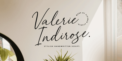 The font is called "Valerie Indirose", it is with fashionable themes. Script font contains 2 set alternates and some ligatures. The Valerie Indirose matches apply in some designs such as the logotype, quotes, wedding invitation, business card, packaging, branding, and more custom design. What's Include : Uppercase, lowercase, numeral, symbol and punctuation, alternates (ss01-ss02), ligature in script font PUA Encoded Multilingual support If you have any questions, please contact : info@sizimon.com
 - Gutknecht by Proportional Lime,
$9.99 Jobst Gutknecht was a highly successful printer in the city of Nuremburg from 1514 to 1542. He published the "Achtliederbuch" (the first Lutheran hymnal, with a whole 4 tunes) and many works by Martin Luther. This font is an accurate "recutting" of the font face Gutknecht used for the body text in his printed works. It has been extended to over 900 glyphs adding hundreds for modern use. It also presents many ancient things like old ligatures such as "tz", a hedera, and alternate style pilcrow for visual interest. And for those conservative types the modern lower case "k" is also available.
 - Potbank by Asdesign,
$50.00 Like many cities in the Midlands and North of England, Stoke-on-Trent has a rich history linked to making and industry. In Stoke’s case it was pottery. In the early 1900s bottle kilns could be seen covering the landscape of the six towns making up Stoke-on-Trent with hundreds of factories producing some of the best ceramics in the world. But by the 1990s most of these had gone. Torn down for development of housing or just left to rot. During the next few decades Stoke continued to change. The industry was in a decline and Stoke itself was seen as another poor midlands city with a dwindling industry. Then in 2008, Spode, one of the largest and most famousceramics factories in Stoke entered into administration. Pens cast aside, drawings left half finished, designs left in the turned-off kilns; Spode factory was abandoned. This was a real shock and the way everything was getting thrown into skips to be put on the tip was heartbreaking. Thankfully people salvaged some of the technical drawings, sketch design, old sample pieces and ceramics that people hard worked so hard on. Potbank has been in development over a number of years taking inspiration from the heritage and designs from the ceramics industry. It has a mixed Clarendon and Antiqua style structure with its main purpose to be used as a printed type.
 - Magnum Sans by FontMesa,
$19.00 Magnum Sans is a strong neutral sans serif consisting of eleven weights with true Italic, Oblique and an alt upright set called Alfa. The definition of Magnum is a large wine bottle that's twice the capacity of one 750ml bottle, today the name is used in any product offering double the capacity, Magnum Sans achieves this by offering two slanted and two upright versions plus a standard and pro set. Designed to be highly readable Magnum Sans is ideal for text, signage, headlines and media broadcasting or anywhere else quick readable lettering is needed. This standard version supports characters sets for central and eastern European countries with code-pages of 1252 Latin1, 1250 Latin 2, 1257 Baltic and 1254 Turkish. Note: for additional language support, please see our Magnum Sans Pro family, which includes Vietnamese, PinYin and Greek.
 - Culinary by Latinotype,
$39.00 Culinary is a typographic system inspired by the art of cooking. This family comes with 2 subfamilies: one Regular Family of 4 weights plus a Sans Line font and a set of Borders, and one 4-weight Script Family that also includes Sans Line and Borders. Culinary is well-suited for packaging, restaurant and cafe branding, bakeries, logos, magazines, menus, recipe books, invitations and much more. The OpenType features allow access to a wide set of characters, including ligatures, swashes, endings, initial and terminal forms, and lots of alternates.
 - Hertical by Edignwn Type,
$12.00 Hi everyone, how are you today? We hope you are good. And don’t forget to stay safe. Today we release a crafted display font again, it's called Hertical. Hope you are enjoy the design of font. Hertical come with two typefaces, serif and sans serif. Every typeface contains four styles (regular, smooth, rough and texture). This matches applies in some designs such as the logotype, poster, label, badge, packaging, branding, quotes and more custom design. Hertical includes : 2 typefaces (serif and sans serif) 4 style typefaces (regular, smooth, rough and texture) All-caps, numeral, symbol and punctuation 2 sets alternates on serif font Multilingual PUA Encoded Thank you for your support and choosing us.
 - Spaghetti Joint JNL by Jeff Levine,
$29.00 An image from the Library of Congress showing a New York City Italian Kitchen storefront window and its various neon signs inspired Spaghetti Joint JNL, which is available in both regular and oblique versions. The term “Spaghetti Joint” is old-fashioned slang for any restaurant serving Italian cuisine, especially those featuring spaghetti or other pasta dishes.
 - Mene One Mexicali by Handselecta,
$38.00This style mimics the flare or upward fade that comes with the use of a spray paint can, as the tops of the letters flare, and become wider. An original font style, named after the border town of Mexicali, this font style falls under the larger umbrella of what is called Cholo-graffiti style. Originally from New Jersey, MENE has made his home in, New York City. He had a brief albeit satisfying career of street bombing in the late 90s that saw its end with a brief encounter with the Vandal Squad. Now a family man, Mene has dedicated himself to the preservation and education of style in its many forms. - Gothix by GlyphStyle,
$19.00 Gothic is a stylized script style, with a wide selection of characters. A bold script font that looks cool. Gothic is perfect for branding projects. You can access swash by changing numbers 0-9 -Features of fonts Lowercase, Uppercase, Numbers & Punctuation, Lowercase alternatives, swash variant ligature Stylistic set 1 (for the end of the word) Stylistic set 2 (for the middle of the word) Stylistic set 3 (for the beginning of the word) Stylistic set 4 (for the end of the word) multilanguage
 - Coffee Beans Time by TypoGraphicDesign,
$9.00 The typeface Coffee Beans Time is designed from 2018–2022 for the font foundry Typo Graphic Design by Manuel Viergutz and Annelena Grascht as a graphic design and photography project. The display font based on the original coffee beans and create a dingbat pattern. 3 font-styles (Dingbats, Mix, Coffee Ground) with 304 glyphs (Adobe Latin 2) incl. decorative extras like icons, arrows, dingbats, emojis, symbols, geometric shapes (type the word #LOVE for ♥︎ or #SMILE for ☺ as OpenType-Feature dlig) and stylistic alternates (2 stylistic sets). For use in logos, magazines, posters, advertisement plus as webfont for decorative headlines. The font works best for display size. Have fun with this font & use the DEMO-FONT (with reduced glyph-set) FOR FREE! ■ Font Name: Coffee Beans Time ■ Font Styles: 3 (Dingbats, Mix, Ground) + DEMO (with reduced glyph-set) ■ Font Category: Display for headline size ■ Glyph Set: 304 glyphs (Adobe Latin 2) incl. extras like icons (decorative extras like arrows, dingbats, emojis, symbols) ■ 93 languages: Afrikaans Albanian Asu Basque Bemba Bena Breton Catalan Chiga Cornish Danish Dutch English Estonian Faroese Filipino Finnish French Friulian Galician German Gusii Indonesian Irish Italian Kabuverdianu Kalenjin Kinyarwanda Luo Luxembourgish Luyia Machame Makhuwa-Meetto Makonde Malagasy Manx Morisyen North Ndebele Norwegian Bokmål Norwegian Nynorsk Nyankole Oromo Portuguese Quechua Romansh Rombo Rundi Rwa Samburu Sango Sangu Scottish Gaelic Sena Shambala Shona Soga Somali Spanish Swahili Swedish Swiss German Taita Teso Uzbek (Latin) Volapük Vunjo Welsh Western Frisian Zulu ■ Design Date: 2018–2022 ■ Type Designer: Manuel Viergutz und Annelena Grascht
 - Styling by Los Andes,
$25.00 Styling is a simple, light, sans-serif typeface inspired on old cars and planes with an aerodynamic shape. The font comes in 5 weights plus italics. Styling and Styling Alt families offer professionals a wide range of creative options. Styling was created in 2014, while its designer was 30,000 feet in the air and the plane was flying over some Latin America cities. A flight full of flavours and shapes. This typeface is the result of anxiety and speed. Keep on rollin’ and fly high with Styling!
 - Gineso Soft by insigne,
$29.99 Handcrafted signs line the stoned walkways of old Italy. Some a century old, these often forgotten works of unknown artists remain etched across cities and villages. But now, they make their inviting impressions once again as the inspiration for insigne design’s Gineso Soft typeface. Gineso Soft absorbs the personality of northern Italian posters, headlines and logotypes, providing a type especially nice for signs and titling with its condensed qualities. The font contains matching italics for the the eight weights and three widths. We’ve also included small features along with fractions and superior / inferior characters to broaden your options. Even more, Gineso Soft is ready for all applications and features a large character set for the languages and literature of Europe. So add a soft touch the next time you’re in a tight spot. Add Gineso Soft and make your project a work to be remembered.
 - Parks Department JNL by Jeff Levine,
$29.00 A WPA (Works Progress Administration) sponsored Water Carnival taking place in Central Park in the 1930s had "Department of Parks, City of New York" in the thin Art Deco hand lettering which is now available as Parks Department JNL.
 - Kwun Tong JNL by Jeff Levine,
$29.00 Loosely based on a hand lettered title found on vintage sheet music for the song "Hong Kong", the design for Kwun Tong JNL emulates the letters and numbers formed from pieces of bamboo stalk. Kwun Tong JNL is named for a locality in Hong Kong although (according to Wikipedia) "the Hong Kong Government is unitary and does not define cities and towns as subsidiary administrative units."
 - London Doodles by Outside the Line,
$19.00 London is always hip. With William and Kate and the 2012 Summer Olympics it made sense that London Doodles would be second in the City Series following Paris Doodles. 29 illustrations and a script word London. Kate’s ring, the Queen’s carriage, crown, skyline, cityscapes, cars, double-decker bus, castles, bridge, tea items, flag and more.
 - Tin Pan Alley JNL by Jeff Levine,
$29.00 According to Wikipedia, Tin Pan Alley is the name given to the collection of New York City music publishers and songwriters who dominated the popular music of the United States in the late 19th century and early 20th century. The name originally referred to a specific place: West 28th Street, between Fifth and Sixth Avenues in Manhattan. With this in mind, Tin Pan Alley JNL, a typeface based on the bold hand lettering from a vintage piece of sheet music is aptly named.
 - Arboria by Type-Ø-Tones,
$60.00 Arboria has been a long-term project. Starting with the commission of a custom ‘architect’ font, this typeface has been changing over the years to its current form, which is its public debut. The source is named after the capital of planet Mongo, a futuristic city with art decó influences in their buildings. Arboria maintains that tension but is influenced by all elements of concern to his author. The result is a hybrid Grotesque with nods to the XXII century. Arboria family consists of six weights and matching italics, aside from many characters (it covers Latin and CE languages), the wide range OpenType features allows Arboria to perform great as a text and as a display typeface. Please check the ‘Read me’ file for more specifications.
 - Double Porter by Fenotype,
$30.00 Double Porter - an elegant font collection. Double Porter includes following: • 6 fonts - a clean and textured version of each. • Ornaments • Catchwords • Ending swash ornaments for the script Double Porter is a clean cut script font with five strong sans fonts. All the fonts are designed to work nice together. Here’s a short introduction to the fonts: • Double Porter 1 -Clean connected script with Swash Alternates for caps and lowercase letters with ascender or descender. The Script also has Contextual Alternates that add variation & make the flow smooth. Contextual Alternates are automatically on. • Double Porter 2 -Wide Sans Serif font. • Double Porter 3 -Bold version of Double Porter 2 • Double Porter 4 -Semi condensed Sans Serif • Double Porter 5 -Condensed Bold Sans Serif • Double Porter 6 -Serif version of Double Porter 5 • Double Porter 7 -Set of 60 icons and ornaments • Double Porter 8 -Set of 68 Catchwords • Double Porter 9 -Set of 62 Ending Swashes and Strokes designed to go with Double Porter 1 - the script. In addition there is a “Printed” version of every Double Porter font. Printed versions are named Double Porter P x. Printed versions are exactly the same but the shapes have rugged outlines and a worn-out texture. Double Porter has wide language support including West European, Central European, Baltic, Turkish and Romanian character sets.
 - Adore You by Resistenza,
$39.00 Fall in love with Adore you, a new script font designed with dry-brush. These original letterforms were created by the expert hand of calligrapher Giuseppe Salerno. A fresh expressive and playful calligraphic approach, then digitized keeping textured strokes and the feeling of dry ink on paper. 2 versatile fonts, upright and slanted, and a set of strokes and lovely decorations which works on very diverse circumstances… beauty care, food, fashion, health, publishing, stationery and so many other uses. It includes opentype features - stylistic alternates and an extended set of Ligatures to customize your text. More About Opentype Features: https://bit.ly/opentype-rsz
 - Kachelofen by Proportional Lime,
$9.99 Konrad Kachelhofen was a printer in the city of Leipzig beginning around 1483. He printed many works by contemporary authors and also many of the classics. He acquired an unusually large amount of typefaces for his shop, a place that included a wine bar and book store. This particular face is based on the Typ.8:170G GfT101 Gesamtkatalog der Wiegendrucke. He probably died in 1529 after passing his business on to his son-in-law Melchior Lotter.
 - Urban Sketart by Putracetol,
$25.00 Introducing Urban Sketart. A Graffiti Style Font with 157 Ligatures. Inspired by the graffiti art on the city streets, so I made it into a font. So that it will make it easier for you to make graffiti writing or designs. There are 157 ligatures that will make this font even cooler. so enjoy it! Suitable for many design project, branding, packaging, logo, wall art, headline, template, banner, poster, and so much more! This font is also support multi language.
 - Heleodora by Andinistas,
$39.95The unconventional structure of this typographic family was inspired in my fonts: Rosadelia, alcira, Navaja, Ninja 1, and Ninja 2. - Houstander by Typia Nesia,
$25.00 Houstander font is an excellent font for modern hand lettering logo or headline / display designs. Houstander Regular comes with upper and lowercase Standard Characters, Punctuation, Numerals. And other Glyphs variation of the OpenType features such as Standard Ligature, Stylistic Alternate, Stylistic Set (ss01 - ss10) and swahes (1-10). Houstander Allcaps comes with 2 sets Uppercase, Punctuation, and Numerals. And Houstander Swash has 26 extras swashes (a to z) to add punch to your designs. Suitable for any design needs : logo, branding, modern advertising design, logos, poster quote, book / cover Title, editorial design, website / blog, card, custom mug, pillow, t-shirts, and any hand-lettered needs.
 - Heraldic Devices Premium by Intellecta Design,
$16.90 A collection of shields, crowns and heraldry designs. Represents heraldry devices, Spanish city seals, world nations seals, coats of arms, helms, crowns, crests etc.
 - Skeletor - Personal use only

- Gunsmoke by FontMesa,
$25.00Gunsmoke is a revival of a James Conner's Sons font that's been listed under different names such as Extended Clarendon Shaded, Original Ornamented and Galena. Dating back to 1888 this font was available with an original lowercase, numbers and punctuation. Today we've expanded the set to include the original shaded version a regular black, open left, open right and a fill font for the two open faced versions. The single Gunsmoke fill font is in alignment with the Gunsmoke Open R version and will also work with Gunsmoke Open L by shifting your fill font layer to align with the Open L version. You will need an application that works in layers in order to use the fill font with the Gunsmoke Open L and R fonts. Make sure you check out the left and right pointing gun hands on the less than and greater than keys, the gun alone is on the left and right brace keys. Remember to check your gun in with the Marshal when entering Dodge City. - VLNL Vondelpark by VetteLetters,
$35.00 The Vondelpark is the famous Amsterdam city park, 47 hectares stretching out from Leidseplein to the Amstelveenseweg. It was founded in 1864 when a group of well-to-do Amsterdam citizens got together and bought land at the (then) edge of the city centre in order to create a park ‘for riding and strolling’. Designed by architect J.D. Zocher, it opened officially in 1865. The park received its name two years later when a statue of Dutch writer Joost van den Vondel was placed in the park. In the 1960s and 1970s the Vondelpark became a symbol and epicenter of the hippie flower power era. The park was declared a state monument in 1996. Donald DBXL was intrigued by the handmade iron nameplate lettering on the park’s entrance gates, and decided to design VLNL Vondelpark in its glory. The somewhat clumsy iron letters were not revived as is but optimized to turn it into a useful typeface. The all-caps serif with a deliberate constructed feel, contains a Positional Open Type feature that places half circles on the vertical stems, at the beginning and end of a word, to enliven the rhythm.
 - Ammurapi by Proportional Lime,
$5.99 Ammurapi was the last king of Ugarit, which was destroyed circa 1200 B.C. Back then all writing was done by hand and all that has been preserved is on clay tablets many of which were fired in the very destruction of the cities that enabled these documents to withstand the rvages of time. Ugarit unlike the other cuneiform scripts has a very limited number of glyphs. It is somehow exotically attractive. This font has been encoded in the appropriate unicode block to permit ease of use for scholarly purposes, but would also make a fine use as a decorative element.
 - Double Nines JNL by Jeff Levine,
$29.00 Double Nines JNL is a dingbat font containing fifty-five glyphs for the tiles found in the second level of domino games. Sets of dominoes can be of either double six, double nine or double twelve. In this font, the double blank tile is located on the zero keystroke, while the one/blank and 1/1 tiles are on the 1 and 2 keystrokes. The rest of the tiles (in numerical order through 9/9) are located on the A-Z and a-z keystrokes respectively. To use any or all of the images contained in Double Nines JNL in any manufactured products or services, please refer to the software license agreement provided when purchasing this font. A separate royalty license must be secured from Jeffrey N. Levine for such purposes. The images are NOT licensed for use in proprietary logos or service marks.
 - Tamiami JNL by Jeff Levine,
$29.00Tamiami JNL is based on a popular old typeface from the early 1900s, best known as "Cuba". 90 miles Northwest of that tropical island is Miami, Florida... and the Tamiami Trail was one of the first connecting routes between the City of Tampa on the West coast of Florida and Miami on the East coast - hence the conjunction "Tamiami".
