10,000 search results
(0.035 seconds)
- Estilo Pro by DSType,
$26.00 Five years later, DSType proudly introduces Estilo Pro: the Ultimate version of Estilo. Now with sharp edges and five weights from Hairline to Bold, Estilo Pro includes an extraordinary set of features like alternate characters, initial swashes, ending swashes, ligatures, ornaments and drop caps in a total of 1000 glyphs per weight.
 - MGN Humble by Morgana Studio,
$17.50 MGN Humble is a sans-serif type that provides room for users to express their experimental and playful side. The pixelated strokes engage venturously with the need to communicate excitement; a perfect set for clothing, gaming, technology, and experimental poster use. Currently available in a beta version and to be developed further.
 - Latha by Microsoft Corporation,
$49.00Latha™ is a font for the Indic script Tamil. Latha was designed by Raghunath Joshi (Type Director) and Vikram Gaikwad for use as a UI font. Tamil is an OpenType font, based on Unicode and contains TrueType outlines. Copyright ™ 2001 Microsoft Corporation. All rights reserved. Latha Character Set: Latin-1, Tamil - Tabloid Edition JNL by Jeff Levine,
$29.00 The headline across the October 7, 1918 edition of the UK’s Daily Mail stated: "Germany Asks the Allies for Peace". Set in extrabold sans serif lettering, it’s now available digitally as Tabloid Edition JNL in both regular and oblique versions. This is another “redrawn from the headlines” typeface from Jeff Levine Fonts.
 - Centaurea by JBFoundry,
$18.00 The Centaurea typeface family is based on a didone with curved serifs. The Original style is legible and adapted to small sizes. The Sketch, Outline and Plain styles allow originality and creativity. Twenty stylistic sets allow the mixture of styles while keeping kerning steady. Overlapping allows the creation of unusual and original effects.
 - AT Glanela by Amera Type,
$15.00 The new fonts from Amera Type are designed in the latest styles and with more inspiration from contemporary typographic art. Glanela was created to complement our visual needs in writing titles, music, fashion and product branding Complete with lowercase and uppercase which have alternate and ligatures to complement every need, support 75+ languages
 - BOTANIC PERSONAL USE - Personal use only

- DAISYWAY PERSONAL USE - Personal use only

- CONFORMITY PERSONAL USE - Personal use only

- FS Lucas by Fontsmith,
$80.00 Pure and not-so-simple Maybe it’s the air of purity, openness and transparency that they transmit, but geometric typefaces are more popular than ever among leading brands. Based on near-perfect circles, triangles and squares, geometric letterforms look uncomplicated, even though making them readable is anything but – something the designers of the first wave of geometric fonts discovered nearly a century ago. Many of the world’s most recognisable brands in technology, retail, travel, food, manufacturing and other industries continue to be drawn to the straightforward, honest character that geometric fonts convey. Fontsmith set out in 2015 to develop a typeface in the same tradition, but optimised for the demands of modern brands – online and offline usage, readability and accessibility. And, of course, with the all-important Fontsmith x-factor built in. FS Lucas is the bold and deceptively simple result. Handle with care The letterforms of FS Lucas are round and generous, along the lines of Trajan Column lettering stripped of its serifs. But beware their thorns. Their designer, Stuart de Rozario, who also crafted the award-winning FS Millbank, wanted a contrast between spiky and soft, giving sharp apexes to the more angular letterforms, such as A, M, N, v, w and z. Among his inspirations were the colourful, geometric compositions of Frank Stella, the 1920s art deco poster designs of AM Cassandre, and the triangular cosmic element symbol, which led him to tackle the capital A first, instead of the usual H. The proportions and angles of the triangular form would set the template for many of the other characters. It was this form, and the light-scattering effects of triangular prisms, that lit the path to a name for the typeface: Lucas is derived from lux, the Latin word for light. Recommended reading Early geometric typefaces were accused of putting mathematical integrity before readability. FS Lucas achieves the trick of appearing geometric, while taking the edge off elements that make reading difficult. Perfectly circlular shapes don’t read well. The way around that is to slightly thicken the vertical strokes, and pull out the curves at the corners to compensate; the O and o of FS Lucas are optical illusions. Pointed apexes aren’t as sharp as they look; the flattened tips are an essential design feature. And distinctive details such as the open terminals of the c, e, f, g, j, r and s, and the x-height bar on the i and j, aid legibility, especially on-screen. These and many other features, the product of sketching the letterforms in the first instance by hand rather than mapping them out mechanically by computer, give FS Lucas the built-in humanity and character that make it a better, easier read all-round. Marks of distinction Unlike some of its more buttoned-up geometric bedfellows, FS Lucas can’t contain its natural personality and quirks: the flick of the foot of the l, for example, and the flattish tail on the g and j. The unusual bar on the J improves character recognition, and the G is circular, without a straight stem. There’s a touch of Fontsmith about the t, too, with the curve across the left cross section in the lighter weights, and the ampersand is one of a kind. There’s a lot to like about Lucas. With its 9 weights, perfect proportions and soft but spiky take on the classic geometric font, it’s a typeface that could light up any brand.
 - FS Lucas Paneureopean by Fontsmith,
$90.00Pure and not-so-simple Maybe it’s the air of purity, openness and transparency that they transmit, but geometric typefaces are more popular than ever among leading brands. Based on near-perfect circles, triangles and squares, geometric letterforms look uncomplicated, even though making them readable is anything but – something the designers of the first wave of geometric fonts discovered nearly a century ago. Many of the world’s most recognisable brands in technology, retail, travel, food, manufacturing and other industries continue to be drawn to the straightforward, honest character that geometric fonts convey. Fontsmith set out in 2015 to develop a typeface in the same tradition, but optimised for the demands of modern brands – online and offline usage, readability and accessibility. And, of course, with the all-important Fontsmith x-factor built in. FS Lucas is the bold and deceptively simple result. Handle with care The letterforms of FS Lucas are round and generous, along the lines of Trajan Column lettering stripped of its serifs. But beware their thorns. Their designer, Stuart de Rozario, who also crafted the award-winning FS Millbank, wanted a contrast between spiky and soft, giving sharp apexes to the more angular letterforms, such as A, M, N, v, w and z. Among his inspirations were the colourful, geometric compositions of Frank Stella, the 1920s art deco poster designs of AM Cassandre, and the triangular cosmic element symbol, which led him to tackle the capital A first, instead of the usual H. The proportions and angles of the triangular form would set the template for many of the other characters. It was this form, and the light-scattering effects of triangular prisms, that lit the path to a name for the typeface: Lucas is derived from lux, the Latin word for light. Recommended reading Early geometric typefaces were accused of putting mathematical integrity before readability. FS Lucas achieves the trick of appearing geometric, while taking the edge off elements that make reading difficult. Perfectly circlular shapes don’t read well. The way around that is to slightly thicken the vertical strokes, and pull out the curves at the corners to compensate; the O and o of FS Lucas are optical illusions. Pointed apexes aren’t as sharp as they look; the flattened tips are an essential design feature. And distinctive details such as the open terminals of the c, e, f, g, j, r and s, and the x-height bar on the i and j, aid legibility, especially on-screen. These and many other features, the product of sketching the letterforms in the first instance by hand rather than mapping them out mechanically by computer, give FS Lucas the built-in humanity and character that make it a better, easier read all-round. Marks of distinction Unlike some of its more buttoned-up geometric bedfellows, FS Lucas can’t contain its natural personality and quirks: the flick of the foot of the l, for example, and the flattish tail on the g and j. The unusual bar on the J improves character recognition, and the G is circular, without a straight stem. There’s a touch of Fontsmith about the t, too, with the curve across the left cross section in the lighter weights, and the ampersand is one of a kind. There’s a lot to like about Lucas. With its 9 weights, perfect proportions and soft but spiky take on the classic geometric font, it’s a typeface that could light up any brand. - Celtic Knots by Clanbadge,
$20.00 While it is obvious that this is an ornamental style font, it is more than that: it is a Celtic Knotwork design tool! Irish, Scottish, Welsh, even Norse and Viking cultures have used knotwork designs for millenia. These ancient traditional interwoven designs are experiencing a revival as Celtic culture gains exposure in the modern world. Intricate Celtic knots are featured everywhere from jewelry to tattoos. While many enjoy them simply for their beauty and fascinating twists, they can also be used to add an air of myth, magic and mystery to any project. The interlaced lines make them perfect for wedding invitations, borders, dividers and rules, web graphics, and logos. I began using Celtic knotwork designs in my own work as part of my knifemaking and jewelry making hobbies. I read all of the books I could find about Celtic knots and at first I drew them by hand with pencil and paper. Then as I realized how nice it would be to have "undos" I switched over to using Corel Draw. Draw proved to be a natural for this type of artwork with tools like contour and the trim function. But even with these great tools, it was still tedious to create these designs. I noticed that I was able to reuse a lot of parts in repetitive sections. I developed a small library of reusable bits and chunks of Celtic designs. I found them so useful and fun to work with that I began thinking about ways to market my Celtic design kit. I thought about CDR and EPS formats, but then I thought of creating this toolset as a True Type Font. That way anyone with ANY program that uses fonts could easily create Celtic knotwork designs. Word processors, embroidery programs, engraving programs, jewelry design programs, CAD/CAM programs...almost every program can use fonts. I was also interested in CNC work and thought that this font would work well for applications such as laser etching, vinyl signs, and machining. With that in mind, I designed each character of the font with extremes of accuracy. If one character from the font is used at one inch tall, every control point will be placed to an accuracy of better than 0.0001 inch. I wanted every piece to meet exactly with the next, with no possibility for misalignment. The different styles are all very carefully created to fit accurately with each other. So the Filled Style fits exactly into the Outline Style, and the Inverse Style fits precisely around the Outline Style so as to make up the background behind the knotwork. Combining the styles allows you to have complete creative control. By assembling the nearly 200 pieces it is quite easy to produce very complex designs. It is actually a bit like playing with a puzzle and many people really enjoy putting the pieces together to make designs. In fact, I have had many customers tell me of how they love playing with this font and making knots into the wee hours of morning. If you like puzzles then you will absolutely love this font! And creating the patterns is just the beginning of the fun! If you apply your favorite Photoshop tricks on them you can make anything from dazzling chrome knotwork to carved stone. Photoshop plug-ins like SuperBladePro are great for converting knotwork text into corroded bronze or rusted iron. Use your knotwork to add texture to a virtual landscape, or add them as surface embelishments on architecture and furniture. You can also make round knotwork by using this font with "WordArt" (WordArt is included with every copy of Microsoft Word. See http://clanbadge.com/round_knots.htm for a tutorial on how to make round knotwork). For Crafters there are limitless uses for this font. It has been used for embroidery, jewelry, leatherwork, stencils, stained glass, quilting, painting, pyrography, woodcarving and lots more. We have even sold copies to monks for use in decorating handmade books!
 - HiH Firmin Didot by HiH,
$10.00 Before Bodoni, there was Didot. With the publication by Francois Ambroise Didot of Paris in 1784 of his prospectus for Tasso’s La Gerusalemme Liberata, the rococo typographical style of Fournier de Jeune was replaced with a spartan, neo-classical style that John Baskerville pioneered. The typeface Didot used for this work was of Didot’s own creation and is considered by both G. Dowding and P. Meggs to be the first modern face. Three years later, Bodoni of Parma is using a very similar face. Just as Bodoni’s typeface evolved over time, so did that of the Didot family. The eldest son of Francois Ambroise Didot, Pierre, ran the printing office; and Firmin ran the typefoundry. Pierre used the flattened, wove paper, again pioneered by Baskerville, to permit a more accurate impression and allow the use of more delicate letterforms. Firmin took full advantage of the improved paper by further refining the typeface introduced by his father. The printing of Racine’s Oeuvres in 1801 (seen in our gallery image #2) shows the symbiotic results of their efforts, especially in the marked increase in the sharpness of the serifs when compared to their owns works of only six years earlier. It has been suggested that one reason Bodoni achieved greater popularity than Didot is the thinner hairlines of Didot were more fragile when cast in metal type and thus more expensive for printers to use than Bodoni. This ceased to be a problem with the advent of phototypesetting, opening the door for a renewed interest in the work of the Didot family and especially that of Firmin Didot. Although further refinements in the Didot typeface were to come (notably the lower case ‘g’ shown in 1819), we have chosen 1801 as the nominal basis for our presentation of HiH Firmin Didot. We like the thick-thin circumflex that replaced the evenly-stroked version of 1795, possible only with the flatter wove paper. We like the unusual coat-hanger cedilla. We like the organic, leaf-like tail of the ‘Q.’ We like the strange, little number ‘2’ and the wonderfully assertive ‘4.’ And we like the distinctive and delightful awkwardness of the double-v (w). Please note that we have provided alternative versions of the upper and lower case w that are slightly more conventional than the original designs. Personally, I find the moderns (often called Didones) hard on the eyes in extended blocks of text. That does not stop me from enjoying their cold, crisp clarity. They represent the Age of Reason and the power of man’s intellect, while reflecting also its limitations. In the title pages set by Bodoni, Bulmer and Didot, I see the spare beauty of a winter landscape. That appeals to a New Englander like myself. Another aspect that appeals to me is setting a page in HiH Firmin Didot and watching people try to figure out what typeface it is. It looks a lot like Bodoni, but it isn't!
 - Auberge Script by Sudtipos,
$79.00 It took me a long time, but I think I now understand why people of my generation and older feel the need to frame current events in an historical context or precedents, while most of the young couldn't care less about what happened ten years ago, let alone centuries back. After living for a few decades, you get to a point when time seems to be moving quite fast, and it’s humbling to see that your entire existence so far can be summed up in a paragraph or two which may or may not be useful to whoever ends up reading the stuff anyhow. I suppose one way to cope with the serenity of aging is trying to convince yourself that your life and work are really an extension of millenia of a species striving to accept, adapt to, and improve the human condition through advancing the many facets of civilization -- basically making things more understandable and comfortable for ourselves and each other while we go about doing whatever it is we are trying to do. And when you do finally convince yourself of that, history becomes a source of much solace and even a little premonition, so you end up spending more time there. Going far back into the history of what I do, one can easily see that for the most part it was ruled by the quill. Western civilization’s writing was done with quill pens for more than thirteen centuries and with newer instruments for about two. By the mid-18th century, the height of the quill experience, various calligraphy techniques could be discerned and writing styles were arranged in distinct categories. There are many old books that showcase the history of it all. I recommend looking at some whenever the urge comes calling and you have to get away from backlit worlds. Multiple sources usually help me get a better perspective on the range of a specific script genre, so many books served as reference to this quill font of mine. Late 17th century French and Spanish professional calligraphy guides were great aides in understanding the ornamental scope of what the scribes were doing back then. The French books, with their showings of the Ronde, Bâtarde and Coulée alphabets, were the ones I referenced the most. So I decided to name the font Auberge, a French word for hotel or inn, because I really felt like a guest in different French locales (and times) when I going through all that stuff. Because it is multi-sourced, Auberge does not strictly fit in a distinct quill pen category. Instead, it shows strong hints of both Bâtarde and Coulée alphabets. And like most of my fonts, it is an exercise in going overboard with alternates, swashes, and ornamental devices. Having worked with it for a while, I find it most suitable for display calligraphic setting in general, but it works especially well for things like wine labels and event invitations. It also shines in the original quill pen application purpose, which of course was stationery. Also, as it just occurred to me, if you find yourself in a situation where you have to describe your entire life in 50 words or less, you may as well make it look good and swashy, so Auberge would probably be a good fit there as well. This is one quill script that no large bird had to die for. A few technical notes The Auberge Script Pro version includes 1800 glyphs, everything is included there. Also latin language support. We recommend you to use the latest design application to have full access to alternates, swashes, small caps, ornaments, etc. The images from the gallery uses this version. For better results use the fonts with “liga” feature on. Awards During 2014 the early develop of Auberge Script was chosen to be part of Tipos Latinos, the most important type exhibition in South America.
 - Libertinas-co. - Personal use only

- HaruNami by PSY/OPS,
$32.00 HaruNami (“spring wave”) fuses Japanese ornamentation with the Roman alphabet. All the motifs in the typeface are based on traditional Japanese wave ornamentation. HaruNami has a unique stylistic system that ranges from Simple to Ornate. The Simple font is a purely functional sanserif that is ready to use as text type. The three other styles, Decorative, Embellished and Ornate, progressively apply the wave ornamentation to the capital letters. HaruNami Complete ships as a unified OpenType font, and as a set of individual fonts. If you're using an application that supports OpenType features, we recommend using the Unified font. The three decorated styles will be accessible as feature sets. Otherwise, you can install the individual fonts and use them in any application. (It is also all right to install the Unified and individual fonts simultaneously.)
 - Linotype Funny Bones by Linotype,
$29.00Linotype Funny Bones is part of the Take Type Library, chosen from the contestants of the International Digital Type Design Contests of 1994 and 1997. The font was designed by the German artist Ingo Preuss and is available in two weights, one and two. Linotype Funny Bones one consists of two different alphabets containing only capital letters and offers a variety of interesting combinations. Weight two and one set of capitals of weight one are somewhat light and delicate, while the other set of capitals of weight one are of a strongly constructed nature, which makes for a good contrast. The carefully constructed details of the font detract from its legibility, but Linotype Funny Bones is perfect for short texts and headlines in point sizes larger than 12. - Just Another Hand Pro by Stiggy & Sands,
$29.00 My personal handwriting has changed a number of times over the years. Just Another Hand is a narrow brush drawn handwriting font, inspired very loosely by the handwriting of my high school days. There's a little artistic license taken with Just Another Hand in the sense that while I never really wrote with a brush in high school, I wanted a cleaner stroke for this interpretation. A little personality, a little restraint... a style that works for all sorts of projects across the board. The Just Another Hand Pro family contains 659 characters per font. The expanded SmallCaps option for gives the typestyle a little extra versatility, expanding on the original typeface inspiration. Opentype features include: A collection of ligatures Smallcaps Limitless Fractions Full set of Inferiors and Superiors Proportional figures and Tabular figure sets
 - EF Casanova Script Pro by Elsner+Flake,
$85.00 The handwritten cursive by the famous Italian Casanova has inspired Petra Beiße to design a new script, the “Casanova Script Pro”, with a complement of over 1400 characters and symbols. “Petras Script”, the first digital script font created by the calligrapher Petra Beiße, has, for many years, met with worldwide success. Petra Beiße has resided for a long time in Wiesbaden, Germany, where she is working as a renowned calligrapher. It is rare that any of her scripts are transferred into digital format and sold worldwide as fonts. Because “Petras Script” became such a huge success, she decided to release this new design for digitization. Under the guidance of Günther Flake, Jessica Franke enlarged this font to contain over 1400 characters. Further information about Petra Beiße and her present workshops can be found under www.handlettering.de.
 - Lukara by Nantia.co,
$18.00 Lukara Script Font is a script decorative font with which you can achieve handwritten-type lettering feeling on the spot. Of course, Lukara supports a full set of Greek characters and an extended Latin character set with diacritics. Therefore, this multilingual font supports all European languages. In addition, the font has a really nice flow so you use it in a large text if you want to give them a handmade aesthetic. Also, it can be used on social media content, for branding, wedding invitations, or packaging. The bouncy romantic flow of this font is perfect for “save the date” cards and any other wedding print material. Again, this modern script font is perfect for a variety of graphic design needs like social media quotes, blog headers, posters, stationery, and branding.
 - Wild Pen by Corradine Fonts,
$14.95 Wild Pen is a handwritten typeface created through an experimental pen that’s made from recycled plastic bottle. Its spontaneous strokes are very free and allow presence of drops and blots of ink. The complete family consists of five different fonts, which have the same feeling, and allow mixing them to obtain a lifelike, handwritten text. OpenType users may choose Wild Pen OT, which includes not just the five basic sets but also contains many additional alternative characters and some discretionary ligatures. Wild Pen OT is discreetly programmed to mix the five basic sets, randomly, and improve texts with the additional alternative characters—which have, in some cases, more than ten additional letters for each character. Wild Pen contains almost 1200 glyphs to cover many Latin languages (Western and Central European).
 - Sindupen Signature by Tebaltipis Studio,
$12.00 Sindupen Signature with a handmade Signature style, decorative characters and a dancing baseline! So beautiful on invitation like greeting cards, branding materials, business cards, quotes, posters, and more!! Sindupen Signature come with 200+ glyphs. The alternative characters were divided into several Open Type features such as Swash, Stylistic Sets, Stylistic Alternates, and Ligature. The Open Type features can be accessed by using Open Type savvy programs such as Adobe Illustrator, Adobe InDesign, Adobe Photoshop Corel Draw X version, And Microsoft Word. And this Font has given PUA unicode (specially coded fonts). so that all the alternate characters can easily be accessed in full by a craftsman or designer. Sindupen Signature Features : Uppercase & Lowercase International Language & Symbols Support Punctuation & Number PUA Unicode Range Standard Ligatures Discretionary Ligatures Stylistic Alternates Stylistic Set. Thank you,
 - Bimbo by Zetafonts,
$39.00 Bimbo is a monoline script font family created in 2018 by Francesco Canovaro for Zetafonts as an extension & redesign of the original Arsenale White typeface created with italian illustrator Jonathan Calugi. Bimbo expands the original design with six new weights and over 300 new characters to cover over 70 languages using the latin, greek and cyrillic alphabets, while keeping the handmade aesthetic that made successful the original font. Bimbo is essentially a display font, born for minimal lettering and logos, with a handwritten sensibility enhanced by the built-in letter swapping open type feature that makes sure double letters are always different one from another. Open counters and a monoline design allow for great readability at small sizes, making Bimbo the ideal font for creating fake handwritten notes and meta-textual jokes.
 - Adusian Signature by Tebaltipis Studio,
$12.00 Adusian Signature with a handmade Signature style, decorative characters and a dancing baseline! So beautiful on invitation like greeting cards, branding materials, business cards, quotes, posters, and more!! Adusian Signature come with 200+ glyphs. The alternative characters were divided into several Open Type features such as Swash, Stylistic Sets, Stylistic Alternates, and Ligature. The Open Type features can be accessed by using Open Type savvy programs such as Adobe Illustrator, Adobe InDesign, Adobe Photoshop Corel Draw X version, And Microsoft Word. And this Font has given PUA unicode (specially coded fonts). so that all the alternate characters can easily be accessed in full by a craftsman or designer. Adusian Signature Features : Uppercase & Lowercase International Languange & Symbols Support Punctuation & Number PUA Unicode Range Standard Ligatures Discretionary Ligatures Stylistic Alternates Stylistic Set. Thank you,
 - Envoy by Tim Rolands,
$20.00 Envoy is a serif type inspired primarily by Garalde oldstyle types like those of Claude Garamond. As such, it is particularly well suited for book and magazine text. Characteristic details more typical of Venetian oldstyle faces serve to give Envoy just a bit more personality. The base family includes regular, italic, bold, bold italic and small capitals. Expert sets add ligatures and alternate letterforms. Display sets include letterforms customized for titling. Originally designed in 1995 and 1996, for the 1996 Morisawa International Typeface Design Competition, Envoy was later revived, completed and publicly released in 1998. During the initial design, the family was known as Truman in honor of Northeast Missouri State University becoming Truman State University, but the name was changed to Envoy prior to entry in the competition.
 - Summertime Stories by Set Sail Studios,
$16.00 Create lasting memories with the Summertime Stories font, a charming uppercase script and doodle set. Crafted by hand with real pen on paper, Summertime Stories naturally replicates the fluidity and imperfections of messy handwriting. This achieved by providing an alternate set of each letter, along with 43 unique ligatures (double letter combinations), designed to create natural pen-stroke connections between handwritten letters. Along with the script font, a separate ‘Doodles’ font is also included, containing 52 arrows, containers, underlines, scribbles, icons and sketches. These are designed to perfectly compliment the Summertimes Stories letterforms, allowing you to add an extra personal touch to your designs. Language Support • English, French, Italian, Spanish, Portuguese, German, Swedish, Norwegian, Danish, Dutch, Finnish, Indonesian, Malay, Hungarian, Polish, Croatian, Turkish, Romanian, Czech, Latvian, Lithuanian, Slovak, Slovenian.
 - Windya Signature by Tebaltipis Studio,
$12.00 Windya Signature with a handmade Signature style, decorative characters and a dancing baseline! So beautiful on invitation like greeting cards, branding materials, business cards, quotes, posters, and more!! Windya Signature come with 200+ glyphs. The alternative characters were divided into several Open Type features such as Swash, Stylistic Sets, Stylistic Alternates, and Ligature. The Open Type features can be accessed by using Open Type savvy programs such as Adobe Illustrator, Adobe InDesign, Adobe Photoshop Corel Draw X version, And Microsoft Word. And this Font has given PUA unicode (specially coded fonts). so that all the alternate characters can easily be accessed in full by a craftsman or designer. Windya Signature Features : Uppercase & Lowercase International Languange & Symbols Support Punctuation & Number PUA Unicode Range Standard Ligatures Discretionary Ligatures Stylistic Alternates Stylistic Set. Thank you,
 - Rockwell Nova by Monotype,
$40.99The Rockwell® Nova family is a sturdy, optically monoweight design with blunt, straight-edged serifs and a no-nonsense attitude. It's the quintessential example of the appealing and eminently usable slab serif type style. The 13 designs of Rockwell Nova make for a robust and adaptable typeface family. Based on the original Monotype Rockwell suite of fonts, Rockwell Nova is an exceptionally durable design that suggests feelings of frank honesty when set in text composition. It is also an exceptionally versatile display design that can be used for headlines, subheads - or virtually anyplace where a strong presence is required. Rockwell Nova OpenType® Pro fonts have extended character set supporting Greek, Cyrillic, most Central European and many Eastern European languages, in addition to providing for the automatic insertion of ligatures and fractions. - Umba Sans by TypeThis!Studio,
$29.00 UMBA Sans is a contemporary typeface designed by Anita Jürgeleit. The wide shaped curves show a new aesthetic appeal in an unexpected pleasant way. Umba Sans fulfills your corporate design needs as well as your editorial demands and helps to push your design to the next level. Thirty styles from thin to bold and matching italics - as well as small caps and alternates - help you create a contemporary design. Umba Sans provides a wide range of variations. Your design may have many faces but it all matches together. Separate styles for alternate and small caps will show up in your font menu, making sure that you stay aware of the wide range of possibilities your new favourite typeface provides. If you like our fonts, you might want to sign up at: www.typethis.studio
 - Adestya Signature by ijemrockart,
$10.00 Adestya Signature with a handmade Signature style, decorative characters and a dancing baseline! So beautiful on invitation like greeting cards, branding materials, business cards, quotes, posters, and more!! Adestya Signature come with 200+ glyphs. The alternative characters were divided into several Open Type features such as Swash, Stylistic Sets, Stylistic Alternates, and Ligature. The Open Type features can be accessed by using Open Type savvy programs such as Adobe Illustrator, Adobe InDesign, Adobe Photoshop Corel Draw X version, And Microsoft Word. And this Font has given PUA unicode (specially coded fonts). so that all the alternate characters can easily be accessed in full by a craftsman or designer. Adestya Signature Features : Uppercase & Lowercase International Languange & Symbols Support Punctuation & Number PUA Unicode Range Standard Ligatures Discretionary Ligatures Stylistic Alternates Stylistic Set. Thank you,
 - Ravenholm by NREY,
$19.00 Hello, Friends! Introducing Ravenholm -a new modern gothic font family. Font looks amazing as single words and as full text blocks. It has support for many languages as: Czech, Danish and Norwegian, Deutsch, English, Espanol, French, Italiano, Magyar, Nederlands, Portuguese, Finnish, Swedish, Turkish, Russian etc. Ravenholm font family cast: - Ravenholm Color (color OTF font) - Ravenholm Bold - Ravenholm Inline - Ravenholm Thin - Ravenhol Slant WARNING #1 Color fonts are pretty new technology - they currently show up in Photoshop CC 2017+, Illustrator CC 2018 and some Mac apps. Learn more about color font support on third-party apps here: https://www.colorfonts.wtf/ Enjoy it on your best projects! For any help regarding this font, please feel free to contact me through my profile page and I’ll be glad to offer support. Thanks for buying!
 - Sentinel by Comicraft,
$19.00 Common use(s) of Comicraft's All-new, All-different SENTINEL font include FACTOR-X, X-MAN, GENERATION NEXT and X-CALIBRE. Possible Side Effects: This font should not be used if you are trapped in a world you never made or a world full of people that hate and fear you. Prolonged exposure to this font during an Age of Apocalypse may cause fatigue, muscle soreness, first degree burns and immobility. Contraindications in Homo Superior may manifest as an outbreak of large purple automatons. Interactions: Before using this font in either regular or bold doses, notify your doctor of any recent exposure to mechanoids, synthezoids or paranoid androids. Reprogrammed Sentinel has improved spacing and kerning, Western & Central European accents, alternate lettershapes, and a new Interlocking Mode with over 100 connecting letter combinations!
 - Galiba by Juraj Chrastina,
$29.00 Give your voice an eye-catching hand-drawn look thanks to this playful font family. You'll get three styles, along with OpenType features including alternates, ligatures and stylistic sets. Galiba Regular works very well with his small brothers Light and Thin. In addition Galiba Light can be used at smaller size along with the other styles to keep the same line thickness. To achieve a random-like effect, the regular style is packed with 4 different variants of each glyph, that automatically cycle if stylistic alternates are turned on. Also you can choose from 5 stylistic sets to easily change the look of a given string, or pick alternates by hand. Not to mention that we've attentively fine-tuned the kerning that’s crucial for this kind of typeface.
 - Isidora by Latinotype,
$26.00 Designed by Enrique Hernández V. Isidora is a modern geometric design based on the classic typefaces of the early 20th Century with a contemporary and functional touch. In spite of its strong and rational structure, the font also looks friendly and expressive, thanks to its rounded terminals. In addition, its diagonal terminal cuts give it a softer and more rounded appearance. Isidora consists of two 7-weight subfamilies: one (more classic) Regular and one Alternative (more contemporary and for display use). Both subfamilies come in italic version, giving a total of 28 fonts. Isidora is the perfect font for headlines, logotypes, branding, packaging, publishing and web use. The family contains a set of 438 characters—supporting 207 different languages—and also includes an alternative character set, which allows for more versatility when composing text.
 - Rhetoric by Monotype,
$25.00 Rhetoric is a friendly display typeface that’s full of personality. The fonts are defined by their roman characters which could be described as “upright italic” – the style traditionally associated with a cursive character set has been applied to the roman glyphs. Rhetoric embraces its curves –exemplified by the voluptuous caps for /A/M/U/V/W/X/Y/ which further enhance this typeface’s quirky nature. This 18-font type family has weights from Hairline to Ultra in both roman and italic. Western European languages are covered in its basic character set, but there are a number of alternates and discretionary ligatures that allow you to embellish your typographic designs. Designed for branding purposes, headlines and short runs of text, Rhetoric will be a worthy addition to your type collection.
 - Alleyn Pro by AVP,
$25.00 Alleyn Pro is a re-working of the font Alleyn in response to a request to increase the character set and include Vietnamese. The fonts now cover most Latin languages, Greek and many Cyrillic languages – apparently around 275 in total. The letters have been redrawn and re-proportioned and the spacing recalculated to make for better reading at text sizes. Alleyn Pro has been developed to meet the needs of publishers, companies and individuals addressing a wide international market in a range of publishing media. The low contrast, slightly rounded sans-serif letterform with six weights and corresponding obliques provides a friendly and highly legible set of styles which are equally effective on signage, packaging, advertising and editorial. Opentype features include many numeral and positioning options, ligatures, stylistic alternatives and localised variants.
 - Mr Happy by Hipopotam Studio,
$22.00 Hand drawn narrow typeface designed for one of our books. You can layer different styles over the background style to achieve lots of colorful effects. Use just one style to get a single color letter or set the shadow and fill over the background style to get a full, three color mode. Mr Happy has upper and lowercase characters with up to three alternate glyphs. Build in OpenType Contextual Alternates feature will automatically set alternate glyphs depending on frequency of appearance of the same character (even in web font but only in HTML5 browsers). The script doesn’t throw random glyphs. For example in the word “HIPPOPOTAMUS” you will automatically get three different “P” glyphs and two “O” glyphs. It really works great but of course you can always fine tune it by hand.
 - Mallorca Dirty Numbers by TypoGraphicDesign,
$25.00 The typeface “Mallorca Dirty Numbers Vol 1” is designed for the Typo Graphic Design font foundry in 2017 by Manuel Viergutz. The playful display font is designed on holiday photos of different numbers (house numbers, graffitis, handwritten menu cards …) from Mallorca. An alphabet built with numbers. 524 glyphs with A–Z, a–z, 0–9 and 99+ decorative extras like ornaments, arrows, dingbats, emojis, symbols, geomatric shapes, catchwords, decorative ligatures (type the word “LOVE” for ❤ or “SMILE” for ☺as OpenType-Feature dlig ) and of course many many numbers (20+ stylistic sets). For use in logos, magazines, posters, advertisement plus as webfont for decorative headlines. The font works best for display size. Have fun with this font & use the DEMO-FONT (with reduced glyph-set) FOR FREE!
 - Austand Signature by Tebaltipis Studio,
$12.00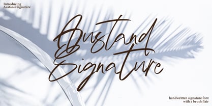 Austand Signature with a handmade Signature style, decorative characters and a dancing baseline! So beautiful on invitation like greeting cards, branding materials, business cards, quotes, posters, and more!! Austand Signature come with 200+ glyphs. The alternative characters were divided into several Open Type features such as Swash, Stylistic Sets, Stylistic Alternates, and Ligature. The Open Type features can be accessed by using Open Type savvy programs such as Adobe Illustrator, Adobe InDesign, Adobe Photoshop Corel Draw X version, And Microsoft Word. And this Font has given PUA unicode (specially coded fonts). so that all the alternate characters can easily be accessed in full by a craftsman or designer. Austand Signature Features : Uppercase & Lowercase International Languange & Symbols Support Punctuation & Number PUA Unicode Range Standard Ligatures Discretionary Ligatures Stylistic Alternates Stylistic Set.
 - Bodoni Classic Ad by Wiescher Design,
$55.00 I became interested in designing Bodoni Classic because of a lazy graphic designer at Jacques Damase publishing house. He had to change a single letter on a bookcover about J. B. BODONI. The French call him Jean Baptiste instead of Giambattista! And that unknown graphic designer just took any old “J” from some newly cut Bodoni. All the new Bodoni cuts have square serifs, whereas the originals had rounded serifs and slightly concave feet. The single letter “J” with the squared off serif was for me like a road sign to start redesigning the entire Bodoni family. That’s exactly what I started in 1993 and a dozen years later I am finished. Okay, I am still adding new Bodoni Classics, but those are my personal additions. Yours very retro, Gert Wiescher


