10,000 search results
(0.065 seconds)
- BF Fiona Slab by BrassFonts,
$36.00See also BF Fiona Serif and BF Fiona Script. - Logotype by Gerald Gallo,
$20.00 Logotype is a sans serif contemporary all caps font.
 - GirderSuper by Wooden Type Fonts,
$15.00 A heavy slab serif font very useful for display.
 - Antique 7 by Wooden Type Fonts,
$15.00 An Egyptian unbracketed heavy serif font, largely for display.
 - Pantext by Jonahfonts,
$25.00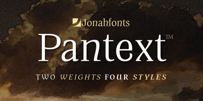 An unusual serif font with a slightly unconventional atmosfere.
 - Gyant by Typotheticals,
$8.00Developed from an earlier sans serif font called Mechanihan. - Looking Glass by SoftMaker,
$9.99 Looking Glass is a serif typeface published by SoftMaker.
 - Dooddle by Gerald Gallo,
$20.00 Dooddle is a casual hand-lettered serif outline font.
 - BF Fiona Script by BrassFonts,
$36.00See also BF Fiona Serif and BF Fiona Slab. - Nagato by Ezequiel Filoni,
$10.00 Nagato, simple, clean and elegant sans serif, pseudo-stencil.
 - Happyjamas by PizzaDude.dk,
$20.00Happyjamas is a playful serif font - the pizzadude way! :) - Mikraot MF by Masterfont,
$59.00 Serif super classic font, high legibility and subtle contrast.
 - Korneuburg Slab Regular, crafted by the talented designer flö rastbichler, beautifully marries the timeless essence of slab serif fonts with contemporary design nuances, creating a versatile and robu...
- The Futurex Slab font, crafted by the innovative team at Apostrophic Labs, is a distinctive typeface that bridges the gap between the future-oriented aesthetics of the digital age and the robust, gro...
- Amariya by Monotype,
$40.99 Designed by Nadine Chahine, the Amariya™ typeface family is intended for long form, on-screen textual content. It supports the Arabic, Persian and Urdu languages. The design is consistent with traditional text typeface models popular in the Middle East, but has a lower level of stroke contrast optimized for on-screen reading. The family is available in nine weights ranging from a light hairline to a very bold black. The middle weights are intended for setting text copy while the extreme hairline and black designs are best suited for headlines, sub heads and similar applications. The Amariya family can be used for numerous projects from branding to blogs, in a variety of interactive design environments on both large and small screens. The fonts include the ITC Charter design by Matthew Carter as a Latin companion.
 - Croissant by ITC,
$39.00Phillip Kelly first drew the Croissant typeface in 1978 for Letraset. Back in the 1970s and 80s, Letraset's rubdown lettersheets were a popular means of designing with type. Today, many of these nostalgic classics are available in digital format. Linotype is pleased to re-present Croissant. This experimental typeface is built up out of round, brush-like strokes, creating heavy, and black letters. These forms are best used for display signage and headline text. If you are designing for a local bakery or donut shop, this typeface may be the perfect fit. The dark, heavy character that Croissant lends to the page is similar to Cooper Black , one of the most renowned American type designs ever produced. If you are looking for a typeface with Croissant's feel, but need to set smaller headlines or text, check out that family's offerings." - Dixplay by Emtype Foundry,
$69.00 Dixplay, a typeface based on a pixel grid, is available in two weights: regular and black. Inspired by video game aesthetics of the 80s, was originally intended for display applications, but it works fine on paper as well. The font has been conceived in 20 px size allowing more freedom to manipulate it and making a big difference with other fonts of its kind, this difference it’s more evident in Dixplay Black. As a result, it’s optimized for screen use at 20 px and its multiples. Spacing is one of the most outstanding aspects of Dixplay. While pixel fonts doesn't have kerning pairs, Dixplay offers more than 300 manually done that fit perfectly to the grid. It is available in Open Type format and supports Western European Languages that uses the Latin alphabet. For more details see the PDF.
 - Eighty Starlight by Godbless Studio,
$17.00 Sneak a peak Eighty Starlight, a font with a futuristic and experimental concept created with a strong and charismatic character. following the current trend design style. Eighty Starlight is made experimentally following a futuristic style recipe with alternate characters made with inktrap and display that makes this font more stylish and varied. Eighty Starlight is a variable font that has 9 weights from thin to black. also includes alternates that are more varied with variables. Eighty Starlight is a versatile font system, designed primarily for display uses with a need of visual impact. Variable : Thin & Italic Light & Italic ExtraLight & Italic Regular & Italic Medium & Italic SemiBold & Italic Bold & Italic ExtraBold & Italic Black & Italic Feature : Alternate Character Ligature Discretionary Ligature Multilingual Support Numeral & Puctuation etc Wish you enjoy our font and if you have a question, don't hesitate to drop message & I'm happy to help.
 - ITC Tyke by ITC,
$29.99Tomi Haaparanta got the idea for the Tyke typeface family after using Cooper Black for a design project. He liked Cooper's chubby design, but longed for a wider range of weights. “I wanted a typeface that was cuddly and friendly,” recalls Haaparanta, “but also one that was readable at text sizes.” He started tinkering with the idea, and Tyke began to emerge. Even though Haaparanta knew his boldest weight would equal the heft of Cooper Black, he began drawing the Tyke family with the medium. His goal was to refine the characteristics of the design at this moderate weight, and then build on it to create the light and bold extremes. Haaparanta got the spark to design type in 1990, when he attended a workshop held by Phil Baines at the National College of Art and Design in Dublin. “I've been working and playing with type ever since,” Haaparanta recalls. He released his first commercial font in 1996, while working as an Art Director in Helsinki. After about two dozen more releases, he founded his own type studio, Suomi Type Foundry, early in 2004. At five weights plus corresponding italics, Tyke easily fulfills Haaparanta's goal of creating a wide range of distinctive, completely usable designs. The light through bold weights perform well at both large and small sizes, while the Black is an outstanding alternative to Cooper for display copy. - Temeraire by TypeTogether,
$49.00 Quentin Schmerber’s Temeraire serif font family was not designed to be invisible. It is a typographic exploration meant to be seen — with its beauty, one could even say beheld. While some fonts aim to be as easily ignored as possible, Temeraire is offered as a gift to wide-eyed readers with its anything-but-boring character and its conspicuous inconsistency in styles. Most type families increase the weight of each character to expand the family. Instead, research into 17th century sources produced Temeraire’s wide range of letterforms, from the predictable to the odd and loosely related through time. Each style is designed to work alongside the others but are also standalone homages to specific parts of English lettering tradition: gravestone cutting, writing masters’ copperplates, Italiennes, and others. Temeraire’s Regular style is a contrast-loving Transitional Serif with vertical stress, making it great for period and classic works, ironic pieces, and modern throwbacks. The weight of the Bold squares off the ends of each glyph to give it stability, and the italic style rings true: flowing, contrasting, and purposefully inconsistent. Temeraire’s Display Black style is one salvaged from expressive gravestone artistry. The details most easily noticed are the ‘g’ with its descending bowl that has been pressed back up in the centre, and the additional serif on the ‘t’ crossbar that holds its neighbouring character at bay. (The ‘g’ and ‘Q’ have loopless alternates.) The final style is the Italienne, the horizontally stressed counterpoint to the family. By design its characters flow and bend in ways not in step with the rest of the family. All the weight has been pushed to either hemisphere within each glyph, resulting in a display style that demands space and peacefulness around it so its presence can impress. As with all TypeTogether families, Temeraire meets the current designer’s needs. Not only does its five styles shine in print work, it includes alternates for when the defaults are too boisterous and has been expertly crafted for screens. The Temeraire serif font family is resurrected from echoes in time and finds its family relation through impeccable taste.
 - Brown Chunkers by Letterhend,
$19.00 Brown Chunkers is an unique serif based display typeface containing many alternates, swashes, ligatures that can make your lettering/logotype become more interesting. The clean and neat of a serif combined with the swirl swashes makes this font one of a kind.
 - IC Havolane by Ironbird Creative,
$7.00 Havolane, A display serif font with a modern vintage twist, ideal for branding, headlines, and packaging. Havolane offers two styles, "Regular" and "Inked," to add versatility and depth to your designs. Perfectly complements sans-serif fonts, making your creations stand out effortlessly.
 - Ronsten by Fontron,
$35.00I know there are already quite a few Stencil type fonts but maybe this fills a niche. A very chunky serif stencil where the serifs are closely aligned and help form the the curves of the letters. An Italic is also available. - SK Reykjavik by Salih Kizilkaya,
$12.99 SK Reykjavik is a modern geometric font family with sans serif and slab serif characters. Supports all typographic elements you will need in Latin, Cyrillic, Greek, Turkish and Baltic alphabets. It contains 32 fonts and 26,208 glyphs and offers full support for ligatures.
 - Gurland by Sans And Sons,
$19.00 Meet our Gurland - Bold Retro Elegant Serif Font A captivating blend of boldness and timeless charm. This font exudes an elegant, vintage vibe with its strong, distinctive serifs and bold strokes. Perfect for making a statement with a touch of retro sophistication.
 - Nünooska by Okaycat,
$29.00 Nünooska is a sans serif type designed by Luke Turvey in 2014. The minimalist charm of Nünooska offers a soft unique style while remaining legible and clean. This rounded geometric sans serif is designed to look excellent for display or printed publication.
 - Town Meeting JNL by Jeff Levine,
$29.00 Town Meeting JNL (available in both regular and oblique versions) is a modified version of Mud Creek JNL (which was based on Tuscan Egyptian – a classic wood type). The side spurs were removed and the split serifs were replaced by slab serifs.
 - Roble by Latinotype,
$26.00 Roble is a Slab Serif Font, from a mix between Andes and Sanchez, following a harmony with both fonts one sans and one serif with a fresh and dynamic result. Roble is a family of 16 display fonts 8 weights plus italics.
 - Canabi by Avchi,
$12.00 CANABI - A classic serif font designed for logo, headline, and suitable for classic design. Combination between serif and condensed style! This is our first product and we will give you the best experience! Multilinguals Numbers & Punctuactions Ligatures Thank you for supporting us!
 - Othello by Monotype,
$29.99 Othello's dense graphic demeanor delivers a straightforward, no-nonsense message. This versatile revival has a direct, experiential quality that suggests action and the outdoors. Originally released by Monotype in 1928, Othello was offered as competition to Rudolf Koch's Neuland typeface. This new digital version includes a wide variety of previously unavailable characters. Small caps, alternate letters, ligatures, and special joined logotype" characters add to the versatility of this powerful communications tool. These many letter variants create new possibilities for headlines and short text blocks in advertisements, signage, and packaging, suggesting the immediacy of woodcuts or hand-drawn lettering."
 - Racers Energy by Din Studio,
$29.00 Do you want energetic designs? Racer energy is a font created in capital letters with the racing theme producing courageous strong impressions in no time making it worth adding to your design list. Letters are made similar to firm rectangle blocks with sharp-angles. Enjoy other incredible features available on this font. Features: Multilingual Supports PUA Encoded Numerals and Punctuation This font looks great on any design projects such as posters, banners, logos, book covers, headings, printed products, merchandise, social media, etc. Find out more ways to use this font by taking a look at the font preview. Purchase it now. Happy designing.
 - TWT Prospero by Three Islands Press,
$24.00TWT Prospero is the kind of typeface you seldom find in blocks of continuous text these days. Similar fonts based on late-18th-century work by Bodoni, the Didots, and others tend to be reserved for display type: their exaggerated contrast and vanishing hairlines can make you squint and strain at small sizes. But TWT Prospero, with its moderate contrast and fairly robust hairlines, is impressively legible in book text while remaining ideal for use in display situations. The full family has seven styles: roman, italic, bold, bold italic, condensed roman, condensed italic, and condensed bold. - Natural Curves OG by Kingpin Designs,
$9.00 'Natural Curves OG' is a friendly typeface that works seamlessly without any trimmings. It's perfect for giving any work a hand-drawn look and feel. The typeface is balanced so the eye doesn't move straight to any singular letter, which means that creating a hierarchy with other elements in your design is simple. Colour blocking to support brand identity is easy with this typeface, and it adds character simply and authentically. This typeface was created for my own brand's identity, and it's been great to add splashes of art in the form of type all over my website and collateral.
 - Adelios by Ilham Herry,
$20.00 Adelios is a display typeface with 12 styles that can stand alone or with layering system. There are 6 styles that can stand alone: Outline, Base 01, Inline, Block, Wireframe, and Monoline, and also allows for mix and match to make this font more decorative by adding Outline, Extrude, Line, Cast, Light, Bottom. Traveling posters, movie theater sign, and Building art deco were the main inspiration for this font. Geometric and decorative shapes are the main characteristics of this font. This font is perfect for Headline, Poster, Signage, Menuboard, Greetingcard, etc. Hope you enjoy with this font.
 - Gangfield by Slex Studio,
$18.00 Based on lettering with a sharp pen, Gangfield features a rather solid character and a measured rhythm. This is named after my nephew who has an optimistic and disciplined style. Gangfield is available in upright variants, with regular, italic and bold weights. Gangfield's bright and cheerful energy shines through either in the form of short blocks of text, or enhanced on display sizes with over 1,100 wildcards and swashes that vary in size and complexity. Gangfield includes 134 alternates with various variations plus several variants of ligatures which make it ideal for special dates such as weddings and parties.
 - Marconi by Linotype,
$29.99 Marconi was created by Hermann Zapf in 1973. According to Gerard Unger, it was the world's first digital typeface. Zapf’s design was developed as a text face for books and magazines. The round forms of the Marconi follow the principle of the superellipse. The lowercase letters are enlarged as the result of reading tests, while the capital letters are slightly reduced. The 8-point size — normally used for newspapers — looks more like 9 1/2 points. Marconi is a legible typeface with its large and open lowercase letters. It is ideal for long text blocks in newspaper, book, and magazine production.
 - Crimmy by HansCo,
$15.00 Crimmy is a modern and clean brush with natural a handwritten font. This texture is very detailed. You can see the swash brushes as alternate characters in this font. Crimmy is suitable for logos, shirts, fashion, blogs, websites, product branding, posters, flyers, any print template or for text overlay to any background image. How to use alternate: if you use Adobe / Corel Draw you just block one of the letters / numbers (for swash) and an arrow will appear under the letter, and you can replace it with alternative characters. Alternative character ready for " f , g , j , y and numeral 0 - 9 "
 - Hiroshima Gyoshi by 38-lineart,
$14.00 Hiroshima Gyoshi is a handwritten font inspired by ancient Japanese calligraphy. The thick and random strokes look very prominent and play with negative space. You will feel the rhythm in irregularity. it is a bold handwritten font, carefully handcrafted to become a true favorite. Its casual charm makes it appear wonderfully down-to-earth, readable and, ultimately, incredibly versatile. This fantastic font is best suited for headlines of all sizes, as well as for blocks of text that have both maximum and minimum variations. Whether it’s for web, print, moving images or anything else – Hiroshima Gyoshi will look spectacular
 - RM True To Type by Ray Meadows,
$19.00 Throw away the carbon paper, ribbons and Tippex ... now you can get that typewritten look with RM True to Type. Legible at all sizes, it is available in regular and bold. That faithful old typewriter has given many years of valiant service, but now the keys are worn and blocked with ink. The Old styles replicate the wear and tear of years of use. Includes: Western European, Central European, Baltic & Turkish sets Due to the modular nature of this design there may be a slight lack of smoothness to the curves at very large point sizes (around 100 pt and above).
 - UT Laurelle by Uniontype,
$20.00 Laurelle is a polished and smooth script family. The family consists of light, regular, bold and press styles. Laurelle provides advanced typographical support with contextual alternates, final forms, ligatures and swashes. This font also includes Cyrillic, with all OpenType features. It is most suitable for the headlines of all sizes, as well as for the text blocks. Laurelle is versatile and can be used on cards, posters, merchandise, book covers, websites, packaging, and basically anywhere you like. The overall feel of the font is warm, elegant and informal and it is perfect if you want to convey a sense of friendliness and style.