10,000 search results
(0.036 seconds)
- IMPuzzled by Ingrimayne Type,
$9.00 IMPuzzled uses the OpenType feature of Contextual Alternatives to alternate two sets of characters. The sets are on two puzzle pieces that tessellate, that is, fit together to fill the plane with no gaps or overlaps. Empty pieces are on the brace keys and can be used to fill spaces. The black or solid style is designed to be used in a layer under the regular style, though it can be used alone if adjacent pieces are given different colors. This unusual font has limited uses but may be appropriate when the topic is related to the broad areas of puzzles, puzzled, and fitting pieces together.
 - Hippie Mojo by Mysterylab,
$18.00 Set the wayback machine for about 1967. Smell the patchouli? Now you can inject just the right dose of swirly-licious mojo into your retro design with this original vintage-styled sixties font. But as with many psychedelic hippie lettering designs, the history reaches back even further; it owes a designer's debt of gratitude to the designs of the Art Nouveau era as well. This is predominantly a uni-case alphabet, but also features a few alternative characters in the lower case – at the full height of the capitals. With an extensive character set and multilingual glyphs, you can use Hippie Mojo to say "Groovy baby" in many languages. Evoke the carefree and tripped-out vibe of the psychedelic era with Hippie Mojo; it's pure retro fun!
 - Psych Handlettering by Mysterylab,
$14.00 Here's a font system distilled from the lettering styles of a thousand vintage psychedelic rock albums and posters from the swingin' sixties. All of the grooviness, but perhaps twice the legibility of some of the more "far out" examples from the genre. This family features an extensive character set and multilingual glyphs, so you can say "Trippy, Man." in many languages. The three versions allow you to harmonize letter bodies and highlight strokes with the color palette of your project Once loaded on your system, the three versions of the font show in your menu as the following three "weights": Psych Handlettering Bold, Psych Handlettering Incised, and Psych Handlettering Highlight. The 3-alphabet collection works together seamlessly to allow you to assign one color to the body of the letter, and a second color to the inset highlight lines. Just copy your text block, paste in place, reassign the font to the "highlight" version, choose a complimentary color, and off you go.
 - Ernest & Emily by Nicky Laatz,
$15.00 I’d like to introduce you to Ernest and Emily :) ....The happiest font duo you'll ever meet :) They are completely in love with each other, and always get along like a house fire :) Ernest and Emily consist of two lovingly handwritten fonts. A brushed quirky-casual script, and a playful all-caps sans-serif font. Perfect for Type-based creations, branding, websites, merchandise, packaging, quotes, invites, greetings and so much more! All they need is a blank canvas, and they work their magic for you! The brush script comes in 3 variants - Regular, Slanted and Upright- each with its own twist to fit the look you need. Four sweet little heart glyphs can be found by typing the characters { } and [ ] individually. Well now that I've introduced you, I'll let you get properly acquainted! :)
 - Amitale by Hackberry Font Foundry,
$24.95 Amitale (A-mi-tah'-lay) is the union of Amitale Book and Amitale Wide into a new 8-font book family in my continuing objective of designing a better font family for readability in booklets. My goal here is for a full range of styles from light, regular, bold, and black without the plugged counters and clunky feel of most bold fonts. In my use, personally. I do not use Amitale Book Bold. I use Wide for the bold and Wide-Bold for the black style. In many ways, Amitale is Brinar with bracketed serifs. Many people find Brinar to be an exceptionally readable and beautiful humanist sans. This new serif font family has many of the same characteristics. This is also the debut of my new OpenType features set for 2009. There are more and more ligatures for your fun and enjoyment: bb gg ff fi fl ffi ffl ffy fj ft tt ty Wh Th and more. Like all of my fonts, there are: caps, lowercase, small caps, proportional lining figures, proportional oldstyle figures, & small cap figures, plus numerators, denominators, superiors, inferiors, and a complete set of ordinals 1st through infinity.
 - Gubia by Graviton,
$20.00 Gubia font family has been designed for Graviton Font Foundry by Pablo Balcells. It is a geometric, sans serif typeface with a slightly condensed design. It has been conceived to be most suitable for all sized headlines, as well as short and middle length text blocks. The standard styles give texts a classic appearence while alternate styles give texts a playfull one. Gubia consists of 8 styles, 4 weights plus alternates, each containing small caps and glyph coverage for several languages.
 - Magazine Grotesque by Latinotype,
$29.00 Magazine Grotesque is a sans-serif font specially designed for headlines and titles. Its unique features make it different from the traditional Grotesk typefaces. For example, outstroke extending beyond body in 'a' and 'e' letters or closed aperture in 'c', creating an unusual rhythm. Magazine Grotesque is the perfect choice for logos, titles, headlines and short blocks of text. As you would expect from Latinotype, this face comes with a standard set of 487 characters that support over 200 Latin-based languages.
 - Nebulosa by Graviton,
$20.00 Nebulosa font family has been designed for Graviton Font Foundry by Pablo Balcells in 2020. It is a futuristic, slightly extended sans serif typeface with semi rounded endings that provide a softened aesthetic without losing its solidity. Nebulosa has been conceived to be most suitable for logos, headlines and display design pieces as well as short length text blocks. Nebulosa consists of 10 styles, 8 of which containing small caps and glyph coverage for several language and 2 of which are free.
 - Horsefeathers by Patricia Lillie,
$29.00Play a while with Horsefeathers, and you'll find yourself feeling kind of a combination of giddy and up. a lively, animated font that draws attention in short bursts yet has remarkable balance in longer text blocks, even at smallish point sizes. And that can be said for all three styles: Regular, Bold, and the aptly-named Horsefeathers Buzzsaw. - Next Stop by Kenneth Woodruff,
$15.00Every possible character in the standard encoding set has been designed, using a block system which is based on varying shapes, rather than the more common grid or dot-based signage systems. Each font contains 188 glyphs. Next Stop was designed for contiguous flow, and can be made pseudo-monospaced by using spacers in the fi and fl ligatures. - Phervasans by Emboss,
$12.95 If you build a block, they will come.
 - Kiddie Blokz JNL by Jeff Levine,
$29.00Kiddie Blokz JNL is a limited character set font in three styles: Regular, Lined and Block, emulating the look of toy blocks for themes with a juvenile motif. For a companion font to set regular copy, use Roughshod JNL. - Happy Holidays by Comicraft,
$19.00 Back in 2006 when we first released our Happy Holidays font, we thought the War on Christmas was over! We'd taken down our Menorahs, our Christmas trees, reclining Buddhas and red, black and green Kwanzaa decorations, and were prepared to sprinkle nothing more than a little Season's Greetings over our end of year celebrations. When we saw our friends and neighbors at department stores, we'd greet them with a simple, cordial, non-denominational “Happy Holidays.” But the font showed up at our company party this year having learned over 200 new languages (and, it must be said, a little bit loaded on Stylistic Alternates) in a mood to celebrate EVERYTHING. It was wishing people happy Bodhi Day, Solstice, Festivus, you name it! It even brought (count 'em) THREE new outfits based on the colors of Christmas, Hanukkah and Kwanzaa. So may the designs on the cups of the hot beverages that take you through the long dark coffee break of the soul that stretches from Halloween to Thanksgiving to New Year's Day be a little more festive this year with the refreshed, Remastered, all-inclusive spirit of Happy Holidays!
 - Monotype Old English Text by Monotype,
$40.99Old English is a digital font that was produced by Monotype's design staff, circa 1990. But its roots go much further back: the face's design is based on that of Caslon Black, a Blackletter type cast by the venerable William Caslon foundry in England, circa 1760. This design has been popular throughout England for centuries. Its style of lettering, conveniently also called Old English, can be found all over the UK. Old English-style typefaces belong to the Blackletter category. They nicely combine the design attributes of both the medieval and Victorian eras. This is mostly because their Textura forms, which were born during the Middle Ages, became quite fashionable again in the late 1800s! This Old English font is very legible for a Blackletter face. Perhaps that is why it is more familiar to readers in the UK and North American than German Blackletter varieties, like Fraktur. A favorite once again today, Old English is ideal for certificates, diplomas, or any application which calls for the look of stateliness and authority. It's a sturdy and sure bet for newspaper banners, holiday greeting cards, and wedding announcements. - Old English by Monotype,
$40.99 Old English is a digital font that was produced by Monotype's design staff, circa 1990. But its roots go much further back: the face's design is based on that of Caslon Black, a Blackletter type cast by the venerable William Caslon foundry in England, circa 1760. This design has been popular throughout England for centuries. Its style of lettering, conveniently also called Old English, can be found all over the UK. Old English-style typefaces belong to the Blackletter category. They nicely combine the design attributes of both the medieval and Victorian eras. This is mostly because their Textura forms, which were born during the Middle Ages, became quite fashionable again in the late 1800s! This Old English font is very legible for a Blackletter face. Perhaps that is why it is more familiar to readers in the UK and North American than German Blackletter varieties, like Fraktur. A favorite once again today, Old English is ideal for certificates, diplomas, or any application which calls for the look of stateliness and authority. It's a sturdy and sure bet for newspaper banners, holiday greeting cards, and wedding announcements.
 - Old English (Let) by ITC,
$29.99 Old English is a digital font that was produced by Monotype's design staff, circa 1990. But its roots go much further back: the face's design is based on that of Caslon Black, a Blackletter type cast by the venerable William Caslon foundry in England, circa 1760. This design has been popular throughout England for centuries. Its style of lettering, conveniently also called Old English, can be found all over the UK. Old English-style typefaces belong to the Blackletter category. They nicely combine the design attributes of both the medieval and Victorian eras. This is mostly because their Textura forms, which were born during the Middle Ages, became quite fashionable again in the late 1800s! This Old English font is very legible for a Blackletter face. Perhaps that is why it is more familiar to readers in the UK and North American than German Blackletter varieties, like Fraktur. A favorite once again today, Old English is ideal for certificates, diplomas, or any application which calls for the look of stateliness and authority. It's a sturdy and sure bet for newspaper banners, holiday greeting cards, and wedding announcements.
 - Cooper Poster by GroupType,
$15.00 Cooper Poster was inspired by showcard lettering samples featured in the book, Commercial Art Of Show Card Lettering, published in 1945. Although named ""Western"", the design was modeled after Ozwald Cooper's 1921 original Cooper Black.
 - Ounce by Typomancer,
$26.00 Ounce is a didone typeface, a combine of high-contrast and rounded characteristic gives a unique feeling. Ounce comes with various weights from Light to Black and two options for Italic. Especially, headline for display.
 - Glendale by Sarid Ezra,
$15.00 Introducing, Glendale - an extreme expanded sans family! Glendale is a basic sans font with unique lowercase form. With expanded lowercase, this font will standout and make a great choice for your next project! The important things is, you can access the special features with any software. You can use this font for any designs. Cool for logos and powerful for posters! With light, regular, and bold version, you can make your headline text more standout! This font also support Multi Language.
 - Eskapade by TypeTogether,
$53.50 The Eskapade font family is the result of Alisa Nowak’s research into Roman and German blackletter forms, mainly Fraktur letters. The idea was to adapt these broken forms into a contemporary family instead of creating a faithful revival of a historical typeface. On one hand, the ten normal Eskapade styles are conceived for continuous text in books and magazines with good legibility in smaller sizes. On the other hand, the six angled Eskapade Fraktur styles capture the reader’s attention in headlines with its mixture of round and straight forms as seen in ‘e’, ‘g’, and ‘o’. Eskapade works exceptionally well for branding, logotypes, and visual identities, for editorials like magazines, fanzines, or posters, and for packaging. Eskapade roman adopts a humanist structure, but is more condensed than other oldstyle serifs. The reason behind this stems from the goal of closely resembling the Fraktur style to create harmony in mixed text settings. Legibility is enhanced by its low contrast between thick and thin strokes and its tall x-height. Eskapade offers an airy and light typographic colour with its smooth design. Eskapade italic is based on the Cancellaresca script and shows some particularities in its condensed and round forms. This structure also provided the base for Eskapade Fraktur italic. Eskapade Fraktur is more contrasted and slightly bolder than the usual darkness of a regular weight. The innovative Eskapade Fraktur italic, equally based on the Cancellaresca script previously mentioned, is secondarily influenced by the Sütterlin forms — an unique script practiced in Germany in the vanishingly short period between 1915 and 1941. The new ornaments are also hybrid Sütterlin forms to fit with the smooth roman styles. Although there are many Fraktur-style typefaces available today, they usually lack italics, and their italics are usually slanted uprights rather than proper italics. This motivated extensive experimentation with the italic Fraktur shapes and resulted in Eskapade Fraktur’s unusual and interesting solutions. In addition to standard capitals, it offers a second set of more decorative capitals with double-stroke lines to intensify creative application and encourage experimental use. The Thin and Black Fraktur styles are meant for display sizes (headlines, posters, branding, and signage). A typeface with this much tension needs to keep a good harmony between strokes and counters, so Eskapade Black has amplified inktraps and a more dynamic structure seen in the contrast between straight and round forms. These qualities make the family bolder and more enticing, especially with the included uppercase alternates. The Fraktur’s black weights are strident, refusing to let the white of the paper win the tug-of-war. It also won’t give away its secrets: Is it modern or historic, edgy or amicable, beguiling ornamentation or brutish presentation? That all depends on how the radically expanded Eskapade family is used, but its 16 fonts certainly aren’t tame.
 - Adana by astype,
$19.00 The roots of Adana going back to the year 1930, to the Berlin-based German graphic designer Wilhelm Berg. His typeface can be interpreted as an answer to Lucian Bernhards Schönschrift. Adana Circular and Regular play well together in all kinds of adverts, as well with designs like Bodoni or Didot.
 - British Stencil JNL by Jeff Levine,
$29.00 British Stencil JNL was sketched from images of a vintage stencil set made by Reese and Sons of England that was being sold on ebay. In truth, this is a semi-stencil, as some of the characters are solid; lacking the breaks in the letter shapes so typical of stencil alphabets.
 - Cambridge by AVP,
$29.00 Cambridge seeks to build on the popularity of Fiendstar amongst educational publishers and advertisers who need easy-to-read text in a classic sans serif format. Cambridge is an elegant typestyle that is equally at home in a schoolbook or an annual report. Feedback from users has resulted in a handful of changed letterforms which remove any ambiguities between similar letter forms. The family contains four weights in three widths and now benefits from matching italic form for all variants. Cambridge Round provides a rounded version of all styles, useful for headings and more informal texts.
 - Schadenfreude by Comicraft,
$19.00 We don't mean to gloat, but we have to say that it gives us immense, malicious pleasure and joy to supplant other popular germanesque letterforms with this, remarkably superior font. This successful addition to our DEAD cool POOL of ACHTUNG BABY alphabets will, no doubt, make you feel that your own library of teutonic fonts is now severely lacking. We're that mercenary, we're Mercs with Mouths, you might say. Wait, did we say that we DON'T mean to gloat? Actually, we do.
 - Dilemma by Sudtipos,
$39.00 Dilemma is a sans/sans serif type system with 42 styles; it is inspired by the anonymous Polyphème, Cyclopéen and Extra Condensé designs from the early 1900s at the Peignot Fonderie. From these initial points of reference, Sudtipos went further and reimagined these projects for an actual use by blending them into a unique and complex type system. Dilemma is defined as ‘a situation in which a difficult choice has to be made between two or more alternatives, especially ones that are equally undesirable’ and that is exactly how we designed this font. We created a workhorse system where each style functioned well alone but would be more powerful when working as a team, pairing the sans styles with the serifs. Dilemma comes in 3 different widths and 7 weights in both the sans and the serif, ranging from the more economical yet legible condensed styles, to the opulent bold and expanded weights. Dilemma also contains 2 Variable Fonts. We imagine Dilemma being used in a limitless array of graphic projects including identity systems, digital platforms, public spaces, editorial design and beyond. Now the Dilemma is yours.
 - Smooth Batters by Balpirick,
$15.00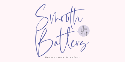 Smooth Batters is a Modern Handwritten Font. Smooth Batters feels equally charming and elegant. It looks stunning on wedding invitations, thank you cards, quotes, greeting cards, logos, business cards and every other design which needs a customized touch. This font is PUA encoded which means you can access all glyphs and swashes with ease! - also multilingual support Enjoy the font, feel free to comment or feedback, send me PM or email. Thank you!
 - Goliath Soldier by Balpirick,
$15.00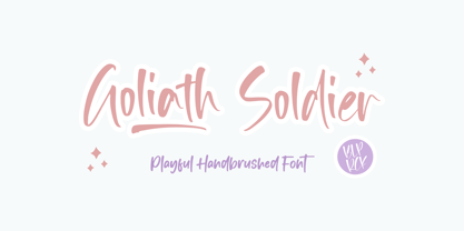 Goliath Soldier is a Playful Handbrushed Font. Goliath Soldier feels equally charming and chic. It looks fun on wedding invitations, thank you cards, quotes, greeting cards, logos, business cards and every other design which needs a customized touch. This font is PUA encoded which means you can access all glyphs and swashes with ease! - also multilingual support - Ligatures & Swash Enjoy the font, feel free to comment or feedback, send me PM or email. Thank you!
 - Calisto by Monotype,
$29.99The appeal of Calisto as a text face lies in its very even color on the page, while its robust construction means that it can work equally well at display sizes. The slightly calligraphic treatment of letter shapes and the classical proportions give Calisto a clean elegance on the page. The Calisto font is a graceful and interesting addition to the typographer's repertoire and will prove particularly useful for book, magazine and advertising work. - Secca Art Std by astype,
$36.00 Secca Art recovers some of the expressive forms of early art nouveau and art deco grotesques — not copying it, but carefully adapting it for today. Secca Art is based on the Secca typeface family and is full interchangeable. Both are equal in weights, widths and word spacing, so you can decide to give your layout a more expressive or serious look. If you need Italic styles just use the Italics from Secca .
 - Coma by Barnbrook Fonts,
$30.00 In its original form Coma was designed for use alongside Japanese typography. The uniform shape of Coma's letterforms allow it to be set horizontally or vertically with equal ease. With a striking profile, modular form and contemporary character, Coma can be used in myriad configurations. The name Coma refers to the perplexity of contemporary existence, to be assaulted by an endless stream of news and stimuli, and to feel paralysed and exhausted by it all.
 - FF Marselis Slab by FontFont,
$62.99 Danish type designer Jan Maack created this slab FontFont in 2013. The family has 8 weights, ranging from Light to Black (including italics) and is ideally suited for advertising, packaging, logo, and branding as well as web and screen design. FF Marselis Slab provides advanced typographical support with features such as ligatures, alternate characters, case-sensitive forms, fractions, super- and subscript characters, and stylistic alternates. It comes with a complete range of figure set options – oldstyle and lining figures, each in tabular and proportional widths.
 - Narevik by ParaType,
$30.00 Narevik consists of 7 styles -- 4 uprights (including black) and 3 italics. It’s a type of dynamic low contrast design with slightly rounded triangle serifs and drops which conveys to it a certain peculiarity. The vertical strokes have gentle intasis that brings additional softness to the shapes. The family was created by Armenian designer Manvel Shmavonyan and got its name after his daughters Nare and Arevik. It can be used in text composition as well as in display matters. Released by ParaType in 2011.
 - Swissra Condensed by Abjad,
$- Following the great success of Swissra, the condensed cut was designed on the same principles of Swiss graphic design. Originally Swissra was designed to create a neutral and carefully crafted Arabic font family that can be used on many different applications. Now it creates even more possibilities to help designers in applications such as signage and editorial design where the condensed cut is needed. The typeface is one of very few Arabic condensed typefaces. Swissra Condensed comes in eight weights which range from Ultralight to Black.
 - Woody by Wiescher Design,
$39.50 Frans Masereel wrote or should I rather say cut some "novels in pictures" around 1927. They are written in powerful black and white woodcuts and were apparently printed from the original cuttings, at least that what it looks like. On the cover he cut the titles in rough wooden letters. Those letters inspired me to produce Woody. Maybe some day I will add a second weight, wich will be an extended cut. But for the time being this is enough woodwork. Your woodcutter Gert Wiescher
 - Roca by My Creative Land,
$29.00 Initially started as an extension to Praline MCL, Roca transformed into a new font family - influenced by the same fonts as Praline - Windsor and Cooper Black - the hits of 60s and 70s – with a hint of Bookman. Created in 2 styles and 6 weights that can be mixed and match, it contains 24 fonts including alternates and true italics . It is full of OpenType features – stylistic alternates and ligatures. This multilingual font family supports most of the European languages as well as Cyrillic ones (Russian and Ukrainian).
 - Aktifo by Degarism Studio,
$45.00 Aktifo is designed with two Flavour which carries a modern and contemporary style, based on elementary geometric shapes and constructed of monolinear lines, it was invented to be functional, leaving behind anything that can be regarded as superfluous. Aktifo comes in 28 styles: there are two types of families Actifo A and Aktifo B from Light to Black, which both have differences in characters and spaces. Developed with powerful opentype features, equipped with extended language support: Cyrillic, Greek (BETA) and fractions, tabular figures, arrows, ligatures and more.
 - LOLO Dingcats by Okaycat,
$24.50LOLO Dingcats are here! Need some cats? Find just about any kind of cat you can imagine here. Not just a A-Z & 0-9 font, LOLO Dingcats has many extra characters. Check it out! There's a mother cat nursing kittens, a cat curled up sleeping, running cats and sleeping cats.There are black cats, white cats and striped cats. Even cats you might not expect: a pirate cat, a cat with an afro, even a robot cat -- and MORE! A must-have for any serious cat lover! - Canciller by Corradine Fonts,
$29.95 Canciller is an elegant typeface designed by Manuel Corradine and Sergio RamÌrez that will give your projects a very exclusive and fresh appearance. Its style is a mix between the grace of calligraphy and the legibility of typography so Canciller can be used in a wide range of purposes. It’s available in six weights that go from light and delicate to black and powerful to give the designer the possibility of creating hierarchies and great contrasts. Its character set supports Western and Central European languages.
 - Malevich by BBDO Studio,
$19.00 Hi! I am Black Square! Probably the most famous square in the world. Thanks to my godfather Kazimir Malevich, who created me in 1915, this year I am celebrating 100th anniversary. Let me tell you what a great gift I just got! It`s a family of almost 300 letters and symbols suprematic as suprematic can be - shapes, form attacks, booms and even hashtags! All under the name of Malevich Font. Isn`t it a great present for my anniversary? Thank You BBDO Ukraine
 - Krete by BluHead Studio,
$29.00 BluHead Studio continues its collaboration with British designer Roy Preston by producing Krete, Roy’s latest text family. This first release of 12 weights includes Light, Book, Regular, Medium, Bold, and Black, each with a drawn italic.