10,000 search results (0.203 seconds)
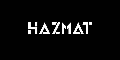
  1. HAZMAT by Little Fonts, $15.00
    Inspired by a love of geometry, combined with an obsession with all things stencil type! HAZMAT is a distinctive stencil, using angular characters to give the font an energetic look and feel. Created with the intention to be different from other stencils, the cut of the font has been designed to create eye catching and intriguing displays. HAZMAT works very well at small sizes for legible and detailed typesetting and is equally successful when used at bigger sizes for creating large format, powerful graphics. The font is available in two styles - Regular & Oblique.
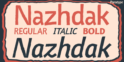
  2. Nazhdak by ParaType, $30.00
    Nazhdak is a handwriting sans serif of three styles sketched with a felted pen and digitized afterwards. Designed in 2001 under the impression of Erik van Blockland's FF Kosmik typeface. Nazhdak is searching and investigating boundaries between regular and irregular typefaces. In spite of ragged letterforms and general laxity the face is rather good for small sizes, and in large sizes it completely shows its crude fascination. The main destinations are small informal text compositions and display typography. Nazhdak was designed by Zakhar Yaschin and released by ParaType in 2009.
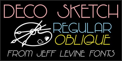
  3. Deco Sketch JNL by Jeff Levine, $29.00
    An interesting hand lettered example of Art Deco lettering (minus the letter ‘L’) was spotted on Pinterest and served as the inspiration for Deco Sketch JNL. Because there was no attribution as to the age or source of the alphabet, it can only be surmised that it was a scan from a 1930s or 1940s source. The original showed many of the irregularities of pen lettering, and had rounded terminals. The digital version has been redrawn more uniformly with flat terminals. Deco Sketch JNL is available in both regular and oblique versions.
  4. Golden Decades by Dharma Type, $19.99
    Back to the basics. In the last ten years, type design has been confronting chaotic scene. The font market is flooded with a mixture of wheat and chaff and typography becomes increasingly complex. But one golden straight path exists. The path began from the industrial revolution, passing through swiss style, now we walk along the path as a matter of course. It is sans-serif. The decades from the Swiss style, namely "less is more age" to the contemporary basic style "Less, but better age", we call it golden decades. In those decades, type design met modernism. Go back to a theory in the golden decades, we redesigned new geometric, minimal sans-serif. Less is more and better. We added cool and calm spices to the modernism in the golden decades. As a result, letterform has a contemporary, sharp, and neutral atmosphere, and geometric rounded bowls and counters create a nice rhythm. Golden Decades consists of 8 weights and their matching Italics for a wide range of usages. Farther, Golden Decades is supporting international Latin languages and basic Cyrillic languages including Basic Latin, Western Europe, Central and South-Eastern Europe. Also, Golden Decades covers Mac Roman, Windows1252, Adobe1 to 3. This wide range of international characters expands the capability of your works. Lowercase "a" has OpenType stylistic alternate for advanced typography.
  5. Skeletor - Personal use only
  6. SUNCUT - Personal use only
  7. Barista - Personal use only
  8. Spectral - Personal use only
  9. Kroftsmann - 100% free
  10. space bounce - Personal use only
  11. Shamrock - 100% free
  12. Graffy Crazzy - Personal use only
  13. English Wd - Unknown license
  14. Babylon5 - Unknown license
  15. Bad - Unknown license
  16. Liquid Ex - Unknown license
  17. Electrik Hollow - Unknown license
  18. Pecot Anical - Unknown license
  19. University Ex - Unknown license
  20. RedPixel - 100% free
  21. Agelast - Personal use only
  22. Handmade - Personal use only
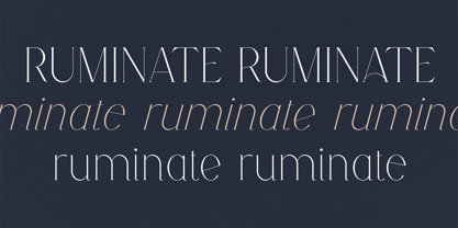
  23. Ruminate by VP Creative Shop, $12.00
    Introducing Ruminate - serif typeface - regular and italic fonts Ruminate is feminine and elegant typeface with multilingual support. It's a very versatile font that works great in large and small sizes. This font is perfect for branding projects, home-ware designs, product packaging, magazine headers - or simply as a stylish text overlay to any background image. FEATURES Uppercase, lowercase, numeral, punctuation & Symbol 3 fonts - regulat, alternate, italic alternate glyphs Multilingual support No special software is required to type out the standard characters of the Typeface. Canva friendly Feel free to contact me if you have any questions! Mock ups and backgrounds used are not included. Thank you! Enjoy!
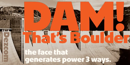
  24. Dez Boulder by Dezcom, $39.00
    A Bold Display Family in Three Personalities: ego, id, and alter. Dez Boulder works like a character actor, presenting the author’s lines but not with the deadpan delivery of a news reporter. Boulder develops the role, adding meaning through facial expression, gesture, and body language. The Dez Boulder family of display faces acts in a supporting role to give meaning to message and context to content. It is a very bold face, not understated. Each of its three personalities (and their sub-personalities) have a different timbre to speak the nuance of your message in a bold voice. Dez Boulder averages more than 800 glyphs per style with uppercase, lowercase, small caps, proportional lining figures, small cap figures, superiors, inferiors, fractions, stylistic sets, alternates, ordinals, case specific punctuation, and more. It has a full range of diacritics and covers all European languages using the Latin script.
  25. Concave Tuscan X by Wooden Type Fonts, $20.00
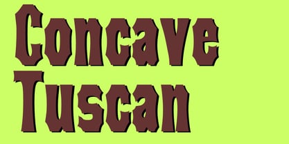
    A revival of one of the popular wooden type fonts of the 19th century, condensed, bold, a very useful design for display.
  26. Latin Extra Condensed by Bitstream, $29.99
    The American nineteenth century display form as handed down through ATF and the composing machine companies, largely for use in newspaper headlines.
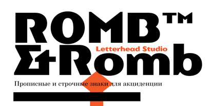
  27. Romb by Letterhead Studio-VG, $35.00
    Romb is the display font based on feeling of the retro typefaces of the early 20th century. Good for posters, magazines, packaging.
  28. Estilo by DSType, $21.00
    Estilo is a very elegant headline typeface in a 30s style with plenty of ligatures for better design possibilities and includes Greek.
  29. Cheval by Solotype, $19.95
    Formalized from some hand lettering by the multifaceted Jugendstil designer Bruno Mauder, perhaps better known for his work in glass and ceramics.
  30. Gothic No.13 by Bitstream, $29.99
    A dark, condensed, nineteenth century sanserif made popular by Linotype, the capitals deriving from Barnhart Brothers and Spindler, the lowercase from Farmer.
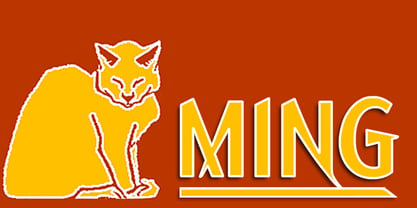
  31. Ming by K-Type, $20.00
    A sans serif with the futuristic retro, Art Deco feel of mid 20th century science fiction, particularly the early Flash Gordon serials.
  32. Industrial Gothic by Monotype, $29.99
    Industrial Gothic recalls the Industrial Revolution of the 19th century. There are four styles: Single-Line, Double-Line, Banner, and Small Caps.
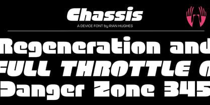
  33. Chassis by Device, $39.00
    A hefty, powerful geometric sans with weight and presence. The unusual counters are defined by lines which cut into the letter shapes.
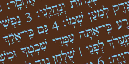
  34. Hebrew Modern by Samtype, $49.00
    This is a classic design from the beginning of the 20th century. This font can be used in many kinds of books
  35. Slab Four Rounded Bold by Wooden Type Fonts, $15.00
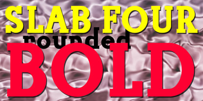
    An original slab serif design inspired by the slab serif designs of the 19th century, with a modern geometric look, bold version.
  36. Slab Four Rounded Super by Wooden Type Fonts, $15.00
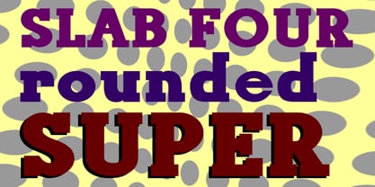
    An original slab serif design inspired by the slab serif designs of the 19th century, with a modern geometric look, extra bold.
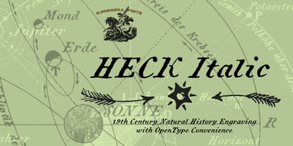
  37. Heck Italic by E-phemera, $20.00
    Heck Italic is based on captions, labels and legends appearing on 19th-century maps and natural history engravings by J. G. Heck.
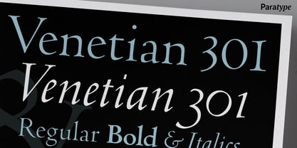
  38. Venetian 301 by ParaType, $30.00
    Venetian 301 is the Bitstream version of the Centaur type family. Centaur was designed by the American book designer Bruce Rogers on the basis of Venetian typefaces of 1470 of Nicolas Jenson. Beautiful Italic based on a face by Ludovico degli Arrighi was developed by Frederic Warde who was an American calligrapher and typography researcher was added as Italic to Centaur. Adapted for mechanical composition by English Monotype in 1929. Its lettershapes owe much to pen-drawn letters of Italian humanist minuscule and cursive. This elegant humanist face is useful for the finest typography both for book text and display matter. Cyrillic version included small caps was developed for ParaType in 2003 by Dmitry Kirsanov.
  39. Aquiline by GroupType, $24.95
    Handsome, adventurous, legible and elegant, this script has the feel of practical handwriting from past centuries. Aquiline is based on a cursive italic style influenced by the 16th century European writing masters. The Aquiline design team turned to Ludovico degli Arrighi, the great 16th century writing master, for period ideas on how to improve, strengthen and add grace to the font. Aquiline has strokes and gestures that seem very like the writing of Arrighi and Mercator, such as the flamboyant balloon of a flourish on the cap A; the graceful flourishes on the cap B, D, and L; and the compact lowercase with tall ascenders. Aquiline has a strong personality and is historically correct.
  40. Debacle by Reserves, $39.99
    Debacle is a super bold contrastive display face built upon pure geometric shapes. Sharp, angular lines are countered against obtuse rounded forms creating a striking visual discord. Select inner corners are rounded, giving characters dual attributes, while linear round-end counters simultaneously contrast and compliment the square-ended punctuation and symbols. Stylistically, Debacle’s prominent letterforms effortlessly create type-as-image text settings. Its style relates to the lush display typefaces from the seventies, yet is highly contemporary in its refinement and finish. Features include: Precision kerning Basic Ligature set including ‘f’ ligatures (ae, oe, fi, fl, ffi, ffl, ff, fh, fj, ft, tt, th, ct, st, la, aj, fa, ls, es, ev, ew, tz, lv, lw, ti, it, ea, kv, ka, ky, yx, xy, yy, km, yw, wy, yv, vy, kw) Alternate characters (O, Q, _, $, ®, •) Slashed zero Full set of numerators/denominators Automatic fraction feature (supports any fraction combination) Extended language support (Latin-1 and Latin Extended-A) *Requires an application with OpenType and/or Unicode support.
Looking for more fonts? Check out our New, Sans, Script, Handwriting fonts or Categories
abstract fontscontact usprivacy policyweb font generator
Processing