10,000 search results (0.021 seconds)
  1. Jean Paul Fraktur by RMU, $25.00
    A typographic treasure, originated at the end of the 18th and the beginning of the 19th century, had been brought back to life. With its charming touch it makes a wonderful font for poems, bookcovers, reprints and other historically relevant projects. To get access to all ligatures, it is recommended to activate both Standard and Discretionary Ligatures; the round s you find on the # key, and typing the combination N-o-period and activating the OT feature Ordinals gets you the numero sign.
  2. Sean's Other Hand by Sean Johnson, $13.99
    Sean’s Other Hand is a hand-drawn font and was created as an alternative to the popular Hand Of Sean font, by the same designer. It has a looser, more natural feel and is best suited to applications where a more organic, hand-written style is needed. Great for annotating sketches, notebooks and wireframes. Great for use on natural product packaging.
  3. Coffee Beans Time by TypoGraphicDesign, $9.00
    The typeface Coffee Beans Time is designed from 2018–2022 for the font foundry Typo Graphic Design by Manuel Viergutz and Annelena Grascht as a graphic design and photography project. The display font based on the original coffee beans and create a dingbat pattern. 3 font-styles (Dingbats, Mix, Coffee Ground) with 304 glyphs (Adobe Latin 2) incl. decorative extras like icons, arrows, dingbats, emojis, symbols, geometric shapes (type the word #LOVE for ♥︎ or #SMILE for ☺ as OpenType-Feature dlig) and stylistic alternates (2 stylistic sets). For use in logos, magazines, posters, advertisement plus as webfont for decorative headlines. The font works best for display size. Have fun with this font & use the DEMO-FONT (with reduced glyph-set) FOR FREE! ■ Font Name: Coffee Beans Time ■ Font Styles: 3 (Dingbats, Mix, Ground) + DEMO (with reduced glyph-set) ■ Font Cate­gory: Dis­play for head­line size ■ Glyph Set: 304 glyphs (Adobe Latin 2) incl. extras like icons (decorative extras like arrows, dingbats, emojis, symbols) ■ 93 languages: Afrikaans Albanian Asu Basque Bemba Bena Breton Catalan Chiga Cornish Danish Dutch English Estonian Faroese Filipino Finnish French Friulian Galician German Gusii Indonesian Irish Italian Kabuverdianu Kalenjin Kinyarwanda Luo Luxembourgish Luyia Machame Makhuwa-Meetto Makonde Malagasy Manx Morisyen North Ndebele Norwegian Bokmål Norwegian Nynorsk Nyankole Oromo Portuguese Quechua Romansh Rombo Rundi Rwa Samburu Sango Sangu Scottish Gaelic Sena Shambala Shona Soga Somali Spanish Swahili Swedish Swiss German Taita Teso Uzbek (Latin) Volapük Vunjo Welsh Western Frisian Zulu ■ Design Date: 2018–2022 ■ Type Desi­gner: Manuel Viergutz und Annelena Grascht
  4. Initial Seals JNL by Jeff Levine, $29.00
    Initial Seals JNL was created by utilizing the typeface from Gummed Letters JNL and one of the decorative dingbats from Miscellany JNL. On the capital A-Z keys, the letters are black on a white on black seal design, while the lower case a-z keys have a seal version in solid black with white letters. Corresponding blank versions of the seals are on the left and right parenthesis keys, and the period key has a fill oval for overlaying background colors onto the black and white set.
  5. Rumble Seat NF by Nick's Fonts, $10.00
    British poster artist Cecil Wade provided the lowercase for this typeface, and his compatriot T. G. Birtles provided the uppercase. The result is a rollicking, frolicking, bouncy romp through the alphabet, not unlike a ride in the compartment for which it is named. Both versions of this font include the complete Latin 1252 and CE 1250 character sets, with localization for Romanian and Moldovan.
  6. Aisle Seats JNL by Jeff Levine, $29.00
    The Redikut Letter Company of Hawthorne, California specialized in die-cut cardboard display letters used by sign makers to achieve a three-dimensional effect on show card and display work. A set of these letters purchased by Jeff Levine brought back memories of classic movie houses with their fancy display and lobby cards, and thus was created "Aisle Seats JNL".
  7. Balcony Seats JNL by Jeff Levine, $29.00
    Balcony Seats JNL is a different take on Jeff Levine's Aisle Seats JNL. The original font was modeled from Redikut die-cut cardboard letters - used in the 1940's and 1950's for display and show card work). Although the basic letter shapes are similar, the horizontal stroke weights have been narrowed, providing a type variation with a classic Art Deco "thick and thin" look.
  8. Embossing Seals JNL by Jeff Levine, $29.00
    Twenty-Six various styles of document seals comprise Embossing Seals JNL. With a little imagination any plain document can take on an "official" look by adding text and a few special effects to the finished image.
  9. MC Hork Beans by Maulana Creative, $22.00
    Hork Beans is a simply casual handwritten font. With medium low contrast stroke, fun character with a bit of ligatures and alternates. To give you an extra creative work. Hork Beans font support multilingual more than 100+ language. This font is good for logo design, Social media, Movie Titles, Books Titles, a short text even a long text letter and good for your secondary text font with sans or serif. Make a stunning work with Hork Beans font. Cheers, Maulana Creative
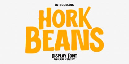
  10. Blunted - Unknown license
  11. KG Primary Penmanship 2 - Personal use only
  12. DeerUp Shouttap Sans - Personal use only
  13. Resavska BG Sans - 100% free
  14. Obti Sans Neue - 100% free
  15. DejaVu Sans Condensed - Unknown license
  16. Osaka-Sans Serif - Unknown license
  17. Romance Fatal Sans - Personal use only
  18. pulse sans virgin - Unknown license
  19. Andreas Sans Cnd - Unknown license
  20. DejaVu Sans Mono - Unknown license
  21. COM4t Sans Medium - Unknown license
  22. SF Diego Sans - Unknown license
  23. Bitstream Vera Sans - Unknown license
  24. Am Sans light - Unknown license
  25. Times Sans Serif - Unknown license
  26. Vazari Sans Serif - Unknown license
  27. Romance Fatal Sans - Personal use only
  28. SF Diego Sans - Unknown license
  29. Starlight Sans JL - Unknown license
  30. Sans I Am - 100% free
  31. !Futurelic Sans Souci - Unknown license
  32. Sans Serif Shaded - Unknown license
  33. Aurulent Sans Mono - Unknown license
  34. FS Silas Sans by Fontsmith, $80.00
    The great enigma There are hidden depths to FS Silas Sans. First impressions are of a functional, multi-purpose typeface with a cool, edgy, angular character. Gaze into its eyes a little longer, though, and you'll detect a more nuanced, colourful personality, with full, open, satisfyingly squarish forms balancing the abruptness of the sharply-angled terminals and ascenders. Authoritative, official and stern on the outside; amiable and welcoming on the inside. You’re so Dane The designers, led by Phil Garnham, were trying to capture something straight-talking, authentic, and a little... Scandinavian. ‘We were thinking about some of the characters in Danish dramas that were on in the early stages of the font’s development, like The Killing and The Bridge,’ says Phil. ‘The police officers, that is, not the psychopathic killers. Smart and a bit cool, but with a warm heart.’ For a good Danish name, we settled on Silas. It was that or Hans-Christian. The finer points Silas Sans rewards close inspection. Study, if you will, its amply squarish forms, the roomy ‘o’ and ‘e’, in particular. Observe the angular ascenders and terminals of, for example, the ‘L’, ‘I’, ‘d’ and ‘i’, inferring the movement and lift of a pen. Consider the cuts to the ‘A’ and ‘v’ that create harmony with adjacent letters. And scrutinise the subtle ink traps set within the ‘A’ and ‘Y’ for reproduction at small sizes. A fine subject, we think you’ll agree, and available in a versatile range of weights to make (with FS Silas Slab) a typographic system with a comprehensive hierarchy.
  35. Arabetic Sans Serif by Arabetics, $32.00
    The Arabetic Sans Serif type family follows the guidelines of the Mutamathil type style but also illustrates the effects of adding and removing Latin-like serifs on Arabetic scripts legibility. It has only one glyph for every basic Arabic Unicode character or letter as defined in Unicode Standards version 5.1. Arabetic Sans Serif employs variable x-height values. It includes all required Lam-Alif ligatures and uses ligature substitutions and selected marks positioning but it does not use any other glyph substitutions or forming. Text strings composed using types of this family are non-cursive with stand-alone isolated glyphs. Tatweel (or Kashida) glyph is a zero width space. Keying it before any glyph will display that glyph’s isolated form. Keying it before Alif Lam Lam Ha will display the Allah ligature. Arabetic Sans Serif family includes both Arabic and Arabic-Indic numerals; all required diacritic marks, Allah ligature, in addition to all standard English keyboard punctuations and major currency symbols. Fonts are available in regular, italic, bold, and bold italic styles.
  36. The Bristers Sans by Letterhend, $17.00
    Bristers is a font duo package contain a hand drawn monoline script and sans serif which looks great to be paired especially for vintage and adventure theme! It also comes with extra illustration and premade logo! This font duo is purposely made for headline, display or logotype, and signature which need a standout appearing. This font is also suitable to be applied especially in logo, and the other various formal forms such as invitations, labels, logos, magazines, books, greeting / wedding cards, packaging, fashion, make up, stationery, novels, labels or any type of advertising purpose. Features : - Bristers Sans & Script - uppercase & lowercase - numbers and punctuation - multilingual - alternates & ligatures - PUA encoded We highly recommend using a program that supports OpenType features and Glyphs panels like many of Adobe apps and Corel Draw, so you can see and access all Glyph variations. How to access opentype feature : letterhend.com/tutorials/using-opentype-feature-in-any-software/ Email us to letterhend@gmail.com if you need something! Happy Designing!
  37. Cowling Sans AOE by Astigmatic, $24.95
    Cowling Sans AOE is a charming Art Deco architectural style typeface. It is the cleaned-up, refined revival and elaboration of a lettering design from “Lettering for Commercial Purposes” by Wm. Hugh Gordon published in 1918. What began as a basic character set of Capitals, lowercase, and two styles of ampersand has been expanded to a full character set including unlimited fractionals, superiors & inferiors, ordinals, tabular, proportional, and oldstyle figures, and an expanded language glyph set, all with a smallcaps and Caps to Smallcap set to match. This lettering style exudes the charm of its era with every word set in it by way of the small details that set it apart from other sans typestyles.
  38. Egiptian Sans Serif by Intellecta Design, $26.90
    a 3D version of the classic egiptian style, but in a sans serif mode
Looking for more fonts? Check out our New, Sans, Script, Handwriting fonts or Categories
abstract fontscontact usprivacy policyweb font generator
Processing