10,000 search results
(0.039 seconds)
- Minnesota Plaid by Breauhare,
$35.00 Minnesota Plaid is the baddest plaid ever! It may not be the choice pattern for golfers' slacks or bagpipers' kilts, but it has a City-like flavor with its own twist, a stylish ruggedness & toughness that could even be described as a sort of formal graffiti, thanks to the art deco swash of many of its strokes. It’s the kind of look that would be perfectly at home with hip hop or rap music, football and other sports, cars and trucks, power tools, and other manly, masculine usages. Of course, women are just as capable of having the aforementioned interests, too. Minnesota Plaid is the kind of font that can get stuck on you! Digitized by John Bomparte.
 - Elevator Music by PizzaDude.dk,
$16.00 When was the last time you listened to elevator music and found yourself humming along? And perhaps the tune you were listening to, got stuck in your ears for the rest of the day...the rest of the week? That's often what happens with elevator music: maybe you don't notice it - but it is there, and it could most likely be one of your all time favourites! :) My Elevator Music font does somewhat the same: it's nice and pretty harmless - but it works, perhaps even without you noticing! :) I've added 4 slightly different versions of each lowercase letter - and that goes for both Regular and Scratch versions. And they both have multilingual support, because elevator music is universal!
 - Sassa Mixed by Celebrity Fontz,
$24.99Uninhibited by typographic demands, this artistic font freely expresses individual creativity. The use of line in conjunction with deceptively simple patterns of squares or dots and the occasional solid infilling gives the letters a lively vigor lacking in many modern designs. The joins between the letters' uprights and curves and the balance between thin and thick strokes are executed with impressive simplicity. The alphabet letters were inspired by Swiss art from 1939. The numbers were patterned after a design cut in stone dating back to the year 1692, while the punctuation and mathematical characters are a simple and modern typeface that is both pleasing to the eye and a whimsical contrast to the other characters. - Brolly Fight by Rachel White Art,
$16.00 Brolly Fight is a fun, slim line font with off-kilter lines. I had so much fun creating this one! It has a stick figure art deco feel. It's fun and playful, with lots of ligatures and alternates to play with. Mix and match lowercase and uppercase letters for a unique look. There are four alternate ampersands, and fun double letter ligatures, as well as playful ligatures for r, k + a, e, o, u combinations. That high lowercase o with an underscore has a twin lowercase a alternate you can access too! Mix and match capitals and lowercase (plus the ligatures & alternates) to create unique text designs. Now with a bold version!
 - Deadline Remastered by Comicraft,
$29.00 The hands on the clock tick inexorably on... the numbers on the digital display roll inevitably toward zero... time is tight, the fuse is getting shorter and the beads of sweat on your forehead are glistening in the red light of the LCD... you have come to a place where the only thing you feel are loaded guns in your face... can YOU handle the DREADED DEADLINE DOOM?!? TICK TICK TICK TICK TICK TICK TICK TICK TICK THRAKAKAKATHOOM! Uh oh… you blew it. Deadline Remastered features 18 static weights, including the new nearly square "Block", each with complete Western & Central European language support. Use the Solid & Open Variable fonts to access unlimited width and angle options.
 - M Gentle PRC by Monotype HK,
$523.99 The design concept of M Gentle is inspired by the aesthetics of ribbon gymnastics and the tenderness of orchids. The beauty of the two are combined in one typeface. Keeping the characters in right proportion and standard structure, its horizontal and vertical strokes (橫、豎) are generally straight. The linkage among dots (點), downstrokes and the ticks (剔) to the right represent a sense of movement and fill the typeface with liveliness and humanity. While M Gentle Light shows purity and softness, Medium and Bold fonts have their own personalities. They are all legible and suitable for a wide range of purposes, make the family a popular choice in the advertising industry.
 - Poole by Poole,
$36.00Poole Standard is the "flagship" typeface from former wine label designer, Wesley Poole. It's a versatile friendly face, antique but not antiquated, elegant yet inviting. "I first used a hand lettered version of this look on the Carmenet label. I've had this alphabet designed in my head for some time. It's perfect for upscale work. Like wine, this font is well rooted in the past, but meant to be appreciated and used in the here and now. Poole Standard is a stylish headline face, yet works well as a text face because of its readability at smaller point sizes. (Other styles and weights are coming soon!) If you're looking for understated elegance, Poole Standard does the job. - VLNL Wood Burger by VetteLetters,
$35.00 We all love a good burger here at Vette Letters. We also love to prepare them ourselves. Grilling the patties, cutting the tomatoes and cucumber, nothing beats a home made hamburger. And the best and tastiest way to grill a burger is on a wood charcoal grill. So all in all we can safely say that burgers and wood are a pretty darn good combination. This made Donald Roos decide to design VLNL Woodburger, obviously based on 19th century American wood type alphabets. Donald decided to add cyrillic characters, as he strongly believed that Russians would be equally partial to home made burgers. VLNL Woodburger is not really polished font, it will give any design a rough sturdy edge.
 - Genia by Akufadhl,
$40.00 Genia is a script typeface that carries roundhand calligraphy DNA. Instead of using pointed nib pen, Genia was created using a fine brush resulting in clean and wavy character. With the OpenType features, Genia creates the natural feel of calligraphy writing. This contextual feature makes the font 'smart'. It knows which letters are the initial and which one is the finial. The feature can be activated in the OpenType section under the names of CALT or Contextual Alternates. Genia also gives you old style and proportional number options. Our advice is always turn the contextual alternates, and don't use the OPTICAL kerning on Adobe softwares. The preview on this site does not support the contextual alternates.
 - M Gentle HK by Monotype HK,
$523.99 The design concept of M Gentle is inspired by the aesthetics of ribbon gymnastics and the tenderness of orchids. The beauty of the two are combined in one typeface. Keeping the characters in right proportion and standard structure, its horizontal and vertical strokes (橫、豎) are generally straight. The linkage among dots (點), downstrokes and the ticks (剔) to the right represent a sense of movement and fill the typeface with liveliness and humanity. While M Gentle Light shows purity and softness, Medium and Bold fonts have their own personalities. They are all legible and suitable for a wide range of purposes, make the family a popular choice in the advertising industry.
 - Colporteur by Hanoded,
$12.00 A Colporteur is a peddler of books, newspapers, and similar literature. When I was young, we often got visits from colporteurs - mostly they wanted to sell us a very expensive encyclopedia. I haven’t seen them for a while - the internet probably killed their trade, as there are numerous free encyclopedias out there. Colporteur font won’t try to sell you stuff - it basically sells itself. It is a jolly serif family of 6 styles plus a very useful doodle style full of arrows. Use it to sell your encyclopedia online, write a book and use if for the cover or create a ‘hunt the colporteur’ game. Comes with an encyclopedic knowledge of diacritics too!
 - Railing by Nathatype,
$29.00 Are you looking for a display font? Do you dream of creating headings that stand out and inspire creativity, imagination, and endless fun? Wait no more, we will give you the best choice. Railing-A Display Font Railing is a gorgeous font, designed with a modern vibe. This font is perfect for anything simple and direct. Every stroke and curve was created to entice happiness and elegance. A real head-turner for your presentation, designs, branding, quotes, invitation, website illustrations, and much more. Our font always includes Multilingual Support to make your branding reach a global audience. Inspire your audience, clients, or guests with this beautiful, statement font. Features: Alternates PUA Encoded Numerals and Punctuation Thank you for downloading premium fonts from Natha Studio
 - Westville by Nathatype,
$29.00 Are you ready to make your branding stand out? Do you dream of creating headings that stand out and inspire creativity, imagination, modernity, and endless fun? Looking for an elegant and stylish font? We've got what you want. Westville- A Blackletter Font Westville is an incredibly unique and distinct blackletter font. The style was influenced by many fonts and extra touch of urban street attitude. This is a timeless font that suits and fit perfectly in any timeframe or style you want. Well suited for you who needs for headline, logotype, apparel, branding, packaging, advertising, and many more. Our font always includes Multilingual Support to make your branding reach a global audience. Features: PUA Encoded Numerals and Punctuation Thank you for downloading premium fonts from Natha Studio
 - Yolan Script by FadeLine Studio,
$15.00 This is a new font script with a unique and thin style. Not only unique, the font is made in detail also has an elegant style, sweet, simple and firm character. With a unique style that dancing, this font can make your design more alive. When you use this font sometimes you do not need to use other fonts pairing, this font can be used in single, but still as you wish! If you are curious, please try it! With a style like this, this font will be suitable in use for logo's, branding projects, homeware designs, product packaging, mugs, quotes, posters, shopping bags, logo's, t-shirts, book covers, name card, invitation cards, greeting cards, and all your other lovely projects.
 - Mayberry by Ascender,
$92.99The Mayberry® is an extensive family of 14 OpenType fonts. Mayberry was initially designed by Steve Matteson to emulate the technical behavior of a font family called Tiresias™ for use in set top TV devices and user interfaces. Mayberry is a significant improvement in aesthetics and functionality over Tiresias. Mayberry includes true italics and a wide range of weights to provide the highest quality and readability on low resolution devices, while also featuring a range of OpenType features that will appeal to creative professionals. Mayberry is a slightly condensed humanist sans serif which allows for more readable text in a narrower column. Open counters and upright stress help keep the design of Mayberry readable at low resolutions. A significant amount of care has been given to design subtleties allowing the design to function well at large sizes. The Mayberry character set supports Cyrillic, Greek, Central and Eastern European, Turkish and Baltic, Mayberry also includes a slashed zero for use where absolute distinction between 'O' and zero is a concern. Also included are typographic features such as old-style figures, fractions, superior and inferior numbers for use with applications that provide advanced OpenType typographic support. A set of closed captioning symbols and arrows add to the font's versatility in interface design. - Hearst Italic by Solotype,
$19.95Carl Schraubstadter of the Inland Type Foundry probably had more to do with the design of this italic than he did with the roman. Great for Craftsman Era projects. - Ah, Scatterbrained Restrained by StimulEye Fonts — a name that sounds like what happens when a caffeine-addicted squirrel tries its hand at typography. This font is the charming eccentric of the font...
- Country Fang by Baseline Fonts,
$39.00Brian Miller is a graphic designer who loves hillbilly culture, which is what inspired his popular phrase, 'country fangs!'--used to describe anyone with teeth that - well - just don't quite line up right. Git Cletus an' Jimmy Ray an' we'll hold down a piggy an' make 'er SQUEAL!!!!!--be sure t' put yer teeths in, too! Country Fang includes multiple grit patterns and appropriate "teeth" icons to spiff up any layout on the fly. - Aribau Grotesk by Emtype Foundry,
$69.00 Born from the intersection of the geometric and grotesque typefaces. Aribau Grotesk combines low contrast and generous width proportions with typical traits of american gothics from the early 20th century, like the counters aperture and a double story ‘g’. Driven by the process, some details that come from the geometric style arose, like the clean-shaped figures and the circular dots that convey a more affable and contemporary look. Aribau Grotesk PDF.
 - Stovepipe Stencil JNL by Jeff Levine,
$29.00 Stovepipe Stencil JNL was not directly designed from a vintage source, but it does draw its influences from classic sans serif lettering of the past. Even its name borrows (somewhat gratuitously) from the "stovepipe" lettering so popular with sign painters. True stovepipe letters tend to be squarer with rounded corners, but the name has also been loosely associated with some tall, condensed type styles. The typeface is available in both regular and oblique versions.
 - Funkboy by PizzaDude.dk,
$20.00 Funkboy looks like something that was made 20 years ago. You know, when Grandmaster Flash was scratching to the beat and graffiti was totally underground. Funkboy was made to look 100% oldschool, and now you can make your own bad-boy oldschool graffiti, using your computer! Comes with two hard knock alternate letters: the peace 'o' + the heart dotted 'i' You will need to use OpenType supporting applications to use the autoligatures.
 - Abhartach by Fontdation,
$18.00 Introducing Abhartach, funky reverse-contrast display typeface. A perfect mix from both classic and modern typography. Packed with lots of alternate characters and ligatures (and faux-italic style too!), lets you explore more letter variations that will level up your designing projects. Check out the entire preview images to get the inspiration & hints of how powerful slash beautiful this typeface is. Hope you enjoy this typeface as much as we created it for you! Cheers!
 - Bermuda LP by LetterPerfect,
$39.00 The Bermuda Family was designed by Garrett Boge and Paul Shaw, in the vein of freely-drawn showcard lettering — jaunty, fun and friendly. In fact the drawings were made with a Speedball™ B-series pen nib, the stock tool of the showcard letterer. Bermuda Open is a stroked outline version and its character shapes are repeated in the other three styles, each with a separate fill variant — Solid, Dots and Squiggles.
 - Castle by Linotype,
$29.99This family, which includes faces in light, book, bold, and ultra weights, more stroke contrast than is typical of sans serifs, making it very legible in text. Because of its large x-height, it is recommended for used in point sizes ranging from 12 point upward. Of course, it functions well in display sizes, too. The contrast between the four weights makes this family optimal for use in hierarchical advertising systems, and corporate identity uses. - You Blockhead by Comicraft,
$29.00 Why you little Numbskull! Nitwit! Visigoth! Dimwitted Jackass! Interplanetary Goat! Highwayman! Sea-gherkin! Jellyfish! KnowNothing! Filibuster! Cachinnating cockatoo! Artichoke! Two-timing Troglodyte! Bald-headed budgerigar! Odd-toed Ungulate! Autocrat! Carpetseller! Duck-billed platypus! Dunderheaded coconut! Ectoplasm! Steamroller! Iconoclast! Kleptomaniac! Raggle taggle ruminant! Orangutang! Rapscallion! Ten thousand thundering typhoons! Whippersnapper! Billions of billious barbecued blue blistering barnacles -- you-you... YOU BLOCKHEAD! With its sturdy stance and over 100 friendly interlocking letter pairs, this font was made famous in the logo and branding for the video game CLASH OF CLANS, and infamous in the logo and branding for the Image comic THE BEEF.
 - Qualion Text by ROHH,
$39.00 Qualion Text™ is a modern geometric sans serif typeface with humanist and calligraphic inspirations. It is a text family designed for excellent legibility. Qualion Text™ is a sibling of Qualion™ & Qualion Round™, geometric family with lots of swashes and ornaments. Letter shapes and proportions has been adjusted to fit paragraph text and small sizes: - typeface is narrower now in order to fit more text in the design space - larger stroke contrast - pronounced ink traps and tapering - elegant true italics made even more calligraphic - adjusted spacing and kerning - adjusted font weights The main purpose of the family is clean and legible paragraph text, however it is very attractive choice for branding, headlines and display use, too. The italic styles as well as thin, bold and black upright styles have very strong character and look great in display sizes. Italics are very fluent, calligraphic, subtle and elegant, from the other side bold and black uprigths are very modern, powerful and unique thanks to the pronounced ink traps. Qualion Text™ family consists of 20 styles - 10 weights with corresponding true italics. Both have extended language support, as well as broad number of OpenType features, such as small caps, case sensitive forms, standard and discretionary ligatures, swashes, stylistic sets, contextual alternates, lining, oldstyle, tabular and small cap figures, slashed zero, fractions, superscript and subscript, ordinals, currencies and symbols.
 - TG Riota Gothic by Tegami Type,
$35.00 TG Riota Gothic is a brand new digital sans serif typeface in geometric style with many faces and possibilities with good proportions forms. TG Riota Gothic is outstanding for use in small text or even bigger sizes with seven weights, two axes & 14 styles, including the variable font. It comes with three alternative groups (single story alternates, no tail alternates & square dot alternates), which you can combine to maximize your needs—also supplied with a bunch of ligatures (standard & discretionary ligatures), lining figures (proportional, denominators, numerators, fractions, subscript & superscript), case-sensitive forms, symbol & Each typeface contains over 674 glyphs covered more than 90 languages Latin based. Language Supports: Afrikaans, Albanian, Asu, Azerbaijani, Basque, Bemba, Bena, Bosnian, Catalan, Chiga, Colognian, Cornish, Croatian, Czech, Danish, Dutch, Embu, English, Estonian, Faroese, Filipino, Finnish, French, Friulian, Galician, German, Gusii, Hungarian, Icelandic, Indonesian, Irish, Italian, Kabuverdianu, Kalaallisut, Kalenjin, Kamba, Kikuyu, Kinyarwanda, Latvian, Lithuanian, Low German, Lower Sorbian, Luo, Luxembourgish, Luyia, Machame, Makhuwa-Meetto, Makonde, Malagasy, Malay, Maltese, Manx, Meru, Morisyen, North Ndebele, Norwegian Bokmål, Norwegian Nynorsk, Nyankole, Oromo, Polish, Portuguese, Romanian, Romansh, Rombo, Rundi, Rwa, Samburu, Sango, Sangu, Scottish Gaelic, Sena, Shambala, Shona, Slovak, Slovenian, Soga, Somali, Spanish, Swahili, Swedish, Swiss-German, Taita, Teso, Thai, Turkish, Turkmen, Upper Sorbian, Vunjo, Walser, Welsh, Western Frisian, Zulu. Typeface Designed by Iqbal Firdaus Published by Tegamitype® Foundry Presentation Design by Eunike Agatha & Dennise Nathalie
 - ITC Vineyard by ITC,
$29.99Although inspired by the engraved lettering on eighteenth-century English trade-cards, ITC Vineyard has unusual characteristics of its own. The type retains some quality of copperplate scripts, but the differentiation between thicks and hairlines is not very sharp. There are a few cursive forms, but most of the letters are romanized: they are almost upright and not joining. Occasional flourishes are casually interpreted from various sources such as the lettering on trade-cards and writing masters' copybooks. “I think it is a new kind of 'copperplate script' which is not too formal and easier to read,” claims designer Akira Kobayshi. Irregularities are apparent in the angle of caps and numerals, but the face's quirkiness gives a type page some friendliness rather than cold brilliancy. ITC Vineyard is designed in two weights: regular and bold. Each variation includes several extra characters such as an alternative lowercase 'd' with a long arm, a T-h ligature, swelled rules, and a pair of flourishes. Swash caps are available for both weights. The swash caps variation also includes oldstyle figures. Kobayashi notes: “There are a few swash-cap lowercase combinations that collide or look awkward. In that case, I recommend using the plain caps. Setting all swash cap copy should also be discouraged.” Featured in: Best Fonts for Tattoos - Le Havre Rough by insigne,
$19.00 Le Havre Rough. It’s high-resolution, hand-crafted letterpress to the core. Based on insigne’s popular Le Havre typeface, this new heat-treated, weathered face of all caps joins the realism and appeal of the top-quality Le Havre family. Rough’s eroded, printed look is extremely customizable, offering eleven distressed choices that appear fantastic even at large output sizes. Go ahead. Try it on, say, a billboard. Maybe even Times Square. The font includes hand-printed texture and distinctive shadow choices, too. Options include three inline versions, two shadow layers, and a clean primary version. Combine and match the options easily as you need, layering normal and shadow variations to alter appearance and texture. You can activate Art Deco alternates by using OpenType contextual alternates. Rough has an extra-large character set for many languages. Additionally, the typeface offers 62 extra ornaments like arrows, emblems, numbers & lines. Use its full texture and grit to capture the classic, genuine print feel that you need in your project. A few suggestions for use: - In Photoshop, jigger with various 'anti-aliasing' options for best outcomes. Smooth or strong is generally best. - In Illustrator, the shadow layer occasionally doesn't align when using the regular layer. To fix the alignment, open the type drop-down menu and choose Area Type Options > Em Box Height. Learn more about the using layered type styles on this informative video.
 - Evanescent, as suggested by its name, embodies a characteristic often associated with things that are fleeting, ethereal, or gently fading into the invisible. This font manages to encapsulate the ess...
- Exceptional by Studio&Story,
$16.00 Exceptional Is a super trendy Handwritten font, Elegant & modern with gentle brush texture , Exceptional comes with a complete set of lowercase and uppercase alternates(Uppercase letters can be used alone), It gives you the option to customize your text and to make it much more unique (It's very fun). And more great extra is the bonus Swash, this set come with 26 swashes, which allows you to add elegant & trendy finishing touches to your work. It's the perfect choice for personal branding projects, product packaging, social media, fashion, advertising and more!...
 - Hess Gothic Round NF by Nick's Fonts,
$10.00 The family tree of this friendly face runs deep. Its primary inspiration is Twentieth Century, designed by Saul Hess as a monoline version of Paul Renner’s Futura. The design was reinterpreted by Herb Lubalin as Avant Garde in the 1970s. This version softens the harsh geometry of the original designs with rounded line endings: the result is a warm, inviting face that is elegant, confident and inviting. All versions of this font include the Unicode 1250 Central European character set in addition to the standard Unicode 1252 Latin set.
 - Bon Mot NF by Nick's Fonts,
$10.00What’s the good word? This elegant, stylish typeface, based on an early twentieth-century Barnhart Brothers & Spindler release, named simply "Engravers Upright Script". Based on French ronde letterforms, this version is bolder—which makes it suitable for text settings, even at smaller sizes—and has more pronounced stroke contrast—which makes it suitable for headlines. Versatile, handsome and charming, this typeface is an invaluable addition to any type repertoire. Both versions of the font contain the complete Unicode 1252 (Latin) and Unicode 1250 (Central European) character sets, with localization for Romanian and Moldovan. - Baggage Claim JNL by Jeff Levine,
$29.00 Sometimes type designs are set aside as one project takes priority over another and occasionally it becomes overlooked. One such example is a set of extra bold, sans serif stencil characters drawn out in 2017. Regrettably, as much time has passed, no backstory can be applied to this typeface. It was checked against existing releases in the Jeff Levine Fonts library and didn’t seem to have been re-worked for any subsequent release. With this in mind, Baggage Claim JNL makes its belated appearance and is available in both regular and oblique versions.
 - Hondo Grunge by Fontasmic,
$16.99 The Hondo Grunge fonts are a collection of ultrabold eroded slab serif typefaces with a dynamic look and extended functionality. Accented with decorative and functional inktraps and complete with Slant and Backslant styles, this heavyweight has a high performance hardcore edge to it. Ideal for titling, poster work, logos, and small bits of copy. For the Opentype savvy, the Opentype version contains a complete alternate set of base characters, which by enabling contextual alternates option will force the typeface to continually alternate between the original & alternate character sets for a more spontaneous look.
 - Ultra Thin Stencil JNL by Jeff Levine,
$29.00 Online auctions offer a treasure trove of lost or forgotten merchandise, and many items pertaining to lettering just beg to be digitized into a typeface. Case in point is a partial set of brass stencils that were the visual model for Ultra Thin Stencil JNL. While most of the brass interlocking stencils available now and in the past have bold lettering for easy readability, this particular set consisted of condensed letters with thin lines. Available in both regular and oblique versions, they join a long list of stencil designs available from Jeff Levine Fonts.
 - Kondolarge by TypeK,
$39.00 Kondolarge is a slab serif typeface developed from our successful Kondolar in 2011. Based on a simple skeleton, straight sides, gently curved horizontals and sturdy serifs, Kondolarge is a bit more geometric than the prior. It is suitable for both text and display. With a well-built character set including small caps and several numeral styles. The font comes in 9 styles, ranging from a delicate Thin to Black, with matching italics, resulting in a total of 18 weights. Kondolarge contains a set of 800 characters that support over 200 Latin-based languages.
 - Sandiaga by Arendxstudio,
$16.00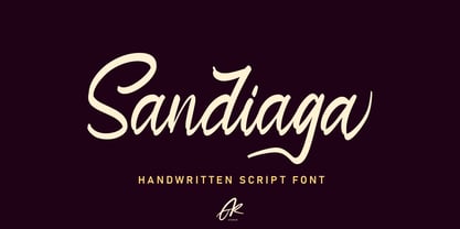 Sandiaga is a handwritten script font that is designed to suit the needs of consumers who focus on the custom style. Sandiaga comes with OpenType features such stylistic alternates, stylistic sets & ligatures good for logotypes, posters, badges, book covers, t-shirt design, packaging and more. Features : • Character Set A-Z • Numerals & Punctuations (OpenType Standard) • Accents (Multilingual characters) • Ligature • Alternate There it is! I really hope you enjoy it - comments & likes are always welcome and accepted. More importantly, don't hesitate to send a message if you have a problem or question.
 - Boot Camp JNL by Jeff Levine,
$29.00 Boot Camp JNL has the same roots as Jeff Levine's Condensed Stencil JNL, as they were both modeled from a set of vintage brass interlocking stencils made by the Stafford Manufacturing Company. The previous font was drawn from limited examples of the stencils seen in an online photograph, so a number of the basic characters had to be improvised. Since then, a nearly complete set was obtained and the alphabet and numerals are truer to the original design. Additionally, both Regular and Oblique versions of Boot Camp JNL are available.
 - Reed by ParaType,
$30.00 Reed is a refined calligraphic font based on humanist italic. It contains two weights and a high-contrast Display style for extra large point sizes. Two unusual stencil styles add zest to the type family. The character set includes lots of swashes and contextual alternates. This makes text set in Reed look very close to live calligraphy. Reed works perfectly in labels and packaging of confectionery, cosmetics, perfumery and sparkling wines, as well as greeting cards and event design. Reed was designed by Isabella Chaeva and released by Paratype in 2020.