10,000 search results
(0.085 seconds)
- SF Buttacup Lettering - Unknown license

- SK Cuber by Shriftovik,
$10.00 SK Cuber™ is an expanded monumental pseudo-pixel typeface. It is based on a strict grid that is not broken in any glyph. This makes the type more organic and consistent. The type's characters are monospaced, but they do not look ridiculous and do not cause discomfort as it usually happens. This could only be achieved by carefully working out each glyph. The type also deliberately uses the contrast between geometric strokes and smooth transitions. It adds to his liveliness and character. SK Cuber is inspired by the monumental architecture of our days. It is brutal and extremely stable, which makes it an excellent font for working with posters, headlines, etc.
 - Dx Dynamix by Dirtyline Studio,
$35.00 Dx Dynamix is a modern minimalist design typeface with geometric type and more feature alternative characters. there include some ligature. It is inspired by hype and urban design a font suited for lifestyle with trend design. Dx Dynamix comes with elegant style, strength, and contrasts, with features an extended Latin character set of 367 glyphs covering over 85 languages. It has been designed as a variable font to give lots of options and access to unique type looks, however, it also includes nine weights to give just as much access to creativity to those without access to variable supporting software. Its distinctive character and many variables make it a versatile, stylish workhorse, great for interfaces and design.
 - News Gothic SB Vietnam by Scangraphic Digital Type Collection,
$26.00 This version of News Gothic contains the Vietnamese character set. Since the release of these fonts most typefaces in the Scangraphic Type Collection appear in two versions. One is designed specifically for headline typesetting (SH: Scangraphic Headline Types) and one specifically for text typesetting (SB Scangraphic Body Types). The most obvious differentiation can be found in the spacing. That of the Body Types is adjusted for readability. That of the Headline Types is decidedly more narrow in order to do justice to the requirements of headline typesetting. The kerning tables, as well, have been individualized for each of these type varieties. In addition to the adjustment of spacing, there are also adjustments in the design. For the Body Types, fine spaces were created which prevented the smear effect on acute angles in small type sizes. For a number of Body Types, hairlines and serifs were thickened or the whole typeface was adjusted to meet the optical requirements for setting type in small sizes. For the German lower-case diacritical marks, all Headline Types complements contain alternative integrated accents which allow the compact setting of lower-case headlines.
 - Ornatique by VP Creative Shop,
$19.00 Introducing Ornatique: Where Elegance Meets Grace Discover the beauty of Ornatique, a stunning and feminine calligraphy typeface designed to add a touch of sophistication to any project. With its clean lines and delicate curves, Ornatique captures the essence of graceful handwriting. This versatile typeface offers four scripts to choose from: the classic Regular script for a timeless look, the Italic script for added flair and elegance, and the Alternate versions that provide even more variety and creative possibilities. But that's not all! Ornatique is truly a global communicator, supporting a staggering 87 languages. Whether you're designing for English, Spanish, French, or countless others, this typeface has got you covered. Embrace the power of seamless multilingual design. What sets Ornatique apart is its collection of 58 swash endings, crafted as ligatures. These intricate and decorative elements bring an extra layer of beauty and charm to your designs. From elegant flourishes to delicate swirls, each swash ending adds a touch of enchantment, making your typography truly remarkable. Whether you're creating wedding invitations, branding materials, or simply adding a touch of elegance to your personal projects, Ornatique is the perfect choice. It combines clean lines with feminine grace, ensuring that your designs will captivate and inspire. Let your creativity soar with Ornatique and discover the magic of calligraphy that transcends language and culture. Elevate your designs and leave a lasting impression with this exquisite typeface. Embrace the beauty of Ornatique today and let your imagination flow! Language Support : Afrikaans, Albanian, Asu, Basque, Bemba, Bena, Breton, Chiga, Colognian, Cornish, Czech, Danish, Dutch, Embu, English, Estonian, Faroese, Filipino, Finnish, French, Friulian, Galician, Ganda, German, Gusi,i Hungarian, Indonesian, Irish, Italian, Jola-Fonyi, Kabuverdianu, Kalenjin, Kamba, Kikuyu, Kinyarwanda, Latvian, Lithuanian, Lower Sorbian, Luo, Luxembourgish, Luyia, Machame, Makhuwa-Meetto, Makonde, Malagasy, Maltese, Manx, Meru, Morisyen, North Ndebele, Norwegian, Bokmål, Norwegian, Nynorsk, Nyankole, Oromo, Polish, Portuguese, Quechua, Romanian, Romansh, Rombo, Rundi, Rwa, Samburu, Sango, Sangu, Scottish, Gaelic, Sena, Shambala, Shona, Slovak, Soga, Somali, Spanish, Swahili, Swedish, Swiss, German, Taita, Teso, Turkish, Upper, Sorbian, Uzbek (Latin), Volapük, Vunjo, Walser, Welsh, Western Frisian, Zulu How to access flourish ending? Just type from ""aa01"" to ""aa58"" at the end of your word :) How to access alternate glyphs? To access alternate glyphs in Adobe InDesign or Illustrator, choose Window Type & Tables Glyphs In Photoshop, choose Window Glyphs. In the panel that opens, click the Show menu and choose Alternates for Selection. Double-click an alternate's thumbnail to swap them out. Mock ups and backgrounds used are not included. Thank you! Enjoy!
 - Garetra by Letterhend,
$17.00 Garetra Serif s a sophisticated serif with many weight you can choose. It has 4 weight styles which you can play around to match your project, whether for a standout headline, or for a tagline, you name it. Perfect to be applied to the other various formal forms such as invitations, labels, logos, magazines, books, greeting / wedding cards, packaging, fashion, make up, stationery, novels, labels or any type of advertising purpose. Features : uppercase & lowercase numbers and punctuation multilingual alternates & ligatures PUA encoded We highly recommend using a program that supports OpenType features and Glyphs panels like many of Adobe apps and Corel Draw, so you can see and access all Glyph variations. How to access opentype feature : letterhend.com/tutorials/using-opentype-feature-in-any-software/
 - Monogramma by Wiescher Design,
$10.40 Monogramma is a set of 676 beautiful and unique Monograms plus some doubles. There is one monogram for each possible letter-combination! For easy use I packed the monograms in 13 packets. One for two starting letter each. So if for example you look for the monogram "GW", you must choose the packet "Monogramma-GH" -- the G-combinations under the uppercase letters. You now have to type a capital "W" and Bingo you have the combination GW! Some letter-combinations have doubles, just check the numbers 0 to 9 if there is anything to be found. If you buy the whole set of monograms you get the basic font free of charge! Your long-distance (this was a lot of work) font-designer Gert Wiescher
 - Hallen by Edignwn Type,
$12.00 This font is called "Hallen" with modern classic themes, it represents a carefully serif display typeface. Hallen comes with unique swashes alternates and combines every character in good typography. Select regular and smooth style for modern theme, for classic theme you can select rough and texture style. You can type some words and then make yourself the best layout, it will look perfect for professional design taste. You also can use this font in some designs such as the logotype, magazine, poster, packaging, branding, website, quote, invitation and more custom design. Hallen includes : 4 style typefaces (regular, smooth, rough, and texture) Uppercase, lowercase, numeral, punctuation & symbol Ligature and Alternates (ss01 - ss06) Multilingual PUA encoded Thank you for your support and choosing us.
 - Chanide Script by Letterhend,
$19.00 Please welcome our newest script typeface: Chanide. As you can see at the previews, this typeface has unique swashes that allows you to create beautiful lettering in a snap! It has many stylistic set alternates that you can choose from. This font is works well for various formal forms such as invitations, labels, logos, magazines, books, greeting / wedding cards, packaging, fashion, make up, stationery, novels, labels or any type of advertising purpose. Features: Uppercase & Lowercase Numbers and Punctuation Multi-lingual Support Ligatures Alternates Swashes PUA encoded We highly recommend using a program that supports OpenType features and Glyphs panels like many of Adobe apps and Corel Draw, so you can see and access all Glyph variations. Email us to letterhend@gmail.com if you need something! Happy Designing!
 - Jubileum by Hanoded,
$15.00 Some time ago, I found myself in a clinic with my wife: at the time she was 20 weeks pregnant and had to do an ultrasound. To pass the time, I leafed through some (ladies') magazines which were lying around. Most of them tackled big issues like which shoes to wear and what type of foundation to plaster on, but one glossy featured a photo shoot. The photographer had found an old building with a beautiful art deco tile mural and had placed his skinny model in front of it. Fortunately for me, the mural featured a lot of text in a beautiful frilly style. I re-created the font I saw and it became "Jubileum" - which just means Jubilee in Dutch.
 - Chiefland by Letterhend,
$17.00 Garetra Serif s a sophisticated variable serif font with with many weight you can choose. It has 12 weight styles which you can play around to match your project, whether for a standout headline, or for a tagline, you name it. Perfect to be applied to the other various formal forms such as invitations, labels, logos, magazines, books, greeting / wedding cards, packaging, fashion, make up, stationery, novels, labels or any type of advertising purpose. Features : variable font with 6 weight style regular and slant uppercase & lowercase numbers and punctuation multilingual alternates & ligatures PUA encoded We highly recommend using a program that supports OpenType features and Glyphs panels like many of Adobe apps and Corel Draw, so you can see and access all Glyph variations.
 - Gemulir by Twinletter,
$18.00 Gemulir is the embodiment of the beauty of classic serif fonts. With smooth lines and elegant character shapes, this font brings a timeless and classy look to any project. Gemulir gives you the ability to create luxurious and memorable documents, promotional materials or web designs. Gemulir's key features include its ability to customize various types of projects. From use in formal documents to use in branding designs, this font always provides a consistent and professional appearance. Gemulir is the perfect choice for those who appreciate classic beauty in design. With the ability to convey messages elegantly and powerfully, this font will take your projects to the next level. So, don't hesitate to choose Gemulir and let your designs shine with classic elegance.
 - Virgolate by Letterhend,
$19.00 Virgolate is a beautiful and classy script based on manual calligraphy ink on a paper. This fnt has many swashes that allows you to create beautiful lettering instantly. it has many stylistic set alternates that you can choose from. This font perfectly made to be applied especially in logo, and the other various formal forms such as invitations, labels, logos, magazines, books, greeting / wedding cards, packaging, fashion, make up, stationery, novels, labels or any type of advertising purpose. Features : uppercase & lowercase numbers and punctuation multilingual ligatures alternates swashes PUA encoded We highly recommend using a program that supports OpenType features and Glyphs panels like many of Adobe apps and Corel Draw, so you can see and access all Glyph variations.
 - Apothicaire by Sudtipos,
$49.00 Apothicaire is a new font designed by Ale Paul and the Sudtipos team that is inspired in, but not limited to, an antique style casted by a German type foundry during the late XIX century. With the addition of a contemporary design approach, Apothicaire comes in three widths —from condensed to expanded— and five weights —from light to extra bold—, offering a wide range of combinations to explore. As a bonus the font family is also available in a single variable format. An elegant small caps set, a variety of ball terminals and delicate swashes, as well as the possibility to choose from many alternates are also included in the OpenType features. Apothicaire supports a wide range of Latin alphabet-based languages.
 - Discota by Craft Supply Co,
$20.00 Discota - Fluffy Display Font embodies the retro coolness of the 80s and 90s, exuding a playful and groovy aesthetic reminiscent of those iconic decades. Its rounded, boogie-inspired design with soft edges and friendly appearance makes it an ideal choice for projects aiming to evoke nostalgia or a carefree, energetic atmosphere. Discota effortlessly captures the spirit of the past, making it the perfect choice to infuse your creative work with a touch of nostalgia and a whole lot of fun. Choose Discota to bring the funky and stylish aesthetics of the 80s and 90s to your designs, creating a memorable and captivating visual experience. This typeface enhances a wide range of design projects, including greeting cards, packaging, brand identity, posters, and more, adding eye-catching and trendy appeal.
 - Fundamental Rush - Unknown license

- Cholla by Emigre,
$49.00 The Cholla typeface family was designed by Sibylle Hagmann in 1998-99 and named after a species of cactus she encountered in the Mojave Desert. Cholla was originally developed for the Art Center College of Design in Pasadena, California. There, art director Denise Gonzales Crisp and associate designer, Carla Figueroa, collaborated with Hagmann to create a series of fonts that would offer a great deal of variation. The variety was needed to echo the school's nine different departments, yet together the fonts had to exude a unified feel. It was first used in the radically designed 1999/2000 Art Center catalog which won a honorable mention in I.D. magazine and was featured in Eye No. 31. Originally Hagmann set out to design a typeface that, as she recalls, "I could feel comfortable making, first of all, and one that would serve a purpose and had a clear idea behind it, and something that I would want to use myself." Stylistically Hagmann set out to create "12 cuts with slightly different personalities, with different ideas applied. For example the bold weight isn't simply the Regular with weight gain, but has bold letterforms with their own peculiar details. What all weights share and what is the necessary unifying detail is the tapered curve - marked out, for example, in the lowercase b's left top and bottom of the bowl." Gonzales adds: "The forms seemed classical as well. This combination could have a long life, and be timely. I also saw - at least in the beginnings of Cholla - forms that connoted hybrid, of inter-connection, of human and machine growing together. These notions seem appropriate for a school that teaches design and art." Greek version by Panos Haratzopoulos.
 - Wires and Cowboys - Unknown license

- Conrad by Linotype,
$29.00The award-winning Conrad was created by Japanese type designer Akira Kobayashi. Its design was based on the fifteenth-century type by Conrad Sweynheym and Arnold Pannartz, two German printers active in Rome at that time. They produced a unique, slightly unbalanced yet attractive type. Kobayashi says of his typeface, “I have designed a couple of typefaces inspired from the past, but this time the original print acted merely as a reference. The distinctive lowercase ‘a’ and some other letters were inspired by Sweynheym and Pannartz’s second roman type, but I revived the type in a more informal way. Here I used the historical type as a springboard. The resulting type looks different, taking on a rather temporary and lively look. I assume that the Conrad is the first revival of the Sweynheym and Pannartz type, though it does not closely resemble the original.” Conrad won first prize for the text typeface category in Linotype’s Third International Typeface Design Contest (2000) as well as the Certificate of Excellence in Type Design from the Type Directors Club (2001). - SF Chaerilidae - Unknown license

- SF Intermosaic - Unknown license

- SF RetroSplice - Unknown license

- SF Piezolectric - Unknown license

- Ah, the 20th Century Font by Ray Larabie, a typeface that's as ambitious and forward-looking as its name suggests, yet marinated in the nostalgic vibes of the past century. Imagine a font that decide...
- Sketchino by Mvmet,
$14.00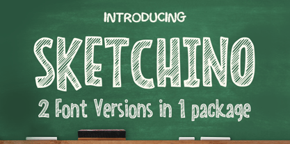 Sketchino is a cool and playful hand drawn font. The font is awesome for creating cool designs that scream for attention. It’s ideal for anything ranging from t-shirts, book designs, restaurant menu, blog writing, greeting cards to stickers, or anything that needs a casual touch. Fall in love with its incredibly cool style, and use it to create lovely designs!
 - Snowy Days by Mvmet,
$10.00 Snowy Days is a cool and playful snow-themed display font. The font is awesome for creating cool designs that scream for attention. It’s ideal for anything ranging from t-shirts, book designs, restaurant menu, blog writing, greeting cards to stickers, or anything that needs a casual touch. Fall in love with its incredibly cool style, and use it to create lovely designs!
 - Linotype Textra by Linotype,
$40.99Linotype Textra is a clever twist on the sans serif genre, designed by Jochen Schuss and Jörg Herz in 2002. Schuss says this about Linotype Textra: "Two in one! The same Linotype Textra, which is so neutral and practical for long text passages turns into an eye-catching headline type when used in larger point sizes. The trick? It's all in the details. The type's clear, robust forms give it a high degree of legibility when used in smaller point sizes for texts. When used in larger sizes, the angular, slightly irregular forms that give the type its strong character become apparent. Hence the name Linotype Textra: pure text with a little something extra!" With 15 weights, the Linotype Textra family provides graphic designers with a good basis for almost any type of work. The five regular weights have matching true italics and old style figures, and the five small cap weights include tabular figures. - ITC Don't Panic by ITC,
$29.99ITC Don't Panic's distressed shapes and craggy outlines evoke the feeling you get when you're just barely in control of a situation. This is type design on the edge. ITC Panic is further down the emotional track, when you've actually lost control and there is no hope in sight. Thompson says the inspiration for these faces arrived one day in the mail. I received an envelope that looked like it had a rough trip; the type that was stamped on it had a tired, ragged appearance. Ironically, the haggard envelope woke me up. I got excited and wanted to replicate the look as a font of type." Thompson designed ITC Don't Panic, then stood back and looked at it and decided it cried out for a more agitated companion. ITC Don't Panic gave birth to the positively psychotic offspring, ITC Panic. Both are all-cap designs with alternate characters in the unshift position. Creating an authentically disturbed appearance proved to be a challenge for Thompson. "I tried to design agitated characters, but they looked staged. So I tried multiple photocopies, but that didn't work. Eventually, I laser-printed the basic characters, wadded up the lasers, then flattened them out and stomped on them with heavy boots. The end result was scanned and used as the basis for the rest of the design." Thompson's work on web sites and multimedia has influenced his interest in type and typography that transcends the cool, unemotional nature of the computer." - ITC Panic by ITC,
$29.99ITC Don't Panic 's distressed shapes and craggy outlines evoke the feeling you get when you're just barely in control of a situation. This is type design on the edge. ITC Panic is further down the emotional track, when you've actually lost control and there is no hope in sight. Thompson says the inspiration for these faces arrived one day in the mail. I received an envelope that looked like it had a rough trip; the type that was stamped on it had a tired, ragged appearance. Ironically, the haggard envelope woke me up. I got excited and wanted to replicate the look as a font of type." Thompson designed ITC Don't Panic, then stood back and looked at it and decided it cried out for a more agitated companion. ITC Don't Panic gave birth to the positively psychotic offspring, ITC Panic. Both are all-cap designs with alternate characters in the unshift position. Creating an authentically disturbed appearance proved to be a challenge for Thompson. "I tried to design agitated characters, but they looked staged. So I tried multiple photocopies, but that didn't work. Eventually, I laser-printed the basic characters, wadded up the lasers, then flattened them out and stomped on them with heavy boots. The end result was scanned and used as the basis for the rest of the design." Thompson's work on web sites and multimedia has influenced his interest in type and typography that transcends the cool, unemotional nature of the computer." - SF Funk Master - Unknown license

- Shary by Alit Design,
$12.00 Inspired by the modern and futuristic sans serif concept, the Shary font is bold and cool. Shary font has 54 families from thin to heavy. Besides that, the urban concept is very cool when combined with the Shary font. Apart from using capital letters for the display font, Shary also contains small letters which are cool and suitable for text. Multilingual various languages are also supported. For logotype or esport, the logo fits perfectly with this font style. Let's make Shary font as your cool font collection for future and current projects.
 - SF Buttacup Lettering - Unknown license

- SF Buttacup Lettering - Unknown license

- SF Buttacup Lettering Shaded - 100% free

- SF Buttacup - Unknown license

- GoudyTwenty - Unknown license

- SchulVokalDotless is a distinctive typeface designed by Manfred Klein, a reputable figure in the realm of typography known for his eclectic and wide-ranging font designs. As its name suggests, “Schul...
- Briaroak Shire - Unknown license

- KaBlam! - Unknown license

- Lefferts JNL by Jeff Levine,
$29.00Lefferts JNL is a wide, light type face type with a square shape. Perfect for formal text.


