10,000 search results
(0.317 seconds)
- Areplos by Storm Type Foundry,
$53.00To design a text typeface "at the top with, at the bottom without" serifs was an idea which crossed my mind at the end of the sixties. I started from the fact that what one reads in the Latin alphabet is mainly the upper half of the letters, where good distinguishableness of the individual signs, and therefore, also good legibility, is aided by serifs. The first tests of the design, by which I checked up whether the basic principle could be used also for the then current technology of setting - for double-sign matrices -, were carried out in 1970. During the first half of the seventies I created first the basic design, then also the slanted Roman and the medium types. These drawings were not very successful. My greatest concern during this initial phase was the upper case A. I had to design it in such a way that the basic principle should be adhered to and the new alphabet, at the same time, should not look too complicated. The necessary prerequisite for a design of a new alphabet for double-sign matrices, i.e. to draw each letter of all the three fonts to the same width, did not agree with this typeface. What came to the greatest harm were the two styles used for emphasis: the italics even more than the medium type. That is why I fundamentally remodelled the basic design in 1980. In the course of this work I tried to forget about the previous technological limitations and to respect only the requirements then placed on typefaces intended for photosetting. As a matter of fact, this was not very difficult; this typeface was from the very beginning conceived in such a way as to have a large x-height of lower-case letters and upper serifs that could be joined without any problems in condensed setting. I gave much more thought to the proportional relations of the individual letters, the continuity of their outer and inner silhouettes, than to the requirements of their production. The greatest number of problems arose in the colour balancing of the individual signs, as it was necessary to achieve that the upper half of each letter should have a visual counterbalance in its lower, simpler half. Specifically, this meant to find the correct shape and degree of thickening of the lower parts of the letters. These had to counterbalance the upper parts of the letters emphasized by serifs, yet they should not look too romantic or decorative, for otherwise the typeface might lose its sober character. Also the shape, length and thickness of the upper serifs had to be resolved differently than in the previous design. In the seventies and at the beginning of the eighties a typeface conceived in this way, let alone one intended for setting of common texts in magazines and books, was to all intents and purposes an experiment with an uncertain end. At this time, before typographic postmodernism, it was not the custom to abandon in such typefaces the clear-cut formal categories, let alone to attempt to combine the serif and sans serif principles in a single design. I had already designed the basic, starting, alphabets of lower case and upper case letters with the intention to derive further styles from them, differing in colour and proportions. These fonts were not to serve merely for emphasis in the context of the basic design, but were to function, especially the bold versions, also as independent display alphabets. At this stage of my work it was, for a change, the upper case L that presented the greatest problem. Its lower left part had to counterbalance the symmetrical two-sided serif in the upper half of the letter. The ITC Company submitted this design to text tests, which, in their view, were successful. The director of this company Aaron Burns then invited me to add further styles, in order to create an entire, extensive typeface family. At that time, without the possibility to use a computer and given my other considerable workload, this was a task I could not manage. I tried to come back to this, by then already very large project, several times, but every time some other, at the moment very urgent, work diverted me from it. At the beginning of the nineties several alphabets appeared which were based on the same principle. It seemed to me that to continue working on my semi-finished designs was pointless. They were, therefore, abandoned until the spring of 2005, when František Štorm digitalized the basic design. František gave the typeface the working title Areplos and this name stuck. Then he made me add small capitals and the entire bold type, inducing me at the same time to consider what to do with the italics in order that they might be at least a little italic in character, and not merely slanted Roman alphabets, as was my original intention. In the course of the subsequent summer holidays, when the weather was bad, we met in his little cottage in South Bohemia, between two ponds, and resuscitated this more than twenty-five-years-old typeface. It was like this: We were drinking good tea, František worked on the computer, added accents and some remaining signs, inclined and interpolated, while I was looking over his shoulder. There is hardly any typeface that originated in a more harmonious setting. Solpera, summer 2005 I first encountered this typeface at the exhibition of Contemporary Czech Type Design in 1982. It was there, in the Portheim Summer Palace in Prague, that I, at the age of sixteen, decided to become a typographer. Having no knowledge about the technologies, the rules of construction of an alphabet or about cultural connections, I perceived Jan Solpera's typeface as the acme of excellence. Now, many years after, replete with experience of revitalization of typefaces of both living and deceased Czech type designers, I am able to compare their differing approaches. Jan Solpera put up a fight against the digital technology and exerted creative pressure to counteract my rather loose approach. Jan prepared dozens of fresh pencil drawings on thin sketching paper in which he elaborated in detail all the style-creating elements of the alphabet. I can say with full responsibility that I have never worked on anything as meticulous as the design of the Areplos typeface. I did not invent this name; it is the name of Jan Solpera's miniature publishing house, in which he issued for example an enchanting series of memoirs of a certain shopkeeper of Jindrichuv Hradec. The idea that the publishing house and the typeface might have the same name crossed my mind instinctively as a symbol of the original designation of Areplos - to serve for text setting. What you can see here originated in Trebon and in a cottage outside the village of Domanín - I even wanted to rename my firm to The Trebon Type Foundry. When mists enfold the pond and gloom pervades one's soul, the so-called typographic weather sets in - the time to sit, peer at the monitor and click the mouse, as also our students who were present would attest. Areplos is reminiscent of the essential inspirational period of a whole generation of Czech type designers - of the seventies and eighties, which were, however, at the same time the incubation period of my generation. I believe that this typeface will be received favourably, for it represents the better aspect of the eighties. Today, at the time when the infection by ITC typefaces has not been quite cured yet, it does absolutely no harm to remind ourselves of the high quality and timeless typefaces designed then in this country.In technical terms, this family consists of two times four OpenType designs, with five types of figures, ligatures and small capitals as well as an extensive assortment of both eastern and western diacritics. I can see as a basic text typeface of smaller periodicals and informative job-prints, a typeface usable for posters and programmes of various events, but also for corporate identity. Štorm, summer 2005 - Pop by Alias Collection,
$60.00 A decorative, maze-like multi-line typeface in two weights. Lower case is narrow, upper case is wide, the two can be mixed to give a variety of bold, dynamic effects.
 - Shpinoza MF by Masterfont,
$59.00 A practical font family with 5 weights for all your day by day design needs: headlines, body text, signage etc. High legibility at small sizes. An extended sans serif typeface with rounded endings that provides unique softness appearance without losing legibility.
 - Darbuka MF by Masterfont,
$59.00 A practical font family with 4 weights for all your day by day design needs: headlines, body text, signage etc. High legibility at small sizes. An extended sans serif typeface with rounded endings that provides unique softness appearance without losing legibility.
 - Bahnhof by Storm Type Foundry,
$29.00Poster type faces from the twenties and thirties are enjoying a new wave of popularity. The summary, even rather hard principle of the sign is required for a view from a distance. The information appearing on the poster must be readable even from the opposite pavement. And, as is often the case with monumental type faces, these type faces are legible even in small sizes. The name Bahnhof suggests the hypothetical use of the type face on railway station buildings. - So Lovely by Positype,
$20.00 Effortless, personal, nonchalant. So Lovely just slides into the room, without a care in the world, flowing from one letter to the next. This simple typeface has a secret—behind that nonchalant attitude is a ton of Stylistic, Swash, and Titling Alternates. It even contains 44 special ligature combinations to insure you have the smoothest entrance possible. So Lovely is the third release of the Positype Relaxed Script Collection of typefaces—all focused on fluid, effortless script fonts for simple use.
 - Linotype Inky Script by Linotype,
$29.99Linotype Inky Script is part of the Take Type Library, chosen from contestants of Linotype’s International Digital Type Design Contests of 1994 and 1997. This fun fon was designed by the German artist Thomas Schnaeble as a handwriting font with little stroke contrast. The lower case letters are broad with a low x-height. Texts presented in Inky Script have a light, personal touch. Linotype Inky Script is well-suited to headlines as well as short to middle length texts. - Scriptuale by Linotype,
$29.00The Scriptuale family, which contains eight styles, is a contemporary upright calligraphic face. Designed by German designer Renate Weise in 2003, this family of typefaces speaks to the present, while at the same time reflecting on a lyrical past. The letterforms of the Scriptuale family are romanticized, they reference German calligraphic styles from the 19th and early 20th Centuries. For instance the design of Scriptuale's uppercase strays from the canon of classical proportion into romantic idealism. While the C and O are drawn according to the ancient quadratic proportions - almost twice as wide, optically, as the E or the L - the letter A is wider than would be expected, and the D narrower. These subtle differences introduce a different rhythm into text set in Scriptuale than Italic styles of calligraphy may offer. Scriptuale's Gs merit special notice: both the upper and lower case G lunge slightly forward, further enhancing the dynamic quality of the text. Also unique in Scriptuale's design is the lowercase width: the letterforms appear slightly condensed; they have large x-heights to compensate for this. In a delightful twist, the number 2's beak has been closed by drawing it full-circle, back into the stem: this references a style of letter design that was practiced, among other places, by artists from the old Klingspor foundry in Offenbach Germany. Typefaces constructed there easily captured the zeitgeist of the romantic period, but are less calligraphic than Scriptuale (e.g., Rudolf Koch's Koch Antiqua). A semi-serif face (like Prof. Hermann Zapf's Optima or Otl Aicher's Rotis Semi), some of Scriptuale's letters have serifs (D), and some do not (A). And although both the B and the E normally have the same "structure" on their left side, Weise has drawn them differently in Scriptuale. These strengthen the calligraphic-like quality of the family. Traces of the pen are easy to see in Scriptuale's design; it is a thoroughly calligraphic face. The eight typefaces in the Scriptuale family include Light, Regular, Semi Bold, and Bold weights. Each weight has a companion italic. Scriptuale is similar to one other contemporary calligraphic family in the Linotype portfolio, Anasdair , from British designer - Regulator Nova by Device,
$39.00 A high lower-case x-height geometric sans with open counters, Regulator Nova is extremely legible at text sizes and in extended settings while the range of weights also make it suitable for headlines. The stoke terminals are all cut at close to 90 degrees, lending a sharp precision to the characters. Alternate versions of the g, j, r, w, K, R, W, # and ampersand are available in both upright and italic, and can be toggled on and off in the Opentype panel or the Glyphs palette. Clean, elegant and legible, Regulator Nova has a classical proportions based on a circumscribed circle and square, and shares structural similarities to early sans serifs such as Rudolf Koch’s Kabel, while adopting more British forms for the M and R. Regulator Nova is an extension and reworking of Regulator, now with extra weights, reweighed italics, Opentype-savvy alternates and a full European character set.
 - Runde Wien by Wannatype,
$36.00 Runde Wien Pro, the rounded sans serif by Ekke Wolf. Typeface lovers looking for a modern, well-developed sans serif font with a touch of retro and warm, individual lettering will get excited about a new addition to the font market. The more than complete Runde Wien Pro front comes in three styles and four different weights. In addition to the upright Runde Wien Pro there is the Runde Wien Pro Oblique with a moderate 6° slant and the Runde Wien Pro Superoblique with an 18° slant. Available weights are light, regular, medium, bold and black. These fonts are equipped with extended Latin alphabet for Central and Eastern Europe and also Cyrillic and Greek alphabet. The set of characters includes nine different sets of numbers, plus its own set for the small caps, as well as alternative characters and groovy ligatures. In addition, all Runde Wien Pro styles are also available as unicase with upper case and lower case x-height alignment. The style, metrics and proportions of Runde Wien Pro combine perfectly with the Liebelei Pro and the script fonts of the Calafati Pro.
 - Amenable by Twinletter,
$12.00 Our latest fonts that save beauty in every word order you write with this font. made by paying attention to detailed geometric and paying attention to the perspective of the eye when reading the text using this font, so we made this font design to appear harmonious and comfortable to read. use this font to create a perfect design. This font is very suitable as text with displays for various kinds of branding, advertisements, posters, banners, packaging, news headlines, magazines, websites, logo design, banners, social media design and of course you can use a lot more.
 - Lion by Atlantic Fonts,
$26.00 Lion is playful, wild, and full of expression. Lion Solid is sans pattern, but just as brave. Mix upper and lower case with pride, and turn on double-letter ligatures for added hand-made presence. Shown in posters with other Atlantic fonts including Atlantic Doodles and Eeeek images.
 - Blob by Superfried,
$32.50 Blob, designed by Superfried, is available in two formats Round and Square. It is an experimental, sans-serif display typeface based on simple geometric shapes. Although unorthodox, care has been taken to ensure that it is completely legible. Blob has been featured on the Behance curated typographic gallery TypographyServed.com.
 - Earthboy by Supfonts,
$10.00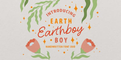 Earthboy will be perfect for wedding lettering, beautiful frame for your home, book covers, greeting cards, logos, marketing, magazines or anything that requires cute handwritten lettering :) What's inside: Earthboy Sans Earthboy Script Multilingual support Cricut support If you have any questions, please contact me directly or in instagram @superdizigner
 - Blessed Dreams by Yumna Type,
$15.00 It could be such frustrating work to find an attractive display font in accordance with your design project. Moreover, a wrong display font will only result in the failure of your design leaving your customers uninterested. However, you should feel no worry as we have the best answer to your problems. Blessed Dreams is a visually attractive display font with soft, gentle nuances caused by the swinging end of the wipes and curves. Each of the letters is interconnected as in the cursive font and the proportions are relatively similar for a legibility reason. Furthermore, you can apply this font, which also provides you with a clipart as a bonus, for big text sizes to be legible. In addition, you may make use of the available features here. Features: Multilingual Supports PUA Encoded Numerals and Punctuations Blessed Dreams fits best for various design projects, such as brandings, posters, banners, headings, magazine covers, quotes, printed products, merchandise, social media, etc. Find out more ways to use this font by taking a look at the font preview. Thanks for purchasing our fonts. Hopefully, you have a great time using our font. Feel free to contact us anytime for further information or when you have trouble with the font. Thanks a lot and happy designing.
 - Cheap Skit by PizzaDude.dk,
$11.00 It doesn’t take long to see that Cheap Skit is a super legible, easy going font. It is intended to be used where text needs to be clear and legible, but have certain amount of handmade energy. I’d say that products that has something to do with children (toys, clothes, games, posters …) or something organic, recipes, bookcovers …
 - AE Prosperity by Altered Ego,
$50.00 Well suited for headlines, packaging and display applications, AE Prosperity will be a robust and versatile addition to your script library. It’s purposefully designed to infer the visual connections of letters for a hand-lettered feel. Some characters will connect, and others will guide your eye to the next letter from, making it highly legible. In 1779, the schooner Prosperity sailed the high seas. Commissioned by a young continental congress, with 6 guns & at twenty tons, she sailed under a Letter of Marque for patriotism and profit. Look lively, because with contextual and alternate glyph sets (contextual glyphs, alternate lower case glyphs and an extended set of alternate capitals), this robust typeface is as inspiring as her namesake and adapts to whatever winds may blow. Prosperity is designed as a free-flowing script, for a spontaneous and historic aesthetic. Contextual glyphs include variations on tt (short and longbar), t longbar, ll, cc and other characters. Contextual features change ascender heights and descender styles. Alternate glyphs (set 1) include variations on b,d,f,g,h,l,o,p,r,s,t,y. Alternate capitals (set 2) include a complete set of alternate upper case letters. Most useful with Adobe® InDesign®, multiple variations of letter combinations can be achieved by selecting Contextual glyphs, and/or set 1 and set 2 from the Character Palette: OpenType: Stylistic Sets menu. Alternate glyphs and contextual characters will be available based on the OpenType support of your application. AE Prosperity™ is available exclusively in OpenType format.
 - NT Gagarin by Novo Typo,
$26.00 Anna Gagarin is the loving matriarch of the Gagarin Family. Her life was full of love and passion. She had several affairs with Futurist and Contstructivist artist in the beginning of the 20th century. She was in love with the Russian poet Vladimir Majakovski (born on July 19th, 1893 and died in Moscow on the April 14th, 1930). She gave birth to his son Boris. She called him 'a cloud with trousers'. After this love story, Anna Gagarin met the designer and artist Gustav Klucis in Italy. His radical and political ideas were much too childish for her. After a period of love and passion Anna gave birth to his son. At that time they were in Italy, which explains his italic forms. After her return to Moscow in the beginning of the 1920's Anna was introduced by Alexander Rodchenko. They were heavenly in love but Ilja Stepanova was very jealous on her husband. Anna once said that 'Alexander fills mine construction with love...' That phrase can be an explanation for the term Constructuvism as an art movement. Alexander was the great love of Anna. She gave birth to their love-baby Dimitri Gagarin. That night Alexander designed his most famous poster. A decade before that Anna told it was 'a time for a change'. In a local bar in Sint Petersburg she met Gregory Rasputin. At that time Rasputin was a well known person and a respected member of the Sint Petersburg upper class.His diabolic character influenced Anna and after several months she gave birth to their son Kurt. He inherited the main characteristics of his father. The Gagarin Family wants to give love and wants be loved...
 - FF Marselis Serif by FontFont,
$58.99FF Marselis crossbreeds geometric and humanistic forms, creating a freshly dynamic sans serif family. All of the counters in the typeface are open; this aids readers’ eyes quickly flow across lines of text, without experiencing hang-ups. Certain superfluous strokes have been eliminated – there are no spurs on the b or q, for instance. The alphabet’s diagonals all bow outwards slightly, adding flavor to the “A”, “K”, “R”, “V”, “W”, “X”, “Y” and “Z”. - Love Board by Sarid Ezra,
$13.00 Love Board, Handmade font with two weight! Love Board is a handmade font based in sans serif. With carefully crafted, this font have a hand lettering vibes that will make your design more natural and humanist. You can use this font for book cover, your t-shirt design, quotes, or even your letter! With two weight that compliment each other, this font will suitable for many projects. This font also support multilingual! Love, Sarid Ezra
 - Design System by Dharma Type,
$14.99 Design System is a great type system consisted of 5X7X2=70 font styles from 70s-style simple square sans to the widest style of all time that are best for titles, logo and text. Their simple form does not limit the target of design and can be used for any creative work. Additionally they all have been designed not to provide a feeling of strangeness when they are used in mixture each others.
 - Fractul by Adam Ladd,
$25.00 Fractul is a geometric sans with architectural qualities. Built from the Konnect family, this typeface introduces even more unique and display oriented design details, which you'll see in characters like a, f, g, t, y, etc. where certain strokes have been straightened for an angular and modern appearance. Also included is Fractul that takes the angular design further by styling characters like m, n, u, etc. to be rectangular and avant garde.
 - Bloomberg Script by Vástago Studio,
$25.00 Bloomberg Script is a typeface designed from the exploration with the different tools we use to write each day on post its, notebooks, etc. But, applying the traditional handwriting repair method in the construction, spacing the glyphs, and giving it texture of fast strokes, ideal for handletters... is more organic. And finally, we have this typeface, a very comfortable letters to read on packaging, poster ads, screen and every display applications; this is Bloomberg Script.
 - Lombardia Illuminata by Celebrity Fontz,
$24.99Lombardia Illuminata is a collection of Lombardic-style letters surrounded by natural forms of vines, leaves, trellises, scrolls, sun rays, and flowers. This beautifully ornate font includes one set of A-Z ornamental initials conveniently assigned to both the upper and lower case alphabet characters which are perfect for starting off the beginning of paragraphs in artistic publications, storybooks, fairy tales, and texts conveying the feel of medieval manuscripts of the 12th-16th centuries. - Sundry by J Foundry,
$25.00 Sundry is J Foundry’s take on the early 20th century grotesque. The design draws influence from various designs of the period. Drawn and cut by hand, these sans have idiosyncrasies and quirks, producing a warm friendly look. The design objective was to even out the quirks and add consistency, without losing the warmth. Sundry looks to balance character and structure for a clear but personable read. Variable Fonts included in the Complete Package.
 - Emmeline by Dear Alison,
$19.00 There's something about the endless variations of handwriting, the tactile process of pen, pencil or brush to paper, and the personal and ephemeral quality as a whole. I recently came across some old handwritten letters from when my younger sister was going to college, and as soon as I saw them, a flood of memories came back to me. All just from seeing her handwriting. That's just one thing handwriting can do. I hope you find enjoyment in my sister's handwriting as much as I still do. This font is complete with alternates that will auto-typeset via the ligature feature to give a more handwritten feel.
 - Close Together by Ingrimayne Type,
$9.00 Close Together was designed to alternate convex and concave letter sets, with convex letters on the upper-case keys and concave shapes on the lower-case keys. The OpenType feature of contextual alternatives (calt) does this automatically. Individually some of the letter shapes are strange and unsightly. They have the shapes that they have so that they fit snuggly with adjacent letters. The family has three weights: regular, bold, and extrabold. The letter spacing is set very tight and the user may want to loosen it by altering characters spacing. (Either the convex or concave set the letters can be used alone if the character spacing is adjusted.) The typeface has four OpenType stylistic sets of alternates, one for numbers and the others for letters D, T, and Y.
 - FF Polymorph by FontFont,
$41.99 German type designer Stefanie Schwarz created this display and sans FontFont in 2008. The family has 6 weights, and is ideally suited for advertising and packaging, festive occasions, editorial and publishing as well as poster and billboards. FF Polymorph provides advanced typographical support with features such as ligatures, alternate characters, case-sensitive forms, super- and subscript character, and stylistic alternates. It comes with a complete range of figure set options – oldstyle and lining figures, each in tabular and proportional widths.
 - Badire by Issam Type,
$18.00 Badire is a beautiful and unique sans-serif font that is perfect for wedding invitations, branding, logos, product packaging and so much more. With its clean lines and distinctive design, Badire offers endless creative possibilities. It comes in regular, italic, round, and round italic font styles, and includes uppercase and lowercase letters, numbers, punctuation, ligatures, alternates, and multilingual support." OpenType Features Kerning Alternates Ligatures Stylistic Sets If you have any questions, please feel free to get in touch. Thank you
 - FF Turmino by FontFont,
$41.99 German type designer Ole Schäfer created this sans FontFont in 2002. The family has 6 weights, ranging from Light to Black and is ideally suited for advertising and packaging, editorial and publishing as well as sports. FF Turmino provides advanced typographical support with features such as ligatures, alternate characters, case-sensitive forms, fractions, super- and subscript characters, and stylistic alternates. It comes with a complete range of figure set options – oldstyle and lining figures, each in tabular and proportional widths.
 - Concavex by Ingrimayne Type,
$9.00 ConcavexCaps is a whimsical bold display typeface family in three styles that are designed to used in layers. It is caps-only, with the upper-case and lower-case keys differing for the BCGKRS characters. Horizontal elements of the letters are straight and vertical elements are curved, flaring either in or out. ConcaveWarp is a distorted form of ConcavexCaps.
 - Peanut Square Layer by PizzaDude.dk,
$19.00 This is a font that will fit in the "hard to read section" because it may not be super legible at first sight - that is because of the negative space. But when you combine the two layers (Layer and Box) the letter suddenly appears very legible! Play around with your favourite colour palette while adjusting the transparency in order for the colours to blend, giving a really nice handcrafted look! You have 4 different versions of each letter to play around with and of course there is multilingual support!
 - FF Advert by FontFont,
$59.99 Dutch type designer Just van Rossum created this sans FontFont in 1991. The family contains 4 weights: Light, Regular, Bold, and Black and is ideally suited for advertising and packaging projects. FF Advert provides advanced typographical support with features such as ligatures, alternate characters, case-sensitive forms, fractions, super- and subscript characters, and stylistic alternates. It comes with a complete range of figure set options – oldstyle and lining figures, each in tabular and proportional widths. This FontFont is a member of the FF Advert super family, which also includes FF Advert Rough.
 - Gracela by Yukita Creative,
$14.00 Introducing the Gracella font in the Elegant Sans Serif style. A versatile font that can be used for both formal and casual. Gracela is a regular style font, not too thin nor too thick, and very suitable for the needs of logos, branding, websites, Features. - Supports all languages in the world (37) - Versatile Single Font. - One font for all needs. Make sure you test out the fonts using one of our examples before making any purchases to know what you're getting yourself into. Thank you for taking care when choosing fonts!
 - Corso by Dominik Krotscheck,
$7.99 Corso is a clean condensed sans serif font family. It comes in upright, slanted and italic, in six weights each. It includes useful typographic features such as fractions, ligatures and case sensitive forms. Also included are double- or single-storey versions of a and g, you can switch via stylistic OpenType sets. Other letters with alternative forms accessible the same way are ß and ampersand. Corso works especially great for larger size uses such as signage, headlines or posters. But that doesn’t mean that it isn’t also useable for short texts.
 - Filson Pro by Mostardesign,
$26.00 Designed by Olivier Gourvat in 2014, Filson Pro is a new geometric sans serif family with versatility in mind. With its 575 glyphs and its round aspect, this typeface covers all kind of graphic and web design projects. This font family contains 16 fonts from Thin to Black with a professional range of Opentype functions such as pro kerning,lining and oldstyle figures, stylistic alternates, case sensitive forms, localized forms and f-ligatures. For better typographic control, Filson Pro also includes Opentype class kerning with thousands of kerning pairs.
 - CUKIER by Borutta Group,
$29.00 After my previous typefaces inspired by the flavour of local typography (Massimo, Picadilly & Zigfrid), I'd like to present new one, called CUKIER. This family was designed mainly for branding purposes - visual identity of CUKIER.WORKS Agency. Cukier is a sans serif, geometric typeface, inspired by the vernacular typography from Zanzibar (Tanzania). A lot of letters have intentionally made mistakes in a drawing, and this it what makes the whole font unusual. Family consist 10 styles – 5 weights with italics.
 - Cicero by Présence Typo,
$36.00Cicero was the first typeface designed by Thierry Puyfoulhoux in 94. It is what could be called a semi-serif. Only the serifs which occur naturally when drawing letters with a flat nib pen have been retained. The absence of certain serifs allows for much tighter spacing. The remaining serifs still stabilize the baseline, although less effectively than a "full-serif" typeface. By borrowing features from both the sans and serif styles, Cicero truly stands at their crossroads. - MapleOaks by Ingrimayne Type,
$14.95 In the early days of PostScript fonts, I designed a font of leaves called XLeafMeAlone. In 2006 I decided to revisit this topic and the result was two sets of new leaf fonts: MapleOaks and MoreLeaves. MapleOaks contains almost 100 images of maple, oak, and sycamore leaves, and MoreLeaves has almost 100 images of leaves of various other species. There are four MapleOak fonts. They have identical images; only the orientation of the images is different. In MapleOaksUR the tips of the leaves point to the upper right, in MapleOaksDR the tips point down to the right, etc.
 - Timernis by Aga Silva,
$19.99 Timernis is humanist multilingual contrast sans serif available in eight weights from thin to black. All caps have this super elegant, classic proportions old school look and is based on 1940 stone engraving commemorative plaque. The engraving itself boasted sophisticated clean look and was a joy to look at. All caps: Would suit display usage such as: signage, titles, headers, engravings, high end packaging. Do try putting space between the letters in your selected word for suave and chic feel. Expanded round shapes are prevalent in lowercase, which is legible in small sizes and pleasant to the eye.