10,000 search results
(0.036 seconds)
- Miss Donna by Scholtz Fonts,
$15.00 Miss Donna - contemporary, powerful, versatile and casual. Curvy, sassy, fast-talking, and utterly useable, she takes you into the world of movie posters, decor ads, fashion posters and tags, greeting cards and invitations. Her lines are bold, clean and legible. The Miss Donna family comes in four styles: - REGULAR - clean good lines and generous curves - for decor ads, greeting cards, copy - NARROW - slim (more compact), and elegant with contained curves - for greeting cards, invitations, copy - BLACK - bold statement, round, generous curves - for movie posters, fashion posters - BLACK CAPS - especially designed for "all-caps" printed text. Use for headings & subheads. Miss Donna Black Caps contains capitals in two sizes and this gives you the ability to generate text of two types: - a correctly spaced and kerned upper case, OR - a TRUE Small Caps -- as opposed to the false Small Caps produced by a well-known word processing application. In a correctly proportioned Small Caps the stroke width should not be reduced in the same proportion as the letter height is reduced. The stroke width of the small capitals should rather be equal or close to the stroke width of the corresponding upper case characters. Note: When using script fonts it is NOT usually advisable to use text in ALL caps. The best effects for headings and subheads are obtained with an initial upper case letter followed by lower case characters. BUT, Miss Donna will still produce excellent results with all caps if you are using an application that supports kerning. If you are using upper and lower case then it is not necessary to use kerning, although it may make a slight difference on occasion. Miss Donna contains over 235 characters - (upper and lower case characters, punctuation, numerals, symbols and accented characters are present). It has all the accented characters used in the major European languages.
 - Wonder by Fenotype,
$20.00 Do you sometimes have an appetite for a bit more wholesome typography? Do you find the ubiquitous sans serifs too industrial and bland in taste? Opt for something more organic: Wonder – a rootsy yet contemporary type family. With a deliciously juicy approach to serifs and a chunky texture, Wonder is a real treat among typefaces. Despite its rustic flair, Wonder is perfectly adaptable for contemporary contexts from branding to packaging, mobile apps and beyond. Savvy features such as multiple numeral styles (old style figures, tabular figures, subscript and superscript numerals), small capitals and swashes are included in all Wonder fonts. Enjoy!
 - Ruthen Back by Java Pep,
$13.00 Ruthen Back - a Stylish Font, offering a different feel than my other fonts. A script font with a taste like signature fonts because all characters are based on the stylish signature, always catchy and elegant if you use it for personal name branding or logotype in your business. This font also looks outstanding in other projects such as greeting cards, tittle book/magazine, poster, neon light logo and etc. What's featured? - Uppercase and lowercase - numeral and punctuations - Multilingual support - PUA encoded Thanks for using this font. For other questions about this font please contact me at java.indonesian@yahoo.com. Have a nice day!
 - Authentic Romantic by SilverStag,
$14.00 A brand new year is here and a brand new font is here as well. I have to say I had so much fun working on this funky slab serif typeface. I have created some quirky letters and over 100 ligatures + the font comes in four weights - light, regular, medium & italic. The font also includes full language support, punctuation, numerals and detailed instructions how to use ligatures in most of the apps on your computer, as well as in Canva. I invite you to check out the preview images, and I hope you will be immersed in my vision for this creative typeface that, I am sure, will work for all kinds of interesting projects you might be working on this year. If you end up publishing your designs on Instagram, tag me - @silverstagco and I will make sure to showcase your design and work to my audience as well! Authentic Romantic - Slab Serif Font Includes: 100+ Ligatures Numerals & Punctuation Language Support Detailed instructions on how to use alternates in most of the apps on your computer as well for Canva Happy creating everyone!
 - ZT Ravigsfen by Zelow Type,
$13.00 In a design landscape dominated by modern advancements, ZT Ravigsfen emerges as a stunning turning point. A work of sans-serif grotesque font that celebrates the style and audacity of classic sci-fi, this font takes users on a journey through time. With Nine Weights spanning from delicate thin to commanding black, ZT Ravigsfen offers boundless flexibility to embrace any design project. Its unique alternative style, featuring a central split, creates characters shrouded in mystery and wonder. This is more than just a font; ZT Ravigsfen is a narrative. Each letter is a blank canvas waiting to be filled with stories and adventures. Both uppercase and lowercase letters, while sharing similar forms, exude distinct auras, framing each word with a signature touch. ZT Ravigsfen Key Features: 9 Remarkable Weights 3 Styles (Grotesque, Oblique, & Alternate) Captivating Alternative Style Distinct Aura in Every Thickness Rich with 525 Glyph Free Updates Download now, discover unforgettable retro aesthetics, and embrace boundless creativity with ZT Ravigsfen. This font is the gateway to a new dimension of design waiting to be explored. I hope you have fun using ZT Ravigsfen. Thanks for using this font ~ Zelowtype
 - Crystania by RGB Studio,
$17.00 Crystania is a must-have signature script that has a diverse. This collection fills a void and separates itself from other scripts available. Crystania is a handwritten signature script with a natural & stylish flow. This collection of scripts is perfect for personal branding. But, this works well for many applications. Everything from personal branding & wedding invitations to advertising could benefit from this collection of signature fonts. These typefaces work well for many different aesthetics. They work well with something like 'cosmetics' for example but would also work well with Liquor Labels, Signage, & any type of signature-styled logo. Files Include : Basic Latin A-Z and a-z Numbers Symbols PUA Encode Multilanguage Support Thanks and have a wonderful day, If you have any questions, please get in touch with us Don't forget to check out our other products.
 - Ant Serif by LNP Fonts,
$9.99 Ant Serif is a font that can be used for advertising, logo creation, webfonts and more. The font comes in two styles, Regular and Italic and has all the characters in the Latin Basic, Additional and Extended scripts. The font's design came from my love of Marvel's Ant-Man and the Wasp logo. The typeface used, which was custom, was of interest for me, so I decided to create it as a font. It's not a perfect font, but I have put work to make sure it looked as decent as possible. Hope you'll enjoy it!
 - ITC Tactile by ITC,
$29.99ITC Tactile is a puzzle of subtle typographic contradictions. Capitals have traditional epigraphic proportions, but the lowercase has a uniform optical width. Light weights are stately and elegant, but bold designs are almost jolly. This paradoxical alphabet even combines two distinctively different serif designs. Designer Joe Stitzlein says, “I wanted to create a modern and dynamic serif face that draws its forms from antiquity. I also wanted to have as much fun as possible with the drawing and architecture of each letter. Hopefully I've created a very legible typeface that grabs the reader's eye in a nice, 'tactile' way.” The apparent inconsistencies of the design are the result of careful consideration. Of the seemingly odd serif design, Stitzlein explains, “The transitional serif is an entry point for the eye into the letterform, and the long slab is an exit, leading to the next letter.” The result is a typeface that's easy to read at text sizes but offers surprising details when enlarged to display sizes, setting ITC Tactile apart from more traditional designs. While this is his first commercial typeface design, Stitzlein has ample experience creating custom typefaces for corporate branding, including companies such as Silicon Graphics and Sempra Energy. His graphic design business has served a wide range of clients, including Apple Computer and the 2002 Salt Lake City Olympics. The ITC Tactile family is available in three weights, with complementary italic designs and a suite of small caps for each of the roman designs. Stitzlein drew the small caps to match the height of the lowercase x-height, which enables “bi-form” or “unicase” setting in display copy. - 99 Names of ALLAH Attached by Islamic Calligraphy75,
$12.00 We have transformed the “99 names of ALLAH” into a font. That means each key on your keyboard represents 1 of the 99 names of ALLAH Aaza Wajal. The fonts work with both the English and Arabic Keyboards. We call this Calligraphy "Attached" because the "alef" and "lam" are attached together. The first "Alef" has a "fatha", this indicates to pronounce the first letter. So instead of saying "R-RAHMAAN" you say "AR-RAHMAAN" (in the zip file you will find a pdf file explaining the differences in the "harakat", pronunciation & spelling according to the Holy Quran). You will also notice that the decorative letters in this font are bigger than usual, we also used the traditional "soukoun" instead of the "Quranic soukoun" & we were a little bit more generous than usual with the decorative symbols. Decorative letters used in this calligraphy: "Mim, Aain, Sin, HHe, He, Kaf, Alef, Tah & Saad". Purpose & use: - Writers: Highlight the names in your texts in beautiful Islamic calligraphy. - Editors: Use with kinetic typography templates (AE) & editing software. - Designers: The very small details in the names does not affect the quality. Rest assured it is flawless. The MOST IMPORTANT THING about this list is that all the names are 100% Error Free, and you can use them with your eyes closed. All the “Tachkilat” are 100% Error Free, all the "Spelling" is 100% Error Free, and they all have been written in accordance with the Holy Quran. No names are missing and no names are duplicated. The list is complete "99 names +1". The +1 is the name “ALLAH” 'Aza wajal. Another important thing is how we use the decorative letters. In every font you will see small decorative letters, these letters are used only in accordance with their respective letters to indicate pronunciation & we don't include them randomly. That means "mim" on top or below the letter "mim", "sin" on top or below the letter "sin", and so on and so forth. Included: Pdf file telling you which key is associated with which name. In that same file we have included the transliteration and explication of all 99 names. Pdf file explaining the differences in the harakat and pronunciation according to the Holy Quran. --------------------------------------------------------------------------------------------------------------------------- Here is a link to all the extra files you will need: https://drive.google.com/drive/folders/1Xj2Q8hhmfKD7stY6RILhKPiPfePpI9U4?usp=sharing ---------------------------------------------------------------------------------------------------------------------------
 - Antique Initials by Kaer,
$19.00 Hello, friends! I have a good news! At last I have finished working on my Antique Initials color font. Wow! It was a long and hard work because every initial is unique. I sketched each letter of the font very scrupulously from scratch. Each letter is uniquely designed and has a unique flower pattern in the background. I used a pale old color palette to color these letters. There came out two font variants: a black and white and a nice colored one. The font contains initials from A to Z (26 characters, lowercase glyphs are same). I hope you enjoy this font. Follow my shop to receive updates of products and the very hottest news! If you have any question or issue, please contact me: kaer.pro@gmail.com Please request to add additional characters and glyphs if you need! Thank you! You can use color fonts in PS since CC 2017, AI since CC 2018, ID since CC 2019, QuarkXPress since 2018, Pixelmator, Sketch, Affinity Designer Since macOS 10.14 Mojave, Paint.NET Windows only. Please note that the Canva do not support color fonts!
 - Kaleko 105 Text by Talbot Type,
$19.50 Kaleko 105 Text is the text specific variation of stablemate, Kaleko 105 . With a shallower x-height and longer ascenders and descenders, its more traditional proportions make it more economical with space and better suited to continuous text. It's a well-balanced, versatile, modern sans, highly legible as a text font and with a clean, elegant look as a display font at larger sizes. The Kaleko 105 Text family comprises of four weights and includes old style non-aligning (lower case) numbers, both proportional and tabular as well as accented characters for Central European languages. It is closely related to Kaleko 205 Text , which offers variations in some characters, most notably a two-storey lower case a and g.
 - Kaleko 205 Text by Talbot Type,
$19.50 Kaleko 205 Text is the text specific variation of stablemate, Kaleko 205 . With a shallower x-height and longer ascenders and descenders, its more traditional proportions make it more economical with space and better suited to continuous text. It's a well-balanced, versatile, modern sans, highly legible as a text font and with a clean, elegant look as a display font at larger sizes. The Kaleko 205 Text family comprises of four weights and includes old style non-aligning (lower case) numbers, both proportional and tabular as well as accented characters for Central European languages. It is closely related to Kaleko 105 Text , which offers variations in some characters, most notably a single storey lower case a and g.
 - Kamerik 205 Text by Talbot Type,
$19.50 Kamerik 205 Text is the text specific variation of stablemate, Kamerik 205. With a shallower x-height and longer ascenders and descenders, its more traditional proportions make it more economical with space and better suited to continuous text. It's a well-balanced, versatile, modern sans, highly legible as a text font and with a clean, elegant look as a display font at larger sizes. The Kamerik 205 Text family comprises of four weights and includes old style non-aligning (lower case) numbers, both proportional and tabular as well as accented characters for Central European languages. It is closely related to Kamerik 105 Text, which offers variations in some characters, most notably a single storey lower case a and g.
 - Kamerik 105 Text by Talbot Type,
$19.50 Kamerik 105 Text is the text specific variation of stablemate, Kamerik 105. With a shallower x-height and longer ascenders and descenders, its more traditional proportions make it more economical with space and better suited to continuous text. It's a well-balanced, versatile, modern sans, highly legible as a text font and with a clean, elegant look as a display font at larger sizes. The Kamerik 105 Text family comprises of four weights and includes old style non-aligning (lower case) numbers, both proportional and tabular as well as accented characters for Central European languages. It is closely related to Kamerik 205 Text, which offers variations in some characters, most notably a two-storey lower case a and g.
 - ITC Don't Panic by ITC,
$29.99ITC Don't Panic's distressed shapes and craggy outlines evoke the feeling you get when you're just barely in control of a situation. This is type design on the edge. ITC Panic is further down the emotional track, when you've actually lost control and there is no hope in sight. Thompson says the inspiration for these faces arrived one day in the mail. I received an envelope that looked like it had a rough trip; the type that was stamped on it had a tired, ragged appearance. Ironically, the haggard envelope woke me up. I got excited and wanted to replicate the look as a font of type." Thompson designed ITC Don't Panic, then stood back and looked at it and decided it cried out for a more agitated companion. ITC Don't Panic gave birth to the positively psychotic offspring, ITC Panic. Both are all-cap designs with alternate characters in the unshift position. Creating an authentically disturbed appearance proved to be a challenge for Thompson. "I tried to design agitated characters, but they looked staged. So I tried multiple photocopies, but that didn't work. Eventually, I laser-printed the basic characters, wadded up the lasers, then flattened them out and stomped on them with heavy boots. The end result was scanned and used as the basis for the rest of the design." Thompson's work on web sites and multimedia has influenced his interest in type and typography that transcends the cool, unemotional nature of the computer." - ITC Panic by ITC,
$29.99ITC Don't Panic 's distressed shapes and craggy outlines evoke the feeling you get when you're just barely in control of a situation. This is type design on the edge. ITC Panic is further down the emotional track, when you've actually lost control and there is no hope in sight. Thompson says the inspiration for these faces arrived one day in the mail. I received an envelope that looked like it had a rough trip; the type that was stamped on it had a tired, ragged appearance. Ironically, the haggard envelope woke me up. I got excited and wanted to replicate the look as a font of type." Thompson designed ITC Don't Panic, then stood back and looked at it and decided it cried out for a more agitated companion. ITC Don't Panic gave birth to the positively psychotic offspring, ITC Panic. Both are all-cap designs with alternate characters in the unshift position. Creating an authentically disturbed appearance proved to be a challenge for Thompson. "I tried to design agitated characters, but they looked staged. So I tried multiple photocopies, but that didn't work. Eventually, I laser-printed the basic characters, wadded up the lasers, then flattened them out and stomped on them with heavy boots. The end result was scanned and used as the basis for the rest of the design." Thompson's work on web sites and multimedia has influenced his interest in type and typography that transcends the cool, unemotional nature of the computer." - Circe Rounded by ParaType,
$40.00 Circe Rounded is an extension for a popular Circe typeface, with rounded terminals. Bold and ExtraBold faces have two variants with different radius of the roundings. Circe Rounded is even more friendly than the original Circe. The typeface is designed by Alexandra Korolkova and Alexander Lubovenko and released by ParaType in 2015. It is known that the Circe typeface is distinguished by mild and humanist nature being formally a geometric sans-serif. However, as an experiment we decided to make it even softer: Circe now has a version with rounded terminals — Circe Rounded. Rounding is generally regarded as a mechanical operation, but in this case a lot of manual adjustment was needed because of the humanist nature and peculiarities of type design. Moreover, the two bold styles now have two options: a basic one is slightly rounded and an alternate one is fully rounded. In Circe Rounded we decided to dismiss characters with swashes that are rather inappropriate in such a rounded font, but the stylistic sets and alternate characters are remaining. Rounded terminals make an open and friendly typeface even more childish. For example, in quite large point sizes (because the x-height is still not big) it can be used as a body type in infant books. Circe Rounded, similar to Circe, has alternative forms of lowercase characters, which are called “infant” and are used in publications for children’s reading. However, a humanist basis is preserved alongside with its softness and it does not allow it to be as “plasticine” as many other rounded fonts. Two of the most obvious areas of possible application of Circe Rounded are everything for children and everything edible, especially all that is sweet and puff. However, we believe that there are other options.
 - Sidesakey by Aminmario Studio,
$20.00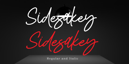 Sidesakey simplifies elegance into one truly stunning handwritten font. With its relaxed feel, Sidesakey is incredibly versatile, suitable to each of the design projects you may have in mind! Use it to create beautiful greeting cards, wedding invitations, logos, website titles and much more! Comes in Regular and Italic styles. Thank you for your purchase! Hope you enjoy with our font
 - Rummy by Bunny Dojo,
$23.00 Rummy is powerful, precise, and packed with personality. Simple and initially unassuming, Rummy may seem a reluctant hero. But, when called upon, Rummy will lend you all of its considerable strength and versatility in order to win the day. Influenced by sports branding and 1940s film, Rummy is an underdog that won't let you down. Need more height? Try Rummy Tall!
 - Nanu by Gustav & Brun,
$20.00 Nanu is a hand drawn font where lower and upper cases have the same cap height. It is multilingual and contains a lot of open type features. When purchasing Nanu you get the Nanu Simple Ornaments for free.
 - Inked God Pro by CheapProFonts,
$10.00 This font has that grungy, gritty look, and combines it with some elegant swirls. Weird and wonderful. I have added swirls and decorations to ALL the uppercase letters that did not have them, so there are now wider possibilities to add interesting decorations to your composition. In addition to the expanded language support, of course. ALL fonts from CheapProFonts have very extensive language support: They contain some unusual diacritic letters (some of which are contained in the Latin Extended-B Unicode block) supporting: Cornish, Filipino (Tagalog), Guarani, Luxembourgian, Malagasy, Romanian, Ulithian and Welsh. They also contain all glyphs in the Latin Extended-A Unicode block (which among others cover the Central European and Baltic areas) supporting: Afrikaans, Belarusian (Lacinka), Bosnian, Catalan, Chichewa, Croatian, Czech, Dutch, Esperanto, Greenlandic, Hungarian, Kashubian, Kurdish (Kurmanji), Latvian, Lithuanian, Maltese, Maori, Polish, Saami (Inari), Saami (North), Serbian (latin), Slovak(ian), Slovene, Sorbian (Lower), Sorbian (Upper), Turkish and Turkmen. And they of course contain all the usual "western" glyphs supporting: Albanian, Basque, Breton, Chamorro, Danish, Estonian, Faroese, Finnish, French, Frisian, Galican, German, Icelandic, Indonesian, Irish (Gaelic), Italian, Northern Sotho, Norwegian, Occitan, Portuguese, Rhaeto-Romance, Sami (Lule), Sami (South), Scots (Gaelic), Spanish, Swedish, Tswana, Walloon and Yapese.
 - Gripewriter by Elemeno,
$20.00Typewriters are becoming scarce, but fonts designed to look like they came from typewriters aren't. In this case, however, Gripewriter is meant to look as if it were typed on a textured paper and enlarged, emphasizing flaws and lending it a funkier, grungier look than your average typewriter face. This was originally called Hypewriter until it was pointed out that a font already existed with that name. The current name is a better fit, anyway, since Gripewriter looks like it might hold a grudge. - LHF Saratoga Panels 4 by Letterhead Fonts,
$53.00The final collection in the series of 4 fonts. Each font contains 37 expertly drawn panels. All you have to do is add your own text and color for a quick and easy design. All 37 of these panels are exclusive to Letterhead Fonts. Typing each letter generates a different panel. Special Note: Due to the large file size of these fonts, they will not convert for use in Gerber Omega. Instead, Omega users may wish to use an alternate program to type the characters and import them into Omega as .eps files. CorelDraw users should use the "Weld" command rather than "Convert to Curves" command to convert these fonts to vector outlines. Otherwise, the program may crash due to the sheer number of points in each panel. - FF Kaytek Rounded by FontFont,
$50.99 Kaytek™ Rounded completes the Kaytek typeface family with seven carefully rounded weights. Every style of the typeface takes up exactly the same amount of space, thanks to the careful creation by Radek Łukasiewicz. This means designers can switch between styles without the text being reflowed, making it particularly useful in magazines, where space might be limited, and also on the internet, where hover links appear in a different style. Kaytek Rounded comes in seven weights, from Thin to Black. It pairs also with Kaytek Sans, Kaytek Slab, and Kaytek Headline.
 - Nat Grotesk by ParaType,
$30.00 Nat Grotesk family consists of 14 styles including 6 narrow ones. It has a half-closed sans serif design with simple and clear lettershapes. Due to compact proportions the face is very space saving, but nevertheless it is rather legible even in small sizes. The bold weights demonstrate increased contrast. The font is recommended for text and display typography as well as for headlines and advertising. It was designed by Natalia Vasilyeva and released by ParaType in 2007. The upgraded version with extended character set was released in 2009.
 - FF Hydra by FontFont,
$62.99 Canadian type designer Silvio Napoleone created this sans FontFont in 2004. The family has 20 weights, ranging from Light to Black in Normal and Extended (including italics) and is ideally suited for book text, editorial and publishing, logo, branding and creative industries as well as small text. FF Hydra provides advanced typographical support with features such as ligatures, alternate characters, case-sensitive forms, fractions, and super- and subscript characters. It comes with a complete range of figure set options – oldstyle and lining figures, each in tabular and proportional widths.
 - Koala by Linotype,
$40.99Koala was originally designed in 1999 by Eric de Berranger with an individual, independent character. A distinguishing characteristic of this sans serif font is its marked stroke contrast, typical of Modern Face fonts. The open, airy forms are reminiscent of ancient Roman capitals. The lower case letters display traits similar to those often seen on posters and in advertisements of the 1930s and 1940s. The lively Koala is particularly good for shorter texts and headlines in larger point sizes and combines well with fonts with little stroke contrast. - The Hohoho by Avchi,
$12.00 Tho Hohoho is a font specially designed for christmas purposes. This font is a condensed sans serif, have a round corner, and have a happy concept. The main target is for Christmas design, but can be use for another purposes such as kitchen, nature, and other. This Font Include : Ligatures Latin Numbers & Punctuation We wish this font can bring customers to happiness.
 - 70toxina by FSdesign-Salmina,
$39.00 70toxina. 70s & 80s combined. Both Seventies and Eighties celebrate their comeback in form of a revival, combined in a font. Let’s have a party with 70toxina!
 - Linotype Rough by Linotype,
$29.99French designer Christophe Badani developed the Linotype Rough family in 1999. The family contains nine different typeface styles, each with a slightly different voice. The forms appear to have found a unique middle ground between hand-drawn letters and pure geometry, especially Linotype Rough Outline. Make sure to pay special notice to the true-italic forms in the three italic weights! Badani's attention to typographic detail is not to be missed. Linotype Rough is perfect for headlines and display work. The medium and bold weights can also function splendidly in text. The entire family is included in the TakeType 4 collection, available through Linotype." - Hops And Barley by Fenotype,
$25.00 Hops And Barley - a Vintage Font Collection. Hops And Barley includes following: • 6 fonts - a textured and clean version of each • Catchwords, textured and clean version • Ornaments, textured and clean version Hops And Barleys’ core is four font styles. Fonts are designed in the same proportions and they have the same soft edges so that they work great together. Here’s a short introduction to the fonts • Hops And Barley 1 -A Connected Script with Contextual, Swash, Stylistic and Titling Alternates • Hops And Barley 1b -A Bold version of Script • Hops And Barley 2 -A Serif vernacular Swash, Stylistic and Titling Alternates • Hops And Barley 3 -A sturdy Sans Serif with a wide character. • Hops And Barley 3b -A Bold version of Sans Serif • Hops And Barley 4 -A Condensed Sans Serif • Hops And Barley 5 -A set of 61 Catchwords • Hops And Barley 6 -A set of 71 Pictograms Hops and Barley fonts have rugged outline and eroded texture inside the letters. Hops And Barley C stands for Clean - they are an identical set of the styles but they come with straight and clean outlines and softened edges. Hops and Barley fonts work great together or on their own. They’re a fantastic choice for any display use and when paired they can cover the whole display part in any project from website to packaging and from poster to logo.
 - Stellar by Monotype,
$29.99Robert Hunter Middleton drew the original design of Stellar for the Ludlow Typograph Company in Chicago. Work began in the late 1920s, when Middleton was asked to create a sans serif type family to compete with European imports of Futura and Kabel. Stellar was Middleton's attempt to raise the ante. Where Futura and Kabel were geometric in design and monotone in weight, Stellar was based on roman character proportions and stroke weighs were stressed. In the late 1990s, Dave Farey took on the task of reviving the Stellar design. While Ludlow cut Stellar in a full range of point sizes, the family was limited to just a roman and bold design. Farey's revival is twice as large a family. It ranges from a very light called Stellar Nova to a very bold called Zeta In between are Lyra and Epsilon. - 1514 Paris Verand by GLC,
$20.00 This set of initial decorated letters was inspired by a font in use in the beginning of 1500s in Paris. Exactly, we have used the set that Barthélémy Verand employed for the printing of Triumphus translatez de langage Tuscan en François, (from “Triumph” of Petrarque) in the year 1514. Some letters, lacked, have been reconstructed to propose a complete alphabet. It appears that the printer used some letters to replace others, as V, turned over to make a A, or D to make a Q. The original font’s letters were drawn in white on a black background only, but it was tempting to propose a negative version in black on white. It is used as variously as web-site titles, posters and flyers design, publishing texts looking like ancient ones, or greeting cards, all various sorts of presentations, as a very decorative, elegant and luxurious additional font. This font supports strong enlargements remaining very smart and fine. It’s original medieval hight is about one inch equivalent to about four lines of characters. This font may be used with all blackletter fonts, but works particularly well with 1543 Humane Jenson, 1557 Italic and 1742 Civilite, without any anachronism.
 - Beachfront Hotel JNL by Jeff Levine,
$29.00 The Raleigh Hotel at 18th Street and Collins Avenue on Miami Beach is an Art Deco landmark and part of the city's popular tourist district. A vintage matchbook from the hotel had its name hand lettered in what is now Beachfront Hotel JNL; available in both regular and oblique versions. The lower case letters have been made more traditional, eliminating the Deco-influenced "overhangs" present on the capital letters, and an alternate "E" from the original matchbook design is available on the bar and broken bar keys.
 - Jannon Pro by Storm Type Foundry,
$55.00 The engraver Jean Jannon ranks among the significant representatives of French typography of the first half of the 17th century. From 1610 he worked in the printing office of the Calvinist Academy in Sedan, where he was awarded the title "Imprimeur de son Excellence et de l'Academie Sédanoise". He began working on his own alphabet in 1615, so that he would not have to order type for his printing office from Paris, Holland and Germany, which at that time was rather difficult. The other reason was that not only the existing type faces, but also the respective punches were rapidly wearing out. Their restoration was extremely painstaking, not to mention the fact that the result would have been just a poor shadow of the original elegance. Thus a new type face came into existence, standing on a traditional basis, but with a life-giving sparkle from its creator. In 1621 Jannon published a Roman type face and italics, derived from the shapes of Garamond's type faces. As late as the start of the 20th century Jannon's type face was mistakenly called Garamond, because it looked like that type face at first sight. Jannon's Early Baroque Roman type face, however, differs from Garamond in contrast and in having grander forms. Jannon's italics rank among the most successful italics of all time – they are brilliantly cut and elegant.
 - Mirava by Din Studio,
$25.00 Hi, Everyone! Ready to make your branding spark? If you need to create a big, bold logo for your business, work on a poster for an event, or whatever your project may be-then this is the perfect font for you. Mirava Sans-A Sans Serif Font Family If we can give you many options then why not? Mirava San is a package that will delight you. With this family you will get many options to maximize your designs with stylish fonts. This font designed to bring your branding to life and add a touch of modernity, fun and style. Mirava paves the way for you to write the information you need to send out to your audience. Perfect to create amazing headings, logos, menus, social media graphics, and many more. Our font always includes Multilingual Support to make your branding reach a global audience. Features: Multilingual Support PUA Encoded Numerals and Punctuation Thank you for downloading premium fonts from Din Studio
 - Sunday Thinker by Hanoded,
$16.00 No, no fantastic story about how I came up with the name for this font. It was a Sunday when I thought up Sunday Thinker. It seemed like the right name and it wasn’t taken yet, so there you have it! Sunday Thinker is a thoughtful font, made with creativity in mind. Personally I think it’d look great on product packaging or book covers, but the font will adapt itself to whatever you think of! Just think happy thoughts!
 - Modelist by Lucky Type,
$18.00 Modelist is a new modern brush font with a bold style and contemporary approach to design, naturally handmade, very suitable for use in title designs such as clothing, invitations, book titles, stationery designs, quotes, branding, logos, greeting cards, T-shirts, packaging designs, posters, and more. Complete with upper and lower case letters, and multi-language support, numbers, punctuation, and some perfect ligatures. Thank you very much for searching and let me know if you have any questions.
 - Kidcut by Malgorzata Bartosik,
$29.00 Kidcut is a typeface created by cutting glyphs out of paper with scissors. The shapes are irregular, giving the impression of being cut out by a child. The typeface contains upper and lower case letters of the Latin alphabet (basic, Eastern, Western and South Western Europe, Vientamese and Pinyin) and three contextual alternates from each glyph, which is very important when there are three identical letters in one word - then we have the impression of handmade, not repetitive.
 - Luxury Ramadan by Nathatype,
$29.00 Luxury Ramadan is a meticulously designed font that pays homage to the timeless elegance of Arabic calligraphy. With Luxury Ramadan, you have a font that's more than just a typeface; it's a bridge between heritage and contemporary design. It's a versatile tool that allows you to infuse your projects with the timeless beauty and clarity of Arabic calligraphy. The characters in Luxury Ramadan are thoughtfully crafted with precision, each letter displaying an elegant and sophisticated aesthetic. The sharp and defined shapes add an air of modernity and clear legibility to the font. In addition, you can also enjoy the features here. Features: Alternates Swashes Multilingual Supports PUA Encoded Numerals and Punctuations Luxury Ramadan fits in headlines, logos, posters, flyers, branding materials, greeting cards, print media, editorial layouts, and many more designs. Find out more ways to use this font by taking a look at the font preview. Thanks for purchasing our fonts. Hopefully, you have a great time using our font. Feel free to contact us anytime for further information or when you have trouble with the font. Thanks a lot and happy designing.