10,000 search results
(0.049 seconds)
- FG Well Well by YOFF,
$13.95 Here you have the FG Well well font who's a scribbling man in the 40+ years who's in a terrible rush.
 - Rivanna NF Pro by CheapProFonts,
$10.00 This font has a charming mix of the organic forms of the Art Nouveau style and the geometric forms of the Art Deco style - and it makes it work! Nick Curtis says: "A general-purpose Art Nouveau font that has been kicking around for a while under various names. As usual, redrawn for consistency and economy of line. Named, for no good reason, after the river that flows near Thomas Jefferson’s home, Monticello." ALL fonts from CheapProFonts have very extensive language support: They contain some unusual diacritic letters (some of which are contained in the Latin Extended-B Unicode block) supporting: Cornish, Filipino (Tagalog), Guarani, Luxembourgian, Malagasy, Romanian, Ulithian and Welsh. They also contain all glyphs in the Latin Extended-A Unicode block (which among others cover the Central European and Baltic areas) supporting: Afrikaans, Belarusian (Lacinka), Bosnian, Catalan, Chichewa, Croatian, Czech, Dutch, Esperanto, Greenlandic, Hungarian, Kashubian, Kurdish (Kurmanji), Latvian, Lithuanian, Maltese, Maori, Polish, Saami (Inari), Saami (North), Serbian (latin), Slovak(ian), Slovene, Sorbian (Lower), Sorbian (Upper), Turkish and Turkmen. And they of course contain all the usual "western" glyphs supporting: Albanian, Basque, Breton, Chamorro, Danish, Estonian, Faroese, Finnish, French, Frisian, Galican, German, Icelandic, Indonesian, Irish (Gaelic), Italian, Northern Sotho, Norwegian, Occitan, Portuguese, Rhaeto-Romance, Sami (Lule), Sami (South), Scots (Gaelic), Spanish, Swedish, Tswana, Walloon and Yapese.
 - Droid Serif - 100% free

- Edita by TypeTogether,
$49.00 Edita is a gentle typeface, humanistic in concept yet with a contemporary feel, where softness and fluidity play a very important role. This can be seen especially in its italics, which are loosely based on handwriting. This book typeface family is intended to be used in books where text is set together with photographs and other graphic elements. However, Edita is a general book typeface, versatile enough to be used in many other contexts, from novels to promotion material. Edita’s large character set, covering most languages which use Latin script, and styles give the designer the possibility to work with a big typographic palette, allowing complex typesetting with several levels of information. This is further enhanced by the two optically corrected weights Edita Small and Small Italic. They have been particularly designed for their use in very small type sizes, such as in captions and notes. They differ in having a slightly bigger x-height, heavier stems, reduced contrast, and carefully drawn ink-traps to ensure legibility at sizes as small as 5 pt. Additionally, their extenders are shorter to save space which allows text to be set with tighter leading.
 - Dazzle Unicase by Device,
$39.00 An elegant, stylish unicase font with alternative lower-case letter-forms designed to fit the capital’s X-height. The lower-case forms are available in many of the lower-case keystrokes, with even more available as “stylistic alternates” or a “stylistic set”, which can be activated in Adobe apps. Eye-catching, sophisticated and contemporary. Available in five weights. A more sober companion to the original op-art version of “Dazzle” .
 - 1431 Humane Niccoli by GLC,
$38.00 Niccolo Niccoli (1364-1437) was a wealthy bibliophile and an acclaimed scribe, in Florence (Italy). He was one of the most important Italian calligrapher in this early time of rediscovering Roman script. Of rare accomplishment was his adaptation of the so called Italian humanistic minuscule script. We were inspired from his late work to create this present Font. We have added a lot of accented and other characters (U/V, I/J...) who was not existing in the original and replacing "long s" by a small "s" for a modern use. The OTF encoding was used for intelligent alternates, permitting to use different forms of the same lower case or capital in a single word, reproducing easily the charming variety of a real manual scripture.
 - Dosky by takoliko,
$10.00 Dosky is a groovy, retro, bubble font. It have a big and bubbly anatomy. Inspired by 70s vibe and culture. The font is perfect to create a project that have a retro feeling but have a little bit modern and modest on it. Dosky support multilingual language also came with 6 font style : Reguler, Condensed, Expanded and Oblique styles. Dosky can be used as a fun or a formal kind of project. It can easily be matched to your projects, and good for communicating your brands.
 - Tremendo by The Ampersand Forest,
$20.00 Tremendo is a gothic sans serif superfamily with a large number of widths and weights that make it a great choice for versatility, clarity, and dynamism. Built with both grotesque and geometric principles in mind, it's remarkably useful for everything from print copy to the largest display applications. If you're looking for a family that will serve your needs, and be noticed Tremendo is it! A note on the name: "Tremendo" is Italian for "too much, insufferable, awful." It's a tongue-in-cheek moniker for a family that's rather monstrous in size and forceful in impact. Give it a try and you'll see that it's much more of a workhorse than it may at first seem to be!
 - Bonedigger by Hanoded,
$15.00 For some reason I had Paul Simon’s song ‘You Can Call Me All’ in my head when I was busy working on this font, so I just had to call it Bonedigger. Bonedigger does not dig bones, but it does have ‘heavy bones’, as it is quite big. Bonedigger is seriously eroded and would look great on book covers and product packaging. It comes in a lovely regular and italic style and a seriously twisted inline style (with, of course, its own italic). As the song goes: With a knick-knack paddywhack, give the dog a bone, this old font came rolling home.
 - CA Segundo by Cape Arcona Type Foundry,
$29.00 The inspiration for this font came from a wall-writing in Cuba. At first glance we thought: "There is something wrong with the wall-writing." But a closer look revealed, that it just mixed up different stroke-styles. That "feature" became the designing principle behind CA Segundo: Round characters like O, U or C are available either with a fat or a thin stroke, whereas other characters with orthogonal lines come in two different styles – uppercase characters emphasize the vertical strokes, while lower cases emphasize the horizontal strokes. This gives you the opportunity to design just while you type.
 - Lemony by Din Studio,
$29.00 Lemony is a serif font family in 8 different volume options expressing formality and elegance in your designs. Its family character is that it has small lines in horizontal or vertical forms on the letter body, easing readers to read the letter as the lines guide readers’ attention to the reading directions. As a result, you may use this font on any text sizes. In addition to the font weight variations, you will have freedom of how and where you should use the font. Enjoy the available features here. Features: Ligatures Multilingual Supports PUA Encoded Numerals and Punctuations Lemony fits for various design projects, such as posters, banners, logos, magazine covers, quotes, invitations, greeting cards, merchandise social media, etc. Find out more ways to use this font by taking a look at the font preview. Hopefully, you have a great experience using our font. Feel free to contact us if you require more information when you are dealing with a problem. Thank you. Happy designing.
 - Peach Daisy (Duplicate) by Nathatype,
$29.00 Ready to make your branding spark? If you need to create a big, bold logo for your business, work on a poster for an event, or whatever your project may be-then this is the perfect font for you. Peach Daisy-A Sans Serif Font Peach Daisy is a new modern sans serif font. This font was carefully crafted and inspired by luxury fashion in the world. It creates a luxurious, rich, exclusive and elegant look in design. It’s thin brush strokes and imperfect baseline give it a fun and stylish. So beautiful on invitation like greeting cards, branding materials, business cards, quotes, posters, lettering and more. Features: Ligatures Alternates Swashes PUA Encoded Numerals and Punctuation Thank you for downloading premium fonts from Natha Studio
 - Peach Daisy by Nathatype,
$29.00Ready to make your branding spark? If you need to create a big, bold logo for your business, work on a poster for an event, or whatever your project may be-then this is the perfect font for you. Peach Daisy-A Sans Serif Font Peach Daisy is a new modern sans serif font. This font was carefully crafted and inspired by luxury fashion in the world. It creates a luxurious, rich, exclusive and elegant look in design. It’s thin brush strokes and imperfect baseline give it a fun and stylish. So beautiful on invitation like greeting cards, branding materials, business cards, quotes, posters, lettering and more. Features: Ligatures Alternates Swashes PUA Encoded Numerals and Punctuation Thank you for downloading premium fonts from Natha Studio - Carnaby Street by Mysterylab,
$19.00 Carnaby Street is a vintage style bold font that pairs strong rectangular framing with softer rounded elements. It has a cool, funky, and groovy vibe, while still retaining a strong sense of linearity and geometry. This lettering style conjures up the retro vibes of the 1960s swinging London scene, or the psychedelic poster art of posters and handbills for the Fillmore Auditorium and Avalon Ballroom in San Francisco in the mid to late '60s. It represents a new take on a classic array of hand lettered stylings that have their roots both in the Art Nouveau Movement and the hippie counterculture movement of the 1960s and early 1970s.
 - Nefelibata by My Creative Land,
$25.00 A new handwritten font collection made by My Creative Land especially for all you dreamers and cloud walkers out there. The collection has everything you might need for your contemporary design project. All of the 9 handwritten fonts and design element can be mixed and matched to tell your story! Brush fonts - scripts and sans serif - come in two styles: clean and canvas - both of them have nice clean edges and can be used in any sizes.
 - Parangon by ParaType,
$25.00 PT Parangon™ was designed in 1986-2002 by Anatoly Kudryavtsev and licensed by ParaType. This type family belonges to Neogrotesque subclass of closed Sans Serif. Letterforms of lower case is based on the tradition of 1710 Civil type and some modern Italic types. The family has a lot of weights and styles including Extra Condensed, Condensed, Regular, Extra Light, Light, Bold, Extra Bold. For advertising and display matter. Also it can be used for texts in advertising magazines.
 - Config by Adam Ladd,
$25.00 Config was influenced by geometric sans with circular forms but the proportions have been condensed by incorporating straight sides for a design that is sturdy and efficient yet friendly. The neutral design with subtle details makes it functional for type setting in small and large sizes. Its clean nature makes it readable at small sizes but the touch of character—as seen in the notched joints, rounded details, and horizontal/vertical terminals—make it interesting at large sizes.
 - Violethe by Letterafandi Studio,
$16.00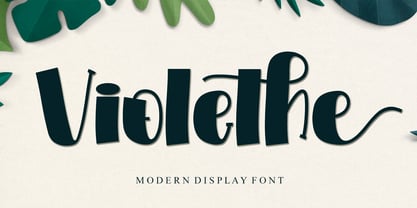 Violethe is a simple and unique-looking display font perfect for a wide variety of products. Use it on your Christmas decorations, Valentine’s Day cards, posters, wedding invitations, branding projects, social media posts, magazines, book covers, and whatever creative project you have in mind, and it will add a fun and friendly touch to your design! This font is PUA encoded, which means you can access all the glyphs and sweeps with ease!
 - BR Segma by Brink,
$30.00 BR Segma is a geometric sans-serif type family of 8 weights plus matching italics. Geometric precision and modern utility create a contemporary modern aesthetic, while open apertures, and low contrast strokes provide a comfortable reading experience. Segma builds upon geometric traditions but remains firmly in the present. BR Segma provides advanced typographic support with features such as case sensitive forms, fractions, slashed zeros and multiple figure sets. For custom enquiries please contact: mail@brinktype.com
 - Sgraffito Display by Ideabuk,
$15.00 Sgraffito Display is a geometric sans-serif typeface. It is perfect for headings, logos, posters, packaging and so much more! The font comes with full upper & lower case characters, numbers, symbols and includes the most common stylistic ligatures. Sgraffito is a technique either of wall decor, produced by applying layers of plaster tinted in contrasting colours to a moistened surface and then scratching so as to reveal parts of the underlying layer.
 - Hazelnut Pro by Eimantas Paškonis,
$- This small family can be counted as 4 fonts in 2. Because both weights contain small caps, 12 sets of stylistic alternates, and a decorative swashed form. That’s not counting dozens of ligatures in both multilingual latin and Cyrillic scripts. Plus ordinals, case-sensitive forms, and manual hinting. Due to its geometric nature, designers can manipulate vectors to change letters' dimensions for logotypes. They may seem modular, but every glyph was shaped individually to give handmade imperfections, reminiscent of wood type press. This allows for plenty of details at large sizes. Regular versions are multilingual but include only standard ligatures and case-sensitive forms.
 - Woreby by ryan creative,
$10.00 Creative greetings... Introducing the Woreby font which has a unique looking design. This font has additional large and small arches. You can use Woreby in modern and contemporary designs, and is suitable for use in various media such as stickers, posters, covers, typography and other digital media. FEATURES; -Uppercase. -Support Foreign, Numbers and Punctuation. -Works on PC. -Simple installation. -Accessible in Adobe Illustrator, Adobe Photoshop. Adobe InDesign, it even works in Microsoft Word. -Fully accessible without additional design software. Woreby is encoded with Unicode PUA, which allows full access to all additional characters without having to design any special software. Mac users can use the Font book, and Windows users can use the Character map to view and copy any extra characters to paste into your favorite text editor/app. Thanks for visiting, have a nice day ;)
 - Cospiog by ryan creative,
$15.00 Creative greetings... Introducing Cospiog which has an elegant looking design. This font has additional ligatures to give it a varied appearance. You can use Cospiog in modern and contemporary designs, and is suitable for use in various fashion media, posters, modeling magazines, typography, promotions and other digital media. FEATURES; Uppercase. Foreign Support, Numbers and Punctuation. Ligatures. Regular & Italic. Works on PC and Mobile. Simple installation. Accessible in Adobe Illustrator, Adobe Photoshop. Adobe InDesign, even works in Microsoft Word. Fully accessible without additional design software. Cospiog is encoded with Unicode PUA, which allows full access to all additional characters without having to design any special software. Mac users can use the Font book, and Windows users can use the Character map to view and copy any additional characters to paste into your favorite text editor/app. Thank you for visiting, have a nice day ;)
 - Soreng by Gatra Std,
$10.00 Cute handwriting "soreng" Handwritten Display Font! If you are needing a touch of casual modern display for your designs, this font was created for you! What's Included: Uppercase and Lowercase Number and Punctuation Support Language This font works best in a program that supports OpenType features such as Adobe Indesign, Adobe Illustrator CC and CS, or Adobe Photoshop CC and CS also CorelDraw More Questions? Here are some (potential) answers! Do not to resell this font in any way. Multilingual Support is included for Western European Languages Have a Wonderful Day, Gatra Std
 - SUE by Typeskets,
$15.00 SUE is a sans serif category with 18 styles or 9 weights with Oblique, this font is also included in the Variable font, with a minimalist appearance of course you can use it in various designs such as headlines, posters, invitations, labels, logos, to make the body text pretty good. . , and many designs that you can apply with this font. You will feel it when you have it as a font collection on your computer SUE OTF (18Font Style) SUE Variable with Oblique version Latin Extended characters accents
 - Baby Giovani Script by Mytha Studio,
$14.00 Introducing may latest font Baby Giovani Script, featuring a modern, trendy, natural calligraphy style. I hope you are interested in this font, if you want to use for your work this font can be used easily and simply because there are a lot of features in it to contain a complete set of letters lower and uppercase letters, assorted punctuation, numbers, and multilingual support. It also contains several ligatures and alternate style Stylistic Sets for those of you who have software that is able to utilize OpenType (Photoshop / Illustrator / InDesign). Thank you, Mytha Studio
 - Plaisir by Tour De Force,
$25.00 Plaisir came unexpectedly, as in between release while we waited for client's confirmation for their project. After trying a couple of different approaches, Plaisir landed as elegant modern sans serif family with 5 weights and matching Italics. With sharp triangle serifs and wide endings, Plaisir was constructed with decent stem contrast that flirt with display category. It is versatile, legible, recognizable family with fluent Italics. Equipped with Standard Ligatures, Tabular Figures, OldStyle Figures, a few Stylistic Alternates, basic Ordinals and Latin Small Caps, Plaisir is a working horse that will suit in any required situations.
 - Grand Guignol by Comicraft,
$19.00 A gruesome operatic drama is about to unfold, a tragic performance of the macabre! We offer for your entertainment a series of unfortunate events full of shocks and lugubrious revelations which will chill you to the bone! We also offer you this font, which may have similar effects, including nausea, migraine, heart palpitations and stomach upset. Pretty, though, isn't it? Art Deco & Art Nouveau posters, this font pair defined the look of John's MARVEL'S FINEST book designs in the early 2000s, and Richard's comic ASK FOR MERCY in the 2020s!
 - Medieval Borders by Aah Yes,
$5.00 This is a large group of typefaces inspired by those borders and patterns you see going across documents from the Middle Ages and Medieval times, eventually becoming this collection of fonts where you can scroll various repeating patterns across a page, for example. You can get a repeating pattern that scrolls seamlessly by repeating the same letter. The default text displaying on the web-page is bbbbbbbb, for example. There's over 2 dozen basic styles, and each style has 52 designs within it, using the characters Upper Case A - Z and lower case a - z, with the lower case being the negative/reverse colour of the Upper Case version, it will be the corresponding design just reverse coloured and with an edging strip. There's also a space - but nothing else. The styles in these fonts usually have groups of six characters (A to F, G to L, M to R, S to X), and where the second group is a variation on the first - usually thicker lines - and the third grouping is another variation on that, usually thicker lines again, making the first 24 letters. (Sometimes there's three groups of eight characters). The pattern within a group normally starts off plain then gets busier as it progresses - such as there'd be a more complex pattern of circles and diamonds as you go through the letters. Then the letters Y & Z are somewhat different to the rest. There's four versions starting with Z, and they're a little bit different, and they're grouped in fives - getting bolder as you progress through the letters, but with similar patterns within each group of 5, and that makes the first 25 characters. The letter Z character is extra busy. Again, lower case is the reverse colour of the Upper Case. Mostly you can get patterns and borders that combine seamlessly by using letters within the same group of 6 or 8 (like maybe abdcedcb). There are a few occasions when that doesn't work out, because there may be circles or diamonds at the sides of the letters that don't match up with another letter that has a different pattern at the side. But you can create a pattern with the exact level of complexity you want perfectly easily. You can see examples of this in the poster images. Neighbouring letters without embellishments at the sides of the letters will usually fit together. Have fun with it, that's what it's there for. aah yes fonts
 - URW Geometric by URW Type Foundry,
$35.99 URW Geometric® is a sans serif typeface inspired by the German geometric typefaces of the 1920s but designed for modern usability. The character shapes have optimized proportions and an improved balance, the x-height is increased, ascenders and descenders are decreased. Special glyphs, which are often designed afterwards for the original geometric typefaces from the 1920s, are perfectly integrated in the URW Geometric® . These design characteristics increase the usability and legibility tremendously. With its 10 weights ranging from Thin to Black, plus 10 additional oblique styles, it has a great versatility in mind. The extreme light styles shine bright in large sizes, the middle weights are perfect for body copy and the bolder variants for the use of emphasis information or bring a strong impact to headlines and information. The optically balanced styles are designed to work in perfect harmony together. URW Geometric® is functional, strong, simple and harmonized in form, and at a glance appears as a modern variant of its predecessors. Apart from the basic characters the design has an extra focus on the special glyphs. These are designed for todays needs. For example: the email glyph looks modern and unique, including a perfectly balanced spacing. The numero sign, in modern use called “hashtag”, is space saving and optically balanced for body text. Additionally, various extra and alternate glyphs are designed to provide a friendly usability. Including a wide Latin language support and character sets, URW Geometric® is perfectly designed for today’s requirements. Please have a look at the URW Geometric® Type Specimen (PDF) for further information.
 - MVB Hotsy Totsy by MVB,
$39.00MVB Hotsy Totsy is Akemi Aoki’s first typeface design. Aoki created the letters in cut paper. Once digitized, the design was expanded to offer several weights and styles. Exaggerating the triangular serifs and tapering strokes of “Latin” typefaces, MVB Hotsy Totsy is the perfect party face, appearing frequently on board games, product packaging, and in children’s books. It is named for (what was at the time) a dive bar in Albany, California. The bar has since been renovated but its neon sign was preserved, a local landmark of San Francisco’s East Bay. - ITC Werkstatt by ITC,
$29.99ITC Werkstatt is a result of the combined talents of Alphabet Soup's Paul Crome and Satwinder Sehmi, along with Ilene Strizver and Colin Brignall. It is inspired by the work of Rudolph Koch, the renowned German calligrapher, punchcutter, and type designer of the first third of this century, without being based directly on any of Koch's typefaces. Werkstatt has obvious affinities with the heavy, woodcut look of Koch's popular Neuland, but also with display faces like Wallau and even the light, delicate Koch Antiqua. Brignall began by drawing formal letters with a 55mm cap height, which Sehmi reinterpreted using a pen with a broad-edge nib. “Not an easy process,” says Brignall, “since one of the features of Koch's style is that while it was calligraphic in spirit, most of the time his counter shapes did not bear any resemblance to the external shapes, as they would in normal calligraphy. This meant that Sehmi could not complete a whole character in one go, but had to create the outside and inside shapes separately and then ink in the center of the letters.” The process was repeated, only without entirely filling in the outlines, for the Engraved version. Crome handled the scanning and digitization, maintaining the hand-made feel while creating usable digital outlines. “The collaboration of artisans with particular skills,” says Brignall, “in a modern-day, computer-aided studio environment, seems very much in step with the 'workshop' ethos that Rudolph Koch encouraged and promoted so much.” - Museum Initials by Wundes,
$12.00Museum is the Wundes foundry's first font revival. These letter forms are scanned from the engravings of Freeman Delamotte who in 1879 published a spectacular set of ancient and mediaeval ornamental alphabets. The original forms for this font were created in 1490, a few years before Columbus discovered America. There was not much information on the origin of this font, save that it came from a British museum, hence the name. The original character set was missing the letters J,P,V and W so I've constructed these letters in the same style to complete the alphabet. Other than those 4 additions, the engravings are true to their original forms. - Noam Text by TypeTogether,
$69.00 Adi Stern’s Noam Text shows that typographic progress is often in the small things — in the perfecting of familiar traditions and in staying loyal to the spirit of what came before. It can’t really be called progress unless it honours its history. In this way, TypeTogether is happy to introduce Noam Text: A Hebrew and Latin serif font that builds on its heritage with the twin tools of honour and progress. Since 1908, the Frank-Rühl fonts have dominated the Hebrew book and newspaper market. Noam Text’s design goal was to create a coherent family with both Latin and Hebrew serif text typefaces, each authentic to its own script, and which would serve as an alternative to last century’s predecessor. In short order, users will recognise Noam Text as a source of progress in its bilingual abilities. Hebrew and Latin have opposite reading directions, creating many issues: opposing directionality of the open counters; vertical stress in Latin, but horizontal in Hebrew; fewer extenders in Hebrew; and no Hebrew capital letters. All these have been taken into account in Noam Text’s modern design. Of unique importance — all punctuation marks have a Hebrew version, which makes each script complete and uncompromising. Among other technologically advanced details, Noam Text was programmed for all expected scenarios of mixing Hebrew, Latin, figures, and punctuation. Noam Text is intended mostly for setting long texts, so it strives to achieve maximum legibility in minimum space with its large x-height, short and fairly condensed Latin capitals, large and open counters, and low contrast. Originally derived from the Hebrew, the shallow horizontal curves and strong baseline serifs provide dynamism and enhance the reading flow. Noam Text Latin’s italic is rounded and reading friendly, is condensed to generate a lighter texture than the roman, and has a flowing stance. These virtues help it endure harsh printing conditions and subpar inks and paper. Noam Text’s three total weights provide a proper solution for integrating texts in both scripts, as well as a contemporary alternative for use in books, newspapers, and magazine design. Aligned with TypeTogether’s commitment to produce high-quality type for the global market, the complete Noam Text family displays an impressive amount of discretion, applying to wide use-cases by not edging too close to religious motifs or imbibing in secular indulgence. This means Noam Text can be the go-to family across the board and capitalise on the desire for clear typographic progress in this modern age.
 - TT Lakes Neue by TypeType,
$39.00 Introducing TT Lakes Neue in version 2.0! Please note that the TT Lakes font has been removed from platforms, but you can still order it by sending a request to the studio's commercial department: commercial@typetype.org We have released a continuation of the geometric sans serif inspired by Finnish functionalism. The new version provides more opportunities, because we not only increased the character set and improved the font technically, but also reworked its visual character. What changed? Font character. TT Lakes Neue 2.0 has become calmer, as we have removed the display details in the characters of the main set, making the font more versatile. New stylistic sets were created, thanks to which the nature of the font can be controlled, making it more expressive. Changed the forms of the characters "Кк", "ЖЖ", "Дд", "Лл", lowercase "b" and alternative "g". Added alternative forms for all types of the number "1", for the characters "Mm", "DD", "Ll". Added technological character sets, with which the font looks stylish and expressive. You may notice that in these sets, the forms of lowercase characters with arches (r, m, n) are changed, and there are gaps in the places of infusions and connections of all characters. Scope of application. The scope of TT Lakes Neue 2.0 have become even more diverse, because the sans serif has become more neutral in character and more functional. TT Lakes Neue 2.0 is the perfect font for the gaming industry. Suitable for game interfaces of different genres. Technological sets can be used in architectural projects, in the headlines of posters and magazines, on outdoor signs. The font is suitable for logo design, looks great in branding. Character set and technical characteristics. We have significantly improved the set of the font, increasing the number of characters from 736 to 921. The font has become more functional due to the updated technical stuffing and new features, of which there are now 36 instead of 24. Added characters of extended Latin, fractions, arrows. Created new kerning and hinting. Updated variable font. Added new OpenType features. The TT Lakes Neue font has 5 subfamilies: Compressed, Condensed, Regular, Extended, Expanded. In total, there are 91 styles in the font: 9 upright and 9 slanted in each subfamily and 1 variable font. Each style has 921 characters and 36 OpenType features.
 - Mistral by URW Type Foundry,
$89.99 Named after the strong cold winds on Southern France, the Mistral font family is another original creation displaying the panache of the French graphic artist Roger Excoffon. Mistral is an informal script in which all letters link up in vigorous strokes. First issued in 1953, its brush-like stems look spontaneous and fresh. The descenders are fairly long and the whole alphabet has a distinctive and unforgettable effect on the page. Mistral is a good complement to sans serif typefaces. Mistral is a trademark of Heidelberger Druckmaschinen AG, which may be registered in certain jurisdictions, exclusively licensed through Linotype Library GmbH, a wholly owned subsidiary of Heidelberger Druckmaschinen AG.
 - FS Kitty by Fontsmith,
$50.00 Cute FS Kitty is the type equivalent of Bagpuss: plump, cute, cuddly and not fond of exercise. So don’t go giving it a run-out on body copy; FS Kitty is an all-caps font made for showing off in posters and headlines, and on products, point-of sale and especially sweets. Blubber Kitty had been quietly curled up in Phil Garnham’s sketchbook for a year before he brought it out to be brushed up. “It was in the mix as a basic form when I started thinking about FS Lola. It was a twisted, bubbly beauty – quite squishable and huggable. The working file was called Blubber. “At that time it was a basic construction of strokes. I created the ‘A’ first, purely as a shape to play with, not as type. I flipped it for ‘V’, and copied that for a ‘W’. I flipped the ‘W’ for an ‘M’... I thought, ‘This looks a bit wacky, but I like it,’ and just carried on. The most tricky characters were the ‘B’ ‘P’ and ‘R’. I must have drawn about 20 kinds of B for this, just to get it to fit.” Variety “When the regular weight of Kitty had been designed,” says Jason Smith, “it just felt like a natural progression to go on and explore how far we could go with it: Light, Solid, Headline, Shadow.” Phil Garnham thinks there’s still more to come. “There are some really individual characters in this font that I think have yet to be exploited: the Greek Omega symbol, the strange face in the ampersand. Like Bagpuss, Kitty has kept a low profile so far. “We know people are using Kitty. In fact, it was the first of any of our fonts that we sold on the day it was released. But I still haven’t seen it out there in the wild. It’s going to be a exciting moment.”
 - FS Kitty Variable by Fontsmith,
$199.99Cute FS Kitty is the type equivalent of Bagpuss: plump, cute, cuddly and not fond of exercise. So don’t go giving it a run-out on body copy; FS Kitty is an all-caps font made for showing off in posters and headlines, and on products, point-of sale and especially sweets. Blubber Kitty had been quietly curled up in Phil Garnham’s sketchbook for a year before he brought it out to be brushed up. “It was in the mix as a basic form when I started thinking about FS Lola. It was a twisted, bubbly beauty – quite squishable and huggable. The working file was called Blubber. “At that time it was a basic construction of strokes. I created the ‘A’ first, purely as a shape to play with, not as type. I flipped it for ‘V’, and copied that for a ‘W’. I flipped the ‘W’ for an ‘M’... I thought, ‘This looks a bit wacky, but I like it,’ and just carried on. The most tricky characters were the ‘B’ ‘P’ and ‘R’. I must have drawn about 20 kinds of B for this, just to get it to fit.” Variety “When the regular weight of Kitty had been designed,” says Jason Smith, “it just felt like a natural progression to go on and explore how far we could go with it: Light, Solid, Headline, Shadow.” Phil Garnham thinks there’s still more to come. “There are some really individual characters in this font that I think have yet to be exploited: the Greek Omega symbol, the strange face in the ampersand. Like Bagpuss, Kitty has kept a low profile so far. “We know people are using Kitty. In fact, it was the first of any of our fonts that we sold on the day it was released. But I still haven’t seen it out there in the wild. It’s going to be a exciting moment.” - Northy fifty by ryan creative,
$14.00 Creative greetings... Introducing the Northy fifty font which has a modern looking design. In this font there are additional arches at each foot of the letter so that it looks more elegant. Northy fifty has Alternate and Ligature that you can use in both modern and contemporary designs, and are suitable for use in a variety of fashion media, posters, modeling magazines, typography, promotions and other digital media. FEATURES; -Uppercase and lowercase letters. -Support Foreign, Numbers and Punctuation. -Alternative, Ligature -Regular & Italic. -Works on PC. -Simple installation. -Accessible in Adobe Illustrator, Adobe Photoshop. Adobe InDesign, it even works in Microsoft Word. -Fully accessible without additional design software. Northy fifty is coded with Unicode PUA, which allows full access to all additional characters without having to design any special software. Mac users can use the Font book, and Windows users can use the Character map to view and copy any extra characters to paste into your favorite text editor/app. Thanks for visiting, have a nice day ;)
 - Craftsman by Woodside Graphics,
$19.95The Craftsman font is a faithful reproduction of the logo, or Title typeface used for Gustav Stickley's "Craftsman" Magazine, the foremost journal of the American Arts & Crafts Movement during its publication years of 1901-1916. It is an All-Caps font, with condensed and closely-spaced characters, specifically designed for titles and headlines. The "Craftsman" font is available in two versions: "Craftsman Regular" and "Craftsman Outline." Each is two fonts in one, in the sense that the capital letters are contained in a hand-drawn box (as on the cover of "The Craftsman" Magazine). Lower-case characters are identical, but without the box. Thus, the two may be used separately, or in combination, to achieve a desired effect.
