10,000 search results
(0.026 seconds)
- Frigate Katakana - 3D - Unknown license

- Frigate Katakana - Cond - Unknown license

- Primitive Tuscan JNL by Jeff Levine,
$29.00 Re-drawn from examples of vintage wood type, Primitive Tuscan JNL captures the essence of early letterpress printing of the 1800s; the styles of which were most closely associated with the Old West.
 - OL Hebrew Prismatic by Dennis Ortiz-Lopez,
$30.00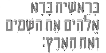
- 1350 Primitive Russian by GLC,
$44.00 This rough font was inspired by a Russian Cyrillic hand of the 1350s “Russkaja Pravda” (a Russian text of common Laws). As a Pro font, it supports Western and Northern European, Icelandic, Baltic, Eastern, Central European and Turkish specific characters, as well as Old Russian glyphs, including many which fell out of use in the 1700s, except in religious texts — in all over 136 Russian glyphs. The upper and lower case have the same form and almost same size, like in the original texts, which had only one size and style.
 - Prismatic Spirals Pro by MMC-TypEngine,
$182.00 PRISMATIC SPIRALS PRO FONT! The Prismatic Spirals PRO is a Decorative Type-System and ‘Assembling Game’, itself. Settled in squared pieces modules or tiles, embedded by unprecedented Intertwined Prismatic Structures Design, or intricate interlaced bars that may seem quite “impossible” to shape. Although it originated from the ‘Penrose Square’, it may not look totally as an Impossible Figures Type of Optical Illusions. More an “improbable” Effect in its intertwined Design, that even static can seem like a source of Kinetical Sculptures, or drive eyes into a kind of hypnosis. Prismatic Spirals Pro has two related Typefaces both more basic or easier to use versions, the Default Family plus its “bold” braided version Prismatic Interlaces… PRO provides a more advanced, complex, and twisted Design, plus requires to be typed alternating caps. Instructions: Use the Map Font Reference PDF as a guide to learn the 'tiles' position on the keyboard, then easily type and compose puzzle designs with this font! All alphanumeric keys are intuitive or easy to induce, you may easily memorize it all! Plus, often also need to consult it! *Find the Prismatic Spirals Pro Font Map Reference PDF Here! (!) Is recommended Print it to have the Reference or open the PDF to also copy and paste, when consulting is required or when it may be difficult to access, depending on the keyboard script or language. The 2 glyphs sets are separated in colors for facilitating. Also use the Map Font with key captions or switch to it for ensure that the characters are alternating between both uppercase and lowercase letters as other Keys as numbers, marks, and punctuation along the strings, holding Shift one by one or actually two by two. As a Tiles Type-System, the line gap space value is 0, this means that tiles line gaps are invisibly grouted, so the user can compose designs, row by row, descending to each following row by clicking Enter, same as line break, while advances on assembling characters. Background History: The first sketches of my Prismatic Knots or Spirals Designs dates back then from 2010, while started developing hand-drawn Celtic Knots and Geometric Drawings in grid paper, while engage to Typography, Sacred Geometry and the “Impossible Figures” genre… I started doing modulation tests from 2013, until around 2018, I got to unravel it in square modules or tiles from the grid, then idealized it as fonts, along with other Type projects. This took 13 years to come out since the first sketches and 6 months in edition. During the production process some additional tiles or missing pieces were thought of and added to the basic set, which firstly had only the borders, corners, crossings, nets, Trivets connectors or T parts and ends, then added with nets and borders integrations. Usage Suggestions: This type-system enables the user to ornate and generate endless decorative patterns, borders, labyrinthine designs, Mosaics, motifs, etc. It can seem just like a puzzle, but a much greater tool instead for higher purposes as to compose Enigmas and use seriously. As like also to write Real Text by assembling the key characters or pieces, this way you can literarily reproduce any Pixel Design or font to its Prismatic Spirals correspondent form, as Kufic Arabic script and further languages and compose messages easily… This Typeface was made to be contemplated, applied, and manufactured on Infinite Decorative Designs as Pavements, Tapestry, Frames, Prints, Fabrics, Bookplates, Coloring Books, Cards, covers or architectonic frontispieces, storefronts, and Jewelry, for example. Usage Tips: Notice that the line-height must be fixed to 100% or 1,0. In some cases, as on Microsoft Word for example, the line-height default is set to 1,15. So you’ll need to change to 1,0 plus remove space after paragraph, in the same dropdown menu on Paragraph section. Considering Word files too, since the text used for mapping the Designs, won't make any literal orthographical sense, the user must select to ignore the Spellcheck underlined in red, by clicking over each misspelled error or in revision, so it can be better appreciated. Also unfolding environments as Adobe Software’s, the Designer will use the character menu to set body size and line gap to same value, as a calculator to fit a layout for example of 1,000 pts high with 9 tiles high, both body size and line gap will be 111.1111 pts. Further Tips: Whenever an architect picks this decorative system to design pavements floor or walls, a printed instruction version of the layout using the ‘map’ font may be helpful and required to the masons that will lay the tiles, to place the pieces and its directions in the right way. Regarding to export PNGs images in Software’s for layered Typesetting as Adobe Illustrator a final procedure may be required, once the designs are done and can be backup it, expanding and applying merge filter, will remove a few possible line glitches and be perfected. Technical Specifications: With 8 styles and 4 subfamilies with 2 complementary weights each (Regular and Bold) therefore, Original Contour, Filled, Decor, with reticle’s decorations and 2 Map fonts with key captions. *All fonts match perfectly when central pasted for layered typesetting. All fonts have 106 glyphs, in which 96 are different keys with 2 versions of each of both caps and shift keys, plus a few repeated for facilitating. It was settled this way in order for exchanging with its Prismatic relative fonts which has only 48 different keys repeated twice. Concerning tiles manufacturing and Printed Products as stickers or Stencils, any of its repeated pieces was measured and just rotated in different directions in each key, so when sided by other pieces in any direction will fit perfectly without mispatching errors. Copyright Disclaimer: The Font Software’s are protected by Copyright and its licenses grant the user the right to design, apply contours, plus print and manufacture in flat 2D planes only. In case of the advent of the same structures and set of pieces built in 3D Solid form, Font licenses will not be valid or authorized for casting it. © 2023 André T. A. Corrêa “Dr. Andréground” & MMC-TypEngine.
 - KG God Gave Me You - Personal use only

- KG God Gave Me You by Kimberly Geswein,
$5.00 This font is reminiscent of teen girl handwriting, with very round letters and a mixed-print-cursive style.
 - Prat MF by Masterfont,
$59.00 The famous favorite of the sign makers. Great for display type as well as headlines for fashion, theater TV etc.
 - Argor Priht Scaqh - 100% free

- Jayne Print YOFF - Personal use only

- SF Arch Rival - Unknown license

- Print Clearly OT - Unknown license

- SF Arch Rival - Unknown license

- Pea Karen's Print - Unknown license

- Pea Gretchie Print - Unknown license

- 101 Zebra Print - Unknown license

- SF Arch Rival - Unknown license

- Print Clearly Dashed - Unknown license

- SF Arch Rival - Unknown license

- Pea Sue's Print - Unknown license

- Plz Print Brush by Outside the Line,
$19.00 Plz Print Brush is a good solid font for posters, headlines and accent words like - SALE! It gives the slightly irregular look of handlettering.
 - Print Embellishments JNL by Jeff Levine,
$29.00 Print Embellishments JNL gathers together a number of vintage typographic enhancements that can be used as simple spot decorations, rule lines or borders, adding a bit of design elegance to any project.
 - Print Damosel JNL by Jeff Levine,
$29.00 Kevin Curtis runs a site called Damosel's Printer's Blocks, specializing in rare an unusual examples from the years when letterpress was the main source of printed material. He graciously provided the source material for Print Damosel JNL. The collected images represent a varied cross-section of ornamentation, embellishments, attention getters, decorations and whimsical illustrations.
 - Print Sellers JNL by Jeff Levine,
$29.00 Another batch of vintage letterpress cartoons, cuts, dingbats and embellishments is offered in Print Sellers JNL.
 - Print Partners JNL by Jeff Levine,
$29.00 The vast variety of vintage letterpress illustrations representing many different eras and art styles allows for yet another volume of cartoons, embellishments, ornaments and stock cuts contained within Print Partners JNL.
 - Rough Print JNL by Jeff Levine,
$29.00 The Superior Marking Equipment Company was originally located in Chicago, Illinois and over the years produced a line of both commercial and toy rubber stamp printing sets which were used for making signs, posters, tickets and other printed items. Rough Print JNL reproduces the scanned images printed from one of the toy rubber stamp sets. The sample characters were smaller than one half inch in height and were further reduced during scanning. This gives the end result of a typeface which looks like rubber stamp imprints at small sizes, and very angular, distorted, somewhat grunge type when printed at larger sizes. There is a limited character set consisting of alphabet, numerals, some punctuation and currency symbols. No kerning was added to keep the hand-made appeal. Rough Print JNL is an all caps font with the letters and numbers jogged randomly on both the caps and lower case keystrokes. For a similar design with lower case, Amateur Printer JNL is recommended.
 - Print Helpers JNL by Jeff Levine,
$29.00 Print Helpers JNL is a compact little assortment of vintage cartoons, ornaments, arrows, words, phrases and other decorative illustrations used to enhance ads, print projects and fliers.
 - Hand Printing Press by Fontscafe,
$39.00 Hand printing typography revolutionized the way books were published. The earliest printing presses made it possible for newspapers to reach the doorstep every morning, for information to freely be shared among the masses for the first time on a large scale…and the fonts that were used in those classic times are forever embedded within the collective memories of societies across the planet. It is to this collective memory that we give a visual form with our new Hand Printing Press Pack. Up for grabs are a set of 10 Hand Printing fonts plus one "Stamps" elements font. The fonts are: the Normal, the Stencil, the Eroded, the Meshed and the Scraped in REGULAR and BOLD versions; each of them displaying a simplistic yet classic printing style and as often happens lately, we are also offering you an "elements" pack, the "Stamps" font, to go with these to create your customized stamp giving to your creations a touch of "official documentation".
 - Print Oddities JNL by Jeff Levine,
$29.00 Print Oddities JNL gathers various cartoons, embellishments, spot illustrations, border elements and arrows into one nostalgic collection; all re-drawn from vintage source material.
 - Hebrew Rinat Kids by Samtype,
$34.00 This is font to help children read. The Diacritic Marks (Nikud) are 25% bigger.
 - Dallas Print Shop by Fenotype,
$20.00 Dallas Print Shop is a refined display collection of five styles and eight fonts. The fonts are designed to act together. They not only work great in pairs, all together, or even alone. Dallas Print Shop Sans is a sturdy Sans with soft edges and two weights - Regular and Heavy Dallas Print Shop Serif is a sturdy Serif with straight forms and just slightly rounded corners. Serif has three weights: Regular, Heavy and Inline which is same as Heavy but with ornate inlines. Dallas Print Shop Brush is a Brush Script with soft and bold classic script forms. Brush is equipped with Standard Ligatures and Stylistic Alternates. Dallas Print Shop Pen is a flashy Monoline Script with a clear character. Pen is equipped with Contextual and Swash Alternates. Dallas Print Shop Script is a curly upright Script with a feminine character. Script is equipped with Standard Ligatures and Swash Alternates. Enjoy!
 - Printing Sorts JNL by Jeff Levine,
$29.00Over 75 images from the past and present comprise Printing Sorts JNL, another dingbat font from Jeff Levine paying tribute to the days of metal type and stock cuts. A PDF file is included with the font, showcasing the special feature that allows you to create arrows in varying lengths with just a few simple keystrokes. - Pirates And Robbers by URW Type Foundry,
$39.99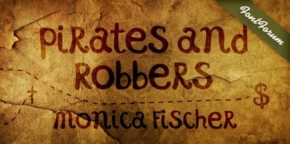
- Print Illustrations JNL by Jeff Levine,
$29.00 Print Illustrations JNL gathers a number of charming and functional designs redrawn from vintage sources. There are attention getters, spot illustrations, catch words and decorative embellishments all in one digital file.
 - Print Assistants JNL by Jeff Levine,
$29.00 For those who can't get enough of the wonderful illustrations, embellishments and dingbats of days gone by, Print Assistants JNL collects more of them in one handy font file.
 - Printed Letters JNL by Jeff Levine,
$29.00Printed Letters JNL is from stamped impressions made by a children's sign making set by the Superior Marking Equipment Company of Chicago - circa the 1940's. The set consisted of individually mounted rubber stamps - easy enough for happy kiddies to print signs, name plates or (unfortunately for their parents) on the walls... Limited character set. - 1790 Royal Printing by GLC,
$38.00 From 1702 to 1811 the French "Royal", then "Imperial", Printers, neglected Garamond and Fournier's designs and used only the font called "Romain du Roy", carved (1693 to 1723) by Philippe Grandjean by order of the king Louis XIV. 1790 Royal Printing was inspired by various variants of Romain du Roy that were in use during this period. Our sources were mainly official and legal documents printed in the late royal period, and in the beginning of the French revolution. There was no bold style. The 1790 Royal Printing Caps fonts contain small caps, plus titling caps for headlines as 1790 Royal Printing capitals are intended to be used preferably for text.
 - Print Spots JNL by Jeff Levine,
$29.00 Print Spots JNL once again gathers together various and sundry vintage letterpress ornaments, embellishments, borders and spot illustrations from various sources.
 - Print Enhancers JNL by Jeff Levine,
$29.00 Decorative border, spacer and ornamental elements comprise the bulk of Print Enhancers JNL, with a few extra goodies included to round out the collection.


