10,000 search results
(0.028 seconds)
- VanBerger by The Northern Block,
$12.80 A geometric san serif typeface influenced by Theo Van Doesburg and the De Stijl movement.
 - Emperor by Solotype,
$19.95Another design inspired by Chinese characters, but with a somewhat less obvious treatment than many. - ITC Souvenir by ITC,
$45.99 A classic, timeless design by the phenomenal Ed Benguiat! Featured in: Best Fonts for Logos
 - Vertigo Death by Mirco Zett,
$10.00 Vertigo Death is a decorative font inspired by the heavy metal and extreme sport culture.
 - Libra by Bitstream,
$29.99 A skillful revival of the Uncial by S.H. de Roos for Lettergieterij Amsterdam in 1938.
 - Gravira by RMU,
$35.00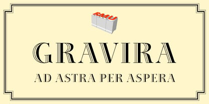 Herbert Thannhaeuser’s Gravira, released by Schelter & Giesecke in 1935, redrawn and revived for nowaday’s use.
 - Rennie Mackintosh Renaissance by CRMFontCo,
$35.00The Timeless Letterforms of Rennie Mackintosh inspired by the graceful lines and textures of Papyrus. - The Only Exception by Kimberly Geswein,
$5.00 This font was inspired by my sister Emily's handwriting. She has neat, fluid cursive handwriting.
 - Maplehurst JNL by Jeff Levine,
$29.00Maplehurst JNL is an original design by Jeff Levine with a strong Art Deco influence. - Blocky Shape by Cititype,
$12.00 Blocky Shape is a bold script with attractive features. Get inspired by its unique style!
 - Southern Flight by Intellecta Design,
$9.00typeface based on old lettering by an 1930's advertise lettering in a Flight Magazine - STM Lovebug by Ziwoosoft,
$33.00 Lovebug is a casual, warm font inspired by the curves of balloons and squishy jelly.
 - Piranesi by Bitstream,
$29.99An informal script designed for ATF as an italic for his Piranesi by W.T. Sniffin. - Commercial Script No2 by SoftMaker,
$9.99 Commercial Script No2 is a bold weight of a moderately flourished script published by SoftMaker.
 - Ballpoint Signature by Viswell,
$18.00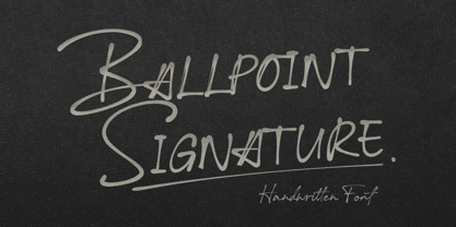 Ballpoint Signature is made with natural hand-drawn inspired by beautiful handwriting, and includes alternates.
 - Radiac by Stereo Type Haus,
$25.00 Radiac is a semi-monospaced unicase design inspired by lettering constructed from pieces of tile.
 - Nacho Rough by RodrigoTypo,
$25.00 Nacho Rough! A dirty version accompanied by a Thin version, including a set of dingbats.
 - Kaufmann by Bitstream,
$29.99 The most popular type of this kind, designed for ATF by M.R. Kaufmann in 1936.
 - Letterhead by Coffee Bin Fonts,
$20.00This font family was inspired by lettering found on old letterheads from the 19th century. - Schadow by Bitstream,
$29.99 Designed by Georg Trump in 1938, this typeface was Weber’s answer to Ludwig & Mayer’s Candida.
 - Artemisia NF by Nick's Fonts,
$10.00A crisp, geometric semiscript, based on the font Adonis, originally released by American Type Founders. - flutSaus by JOEBOB graphics,
$- Another font by Hilde Rikken (age 10) with crazy serifs and almost every special sign.
 - Brion by The Northern Block,
$12.80 An elegant typeface with rounded corners influenced by the work of Visual Graphics Corporation ( VGC ).
 - Prima Sans Mono by Bitstream,
$29.99The monospace companion to Jim Lyles’ Prima Sans, designed by colleague Sue Zafarana at Bitstream. - BD Gitalona Moxa by Balibilly Design,
$19.00 This is an Experimental typeface, a direct descendant of the BD Gitalona font family, which has a supermassive family with Variable technology. However, this version is more on the aesthetic aspect, which is experimental and exploratory. It complements the beauty of the primary typeface that we released separately. If you are a fan of Effectiveness and flexibility, please learn more about BD Gitalona and BD Gitalona Variable! Inspiration The world of entertainment moves non-stop. One by one, figures appeared and left. We expect to create something to entertain previous trends with packaging more relevant to the present. More specifically, we admire and are inspired by some of the world's leading and top singers with a segmented nature. We imagine so many figures that can affect every viewer. However, each artist or singer has a segment because almost all of them have characteristics. The Design The basic design of this typeface begins with a transitional serif shape with sharp, shapeless corners. Then in the middle of the invention, there was an opportunity to explore it further from the readability side by adding an optical variable that can adjust the serif thickness when used together between large, medium to paragraph text sizes for editorials. The shift from serif to sans-serif with the contrast initiated by the shift of the serif family form as a different variable also makes this font richer in terms of the features it contains. Parts are expected to add to the user satisfaction with the complexity of this font. The Features BD Gitalona consists of one sub-family intended for body text with nine weights from Thin(100) to Black(900) and four other display sub-families such as Display serif, Flick, Harmony Sans and Contrast Sans. Each consists of four weights Thin(100), Regular Weight(400), Bold(700), and Black(900). And again, there are also retailed separately; the BD Gitalona Variable font, which is designed to accommodate all Subfamily in 1 font file, and BD Gitalona Moxa, an experimental typeface. A total of 700+ glyphs in each style. Advanced OpenType features functionally and aesthetically, such as Case-sensitive forms, small caps, standard and discretionary ligatures, stylistic alternates, ordinals, fractions, numerator, denominator, superscript, subscript, circled number, slashed zero, old-style figure, tabular and lining figure. Supports multi-languages including Western Europe, Central Europe, Southeast Europe, South America, and Oceania.
 - Basenji by Typodermic,
$11.95 Basenji is a flowing headline typeface influenced by the modular geometric design trend of the 1970s. Herbert Bayer published his highly influential Universal Alphabet in 1924, which was based on circles and straight lines and had a modern, industrial appearance. Jan Tschischold’s typography popularized this simple, unconventional style but by the late 1950s, it had fallen by the wayside. Type designers Joe Taylor and Herb Lubalin inaugurated the 1970s with fresh takes on an old concept. These new typefaces were more practical than the original, and their blend of futuristic curves and funky curls fit the zeitgeist. The popularity of these types spawned a flood of similar designs like Pink Mouse, Bauhaus, Pump, and Harry. These typefaces were popular throughout the decade then fell out of favor by the mid-1980s, making a comeback in the year 2000. Many contemporary font designs have drawn inspiration from the beginnings of the Universal Alphabet, but Basenji is unique. This typeface amplifies of the 1970s elements of Rondo, Pump, Bauhaus and Blippo, and packs them into a practical, versatile design toolset. Basenji comes in nine weights and italics. Most Latin-based European, Vietnamese, Greek, and most Cyrillic-based writing systems are supported, including the following languages. Afaan Oromo, Afar, Afrikaans, Albanian, Alsatian, Aromanian, Aymara, Azerbaijani, Bashkir, Bashkir (Latin), Basque, Belarusian, Belarusian (Latin), Bemba, Bikol, Bosnian, Breton, Bulgarian, Buryat, Cape Verdean, Creole, Catalan, Cebuano, Chamorro, Chavacano, Chichewa, Crimean Tatar (Latin), Croatian, Czech, Danish, Dawan, Dholuo, Dungan, Dutch, English, Estonian, Faroese, Fijian, Filipino, Finnish, French, Frisian, Friulian, Gagauz (Latin), Galician, Ganda, Genoese, German, Gikuyu, Greenlandic, Guadeloupean Creole, Haitian Creole, Hawaiian, Hiligaynon, Hungarian, Icelandic, Igbo, Ilocano, Indonesian, Irish, Italian, Jamaican, Kaingang, Khalkha, Kalmyk, Kanuri, Kaqchikel, Karakalpak (Latin), Kashubian, Kazakh, Kikongo, Kinyarwanda, Kirundi, Komi-Permyak, Kurdish, Kurdish (Latin), Kyrgyz, Latvian, Lithuanian, Lombard, Low Saxon, Luxembourgish, Maasai, Macedonian, Makhuwa, Malay, Maltese, Māori, Moldovan, Montenegrin, Nahuatl, Ndebele, Neapolitan, Norwegian, Novial, Occitan, Ossetian, Ossetian (Latin), Papiamento, Piedmontese, Polish, Portuguese, Quechua, Rarotongan, Romanian, Romansh, Russian, Rusyn, Sami, Sango, Saramaccan, Sardinian, Scottish Gaelic, Serbian, Serbian (Latin), Shona, Sicilian, Silesian, Slovak, Slovenian, Somali, Sorbian, Sotho, Spanish, Swahili, Swazi, Swedish, Tagalog, Tahitian, Tajik, Tatar, Tetum, Tongan, Tshiluba, Tsonga, Tswana, Tumbuka, Turkish, Turkmen (Latin), Tuvaluan, Ukrainian, Uzbek, Uzbek (Latin), Venda, Venetian, Vepsian, Vietnamese, Võro, Walloon, Waray-Waray, Wayuu, Welsh, Wolof, Xavante, Xhosa, Yapese, Zapotec, Zarma, Zazaki, Zulu and Zuni.
 - Lost and Foundry by Fontsmith,
$15.00 Breaking the cycle of homelessness We are partnered with The House of St. Barnabas, a private members club in Soho Square, whose work as a not for profit charity aims to break the cycle of homelessness in London. Each purchase (of the family pack) comes with a one month membership to The House and 100% of the proceeds from sales of fonts go directly to the charity to help their essential work. This unique collection of 7 typefaces is based on the disappearing signs of Soho, at risk of being lost forever due to the ever changing landscape of the area. By re-imaging the signage as complete fonts, we have rescued this rich visual history from the streets and present the typefaces into a contemporary context for a bright optimistic future. FS Berwick Thanks to its humble tiled origins, this Egyptian serif type maintains a uniform character width, creating the irregular letter proportions found in the final alphabet. Broad-shouldered, the bracketed serifs firmly ground the font, whilst its extreme hairlines become a necessity due to the uniform width. Of note is the upside down ‘S’, to be found on the original sign on Berwick Street. Perhaps due to its ceramic origins, there is a surprising ‘slippiness’ to its final appearance. FS Cattle Cattle & Son is best described as a wide, but not overly extended, grotesque-style sans serif, showing a uniform width and carrying a robust strength to its form. Whilst lightly functional overall, the purposeful diagonal legs of the ‘K’, ‘R’ and the tail of the ‘Q’ add an urgency to its appearance. The reduced size of the ampersand gives away Cattle & Son’s hand-painted origins, and the oblique compacted ‘LTD’ found on the original sign is also included in the final set. This beautiful sign is tucked away under an arch in Portland Mews, sheltering from the weather. Perhaps this is why it has lasted so long. FS Century This somewhat elongated set of Roman capitals was originally rendered in paint circa 1940, but its roots trace back to the Trajan Column in Rome. Witness the slightly unbalanced ‘W’ and the painter’s hand is revealed. Century’s flared serif style is extremely short, sharp and bracketed. The ‘M’ is splayed and has no top serifs. Century has a uniform appearance of width, probably due to its sign-written origins. Yet is elegant, classic and exudes sophistication. FS Charity A true Tuscan letterform, the original is located on The House of St. Barnabas in ceramic tiles and was revealed in all its broken glory in 2014. FS Charity retains the option of using these incorrect characters (try typing lowercase in the test drive above and compare with the more uniform uppercase characters). FS Charity features fishtailed terminals on its strokes, a curious branched ‘T’ and the ‘S’ displays tear-drop ends to its serifs. Almost uniform in width, the ‘A’, ‘M’ and ‘W’ are the widest characters in this set. FS Marlborough The elongated Marlborough features diagonal terminals to some characters and numerals. Also retained is the space-saving contracted ‘T’ glyph from the original sign, while the ‘R’ features a distinctive wedge-shaped leg. Highly individual in this form, similar signage appears around Soho, but featuring a variety of widths in their design. FS Portland The sister type to Cattle & Son, Portland is oblique rather than italic. The serifs are not overly long, yet still enhance its rather rigid cap height and baseline appearance. Its ‘A’ has a top serif, the ‘M’ is square and the ‘G’ foregoes any spur. Particularly delightful is the open ampersand. Numerals align to encourage the horizontal flavour of the oblique style. Overall, Portland is both confident and graceful. FS St James A lineal Continental style, St James also displays a true sense of ‘Londoness’ in its titling form, perhaps influenced by early Underground signage. Irregular letterforms display a continental flavour, particularly evident in its Deco style ‘W’, ampersand and numerals. The rather high cross bar in the ‘A’ is also reflected in the raised middle strokes of the ‘M’. Noteworthy are the distinctive unions found on all of the characters and the additional small caps. The original lettering is still located on Greek St.
 - Comenia Sans by Suitcase Type Foundry,
$75.00Comenia Sans was designed in the framework of a unique typographic project for all types of schools. It is a complementary face for Comenia Serif, released by our friends at Storm Type Foundry. Comenia Sans has a lot in common with its serif sister: the height of both upper and lower case, the length of ascenders and descenders, and the general weight. This makes the two perfect partners which work well even when set side by side in a single line of text. Comenia Sans does, however, lack all serifs, ornamental elements and stroke stress variation. All these elements freshen up the feel of long texts, but for shorter texts use, they are not necessary. Despite that, Comenia Sans retains the soft, friendly character of its big sister, as well as a few tiny details which lend it its unique character without compromising legibility or utility. Open counters give all letters an airy feel and permit enough variation in construction. This is why the face works well even in multiple-page texts. All its letters are easily distinguished from each other, so the reader's eyes are not strained. Diacritics and punctuation harmonize with both upper and lower case. As usually, all diacritical marks fully respect conventional shapes of accents and they are perfectly suitable for Czech, Slovak, Polish and other Central European languages, where a lot of diacritics abounds. Similarly to the renaissance italics which refers to the cursive forms, Comenia Sans introduces novel shapes of some characters drawing from the hand-written heritage. This is most apparent in the single-bellied a, the simplified g, and the stem of f which crosses the baseline and ends with a distinct terminal. In the text, emphasized words are thus distinguished not only by the slant of letters, but also by the shapes of the letters themselves. All twelve styles contain set of small caps, suitable for the names, in the indexes or the headlines in longer texts. Legibility in small sizes under 10 points was at the center of designers' attention, too. This is why the counters of a, e and g are large enough to prevent ink spread in small sizes, both on-screen and in print. After all, the font was specifically optimized for screen use: its sober, simple forms are perfectly fit to be displayed on the computer screen and in other low-resolution devices. When used in the context of architecture, the smoothness of all contours stands out, permitting to enlarge the letters almost without limit. A standard at the Suitcase Type Foundry, each style of Comenia Sans boasts a number of ligatures, an automatic replacement of small caps and caps punctuation, a collection of mathematical symbols, and several types of numerals which make it easy to set academic and other texts in an organised, well-arranged way. For the same purpose, fractions may come in handy, too. Apart from the standard emphasis styles, the family also contains six condensed cuts (each set has the same number of characters), designated for situations where space is limited or the need for striking, poster-like effect arises. Comenia Sans is the ideal choice for the setting of magazines, picture books, and navigation systems alike. Its excellent legibility and soft, fine details will be appreciated both in micro-typography and in poster sizes. Although it was designed as a member of a compact system, it will work equally well on its own or in combination with other high-quality typefaces. - Anha Queen VMF - Personal use only

- Kaya - Personal use only

- the EV$NT - Personal use only

- La chata - 100% free

- MONACO - Personal use only

- Share-Regular - Unknown license

- MythBusters - Personal use only

- Promenadenmischung - Personal use only

- j.d. - Unknown license

- MCF bad manners ww - 100% free

- CarrickGroovy - Unknown license

- Gizmo - Unknown license


