10,000 search results
(0.026 seconds)
- Quiet Sans by Dharma Type,
$29.99 Quiet Sans is a super geometric sans-serif family for text designed by Ryoichi Tsunekawa and the whole family consists of 6 weights from ExtraLight to ExtraBold and their matching Italics. The basic concept of this family is not only to make crisp, sharp and strong impact by geometric letter form but also to be legible and readable even on small size screen by their sophisticated design. Quiet Sans supports almost all European languages: Western, Central, South Eastern Europeans and afrikaans. And proportional figures, superior figures, inferior figures, denominators, numerators, fractions, ordinals and case-sensitive-forms can be accessed by using OpenType features.
 - Amagusi by Miracledsign,
$15.00 Amagusi is a font that is inspired by Japanese culture with all its uniqueness and beauty that makes the bamboo curtain country very loved by many people, as well as in the art of writing kanji which has its own aesthetic value. The amagasi font is formed and made by combining the contours and anatomy of kanji letters so that it has a very beautiful value when used in a sentence and is very attractive to readers who see it and of course it will make your product more elegant and appreciated by everyone who sees it.
 - FreeSet by ParaType,
$30.00 The type family in four basic styles was designed in ParaType (ParaGraph) in 1992 by Tagir Safayev. Based on Frutiger, of Mergenthaler Linotype, 1976 by Adrian Frutiger. Frutiger font was originally designed for use on signs at the new Charles de Gaulle Airport at Roissy. The straightforward sans serif shapes are suited well for both text and display setting. Six additional styles were added in 1998-2000. Multilingual versions of 6 styles (Light, Demi and Extrabold) include Armenian alphabet designed by Manvel Shmavonyan in 1997. Two condensed Cyrillic styles (Demi Condensed and Bold Condensed) designed by Manvel Shmavonyan in 2005.
 - HT Pavla Prospekt by Hype Type,
$34.00 A pure neo-grotesque typefamily inspired by the first typographies' old wooden characters, and by the marks soft and sometimes imprecise these left on the paper. All typographic elements are also influenced by the Cyrillic alphabet letter-form. -- HT Pavla Prospekt is inspired by ancient wooden typefaces and eastern-style letterform. This reference gives the letters unusual but characteristic proportions. The visual effect of the diffusion of the ink imprinted on the paper, which gives softness to the forms, is also very influential. The proportions of the bold and thin faces are visually balanced to ensure a more modern feeling. --
 - Ongunkan Death Space Unitology by Runic World Tamgacı,
$50.00 Dead Space is a science fiction/horror media franchise created by Glen Schofield and Michael Condrey, developed by Visceral Games, and published and owned by Electronic Arts. The franchise's chronology is not presented in a linear format; each installment in the Dead Space franchise is a continuation or addition to a continuing storyline, with sections of the storyline presented in prequels or sequels, sometimes presented in other media from the originating video game series, which includes two films and several comic books and novels. I created this font by redrawing the alphabet in which the Death Space alien language is written.
 - Rolphie by Aah Yes,
$9.95 Rolphie can be your go-to sans-serif, with 16 easy-to-read weights and 10 versions for each weight, and the subtlety of choice that represents. The versions contained in each weight are: Regular; Condensed; Half-Condensed; Expanded; Small Capitals: and their italic counterparts. (At heavier weights particularly it seemed to be justified to have two Condensed versions). Plus there's 20 funky versions with the letters all shook up (that would make a good title for a song), or jumbled around, plus some Shadow, Doubled-Up, College, and other FX versions. In total there's 180 variations, giving a comprehensive selection of both standard and funky fonts, and that subtle degree of choice of weight. To make things easier, the weights are put in ascending numerical order from 01 to 16, and the FX versions have been stuck in the 80s and 90s, (like two musicians I know). There are grouped packages available for certain weights (which have 10 fonts in them) and the complete family package (180 fonts) which represent better value than the individual fonts, and there's a basic package containing the Normal and Italic versions of all 16 weights (32 fonts). A limit of 5 sub-family packages has been imposed, unfortunately, which precludes a more comprehensive selection. To let you know what's in the font that you might otherwise never know about . . . With Discretionary Ligatures on, you get special characters if you type Mc St. Rd. Bd. Ave. c/o No. (p) (P) - include the full-stop/period. With Stylistic Alternates switched on, you get plenty of extra characters - including a WiFi symbol (type Wifi or WiFi) / bullet numbers instead of ordinary numbers / that different U-dieresis / special characters for c/o No. Mc / an upside down ~ / a huge bullet, and different forms for cent, dollar, percent, per-thousand. As you'd expect, there's all the accented characters for all Western European scripts using Latin letters, and standard ligatures, plus other Open Type features including Class Kerning, Slashed-Zero, Historical Forms, Sub- and Superscript numbers, fractions for halves, thirds and quarters, Ornamental forms giving bullet numbers, etc. There's also the main mathematical operators, symbols like card-suits and male/female signs and so on, and some more obscure stuff like schwa and O-horn, U-horn - and there's lots more if you can Access All Alternates. Much will depend on what your software recognises. The Small Caps versions have (intentionally) lost the ligatures for lower case ff, fi, fj, fl, fr, fu, ffi, ffj, ffl, ffr, ffu. The names for the weights are not absolute - we had to make up some names to make them stretch out to sixteen - so rather - see them as relative to each other, being in ascending numerical order by weight.
 - Transformers - Unknown license

- a bug's life - Personal use only

- Macromedia - Unknown license

- PassCaps - Unknown license

- Vostrey - Unknown license

- Florentine by SoftMaker,
$9.99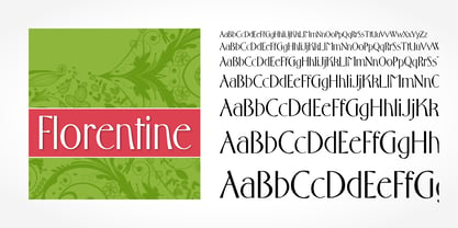 Florentine is a typeface published by SoftMaker.
 - LHF Matthews Thin by Letterhead Fonts,
$43.00 Inspired by E.C. Matthew's, circa 1940's.
 - Estelle by SoftMaker,
$9.99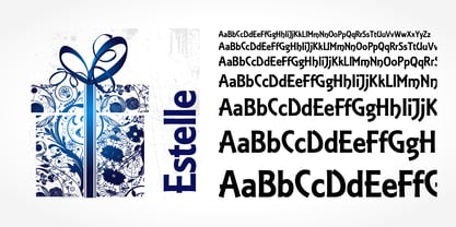 Estelle is a typeface published by SoftMaker.
 - Stich Me by Volcano Type,
$19.00 Stich Me was inspired by embroidery patterns
 - Cavalier by SoftMaker,
$9.99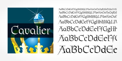 Cavalier is a typeface published by SoftMaker.
 - Spaceboy by Prototype Fonts,
$20.00Inspired by 80's Japanese pop culture. - Zyncho by Emboss,
$14.00 Inspired by fortune tellers and tarot cards.
 - Verie by Prototype Fonts,
$20.00Inspired by digital displays and mass transit. - Linotype Decoration Pi by Monotype,
$29.00Decorative symbols designed by Linotype Design Studio - Entebbe by SoftMaker,
$9.99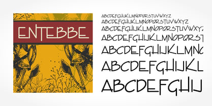 Entebbe is a typeface published by SoftMaker.
 - Decline by Prototype Fonts,
$20.00Inspired by 80's Japanese pop culture. - Messing by SoftMaker,
$9.99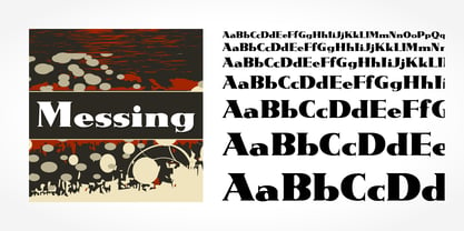 Messing is a typeface published by SoftMaker.
 - Frenzy by SoftMaker,
$9.99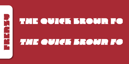 Frenzy is a typeface published by SoftMaker.
 - Boss by SoftMaker,
$9.99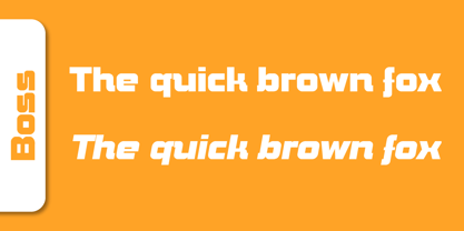 Boss is a font published by SoftMaker.
 - DINk - 100% free

- Xorx_Toothy Cyr - Unknown license

- pf_zappa - Unknown license

- Alice in Wonderland - Unknown license

- Vedette Blanche - Unknown license

- Vedette Noire - Unknown license

- Azalleia Ornaments by Intellecta Design,
$24.90 Azalleia Ornaments is a new flourished ornaments typeface. Well elaborated and unusual design, inspired by old cross-stitch and craft books and entirely designed by hand, without use of auto-tracing and available in two different designs.
 - Western Wood Type JNL by Jeff Levine,
$29.00 Inspired by a sample of a vintage wood type supplied by a fan of Jeff Levine fonts, Western Wood Type JNL is a traditional Clarendon-style condensed typeface from the era of letterpress and the Old West.
 - Foda Tholoth by Fo Da,
$50.00 Foda Tholoth font is to reflect the beauty of its original Arabic and Islamic calligraphy. This font can be used headlines and Quranic verses. Foda Tholoth is designed by Foda & Esraa Amer and manufactured by Ahmed Eraqi.
 - Kalendar by Alphabet Design,
$15.00Kalendar is a geometric display font, inspired by a calendar design by Ivica Kis, a Croatian architect. This font contains alternative letter-forms for many characters. Kalendar works best in display applications, such as logos and titles. - FF Info Pict by FontFont,
$62.99 Erik Spiekermann, working in collaboration with Ole Schäfer, originally designed FF Info® Display for use in the context of wayfinding systems. The variants FF Info™ Text and FF Info™ Correspondence were developed later for text setting and office communication. FF Info Display The sober and clear forms of the sans serif FF Info Display have been deliberately molded to make them perfect for use on wayfinding systems. The font by Ole Schäfer and Erik Spiekermann not only takes the problem of lack of space into account - it is some 15% narrower than comparable typefaces - the characters have also been designed to ensure they remain legible even in adverse conditions for reading. As text on signs often contains words with which readers are unfamiliar and which are thus deciphered letter for letter rather than perceived as whole words, it is essential to provide for a clear differentiation between glyphs. Additional serifs on the lowercase "i" and uppercase "I" and a small arch on the terminal of the lowercase "l" ensure that it is possible to readily discriminate between these particularly problematic letters. Moreover, sharp corners on glyphs can also make it difficult to read signs with backlighting or when driving past. The rounded corners of FF Info Display counteract this effect and make sure that the character forms remain well defined.FF Info Display is available in five carefully coordinated weights, from Regular to Bold. In the corresponding italic variants, the letters appear overall more rounded while the lowercase "a" has a closed form and the "f" has a descender. Also included among the glyphs of FF Info Display are several ligatures and arrow symbols. Pictograms with different themes that complement the typeface are also available in four weights. FF Info Text Thanks to his know-how gained through designing other typefaces, Erik Spiekermann became aware that fonts created for use in problematic environments can be used in many different situations. In smaller point sizes, FF Info Display cuts a fine figure when used to set longer texts. So Spiekermann carefully reworked FF Info Display to produce FF Info Text, a font perfected for use in this context. Not only can the characters be more generously proportioned, certain features, such as additional serifs to aid with the differentiation of problematic letters, are also no longer necessary in textual surroundings. The upright styles have a double-story "g" while Spiekermann has added oldstyle figures and small caps. FF Info Correspondence FF Info Correspondence has also been designed for setting block text although it recalls the style of old typewriter characters and is specifically intended for use in office communication. The characters of this third member of the family are thus more formal, without rounded terminals but with rectangular punctuation marks. The narrower letters are provided with large serifs to give them more space although, at the same time, this reduces the differences in terms of letter width among the alphabet. In contrast with its two siblings, FF Info Correspondence has only three weights, each with corresponding italic.The three styles of the FF Info super family cover an extensive range of potential applications. If the different kerning is adjusted manually, the three styles harmonize happily with each other and can be readily used in combination to set, for example, headlines and texts and also creative display options.
 - Vary Variable by Monotype,
$209.99The final text should look like this then:Vary by Olli Meier is a geometric sans serif typeface inspired by Bulgarian Cyrillic. Vary is fun and adaptable and was built with three feelings (variations): classic, modern, and loopy, offering an opportunity for designers to be playful in their creations. The inspiration in Bulgarian Cyrillic is seen mostly in the character “g,” which was inspired by a very uncommon handwritten “в” spotted by the designer in a shop window in Sofia, Bulgaria. When he flipped this design in 180°, the Latin character ‘g’ was born for Vary. Another example is the “R” in the modern stylistic set, which was inspired by the handwritten Cyrillic character “Я”. Vary is available as a variable font also and comes with 10 preset instances from Hairline to ExtraBlack. - Quo Vadis Quasimodo - Personal use only

- Craw Modern by GroupType,
$19.00 Craw Modern was designed by Freeman Craw in 1958 and first released by The American Typefounders Company, (ATF). In typography, 'Modern' is a style of typeface (classification) developed in the late 18th century that continued through much of the 19th century. Characterized by high contrast between thick and thin strokes and flat serifs. Bodoni is among the most popular of the Moderns. Moderns are also known as Didone and New Antiqua.
 - Yefimov Sans by ParaType,
$30.00 Yefimov Sans is a sans companion for Yefimov Serif . It is one of the last original faces by Vladimir Yefimov. It has contemporary design, squarish shapes of the round letters and legible proportions. Thanks to open aperture, it works well in small point sizes, and its distinctive letterforms make it good also for display purposes. The typeface was completed by Maria Selezeneva and Alexandra Korolkova. Released by ParaType in 2015.


