10,000 search results
(0.024 seconds)
- Lucida Grande by Monotype,
$50.99 Lucida Grande is a humanist sans serif font with a large x-height, clear letterforms, and space-saving economy. Its easy reading qualities make it legible for printing and screen displays even down to small sizes. Lucida Grande is part of the Lucida superfamily of fonts from Bigelow & Holmes. Lucida is highly regarded for legibility and its extensive range of type styles. The Lucida Grande family has eight fonts with weights from Thin to Black with matching italics. Each font has 674 glyphs and supports the W1G character set. This includes Latin, Greek and Cyrillic alphabets to support many languages in Europe, the Americas, and worldwide.
 - Jane Roe by deFharo,
$10.00 JANE ROE is a family of 10 Sans Serif condensed fonts of geometric construction and neo-Gothic style, a friendly typography with maximum readability, specially drawn for the composition of texts of any size for both printing and screen, signage or headlines and where you need savings in horizontal space. This typeface contrasts its neutral aspect with the humanistic modulation of the antlers in the characters, giving the opportunity to compose texts adaptable to any context and concept of design. The typeface includes small letters with support for Latin Extended-A, dynamic fractions, several set of numbers, etc. Look at the PDF with all the functions.
 - Supernett cn by FaceType,
$19.90 ›Hi! Please note you are visiting Old Supernett. We decided to upgrade it: more styles, more glyphs, more features, more everything! View New Supernett here: Supernett 2019› Georg from FaceType Supernett – a versatile hand drawn/handmade/handwritten font – is tailored for large font sizes but also impresses with an astounding legibility in small typesettings. Supernett is fairly condensed for space-saving headlines. The extensive character set supports Central and Eastern European as well as Western European languages. Each style contains more than 4700 glyphs to let the font look real hand-made. Three OpenType features are specially created to enhance this impression, with a maximum effect when applied to big type: Alternating Letters For a truly hand-drawn look, letters and numerics alternate randomly between three different variants → activate Contextual Alternates Rotating letters All glyphs rotate randomly and slightly around their own axis → activate OpenType Swashes Varying Baseline Shift Each single glyph moves individually up or down → activate OpenType Titling Alternates More OpenType Features: Case Sensitive Forms This feature shifts various punctuation marks to a position that works better with all caps typography → It is deployed when an app’s all-caps styling is applied Slashed Zero The problem with the numeral 0 is that it can look too much like O in some typefaces. This feature replaces every zero with a slashed zero → activate Zero with a Slash Fractions Substitutes figures separated by a slash by proper fraction glyphs. A date however, written like 10/12/2013 will remain unchanged → activate Fractions Stylistic Set 03 Choose between two different styles of bullet (•) → activate Stylistic Set 03 Stylistic Set 04 Choose between two different styles of Y → activate Stylistic Set 04 View other fonts from Georg Herold-Wildfellner: Sofa Serif | Sofa Sans | Mila Script Pro | Pinto | Supernett | Mr Moustache | Aeronaut | Ivory | Weingut
 - Checkmark by Set Sail Studios,
$14.00 Make your mark with Checkmark; a slick, high energy signature-style script font guaranteed to make a big impression. Digitally hand-drawn, it's super-clean smooth flow and high-intensity pen strokes make an unmistakeable impact in logo/branding projects, large header text and product packaging. Checkmark is packed full of extra features to give you plenty of customization options. This includes; a full set of upper and lowercase alternate letters, 20 ligatures (double letters) to help the script lettering flow more naturally, 26 swashes and a full set of lowercase end forms to give your text that extra flair and finesse. Here's a run through everything in more detail; Checkmark • A smooth-edged signature style font containing upper & lowercase characters, numerals, and a large range of punctuation. Checkmark Alt • This is a second version of Checkmark, with a completely new set of both upper and lowercase characters. If you wanted to avoid letters looking the same each time to recreate a custom-made style, or try a different word shape, simply switch to this font for an additional layout option. Checkmark Swash • A third font containing 26 hand drawn swashes. Simply type any a-z or A-Z character in this font to generate a swash. Perfect for underlining your Checkmark text and adding a bit of extra flair! Ligatures • 20 ligatures (double-letters) are included to help your lettering flow more naturally. Many programs will automatically have this feature switched on for you, but if you need any help accessing them, please feel free to drop me a message. End forms • Are available for all lowercase characters when using the Checkmark font. Use these characters at the end of your word to add a stylistic 'end-swash'. These are accessible via software with opentype capability, by turning on 'Stylistic Alternates', or via a Glyphs panel. Language Support • Checkmark fonts support the following languages; English, French, Italian, Spanish, Portuguese, German, Swedish, Norwegian, Danish, Dutch, Finnish, Indonesian, Malay, Hungarian, Polish, Croatian, Turkish, Romanian, Czech, Latvian, Lithuanian, Slovak, Slovenian.
 - Desperate by Typodermic,
$11.95 Are you tired of playing it safe with your typography? Want to stand out from the crowd and make a bold statement? Look no further than Desperate, the punk rock font that will bring a rebellious edge to your designs. With interlocking shapes that give it a new wave feel, Desperate is a font that refuses to play by the rules. And with OpenType technology, it generates wild ligatures for over 200 letter combinations, adding to its unpredictable, untamed vibe. But Desperate isn’t just about making a scene. It delivers your message with an aggressive, hard-hitting style that commands attention. Whether you’re designing a gig poster, album cover, or anything in between, this font will give your work the punk rock attitude it deserves. So why settle for boring fonts when you can embrace your inner rebel with Desperate? It’s time to make your mark and let your designs scream out loud. Most Latin-based European writing systems are supported, including the following languages. Afaan Oromo, Afar, Afrikaans, Albanian, Alsatian, Aromanian, Aymara, Bashkir (Latin), Basque, Belarusian (Latin), Bemba, Bikol, Bosnian, Breton, Cape Verdean, Creole, Catalan, Cebuano, Chamorro, Chavacano, Chichewa, Crimean Tatar (Latin), Croatian, Czech, Danish, Dawan, Dholuo, Dutch, English, Estonian, Faroese, Fijian, Filipino, Finnish, French, Frisian, Friulian, Gagauz (Latin), Galician, Ganda, Genoese, German, Greenlandic, Guadeloupean Creole, Haitian Creole, Hawaiian, Hiligaynon, Hungarian, Icelandic, Ilocano, Indonesian, Irish, Italian, Jamaican, Kaqchikel, Karakalpak (Latin), Kashubian, Kikongo, Kinyarwanda, Kirundi, Kurdish (Latin), Latvian, Lithuanian, Lombard, Low Saxon, Luxembourgish, Maasai, Makhuwa, Malay, Maltese, Māori, Moldovan, Montenegrin, Ndebele, Neapolitan, Norwegian, Novial, Occitan, Ossetian (Latin), Papiamento, Piedmontese, Polish, Portuguese, Quechua, Rarotongan, Romanian, Romansh, Sami, Sango, Saramaccan, Sardinian, Scottish Gaelic, Serbian (Latin), Shona, Sicilian, Silesian, Slovak, Slovenian, Somali, Sorbian, Sotho, Spanish, Swahili, Swazi, Swedish, Tagalog, Tahitian, Tetum, Tongan, Tshiluba, Tsonga, Tswana, Tumbuka, Turkish, Turkmen (Latin), Tuvaluan, Uzbek (Latin), Venetian, Vepsian, Võro, Walloon, Waray-Waray, Wayuu, Welsh, Wolof, Xhosa, Yapese, Zapotec Zulu and Zuni.
 - Laurentian by Monotype,
$29.99 Maclean's is a weekly Canadian newsmagazine with a broad editorial mission. A typical issue covers everything from violence on the other side of the globe to the largest pumpkin grown in a local county. In 2001, Maclean's invited Rod McDonald to become part of the design team to renovate" the 96-year-old publication. The magazine wanted to offer its readers a typographic voice that was professional, clean, and easy to read. Above all, the typeface had to be able to speak about the hundreds of unrelated subjects addressed in each issue while remaining believable and uncontrived. A tall order, perhaps? Now add in that this would be the first text typeface ever commissioned by a Canadian magazine. McDonald, who some have called Canada's unofficial "typographer laureate," took on the challenge. McDonald used two historic models as the basis for Laurentian's design: the work of French type designer Claude Garamond, and that of the English printer and type founder, William Caslon. From Garamond Laurentian acquired its humanist axis, crisp serifs and terminals that mimic pen strokes. Caslon's letters are less humanistic, with a more marked contrast in stroke weight and serifs that appear constructed rather than drawn. These traits also made their mark on Laurentian. Using these two designs as a foundation, McDonald drew Laurentian with the narrow text columns and small type sizes of magazine composition in mind. He gave his letters strong vertical strokes and sturdy serifs, a robust x-height and a slightly compressed character width A tall order, per McDonald's genius is evident in the face's legibility, quiet liveliness and in the openness of the letters. The result is a typeface that not only met Maclean's demanding design brief, but also provides exceptional service in a wide variety of other applications. Laurentian is available in three weights of Regular, Semi Bold and Bold, with complementary italics for the Regular and Semi Bold, and a suite of titling caps."
 - Rahere Informal by ULGA Type,
$18.99 Rahere Informal is a slab semi-serif typeface that has a seriously charming personality and a little spring in its step. Serifs bend and flick, giving the characters a spirited, almost calligraphic feel. It's lively and friendly without being whimsical, great for messages that need a casual but credible tone with a bit of zing in the mix. Rahere Informal is suitable for a wide range of applications such as information signage, packaging, advertising, brochures, catalogues, screen text, visual identities and opera festivals. Want an annual report that pleases the board, shareholders and investors? Set it in Rahere Informal - that’ll put a smile on everyone’s face. The family comes in six weights from light to extra bold with corresponding italics. The lighter weights are more delicate, an evenly-spaced flamboyance of flamingos basking in the sun. As the weights get heavier, characters transform into a tight-knit group of line dancing rhinos. All styles contain a set of swash caps, a few ligatures and alternatives. Nice. The character set covers most European languages plus Vietnamese. Each weight contains lining & non-aligning numerals in both proportional & tabular spacing. The tabular numerals share the same width across all weights and styles (matching Rahere Sans and Rahere Slab). If a companion sans serif is needed, Rahere Sans is the ideal partner. They are both part of the extended Rahere typeface family and have been designed to complement each other. Seriously charming, charmingly serious. Seriously, what more do you want from a typeface? Rahere, founder of St Barts in London The typeface is named after Rahere, a 12th-century Anglo-Norman priest, who founded the Priory of the Hospital of St Bartholomew, London in 1123. In 2007 I was successfully treated at Barts for relapsed testicular cancer so I’m indebted to all the doctors, nurses and support staff who work there. A special shout out to Orchid Cancer – a UK charity that helps men affected by cancer – who funded the research for my treatment.
 - Dynatype by Alphabet Soup,
$60.00 Suddenly...it’s the World of Tomorrow! With the push of a button Dynatype automates your typesetting experience. Dynatype is actually Two fonts in One–without switching fonts you can instantly change from Dynatype’s “regular” style to its alternate connecting version with the simple push of a button. For more details download “The Dynatype Manual” from the Gallery Section. What is Dynatype? Dynatype is the upright, slightly more formal cousin of Dynascript. It shares many of the characteristics of it’s slightly older relation, but is drawn entirely from scratch and has it’s own unique character. Dynatype may be reminiscent of various mid-century neon signage, and of sign writing, Speedball alphabets and even baseball scripts. Its design also takes some cues from a historical typographic curiosity that began in Germany in the ‘20s and which lasted into the ‘60s—when Photo-Lettering gave it the name "Zip-Top". Basically it was believed to be the wave of the future—that by weighting an alphabet heavier in its top half, one could increase legibility and reading speed. The jury’s still out on whether or not there’s any validity to this notion, but I think you’ll agree that in the context of this design, the heavier weighting at the top of the letters helps to create some uniquely pleasing forms, and a font unlike any other. Typesetters across the planet will also be able to set copy in their language of choice. Dynatype’s 677 glyphs can be used to set copy in: Albanian, Basque, Catalan, Cornish, Croatian, Czech, Danish, Dutch, Esperanto, Estonian, Faroese, Finnish, French, Galician, German, Hungarian, Icelandic, Indonesian, Irish, Italian, Kalaallisut, Latvian, Lithuanian, Malay, Maltese, Manx, Norwegian Bokmål, Norwegian Nynorsk, Oromo, Polish, Portuguese, Slovak, Slovenian, Somali, Spanish, Swahili, Swedish, Turkish, and Welsh—and of course English. Sorry! Off-world languages not yet supported. PLEASE NOTE: When setting Dynatype one should ALWAYS select the “Standard Ligatures” and “Contextual Alternates” buttons in your OpenType palette. See the “Read Me First!” file in the Gallery section.
 - Dynascript by Alphabet Soup,
$60.00 Typography enters the Space Age! Dynascript brings the ease of “Pushbutton Automatic” to your typesetting experience. Dynascript is actually Two fonts in One–without switching fonts you can instantly change from Dynascript’s connecting font to the non-connecting italic with the simple push of a button. For more details download “The Dynascript Manual” from the Gallery Section. What is Dynascript? Dynascript is the slanted script cousin of Dynatype. It shares many of the characteristics of it’s sibling, but is drawn entirely from scratch and has it’s own unique character. To some it may be reminiscent of various mid-century neon signage, and of sign writing, Speedball alphabets and even baseball scripts. The design of Dynascript also takes some cues from a historical typographic curiosity that began in Germany in the ‘20s and which lasted into the ‘60s—when Photo-Lettering gave it the name "Zip-Top". Basically it was believed to be the wave of the future—that by weighting an alphabet heavier in its top half, one could increase legibility and reading speed. The jury’s still out on whether or not there’s any validity to this claim, but I think you’ll agree that in the context of this design, the heavier weighting at the top of the letters helps to create some uniquely pleasing forms, and a script unlike any other. Typesetters across the planet will also be able to set copy in their language of choice. Dynascript’s 694 glyphs can be used to set copy in: Albanian, Basque, Catalan, Cornish, Croatian, Czech, Danish, Dutch, Esperanto, Estonian, Faroese, Finnish, French, Galician, German, Hungarian, Icelandic, Indonesian, Irish, Italian, Kalaallisut, Latvian, Lithuanian, Malay, Maltese, Manx, Norwegian Bokmål, Norwegian Nynorsk, Oromo, Polish, Portuguese, Slovak, Slovenian, Somali, Spanish, Swahili, Swedish, Turkish, and Welsh—and of course English. Sorry! Off-world languages not yet supported. PLEASE NOTE: When setting Dynascript one should ALWAYS select the “Standard Ligatures" and “Contextual Alternates” buttons in your OpenType palette. See the “Read Me First!” file in the Gallery section.
 - Bulblamp by Popskraft,
$9.00 Layered font set 3D Bulb lamp Bulblamp is a 12 component font system that can be layered in different ways to create endless classic titling effects used commonly in signage by skilled sign painters and sign makers and any who interested in simple and flexible ways to make graphic design. Examples of how to use this you can see on the images. Moreover, You can start fast in Figma, Illustrator and Photoshop with predefined downloadable package. ! Download free predesigned Figma, Illustrator and Photoshop sets for this fonts here: https://drive.google.com/open?id=17ogdSIjPuLA5-CUaAO1TlqJGbRPWy5iA&authuser=popov_av%40koriphey.ru&usp=drive_fs Each file is named according to its purpose. The number indicates the recommended order of the layers. 1 below, 5 on top. 1 means you should place it first. Of course, you do not have to use all the fonts, and vice versa - you can repeatedly use the same font style with different styles. What is Layered font? In fact, these are common fonts located in a stack strictly one above the other. This allows quickly create unique text effects using ordinary fonts. Where can you use this? These fonts can be used in any program that allows you to stack fonts as objects strictly one above the other, however it is recommended to work in professional programs such as Illustrator, Photoshop, Figma and so on ... How to use this font set quickly? For quick use, I recommend using ready designs for Figma, Photoshop or Illustrator. Download fonts and Install all fonts. Go to the link https://drive.google.com/open?id=17ogdSIjPuLA5-CUaAO1TlqJGbRPWy5iA&authuser=popov_av%40koriphey.ru&usp=drive_fs which has contained pre-made solutions for this font applicable in Figma, Photoshop or Illustrator and download presets. Follow the recommendations on the pages. Basically, you will need to replace the words in the template with your own, then edit colors and transfer the result to your design. In that’s all, it's easy.
 - Rahere Slab by ULGA Type,
$18.98 Part of the extended Rahere typeface family, Rahere Slab is a humanist slab serif (or Egyptian) in six weights from light to extra bold with corresponding italics. Rahere Slab – like its sibling Rahere Sans – features subtle detailing, giving the typeface a distinctive, warm appearance without distracting the reader. Legible at large and small sizes, Rahere Slab is a versatile, workhorse typeface that is suitable for a wide range of applications such as information signage, packaging, annual reports, advertising, brochures, catalogues, screen text and visual identities. Slab serifs are ideal for projects that need to convey a sense of authority tempered with diplomacy or messages that just need some serious oomph – and Rahere is a great slab for the job. The italic lowercase is more cursive and expressive than the roman and when they’re used together it displays enough character to create emphasis without looking out of place while harmonising admirably. Set on its own (for example, pull-out quotes), the italic exudes a charm that draws attention to the text. The character set covers most European languages plus Vietnamese. Each weight contains lining & non-aligning numerals in both proportional & tabular spacing. The tabular numerals share the same width across all weights and styles (matching Rahere Sans too) – indispensable for financial tables in annual reports. If a companion sans serif is needed, Rahere Sans is the perfect partner. They are both part of the extended Rahere typeface family and have been designed to complement each other beautifully. The typeface is named after Rahere, a 12th-century Anglo-Norman priest, who founded the Priory of the Hospital of St Bartholomew, London in 1123. In 2007 I was successfully treated at Barts for relapsed testicular cancer so I’m indebted to all the doctors, nurses and support staff who work there. A special shout out to Orchid Cancer – a UK charity that helps men affected by cancer – who funded the research for my treatment.
 - the Incredibles - Unknown license

- Blade 2 - Unknown license

- Misfortune - Unknown license

- Republica - Unknown license

- Scriptura by Sylvestre Studios,
$20.00A fluid font drawn by hand. - Mamba by W Type Foundry,
$19.50 Mamba is inspired by Cooper Black.
 - Manic Tambourine AOE by Astigmatic,
$19.95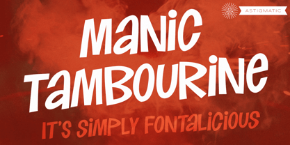 A dynamic font inspired by cartoons.
 - Something - 100% free

- Blackboard Ultra - 100% free

- Quasi - Unknown license

- Kaela - Unknown license

- Some's Style - Unknown license

- Michel by sugargliderz,
$20.00 The design of this typeface was influenced by the typefaces left by Firmin-Didot. There are three weights, and all weights can be used in large font sizes to create a gorgeous and attractive impression.
 - Blick by ParaType,
$25.00 A display face with rounded terminals stylized like drops of a liquid. For use in large sizes in advertising matter and decorative headings. The face designed by Natalya Vasilyeva and licensed by ParaType in 2007.
 - Antipasto by Zetafonts,
$29.00Antipasto is a soft round font and really smart, created by Cosimo Lorenzo Pancini. It is coordinated, compatible and based on Arista font collection by Zetafonts. Now with 2 brand new weight, ExtraBold and ExtraLight! - Maeva by Autographis,
$39.50 Maeva is a non-joining wide formal 60s script, directly designed and carefully finished by hand on screen, trying to keep the script alive – preventing it from looking mechanical – by drawing each letter from scratch.
 - Lotape by Hurufatfont,
$29.00 "Lotape" was designed by calligraphy artist Mustafa Eren and digitized by Oğuzhan Cengiz. It is striking with its unusual ligature structure. Ideal for creating special and unique header texts with swashes and rich ligature alternatives.
 - Text Book by ParaType,
$30.00 Designed at Polygraphmash in 1958 by Elena Tsaregorodtseva; Latin characters and italic were added in 1987 by Emma Zakharova. An early sans serif ('Grotesque'), it was developed for primers and the first level school textbooks.
 - CF Anarchy - Personal use only

- TaitDemo - Unknown license

- Drawing Blood - Personal use only

- ITC Cheltenham Handtooled by ITC,
$29.99ITC Cheltenham font in its present form is the work of designer Tony Stan. Originally designed by architect Bertram Goodhue, it was expanded by Morris Fuller Benton and completed by Stan in 1975 with a larger x-height and improved italic details. ITC Cheltenham font is an example of an up-to-date yet classic typeface. In 1993 Ed Benguiat added the Handtooled weights to this family. - Rekord Antiqua by RMU,
$30.00 Rekord Antiqua, regular and semibold, released 1911 by Wagner & Schmidt, is a perfect body text partner for Art Nouveau display fonts. Both styles come with a long s, which can be reached by the OT feature of historical forms or by typing [alt] + b. In addition, you find two framing elements on [alt] + P and [alt] + p, and an oblique style was added too.
 - Skyline by Font Bureau,
$40.00 Skyline was commissioned from Font Bureau by Condé Nast specifically as a headline typeface for Traveler magazine. This strongly personal work by Imre Reiner from 1929 and 1934 was known in Europe as Corvinus. Skyline Black and Bold Condensed offer immediate headline recognition through Reiner’s variations on the themes found in the classical Modern structure. Both styles were adapted by Jane Patterson; FB 1992
 - Perigord by Scriptorium,
$18.00Perigord has mixed origins. It was inspired by Gutenberg’s capitals and by lettering developed by German designer Ernst Bentele, but its calligraphic antecedents go back to French initials of the Carolingian period. The result of this is a formal, attractive and antique look which we hope you'll like. The full version includes alternate forms for many of the letters, as well as numbers and punctuation. - Eurostile by URW Type Foundry,
$89.99 Eurostile Display Caps The Eurostile font family was designed (by Novarese and Butti in 1952) to complement the titling font, Microgramma, by offering a lowercase alphabet. Issued by the Nebiolo foundry, the rather square sans serif Eurostile became popular for display and advertising use. The linear nature of Eurostile suggests modern architecture, and its attraction is technical and functional. Eurostile is commonly misspelled Eurostyle.
 - Mayak by ParaType,
$30.00 Mayak is a geometric sans serif inspired by the Soviet constructivist fonts of the 1920s-1930s. It contains traditional upper and lower case characters as well as small caps and a great number of stylistic alternates. The font comes in 12 styles: 4 weights in 3 widths. Mayak was designed by Yana Nosenko with contributions from Dmitry Kirsanov and released by ParaType in 2017.
 - Garth Graphic by Monotype,
$29.99Released by the Compugraphic Corporation in 1979, the Garth Graphic font family is based on a design by John Matt from the 1960's, reworked by Renee LeWinter and Constance Blanchard. Garth Graphic was named after Bill Garth, a founder of Compugraphic. A fairly strong old style face suitable for text setting; the heavier weights and condensed forms are most used for display work. - Orchard Street NF by Nick's Fonts,
$10.00This playful Art Deco classic was inspired by one of many posters produced by the WPA by anonymous artists during the 1930s. An inline version has been added to spice up the visual interest and add a touch of class. Both versions of the font include complete Latin 1252, Central European 1250 and Turkish 1524 character sets, with localization for Moldovan, Romanian and Turkish.


