10,000 search results
(0.022 seconds)
- Night Scream by Ditatype,
$29.00 Night Scream is a spine-chilling display font that brings a horrifying twist to your designs. With its big letters and bold weight, this font commands attention and instills fear. The details of the letters are carefully crafted to resemble menacing plant roots, adding a nightmarish and eerie touch to the font. Each letter in this font is bold and impactful, demanding to be noticed. The large size of the letters adds to the font's imposing presence. The root-like details in Night Scream give the font an organic and otherworldly appearance, reminiscent of sinister, twisted plant life. These details add an element of the unknown and create an atmosphere of dread, immersing the viewer into a world of dark and chilling horrors. For the best legibility you can use this font in the bigger text sizes. Enjoy the available features here. Features: Multilingual Supports PUA Encoded Numerals and Punctuations Night Scream fits in headlines, logos, movie posters, flyers, invitations, branding materials, print media, editorial layouts, headers, and any project that requires a terrifying touch. Find out more ways to use this font by taking a look at the font preview. Thanks for purchasing our fonts. Hopefully, you have a great time using our font. Feel free to contact us anytime for further information or when you have trouble with the font. Thanks a lot and happy designing.
 - Redfighter by Ditatype,
$29.00 Redfighter is an attention-grabbing display font with a games theme, featuring large letters and a rectangular shape with sharp corners. This font shows large letters that demand attention and make a statement. The generous size of each character ensures maximum visibility and impactful design elements. This design choice allows this font to stand out and grab the viewer's attention with its imposing presence. The rectangular shape with sharp corners in Redfighter adds a sense of structure and strength to the font. The clean lines and defined angles create a visually bold and striking appearance. This unique feature evokes a sense of power and precision, reflecting the intensity and competitiveness found in the gaming world. For the best legibility you can use it in the bigger text. Enjoy the available features here. Features: Stylistic Sets Multilingual Supports PUA Encoded Numerals and Punctuations Redfighter fits in headlines, logos, posters, titles, branding materials, print media, editorial layouts, website headers, and any other projects that aim to create a strong visual impact. Find out more ways to use this font by taking a look at the font preview. Thanks for purchasing our fonts. Hopefully, you have a great time using our font. Feel free to contact us anytime for further information or when you have trouble with the font. Thanks a lot and happy designing.
 - Scary Notes by Ditatype,
$29.00 Scary Notes is a spine-chilling display font designed to evoke fear and horror. With its big letters and bold weight, this font demands attention and is sure to send shivers down your spine. The details of the letters are meticulously crafted to resemble brush strokes, adding an unsettling and handcrafted touch to the font. Each letter in Scary Notes is bold and commanding, creating an impactful presence that cannot be ignored. The big size of the letters adds to the font's intensity. The brush details in this font give the font an organic and chaotic appearance, reminiscent of chilling hand-painted writings. These details add a sense of unpredictability and terror, immersing the viewer into the world of horror and fear. For the best legibility you can use this font in the bigger text sizes. Enjoy the available features here. Features: Multilingual Supports PUA Encoded Numerals and Punctuations Scary Notes fits in headlines, logos, movie posters, flyers, invitations, branding materials, print media, editorial layouts, headers, and any project that requires a terrifying touch. Find out more ways to use this font by taking a look at the font preview. Thanks for purchasing our fonts. Hopefully, you have a great time using our font. Feel free to contact us anytime for further information or when you have trouble with the font. Thanks a lot and happy designing.
 - Alimentary by Missy Meyer,
$12.00 Alimentary (adjective): relating to nourishment or sustenance. If you've seen my other fonts, you know I tend to lean into food-based names. This name has to do with food and science combined, so it's double nerdy in the ways I like to be nerdy! I started with Alimentary Medium, which was inspired by my shorter, wider font MacGuffin - I wanted something taller, narrower, with a hip and retro feel. When I finished the Medium weight, I felt like I wanted a Light weight. Then a Heavy weight. Then I figured, "what the heck," and made an outline version of the Medium weight too. In the end, I wound up with four members of the Alimentary family, each with over 700 glyphs! Not only do they all have the basics (A-Z, a-z, 0-9, and tons of punctuation), but they also each have 330 characters for European language support, and a limited selection of Greek, Coptic, and Cyrillic characters. Plus a double handful of alternates and ligatures to add a little variety to your designs! And of course, all of the Alimentary fonts are super-smoothed, with reduced nodes and clean curves, so whether you're cutting them out, printing them, engraving them, or using them in a way I haven't even thought of, these fonts will be sharp and crisp!
 - Brolike by Alit Design,
$21.00 Presenting the ✨Brolike Typeface✨ by alitdesign. Inspired by cassette music album covers in the 70s and 80s, a retro font was created in a calm and simple style but still gives an interesting and unique impression. Besides that, combined with a dynamic stencil style, the Brolike font becomes more stylish, especially if the design to be made uses swash on alternative fonts to create, for example, lettering or a logotype that is designed to make your design cool and different. Brolike font is very suitable for making designs with retro concepts, simple and playful designs, for example making magazine cover designs, music covers, YouTube thumbs, text headers, logotypes and so on with an elegant retort theme. Besides that this font is very easy to use both in design and non-design programs because everything changes and glyphs are supported by Unicode (PUA). Brolike font has a total of 746 glyphs including symbol, multilingual and alternative glyphs. We really enjoyed the process of making the Brolike font, we hope you are also happy when using the Brolike font. Language Support : Latin, Basic, Western European, Central European, South European,Vietnamese. In order to use the beautiful swashes, you need a program that supports OpenType features such as Adobe Illustrator CS, Adobe Photoshop CC, Adobe Indesign and Corel Draw. but if your software doesn't have Glyphs panel, you can install additional swashes font files.
 - JT Olifer by Jolicia Type,
$17.00 JT Olifer is family font of Jolicia Type designed by Laire Banyu Sandi Pawenang in October 2021, JT Olifer inspired by Modern Typography developed by us in our perspective, with a typeface detail in every corner we make more rounded, and give an inktrap accent to make unique impression special in every glyph, we really consider about aspect legibility, therefore we make family font amount 40 to assist the selection according to visual needs. Font type of JT Olifer contains several nuances that combain aesthetic, contemporary and modern, furthermore we make some alternates glyph that have a friendly and subtle impression, for example ‘f’ the alternate of this name our font we designed is more circular and smooth. JT Olifer has a total of 465 letters with regular, slanted and condensed styles support in 90 languages : Afrikaans Albanian Asu Basque Bemba Bena Breton Catalan Chiga Colognian Cornish Croatian Czech Danish Dutch Embu English Esperanto Estonian Faroese Filipino Finnish French Friulian GalicianGanda German Gusii Hungarian Inari Sami Indonesian Irish Italian Jola-Fonyi Kabuverdianu Kalaallisut Kalenjin Kamba Kikuyu Kinyarwanda Latvian Lithuanian Lower Sorbian Luo Luxembourgish Luyia Machame Makhuwa-Meetto Makonde Malagasy Maltese Manx Meru Morisyen Northern Sami North Ndebele Norwegian Bokmål Norwegian Nynorsk Nyankole Oromo Polish Portuguese Quechua Romanian Romansh Rombo Rundi Rwa Samburu Sango Sangu Scottish Gaelic Sena Serbian Shambala Shona Slovak Soga Somali Spanish Swahili Swedish Swiss German Taita Teso Turkish Upper Sorbian Uzbek (Latin) Volapük Vunjo Walser Zulu
 - Aquawax Pro by Zetafonts,
$39.00 Aquawax Pro PDF Specimen Aquawax Graphic Project on Behance Created as a custom brand typeface in 2008 by Francesco Canovaro, Aquawax is one of Zetafonts most successful typefaces - having been chosen, among the others, by Warner Bros for the design of the logo for the Aquaman movie. Its logo design roots are obvious in the design details, from the blade-like tail of the Q and the fin-like right leg of the K to the intentionally reversed uppercase W, as well as the rounded edges softening the stark modernist lettershapes. While this details make the typeface extremely suitable for logo and display design, especially in the bolder weights, the open, geometric forms of the letters and a generous x-height make it extremely readable at small sizes, making it perfect for body text and webfont use. In 2019 the family was completely redesigned by the Zetafonts team, expanding the original glyph set to include Cyrillic and Greek and adding three extra weights and italics to the original six weights, for a total of 27 weights (including 9 pictograms). The restored and revamped version, named Aquawax Pro, also includes full Open Type features for Positional Figures, Stylistic Alternates, Discretionary Ligatures and Small Caps, and adds to the typeface new alternate glyph shapes, accessible as Stylistic Alternates. Optimized for maximum screen readability, it covers over 200 languages that use the Latin, Cyrillic and Greek alphabet, with full range of accents and diacritics.
 - Stat Text Pro by Jure Kožuh,
$45.00 www.Stat-Type.com Complementary Type Family Stat Display Pro Stat Text Pro is an information design sans serif type family which was developed as a complementary to Stat Display Pro. Stat Text Pro retains many characteristics of its display counterpart, while giving readability a greater importance. It has simpler letter shape details which enable it to accomplish a constant rhythm whiles being read. Its main intended use is to accompany Stat Display Pro in places where longer passages of text are needed. In this way the visual character of the composition is retained and at the same time readability of text is given attention. As its display counterpart it has a large character set with multiple weights, which are defined by optimal size ratio, wide aperture and balanced counters. It contains nearly 700 glyphs, including diacritics, ligatures, small caps, old–style figures, arrows and more. This enables it to achieve wide language support. It consists of four weights (Light, Regular, Medium, Bold) which are accompanied by their corresponding obliques. Stat Text Pro type family has higher than average x height (72% of cap height) which is accompanied by matching ascender and descender size ratios. The development of the type family was based on research in legibility to achieve highly legible letter shapes, while not diminishing their visual character. A detailed description of Stat Pro type family is available at Stat-Type.com where a DEMO font can be downloaded.
 - Aeonian by Adorae Types,
$40.00 Aeonian, designed by Emilia Adorno, was mostly inspired by the iconic morphology adopted by the arts of the 1920s. One hundred years later we can still see the resemblance between the wants and the needs of now and then to reach for the sky, to look ahead and enter the future in style. Now as then, we seek the right tools to do so, then once again, we embrace the rational, yet elegant and stylish forms of simplicity, geometry and symmetry. At the same time, there is a strong and growing need for a warmer approach to creating lovemarks. For that, Aeonian’s alternates hold attractive, soft and inviting shapes to an emotional appeal. Aeonian is a combination of all of them. A rational side entwined with an emotional one. Born a geometric sans, Aeonian ended up being a 2 in 1 font with a sans serif set and alternates reaching over 1200 glyphs. The entire family contains 6 weights, from thin to black, with its matching italics. It features a variety of ligatures to be used as connectors, specially for display. It also offers multilingual support, even for certain display ligatures. Later, Aeonian kept growing, with stylistic alternate sets of initial, mid and final glyphs. These are its arms to reach for infinity with a warm heart. The wide range of possibilities that Aeonian offers, makes it the best font for creating vast design systems with a rich visual language.
 - Minea by Bistatype,
$35.00 A characteristic of the Minea font family is the achievement of the calligraphic handwriting effect. In addition to basic, simple letter forms, it contains a large number of additional stylistic alternatives and ligatures that, by combining and changing without repetition, give the effect of calligraphic writing. Some of these characters can be changed by automatically turning on a particular OpenType function, when ligatures replace the combination of letters that are part of them, the letter is replaced by a certain alternative when found in a given context, and capital letters are replaced with decorative initials. Letter swap functions can be used in all programs that support OpenType programming. Minea is an attractive font that is sleek, clean, feminine, sensual, glamorous, simple and very easy to read. The Minea font family, based on original calligraphic sketches, contains a total of six weights. Thin, regular and medium weights have ligatures and alternate letter shapes, which help make the syllable look like an authentic calligraphic print. Semi-bold, bold, and black weights contain only basic letter shapes. The font family contains Latin and Cyrillic. Includes Russian and Serbian alternative letter forms. The family of calligraphic fonts Minea can be used on various occasions, and is intended for use in print and online. Can be used in the realization of certain tasks, unusual advertisements, packaging and invitations, diplomas ... as well as for all purposes where this type of letter is needed.
 - Zira by Artcity,
$10.00 Zira is a playful hand-drawn font family designed by Daniel Bak (Artcity). It is available in three handy weights: regular, bold and screaming. It contains international language accent marks and diacriticals, including Greek and Cyrillic. Zira can be considered as smoothed serif version of Cornelius font. Zira as Cornelius as well is a chimpanzee character in the novel and movie series Planet of the Apes. Dr. Zira is a chimpanzee psychologist and veterinarian, who specializes in the study of humans, in the novel and subsequent movie series Planet of the Apes. Zira was played in the first three Apes movies by actress Kim Hunter. Unique among the Apes characters, Zira has blue eyes. Zira is the fiancée (later wife) of Cornelius, and both are ultimately responsible to the Minister of Science, Dr. Zaius. Zira's character and role are essentially the same in both the novel and the movies, though some story details differ. Her work in each involves both working with humans under laboratory conditions (e.g. learning and behavioural experiments), and working on them physically (lobotomy and other brain surgeries, vivisection, physical endurance and tolerance experiments, and subsequent autopsies). Zira is an outspoken liberal by nature, deploring war and militancy (and despising the gorillas, who seem to make both a way of life), and eager to seek and develop intelligence anywhere it can be found. Zira literally stands for her principles - or refuses to stand, as the case may be.
 - Culoare v.2 by Luxfont,
$19.00 Introducing Culoare V2.0 is the second version of the space bright color gradient font. (The first version is here - Culoare) This is a new set with completely new color combinations, bright and saturated like neon. 3 types of stylization in 9 different color gradient combinations with soft transitions. Letters seem to be backlit and it looks very original in addition to stylish minimalist glyphs. Lots of design use cases. Ideal for promotional illustrations, headlines and covers. Font family is based on the Regular font Boldini - which means that if necessary you can combine these two families and they will be absolutely stylistically identical and complement each other. Check the quality before purchasing and try the FREE DEMO version of the font to make sure your software supports color fonts. P.s. Have suggestions for color combinations? Write me an email with the subject "Culoare V2 Color" on: ld.luxfont@gmail.com Features: - Free Demo font to check it works. - Uppercase and lowercase the same size but different colors. - Transparency in letters. - Kerning. IMPORTANT: - Multicolor version of this font will show up only in apps that are compatible with color fonts, like Adobe Photoshop CC 2017.0.1 and above, Illustrator CC 2018. Learn more about color fonts & their support in third-party apps on www.colorfonts.wtf -Don't worry about what you can't see the preview of the font in the tab "Individual Styles" - all fonts are working and have passed technical inspection, but not displayed, they just because the website MyFonts is not yet able to show a preview of colored fonts. Then if you have software with support colored fonts - you can be sure that after installing fonts into the system you will be able to use them like every other classic font. Question/answer: How to install a font? The procedure for installing the font in the system has not changed. Install the font as you would install the classic fonts. How can I change the font color to my color? · Adobe Illustrator: Convert text to outline and easily change color to your taste as if you were repainting a simple vector shape. · Adobe Photoshop: You can easily repaint text layer with Layer effects and color overlay. ld.luxfont@gmail.com
 - 99 Names of ALLAH Minimal by Islamic Calligraphy75,
$12.00 We have transformed the “99 names of ALLAH” into a font. That means each key on your keyboard represents 1 of the 99 names of ALLAH Aaza Wajal. The fonts work with both the English and Arabic Keyboards. We call this Calligraphy "Minimal" because of the minimal decoration and simplistic design. The first "Alef" has a "hamzit wasel", this indicates that the name can be pronounced both as "AR-RAHMAAN" or "R-RAHMAN" (in the zip file you will find a pdf file explaining the differences in the "harakat", pronunciation and spelling according to the Holy Quran). This calligraphy is not only minimal in its design but easy to read, very few letters overlaps and the decorative symbols are at minimum. Decorative letters used in this calligraphy: "Mim, Aain, Sin, HHe, He & Saad". Purpose & use: - Writers: Highlight the names in your texts in beautiful Islamic calligraphy. - Editors: Use with kinetic typography templates (AE) & editing software. - Designers: The very small details in the names does not affect the quality. Rest assured it is flawless. The MOST IMPORTANT THING about this list is that all the names are 100% ERROR FREE, and you can USE THEM WITH YOUR EYES CLOSED. All the “Tachkilat” are 100% ERROR FREE, all the "Spelling" is 100% ERROR FREE, and they all have been written in accordance with the Holy Quran. No names are missing and no names are duplicated. The list is complete "99 names +1". The +1 is the name “ALLAH” 'Aza wajal. Another important thing is how we use the decorative letters. In every font you will see small decorative letters, these letters are used only in accordance with their respective letters to indicate pronunciation & we don't include them randomly. That means "mim" on top or below the letter "mim", "sin" on top or below the letter "sin", and so on and so forth. Included: Pdf file telling you which key is associated with which name. In that same file we have included the transliteration and explication of all 99 names. Pdf file explaining the differences in the harakat and pronunciation according to the Holy Quran. Here is a link to all the extra files you will need: https://drive.google.com/drive/folders/1Xj2Q8hhmfKD7stY6RILhKPiPfePpI9U4?usp=sharing ---------------------------------------------------------------------------------------------------------------------------
 - 99 Names of ALLAH Random by Islamic Calligraphy75,
$12.00 We have transformed the “99 names of ALLAH” into a font. That means each key on your keyboard represents 1 of the 99 names of ALLAH Aaza Wajal. The fonts work with both the English and Arabic Keyboards. We call this Calligraphy "Random" because we don't follow any one principle to write the names, some overlap some don't, some letters are big and some are small. All the letters, harakat, decorative letters and symbols may differ from one name to another.(in the zip file you will find a pdf file explaining the differences in the "harakat", pronunciation and spelling according to the Holy Quran). Decorative symbols are at a minimum. Decorative letters used in this calligraphy: "Mim, Aain, Sin, HHe, He, Kaf". Purpose & use: - Writers: Highlight the names in your texts in beautiful Islamic calligraphy. - Editors: Use with kinetic typography templates (AE) & editing software. - Designers: The very small details in the names does not affect the quality. Rest assured it is flawless. The MOST IMPORTANT THING about this list is that all the names are 100% ERROR FREE, and you can USE THEM WITH YOUR EYES CLOSED. All the “Tachkilat” are 100% ERROR FREE, all the "Spelling" is 100% ERROR FREE, and they all have been written in accordance with the Holy Quran. No names are missing and no names are duplicated. The list is complete "99 names +1". The +1 is the name “ALLAH” 'Aza wajal. Another important thing is how we use the decorative letters. In every font you will see small decorative letters, these letters are used only in accordance with their respective letters to indicate pronunciation & we don't include them randomly. That means "mim" on top or below the letter "mim", "sin" on top or below the letter "sin", and so on and so forth. Included: Pdf file telling you which key is associated with which name. In that same file we have included the transliteration and explication of all 99 names. Pdf file explaining the differences in the harakat and pronunciation according to the Holy Quran. Here is a link to all the extra files you will need: https://drive.google.com/drive/folders/1Xj2Q8hhmfKD7stY6RILhKPiPfePpI9U4?usp=sharing
 - 99 Names of ALLAH Straight by Islamic Calligraphy75,
$12.00 We have transformed the “99 names of ALLAH” into a font. That means each key on your keyboard represents 1 of the 99 names of ALLAH Aaza Wajal. The fonts work with both the English and Arabic Keyboards. We call this Calligraphy "Straight" because of the straight like design. Everything is clear, symmetric and straight. The first "Alef" has a "fatha", this indicates to pronounce the first letter. So instead of saying "R-RAHMAAN" you say "AR-RAHMAN" (in the zip file you will find a pdf file explaining the differences in the "harakat", pronunciation and spelling according to the Holy Quran). We went for the traditional "soukoun" instead of the Quranic "soukoun" & the decorative symbols are at a minimum. Decorative letters used in this calligraphy: "Mim, Aain, Sin, HHe, He & Kaf". Purpose & use: - Writers: Highlight the names in your texts in beautiful Islamic calligraphy. - Editors: Use with kinetic typography templates (AE) & editing software. - Designers: The very small details in the names does not affect the quality. Rest assured it is flawless. The MOST IMPORTANT THING about this list is that all the names are 100% ERROR FREE, and you can USE THEM WITH YOUR EYES CLOSED. All the “Tachkilat” are 100% ERROR FREE, all the "Spelling" is 100% ERROR FREE, and they all have been written in accordance with the Holy Quran. No names are missing and no names are duplicated. The list is complete "99 names +1". The +1 is the name “ALLAH” 'Aza wajal. Another important thing is how we use the decorative letters. In every font you will see small decorative letters, these letters are used only in accordance with their respective letters to indicate pronunciation & we don't include them randomly. That means "mim" on top or below the letter "mim", "sin" on top or below the letter "sin", and so on and so forth. Included: Pdf file telling you which key is associated with which name. In that same file we have included the transliteration and explication of all 99 names. Pdf file explaining the differences in the harakat and pronunciation according to the Holy Quran. Here is a link to all the extra files you will need: https://drive.google.com/drive/folders/1Xj2Q8hhmfKD7stY6RILhKPiPfePpI9U4?usp=sharing
 - 99 Names of ALLAH Kids by Islamic Calligraphy75,
$12.00 We have transformed the “99 names of ALLAH” into a font. That means each key on your keyboard represents 1 of the 99 names of ALLAH Aaza Wajal. The fonts work with both the English and Arabic Keyboards. We call this Calligraphy "Kids" because it looks as if a child is writing the names. The first "Alef" has a "hamzit wasel", this indicates that the name can be pronounced both as "AR-RAHMAAN" or "R-RAHMAN" (in the zip file you will find a pdf file explaining the differences in the "harakat", pronunciation and spelling according to the Holy Quran). Some of the letters in the calligraphy are unusually big, they look as a child is writing them. No decorative letters are used in this calligraphy. Purpose & use: - Writers: Highlight the names in your texts in beautiful Islamic calligraphy. - Editors: Use with kinetic typography templates (AE) & editing software. - Designers: The very small details in the names does not affect the quality. Rest assured it is flawless. The MOST IMPORTANT THING about this list is that all the names are 100% ERROR FREE, and you can USE THEM WITH YOUR EYES CLOSED. All the “Tachkilat” are 100% ERROR FREE, all the "Spelling" is 100% ERROR FREE, and they all have been written in accordance with the Holy Quran. No names are missing and no names are duplicated. The list is complete "99 names +1". The +1 is the name “ALLAH” 'Aza wajal. Another important thing is how we use the decorative letters. In every font you will see small decorative letters, these letters are used only in accordance with their respective letters to indicate pronunciation & we don't include them randomly. That means "mim" on top or below the letter "mim", "sin" on top or below the letter "sin", and so on and so forth. Included: Pdf file telling you which key is associated with which name. In that same file we have included the transliteration and explication of all 99 names. Pdf file explaining the differences in the harakat and pronunciation according to the Holy Quran.
 - 99 Names of ALLAH Handwriting by Islamic Calligraphy75,
$12.00 We have transformed the “99 names of ALLAH” into a font. That means each key on your keyboard represents 1 of the 99 names of ALLAH Aaza Wajal. The fonts work with both the English and Arabic Keyboards. We call this Calligraphy "Handwriting" for obvious reasons. The first "Alef" has a "fatha", this indicates that the name can be pronounced only one way, "AR-RAHMAAN". (in the zip file you will find a pdf file explaining the differences in the "harakat", pronunciation and spelling according to the Holy Quran). The calligraphy is very easy to read, no letters overlaps and the decorative symbols are at minimum. Decorative letters used in this calligraphy: "Mim, Aain, Sin, HHe, He, Saad & Ta". Purpose & use: - Writers: Highlight the names in your texts in beautiful Islamic calligraphy. - Editors: Use with kinetic typography templates (AE) & editing software. - Designers: The very small details in the names does not affect the quality. Rest assured it is flawless. The MOST IMPORTANT THING about this list is that all the names are 100% ERROR FREE, and you can USE THEM WITH YOUR EYES CLOSED. All the “Tachkilat” are 100% ERROR FREE, all the "Spelling" is 100% ERROR FREE, and they all have been written in accordance with the Holy Quran. No names are missing and no names are duplicated. The list is complete "99 names +1". The +1 is the name “ALLAH” 'Aza wajal. Another important thing is how we use the decorative letters. In every font you will see small decorative letters, these letters are used only in accordance with their respective letters to indicate pronunciation & we don't include them randomly. That means "mim" on top or below the letter "mim", "sin" on top or below the letter "sin", and so on and so forth. Included: Pdf file telling you which key is associated with which name. In that same file we have included the transliteration and explication of all 99 names. Pdf file explaining the differences in the harakat and pronunciation according to the Holy Quran. Here is a link to all the extra files you will need: https://drive.google.com/drive/folders/1Xj2Q8hhmfKD7stY6RILhKPiPfePpI9U4?usp=sharing
 - Oktah Neue by Groteskly Yours,
$25.00 Oktah Neue is an extended version of a more limited Oktah family. Since its release in 2019, Oktah Neue received two major updates, the most recent in June 2022. The latest version of Oktah Neue is comes in 22 styles as well as one variable font. Oktah Neue inherits the best traits of Oktah—great legibility, simple geometric letters shapes, low contrast across all styles—but also introduces what Oktah fell short of: extensive language support and enhanced OpenType features. While working on Oktah Neue, we strove to create a neutral typeface that would be a workhorse for designers, typographers and other font users alike. Building onto the familiar shapes of Oktah, we tried to make them more neutral, at the same time preserving the unique character of the typeface. Certain characters remained the same, others have undergone a complete transformation, which left them better tailored for the wide implementation range of Oktah Neue. Over the past years the size of the character set in Oktah Neue was significantly expanded (currently standing at 2500+ characters). In addition to Extended Latin, new language systems (Extended Cyrillic, Greek — both Basic and Polytonic — and Hebrew) were introduced. The already vast Cyrillic set also includes localised forms for such languages as Bulgarian, Serbian and many others. Oktah Neue is OpenType friendly: it knows how to do alternatives, contextual alternatives, switch various between stylistic sets and adjust the height of punctuation and symbols as you type. Small Caps include all listed languages as well as numerals and symbols. Oktah Neue comes equipped with various styles of numerals — from standard Proportional Lining figures to Oldstyle, Tabular Oldstyle. Sub- and Superscript, Fractions and two sets of circled numbers. Oktah Neue is well-kerned with more than 3000 kerning pairs and automatically hinted. Oktah Neue comes in 22 styles (11 uprights and 11 italics), two of which — Ultra Light and Black Italic — can be downloaded free of charge to get a firsthand experience of what Oktah Neue is ready to offer. The latest update of Oktah Neue introduced a fully variable option: now, both axes (Slant and Weight) can be accessed in the same file for utmost convenience.
 - Mod - Personal use only

- Izhitsa by ParaType,
$25.00 Designed at Polygraphmash Type Design Bureau in 1988 by Svetlana Yermolaeva. Based on Kirillitsa (1982), inspired by typographic poluustav of the Printing Office of the Russian Empire Academy of Science (late 19th century). Shadow style was added by Alexander Tarbeev in 1994. Latin alphabet was added by Oleg Karpinsky in 2009.
 - Grand Prix ES - 100% free

- Ruina One by RodrigoTypo,
$25.00 Ruina One is a Rough and distressed font, but at the same time very gestural. It is especially great for youth and child graphics, but can be applied in many other domains too. Ruina One contains various ligatures.
 - M Circus HK by Monotype HK,
$523.99 M Circus HK is a graphic style Traditional Chinese typeface. Graphic font designs have strong personalities and visual impact. Graphic style Traditional Chinese fonts feature decorative elements and pronounced graphics characteristics, suitable for catching attention in display applications.
 - Minsky by Solotype,
$19.95The Bruce Foundry in New York gave this Italian Clarendon the catchy name of Ornamented No. 1529. The original had a top right white shadow which we eliminated. Additionally we improved the color of several of the characters. - Highman by Eko Bimantara,
$19.00 Highman is a modern condensed bold font. Its contain all caps letter yet its have a different height between the uppercase and lowercase. Its fit for brand, titling, stacking or grid layout and all kind of display usage.
 - Chateline by DYSA Studio,
$19.00 Chateline is a new Handwritten Script Font. This another collection of handwritten is perfect for your next branding project, excellent for your business. Chateline Brush have a natural edges, so this font gives an authentic handcrafted feel style.
 - Munc by Stone Type Foundry,
$49.00 Munc is the uncial version of Magma. It has been designed with the same stroke weights and cap heights. Characters from the two families can be mixed. Uncial letterforms are ancient, but familiar. Their history remains somewhat mysterious.
 - M Lava PRC by Monotype HK,
$523.99 M Lava PRC is a graphic style Simplified Chinese typeface. Graphic font designs have strong personalities and visual impact. Graphic style Simplified Chinese fonts feature decorative elements and pronounced graphics characteristics, suitable for catching attention in display applications.
 - Claire News by Monotype,
$29.99Claire News is a clear choice for text, especially for newspapers and books. The Claire News font family has a resemblance to New Clarendon but there is a greater contrast in strokes and serifs have more defined brackets. - Anise Seeds by Gleb Guralnyk,
$13.00 This vintage font set named Anise Seeds includes two versions — textured rough and smooth clean. This capital decorative typeface is perfect for label design and lettering compositions. West European languages support is available. Thank you and have fun!
 - M Yoyo PRC by Monotype HK,
$523.99 M Yoyo PRC is a graphic style Simplified Chinese typeface. Graphic font designs have strong personalities and visual impact. Graphic style Simplified Chinese fonts feature decorative elements and pronounced graphics characteristics, suitable for catching attention in display applications.
 - M Ngai HK by Monotype HK,
$523.99 M Ngai HK is a graphic style Traditional Chinese typeface. Graphic font designs have strong personalities and visual impact. Graphic style Traditional Chinese fonts feature decorative elements and pronounced graphics characteristics, suitable for catching attention in display applications.
 - Murisa Monolinia by Murisa Studio,
$10.00 Monolinia is a font that is unique and different from the others. Monolinia will make your designs and products more attractive. Try Monolinia and have an amazing experience. Your designs and products will look more elegant and authoritative.
 - Ando Round by JCFonts,
$30.00 This is the rounded version of Ando, an elegant geometric typeface with smooth curves, designed for headlines. Six styles are available, with the same OpenType features as the original: stylistic alternates, case sensitive forms, tabular figures, and more!
 - M Cascade PRC by Monotype HK,
$523.99 M Cascade PRC is a graphic style Simplified Chinese typeface. Graphic font designs have strong personalities and visual impact. Graphic style Simplified Chinese fonts feature decorative elements and pronounced graphics characteristics, suitable for catching attention in display applications.
 - M Stream PRC by Monotype HK,
$523.99 M Stream PRC is a graphic style Simplified Chinese typeface. Graphic font designs have strong personalities and visual impact. Graphic style Simplified Chinese fonts feature decorative elements and pronounced graphics characteristics, suitable for catching attention in display applications.
 - Vienna by Solotype,
$19.95This early 1900s type is from the German foundry of Schelter & Gieseke, and is typical of early twentieth century design. As usual, we have added all the modern necessities, such as monetary signs for the major commercial countries. - M Cascade HK by Monotype HK,
$523.99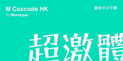 M Cascade HK is a graphic style Traditional Chinese typeface. Graphic font designs have strong personalities and visual impact. Graphic style Traditional Chinese fonts feature decorative elements and pronounced graphics characteristics, suitable for catching attention in display applications.
 - Construct by Breitenlauf,
$20.00 Construct is a technically based headline font that can also be used as body text. The font has some new ligatures that are automatically applied. Construct particularly suitable for headlines which should have a urban and technical character.
 - Gloriesta Playful by DYSA Studio,
$19.00 Gloriesta Playful is a new playful typeface. This another collection of display is perfect for your next branding project, excellent for your business. Gloriesta Playful have a natural edges, so this font gives an authentic handcrafted feel style.

