10,000 search results
(0.102 seconds)
- EctoBlaster - Unknown license

- Kremlin Kiev - Unknown license

- Cheetah - Unknown license

- Yoon Gothic 700 by Yoon Design,
$400.00 YD Gothic 700 is a modern sans serif typeface consisting of 9 weights. It supports up to 13 different languages such as English in Latin and other scripts
 - American Gothic by MADType,
$24.00 A blocky and bold geometric sans with inner angles and outer curves. No ascenders; lower case characters are as big as the upper case. Mix cases for variety.
 - Radio Broadcast JNL by Jeff Levine,
$29.00 An interesting hand lettered sans serif type style with a “brush stroke” feel was used for various article headlines in the October, 1938 issue of “Radio Stars” magazine.
 - Old Favorites JNL by Jeff Levine,
$29.00Old Favorites JNL is a collection of over 35 dingbats based on designs from the early days of printing. These timeless images will fill a variety of needs. - Madison by MADType,
$21.00 Madison is a classic slab serif stencil typeface. It is reminiscent of the days before computers when the best way to reproduce letters quickly was to stencil them.
 - Bubblewrap by Fontmill Foundry,
$20.00Bubblewrap is based on a 10 x 14 dot matrix grid and is perfect for projects where a little care and attention is the order of the day. - Championship Inline by Device,
$39.00 A punchy heavy sans suitable for headlines that require impact with character. The inline imparts a celebratory tone reminiscent of sport jerseys, car marques or ice-cream parlors.
 - Nat Vignette by ParaType,
$25.00 PT Nat Vignette™ was designed by Natalia Vasilyeva and licensed by ParaType in 2002. Original vignettes may be used as fleurons, composed borders, and corners as well.
 - Weekend Tabloid JNL by Jeff Levine,
$29.00Weekend Tabloid JNL is a classic sans serif wood type design that found its way into the setting of newspaper headlines during the pre-electronic age of publishing. - Syndication JNL by Jeff Levine,
$29.00 Syndication JNL was derived from Outline Sans JNL. By removing the outer letters, a thinner character set remained. This typeface is available in both regular and oblique versions.
 - Niks by dooType,
$20.00 Niks is the first sans serif created by dooType. It has 4 weights with corresponding italics. The character set supports more than 30 languages and some Opentype Features.
 - Richard Miller Rounded by Miller Type Foundry,
$19.00 Richard Miller Rounded started out as just a logo for a website/business card. It is a modular sans that works well in both print and web design.
 - Simplicity JNL by Jeff Levine,
$29.00 Simplicity JNL is a lightface monoline sans design for titling and short text that is clean and effective without being bland. Available in both regular and oblique versions.
 - Xevgo by Baqoos,
$18.00 Xevgo is a syndicate roundel tech sans apt for headline, editorial, branding, packaging, printed materials and typographic applications. 200+ glyphs with ligatures and fractions provided in opentype .otf.
 - TB Valentine by TrueBlue,
$14.00This is a series of elegant ormnaments created for Valentine's day. Each ornament is designed with care to ensure that it can be used at the largest sizes. - Tavern by FontMesa,
$25.00 Tavern is a super font family based on our Algerian Mesa design, with Tavern we've greatly expanded the usability by creating light and bold weights plus all new for 2020 with the introduction of extra bold and black weights Tavern is now a five weight family. The addition of the bold weight made it possible to go further with the design by adding open faced shadowed, outline and fill versions. Please note, the fill fonts are aligned to go with the open faced versions, they may work with the outline versions, however you will have to apply them one letter at a time. The Tavern Fill fonts may also be used a stand alone font, however, the spacing is much wider than the regular solid black weights of Tavern. In the old days of printing, fill fonts rarely lined up perfect with the open or outline font, this created a misprinted look that's much in style today. To create that misprinted look using two different colors, try layering the outline fonts offset over the top of the solid black versions. Next we come to the small caps and X versions, for a font that's mostly seen used in all caps we felt a small caps would come in handy. The X in Tavern X stands for higher X-height, we've taken our standard lowercase and raised it for greater visibility in small text and for signage where you want the look of a lowercase but it needs to be readable from the street. In August of 2016 I started the project of expanding this font into more weights after seeing the font in use where someone tried creating a bold version by adding a stroke fill around the letters. The result didn't look very good, the stroke fill also caused the shadow line to merge with the serifs on some letters. This lead me to experiment to see if a new bold weight was possible for this font and I'm pleased to say that it was. After the bold weight was finished I decided to type the regular and bold weights together in a first word thin second word bold combination, however the weight difference between the two wasn't enough contrast. This lead me to wonder if a lighter weight was possible for this font, as you can see yes it was, so now for the first time in the history of this old 1908 type design you can type a first word thin second word bold combination. So why the name change from Algerian to Tavern? Since the original font was designed in England by the Stephenson Blake type foundry I decided to give this font a name that reminded you of the country it came from, however, there were other more technical reasons. During the creation of the bold weight the engraved shadow line was sticking out too far horizontally on the bottom right of the serifs dramatically throwing the whole font off balance. The original font encountered this problem on the uppercase E, L and Z, their solution was a diagonal cut corner which was now needed across any glyph in the new bold weight with a serif on the bottom right side. In order to make the light and regular weights blend well with the bold weight diagonal cut offs were needed and added as well. This changed the look of the font from the original and why I decided to change the name, additional concerns were, if you're designing a period piece where the font needs to be authentic then this font would be too new. Regular vs. Alt version? The alternate version came about after seeing the regular version used as a logo and secondary text on a major product label. I felt that some of the features of the regular version didn't look good as smaller secondary text, this gave me the idea to create an alternate version that would work well for secondary text in an advertising layout. But don't stop there, the alternate version can be used as a logo too and feel free to exchange letters between both regular and alternate versions. Where are the original alternates from Algerian? Original alternates from Algerian are built into the regular versions of Tavern plus new alternates have been created. We're excited to introduce, for the first time, all new swash capitals for this classic font, you're going to love the way they look in your ad layout, sign or logo. The best way to access alternate letters in Tavern is with the glyph map in Adobe Illustrator and Adobe InDesign products, from Adobe Illustrator you can copy and paste into Photoshop as a smart object and take advantage of all the text layer style features Photoshop has to offer. There may be third party character maps available for accessing alternate glyphs but we can't advise you in that area. I know what you're thinking, will there be a Tavern Condensed? It takes a lot of hours to produce a large font family such as this, a future condensed version will depend on how popular this standard version is. If you love Tavern we're happy to introduce the first weathered edge version of this font called Bay Tavern available in February 2020.
 - PROG.BOT - 100% free

- One Mith Script - Personal use only

- PythonianDeluxe - Unknown license

- Filogofil by Muksal Creatives,
$12.00 Filogofil is a sophisticated type of sans serif logo font. Inspired by a mix of logos and philosophies, a solid, uncompromising style can be felt through controlled letterforms and a modern twist. A balance of hard lines and smooth curves.Filogofil are perfect for logo projects and great for any design project
 - Barbaros by MoodyType,
$49.00 An Art Deco condensed display sans font with 8 styles, +800 glyphs, +100 ligatures, +30 languages and many opentype features. It is perfect for poster designs, magazines, book covers, logotypes, headlines, newspapers and press. It's bold, daring, modern, geometric and covers a good range of weights from light to block.
 - Flick Casual by Jeff Marshall,
$35.00 This hand-lettered italic casual is another versatile font produced by Jeff Marshall, aptly named “Flick” due to its off the brush casual feel. This style was a work horse back in the day where it was used on cafe menu boards through to regulation lettering on trucks and aircraft.
 - Lieur by inkstypia,
$3.00 Lieur is a minimalist, geometric, sans serif font suitable for logos, label designs, or even just plain body text. It comes with 2 styles, Normal and Italic, and includes Light, Regular, Medium, Bold, and Black weights to give you great possibility to harmonize the look and feel of your text.
 - Fantastique by Hanoded,
$15.00 Fantastique is a bit of a sloppy 3D font: the outline is wobbly and the glyphs are uneven. Because of its imperfectness, it is ideal to create posters, advertisements and the like, because sloppy as it may be, Fantastique will catch your eye! C'est Fantastique! Comes with extensive language support.
 - Latinka by Jaroslav Zavodny,
$15.00 The Latinka family is a clean modern sans serif font created for website use as for desktop use. It is perfectly suited for graphic design and any display use. It comes with 18 different styles from thin to black. Each weight includes extended language support inclusive Cyrillic and Greek alphabet.
 - AntartidaEssential by Los Andes,
$18.00 AntartidaEssential is a minimal sans serif typeface. While its simple monolinear structure gives it a kind of neutral feeling, it is functional and clean. It is a essential family of 4 fonts, 2 weights and italics. This typeface no contains alternate glyphs and add only Windows 1252 Character set (219 Glyphs).
 - Disgrunged ABCD by Aah Yes,
$12.00Disgrunged is a distressed grunge font, as you might guess, and industrial sans-serif in feel. The Disgrunged ABCD family resembles bad printing with rubber stamps, with corners showing, along with misprinted letters, and the typeface has four versions (A, B, C, D) giving increasing amounts of chaos, jumbledness and irregularities. - DotumChe by Microsoft Corporation,
$129.00DotumChe™ features plain strokes similar to sans serif designs with half-width Latin characters, and works well for on-screen display such as user interfaces. This DotumChe font file is 5.2 MB in size. DotumChe is a trademark of Microsoft Corporation. DotumChe Character Set: Latin 1, Korean code page 949 - Joe College NF by Nick's Fonts,
$10.00Go, team, go! Fight, team, fight! Win, team, win! Here’s a family of typefaces based on typical athletic jersey lettering, in sans and serif styles, with inlines and an extrabold Letter Sweater treatment. Both versions of this font include the complete Unicode Latin 1252 and Central European 1250 character sets. - Weglly Hauston by Wildan Type,
$17.00 Weglly Hauston is a modern sans serif font with a unique ligature and aletrnate style. A simple serif with special impression. Combaine with high contrast and slat style perfect for feminine logo signs, fashion heads & editorial designs, branding projects, Clothing Branding, packaging, magazine headings, advertising, T-shirts, postcards and much more.
 - GulimChe by Microsoft Corporation,
$129.00GulimChe™ features plain strokes similar to sans serif designs with half-width Latin characters, and works well for on-screen display such as user interfaces. This GulimChe font file is 5.2 MB in size. GulimChe is a trademark of Microsoft Corporation. GulimChe Character Set: Latin 1, Korean code page 949 - Diaspora by Letteralle,
$23.00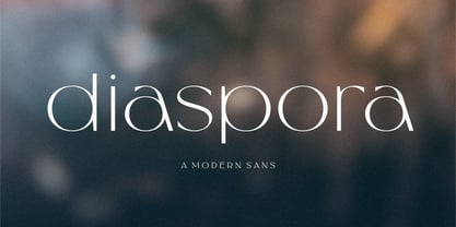 Diaspora is fancy modern sans serif font. Designed to give the impression of elegance and luxury. Contains uppercase & lowercase characters, all punctuation & numerals. Diaspora is absolutely perfect for editorial projects, Logo design, Wedding, Clothing Branding, product packaging, magazine headers, or simply as a stylish text overlay to any background image.
 - Rainis by Andrejs Kirma,
$3.00 Rainis is a geometric display typeface that is inspired by the art deco era of design. It has a modern feel to it and will work as a prominent accent in poster, web, branding, illustration or any other design. It works beautifully in a combination with geometric sans serif fonts.
 - Black Orchard by ErlosDesign,
$19.00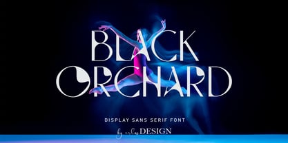 Black Orchard is a sans serif font with modern style. It includes uppercase letters, numeral, a large range of punctuation and also multilingual support. Perfects for poster, web design, magazine cover, album cover , branding and many more. The file you will get is: • Works on PC & Mac • Simple installation Enjoy!
 - Laviosar by Say Studio,
$12.00 Laviosar is a psychedelic inspired typeface. Unique tripped out lettering makes this font perfect for those groovy band poster, hippy logos and quotes. Laviosar mixes futurist letters with nostalgic curves to create stand out typography. Including lots of alternate letters! uppercase, alternates, numbers, punctuation Multilingual support Have a wonderful Day, Saystudio
 - SK Curiosity by Salih Kizilkaya,
$9.99 SK Curiosity is a modern geometric and sans serif font.It was designed by Salih Kızılkaya in 2020, inspired by the circular structures of the planets, blending modern design with a futuristic perspective. It includes all Latin characters. It is available in 40 different fonts and contains 18.200 glyphs in total.
 - Toppo by Typoforge Studio,
$30.00 To design the font Toppo I was inspired by a You And Me Monthly published by National Magazines Publisher RSW Prasa that appeared from Mai 1960 till December 1973 in Poland. This family contains 6 different styles. In the Toppo family, every variety contains 3 alternative characters with automatic replacement.


