10,000 search results
(0.021 seconds)
- King15 by Typo5,
$5.95King15 is a beautiful script font based on signatures dated back from hundreds of years. Its asymmetry and ink imperfections give it a strong and a truly unique character. - Tandem by Présence Typo,
$36.00Tandem is a set of opened capitals constructed on a Futura frame. Each sign exists in two versions aimed to be mixed-up to add rhythm to the words. - Lumberjacky by Tour De Force,
$25.00 In winter when cold time comes, when animals with thin fur play drums, there’s one guy who keeps you warm, his name is Lumberjacky and he’s stronger then storm!
 - CAL Bodoni Ferrara by California Type Foundry,
$47.00 Bodoni Ferrara™ Fashionable, Luxury Heritage: The Original Bodoni Ferrara Sculpted from hi-res photos and scans of Bodoni's original Ferrara Font—his 1818 Manuale Tipografico and 1768 specimens. It has never before been available. This cut of Bodoni specially selected by Dave Lawrence from rare book specimens. Part of the California Type Foundry Origin Series. 3 Display Fonts in One!! And 6+ style mixes. Bodoni's 1st Draft - Transitional Serif Bodoni was often inspired by French type designs. His first draft of Ferrara was inspired by Pierre Simon Fournier. But Bodoni added his own Italian sensibilities. Bododni’s first, transitional style can pair with humanist sans, and transitional fonts. Bodoni's Rework - Modern Serif Later, Bodoni reworked Ferrara to match the later neo-classic style or modern serif of Firmin Didot¹. Bodoni’s modern style can pair with geometric sans, grotesque sans, neo-grotesque sans, gothic sans, copperplate script, . Informal On™ - Informal Mode by CAL Type Foundry This can pair with “infant” fonts. Geometric sans, and other sans or serifs with one-storied a’s. + Bodoni’s Tivoli a for another option! Works great with Fournier¹ fonts and grotesques, since the terminals will match. Font Pairing Guide This font includes a 78 page Ferrara Pairing Guide. This book shows you 131 pairings with text fonts. 47 pairings with subheader fonts! We want to help you get more out of your font collection. Design Features • Subtle forward angle (0.5-1.5°) makes Ferrara more lively and engaging than most Bodoni or Didot fonts. • Round curves make this font feel letter-pressed. • Bodoni's original tall x-height and slightly condensed proportions: great for headlines, where space is at a premium. • Better uppercase. Uppercase punctuation for design apps. • Proportional oldstyle and lining figures, both modern style and transitional numbers. Every pair of numbers is kerned for display sizes: no unsightly gaps! • Multiple special symbols for whenever you need a design to pop, including 3 of Bodoni’s amazing ampersands. Language Features Latin standard for western European and other languages. +Advanced support for: German, French, Spanish, Portuguese, Italian, and French. Special, uppercase umlauts for titles! Compare to metal Bauer¹ Bodoni! Special context kerning for French, Spanish, Portuguese, Italian, and French, to allow better better words like L'Angelique & “¿Nosotros?”. This kerning gets rid of unsightly gaps between “¿ and other combinations. Can’t Find the Pairing Guide? Can't find the pairing guide? Google “California Type Foundry” and grab the pairing guide. Get another free pro font while you’re there! Ferrara: many sizes, styles, moods and situations. It's a classic, fashionable font for display, headlines, and titles. Grab Ferrara today! ----------- ¹Trademarks of their respective owners. Ferrara™ is a trademark of the California Type Foundry.
 - FS Siena by Fontsmith,
$80.00 Eclectic FS Siena is a typeface with history, and not just in the sense of having its origins in classical Roman lettering. Fontsmith founder Jason Smith first committed it to tracing paper while still at college, instinctively redrawing letterforms based on Hermann Zapf’s Optima according to ‘what felt right’. When Krista Radoeva took up the challenge to edit and extend the typeface, she and Jason were determined to preserve its subtly nonconformist and eclectic spirit. Like a great dish, there are individual components throughout the character set that all add flavour, and need to be balanced in order to work together. The smooth connection of the ‘h’ ‘m’ ‘n’ and ‘r’ contrasts with the corners of the ‘b’ and ‘p’. The instantly recognisable double-storey ‘a’ – the starting point of the design – contrasts with the single-storey ‘g’ and the more cursive ‘y’. And only certain characters – ‘k’, ‘w’, ‘v’ and ‘x’ in the lowercase and ‘K’, ‘V’, ‘W’, ‘X’ and ‘Y’ in the caps – have curved strokes. Transitional FS Siena is a contrasted sans-serif typeface, blending classical elegance and modern simplicity. Its construction and proportions are descended from classical broad-nib calligraphy and humanist typefaces, with a high contrast between the thick and thin strokes. The angle of the contrast, though, is vertical, more in the character of pointed-nib calligraphy and modernist typefaces. This vertical stress helps to give FS Siena a strong, cultured presence on the page. Idiosyncratic italics The italics for FS Siena were developed by Krista to complement the roman upper and lower-case alphabets first drawn by Jason. Many of the letterforms are built differently to their roman counterparts: there’s a single-tier ‘a’, a looped ‘k’ and connections more towards the middle of stems, such as in the ‘m’, ‘n’ and ‘u’. These distinctions, along with generally much narrower forms than the roman, give the italics extra emphasis within body copy, where the two are side-by-side. In editorial, especially, the combination can be powerful. To cap it all… In his original draft of the typeface, Jason found inspiration in Roman square capitals of the kind most famously found on Trajan’s Column in Rome. In keeping with those ancient inscriptions, he intended the capitals of FS Siena to also work in all-upper-case text, in logotypes for luxury consumer brands and property developments, for example. A little added space between the upper-case letters lets the capitals maintain their poise in a caps-only setting, while still allowing them to work alongside the lower-case letterforms. The caps-only setting also triggers a feature called case punctuation, which adapts hyphens, brackets and other punctuation to complement the all-caps text.
 - Nefertiti by JAB,
$12.00As you can see, Nefertiti is a font based on ancient Egyptian hieroglyphs and could be classified as a fun-font. I've always been really interested in Egyptology and a couple of years ago I thought it would be great to be able to write in hieroglyphs. I started to study them but soon realized it would take me a long time to be able to do this. Still, I was determined to find a way around this problem. At some point I came up with the idea of rearranging and reforming the hieroglyphs so as to resemble the English alphabet. During this process I tried as much as possible to preserve their ethos and appearance. However, since they are designed to write in English with, it's obvious that they are not always going to look like the real thing. Despite this, I'm really happy with the final result and I think many Pharaohphiles who just want to have some fun will be also. The only difference in this font between lower and upper case characters, is that the latter are set between two parallel, horizontal lines. These are for use with brackets (motif ends) to form cartouches - elongated ovals for names and/or titles. Try typing the following using the upper case in the sample text box. e.g. (JOHN} The zigzagged vertical lines at each end, separate the motifs from the hieroglyphs. Note the three types of ends/brackets. These lines are also used to separated words from one another and to give a more authentic appearance. So pressing the space bar gives a zigzagged line - not a space. They can also be used at any point within a cartouche to separate first and last names or titles. e.g. ; (JOHN;BROWN} walked straight home after work. Notice the eye glyph (period/full stop) at the end of the sentence. This is the only punctuation mark which can be used within a cartouche, e.g. after Mr. or to add a more Egyptian appearance to a name or title. e.g. (MR>;JOHN;BROWN} Parallel lines dividing hieroglyphical inscriptions and writing into rows or columns are very common. To incorporate these in a body of text, simple use the underline U. e.g. (OSIRUS) and {ISIS} were important gods of the ancient Egyptians. (HORUS) {HATHOR} and [RA],the sun god, were also highly revered deities. The punctuation marks available are shown below. . , " " ' ! ? "where is the king?" The font also includes the numbers 0-9, the following mathematical symbols and the hash sign(Scarab beetle). Once again, I've tried to make them look as Egyptian as possible; whether I've succeeded or not is open to debate. e.g. + - x / = # This font is named after Akhenaten's beautiful wife, Nefertiti, who's image can be seen in the graphic on this page. - Nightmare AOE - Unknown license

- Sunspots AOE - Unknown license

- Barbecue - Unknown license

- Diskun - Unknown license

- Poppy AOE - Unknown license

- Microbe AOE - Unknown license

- Visitation - Unknown license

- Inline Square JNL by Jeff Levine,
$29.00 Inline Square JNL is modeled from the hand lettered title found on the 1935 sheet music for "Cielito Lindo (Beautiful Heaven)", and is available in both regular and oblique versions.
 - Star by ParaType,
$25.00 Designed at ParaType in 1995 by Alexander Tarbeev, based on PT Compact, 1991, by Vladimir Yefimov. A decorative style was added in 1996. For use in advertising and display typography.
 - Artful Nouveau JNL by Jeff Levine,
$29.00 Artful Nouveau JNL was modeled from the hand lettering on the sheet music cover for the 1910 song "Gee, But It's Great to Meet a Friend from Your Home Town".
 - Griba by Decade Typefoundry,
$20.00 GRIBA Typeface is an experimental display typeface, based on every shape of each characters and transformed into double lines. This font is perfect for poster, titles, and t-shirt designs.
 - Dancin' by ITC,
$29.00Dancin' is yet another unusual typeface from American designer David Sagorski. Based on his own style of handwriting, Dancin' is an inventive, carefree typeface ornamented with dots and unusual strokes. - Nouveau Work JNL by Jeff Levine,
$29.00 Based on the sheet music title lettering for Al Jolson's 1920 song "Grieving for You", the casual style of Nouveau Work JNL is available in both regular and oblique versions.
 - Monthly Meeting JNL by Jeff Levine,
$29.00 A set of plastic pin-back letters served as the model for Monthly Meeting JNL. Pin-back letters were primarily used on cork bulletin boards for changeable notices and announcements.
 - Hexil Pixel 2 by Konst.ru,
$20.00 Font with hexagonal dots for small texts, names, logotypes, titles, headers, topics etc. Big size of this font can be used for texts on posters, t-shirts and other surfaces.
 - Coptic Alphabet by Deniart Systems,
$10.00Based on the writing used by the Copts in ancient Egypt, the font includes alphabet and numeral symbols. NOTE: this font comes with a comprehensive interpretation guide in pdf format. - Cross Stitch Regal by Gerald Gallo,
$20.00 Cross Stitch Regal is based on upper case characters 25 stitches tall and contains upper case characters A-Z, ampersand, exclamation and question marks, comma, period, colon, and semi-colon.
 - Haeock by Pedro Teixeira,
$16.00 Haeock is very readable, an beautiful slab serif designed by Pedro Alexandre Teixeira. This font family works very well on packagings, branding and editorial design, tiles, books, magazines, corporate design.
 - Pogba by Mr. Typeman,
$14.00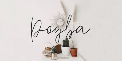 Pogba is a stylish calligraphy font with an amazing and natural style. Pogba is perfect for branding & logo projects, also suitable for packaging, wedding invites and cards and so on.
 - Drexel JNL by Jeff Levine,
$29.00 The bold hand lettered title on the 1940 sheet music for the band piece "Drexel Marching Song" was the inspiration for Drexel JNL; available in both regular and oblique versions.
 - Zigfrid by Borutta Group,
$20.00 The Zigfrid family was made after my visit to Deutschland and impression of old typography on the streets of Berlin. Zigfrid contains 5 different styles with a geometric, “trendlist” feel.
 - Phoebus by Linotype,
$29.99Phoebus is one of Adrian Frutigers first typefaces which he made for the Deberny & Peignot foundry in Paris. The intention was to create a shadowed type with extra ordinary impression. - Oron MF by Masterfont,
$59.00 A multi functional modern Hebrew font family, based on function rather than decoration. This font family enables many combinations, maintaining visual consistency. An excellent companion with Latin Universe font family.
 - Maitre d Stencil JNL by Jeff Levine,
$29.00 Maître d' Stencil JNL is based on an alphabet example found in the 1949 French lettering book “Album de Lettres Arti”, and is available in both regular and oblique versions.
 - Loulou by Wiescher Design,
$39.50 LouLou is a scriptlike typeface that looks as if it came right out of the sixties and seventies. Flowerpower! I enjoyed doing this one. Your swinging type designer Gert Wiescher
 - Mountain Goat by Atlantic Fonts,
$26.00 Mountain Goat is friendly, but likes to live on the edge. Undaunted by difficult terrain, this goat can do things you never dreamed of... P.S. Mountain Goat is never sheepish.
 - Eraser by Turtle Arts,
$20.00Eraser Carved is based on an alphabet set that was hand carved from pencil erasers. A combination of upper and lower case letters makes this a fun and quirky alphabet. - Alleyway JNL by Jeff Levine,
$29.00 Alleyway JNL is an original typeface by Jeff Levine drawing heavily on Art Deco influences. It's elegant, condensed design is perfect for anything from invitations to letterheads to ad copy.
 - Pool Deck JNL by Jeff Levine,
$29.00 There's nothing too fancy about Pool Deck JNL, which is based on an older typeface design. It's your basic sans serif condensed type style with a few unconventional letter shapes.
 - Berdina by TM Type,
$12.00 Berdina feels equally charming and elegant. It looks stunning on wedding invitations, thank you cards, quotes, greeting cards, logos, business cards, and every other design which needs a handwritten touch.
 - Silk Remington Pro by Jadugar Design Studio,
$19.00 Silk Remington Pro is the best Typewriter font with 14 variations, one of the most variations in typewriter fonts available in market. It's designed to give a real typewriter feel.
 - Deco Style JNL by Jeff Levine,
$29.00 The hand lettered title on the 1943 sheet music for "This Love of Mine" formed the basis for Deco Style JNL, which is available in both regular and oblique versions.
 - TDF Arena by TypeDrift,
$15.00 TDF Arena is a solid block font built for a sellout crowd. One of our best-selling typefaces is now available here, exclusively in a grunge style with Monotype Fonts.
 - Sandy by Oleg Stepanov,
$15.00 Sandy is a handwritten sans serif font, based on shapes made with ink brush. Sandy is a lively and informal typeface with good readability. Most of European languages are supported.


