4,856 search results
(0.018 seconds)
- Le Mans Classic by Kazer Studio,
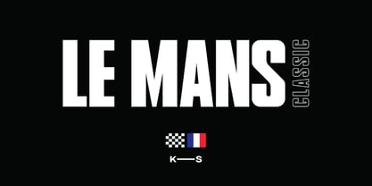
$6.00LE MANS - CLASSIC is a font inspired by vintage motorsport racing. In particular, advertising posters from the 70's. This time period was important as it showcased not only the cars that changed but also the illustrative styles & typography. Features: Offered in 2 Styles - Regular & Compressed Extensive Language support Specialised Kerning on all character combinations Designed by KAZER STUDIO - Braggadocio by Monotype,
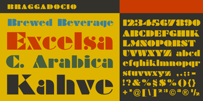
$29.99Braggadocio is a very black typeface. Braggadocio is a strange hybrid with characteristics of both sans serif and modern faces; and it belongs very much to its time. Like high society in the 1920's, it should not be taken too seriously. Use the Braggadocio font for display lines in advertising, magazines and light hearted communications. - Buchfraktur by RMU,
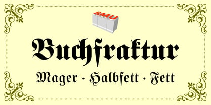
$25.00The late-19th and early-20th century standard blackletter family in Germany, in three weights. To get access to all ligatures, it is recommended to activate both Standard and Discretionary Ligatures. You find the round s on the # key, and by typing the combination N-o-period and activating the OT feature Ordinals you get the numero sign. - Gulfs Display by Studio Sun,
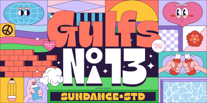
$10.00Gulfs Display Inspired by the 90's playful cartoon & comic books. This playful font comes in six widths; condensed, semi condensed, normal, semi expanded, expanded and extra expanded. This font can be used for modern and vintage designs, also can be easily paired with some graphic elements (Illustration, Photography) this font perfect for, Logotype, Branding, Title, and Packaging. - Jaggers by Victory Type,
$20.00Jaggers is a handwritten typeface based on the letterforms Caslon. It may be hard to see the resemblance between these two since Jaggers is such a unique font. Its casual appearance is charming and easy to read. Jaggers has an expanded character set including European letters and symbols! This font is definitely one of Victory"s best. - Digitany by Zealab Fonts Division,
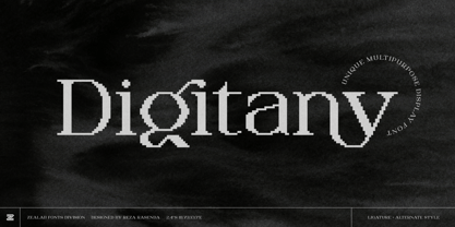
$10.00Digitany is a multipurpose display font, its a combination between luxury serif font and 8bit/pixel art style. Effortlessly re-create the classic fun vibes of the 80's using this display typeface that goes well with retro t-shirt designs, posters, illustrations, logos, and more. Digitany include uppercase and lowercase, ligature and alternate style, and also multilingual support. - Parler Fraktur by RMU,
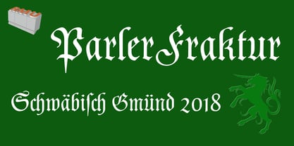
$25.00Friedrich Poppl’s blackletter font, carefully redrawn and redesigned for modern use, named after the Parler master builder family who built the Schwaebisch Gmuend cathedral. This font contains the letter ‚long s‘ which can be reached in two ways. Either you use the OpenType feature ‚historical forms‘, or you type the integral sign + the option key on your keyboard. - Frenda by Blankids,
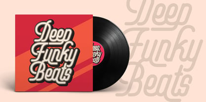
$17.00Introducing a new monoline layered font family called Frenda font. Frenda inspired by 80's music poster, automotive poster, funk music poster. Frenda came with opentype features you can mix and match with as you like and many choices of alternative character. Frenda good for logotype, poster, badge, book cover, tshirt design, packaging and any more. - Zenia by Greater Albion Typefounders,
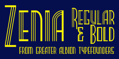
$9.50Zenia, offered in regular and bold weights is a homage to the streamline era of the later 1930s. It's a distinctive display family, glyphic yet still intuitive and easy to read. Use it anywhere you want that 30's streamlined feel, or perhaps in science fiction inspired work particularly those that have a 'past inspired future' feel... - Modakshar BT by Bitstream,
$50.99Modakshar was inspired by traditional Indic handwriting scripts which ‘hang’ from a common upper horizontal bar. Adapting this motif to Latin letterforms was challenging. The typeface was first conceived in the 1970's as a design project in school. The current digital design was completed in 2002. Basic motif was inspired by traditional Indic script handwriting. - LTC Cloister by Lanston Type Co.,
$24.95Designed by Morris Fuller Benton 1913-15, this Oldstyle family was digitized by Jim Rimmer in the early 2000's. It is a roman face closely styled to that of Nicholas Jensen's with a companion italic in the style of Aldus Manutius. Benton considered Cloister the ideal typeface and it does indeed lend itself to many uses. - SusiScript by Ingrimayne Type,
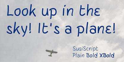
$9.00SusiScript is an friendly, informal typeface family with three weights, each with an oblique style. The idea for SusiScript came from a girl named Suzi who wrote her "e"s in a peculiar way. The typeface does not replicate her handwriting, which was very hard to read; it merely drew inspiration from several of her letters. - Ten Oldstyle by Adobe,
$35.00Ten Oldstyle is a four-weight type family from Principal Designer Robert Slimbach at Adobe. He designed it as the Latin component of Ten Mincho, a Japanese typeface by Adobe?s Chief Designer Ryoko Nishizuka. As it began to take the form of a small type family, Robert decided to release Ten Oldstyle on its own as well. - Retirement JNL by Jeff Levine,
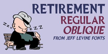
$29.00The hand lettered film credits for 1937’s “Make Way for Tomorrow” were done in a sans serif design with an ever-so-slight flare and a slightly semi-calligraphic look. Unusual in both style and varying character thicknesses, the lettering has been digitally redrawn as Retirement JNL, which is available in both regular and oblique versions. - Franky by Hasta Type,
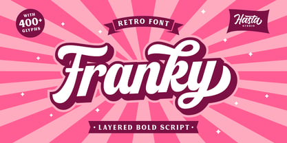
$25.00Franky is a retro, bold handwritten font with an 80’s style. This font is PUA encoded which means you can access all of the glyphs and swashes with ease! It features a varying baseline, smooth lines, gorgeous glyphs and stunning alternates. Fall in love with Franky's incredibly versatile style and use it with your favorite design projects! - Alige by Unforma Club,
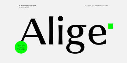
$20.00Alige is a humanist sans serif typefaces made for body text and display. Carried classic roman proportion in higher letterform for better reading experence. Inspired by Optima Nova which designed by Hermann Zaph in early 50's, alige contains 28 cuts which 14 style in text and 14 in display. Kindly visit Alige Playground for more detail presentation. - Hoelderlin by RMU,
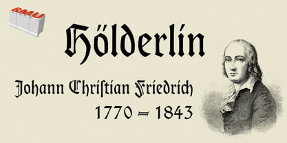
$25.00In 1938 the Frankfurt-based foundry Ludwig & Mayer released Eugen Weiss’ beautiful fraktur ‚Hoelderlin‘. Carefully redrawn and redesigned, this digitized version is intended to add another gem to the enthusiasts’ treasure drove of blackletter types. The font contains the historical long s which can be reached by the OpenType feature historical forms or by typing the integral sign [ ∫ ]. - Rorschach by Kenn Munk,
$15.00How to use The Rorschach dingbat: q,w,e,r,t,y,u,i,o,p create the start of an inkblot a,s,d,f,g,h,j,k,l create a middle, you can use any number of middle-elements z,x,c,v,b,n,m create the ending. Your Rorschach is now finished, get analysing! - Deco Pen JNL by Jeff Levine,
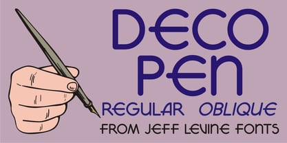
$29.00Hand lettering found across the sheet music cover of 1931's "Bend Down, Sister" [from the Eddie Cantor film "Palmy Days"] covered a couple of varying Art Deco styles; both made with a round-tipped pen nib. Deco Pen JNL combines the best of both styles into one design that's available in both regular and oblique versions. - Vizille by TeGeType,
$29.00 - Lush Script by Positype,
$59.00Lush was a formal script until it had a few too many drinks and, as a result, loosened up a little bit. Harkening back to the handlettering of the 40s and 50s, Lush has evolved into a casual, but well-dressed script that maintains a rather aggressive rhythm. Transitions often whip back quickly, forcing the letters to reel from the movement and resolve efficiently. It is not as warm as some scripts, intentionally so, so as to distinguish it from its predecessors. Type and lettering fans will revel in the options afforded to each character—in some cases there are up to 15 different variations with multiple glyph recipes available to produce the most unique and fluid lettering combinations possible. An often overlooked segment of contemporary script fonts, the uppercase letters have at least 3 options to work with that mesh well with the 36 ornamental flourishes to add even further embellishment. In total, there are over 1,650 glyphs in the typeface that includes these OpenType options: Stylistic Alternates, Contextual Alternates, Swashes, Titling, Historical Forms, Initial Forms, Oldstyle Numerals and 3 additional Stylistic Sets. With this release, I have tried to provide as much flexibility and 'forgiveness' within the typeface so the lettering enthusiast can have fun and explore thousands of iterations… and it's pretty easy math to figure this out: with over 970 alternates and 270 ligatures, I intended this typeface to be one that keeps on giving. One important fact to note… this marks the first release of a smooth, non-brushed, non-textured script from me—but it won't be the last. That said, I will have to admit that the brush has influenced many of the characters and their construction. Enjoy :) - Boxy Code by Just My Type,
$15.00In the late 60’s, one of the best art publications in the country was Motive magazine, published (amazingly) by the United Methodist Church. Filled to the brim with poetry, essays, line drawing and woodcuts, it also featured some cutting-edge typography. Boxy/Code is based upon my memories of woodcut typography from that great magazine. Since Boxy/Code ’s lowercase consists of the uppercase’s negative spaces, it’s easy to combine the two with Layer Styles in Photoshop in order to achieve the effect I used in one poster above. It also works great if you use a well-known text as a background. This new version is totally redrawn and features all the Latin-accented letters. Uppercase consists of black capitals in boxes; lowercase features the negative spaces of those boxed capitals. Uppercase and lowercase line up exactly for 2-color effects. - 1534 Fraktur by GLC,
$38.00This family was inspired by the early Fraktur style font used circa 1530 by Jacob Otther, printer in Strasbourg (Alsace-France) for German language printed books. Although it is an early Fraktur pattern, it is easy to see the characteristic differences with the Schwabacher style (look at 1538 Schwabacher), like in the small d, o or y... and the capitals (look at the H, K, T...). Frequently, Schwabacher and Fraktur were used together in the same book : Fraktur style for the main and Schwabacher for marginalia and comments. This font contains standard ligatures and German historical ligatures (German double s, long s, ts...) and diacritics (special ummlaut "e superscript" and "∞" instead of dieresis with letters a, o and u,) naturally, we have added numerous letters lacking in the original to permit a contemporary use of the font. - Olivera by Artisan Studio,
$15.00Olivera has Stylistic standard, Stylistic Initial, Stylistic Teminal and ligatures and includes uppercase and lowercase letters, numbers and punctuation marks. Multilingual Support OpenType smart programs such as Adobe Photo Shop, Adobe Illustrator, Adobe Indesign, Corel Draw and Microsoft Office. A total of 462 Glyphs: Ligatures: Ju Ct ff Cl all gh of ck tt ut nt ak ll pp il rt it ot st at rr om mm ar ss as or ox ow on tt ut ut Ct st at ot rt it Cl Swashes access: A B C D E F G H I J K L M N O P Q R S T U V W X Y Z 7 alternative sets access: a b c d e f g h i j k l m n o p q r s t u v w x y z - Sheridan Gothic SG by Spiece Graphics,
$39.00Sheridan Gothic, also known as Grant Antique, is a quaint design produced in the late nineteenth century. Its proportions are in keeping with extra condensed faces of the times. Its uppercase letters are quite narrow. Its lowercase letters are equally narrow and tall. This pleasant and enduring design contains a touch of novelty, too. Swelled terminal flourishes on such characters as C, J, S, c, e, r, and s help add interest and warmth to what is basically a friendly old soul. Sheridan Gothic is now available in the OpenType Std format. Some new stylistic alternates have been added to this OpenType version. Advanced features work in current versions of Adobe Creative Suite InDesign, Creative Suite Illustrator, and Quark XPress. Check for OpenType advanced feature support in other applications as it gradually becomes available with upgrades. - Sacramento Pro by Stiggy & Sands,
$39.00The Sacramento Pro family of typefaces was inspired by a monoline, semi-connected script from hand-lettering artist brochure work of the 1950's and 1960's. With its sophisticated upright stance, it stands on a thin line between formal and casual lettering styles, yet it has a commanding presence for headlines and titles. The Slim adds a fine pen-line style, while the Stout style expands the formal/casual dichotomy much further than the original weight. Opentype features include: - Contextual Alternates for initial and final forms. - Stylistic Alternates for an alternate lowercase t. - Discretionary Ligatures* for catch words like “and”, “at”, “by”, “for”, “of”, “or”, “the”, “to”, and “with”. - Full set of Inferiors and Superiors for limitless fractions. - Proportional and Oldstyle figure sets. * Discretionary Ligatures not included in the Stout style due to heavyweight nature. - Volantene Script by Catharsis Fonts,
$-Volantene Script is a fully equipped display typeface inspired by the fine penmanship of Lady Talisa Maegyr-Stark. The lowercase letters are crafted to be as faithful as possible to the lady�s hand-written forms, while the uppercase, figures, symbols, and punctuations are original designs by Catharsis Fonts (Christian Thalmann) matching the lowercase in style. Volantene Script comes with an extensive character set and OpenType features like ligatures and contextual alternates. The common romanization of High Valyrian uses macrons (??????) to mark long vowels. Since these are difficult to type with most keyboard mappings, Volantene Script offers macron-shaped diaereses (������), which are easily accessible. Volantene Script was completed within a week�s time. The name is derived from the free city of Volantis, where Lady Talisa grew up and learned to write. This font is dedicated to Simone. Geros ilas! - 1543 German Deluxe by GLC,
$38.00This family was inspired by the sets of fonts used in 1543 by Michael Isengrin, printer in Basel (Germany) to print the splendid New Kreüterbuch...(New herbal...), with numerous nice pictures, the masterpiece of Leonhart Fuchs, father of the modern botany. It is a Schwabacher pattern, with three different sets of fonts, small (± 4mm for the upper case) in the main text, larger for titles (± 8mm for the upper case) and large Initials or lettrines (five lines of main text). This font contains standard ligatures and German historical ligatures (German double s, long s, tz, ch,...) and diacritics (special umlaut "e superscript" and "∞" unstead of dieresis with letters a, o and u,) naturally, we have added numerous letters lacking in the original to permit a contemporary use of the font. It can be used in complement with 1538 Schwabacher or/and 1534 Fraktur. - 1715 Jonathan Swift by GLC,
$42.00The famous Irish poet and novelist Jonathan Swift (Dublin 1667-1745) has a large personal library of which he noticed carefully the book list by himself. We have used a facsimile from this catalogue to reconstruct this present font, as one example of the poet’s personal hands but also as a typical example of the British quill pen handwriting from about mid 1600’s to the beginning of 1700’s . It is a “Pro” font containing Western (including Celtic) and Northern European, Icelandic, Baltic, Eastern, Central European and Turquish diacritics. The numerous alternates and ligatures allow to made the font looking as closely as possible to the real hand. Using an OTF software, the features allow to vary automatically almost each character of a word without anything to do but to select contextual alternates and standard ligatures and/or stylistic alternates options. - Atlantica by Jonahfonts,
$35.00My pet peeve for many years has been with the 'rn' in small texts, especially with my smart phone. I felt that perhaps others may have the same peeve. I decided to try and fix that with Atlantica. As you can see in poster No. 4. "With the combination of 'rn' in small text it tends to appear as 'm'. Therefore it may be read as 's t e m' instead of 's t e r n'. Altalntica has an alternate 'rn'. By invoking the < Contextual-Alternate > feature. Atlantica will replace each 'rn' - or you may individually change them if you desire". Also note the deep cuts to help legibility for smaller texts. This combination apparently does not appear in many words, but when it does it can suggest a different word as in; eastern, stern, tarnish, Tornado, Turn and in some names as well. - Excited Alphabets by Harald Geisler,
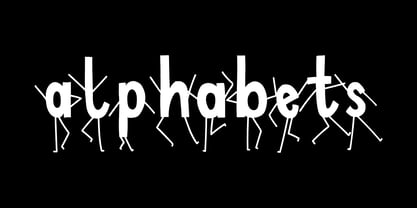
$50.00Excited-Alphabets is a lowercase display font. The letterform is sans-serif with a few appendages to give the letters a life-like and cheerful form. Also, each Letter has two poses (i.e. s and S) which makes it easy to design the perfect headline, characters can also be chosen individually from the glyphs menu to get a unique look. Its dynamic or ‘dancing’ look makes it perfect for (short) editorial headlines, celebratory lines, fun branding, social media posts, website headers, posters, ads, products, stationery designs and more. Excited alphabets was born in Frankfurt (Germany) when two ‘almost-neighbours’ met at a coffee shop. Inspired by the illustration of Sumbo Pinheiro, Excited was designed by Harald Geisler and Sumbo Pinheiro. From quirky illustration to font, this was a fun project to work on because each alphabet comes with its own sassy character. - Romena by Brenners Template,
$19.00It is a modern grotesque family that can feel strong power. Hairline Styles are designed to be thinner than the average Thin Styles and have a lower x-height than Black Styles. So when you design your typography using the entire font family, you get a great sense of balance and harmony. And with creative Alternates, you can make your logo and product branding design work unique. Cropped glyphs provide meaningful metaphors for logo design. Be sure to try the Stylistic Alternates and Ligatures this family has to offer. OpenType Features Stylistic Alternates - C, G, K, N, R, S, a, e, g, i, o, s, u, y Standard Ligatures - ff, ffi, fi Discretionary Ligatures - tt, rr Fractions Oldstyle Figures Tabular Figures Circled Numbers Multilingual Support Western Europe, Central/Eastern Europe, Baltic, Turkish, Romanian Basic Cyrillic Ukraine - Josefov by Ingo,
$28.00A narrow, modern Slab Serif. JOSEFOV is directly derived from the sans serif text font ”Hedwig“. Therefore, of course, it pairs best with “Hedwig”. The basic thought was to create a font with heavy rounded serifs in the style of ”Clarendon“ but which hardly reminds one of that particular font. The form principle of rounded serifs is applied whenever possible — for example at the points where the individual strokes of the characters join one another. JOSEFOV seems very technical, very constructed (and truly is). In order to soften up the rigid impression, the serifs are applied at some points contrary to the tradition handed down, as with the upper case A C G K M V W and the lower case a b d h i j k l s t. Historically there is no example of the laterally oriented serifs of capital and small s (S) and C G. On the other hand, the double-sided serifs on the stems of b d h k l appear at the beginning of modern times in the very first serif types from five hundred years ago. The double-sided serifs of A M V W were also customary in the first decades of printing. JOSEVOV is particularly suitable for topics such as nature, folklore, culture, music, nutrition. - Quiroh by Hashtag Type,
$32.00Quiroh is a functional typeface that expresses both artistic life and emotion. Taking its inspiration from the industrial revolution of the 19th Century where romance and science coincided. With a cushioned finish and designed according to traditional conventions, the sentiment is equally as important as the reason, resulting in a very pleasurable read. Quiroh includes both heavy display weights and lighter weights for small copy, it's a perfect tool for communicating to the masses. Tall ascenders and descenders give the typeface a distinctive look with an elegant feel, and while these expressive forms invite the reader to observe its visible shape and appearance, its rhythm and function invites the reader to peruse at their leisure. Full details include 7 weights from thin to heavy with over 470 characters, manually edited kerning and OpenType features. - EG Dragon Caps - 100% free
- Throrian Formal - 100% free
- Throrian Commonface - 100% free
- Garalda by TypeTogether,
$49.00Type designer Xavier Dupré’s Garalda is a charming 21st century family that renews a legacy of finesse. As paragraphs on a page, Garalda’s overall impression is of a workaday personality, committed to the main purpose of the job: easy long-form reading. But setting it in display sizes proves something different: This reinvented Garamond is anything but basic. The Garalda story begins with the serendipitous finding of a book typeset in a rare Garalde, called Tory-Garamond, with which Dupré was not immediately familiar. This Garamond was used in bibliophile books in the decades surrounding 1920, but after that it became déclassé for an unknown reason. Dupré found the italic styles especially charming and discovered the family was probably the mythical Ollière Garamond cut from 1914. He obtained low resolution scans of the typeface and used them, rather than high resolution scans, as the basis for his new type family. This allowed Dupré the mental freedom to experiment and remix as he saw fit, culminating in a contemporary family with heritage. As seen in the simplistic rectangular serifs, Garalda is a humanist slab serif, but with a mix of angles and curves to give the classic shapes a fresh, unorthodox feeling. While almost invisible in paragraph text, these produce a graphic effect in display work. The set of ligatures in the roman and italics lend themselves to unique display use, such as creating lovely logotypes. In the italics, some swashes inspired by different historic Garamonds are included, sometimes breaking their curves to be more captivating. Just look at how the italic ‘*-s’ ligatures create ‘s’ with a cursive formation rather than merely a flowing slant. And how the roman ‘g’ link swings as wide as a trainer’s whip. These are all balanced by squared serifs in the roman to keep an overall mechanised regularity. The Garalda family comes in eight styles, includes some of the original arrows and ornaments, and speaks multiple languages for all typesetting needs, from pamphlets to fine book printing. The complete Garalda family, along with our entire catalogue, has been optimised for today’s varied screen uses. - Deco Freehand by S. John Ross is an intriguing font that encapsulates the essence of Art Deco style while infusing it with a personal touch. This font is characterized by its distinctiveness; it's ne...
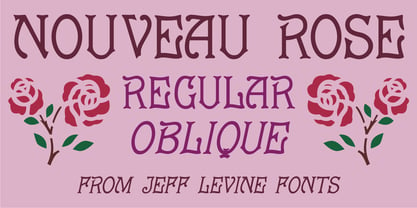
- Nouveau Rose by Jeff Levine,
$29.00In the July 24, 1915 issue of “Dry Goods Reporter” is a demonstration of hand lettering rendered with the use of a “speed pen”. Two suggested examples cited in the accompanying article were the Payzant pen and the then-new Speedball pen. An ornate Art Nouveau serif alphabet is displayed, with some examples having delicate floral elements entwining the letters. The initial alphabet was auto-traced, then cleaned-up and modified to recreate the core design of the basic (unadorned) letters. The numerals, punctuation and all additional characters were then made from scratch. Nouveau Rose JNL is the finished result, and is available in both regular and oblique versions.
