4,918 search results
(0.017 seconds)
- Russian - 100% free

- Gussian by Flawlessandco,
$9.00 Introducing "Gussian" - A Modern Sans Serif Font. Gussian is a contemporary sans serif font that effortlessly combines modern aesthetics with clean simplicity. There's some connected letters and some alternates that suitable for any graphic designs. This font support for some multilingual. Also contains uppercase A-Z and lowercase a-z, alternate character, numbers 0-9, and some punctuation. If you need help, just write me! Thanks so much for checking out my shop!
 - Old Russian by Grummedia,
$20.00Old Russian is a fake Cyrillic alphabet, based on old Slavic characters universally adopted in the old days of the Russian empire. Offering an opportunity to create a unique historical look. - RussianQuality - Unknown license

- Gyrussian - Unknown license

- Hessian by MADType,
$39.00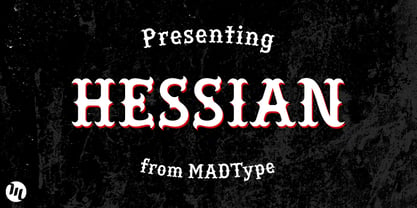
- Fussion by Variatype,
$12.00 Fussion is inspired by modern technology, it's really suited to your branding project or logotype and more commercial project. With more ligatures to make it flexible to any brand name. FONT FEATURES Additional Accents 66 Languages Kerning Alternates Ligatures SOFTWARE RECOMMENDATION Adobe Photoshop Adobe Illustrator
 - Rusthian by MC Creative,
$10.00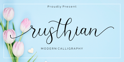 Rusthian a new modern & fresh calligraphy font with a lot of stylistic alternate make this font looks natural, elegant, and perfect for any awesome projects. Rusthian is perfect for many different project such as logos & branding, invitation, stationery, wedding designs, social media posts, advertisements, product packaging, product designs, label, photography, watermark, special events or anything. What’s Included : Standard Glyphs Ligature Works on PC & Mac Simple installations Accessible in the Adobe Illustrator, Adobe Photoshop, Adobe InDesign, even work on Microsoft Word. PUA Encoded Characters – Fully accessible without additional design software. Fonts include multilingual support for; ä ö ü Ä Ö Ü ß ¿ ¡ Thank you for your purchase! Hope you enjoy with our font!
 - Busstan by YonTypeStudio Co,
$10.00 A dapper, rustic, handwritten font with a personal charm. With quick-drying strokes and distinctive styles, Busstan is perfect for branding projects, household appliance designs, product packaging - or just as a style text overlay for any background image. That's it! I really hope you enjoy it - please do let me know what you think, comments & likes are always hugely welcomed and appreciated.
 - Ruffian by Scriptorium,
$18.00 - Seussian by Sylvestre Studios,
$20.00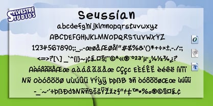
- Prussian Brew - Unknown license

- Rushine by Keristyper Studio,
$14.00 Say hello to Rushine Script, a vintage calligraphy brush stroke font. This font is good for logo design, Social media, Movie Titles, Books Titles, short text even long text letters, and good for your secondary text font with sans or serif. Featured: Standard Uppercase & Lowercase Numeral & Punctuation Multilingual : ä ö ü Ä Ö Ü ß ¿ ¡ Alternate & Ligature PUA encoded We recommend programs that support the OpenType feature and the Glyphs panel such as Adobe applications or Corel Draw. so you can use all the variations of the glyphs. Hope you enjoy our fonts!
 - Ruskin by Fine Fonts,
$29.00 The origin of Ruskin was a commission for Michael Harvey to design a signage font for the Dean Gallery in Edinburgh. The style of the letterforms was to complement the period of the building which was originally an orphanage built in 1839. Only uppercase letters were created at first with the lowercase letters—and other characters necessary for a font—added later. With elegant and slightly extended letterforms, Ruskin fulfilled its rôle well as a signage font. It also functioned extremely well as a general display font. It is particularly suited to item descriptions and placards in galleries and museums which are frequently read from an angle, as well as head-on. The fonts have both proportionally and monospaced numerals.
 - Sussan by Estudio Calderon,
$20.00 The Sussan type family is a hand lettering collection designed by Felipe Calderón. It contains sixteen different hand-drawn fonts and a set of funny illustrations designed by Jhony Velasco. On this occasion, we tried to match several font concepts to create nice pieces with them and each one is equipped with automatically exchanging alternates, ligatures, swash letters and some other feature.
 - Times by Linotype,
$40.99In 1931, The Times of London commissioned a new text type design from Stanley Morison and the Monotype Corporation, after Morison had written an article criticizing The Times for being badly printed and typographically behind the times. The new design was supervised by Stanley Morison and drawn by Victor Lardent, an artist from the advertising department of The Times. Morison used an older typeface, Plantin, as the basis for his design, but made revisions for legibility and economy of space (always important concerns for newspapers). As the old type used by the newspaper had been called Times Old Roman," Morison's revision became "Times New Roman." The Times of London debuted the new typeface in October 1932, and after one year the design was released for commercial sale. The Linotype version, called simply "Times," was optimized for line-casting technology, though the differences in the basic design are subtle. The typeface was very successful for the Times of London, which used a higher grade of newsprint than most newspapers. The better, whiter paper enhanced the new typeface's high degree of contrast and sharp serifs, and created a sparkling, modern look. In 1972, Walter Tracy designed Times Europa for The Times of London. This was a sturdier version, and it was needed to hold up to the newest demands of newspaper printing: faster presses and cheaper paper. In the United States, the Times font family has enjoyed popularity as a magazine and book type since the 1940s. Times continues to be very popular around the world because of its versatility and readability. And because it is a standard font on most computers and digital printers, it has become universally familiar as the office workhorse. Times™, Times™ Europa, and Times New Roman™ are sure bets for proposals, annual reports, office correspondence, magazines, and newspapers. Linotype offers many versions of this font: Times™ is the universal version of Times, used formerly as the matrices for the Linotype hot metal line-casting machines. The basic four weights of roman, italic, bold and bold italic are standard fonts on most printers. There are also small caps, Old style Figures, phonetic characters, and Central European characters. Times™ Ten is the version specially designed for smaller text (12 point and below); its characters are wider and the hairlines are a little stronger. Times Ten has many weights for Latin typography, as well as several weights for Central European, Cyrillic, and Greek typesetting. Times™ Eighteen is the headline version, ideal for point sizes of 18 and larger. The characters are subtly condensed and the hairlines are finer. Times™ Europa is the Walter Tracy re-design of 1972, its sturdier characters and open counterspaces maintain readability in rougher printing conditions. Times New Roman™ is the historic font version first drawn by Victor Lardent and Stanley Morison for the Monotype hot metal caster." - 1350 Primitive Russian by GLC,
$44.00 This rough font was inspired by a Russian Cyrillic hand of the 1350s “Russkaja Pravda” (a Russian text of common Laws). As a Pro font, it supports Western and Northern European, Icelandic, Baltic, Eastern, Central European and Turkish specific characters, as well as Old Russian glyphs, including many which fell out of use in the 1700s, except in religious texts — in all over 136 Russian glyphs. The upper and lower case have the same form and almost same size, like in the original texts, which had only one size and style.
 - Ruffian bold - Unknown license

- Ruffian Outline - Unknown license

- X Ruffian by ThoroughBR&,
$9.00 X RUFFIAN Ruffian was a champion thoroughbred horse who won 10 consecutive races. A feat worth mentioning & repeating. Her tenacity & steadfast approach established the basis for this variable based font. The X represents both the Roman numeral 10, but also the X-factor for creating bespoke works of art. It is quite befitting that this font be named after a legendary champion. Which begs the question...Do you champion variety? X Ruffian's design motif uses a broad tipped chiseled marker that was set at an angle for that extra bit of vigor. Identical letter forms defeat that truly "hand rendered" look that we ultimately strive for. Each uppercase letter offers 10 (X) or more stylistic alternatives, the lowercase and number sets have 3+ options and an over under for those special characters that yield a long bottom or top (see images). Ligatures & bonus characters can add that unique offering to your already individual style & can easily be found via the glyphs panel in any open type program. With a gigantic glyph count of 688, you'll never run out of options. As a right of passage, we felt obliged to include a roman numeral set as the name beckons, which differs from the standard letter form in which you would use to create. This is a variable winner. See you at the races!
 - Prussian Brew Offset - Unknown license

- Prussian Brew Upper - Unknown license

- DS Russia Demo - Unknown license

- EF Ossian by Elsner+Flake,
$35.00 - Patricia Rustine by Letterena Studios,
$9.00 Patricia Rustine is a romantic and sweet calligraphy typeface with characters that dance along the baseline. It will add a luxury spark to any design project that you wish to create!
 - Typography times - 100% free

- Good Times - Unknown license

- Tribal Times - Personal use only

- Chaos Times - Unknown license

- !Sketchy Times - Unknown license

- Still Time - Unknown license

- !Sketchy Times - Unknown license

- Movie Times - Unknown license

- Viney Times - Unknown license

- Santa Time - Unknown license

- Chunky Times - Unknown license

- Time Pundits - Personal use only

- Good Times by Typodermic,
$11.95 Introducing Good Times, the techno-inspired typeface that will take your designs to the next level. With its wide, capsule-shaped design, Good Times is perfect for high-tech, sports, and scientific themes. The letterforms were inspired by the lettering used on Pontiac cars from 1989-1994 and is designed with straight lines, simple forms, and unconnected strokes. Whether you’re designing for a futuristic tech company or a cutting-edge sports brand, Good Times has you covered. The font comes in seven different weights, including oblique styles, so you can choose the perfect weight for your project. For a more edgy look, check out Good Times Bad Times, a rusty texture variant that adds a rugged feel to your designs. And with OpenType technology, you can automatically substitute common letter pairings with customized ones for a genuine chipped metal aesthetic. But that’s not all. If you’re looking for lowercase letters, be sure to check out Good Timing, the follow-up to Good Times. With its sleek, modern look, Good Timing is the perfect complement to Good Times, offering even more design possibilities. So whether you’re creating a high-tech ad campaign or a scientific presentation, Good Times is the font that will make your design stand out. With its distinctive capsule-shaped design and versatile weights, you can create designs that are both bold and sophisticated. So why wait? Try Good Times today and see the difference for yourself! Most Latin-based European writing systems are supported, including the following languages. Afaan Oromo, Afar, Afrikaans, Albanian, Alsatian, Aromanian, Aymara, Bashkir (Latin), Basque, Belarusian (Latin), Bemba, Bikol, Bosnian, Breton, Cape Verdean, Creole, Catalan, Cebuano, Chamorro, Chavacano, Chichewa, Crimean Tatar (Latin), Croatian, Czech, Danish, Dawan, Dholuo, Dutch, English, Estonian, Faroese, Fijian, Filipino, Finnish, French, Frisian, Friulian, Gagauz (Latin), Galician, Ganda, Genoese, German, Greenlandic, Guadeloupean Creole, Haitian Creole, Hawaiian, Hiligaynon, Hungarian, Icelandic, Ilocano, Indonesian, Irish, Italian, Jamaican, Kaqchikel, Karakalpak (Latin), Kashubian, Kikongo, Kinyarwanda, Kirundi, Kurdish (Latin), Latvian, Lithuanian, Lombard, Low Saxon, Luxembourgish, Maasai, Makhuwa, Malay, Maltese, Māori, Moldovan, Montenegrin, Ndebele, Neapolitan, Norwegian, Novial, Occitan, Ossetian (Latin), Papiamento, Piedmontese, Polish, Portuguese, Quechua, Rarotongan, Romanian, Romansh, Sami, Sango, Saramaccan, Sardinian, Scottish Gaelic, Serbian (Latin), Shona, Sicilian, Silesian, Slovak, Slovenian, Somali, Sorbian, Sotho, Spanish, Swahili, Swazi, Swedish, Tagalog, Tahitian, Tetum, Tongan, Tshiluba, Tsonga, Tswana, Tumbuka, Turkish, Turkmen (Latin), Tuvaluan, Uzbek (Latin), Venetian, Vepsian, Võro, Walloon, Waray-Waray, Wayuu, Welsh, Wolof, Xhosa, Yapese, Zapotec Zulu and Zuni.
 - Medieval Times by Celebrity Fontz,
$24.99 Medieval Times is a digital revival of an illuminated alphabet dating back to a text from the medieval period. Each letter is made up of several different human or mythological animal figures engaged in activities that reflect the beliefs and myths of that enchanted era. Some examples of the beings that you will find in this font are: griffins, dragons, chimeras, lions, gargoyles, unknown mythical winged creatures, peasants, priests, saints, and warriors battling with spears. Comes with a full set of accented letters.
 - Times Eighteen by Linotype,
$29.00In 1931, The Times of London commissioned a new text type design from Stanley Morison and the Monotype Corporation, after Morison had written an article criticizing The Times for being badly printed and typographically behind the times. The new design was supervised by Stanley Morison and drawn by Victor Lardent, an artist from the advertising department of The Times. Morison used an older typeface, Plantin, as the basis for his design, but made revisions for legibility and economy of space (always important concerns for newspapers). As the old type used by the newspaper had been called Times Old Roman," Morison's revision became "Times New Roman." The Times of London debuted the new typeface in October 1932, and after one year the design was released for commercial sale. The Linotype version, called simply "Times," was optimized for line-casting technology, though the differences in the basic design are subtle. The typeface was very successful for the Times of London, which used a higher grade of newsprint than most newspapers. The better, whiter paper enhanced the new typeface's high degree of contrast and sharp serifs, and created a sparkling, modern look. In 1972, Walter Tracy designed Times Europa for The Times of London. This was a sturdier version, and it was needed to hold up to the newest demands of newspaper printing: faster presses and cheaper paper. In the United States, the Times font family has enjoyed popularity as a magazine and book type since the 1940s. Times continues to be very popular around the world because of its versatility and readability. And because it is a standard font on most computers and digital printers, it has become universally familiar as the office workhorse. Times™, Times™ Europa, and Times New Roman™ are sure bets for proposals, annual reports, office correspondence, magazines, and newspapers. Linotype offers many versions of this font: Times™ is the universal version of Times, used formerly as the matrices for the Linotype hot metal line-casting machines. The basic four weights of roman, italic, bold and bold italic are standard fonts on most printers. There are also small caps, Old style Figures, phonetic characters, and Central European characters. Times™ Ten is the version specially designed for smaller text (12 point and below); its characters are wider and the hairlines are a little stronger. Times Ten has many weights for Latin typography, as well as several weights for Central European, Cyrillic, and Greek typesetting. Times™ Eighteen is the headline version, ideal for point sizes of 18 and larger. The characters are subtly condensed and the hairlines are finer. Times™ Europa is the Walter Tracy re-design of 1972, its sturdier characters and open counterspaces maintain readability in rougher printing conditions. Times New Roman™ is the historic font version first drawn by Victor Lardent and Stanley Morison for the Monotype hot metal caster."


Page 1 of 123Next page