9,913 search results
(0.044 seconds)
- Big Top by Comicraft,
$19.00 Step Right Up, Step Right Up, the Font Circus is in town and ready to reveal our stupendous new tent-pole feature! Step inside for the best seat in the house. Ringmaster Roshell Beauregard dons his Big Top Hat especially for this occasion and promises us that Clowntime ain't over until the Bearded Lady takes a custard pie in the face. Our Big Top Bonanza performance begins with sideshow attractions and distractions, high-wire acrobats and low-cost rubber band guns. Can you smell the greasepaint and hear the roar of the crowd already...?
 - Top Forty by Jeff Levine,
$29.00 A 1963 issue of Billboard Magazine contained an ad for Jimmy Smith (along with some other artists on the same record label) that was hand-lettered in a free-form style similar to show-card ‘one-stroke’ typographic design. This was the inspiration for Top Forty JNL, which is available in both regular and oblique versions.
 - Rusty Frozee - Personal use only

- Rusty Sign - Personal use only

- Rossie Kelly by Sarid Ezra,
$15.00 Rossie Kelly is a handmade font. You can use these fonts for various purposes such as making realistic handwriting, for promotions, or other purposes that will make your design more real as handmade. This font also contain alternates to each characters, along with ligatures.
 - Rossi Mithori by Asd Studio,
$15.00 Rossi Mithori is a script font created with love, sincerity, and patience. can be used to make invitation writing, lettering, and all graphic design needs. This font is only equipped with 2 stylistic sets, but it will still look beautiful; and some alternative characters that will make your design look more attractive and beautiful. I highly recommend using a program that supports OpenType featuresand Glyphs panels such as Adobe Illustrator, Adobe Photoshop CC, Adobe InDesign, or CorelDraw, so you can see and access all Glyph variations. This font is encoded with Unicode PUA, which allows full access toall additional characters without having special design software. Mac users can use Font Book, and Windows users can use Character Map to view and copy one of the extra characters to paste into your favorite text editor / application. Thank you if you are interested in purchase and using my font. I hope you enjoy the font, thank you.
 - Rusty Cage by Hanoded,
$15.00 I named this font after one of my favorite songs by Soundgarden: "Rusty Cage". The font is a mishmash of letters, which were hand-drawn and given a photoshop overhaul to make them look grungy and grotesque. I mixed upper and lower case letters, added a whole bunch of alternate letters, spooned in some Salt and Calt and added a pinch of Liga as well. The result is a weird concoction, which looks good on posters, in ads and possibly even tattoos. I dare you!
 - Graffiti Rusty by Nirmana Visual,
$22.00 Inspired by the urban landscape and the rebellious spirit of youth culture. characterized by an edgy, raw, and energetic aesthetic that captures the dynamic energy of the street. Graffiti Rusty offers beautiful typographic harmony for a diversity of design projects, including logos & branding, social media posts, advertisements & product designs.
 - Rusty Plate by Sign Studio,
$12.00 Rusty Plate is a font for display purposes that reflects creative and natural. It will be suitable for making a dramatic impression on posters, brochures, apparel, logotypes and many other types of print. This font is PUA encoded which means you can access all of the glyphs and alternates with ease.
 - Rusty Mates by Maulana Creative,
$13.00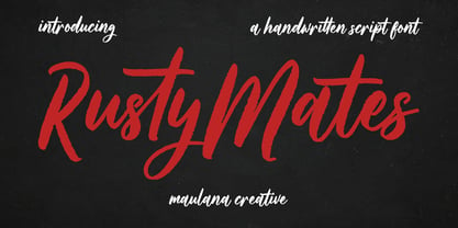 Rusty Mates is a fancy handwritten script font. With rough medium stroke, fun character with a bit of ligatures and alternates. To give you an extra creative work. Rusty Mates font support multilingual more than 100+ language. This font is good for logo design, Social media, Movie Titles, Books Titles, a short text even a long text letter and good for your secondary text font with sans or serif. Make a stunning work with Rusty Mates font. Cheers, Maulana Creative
 - Ruqia Arabic by Zaza type,
$29.00 Ruqia Arabic typeface is a modern Arabic typeface designed by Ahmed Zaza. the design is inspired by the Naskh style. The result is a hybrid that combines modern proportions with Classic Arabic scriptsit's suitable for branding, editorial, packaging, and advertising.Ruqia Arabic Features five weights from Light to Black.
 - Rusty Cellair by Maulana Creative,
$13.00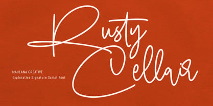 Rusty Cellair is an expressive signature script script font. With light mono-line consist stroke, fun character with a bit of ligatures and alternates. To give you an extra creative work. Rusty Cellair font support multilingual more than 100+ language. This font is good for logo design, Social media, Movie Titles, Books Titles, a short text even a long text letter and good for your secondary text font with sans or serif. Make a stunning work with Rusty Cellair font. Cheers, Maulana Creative
 - Rusty Forest by Mans Greback,
$69.00 Rusty Forest is a typeface that takes you back to the days of golden design, when travel and adventure were celebrated in striking posters. This font's rustic appearance, created by its brush-style strokes, evokes images of a cabin in the woods, surrounded by the beauty of nature. It's as if you can smell the campfire smoke and hear the rustling of leaves in the wind. This font is perfect for designers looking to add a touch of vintage charm to their projects, whether it be a poster for a national park or a logo for a wilderness-themed brand. Its 1950s-inspired style will transport viewers back in time to a simpler era, where the call of the wild was all one needed to feel free. The Rusty Forest family includes Bold, Italic, Bold Italic, and Regular, offer a range of options to suit different design needs. The font is built with advanced OpenType functionality and has a guaranteed top-notch quality, containing stylistic and contextual alternates, ligatures and more features; all to give you full control and customizability. It has extensive lingual support, covering all Latin-based languages, from Northern Europe to South Africa, from America to South-East Asia. It contains all characters and symbols you'll ever need, including all punctuation and numbers.
 - Salty Mussy by Ahmad Jamaludin,
$17.00 New Twist Display font, so here for you, Salty Mussy! Salty Mussy - A display typeface that has quirky and twisted style, It brings back the 70s vibes with its modern but still funky rhythm. This font has a beautiful uppercase and lowercase, so it can show more options for your project! Salty Mussy - This font is also included in the psychedelic style which can be very suitable for use in many projects such as street art design, posters, magazines, quotes for Instagram, and many more! What you get : Letters, numbers, punctuation, multilingual support Has 64 beautiful alternates and ligatures Come and say hello over on Instagram! https://www.instagram.com/dharmas.studio/ Dharmas Studio
 - Rusty Store by Alit Design,
$15.00 Introducing Rusty Store Typeface Rusty Store Typeface is inspired by the classic era typeface in the 1800 era but is combined with today’s era and produces a very elegant and charming typeface. The details of the “Rusty Store” shape are very subtle and flow creating unique and gorgeous curves. Elegant serif like “Rusty Store” are very easy to apply to any design, especially those with an elegant and smooth concept, apart from that this font is very easy to use in both design and non-design programs because all alternates and glyphs are supported by Unicode (PUA).
 - Mattius Rossy by Zamjump,
$17.00 Mattius Rossy is a handwritten font suitable for branding, signatures, wedding invitations, promotions, product packaging and other necessities. This font is modern, simple, but still authentic. You will get a full set of lowercase and uppercase letters, numbers and punctuation marks, multilingual symbols, ligatures, dashes, and swashes. This is tutorial to use ligature and swash : To use swash you can type a + underscore + underscore ( a_ _ ) without space. this only applies up to ( j_ _ ) for ligatures available only ( ee, ff, ll, oo, rr, ss, tt ). "To generate all ligatures, go to Adobe Illustrator - Type - Glyphs." Please send me a message if you are having trouble either installing or using this font. We want to hear your feedback to further improve our product. If you're using this product and come across a problem or come across something we might have missed, feel free to drop us a message.
 - Giallo Rossa by Remedy667,
$18.00 Step into the chilling world of 70s Italian horror with Giallo Rossa, a giallo inspired typeface. This macabre creation captures the essence of classic Italian giallo films, evoking a sense of foreboding and terror in every letter. With its sharp edges and jagged lines, Giallo Rossa has an unsettling energy that will leave you mesmerized. Immerse yourself in a typographic nightmare as you unleash the power of Giallo Rossa. Its letters embody the twisted beauty of giallo cinema – every curve reminiscent of a shadowy figure lurking in the dark corners. No matter what you’re designing, Giallo Rossa is your perfect accomplice. This horrifying typeface will set your creations apart from the mundane. Beware though: once you delve into Giallo Rossa‘s sinister embrace, there’s no turning back!
 - Roxie rossa by ToniStudio,
$15.00 Introducing the new font Roxie rossa Ligature Sans serif!!! Roxie rossa is a modern and elegant Sans serif font. This font is modern and nostalgic and is perfect for logos, magazines, social media. It's matched and ready to be used together for your next design! For those of you who need a touch of elegance, style, classy, chic and modernity to your designs, this font was created for you! Roxie rossa is built with OpenType features and includes ligatures, alternatives, numbers, punctuation, and also supports other languages.
 - TOMO Trompa Pro by TOMO Fonts,
$12.00 TOMO Trompa (PRO) is a geometric handmade face with a retro and fun touch. Its friendly feel makes this font incredibly versatile, fitting a wide range of contexts. Add it to your creative ideas and notice how it makes them stand out!. It also comes with a shadow style to combine and generate an awesome effect.
 - Linotype Typo American by Linotype,
$29.99Mark Stanczyk designed Linotype Typo American in 1999. The font is an excellent revival of American style typewriter type. As most of us can remember from our childhood years, or through old stories and movies, everyone used to type with typewriters before the invention of computers. Unlike computers, most individual typewriters only had one typestyle, or font, to chose from. To make matters worse, the letters in a typewriter font would wear down with use. Over time, text typed out on a typewriter would look more and more corroded, old, and uneven. Stanczyk has captured exactly these features in this “revival” font! Also like most older typewriter styles, Linotype Typo American’s letters are all mono-spaced, i.e., the letter i is the same width as the letter w. Typewriter letters also all tended to be cast in the same size, around 12 points or so. When using typewriter-style fonts, it is best to keep setting your text in similar sizes. (Of course, you can set really large and fun headlines with Linotype Typo American, too; if anything the unevenness of the design will come even more across in these applications.) - TOMO Dora Sans by TOMO Fonts,
$15.00 TOMO Dora is a new face designed by TOMO FONTS. Dora is a condensed style-driven sans serif typeface made by hand, adding unique and a sweet touch. A family of 4 styles + awesome icons! Enjoy!
 - Tipo Movin CDMX by Ixipcalli,
$- La versión propuesta por la SEMOVI (Secretaria de Movilidad) es un estilo más angosto y ortográfico, creadó con la finalidad de aligerar las aplicaciones tipográficas del sistema. Se emplea oficialmente en todas las aplicaciones del sistema de Movilidad Integrada de la Ciudad de México. El creador de la tipografía es Lance Wyman. En esta edición, los tipos minúsculas son una adaptación “no oficial” para el Tipo Movin CDMX, enriqueciendo la tipografía a un estilo visual de altas y bajas, por lo que se prescinde del diseño base como trabajo propio para enfatizar los tipos minúsculas exclusivamente, además de que se han añadido algunos caracteres de acentuación extendiendo su uso a otros lenguajes. Los tipos son una nueva propuesta por Ixipcalli en el presente año 2023. The version proposed by SEMOVI (Secretary of Mobility) is a narrower and more orthographic style, created with the purpose of lightening the typographic applications of the system. It is officially used in all the applications of the Integrated Mobility system of Mexico City. The creator of the typeface is Lance Wyman. In this edition, the lowercase types are an “unofficial” adaptation for the Tipo Movin CDMX, enriching the typography to a visual style of highs and lows, so the base design is dispensed with as my own work to emphasize the lowercase types exclusively, In addition, some accentuation characters have been added, extending their use to other languages. The types are a new proposal by Ixipcalli in the current year 2023.
 - Tipo Metro CDMX by Ixipcalli,
$- La tipografía “Tipo Metro CDMX” fue desarrollada por Lance Wyman como parte del proyecto “Metro” desde los años setenta, y es uno de los elementos clave de la cultura visual del transporte del Sistema de Transporte Colectivo Metro (STC Metro). Este estilo se ha convertido en el icónico fundamental del trasporte público para los residentes de la Ciudad de México. En esta edición, los tipos minúsculas son una adaptación “no oficial” para el Tipo Metro CDMX, enriqueciendo la tipografía a un estilo visual de altas y bajas, por lo que se prescinde del diseño base como trabajo propio para enfatizar los tipos minúsculas exclusivamente, además de que se han añadido algunos caracteres de acentuación extendiendo su uso a otros lenguajes. Los tipos son una nueva propuesta por Ixipcalli en el presente año 2023. The “Tipo Metro CDMX” typeface was developed by Lance Wyman as part of the “Metro” project since the 1970s, and is one of the key elements of the visual culture of transportation of the Metro Collective Transportation System (STC Metro). This style has become the iconic fundamental of public transportation for the residents of Mexico City. In this edition, the lowercase types are an “unofficial” adaptation for the Tipo Metro CDMX, enriching the typography with a visual style of highs and lows, so the base design is dispensed with as my own work to emphasize the lowercase types exclusively, In addition, some accentuation characters have been added, extending their use to other languages. The types are a new proposal by Ixipcalli in the current year 2023.
 - TOMO Zomba Pro by TOMO Fonts,
$20.00 ZOMBA! It's a retro-horror typeface that speak for itself. Ideal for big and strong messages. Kids gonna love it. Carefully hand crafted, includes almost all latin languages and cyrillic!
 - Got heroin? - Personal use only

- Got heroin? - Unknown license

- Got Love by Seemly Fonts,
$14.00 A beautiful display font is called Got Love. Add it to your original ideas to see how it helps them stand out since it can be readily suited to a huge range of projects.
 - Got Milk by Just My Type,
$20.00 Working on a parody of the “got milk?” ads and loved the challenge of creating a whole font (family) from 8 glyphs. Quite condensed, clean, jaunty san serif Usage recommendations Advertising, announcements, logos
 - Prussian Brew Offset - Unknown license

- Prussian Brew Upper - Unknown license

- Dead Wood Rustic by Intellecta Design,
$26.90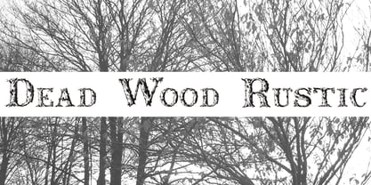
- Rustic Inn JNL by Jeff Levine,
$29.00 Rustic Inn JNL comes from hand lettering on a vintage piece of sheet music entitled "My Cabin of Dreams".
 - Cal Rustic Capitals by Posterizer KG,
$16.00 Calligrapher Rustic Capitals Font, is one of the calligraphic group of fonts called “21 alphabets for Calligraphers“. All graphemes are taken from calligraphic pages written on traditional Rustic Capitals calligraphic stile. This font is ideal for calligraphic sketches or for imitation of ancient manuscripts. It contains all the Latin glyphs.
 - Rustic Setting JNL by Jeff Levine,
$29.00 Rustic Setting JNL is the solidified version of Rustic Stencil JNL. Originally modeled from lettering on the cover a children's book, the solid version of this Western-inspired typeface is reminiscent of the classic wood types of the era.
 - Cal Rustic Black by Posterizer KG,
$16.00 Calligrapher Rustic Black is one of the calligraphic group of fonts called “21 alphabets for Calligraphers“. All graphemes are taken from calligraphic pages written on modern Rustic calligraphic style. This font is ideal for calligraphic sketches or for imitation of ancient manuscripts. Calligrapher Rustic Black contains all the Latin glyphs.
 - Rustic Stencil JNL by Jeff Levine,
$29.00 A hand-lettered title on a children's stencil book for sale in an online auction served as the basis for Rustic Stencil JNL. Reminiscent of classic wood type, this stencil design adds a Western-influenced flair to any typographic project.
 - Alien Ghost 2 - Unknown license

- Post Production JNL by Jeff Levine,
$29.00 A title card listing the supporting cast of the 1950 Humphrey Bogart and Gloria Grahame drama “In a Lonely Place” provided the hand lettered slab serif type design that served as the model for Post Production JNL – available in both regular and oblique versions.
 - Lost in space by Gleb Guralnyk,
$13.00 This futuristic typeface "Lost in space" is a geometric vintage font with multi-lingual support.
 - Lamp Post JNL by Jeff Levine,
$29.00 Lamp Post JNL is a digital interpretation of a design popular in the early 1900s called Post Old Style; no doubt inspired by a certain Saturday periodical with a similar name. There is an intrinsic charm to lettering that evokes a hand-made look, and this design is a perfect example of the genre. Available in both regular and oblique versions, it will add the nostalgia of simpler times to any print or web project.


