10,000 search results
(0.042 seconds)
- Geometry Soft Pro Bold N - 100% free

- Sortie Super by Lewis McGuffie Type,
$40.00 Sortie Super is a take on one of the kings of display lettering - Caslon's high-contrast, reversed stress 'Italian' style. It looks great at big sizes and in short flurries... and shouldn't be used in confined spaces. When compared with the original face, the weight and contrast of Sortie Super has been exaggerated. To add gravity to the letters I've increased their width overall and reduced the spacing to a hair-line fracture for added visual impact. Characters like 'S', 'E','O' and 'Z' are relatively close to their historical precedents - however the terminals on the 'C-G-S-З-Є', which have been drawn so to be more consistent. Other aspects, such as the leg of the 'R' and 'Я', the apex of the 'A' and the spur of the 'G' are revised and simplified, to help spacing and optical weight across the alphabet. Also, to reduce visual noise terminals in characters like 'C', 'J' and 'R'' are horizontally aligned. Meanwhile, the central horizontal strokes in the 'B', 'P' and 'R' etc are reduced to a hairline, so as to create a more simplified system of thick-to-thin. The temptation when drawing this kind of esoteric display alphabet is to start to rely on modular components. Which, while copy-paste-repeat is a sure-fire way to make the face more visually consistent, it's a lazy method that risks allowing the font become soulless and mechanical. An early experiment I made was making a monospaced version, which was useful in headlines, but it lost that loving feeling. So, by maintaining a handful of flourishes – the tail of the '?', the inky drop of the '!', the bulbous gloop of arms of the 'Ж' and 'К', the swirling legs in the 'R', 'Я' and 'Л', the big-bowling weight of the 'J' and 'U' – plus a few in-built inconsistencies and a bit of its own silliness, Sortie Super retains some of the organic warmth of its ancestor. Conversely, the counters, apertures and negative space are largely rigidly geometric, which helps give the revival font a bit of a modern touch. Sortie Super is an uppercase-only display font that comes with Western, Central and East European Latin, extended Cyrillic, Pinyin, as well as a set of hairline graphic features and symbols.
 - Vegapunk by Factory738,
$15.00 The awesome sports font Vegapunk has unique cutouts, a dynamic slant, and gives the impression of power and speed. Ideal for fast-paced sports titles like auto racing, cycling, running sporting events, and automotive game logos and monograms, as well as other dynamic modern or vintage text. A wide variety of characters are offered by the available Ligatures and Italic styles, giving your project design an unique appearance. 5 Weights (Narrower, Narrow, Regular, Wide, Wider) 2 Styles (Regular and Italic) Basic Latin A-Z and a-z Numerals & Punctuation Stylistic Ligatures and Alternate glyps Multilingual Support for ä ö ü Ä Ö Ü ... Free updates and feature additions Thanks for looking, and I hope you enjoy it.
 - Eagle Lake Pro by Stiggy & Sands,
$29.00 A Practical Calligraphic Hand. Eagle Lake Pro is based on the calligraphic lettering style known based on the practical Running Book Hand. It has shorter capitals that create a visually taller x-height lending to high legibility and fluidity. Classic, clean, and casual, Eagle Lake Pro fits a lot of design uses. The SmallCaps and extensive figure sets only work to further expand the usefulness of the typeface across a wider breadth of applications. See the 5th graphic for a comprehensive character map preview. Opentype features include: - SmallCaps. - Full set of Inferiors and Superiors for limitless fractions. - Tabular, Proportional, and Oldstyle figure sets (along with SmallCaps versions of the figures). - Stylistic Alternates for Caps to SmallCaps conversion.
 - FF Fago Monospaced by FontFont,
$67.99 FF Fago Thanks to his many years of involvement in major corporate type projects, Ole Schäfer had the necessary resources from which to construct his FF Fago™. The result is an extended family that provides comprehensive typographic support and whose qualities come to the fore in all relevant contexts ? from print to office through internet and wayfinding systems. FF Fago The sizable x-height together with the generous and open design of the characters ensure that the sans serif Fago remains clearly legible even in small point sizes or in potentially difficult situations, such as on wayfinding systems. A subtle contrast in line weight and letter forms that are reminiscent of those of an antiqua typeface provide the font with a restrained yet friendly and lively tone. Available in five weights, each with three different kerning widths and matching genuine italic variants, FF Fago is equipped for practically every situation. There are also small caps, oldstyle and lining figures, a selection of ligatures and geometric symbols. The range of potential applications of this universal font is almost inexhaustible ? it can be used in packaging design, on signs, posters and even for setting longer text sections. Fago is the ideal partner for those working on major corporate projects! FF Fago Correspondence Sans und Correspondence SerifThe Correspondence versions of Fago have been optimized for use in the business environment and in office communication. The carefully modified characters have a particularly robust feel, so that the clear, easily differentiated glyphs allow for straightforward communication even on screen. With these aims in mind, Schäfer has not only adjusted the x-height, but has provided certain letters in the sans variant ? such as the lowercase "i", the "r" and the uppercase "I" ? with serifs. Correspondence Serif, on the other hand, has been conceived as a slab serif throughout and in appearance has the look of the letters produced by the old office typewriting machines. An individual note has been added by providing a few unusual serif forms, as for example in the case of the "m", the "v" and the "y". Both Correspondence Sans and Serif are available in two weights with complementary italic versions and thus are ideally suited for use with standard office programs. This is all rounded off with a selection of office symbols. FF Fago Monospaced The use of a few typographic tricks is necessary to ensure that the letters of the alphabet appear to have the same width. Narrow letters such as "r" and "i" have been made to seem more expansive by using prominent serifs while the broader letters ? a good example is the "m" ? have the forms seen in a condensed font. And it is thanks to this design strategy that Fago Monospaced has the character of old typewriter text. What was once unavoidable because of the technology of the time is now a welcome alternative that can be used for the purposes of emphasis. As an additional supplement to the Fago superfamily, Fago Monospaced can be used, for example, to set short notes or draw attention to special text passages. There are three weights, in their original form without italic variants or small caps, but offering an alternative, technical form of the "0" with a crossbar.
 - Kristen Curly - Personal use only

- Thang by Fenotype,
$30.00 Aint’ nuthin but the Thang. Thang is a street cred script family with big initial caps and tight flow. Thang is great for flashy headlines or as a logotype. Thang family comes with three weights. Thang Extras is a pack of strokes and dots that can be used to decorate your texts typed with Thang. Thang Extras can also be combined with Thang letters for custom Swash. Thang is packed with several OpenType features: keep on Standard Ligatures and Contextual Alternates for smooth flow. Try Swash, Stylistic or Titling Alternates for alternate characters to create customised lettering works. Check out Glyph Palette for even more alternate characters and go wild the Thang.
 - Praysire by Letterhend,
$19.00 Praysire is a sophisticated sans serif with beautiful swashes. It has many alternates which you can play around to match your project, whether for a standout headline, or for a tagline, you name it. The unique letterform makes this font one of a kind! Perfectly to be applied to the other various formal forms such as invitations, labels, logos, magazines, books, greeting / wedding cards, packaging, fashion, make up, stationery, novels, labels or any type of advertising purpose. Features : uppercase & lowercase numbers and punctuation multilingual alternates & ligatures PUA encoded We highly recommend using a program that supports OpenType features and Glyphs panels like many of Adobe apps and Corel Draw, so you can see and access all Glyph variations.
 - Bozon by ROHH,
$39.00 Bozon™ is a modern, minimalist geometric grotesk typeface. Letter shapes are crafted with the highest care for proportions and legibility. This clean, sharp sans serif is a great choice for all kinds of modern projects including branding, logo design and display use. Bozon™ family consists of 10 weights with corresponding italic styles, that give total of 20 styles. Italic styles were hand drawn to get sharp and fine letter shapes. The family has extended language support, as well as broad number of OpenType features, such as small caps, case sensitive forms, ligatures, stylistic sets, contextual alternates, lining, oldstyle, tabular, circled and small cap figures, slashed zero, fractions, superscript and subscript, ordinals, currencies and symbols.
 - Brugenfield by Zamjump,
$21.00 Brugenfield is a modern serif display with a unique ligature. This typeface has been crafted with care to ensure a premium quality and luxurious feel. The binders make this typeface unique and stand out from regular serif fonts. It is suitable for logos, headlines, titles and various other formal forms such as invitations, labels, logos, magazines, books, greeting / wedding cards, packaging, fashion, make up, stationery, novels, labels or any kind of advertising purposes. We highly recommend using a program that supports the OpenType feature and the Glyphs panel such as many Adobe and Corel Draw applications, so that you can view and access all variations of Glyphs. Email us to zamjump@gmail.com if you need anything! Happy Designing!
 - Valet by Canada Type,
$29.95 Valet is deco moderne the way it was meant to be: Big, bold, classy, flashy, and clean at the seams. Its message is rich, strong, confident and reliable. Valet tells you that it’s used to thorns being part of every rose, that it can handle sharp objects just fine, and that it'd much prefer buying the tuxedo rather than renting it. This font grew out of an uncredited early 1970s all-cap film type called Expression. An appropriate deco lowercase was added, along with small caps, zippy titling caps, and Pan-European language support. With over 9250 glyphs, we bow our heads with the admission that we kind of got carried away with it.
 - Core Circus Rough by S-Core,
$20.00 Core Circus Rough is a textured version of Core Circus which is a layered type family consisting of seven 3D effect layers, eight 2D effect layers and one shadow effect layer. Uppercase and lowercase letters are separated by such features that counters are opened or closed. Core Circus provides other closed counter styles such as numbers with opentype feature (Stylistic Alternatives). Also available Core Magic Rough (Slab-Serif version of Core Circus Rough) The shape of Core Circus is simple but the combinations of effect fonts are impressive. Core Circus makes your works charming and special with endless combinations (at least 262,551 kinds). This family is really nice for book titles, headlines, logotypes and any artworks.
 - Sabler Titling by insigne,
$- Make the right statement with the elegant Sabler Titling. This showstopping font features an inherent grace combined with the classic style of the Art Deco period. The subtle beauty of its letters is highlighted by the typeface’s stems, which taper towards the baseline highlight--a feature that adds clear distinction to your design. Originally inspired by a WPA poster, this typeface has been expanded to include three equally elegant proportions. Sabler Titling includes more than 60 free alternative forms, including support for most Latin-based languages. Add a hint of seduction to your work with Sabler’s high-contrast letterforms--ideal for magazines, advertisements and books on fashion, fine arts, and luxury goods of all kinds.
 - Black Script by Fenotype,
$35.00 Black Script is a bold connected script family with plenty of weights: Regular, Bold, Inline versions, Caps, Ornaments and Printed versions of all those. For the best price purchase either Black Script Family or Black Script Printed Family or Black Script Complete Pack which contains all versions of the font. Black Script is equipped with automatic OpenType Ligatures, Swash and Stylistic Alternates to let you customise your designs. Find even more alternates from Glyph Palette. Black Script Caps is a block letter font designed to work alone or to support the script. Caps is equipped with Swash alternates. Black Script is a great font family for creating ambitious headlines, logos & posters with a custom-made feeling.
 - Snoopy Snails NF by Nick's Fonts,
$10.00Duck! There’s a cream pie headed your way! This wild and wacky face is based on the title card lettering for the original Soupy Sales TV show, a lasting testament to my misspent youth. Both versions of this font contain the complete Unicode Latin A character complement, with support for the Afrikaans, Albanian, Basque, Bosnian, Breton, Catalan, Croatian, Czech, Danish, Dutch, English, Esperanto, Estonian, Faroese, Fijian, Finnish, Flemish, French, Frisian, German, Greenlandic, Hawaiian, Hungarian, Icelandic, Indonesian, Irish, Italian, Latin, Latvian, Lithuanian, Malay, Maltese, Maori, Moldavan, Norwegian, Polish, Portuguese, Provençal, Rhaeto-Romanic, Romanian, Romany, Sámi, Samoan, Scottish Gaelic, Serbian, Slovak, Slovenian, Spanish, Swahili, Swedish, Tagalog, Turkish and Welsh languages, as well as discretionary ligatures and extended fractions. - Hilleria by Keristyper Studio,
$12.00 Hilleria is a calligraphy script font that comes with exquisite change characters, a kind of classic decorative script with a modern twist, designed with great detail to bring out a stylish elegance. This font is good for logo design, Social media, Movie Titles, Books Titles, short text even long text letters, and good for your secondary text font with sans or serif. Featured: Standard Uppercase & Lowercase Numeral & Punctuation Multilingual : ä ö ü Ä Ö Ü ß ¿ ¡ Alternate & Ligature PUA encoded We recommend programs that support the OpenType feature and the Glyphs panel such as Adobe applications or Corel Draw. so you can use all the variations of the glyphs. Hope you enjoy our fonts!
 - Mersin by Hurufatfont,
$29.00 Mersin is a modern sans serif font family. The asymmetrical structure of the beginning and ending shapes of letters such as "Cc, Ss" is its most distinguishing feature. Mersin has a total of 20 fonts, includings 10 weights and their appropriate italics. With its 2-axis (Weight & Italic) Variable Version, Mersin offers the advantage of using a very rich weight between 100-900. It includes detailed ligatures such as "Th, Tl, Ti, Tä, Tä, Tü, Tö, iï, fä, fä, fö fü" for very wide and different accents. “Mersin Book” and “Mersin Book Italic” are specially designed for body texts and small fonts usages. Ideal for corporate identity, posters, brochures, guidance signages and all other kinds of graphic design works.
 - Paramour by Redy Studio,
$15.00 Paramour is a handwritten font that is the perfect way to add some flirty elegance to your design. Use it to create inked-style logos, wedding stationery & photographer watermarks, or to add a handwritten look to your website's typography. Paramour includes a full set of gorgeous uppercase and lowercase letters, numerals, a large range of punctuation, and 93 ligatures. This handcrafted typeface has been engineered to perfectly fit together. Paramour Features: A full set of upper & lowercase characters Numbers & punctuation 93 Gorgeous ligatures Multilingual symbols PUA Encoded Characters – Fully accessible without additional design software. Thank you for checking out Paramour! I hope you find it enjoyable, and feel free to give it a try below!
 - Belluga by Nicky Laatz,
$20.00 Slip into something a little more sophisticated with Belluga - A stylish, fresh new handwritten brush script. Oozing with Opentype Features, this script comes to life as if you are hand-brushing it yourself. Belluga Script was created to look as close to a natural handwritten script as possible by including over 80 natural-looking opentype ligatures, and a full set of lowercase alternates. From the Glyph Palette you’ll also find 11 swashes that can be used as underlines and for emphasis. Perfect for bold statements and sophisticated branding , Belluga helps set your designs apart by adding a custom-lettered look. A smooth , solid version of the font is also available for those who require a less textured look.
 - Stepford by Joanne Marie,
$10.00 A typographic playground Stepford is a versatile semi-serif boasting 6 styles - regular and italic, sketch and italic and outline and italic. It includes 231 glyphs, ligatures and multilingual support. These six styles make it the perfect display typeface for any kind of project. Absolutely sweet for editorial design - mainly headers and sub-headers but can also be used for body text too. This typographic trio is based on the vintage 50’s and 60’s style scripts and modernised for the present day. It’s another powerful typeface to add to your arsenal of design assets that command attention. That’s what design is all about! For regular updates and freebies follow me on Instagram at joannemarie_cm
 - Grande SS by Sensatype Studio,
$15.00 grande font is a collections of a modern, feminine, beauty and classy characters, give you unique looks for any branding or logo design needs. grande font is mix of beauty and classy feels, which has a wide range of uses but was mainly intended for logos, perfumes, fashion magazines, invitations, or book covers. Not only you'll find many decorative characters, but also amount of unique alternate characters will make you really adore this font. grande is also included full set of: uppercase and lowercase letters alternates and ligatures multilingual characters numerals punctuations Wish you enjoy our font and if you have a question, don't hesitate to drop message & I'm happy to help :)
 - NS Lasttown by Novi Souldado,
$40.00 Inspired by the 18th - 19th century of Penmanship specimens archive from Europe and America, carefully crafted with precise mood, technique, and visual touch to bring back your design works into that specific era. It comes with a collection of 3 fonts that match well with each other. Also a set of wide features such as Ligatures and alternative swashes. Lasttown will be a great choice for your classy and formal visual looks such as certificate design, vintage label, commercial lettering works, sign painting, glass gilding, logo type projects, liquor store branding, wine packaging, anytime you need a classic visual touch, please, be our guest. What you get : Standard & Discretionary Ligatures Stylistic set Numerals & Punctuation
 - TT Tsars by TypeType,
$39.00 TT Tsars useful links: Specimen | Graphic presentation | Customization options The TT Tsars font family is a collection of serif display titling fonts that are stylized to resemble the fonts of the beginning, the middle and the end of the XVIII century. The project is based on title fonts, that is, the fonts that were used to design book title pages. The idea for the project TT Tsars was born after a small study of the historical development of the Cyrillic type and is also based on Abram Shchitsgal’s book "Russian Civil Type". At the very beginning of the project, we had developed a basic universal skeleton for the forms of all characters in all subfamilies of the family, and later on, we added styles, visual features, artifacts and other nuances typical of the given period onto the skeleton. Yes, from the historical accuracy point of view it might be that such an approach is not always justified, but we have achieved our goal and as a result, we have created perfectly combinable serifs that can be used to style an inscription for a certain time period. The TT Tsars font family consists of 20 fonts: 5 separate subfamilies, each of which consists of 4 fonts. Each font contains 580 glyphs, except for the TT Tsars E subfamily, in which each font consists of 464 characters. Instead of lowercase characters in the typeface, small capitals are used, which also suggests that the typeface is rather a display than text one. In TT Tsars you can find a large number of ligatures (for Latin and Cyrillic alphabets), arrows and many useful OpenType features, such as: frac, ordn, sinf, sups, numr, dnom, case, onum, tnum, pnum, lnum, salt (ss01), dlig. Time-related characteristics of the subfamilies are distributed as follows: • TT Tsars A—the beginning of the 18th century (Latin and Cyrillic) • TT Tsars B—the beginning of the 18th century (Latin and Cyrillic) • TT Tsars C—the middle of the 18th century (Latin and Cyrillic) • TT Tsars D—the end of the 18th century (Latin and Cyrillic) • TT Tsars E—conditionally the beginning of the 18th century (only Latin) TT Tsars A and TT Tsars B families (both the beginning of the 18th century) have different starting points: for TT Tsars A it is Latin, for TT Tsars B it is Cyrillic. The development of the TT Tsars A family began in Latin, the font is based on the royal serif Romain du Roi. The Cyrillic alphabet is harmoniously matched to the Latin. The development of the TT Tsars B family began in Cyrillic, which is based on a Russian civil type. Characteristic elements are the curved one-sided serifs of triangular characters (A, X, Y), drops appear in the letter ?, the middle strokes ? and P are adjacent to the main stroke. Latin was drawn to pair with Cyrillic. It is still based on the royal serif, but somewhat changed: the letters B and P are closed and the upper bar of the letter A rose. This was done for the visual combination of Cyrillic and Latin and at the same time to make a distinction between TT Tsars A and TT Tsars B. TT Tsars C is now the middle of the 18th century. Cyrillic alphabet itself did not stand still and evolved, and by the middle of the 18th century, its forms have changed and become to look the way they are shown in this font family. Latin forms are following the Cyrillic. The figures are also slightly modified and adapted to the type design. In TT Tsars C, Cyrillic and Latin characters are created in parallel. A distinctive feature of the Cyrillic alphabet in TT Tsars C is the residual influence of the flat pen. This is noticeable in such signs as ?, ?, K. The shape of the letters ?, ?, ?, ? is very characteristic of the period. In the Latin alphabet, a characteristic leg appears at the letter R. For both languages, there is a typical C characterized by an upper serif and the appearance of large, even somewhat bolding serifs on horizontals (T, E, ?, L). TT Tsars D is already the end of the 18th century when with the development of printing, the forms of some Cyrillic characters had changed and turned into new skeletons of letters that we transposed into Latin. The figures were also stylized. In this font, both Cyrillic and Latin are stylistically executed with different serifs and are thus logically separated. The end of the century is characterized by the reduction of decorative elements. Straight, blueprint-like legs of the letters ?, R, K, ?. Serifs are very pronounced and triangular. E and ? are one-sided on the middle horizontal line. A very characteristic C with two serifs appears in the Latin alphabet. TT Tsars E is a steampunk fantasy typeface, its theme is a Latinized Russian ?ivil type (also referred to as Grazhdansky type which emerged after Peter the Great’s language reform), which includes only the Latin alphabet. There is no historical analog to this typeface, it is exclusively our reflections on the topic of what would have happened if the civil font had developed further and received a Latin counterpart. We imagined such a situation in which the civil type was exported to Europe and began to live its own life.
 - Wegas by Craft Supply Co,
$20.00 Introduction to Wegas – Bubble Font Wegas – Bubble Font offers a playful and cheerful design, perfect for adding a fun touch to any project. It’s inspired by the lightness of clouds and the joy of bubbles. This font brings a fresh, airy feel to your designs, making them stand out. It’s ideal for creative projects that need a touch of whimsy. Design and Inspiration This font features rounded edges, mimicking the shape of clouds and bubbles. Its design is based on a cheerful and lively aesthetic, perfect for uplifting content. The bubbly appearance gives a sense of joy and playfulness. It’s like capturing the essence of a sunny day in a font. Versatility and Usage Wegas – Bubble Font is incredibly versatile. It works great for children’s books, party invitations, and playful branding. Its readability makes it suitable for both digital and print media. The font is a great choice for anyone looking to inject a sense of fun into their work. Easy to Use and Accessible This font is user-friendly, ensuring accessibility for all skill levels. Its simplicity caters to a wide audience, from professional designers to hobbyists. Downloading and installing Wegas – Bubble Font is straightforward, allowing you to start creating joyful designs immediately.
 - Wingko by Sabrcreative,
$17.00 Introducing Wingko font, a delightful and versatile display sans serif typeface that will elevate your designs with its clean and fun style. Whether you're working on quotes, headlines, crafts, or any creative project, Wingko is here to add a touch of charm and playfulness. With its simple and clean design, Wingko offers a contemporary aesthetic that is both eye-catching and readable. The combination of uppercase and lowercase letters provides creative flexibility, allowing you to experiment with different layouts and styles. The inclusion of numbers and punctuation ensures seamless integration with various design elements. One of the notable features of Wingko font is its multilingual support, making it accessible to a wide range of languages and global audiences. From English to French, German to Spanish, and beyond, your message can be beautifully communicated in different parts of the world. Wingko font is designed with attention to detail, ensuring legibility and visual appeal across different mediums. Whether you're designing digital content, print materials, logos, or social media graphics, this font will captivate your audience and leave a lasting impression. Embrace the versatility of Wingko font and let your creativity soar. Download this clean and fun display sans serif typeface today and infuse your designs with a touch of character and whimsy.
 - Yugoslavia - Personal use only

- Neue Frutiger Paneuropean by Linotype,
$79.00During planning for the new Roissy Charles de Gaulle airport in Paris at the beginning of the 1970s, it was determined that the airport's signage system had to include the clearest and most legible lettering possible. The development of all signage was put into the hands of Adrian Frutiger and his studio. The team carried out their task so effectively that a huge demand for their typeface soon arose from customers who wanted to employ it in other signage systems, and in printed materials as well. The Frutiger® typeface not only established new standards for signage, but also for a range of other areas in which a clear and legible design would be required, especially for small point sizes and bread-and-butter type. The typeface family that which emerged as a result of this demand was added into the Linotype library as "Frutiger" in 1977. Frutiger Next, created in 1999, is a further development of Frutiger, not necessarily a rethinking of the design itself. It was based on a new concept, the most obvious visual characteristics of which is the larger x-height, as well as a more pronounced ascender height and descender depth for lower case letters in relation to capitals. This new design created a balanced image and included considerably narrower letterspacing. Frutiger Next meets the demand for a space-saving, modern humanist sans. 2009's Neue Frutiger is a rethink of the 1977 Frutiger family, now revised and improved by Akira Kobayashi in close collaboration with Adrian Frutiger. Despite the various changes, this "New Frutiger" still fits perfectly with the original Frutiger family, and serves to harmoniously enhance the weights and styles already in existence. The perfect mix, guaranteed Neue Frutiger has the same character height as Frutiger. As a result of this, already existing Frutiger styles can be mixed with Neue Frutiger where necessary. Likewise, Neue Frutiger is perfect for use alongside Frutiger Serif. Newly added are the "Neue Frutiger 1450" weights. Especially for the requirements of the newly released German DIN 1450 norm we have built together with Adrian Frutiger specific weights of the Neue Frutiger. The lowercase l" is curved at the baseline to better differentiate between the cap "I", additionally the number "0" has a dot inside to better differentiate between the cap "O", and the number "1" is now a serifed 1. The font contains additionally the origin letterforms from the regular Neue Frutiger font which can be accessed through an Opentype feature." - Neue Frutiger Cyrillic by Linotype,
$89.00During planning for the new Roissy Charles de Gaulle airport in Paris at the beginning of the 1970s, it was determined that the airport's signage system had to include the clearest and most legible lettering possible. The development of all signage was put into the hands of Adrian Frutiger and his studio. The team carried out their task so effectively that a huge demand for their typeface soon arose from customers who wanted to employ it in other signage systems, and in printed materials as well. The Frutiger® typeface not only established new standards for signage, but also for a range of other areas in which a clear and legible design would be required, especially for small point sizes and bread-and-butter type. The typeface family that which emerged as a result of this demand was added into the Linotype library as "Frutiger" in 1977. Frutiger Next, created in 1999, is a further development of Frutiger, not necessarily a rethinking of the design itself. It was based on a new concept, the most obvious visual characteristics of which is the larger x-height, as well as a more pronounced ascender height and descender depth for lower case letters in relation to capitals. This new design created a balanced image and included considerably narrower letterspacing. Frutiger Next meets the demand for a space-saving, modern humanist sans. 2009's Neue Frutiger is a rethink of the 1977 Frutiger family, now revised and improved by Akira Kobayashi in close collaboration with Adrian Frutiger. Despite the various changes, this "New Frutiger" still fits perfectly with the original Frutiger family, and serves to harmoniously enhance the weights and styles already in existence. The perfect mix, guaranteed Neue Frutiger has the same character height as Frutiger. As a result of this, already existing Frutiger styles can be mixed with Neue Frutiger where necessary. Likewise, Neue Frutiger is perfect for use alongside Frutiger Serif. Newly added are the "Neue Frutiger 1450" weights. Especially for the requirements of the newly released German DIN 1450 norm we have built together with Adrian Frutiger specific weights of the Neue Frutiger. The lowercase l" is curved at the baseline to better differentiate between the cap "I", additionally the number "0" has a dot inside to better differentiate between the cap "O", and the number "1" is now a serifed 1. The font contains additionally the origin letterforms from the regular Neue Frutiger font which can be accessed through an Opentype feature." - Neue Frutiger 1450 by Linotype,
$71.99 During planning for the new Roissy Charles de Gaulle airport in Paris at the beginning of the 1970s, it was determined that the airport's signage system had to include the clearest and most legible lettering possible. The development of all signage was put into the hands of Adrian Frutiger and his studio. The team carried out their task so effectively that a huge demand for their typeface soon arose from customers who wanted to employ it in other signage systems, and in printed materials as well. The Frutiger® typeface not only established new standards for signage, but also for a range of other areas in which a clear and legible design would be required, especially for small point sizes and bread-and-butter type. The typeface family that which emerged as a result of this demand was added into the Linotype library as "Frutiger" in 1977. Frutiger Next, created in 1999, is a further development of Frutiger, not necessarily a rethinking of the design itself. It was based on a new concept, the most obvious visual characteristics of which is the larger x-height, as well as a more pronounced ascender height and descender depth for lower case letters in relation to capitals. This new design created a balanced image and included considerably narrower letterspacing. Frutiger Next meets the demand for a space-saving, modern humanist sans. 2009's Neue Frutiger is a rethink of the 1977 Frutiger family, now revised and improved by Akira Kobayashi in close collaboration with Adrian Frutiger. Despite the various changes, this "New Frutiger" still fits perfectly with the original Frutiger family, and serves to harmoniously enhance the weights and styles already in existence. The perfect mix, guaranteed Neue Frutiger has the same character height as Frutiger. As a result of this, already existing Frutiger styles can be mixed with Neue Frutiger where necessary. Likewise, Neue Frutiger is perfect for use alongside Frutiger Serif. Newly added are the "Neue Frutiger 1450" weights. Especially for the requirements of the newly released German DIN 1450 norm we have built together with Adrian Frutiger specific weights of the Neue Frutiger. The lowercase l" is curved at the baseline to better differentiate between the cap "I", additionally the number "0" has a dot inside to better differentiate between the cap "O", and the number "1" is now a serifed 1. The font contains additionally the origin letterforms from the regular Neue Frutiger font which can be accessed through an Opentype feature."
 - Prefix - Unknown license

- Spooky Ghost by Sakha Design,
$12.00 Spooky Ghost is a cool, fun, and quirky decorative font. This font is PUA encoded which means you can access all glyphs and swashes with ease! Add it confidently to your favorite Halloween designs and let yourself be amazed by the outcome generated.
 - Big Heroes by Typefactory,
$14.00 Big Heroes is playful font which puts a smile on your projects and will inspire you to create something fun and memorable. It is perfect for headings, flyer, greeting cards, product packaging, book cover, printed quotes, logotype, apparel design, album covers, etc
 - Milky Quaker by Almarkha Type,
$23.00 Milky Quaker is a - Playful Display Font that will make your designs look modern, unique and fun. It’s perfect for labels, quotes, posters, DIY projects, branding, packaging, greeting cards, websites, photos, photography overlays, signs, window art, scrapbooking, tags and so much more!
 - Star Kids by Rockboys Studio,
$23.00 Star Kids is a display font that embodies fun, quirkiness, and authenticity. This enchanting display font will turn any creative idea into a true standout. Get inspired by its childlike playfulness, and use it to brighten up any kids and school project!
 - Cellophane Tape JNL by Jeff Levine,
$29.00 Cellophane Tape JNL is a stripped-down and slightly modified version of Eckhardt Trilinear JNL with open-ended letters. While the name Cellophane Tape JNL is nostalgic (tape is no longer made from cellophane), its still a fun, novelty font for many applications.
 - Crayon Crumble by Hanoded,
$15.00 Crayon Crumble is exactly what it reads on the package: it was made using cheap crayons, since the cheapies crumble a lot. It is a fun, kiddie font, with a grown-up look to it. Of course it comes with all the accents.
 - Pear Amigo by Qwrtype Foundry,
$14.00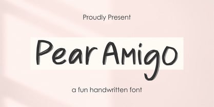 Proudly Present, Pear Amigo Pear Amigo is a Fun Handwritten Font Pear Amigo is perfect for product packaging, branding project, megazine, social media, wedding, or just used to express words above the background. Pear Amigo also come with Multi-Lingual Support. Thank you!
 - Hello Sintha by Sakha Design,
$12.00 Hello Sintha is a fun and friendly handwritten font. Whether you are using it for cartoon-related designs, children’s games, quotes, titles, brand names, book covers, posters, or just any creation that requires a touch of joy, this font is a great choice.
 - Berlion by Blankids,
$23.00 Introducing of our new product the name is Berlion a Handwritting Script Font, Berlion inspired by Bouncy Calligraphy style with a fun theme very good for Logotype, kids poster, flyer, childrenbook, cartoon, comic etc FEATURES : Uppercase Lowercase Number Punctuation Multilingual PUA Encode Opentype
 - Sweet Bubble by 38-lineart,
$14.00 Sweet Bubble is a fun, bubbly font that is perfect for headlines and more! This playful outline font is a great way to give your designs a relaxed and playful vibe; this download comes with extras so you can make coherently themed designs!


