10,000 search results
(0.025 seconds)
- Cadora Woods by Hanoded,
$15.00 Last year I walked half of Offa’s Dyke path, a long distance trail on the Welsh/English border. Walking the trail, I came across a beautiful stretch of forest with a lovely name: Cadora Woods. Cadora Woods font was made with a Japanese brush pen. It sort of looks medieval and a friend of mine suggested it would be the font of choice for maps of ‘The Shire’. I guess that is true, but I am convinced you can come up with some innovative uses for this font!
 - Pantoufle by Kitchen Table Type Foundry,
$16.00 Pantoufle is French for slipper. Not the flipflop variety (or thongs if you’re from Australia), but the one you wear indoors when it’s cold. I have some too; Spanish ones, made from recycled PET bottles. Here in Holland, we call them ‘Pantoffels’ and you don’t have to be a language expert to see the resemblance between the French and the Dutch word. That is because the French are probably more savvy when it comes to keeping your feet warm and the Dutch just borrowed the word, pronunciation and all! Pantoufle is a font I made with a big fat marker pen. My kids had used it to decorate some gifts for Sinterklaas (if you want to know what Sinterklaas is, look it up). Pantoufle comes with extensive language support and a full set of alternates for the lower case glyphs. Enjoy!
 - NewJune by Hubert Jocham Type,
$39.00 NewJune is a very strong unique character. It is already used in many magazines all over the world. Like Harvey Nichols magazine in London and later W magazine in New York. NewJune is the corporate typeface of the Academy of the Arts in Munich.
 - Dorniela by Gholib Tammami,
$15.00 Introducing Dorniela, a charming and delightful font that brings a whimsical touch to your creative projects. With a name that evokes the magic of fairy tales and the essence of all things cute, Dorniela is your ticket to a world of adorable design possibilities.
 - Awry by Gholib Tammami,
$15.00 Awry is a cute and quirky handwritten font that elegantly dances on the edges of organized precision and captivating disorder. With its unique design, ‘Awry’ breaks free from the confines of traditional typography, inviting you to explore a world where imperfection becomes an art form.
 - Rennie Mackintosh Stems by CRMFontCo,
$25.00Derived from the world famous Rennie Mackintosh Font, the Stems version gives a lightweight look to the genius of Charles Rennie Mackintosh. The “Stems” name is a link to Mackintosh’s love of using floral images in his designs, especially abstracts of the rose and tulip. - MBF Urban Poet by Moonbandit,
$15.00 Moonbandit presents Urban Poet, a modern display font with a sophisticated and a little bit of vintage flair. This typeface is inspired by the creative lifestyle of the urban world. Use Urban Poet for logo, poster, display, headline, title, editorial, merchandize and so much more
 - Brink by 4RM Font,
$23.00 Inspired by the modern world, the Brink font appears with an extra expanded style combined with geometric letterforms, making this font look stylish, this font is included in the display font category that is suitable for use in graphic design, especially those with futuristic themes.
 - Moldr Thai by Deltatype,
$59.00 Moldr Thai, a sans-serif with modular grid structure with Thai script, inspired from handmade letter to industrial machine mold, Moldr come with 9 weights in complete family, Support many language with standard Adobe Lain 4 glyphs, world-ready and mark2mark support, especially Thai script.
 - North Bridge by Olivetype,
$18.00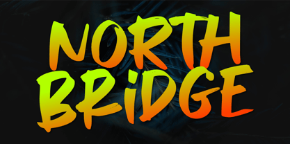 North Bridge is a cool and unique display font. It has a modern yet whimsical style and it will easily immerse your design into a magical world. Features : Basic Latin A-Z & a-z. Numbers, symbols, and punctuations Multilingual Support. Accented Characters : ÀÁÂÃÄÅÆÇÈÉÊËÌÍÎÏÑÒÓÔÕÖØŒŠÙÚÛÜŸÝŽàáâãäåæçèéêëìíîïñòóôõöøœšùúûüýÿžß Thank You.
 - California Personal Use - Personal use only

- NFL Packers - Unknown license

- Yardley Personal Use - Personal use only

- Victoria Serif - Personal use only

- CADILLAC PERSONAL USE - Personal use only

- Beth Ellen - 100% free

- Cchicanos Personal Use - Personal use only

- Pinstripe Limo - Personal use only

- Mostly Ghostly - 100% free

- NFL Saints - Unknown license

- Jambetica - Personal use only

- Scars Before Christmas - Personal use only

- the girl next door - Personal use only

- DigItAl FingerpRINT PERSONAL US - Personal use only

- CREATOR PERSONAL USE - Personal use only

- SMILE PERSONAL USE - Personal use only

- WATCHER PERSONAL USE - Personal use only

- Love Glitch Personal Use - Personal use only

- Blue Screen Personal Use - Personal use only

- FF Hertz by FontFont,
$68.99 Low stroke contrast, generous spacing, and fine-grained weights from Light to Extra Bold make FF Hertz a workhorse text typeface which holds up well under today’s widely varying output conditions from print to screen. The quite dark Book style works well on e-ink displays which usually tend to thin out letters, as well as in print when you want to evoke the solid letter image of the hot-metal type era. Two sizes of Small Caps are included: A larger size for abbreviations and acronyms, and a smaller size matching the height of the lowercase letters. FF Hertz is a uniwidth design, that means each letter occupies the same space in all weights. This feature allows the user to switch between weights (but not between Roman and Italic styles) without text reflow. Jens Kutilek began work on FF Hertz in 2012. From a drawing exercise on a low-resolution grid (a technique proposed by Tim Ahrens to avoid fiddling with details too early), it soon evolved into a bigger project combining a multitude of influences which up until that point had only been floating around in his head, including his mother’s 1970s typewriter with its wonderful numbers, Hermann Zapf’s Melior as well as his forgotten Mergenthaler Antiqua (an interpretation of the Modern genre), and old German cartographic lettering styles. Jens likes to imagine FF Hertz used in scientific books or for an edition of Lovecraftian horror stories.
 - dubfresh - 100% free

- Roundico - Unknown license

- Paper Cube by Pisto Casero,
$14.00 Paper Cube font family is the first font I've created. I unconciously started to draw letterforms with straight horizontal and vertical lines contained in a square. Soon this experiment became a 3d outlined display family of 3 weights, each one of them gaining depth and articulating into planes. Designed in Cuenca (Spain) in 2011.
 - KG Love You Through It by Kimberly Geswein,
$5.00 My beautiful mom was diagnosed with breast cancer in August 2011. Our family's resolution was to love my mom through this time- to stay by her side and remind her each day that she is not alone and that she is loved as she walks this difficult road. This font was made in her honor.
 - Kyrial Display Pro by Mostardesign,
$29.00 Designed in 2011 by Olivier Gourvat, this font family has generous proportions with a range of weights make it a versatile family for print and web design work. Kyrial Display Pro is also a practical typographic choice to express strength, elegance, and conceptual clarity. Kyrial offers lots of OpenType goodness and broad language support.
 - Chemicalife by IKIIKOWRK,
$15.00 Proudly present Chemicalife - Hand Drawn Letterpress Type, created by ikiiko Take advantage of "Chemicalife," a stunning hand-drawn letterpress typeface created to take your poster designs to new heights, and embrace its retro appeal and aesthetic attraction. The distinctive "Regular" and "Rough" forms of this typeface, each with its own compelling personality, provide your projects an unsurpassed degree of versatility. Discover the world of purposeful imperfection with Chemicalife's "Rough" aesthetic. This variation celebrates the natural flaws of handcrafted artwork and is inspired by the genuine charm of vintage letterpress prints. Every word and character exudes an artistic rawness that gives your posters a sense of true craftsmanship. These imperfections and uneven edges are the telltale signs of an artist's touch. This typeface is perfect for an vintage poster, movie title, packaging, food & beverages, magazine design, fashion brand, classic stuff, quotes, or simply as a stylish text overlay to any background image. What's Included? 2 Weight : Regular & Rough Uppercase & Lowercase Numbers & Punctuation Multilingual Support Works on PC & Mac
 - Cloverside by IKIIKOWRK,
$17.00 Proudly present Cloverside - Vintage Label Font, created by ikiiko. Where timeless elegance meets vintage charm in the world of typography. This exceptional font is a nod to the classic label style, meticulously crafted to add a touch of nostalgia to your designs. With its seamless blend of sophistication and retro flair, Cloverside captures the essence of a bygone era while maintaining a contemporary edge. Give yourself to the charm of two unique looks: the striking and adaptable Regular font and the minutely detailed Inline font. Every word is a unique piece of art, painstakingly created to convey the feeling of fine craftsmanship found in old-fashioned labels. This font is very suitable for making a vintage or retro stuff, magazine layout, book cover, food & beverages packaging, quotes, or simply as a stylish text overlay to any background image. What's Included? 2 Styles : Regular & Inline Uppercase & Lowercase Numbers & Punctuation Multilingual Support Works on PC & Mac
 - Anowy by Product Type,
$17.00 Welcome to the world of Anowy, where handwriting seduces with impressive display dynamics. This font offers seven font styles including Regular for a classic look, Slant for a dynamic slanted touch, Blur for a natural ink writing effect, Smooth for softness, and Shadow for a dramatic feel. The specialty of the Anowy font is Seven Tiered Styles: Explore a variety of seven Anowy style variants to create a unique and attractive design according to your wishes. A Touch of Handwritten Vulnerability: Every character in Anowy provides a touch of seductive handwriting, creating an air of authenticity and humanity in every detail. Anowy is an ideal choice for projects that require a beautiful handwritten touch and a diversity of styles. Whether you're designing promotional materials, greeting cards, or other creative works of art, these fonts bring an unmatched personal element. Do not miss this opportunity! Get Handwritten Fonts for Anowy Looks now and watch how each word becomes a special artistic expression.
 - Altertypo by Popskraft,
$12.00 Altertypo, a font family on a never-ending quest for the "perfect" sans-serif style. Inspired by the early 20th-century pioneers like Gill Sans and Johnston Sans, Altertypo seamlessly blends their classic elegance with contemporary flair. This unique typeface is your passport to creative freedom in graphic design, serving a multitude of purposes from editorial and corporate to web and interaction design. This font allows you to craft compelling designs that transcend the ordinary, providing the versatility and innovation you seek. It invites you to explore a world of creative possibilities, where every character is thoughtfully placed to ensure a smooth, organic flow of words. Step into the realm of Altertypo, and leave behind the constraints of conventional fonts. It's your gateway to exceptional design, where each letter harmonizes effortlessly to deliver a captivating visual experience. Say goodbye to the limitations of standard fonts and embrace the boundless potential that Altertypo offers.
 - Tintoretto by profonts,
$41.99 Tinteretto is a very beautiful, decorative Art-d�co font which is ideal for ad design about fine arts events and the world of arts and crafts as well as in restaurants, bars and for food packaging. Tintoretto harmonizes well with serif and sans serif fonts created at the beginning of the last century. It contains character sets for West and Central European as well as for Romania and Turkey. When Unger started his work on Tintoretto, he had the splendid idea of adding a Fill version to the original 3D characters. Combining both fonts make it even stronger and more beautiful. How to combine both fonts in order to achieve a color fill effect: Type your word or phrase and do not make any changes to the spacing or kerning. Duplicate or copy the original and change it to the Fill version (font change). Apply a color to the copy and position it exactly behind the original. See and love the result.


