10,000 search results
(0.05 seconds)
- Artico by cretype,
$20.00 Artico Family is a modern sans-serif typeface that is clean, simple and highly readable. Letters in this type family are designed with genuine neo-grotesque and neutral shapes without any decorative distractions. The spaces between individual letter forms are precisely adjusted to create the perfect typesetting. Artico is versatile type family of 72 fonts. Artico family consists of 9 weights (Thin, ExtraLight, Light, Regular, Medium, Bold, ExtraBold, Heavy & Black) and 4 widths (Extra Condensed, Condensed, Normal & Expanded) with their corresponding italics. The Open Type fonts contain complete Latin 1252, Cyrillic, Central European 1250, Turkish 1254 character sets. Each font includes proportional figures, tabular figures, numerators, denominators, superscript, scientific inferiors, subscript, fractions and case features. We highly recommend it for use in books, web pages, screen displays, and so on.
 - Kaneishia Script by Solidtype,
$14.00 A new modern calligraphy font, with elegant touch, stylish and lovely. It comes with a handy set of opentype stylistic, use the beautiful ligatures, alternates and swashes. You need a program that supports OpenType features such as Adobe Illustrator CS, Adobe Photoshop CC, Adobe Indesign, Microsoft Word 2010. It is perfect for logo, greetings, branding, quotes, prints, invitations and crafting. All lowercase letters include alternates, beginning & end swashes, that makes the font look fabulous! These are all coded with PUA Unicode. Mac users can use Font Book and Windows users can use Character Map to view and copy any of the extra characters to paste into your favourite text editor/app. For sans serif only available for uppercase letters, numbers, punctuation and all fonts are available in multilingual support. Thanks and have a wonderful day :)
 - Norvin by Letterhend,
$19.00 Norvin is a strong and bold sans serif with a touch of vintage look and feel. Comes with 38 bonus hand drawn illustration in vector and free 12 premade logo. This type of font perfectly made to be applied especially in logo, headline, signage and the other various formal forms such as invitations, labels, logos, magazines, books, greeting / wedding cards, packaging, fashion, make up, stationery, novels, labels or any type of advertising purpose. Features : Regular & Stamp version uppercase & lowercase numbers and punctuation multilingual alternates / swashes and ligatures PUA encoded We highly recommend using a program that supports OpenType features and Glyphs panels like many of Adobe apps and Corel Draw, so you can see and access all Glyph variations. How to access opentype feature : letterhend.com/tutorials/using-opentype-feature-in-any-software/
 - Ciutadella by Emtype Foundry,
$69.00 Ciutadella was originally commissioned by Mario Eskenazi’s studio. It is a versatile geometric sans serif, a simple, clean and direct family. Its power resides in an overhaul simplicity that reflects an “open” personality, easily suitable to be used across a wide range of applications, from identity systems to publications. Although it has been conceived to be used as a display typeface, it performs well in intermediate length texts mostly because of some specific characteristics such as the alternate two-story ‘a’. It is available in Open Type format and includes Alternate Characters, Ligatures, Tabular Figures, Fractions, Numerators, Denominators, Superiors and Inferiors. It supports Central and Eastern European languages. The type family consists of 10 styles, 5 weights (Light, Regular, Medium, SemiBold and Bold) plus italics. See also Ciutadella Rounded and Ciutadella Slab. Ciutadella PDF.
 - Altra Two by Hackberry Font Foundry,
$24.95AltraTwo is a complete redraw of a family based on a tracing of a clip art font from an old printed book. The AltraTwo family adds italic, black, and black italic. I liked the gentle calligraphic look. Consider it a sans serif with style. This is a typical NuevoDeco OpenType pro font with caps, lowercase, small caps, lining, oldstyle, and small cap figures, numerators, denominators, fractions, swashes, and so on. There aren't many unusal ligatures for this one, though. It does have the Latin 2 character set or what Adobe calls CE, Central European characters. Altra has been my preferred header face for sevral years. it also works very well for body copy. I usually use it for my contrasting tip and quote paragraphs with Bergsland Pro as my normal body copy. - Maribor by Dima Pole,
$30.00 Maribor is a slab serif font with nice shapes, they are both soft and angular. It is perceived calmly and with a twist. Maribor means "Mara`s pinery". The energy of the Universe, reflecting the modification, renewal and change for the better is called Mara; Ancient wise ancestors called it so. Today it is known as the goddess Mara in the Vedic worldview of the Slavic-Aryan peoples. Maribor is a multilingual font, it contains characters for 104 Latin languages and all Slavic, including all capitals for them. There are all major currency signs, including the ruble and the Euro. Many OpenType features allow you to make a variety of compositions; as well as to see the font from the new side thanks to the stylistic sets for the Slavic alphabets.
 - Batch by Umka Type,
$15.00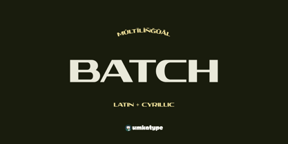 Batch - A Sans Serif Font : Batch is a carefully crafted display font. It has Extended Latin and Cyrillic characters. It created for poster, web, brand and social media designs. It supports 91 Languages: Belarusian, Russian, Afrikaans, Albanian, Asu, Basque, Bemba, Bena, Breton, Catalan, Chiga, Colognian, Cornish, Croatian, Czech, Danish, Dutch, Embu, English, Esperanto, Estonian, Faroese, Filipino, Finnish, French, Friulian, Galician, German, Gusii, Hungarian, Indonesian, Irish, Italian, Kabuverdianu, Kalenjin, Kamba, Kikuyu, Kinyarwanda, Latvian, Lithuanian, Lower Sorbian, Luo, Luxembourgish, Luyia, Machame, Makhuwa-Meetto, Makonde, Malagasy, Maltese, Manx, Meru, Morisyen, North Ndebele, Norwegian Bokmål, Norwegian Nynorsk, Nyankole, Oromo, Polish, Portuguese, Quechua, Romanian, Romansh, Rombo, Rundi, Rwa, Samburu, Sango, Sangu, Scottish Gaelic, Sena, Serbian, Shambala, Shona, Slovak, Soga, Somali, Spanish, Swahili, Swedish, Swiss German, Taita, Teso, Turkish, Upper Sorbian, Uzbek (Latin), Volapük, Vunjo, Walser, Welsh, Western Frisian, Zulu
 - Linotype Nautilus by Linotype,
$29.99According to Hellmut G. Bomm "Nautilus was based on a handwritten type used for the text Li. Das Helle, Klare from the I Ging. "The intention was to create a clear, highly legible typeface. While the even strokes of sans serif types eventually tire the eyes in long texts, the marked stroke contrast of Nautilus lends the type its legibility. The characters were drawn with a broad tipped pen, and like an antiqua type, the forms of Nautilus display a variety of elements. The narrow figures with relatively large spaces between them create an overall open appearance and allow a large quantity of text to fit into a small space. "The headstrong forms of Nautilus make this an excellent display type. The italic weights are independent typefaces with hints of a handwritten character." - Branding by Latinotype,
$39.00 Branding, a modern typeface for modern needs! Branding, especially designed for meeting contemporary aesthetic and functional needs, is the interpretation of a modern typeface from the designer’s own perspective. This typeface encapsulates a wide range of nuances and combines, seemingly, opposite elements such as technology and friendly rounded shapes. In addition, alternative characters make Branding an ideal tool for both graphics designers and art directors. Branding is a sans-serif spurless typeface with a medium-large x-height, slightly wider horizontal proportions, straight curves and convex terminals. This font is well-suited for logotypes, isotypes, short text, etc. Branding comes in 7 weights—ranging from Thin to Black—with matching italics and includes a set of 544 characters that supports 128 different languages. European accents, old style numbers and multiple alternates are also included.
 - Marlino by Nathatype,
$25.00 Do you want to achieve more? Marlino makes your work got even easier. Marlino is a sans serif font family. It's simple, modern yet purposely function and definitely helps you achieve favorable design results. There are 8 different styles in this family. This variety in styles and character availability gives you some flexibility in terms of where and when you decide to use it. Features: Multilingual Supports Numerals and Punctuations PUA Encoded It can be used for many design projects, such as poster, logo, book cover, branding, heading, printed product, merchandise, quotes, social media campaign, etc. Learn more about how to use it by seeing the font preview. Thank you for purchasing our fonts. Please don’t hesitate to contact us, if you have any further question or issues. We’re happy to help. Happy Designing.
 - Graphie by Dharma Type,
$24.99 Graphie is a modern geometric sans-serif family designed by Ryoichi Tsunekawa and the whole family consists of 16 style: eight weights from Thin to ExtraBold and their matching Italics. The range of styles provides flexibility for title, headline and body text. And the clear-cut-corner, vibrant straight lines and large x-heights give them legibility, readability and keenness. The basic skeleton of their letterform was designed geometrically and optically corrected. The sophisticated geometric design gives them universality, neutrality and sense of unity and make it possible to be used across a wide range of applications in all medias, all purposes. Graphie supports almost all European languages: Western, Central, South Eastern Europeans and afrikaans. And superior figures, inferior figures, denominators, numerators and fraction can be accessed by using OpenType features.
 - Romanovsky by ParaType,
$30.00 Romanovsky is the font developed on the base of samples from the catalogue of Osip Lehman foundry in Sankt Petersburg. Original Latin design that was used for Romanovsky can be found in Feder Grotesk by Jacob Erbar. The current digital font is not a scanned version of Lehman’s samples but a newly drawn typeface that differs from the original in many details. Romanovsky is a sans serif typeface with narrow proportions and noticeable contrast. It will be good for headings and display matters. Character set covers languages of Western and Central Europe and Cyrillic-based languages. It also contains around 20 ligatures of uppercase letters for the most frequent combinations. Designed by Vasily Biryukov. The bold weight was developed together with Olexa Volochay. Released by ParaType in 2013.
 - Sajola by Twinletter,
$14.00 The Sajola font is a contemporary sans-serif designed in four variants. Font designs range from formal and non-formal modern styles with a coherent typography system that has the same amount of weight, identical character sets, and vertical dimensions. Professional typography that supports using individual variants as main headings, sub-headings, sentence and paragraph texts, making this font complete as your choice. This font is designed with space-sensitive environments in mind. Environments such as interfaces, forms, and pathfinding applications. Font spacing is adjusted in a way that allows switching of weight and style without having a significant impact on overall space consumption. No matter the topic, this font will be an incredible asset to your fonts' library, as it has the potential to elevate any creation.
 - Rosabelia Script by Solidtype,
$16.00 A new modern script font with elegant touch, casual and lovely. It comes with a handy set of opentype stylistic, use the beautiful ligatures, alternates and swashes. You need a program that supports OpenType features such as Adobe Illustrator CS, Adobe Photoshop CC, Adobe Indesign, Microsoft Word 2010. It is perfect for logo, greetings, branding, quotes, prints, invitations and crafting. All lowercase letters include alternates, beginning & end swashes, that makes the font look fabulous! These are all coded with PUA Unicode. Mac users can use Font Book and Windows users can use Character Map to view and copy any of the extra characters to paste into your favourite text editor/app. For sans serif only available for uppercase letters, numbers, punctuation and all fonts are available in multilingual support. Thanks and have a wonderful day :)
 - Homura by Arterfak Project,
$18.00 Homura is a sans-serif display font that is inspired by newspaper headlines and modern typography. It comes in four styles: regular, rounded, slanted, and slanted rounded. This font is condensed, bold, and elegant, with a tight design that includes ink-traps in some sharp corners, giving it a fancy, fun, and minimalist impression. Flexible for various design themes. With its condensed and elegant look, Homura is perfect for creating high impact logos, headlines, and quotes. Homura's versatility makes it a great choice for any project. This font is perfect for large displays or headlines, such as logos, short quotes, stickers, label and posters. What you'll get : Uppercase & lowercase Numbers & punctuation Symbols & multilingual Stylistic alternates Give it a try today and see the difference it can make! Thanks!
 - Alurea by Storictype,
$19.00 Alurea is a feminine and girly font with delicate serifs that add a touch of elegance . Unique ligatures the graceful lines and curves evoke a sense of beauty and romance. This is a font for love letters, cover novel, magazine, coffee shop, wedding invitations, and feminine branding. It whispers sweet nothings in your ear with its delicate and intimate forms. The sensual contours beckon with a coy wink and a bashful smile. Like a graceful ballerina effortlessly dancing across the page, this font brings a soft, romantic air to any design. Use it to make a statement with its delicate femininity and inner poise. This is a font that celebrates the beauty, charm, and tenderness Features : Character Set A-Z Numerals & Punctuations (OpenType Standard) Disrectionary Ligatures Accents (Multilingual characters) Thank You
 - Fabrikat Mono by HVD Fonts,
$40.00 Fabrikat Mono is a type family designed by Christoph Koeberlin. The monospaced Sans Serif family is published by HVD Fonts and consists of seven weights plus matching italics. It is an addition to the popular Fabrikat type family that emphasises its engineering roots. Compared to Fabrikat, the Mono version evens out not only the characters’ variable widths but also its more subtle characteristics: Letters like B and R are counterbalanced, the height difference between caps, ascenders and even “t” are eliminated, while characters like the percent sign together with the stressed punctuation give a nod to typewriter typefaces. The type family is equipped for complex, professional typography with OpenType Features like alternate letters, arrows and an extended character set to support Central and Eastern European as well as Western European Languages.
 - Jiho Soft by cretype,
$20.00 Jiho Soft Family is a modern & soft sans-serif typeface that is clean, simple and highly readable. It is the rounded version of Jiho Family. Letters in this type family are designed with minimal & modern shapes without any decorative distractions. The spaces between individual letter forms are precisely adjusted to create the perfect typesetting. Jiho Soft is versatile type family of 18 fonts. Jiho Soft family consists of 9 weights (Thin, ExtraLight, Light, Regular, Medium, Bold, ExtraBold, Heavy & Black) with their corresponding italics. The Open Type fonts contain complete Latin 1252, Cyrillic, Central European 1250, Turkish 1254 character sets. Each font includes proportional figures, tabular figures, numerators, denominators, superscript, scientific inferiors, subscript, fractions, old style-figures and case features. We highly recommend it for use in signage, books, web pages, screen displays, and so on.
 - Suffix by Obelisk Gestalt,
$34.00 Suffix Mono is a monospaced sans-serif family that offers an extensive range of weights and styles. Additionally, it provides numerous OpenType features, including 16 distinct stylistic sets for users to experiment with. The core concept behind Suffix Mono is to explore the distinctive textures often associated with monospace fonts, which are primarily characterized by their "fixed width" nature. Suffix Mono enhances these textures by introducing various stylistic features that enable users to replace closed glyph contours, such as those found in characters like 'f,' 'r,' 'i,' and 'j,' with more open and airy alternatives. Enabling these alternates results in an overall transformation of the textural appearance of Suffix Mono. Furthermore, Suffix Mono boasts one of the hallmark features of modern typefaces: extensive language support, encompassing nearly the entire Latin script.
 - Rhodes by Eurotypo,
$19.00 Rhodes is a modern geometric sans serif consisting of 5 weights ranging from Extra Light to Bold with matching true italics. Its variety of weights provide a range of choices that will help you find the best typographic color for your project. Lighter weights are well-suited for body text while heavier ones are ideal for high impact headlines. Rhodes has been designed purposely to enable brands to appeal more emotionally to modern consumers. The balanced characteristic of Rhodes with unique details, such as the geometric form and the prominent x-height makes it perfect for strong headlines and outstanding logos, but also suitable for long text. Rhodes includes a set of ornaments in regular and italic to be able to combine it with the glyphs and thus, to give your designs more exclusivity.
 - Storica by Arkitype,
$15.00 Storica is a display typeface with roman style serifs that create a sense of history and culture. The Storica family has 7 weights as well as a Heavy Rough and Heavy Hand version that give you an option for a more rustic or hand style approach to you projects. The character set is expansive and has a wide range of language support. Storica has a great selection of Stylistic alternates, ligatures, small-caps, old-style numbers and more packed into the opentype features. This typeface is an excellent choice for branding, particularly in the beverage industry, it is also perfect for typographic layouts for magazines, poster, books etc. Storica has been designed to make it easy for a designer to create beautiful typography with creative flair quickly and easily.
 - Six Hands by ParaType,
$10.00 Six Hands is a set of handwritten fonts based on various writing tools, such as pencil, felt-tip pen, ball-point pen, and brush. The character set of each of these fonts supports the Cyrillic alphabet, as well as the extended Latin script for all European languages. Most of the styles also contain additional alternatives that have the capability of automatically interchanging in the setting, which significantly variegates and humanizes the text. Six Hands is quite a rare combination of diverse display fonts that work well together. It is made for talented designers who can use it creatively in packaging, advertising, displays, posters, menus, invitations and so on. The design of Six Hands was a result of collaboration between Alexandra Korolkova, Alexander Lubovenko and all those who assist them in this work. This set of fonts was released by Paratype in 2018.
 - Aramus by Hackberry Font Foundry,
$24.95 Aramus is a new serif font in my continuing objective of designing book fonts that I can really use. In many ways, Aramus is a very different direction for me. It comes from a scan of an old display face that has been radically modified to a much smaller x-height than I have been using lately, plus taller ascenders. Many of the characters needed a lot of correction to bring them into my taste. In general, I have decided that many of my fonts create a type color that is too dense. Aramus is an attempt to get away from that look. Although Amitale has been a very successful book family and excellent to work with, I find I still need something more open with a lighter color. Aramus is the first look at the new direction. The original hand-cut serifs vary a lot, different for almost every character. This gives a little looseness and helps the lightness I am looking for. It will be interesting to see where this all goes. This is a normal serif for me in that it has caps, lowercase, small caps with the appropriate figures for each case. This font has all the OpenType features in the set for 2009. I didn't bother with the CE accents (though I can add them upon request. They will be in the final new book family). There are several ligatures for your fun and enjoyment: bb gg ff fi fl ffi ffl ffy fj ft tt ty Wh Th and more. Like all of my fonts, there are: caps, lowercase, small caps, proportional lining figures, proportional oldstyle figures, & small cap figures, plus numerators, denominators, superiors, inferiors, and a complete set of ordinals 1st through infinity. Enjoy!
 - Cubio Mono by R9 Type+Design,
$38.00 Cubio™ Mono is a new monospaced geometric sans serif inspired by the hexagonal silhouette of isometric cubes. We applied this angular form through all aspects of Cubio™ type design from the overall look of letters and icons down to the small details such as the end of each letter stem and hexagonal dotted lines. This font family comes in 3 weights/styles: 300 (Regular), 500 (Medium), and 700 (Bold). With over 1,500 glyphs, Cubio™ Mono not only supports most Latin-based languages, but also features an extensive set of UX/UI icons, and patterns. Cubio™ Mono is a versatile typeface for both digital and traditional designs. Perfect for packaging design, logo design, print design, store signages, UX/UI web & apps designs. Cubio™ Mono packed with features such as case-sensitive marks, punctuations and math symbols. It also comes with an extensive set of box/compartment drawing glyphs to help you create a unique modern design without even using the line tools. We designed the Cubio™ Mono font system with your convenience in mind. It comes with two sets of hexagonal dotted line and icon positions (Mid Cap Height and Mid X-Height ), so you don’t have to use the baseline shift command to set them to the perfect spots. To find out more about Cubio™ Mono Opentype features and type specimen, please visit www.r9typedesign.com
 - Trump Mediaeval Office by Linotype,
$50.99The Trump Mediaeval Office family is designed after the model of the original serif family produced by Georg Trump in 1954. Trump released this typeface through the C.E. Weber type foundry in Stuttgart, and Linotype quickly cut the face for mechanical composition. Thereafter it became popular around the world. One of the most prolific German type designers of the 20th century, Trump created numerous typefaces in several different styles, but Trump Mediaeval is often regarded as his best work. Trump Mediaeval is an old style serif typeface, with new inherent quality that could only have come about after centuries of variation on this theme. It bears some resemblance to the classic Garamond typefaces, yet its characteristic letters set it apart in a positive way. Akira Kobayashi, Linotype’s Type Director, released his own revived design, Trump Mediaeval Office, in 2006. Trump Mediaeval Office has two weights, each with an italic companion. Unlike the original design, Kobayashi has harmonized the varying letterforms across the two weights, allowing Regular and Bold text to stand side by side harmoniously. Trump Mediaeval’s numbers now match across weights as well, optimizing their legibility in sizes large and small. Decades ago, Trump Mediaeval was a popular choice for setting book texts, because of its robust serifs. These are exactly what make the face a good choice for office application today; on lower-resolution printers, these serifs will still remain a strong feature on the letterform, increasing legibility along the line of text. - Hedwig Pro by Ingo,
$42.00 A modern sans serif with open round forms. The ”round“ letters emphasize the condensed open oval; the light counter forms provide the rhythm of the typeface, causing the typeface to appear gentle and pleasing. The ”modern“ design of a and g being especially contributive here. All of the letters are recognizably narrow, almost ”condensed,“ the forms being very functionally shaped. The construction of the ”triangular“ upper case letters A M N V W as well as v and w, especially catches the eye with the shafts joined together as beams are stacked upon each other. With this construction Hedwig displays a down-to-earth touch. Contrary to the classical sans serifs, a few letters were given light echoes of serifs which promote fluency: a d l are displayed below the line in a reading direction and end in a compressed but also very short serif style; on m n p r the upstroke is gently displayed and on u the downstroke. For all the typo-maniacs among you designers there are alternative forms for a number of letters in Hedwig: A B D G I M R W and a d f g j l ß u. Even an antiquated ”long“ s and an upper case ß is available. Plus, Hedwig includes numerous ligatures which can save that little bit of space where required and which allow the typeface to appear more variable: ch, ck, ct, fi, fj, fl, ff, ffi, ffl, ft, mm, ti, tt, tz.
 - Dever by insigne,
$24.00 Dever’s brute, industrial lines are rounded up in this new typeface from Jeremy Dooley. Dever combines plenty of inspirations. It’s the flair of the Wild West melded with a shout out to the sign painters and package lettering artists of the 1800s. Dever’s big, bold, and handy frame moves through all three of the family’s strapping members. First is the sans. No doubts on what this brother’s like. Dever Sans is as straight-forward as you’ll find in this family with its four separate weights and numerous distressed options. The second of the kin’s a bit of half-breed, you might say. Pointed serifs bring a sharpness to this outfit. Rounding out the family is Dever Wedge, a bit of wild rodeo all its own. This poke’s a quick draw with any of its 107 font, and with it’s auto-replacing alternates, no two repeating characters are alike. You’re guaranteed a great show anytime Dever leaves the chute. The route to Dever was long, with many a switchback. The Wedge variant was designed first, shelved, then developed into Plathorn. But I wanted to return to those brutish forms and decided to round out the family with a sans, serif and plenty of other options. Any of the Dever family have an extended character set including Central and Eastern European languages. The strong faces have specially adapted sub-families, too, so they’re bound and determined to have an outstanding impact at whatever size you use ‘em. It’s a hard ride ahead corralling all those words. Be sure and add these able-bodied boys to your posse today!
 - Atrament by Suitcase Type Foundry,
$75.00The Atrament font family was originally conceived in 2003 as the corporate display type family for Suitcase Type Foundry. Its original source of inspiration is the front cover of the Devetsil - Revolucni slovn’k almanac (1922), designed by Karel Teige. The lettering on this cover is a condensed sans serif with rounded stroke terminals. Atrament is significantly broader than the model and its characters are better balanced, reflecting the evolution of semi-condensed sans serifs throughout the 1960s. The horizontal strokes of both lower and upper case are less stressed than the vertical stems. Noteworthy are the unusual tiny gaps in the apex and vertex of letters with diagonal strokes, designed to prevent ink from spreading and smudging the letter shapes. This detail is one of the main features of the font's character. The general feel of the italics closely matches the strictly vertical, parallel character of the regular cut. When converting the family to OpenType the alternate character shapes from the Alternator weights were incorporated in the regular cut, which allows the user to switch selected characters from one shape to another within the same font. A number of glyphs and accents were corrected, and all the glyphs missing in the Suitcase Standard character set were added, along with the relevant kerning pairs. The individual weights of Atrament Std thus contain accented upper and lower case, small caps, alternate glyphs for most European languages, nine types of numerals, superscript characters, caps glyph versions, and much more. Its narrow proportions make Atrament the perfect choice whenever economy of space is a must. It is however not very well suited for setting long texts. Ideal for headlines and display use, it is perfect for situations where the text needs to make a great impact in a little space. - Aviano Gothic by insigne,
$22.00 The Aviano collection returns, refined into a new, mid-contrast sans-serif inspired by the design and style of early 1900ís American engravers. Engravers would meticulously carve lettering into copper plates for printing, and often these letters, for more impact, would be extended and only utilize capitals. While taking inspiration from the past, Aviano Gothic is distinctly one-of-a-kind, and is not a revival, but instead is based on the structure of pre-existing Aviano type families for interchangeability and interoperability. Aviano Gothic has been diligently honed to be sinuous and seductive, making it great for high-end work such as including jewelry, beauty, and other luxury products. The full Aviano Gothic family presents you with six distinct weights and is full of OpenType options. Available with the face are deco alternates for replicating inscriptions and signage of the í20s and í30s. Style sets are offered, together with four full sets of art deco-inspired alternates, swashes, and titling, in addition to an expansive range of other alternates to help ìunique-ifyî your layouts. Aviano Gothic also features forty discretionary ligatures for inventive typographic compositions. Begin planning your work with Aviano Gothic by looking at these options in the instructive .pdf brochure. OpenType-able applications, including Quark or the Adobe suite, allow for the comprehensive benefit of the ligatures and alternates. This typeface also features the glyphs to aid a broad number of languages. Several variants have been made to extend the usefulness of the typeface, and it makes for a fine substitute for Copperplate, ITC Blair or Engravers Gothic. Aviano Gothic also pairs perfectly with the other members of the Aviano collection, including the original Aviano, Aviano Serif, Aviano Sans, Aviano Didone, Aviano Flare, Aviano Future, Aviano Wedge, Aviano Contrast and Aviano Slab.
 - RQND Pro V.2 by Tondi Republk,
$25.00 Introducing RQND Pro 2 - The Futuristic and Industrial Sans Serif Font Welcome to the world of RQND Pro 2, a cutting-edge sans serif font designed to elevate your designs to new heights. With its industrial aesthetic and futuristic appeal, this font is the perfect choice for projects seeking a bold and contemporary look. Key Features: 1,201 Glyphs: RQND Pro 2 boasts an extensive character set, offering you a vast array of design possibilities. Supports 123 Languages: No matter where your audience is, this font ensures that your message is conveyed clearly and effectively. 20 Font Styles: With 5 font weights and 5 font widths, RQND Pro 2 offers 20 unique styles to suit every creative vision. Expanded to Extra Condensed: Whether you need a spacious layout or a compact design, this font delivers unmatched versatility. 18 OpenType Features: Unlock the full potential of RQND Pro 2 with various OpenType features, including small caps, alternate characters, standard numerals, circled numerals, fractions, and more. All Caps Font: Embrace the power of uppercase letters with this font, enhancing the impact of your message. Full Character Set: From standard numerals to punctuation marks, mathematical symbols to special characters, RQND Pro 2 has everything you need for seamless communication. Latin and Cyrillic Support: Perfect for international projects, this font provides complete support for both Latin and Cyrillic languages. RQND Pro 2 empowers designers, creatives, and typographers to explore new design territories. Its sleek and modern appearance makes it ideal for tech branding, UI design, editorial projects, advertisements, web design, and more. Discover a font that combines sophistication with contemporary flair. Elevate your designs with RQND Pro 2 and leave a lasting impression on your audience. Explore the full range of styles and unleash your creativity today.
 - Mess Hall JNL by Jeff Levine,
$29.00Modeled from a set of individual painting stencils, Mess Hall JNL is named for the armed services cafeteria where thousands of enlisted men endured bland, boring meals day in and day out for years. - Czykago Rough by TypoGraphicDesign,
$19.00 From 2019 back to the 90s … The typeface “Czykago Rough” by Alexander Branczyk and Manuel Viergutz is a re-issue of the font “Czykago” published in 1995 by the font label “Face2Face”. Designed as a re-release for the Font Foundry “Typo Graphic Design” in 2019. The rough sans serif display font is inspired by the 80s and 90s. Glyhph-Set: Latin Extended (Adobe Latin 3). 907 glyphs with 3× A–Z & a–z and 350+ decorative extras like icons, arrows, dingbats, emojis, symbols, sign of the zodiac, geometric shapes, catchwords, decorative ligatures (type the word #LOVE for ❤ or #SMILE for ☺ as OpenType-Feature dlig) and stylistic alternates (4× stylistic sets). For use in logos, magazines, posters, advertisement plus as webfont for decorative headlines. The font works best for display size. Have fun with this font & use the DEMO-FONT (with reduced glyph-set) FOR FREE! ■ Font Name: Czykago Rough ■ Font Weights: Cond + Stretch + Mix + CondBG + Icons + DEMO (with reduced glyph-set) ■ Font Category: Display for headline size ■ Font Format: .otf (OpenType Font for Mac + Win) + .ttf (TrueType Font) ■ Glyph Set: 907 glyphs with 350+ decorative extras like icons ■ Language Support: 80+ for Latin Extended (Adobe Latin 3). Afrikaans, Albanisch, Baskisch, Bemba, Bena, Bosnisch, Dänisch, Deutsch, Englisch, Estnisch, Färöisch, Filipino, Finnisch, Französisch, Friulisch, Galizisch, Gusii, Indonesisch, Irisch, Isländisch, Italienisch, Kabuverdianu, Kalenjin, Katalanisch, Kinyarwanda, Kölsch, Kornisch, Kroatisch, Lettisch, Litauisch, Luhya, Luo-Sprache, Luxemburgisch, Machame, Madagassisch, Makhuwa-Meetto, Makonde, Malaiisch, Manx, Morisyen, Niederländisch, Niedersorbisch, Nord-Ndebele, Norwegisch Bokmål, Norwegisch Nynorsk, Nyankole, Obersorbisch, Oromo, Pare, Polnisch, Portugiesisch, Rätoromanisch, Rombo, Rukiga, Rumänisch, Rundi, Rwa, Samburu, Sango, Sangu, Schottisches Gälisch, Schwedisch, Schweizerdeutsch, Sena, Shambala, Shona, Slowakisch, Slowenisch, Soga, Somali, Spanisch, Suaheli, Taita, Teso, Tschechisch, Türkisch, Turkmenisch, Ungarisch, Vunjo, Zulu ■ Specials: Alternative letters, stylistic sets, automatic contextual alternates via OpenType Feature (3× different versions of A–Z & 0–9 + a–z), Euro, kerning pairs, standard & decorative ligatures, Versal Eszett (German Capital Sharp S), 350+ extras like Dingbats & Symbols, arrows, hearts, emojis/smileys, stars, further numbers, lines & geometric shapes ■ Design Date: 1995–2019 ■ Type Designer: Alexander Branczyk and Manuel Viergutz
 - hooge 05_55 Cyr2 - Unknown license

- Achilles - Unknown license

- QuickQuick - Unknown license

- Rosehot by Alit Design,
$12.00 Introducing Rosehot Serif Elegant typeface The Rosehot Serif typeface is an elegantly themed font that has a dynamic serif style. The details of the shape of the "Rosehot Serif Elegant typeface" are very smooth and flow to create unique and beautiful curves. Elegant Serif typefaces such as “Rosehot Serif Elegant typeface” are very easy to apply to any design, especially those with an elegant and smooth concept, besides that this font is very easy to use both in design and non-design programs because everything changes and glyphs are supported by Unicode (PUA). The Rosehot Serif Elegant typeface contains 559 glyphs with many unique and interesting alternative options.
 - Bulone by Alit Design,
$18.00 🌻Introducing Bulone Serif Elegant typeface🌻 The Bulone Serif typeface is an elegantly themed font that has a dynamic serif style. The details of the shape of the "Bulone Serif Elegant typeface" are very smooth and flow to create unique and beautiful curves. Elegant Serif typefaces such as “Bulone Serif Elegant typeface” are very easy to apply to any design, especially those with an elegant and smooth concept, besides that this font is very easy to use both in design and non-design programs because everything changes and glyphs are supported by Unicode (PUA). The Bulone Serif Elegant typeface contains 613 glyphs with many unique and interesting alternative options.
 - Liaisons by The Ampersand Forest,
$35.00 A Belle Époque humanist serif in two styles: crisp, high-contrast Haut-Monde and soft, low-contrast Demimonde… When you design a lot of display pieces, you’re often in need of tall, slim type. Liaisons provides that, in a distinct fin-de-siècle style inspired by the great posters of the Gilded Age from Sweden, Denmark, France, and Scotland. (The ampersand alone is a bit of a love letter to Charles Rennie Mackintosh!) Both styles use the same slim skeleton, and are named after the stratum of society where one might find… a “dancing partner.” HAUT-MONDE is a high contrast face of the sort that says “High Society.” Elegant and sleek, it speaks to the refinement of the moneyed classes of a bygone era. Great for high-end products, too! DEMIMONDE is soft and low-contrast — more reminiscent of hand-lettering on Art Nouveau/Jugendstil/Wiener Werkstätte advertisements and posters. A comfortably chic display face all around! Both typefaces feature full Western and Eastern Latin character sets, as well as full Cyrillic/Slavic ones. And, perhaps best of all, both typefaces feature capitals with high, middle, and low waists, so you can change up the look as you see fit! Part of The Ampersand Forest's Sondheim Series
 - Cocogoose Classic by Zetafonts,
$39.00 Download PDF Specimen Created as a display typeface in 2012 by Cosimo Lorenzo Pancini, Cocogoose is one of Zetafonts most loved typefaces. A sans serif typeface of geometric proportions, with very low contrast and slightly rounded corners, it was the first typeface to be produced in the Coco series, an ongoing research on the design variation in gothic typefaces through the ages. Cocogoose extreme x-height and ultrabold weight (with regular being comparable to heavy weights of other typefaces), have since then made it very popular for effective display and logo use, also thanks to decorative versions like Cocogoose Letterpress. Since 2016, Andrea Tartarelli has been improving the typeface expanding the original glyph set to include cyrillic and greek and adding extra weights, widths, and italics to the original family range, and bringing Cocogoose to an impressive count of 52 variants. In 2019, Francesco Canovaro has teamed with Andrea Tartarelli and Cosimo Lorenzo Pancini to create a new variant subfamily: Cocogoose Classic, featuring 8 weights and matching italics. Cocogoose Classic keeps the original design for uppercase characters while developing a new design for lowercase, with a smaller x-height, round dots and expanded open-type features, including positional numerals, alternate forms, and extended ligatures and bringing the glyph count to over 1000 characters.
 - Pseudonym by Monotype,
$20.99 Pseudonym is a low-contrast, subtly-flared serif available in four weights across three styles in both roman and italic. As with all of my typeface designs, I am creating fonts that I would use myself for branding purposes—typefaces with style and purpose that are intended for use in creating logos and distinctive branding typography. I wanted to create a typeface that had incisive flared serifs combined with the strength and solidity of modern grotesque faces. The result is Pseudonym, which I feel has great presence, style and legibility. Although I must admit, I had to tone down the flared serifs during the design process in order to achieve that :) I’m sure you will have great fun playing with some of the Open Type features that I’ve added to Pseudonym. There’s a full set of true small caps with their corresponding diacritics and figures. There are also a number of discretionary ligatures, these are chosen from the glyphs palette in your layout app to replace pairs of standard characters. You’ll also enjoy making use of the catchwords – these have been created to harmonise with each style, again, giving you more flexibility and scope to create some innovative typography. Finally, there are some alternate characters for /C/D/O/. You may wish to use these when creating logos that include standard contractions for limited, number, incorporated, etc. Key features: • Pseudonym is a low-contrast, subtly-flared serif that has great presence, style and legibility • 3 styles – Narrow, Regular and Wide • 4 weights in roman and italic: • Light | Regular | Medium | Bold • Full set of small caps with diacritics and figures • 30+ discretionary ligatures, catchwords and alternate characters • Full European character set • 600 glyphs per font


