7,562 search results
(0.034 seconds)
- Chardmilk Script by Ajibatype,
$15.00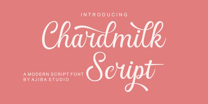 Chardmilk Script is a sleek, refined script font. It looks dazzling on wedding invitations, thank you cards, quotes, greeting cards, logos, business cards, and every other design which needs a customized touch. This font is PUA encoded which means you can access all of the glyphs and swashes with ease
 - Busteball by Ditatype,
$29.00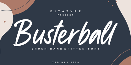 Busterball is a classy script font. Made for any professional project branding. It is the best for logos, branding and quotes. Every letter has a unique and beautiful touch. Includes: Busterball (OTF) Features: Beautiful Ligatures Multilingual Support PUA Encoded Numerals and Punctuation Thank you for downloading premium fonts from Dita Type
 - Chunky Chicken by Hanoded,
$15.00 Chunky Chicken is a fat, weird, funny and unique font. It was named in honor of my five chickens, who, despite the snow and freezing temperatures, keep laying eggs every day. Chunky Chicken is a headline font, ideal for books and posters and comes with a full range of diacritics.
 - Garetha by Din Studio,
$29.00 Garetha is modern sans serif font. Made for any professional project branding. It is the best for branding, printing, wedding and quotes. Every letter has a unique and beautiful touch. Features: Swashes Stylistic Sets PUA Encoded Multilingual Support Numerals and Punctuation Thank you for downloading premium fonts from Din Studio
 - Soage by Din Studio,
$29.00 Soage is modern sans serif font. Made for any professional project branding. It is the best for branding, printing, wedding and quotes. Every letter has a unique and beautiful touch. Features: Alternates Stylistic Set PUA Encoded Multilingual Support Numerals and Punctuation Thank you for downloading premium fonts from Din Studio
 - Marithan by Twinletter,
$17.00 With Marithan, every character is a hunk of hero inspiration. This superhero-style display font is the answer for projects that need great visual flair. What’s Included : File font All glyphs Iso Latin 1 Alternate, Ligature Simple installations PUA Encoded Characters – Fully accessible without additional design software. Fonts include Multilingual support
 - Watterbite by Ditatype,
$29.00 Watterbite is a classy script font. Made for any professional project branding. It is the best for logos, branding and quotes. Every letter has a unique and beautiful touch. Includes: Watterbite (OTF) Features: Beautiful Ligatures Multilingual Support PUA Encoded Numerals and Punctuation Thank you for downloading premium fonts from Dita Type
 - Mono Polz by Four Lines Std,
$15.00 "Mono Polz" takes its inspiration from the zany and eccentric world of cartoons. Every letter is an explosion of creativity, with bold lines and playful shapes that'll make your designs pop right off the page. It's the perfect font to add a touch of comic mischief to your projects. - Uppercase
 - Finest Butter by Din Studio,
$29.00 Finest Butter is a modern script font. Made for any professional project branding. It is the best for logos, branding and of quotes. Every letter has a unique and beautiful touch. Features: Beautiful Ligatures Multilingual Support PUA Encoded Numerals and Punctuation Thank you for downloading premium fonts from Din Studio
 - Sendertime by Aminmario Studio,
$20.00 Sendertime is a stylish and incredibly elegant handwritten font. It looks stunning on wedding invitations, thank you cards, quotes, greeting cards, logos, business cards and every other design which needs a handwritten touch. This font is PUA encoded which means you can access all of the glyphs and swashes with ease!
 - Borough Pro by The Type Fetish,
$45.00 Inspired by a hand painted sign from Lanesboro, MN. Borough is an OpenType font that contains four variations of every character in its extended character set. Using Contextual Alternatives in OpenType savvy applications will allow the font to rotate through the variations to give a more random look to the text.
 - Sanelya by Niyyos Studio,
$16.00 Falena is a stylish and incredibly elegant script font. It looks stunning on wedding invitations, thank you cards, quotes, greeting cards, logos, business cards and every other design which needs a handwritten touch. This font is PUA encoded which means you can access all of the glyphs and swashes with ease!
 - PF Beau Sans Pro by Parachute,
$79.00 The design of Beau Sans was inspired by Bernhard Gothic which is considered one of the first contemporary American sans serifs and was designed by Lucian Bernhard in the late 1920s. Panos Vassiliou came across this font while attempting to reduce the design elements of a text typeface, by introducing Bauhaus-like minimal forms to the characters. The first version was completed back in 2002 and introduced one year later in Parachute’s 3rd catalog, under the name PF Traffic. Some time later it was decided to make a few improvements but the project was so carried away that the new typeface which emerged needed urgently a new name. Beau Sans Pro is a modern sans-serif family of 16 fonts which includes true-italics. Just like all other Parachute fonts, it covers a broad range of languages by incorporating 3 major scripts i.e. Latin, Greek and Cyrillic in one font. Furthermore, every font in this family has been completed with 270 copyright-free symbols, some of which have been proposed by several international organizations for packaging, public areas, environment, transportation, computers, fabric care and urban life. This typeface is totally recommended for titles and/or body text when you want to give a distinct and contemporary identity to a product or service.
 - Imagine if your handwriting decided to hit the gym, attend a few self-improvement workshops, and then came back with a new swagger—that's Billion Dreams for you, crafted by the wizard of letters, Mån...
- Elektrogothik is a typeface that encapsulates the spirit of two seemingly disparate worlds: the dark allure of gothic culture and the energized pulse of electronic music. This font is designed to bri...
- Ah, the Riparo font! It's like diving into the world of quirky and eye-catching typography, a playground where creativity meets functionality. Crafted by the talented Vladimir Nikolic, Riparo doesn't...
- Makeba Retro Funky Groovy by Beast Designer,
$15.99 Makeba Retro Funky Groovy Font is a fun and funky display font that brings back the spirit of the 70s. Its bold, rounded letters feature groovy curves and playful embellishments that exude a retro vibe. This font is perfect for creating eye-catching titles and headlines for posters, album covers, and other retro-inspired designs. The font’s energetic and upbeat personality is sure to make any project stand out.
 - Bazoka by Juncreative,
$15.00 Bazoka font is a display style that mimics the look of hand-drawn graffiti lettering. The letters are rounded and bubbly in shape, with a bold appearance. This style is perfect for informal or urban-themed designs, such as posters, flyers, and street art. Overall, graffiti bubble font is a fun and energetic way to add personality to your design. and this font include 3 styles regular, outline and extrude.
 - Activity by Arendxstudio,
$16.00 Activity is an energetic hand styled script. It is beautiful for wedding card design, logotype, website headers, fashion design and much more. It includes multi-lingual and swash characters. There it is! I really hope you enjoy it - comments and likes are always welcome and accepted. More importantly, don't hesitate to send a message if you have a problem or question. Now just read this, go there and make it happen :)
 - TEMPER Wide by OGJ Type Design,
$35.00 Temper Wide is an extended neogrotesque slab with unbracketed serifs and square dots. Its hard-working letterforms and industrial heritage make for a no-nonsense look, well suited to editorial design and advertising. It provides an energetic backdrop for fashion and accessories, whether on-product, in campaigns, or branding. Horizon’s the limit! This sturdy font family will be by your side. A neutral, unembellished typeface, ready to make an impact.
 - ITC Blaze by ITC,
$29.00ITC Blaze was designed by Patty King in 1995. It is a typeface which looks as though it were written by hand with a broad tipped pen on rough paper. The pointed ends of the characters and the leaning to the right give the font a dynamic, energetic feel. Blaze shows the influence of the late 1940s and is best suited for headlines and short to middle length texts. - Gronau by Zetafonts,
$35.00 Andrea Tartarelli discovered the letterforms that would inspire his Gronau family in a 1912 specimen that showcased the typeface Fette Reichs-Deutsch, designed by Wilhelm Gronau in 1902. Fette Reichs Deutsch has been digitised by Tartarelli as Gronau Fette. With Gronau Neue, Tartarelli tried to find a contemporary, gestural interpretation of blackletter shapes, adding a slightly calligraphic look and feel to the original hasty lines and energetic construction.
 - Graphy by Ahmad Jamaludin,
$17.00 Introducing Graphy, the font that fuses the energetic spirit of street art and the trendsetting vibes of y2k culture. This unique typeface offers three distinct styles: Filled, Anti Counter, and Outline, whether you're working on logos, branding, or social media graphics Graphy Main File Has 3 style: Filled, Anti Counter, and Outline Instructions (Access special characters, even in Cricut Design) Unique Letterforms Works on PC & Mac Thank you, Dharmas Studio
 - Diskus by Linotype,
$29.99Fonts based on handwritten forms enjoyed a revival in popularity in the 1930s. Diskus was designed by Martin Wilke in 1938 and exhibits many traits of modern script and brush typefaces. The informal and energetic Diskus is a script and brush font for daily use and the capitals can be used as initials mixed with other fonts. Diskus is particularly good for titles or texts in middle to larger point sizes. - Blankone by Arterfak Project,
$16.00 Blankone is a solid freestyle brush font, created with expressive brush strokes, keeping the flows to gives the energetic effect, and get an eye-catchy combination between the uppercase and small caps, also complete with swashes Blankone is perfect for many themes such as urban, thriller, sporty, horror, psychedelic, vibrant, and youth taste! Good choice to use this font for Logo, Merchandise, Brand imagery, Apparel, Packaging, Simple quotes, and many more!
 - Flood by Adobe,
$35.00Flood was designed by Joachim M�ller-Lanc� and is not just another handwritten face. At smaller point sizes it exhibits the natural, dynamic, and spontaneous flow of felt tip marker writing. At larger sizes Flood is immediate, urgent, and provocative in its stylized detailing, without being overly dramatic. Flood�s energetic rhythm is well suited for informal menus, logos, and brief ad copy, as well as personal correspondence. - Love Script by Positype,
$55.00 Love Script came about as a way to finally answer the requests by individuals to take my brush pen/marker lettering styles and turn them into a typeface. Literally, everything lined up perfectly and there was a renewed impetus to push this genre, this style of lettering I have adapted over the years into what will become a series of brush pen/marker typefaces. The first I chose to complete was a high-contrast variant… I seem to be attracted to high contrast, high energy letters (think Lust, Lust Slim and Lust Script). As I was finalizing everything, I kept saying ‘I love this script’, which ultimately led the christening of the typeface as Love Script. For more fun, visit the Love Script Minisite Designer’s note: for this font to truly sing, be sure you have Contextual Alternates on in your OpenType settings. Hope you love it as much as I do.
 - P22 Barabajagal by IHOF,
$29.95 P22 Barabajagal is a unique take on the display fat face by way of doodling fun. Somewhat informed by the shapes of an early 1970s film type called Kap Antiqua Bold, this font’s aesthetic is the stuff of boundless energy and light humour, where an uncommon “peak” angle drawing perspective results in sturdy trunks, fat bottom curls, and active ascenders eager for mobility in space. This is the kind of font that makes you wonder whether it was drawn with rulers, protractors and compasses, or just by a mad doodler’s crazy-good free hand. Regardless, Barabajagal easily turns the geometry of modern forms into an exercise in sugar-loaded fun. It’s a very good tool to use in design geared at kids and young adults, such as food and toy packaging, books, animation, cartoons and games. Barabajagal comes with over 550 glyphs, lots of alternates, and a few ligatures and swash caps. It also contains extended support for Latin languages.
 - P22 Schneeberger by IHOF,
$29.95 In this font from graphic arts veteran Tracy Sabin, his trademark whimsy and playfulness are exhibited in spades. Sabin takes a multitude of influences, from mid-century art nouveau to today’s pleasant dream-pop doodles, and mixes them up into a sweet and animated alphabet that oozes energy, enthusiasm and honest innocence. Alongside the chromatic and colour-play possibilities that come with two layerable fonts, the jumpy, rough and curly elements that make up Schneeberger’s construct make this face a unique and essential tool for display and packaging aimed at catching the eyes of kids and teens. Use it for fantasy flicks, sugar-fix wrapping, and the elaborate backyard birthday party invite where the program is just as appealing for the adults as it is for the children. P22 Schneeberger comes in solid (Black) and outline (Regular) variants, each of which containing more than 400 characters, some very cool built-in stylistic alternates, a bunch of ligatures, and support for the majority of Latin languages.
 - ST Remona Neue by Skinny Type,
$18.00 ST Remona Neue is a confident serif. Designed to reflect nature, it creates a sense of softness and natural expression. We pushed the concept in a usability-focused direction, to work as a bold tool and a beautiful communicator. ST Remona Neue allows for fluid designs in 3 styles. Regular, Italic, Outline and Latin based main language. The right slant advances aesthetics, brings energy and makes it suitable for modern design. The type family blends organic curves and soft repetition into strong and harmonious types. At large dot sizes you can appreciate the shape of the letters, while the same control and focus creates an even texture for small dot sizes and long reads. Fonts extend their use by providing a variety of unique language and style supports. The ST Remona Neue character set combines additional symbols, style alternatives, unique binding, and case sensitive punctuation - resulting in a stable, hardworking family ready to tackle projects of any size. Happy Designing
 - Weird Better by Heyfonts,
$15.00 Weird Better fonts are typography designs that imitate or simulate the appearance of liquids. They are often fluid and dynamic in nature, providing an illusion of movement and flow in letters and characters. Weird Better fonts can be created using different design techniques, including hand-drawn illustrations, digital effects, or 3D modeling software. Some common features of liquid fonts include: Fluid and dynamic appearance: Weird Better fonts have a free-flowing and organic appearance, mimicking the look and movement of liquids such as water, ink, or paint. Variations in thickness: The thickness of the lines and curves in Weird Better fonts can vary, creating an uneven and organic appearance. Versatile use: Weird Better fonts are commonly used in creative designs such as logos, album covers, and advertising campaigns to create an eye-catching and memorable visual impact. Overall, Weird Better fonts are a unique and creative way to portray text, giving a sense of energy, motion, and fluidity to design projects.
 - Solar by Andinistas,
$34.00 Solar is a font family designed by Carlos Fabian Carmargo G. Its members, together or separate, can be used in packaging, posters, cards, invitations and logos that need expressive letters with craft features. First, a set of arbitrary ideas were designed on rough paper, and through changes five styles resulted to mix and compose bright words and phrases. Solar Script comes from crossbreeding and the collusion of primitive visceral strokes and calligraphy on textured paper. This way its letters were planned for empty and full areas deteriorated sometimes simulating irregular ink clots. Therefore, the simulate trajectories with bold brushstrokes made that it works especially well in sizes larger than 12 points. Its rhythmic vitality and energy give personality, reflected in uninterrupted rapid and logical talics with strokes. Solar Words has more than 115 words unstable and inclined. Solar Dingbats has more than 100 brightness generating drawings, Solar Sans and Serif are capitals combined with other members of the family.
 - Moodie by LetterStock,
$25.00 Introducing "Moodie" - Your Retro Hand-Drawn Playful Font Bring a splash of retro playfulness to your designs with "Moodie," a font that exudes the charm of hand-drawn lettering. This font is your ticket to a whimsical journey back in time, perfect for posters, invitations, and branding projects that crave a touch of playful nostalgia. Key Features: Retro Hand-Drawn Whimsy: "Moodie" captures the whimsical essence of retro hand-drawn lettering, infusing your designs with a joyful spirit. Playful Vibes: Each character dances with a playful energy, making "Moodie" the perfect choice for designs that seek a lighthearted and retro aesthetic. Why Choose "Moodie": Craft posters that radiate a joyful retro vibe. Design invitations that set the stage for a celebration of playfulness. Establish a brand presence with a font that combines the charm of the past with a modern twist. Download "Moodie" Now and Infuse Your Designs with Retro Playful Vibes!
 - M Banquet P PRC by Monotype HK,
$523.99 M Banquet is a humanistic script written by a Chinese restaurant owner, which the name ‘Banquet’ comes from. It is a calligraphic style that always being seen in traditional Chinese banquet menu. Incorporated a feeling of masculinity, fill with strength and energy and attracts eyeballs of customers. It was written with a thin ball pen in a unique, personal and expressive writing style, such that it is realistic, natural and masculine. Contrast of strokes is low and the text is visible and eye-catching. Its light to medium stems (豎) make it suitable for small text to subheading with little conglutination. All strokes are irregular, inconsistent, irregularly oriented and tightly coupled. Spatial distribution, positioning, size and relative proportion of radicals fully reflect a natural and personal style. It is one of the few proportional-width font in a full scale. It is best suited for casual lively atmosphere, illustrations, set upright (non-slanted), non-condensed.
 - Samaritan Tall Lower by Comicraft,
$49.00 Fifteen hundred years from now, a man will be selected to go back in time to prevent a catastrophic event which turned his world into a dystopia. Sent back in time, he was enveloped in empyrean fire, the strands of energy that make up time itself. Crash-landing near Astro City in late 1985, he learned how to master and channel the empyrean forces that had suffused his body -- finally learning to control his powers in time to prevent the destruction of the Space Shuttle Challenger, the event he had been sent to avert. He described himself to journalists as nothing more than "a Good Samaritan", and has continued to help his fellow man in Astro City ever since. John JG Roshell has also been struggling with the empyrean challenge of fitting all of Kurt Busiek's ASTRO CITY dialogue into balloons with the regular Samaritan font, so he created the Samaritan Tall font to help his fellow comic book letterers! It's kinda the same thing, really.
 - Liquidity by Heyfonts,
$15.00 Liquidity fonts are typography designs that imitate or simulate the appearance of liquids. They are often fluid and dynamic in nature, providing an illusion of movement and flow in letters and characters. Liquid fonts can be created using different design techniques, including hand-drawn illustrations, digital effects, or 3D modeling software. Some common features of Liquidity fonts include: Fluid and dynamic appearance: Liquidity fonts have a free-flowing and organic appearance, mimicking the look and movement of liquids such as water, ink, or paint. Variations in thickness: The thickness of the lines and curves in liquid fonts can vary, creating an uneven and organic appearance. Versatile use: Liquidity fonts are commonly used in creative designs such as logos, album covers, and advertising campaigns to create an eye-catching and memorable visual impact. Overall, Liquidity fonts are a unique and creative way to portray text, giving a sense of energy, motion, and fluidity to design projects.
 - M Banquet P HK by Monotype HK,
$523.99 M Banquet is a humanistic script written by a Chinese restaurant owner, which the name ‘Banquet’ comes from. It is a calligraphic style that always being seen in traditional Chinese banquet menu. Incorporated a feeling of masculinity, fill with strength and energy and attracts eyeballs of customers. It was written with a thin ball pen in a unique, personal and expressive writing style, such that it is realistic, natural and masculine. Contrast of strokes is low and the text is visible and eye-catching. Its light to medium stems (豎) make it suitable for small text to subheading with little conglutination. All strokes are irregular, inconsistent, irregularly oriented and tightly coupled. Spatial distribution, positioning, size and relative proportion of radicals fully reflect a natural and personal style. It is one of the few proportional-width font in a full scale. It is best suited for casual lively atmosphere, illustrations, set upright (non-slanted), non-condensed.
 - Edge Of Madness - Personal use only

- Pure evil 2 - Personal use only

- WereWolf - Unknown license


