10,000 search results
(0.042 seconds)
- Pea Kari - Unknown license

- Pea Kristy - Unknown license

- Pea Sara - Unknown license

- Pea Alesa - Unknown license

- DS Kork - Unknown license

- Water Street - Unknown license

- DS Eraser2 - Unknown license

- Kirsty - Unknown license

- Archipelago - Unknown license

- Pea Girly Girls Print - Unknown license

- Anime Eyes - Unknown license

- Pea Courtney - Personal use only

- Pea XOXO from Karen - Personal use only

- Nsai Regular - Personal use only

- Sigmund Freud Typeface by Harald Geisler,
$29.00 “For those who regret what keyboards and touch screens have done to their penmanship, typographer Harald Geisler has an answer: Sigmund Freud.” — The Wall Street Journal Sigmund Freud was a neurologist who lived from 1856 to 1939. His research and studies led to the foundation of ‘Psychoanalysis’. When I first saw Freud’s century old letters, I was fascinated by the beauty of these historic manuscripts. It made me smile to imagine a person writing his or her shrink a letter set in Freud’s handwriting. I started to plan creating a font based on his manuscripts. I contacted the Sigmund Freud Museum Vienna and Freud Museum London. To start the creation I selected eight handwritten documents from the archive in Vienna – This selection of specimen was my orientation during the design process. The Samples were created between 1883 to 1938 and are of various character such as handwritten scientific papers, personal letters, notes and a telegram. A successful Kickstarter Campaign "The Sigmund Freud Typeface - A Letter to your Shrink" with over 1400 Backers enabled me to visit the archive in Vienna and study the original manuscripts of Sigmund Freud. After a year of preparation and design work, I finished four alphabets based on Freud’s handwriting. What are the different Versions PRO, Kurrent, #1, #2, #3 and #4 about? “This project gives people the convenience afforded by the computer while maintaining the romantic nostalgia, beauty, and character of letter writing with real handwriting.” — Daniel Vahab, The Huffington Post When you write with your hand, every letter looks a little different. When you write a text on your computer every letter looks exactly the same. In order to make type look like handwriting, I chose four different variations of each letter from Freud’s manuscripts, drew and stored them in the font. The font is then programmed to exchange letters while you are typing. This makes the rendered result on your screen or print look like unique handwriting. PRO While you are typing… the PRO Version actively combines all four alphabets and exchanges them automatically. Through this mechanism never the same two o’s will stand next to each other. With every touch a unique look is generated. This works in certain applications i.e. Word 2010(or newer), Pages, TextEdit, Editor(Pre-installed on Windows 7 or newer), InDesign, Illustrator… →Here you can see an animation of what this effect looks like in action. (Please Note: some applications like LibreOffice, OpenOffice do currently not support this feature. Date: December 2013) #1 #2 #3 and #4 The Sigmund Freud Typeface #1, #2, #3 and #4 each hold one individual lowercase alphabet based on Freud’s handwriting. Kurrent Most of Freud’s correspondence was written in German. Until the 1950′s a different handwriting was taught throughout German speaking countries (Switzerland, Austria, Germany). This style is called Kurrent. The name Kurrent and Cursive derive from the Latin word currere - to run, hurry - both styles were designed to write fast. As you can see in the samples above, Freud practiced both Kurrent and when writing english Cursive (Latin script or Joined-up). Kurrent has three significantly different letters (s,h,e). Use Kurrent to render the authentic look of an historic Sigmund Freud letter in German. Bundle On the Top of this page you can get all six fonts of the Sigmund Freud Typeface Family in a bundle. International Typeface All styles of the Sigmund Freud Typeface feature a wide range of accented letters so you can write to all your friends in Sweden (Bjørn) France (Chloé & Zoë), Ireland (Dáirine), Poland (Łucja), Germany (Jörg) and almost everywhere around the globe (Find a complete list in the tech specs). Usage recommendations I hope that this design will be valuable to you and most of all that you have fun with this typeface! 1. Point Size — To reproduce the size of Sigmund Freud’s handwriting adjust the type size between 18-24 point in your word processor. If you are using an imaging software like Photoshop set the resolution to 300dpi and adjust the point size between 18-24. 2. Line Spacing — Narrow the line hight until swashes of capital letters touch the baseline above. This also happens when you write a letter and gives the document a unique handwritten look. 3. Right Aligned — Freud had the habit to write towards the right edge of the page and start loosely on the left. Set your text alignment to ‘right’ to incorporate this dramatic expression also to your documents. What do other People say about the Sigmund Freud Typeface? “Wouldn’t you love to write a letter to your shrink using the Sigmund Freud typeface?” — Dorothy Tan, Design TAXI ''“JUST DON’T WRITE A LETTER TO YOUR MOTHER WITH IT… …until the reader looks a bit closer, and they see 70+ years of modern science weighing in on turn-of-the-century pop psychology."'' — Mark Willson, Fast Company “Doctor, what does it mean if you dream of creating a font of Freud’s handwriting?” — Ayun Halliday, Open Culture “…geekily romantic, at once artistic and scientific” — Edie Jarolim, Freud’s Butcher “…sympathisch” — Jürgen Siebert, Fontblog !WOW! Thank you for reading the complete font description! You are awesome! If you still have a question please contact me through MyFonts or my website haraldgeisler.com. Credits This project was made possible by the help of 1481 Backers on Kickstarter and the kind support of the Sigmund Freud Museum Vienna and the Freud Museum London. Thank you. All of Freud’s Manuscripts shown are © Sigmund Freud Museum Vienna. Poster Image: IN17 - Sigmund Freud, Germany 1932. © Freud Museum London. Flag Image: IN19 - Sigmund Freud 1930’s. © Freud Museum London.
 - Anultra Slab by Eclectotype,
$40.00 Anultra Slab is, you guessed it... An ultra bold slab serif! Anultra Slab is a hard hitting headliner, designed to be set LARGE. Because it's a single weight typeface, no compromises were necessary to get it interpolatable with other weights, so it is as bold and tight as I intended. Features include automatic fractions, case-sensitive forms, ligatures, stylistic alternates for non-descending J and Q, and a 3D 'xtrude' style, which can be layered behind the regular to create two colour, photo-lettering style text. Very seventies. Very cool. A companion typeface, Alight Slab , is available at the other end of the weight scale, but there are no weights in between. You're no middle-weight designer, so why use middle-weight fonts?!
 - Hyper Turfu by Bisou,
$10.00 Made in La Chaux-de-Fonds (Switzerland), HyperTurfu was born during the shooting of “The Return of Hyperturfu Xpress 2”. A GoPro on a lego electric train, meters and meters of rails, an empty industrial space, loads of puppets, paper, cardboard, pizza boxes, lights, hot glue and a bunch of friends preparing a one shot scene for a month. The title of the movie was made out of lego pieces, painted with golden spray and hanged over the rails. It was the first inspiration for this awsome superbold font. HyperTurfu is thought from ground up to give a strong impact. It’s gothic retro science fiction 80’s style makes it best suitable for metal music albums or posters. As the “Banco” font it works perfectly with short texts for advertisement, bar, cofee shops concert places or even fancy hairdresser. Just hang it over a pet shop and see what cool animals will come in.
 - Filistique by URW Type Foundry,
$39.99 Filistique is gracious, flexible, and stylish. In the first sketches of this typeface, the one-line drawing principle was the rule. This principal had to perish soon when more complex characters came up. But still the one-line rule was kept in tradition to maintain the behavior of the natural course of the drawing line. Once writing, the characters joined fluidly into words and slipped easily into sentences like they had always belonged there. They have these natural features maybe somewhat familiar on the first sight. Filistique approaches handwriting but likes to be straight up as well. Please, no Christmas card writing with this character! She is best in shape for finger licking good menus of classy restaurants, lyrics on an album cover of a renowned and utterly cool artist, for a letter to your precious loved one and of course for making a hell of an impression anyway!
 - Whipsmart - Personal use only

- Sweet Steeffie - Personal use only

- Too Much by Comicraft,
$19.00If you've had too much coffee but not enough of Too Much Coffee Man you can now indulge in an excess of characters created by the hand of Too Much Coffee Man's creator, Mister Shannon Wheeler. Don't worry, in our efforts to ensure clean and confident lettering samples, we kept Shannon on decaf until he was done. Dip this font in your system folder and your hard drive will get a caffeine and sugar rush guaranteed to increase its memory partition and bring the images on your monitor into sharper focus. - Albireo by Cory Maylett Design,
$25.00 Albireo is a typeface for those times when you have more to say than space to say it. It also looks fantastic spread out across the page as though space doesn’t matter. Expertly crafted with a high level of attention to detail, Albireo is an immensely practical and flexible typeface that’s neutral enough to be used almost anywhere a highly condensed, sans-serif face is needed. Despite its down-to-earth functionality, this is a typeface that definitely isn’t lacking in style. It really shines when used for headlines or subheadings in magazines, brochures, posters, newspapers, flyers or on the web. With 42 weights, widths and italics, there’s enough flexibility to make every word fit perfectly. You may buy one font at a time or save money by purchasing packages consisting of the 14 fonts in each width (Extra Condensed, Condensed or Semi Condensed). Save even more by purchasing the entire collection and, in addition to the 42 separate fonts, you'll receive two variable fonts (upright and italic) that cover all the weights, widths and everything in between. So where does the name come from? Well, look upwards at night. Albireo is a binary star in the constellation Cygnus. Through a backyard telescope, Albireo (the star) resolves into two brilliant component stars — one orange and one blue. The beginnings of the typeface were the result of me needing a newspaper feature headline about space exploration. I couldn’t find the right typeface, so I drew my own letters and eventually expanded it out into an entire mega-family. Given its origins, naming it after my favorite star seemed totally appropriate. Check it out. I think you’ll love it. Albireo deserves its place as a shining star in everyone’s font collection. It’s that good — really.
 - Arto Condensed by S6 Foundry,
$29.00 Arto is a unique super-condensed typeface, ideal for branding projects and editorials headlines. The super tight kerning give this family a distinctive retro feel. The full family is a go to font for making projects distinctive, allowing projects to stand out. Arto Condensed has an extended character set to support Central and Eastern European as well as Western European language. Also available a variable version of the font.
 - Mikhaloo by Letterara,
$12.00 Mikhaloo is a bold, playful, and fun display font. Whether you use it for cartoon-related designs, children's games, or just any creation that requires a lovely touch, this font will be an amazing choice, especially when combined with bright colors. Use it to make your ideas more realistic and create spectacular designs! This font is PUA encoded which means you can access all the beautiful glyphs with ease!
 - Marlyn Malson by Bosstypestudio,
$12.00 Marlyn Malson is a beautiful and light handwritten font with a romantic twist. Use it to add an authentic spark to any design project. It includes 1-10 amazing alternates, which gives you the opportunity to create multiple unique designs with just this one download. It is suitable for logos, web, stationary kits, banners, greeting cards, quotes and every other design which needs an elegant touch. Have a great day! Thanks :)
 - New Aster LT by Linotype,
$29.99This book and newspaper font was designed by Francesco Simoncini in 1958. After the Second World War brought type design to a standstill, the years of reconstruction meant a reconsideration of old values in the typographical world as well as in Europe in general. Aster is the result of this movement, displaying instead of Modern Face influence, a tendency toward Transitional characteristics and giving text a light feel. - Equalis by Eurotypo,
$44.00 From Latin aequālis (equal). The case conveying an equality with another noun. Equalis, sets its sights on applied mathematics. Equalis is a slab-serif typeface characterized by a tall x-height and very short ascenders / descenders. This OpenType font family comes in two weights and italics, with support for CE languages. Equalis can be used as display type. Suitable for body text, headlines, package & a wide range of projects.
 - Simple Christmas by Stefani Letter,
$12.00 Simple Christmas is a bold, playful, and fun display font. Whether you use it for cartoon-related designs, children's games, or just any creation that requires a lovely touch, this font will be an amazing choice, especially when combined with bright colors. Use it to make your ideas more realistic and create spectacular designs! This font is PUA encoded which means you can access all the beautiful glyphs with ease!
 - Neue Farmero by Kaligra.co,
$19.00 Neue Farmero is an ultra condensed Type Family that includes 3 styles: Regular, Rounded & Vintage versions. This family is an All-Caps family with each version contains alternates. With 3 styles and iconic alternates, Neue Farmero can give a diverse set of aesthetics. With light giving a much more simple modern vintage look, fashionable feel and the bold giving a more rugged vibe for Simple Coffee shop logo, Brewing Company logo.
 - Wood Rounded JNL by Jeff Levine,
$29.00 This reinterpretation of Caslon Rounded showcases one of the early attempts of type foundries to create a novelty ‘rounded’ typeface for general use. While the lettering might easily convey a more modern look of 1960s or 1970s pop typography, its roots definitely lay in the later part of the 19th Century and the heyday of wood type design. Wood Rounded JNL is available in both regular and oblique versions.
 - Deliver by PizzaDude.dk,
$20.00 I am here to deliver! I used a semi dry brush for this font, and when views at large sizes you can really enjoy the brush traces. The font keeps the authentic feeling of something hastily written with a brush. Along with he very tight spacing and kerning, it does it job! Quite good for headlines that needs that extra punk, or T-shirts design, posters, Instagram photos or interactive designs!
 - New Berolina MT by Monotype,
$29.99 Martin Wilke designed the dynamic calligraphic typeface New Berolina in 1965. The light line of the strokes and the strong stroke contrast lets New Berolina dance across the page. Broad, generous capitals complement beautifully the narrower lower case characters with their low x-height. The capitals can also be used as initials. Used carefully and with generous line spacing, New Berolina will lend any text a fresh, lively look.
 - Oh Manoghara by Bosstypestudio,
$14.00 Oh Manoghara is a beautiful and light handwritten font with a romantic twist. Use it to add an authentic spark to any design project. It includes 1-10 amazing alternates, which gives you the opportunity to create multiple unique designs with just this one download. It is suitable for logos, web, stationary kits, banners, greeting cards, quotes and every other design which needs an elegant touch. Have a great day! Thanks :)
 - Spire by GroupType,
$19.00 Originally designed by Sol Hess for the Lanston Monotype Foundry in 1938, this revival was designed by Ann Pomeroy in the early 90s. Spire is a condensed serif with a very 1930s retro look. PLEASE NOTE: Each Spire font (Regular, Extra Light and Monoline) include a companion Expert font in the download. The Experts feature several alternate glyphs. The Family includes three Styles and three Expert styles. 6 fonts all together.
 - Samalia Script by Bosstypestudio,
$14.00 Samalia Script is a beautiful and light handwritten font with a romantic twist. Use it to add an authentic spark to any design project. It includes amazing alternates, which gives you the opportunity to create multiple unique designs with just this one download. It is suitable for logos, web, stationary kits, banners, greeting cards, quotes and every other design which needs an elegant touch. Have a great day! Thanks :)
 - Sherina Script by Bosstypestudio,
$15.00 Sherina Script is a beautiful and light handwritten font with a romantic twist. Use it to add an authentic spark to any design project. It includes amazing alternates, which gives you the opportunity to create multiple unique designs with just this one download. It is suitable for logos, web, stationary kits, banners, greeting cards, quotes and every other design which needs an elegant touch. Have a great day! Thanks :)
 - Tombouctou by Hanoded,
$15.00 Tombouctou is the French name for Timbuktu, a city in central Mali. I have been to Timbuktu several times; usually arriving after a three day boat trip up the Niger river. Timbuktu is a smallish city, literally in the middle of nowhere, with a treasure trove of UNESCO listed sights. Tombouctou font is a handmade brush font. It is nice and elegant and will give your designs an ‘oriental’ touch.
 - Grand Junction by Bluestudio,
$15.00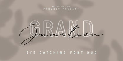 Grand Junction is a modern, elegant and stylish font duo. Grand Junction is the perfect collection of fonts for any design project that requires a light and charming feel. Use it to turn any design project into a true standout! What's include : Grand Junction Script Grand Junction Regular Grand Junction Outline Multilingual support - spread your message globally AÀÁÂÃÄÅCÇDÐEÈÉÌÍÎÏIÌÍÎÏNÑOØÒÓÔÕÖUÙÜÚÛWYÝŸÆßÞþ Encoded PUA Characters Fonts are fully accessible without additional design software. Happy designing!
 - Stateside by Studio K,
$45.00 Stateside is a bold condensed serif with a vintage feel. It has an urban and, I like to think, urbane character which puts me in mind of classic Thirties architecture like the Rockefeller Centre or the Empire State Building. I did consider calling it Rockefeller, but the family might think it a bit of a liberty, and I can’t afford to get into a copyright battle with them!
 - VG Sans by Vitaliy Gotsanyuk,
$25.00 VG Sans is a distinctive grotesque font that preserves the features of old grotesques while incorporating new conceptual solutions. Working on the font, its shape has been completely transformed, corrected, and the glyph set has been expanded. The font has a light contrast that increases with weight. VG Sans includes 5 weights, 670 glyphs, an extended Cyrillic/Latin character set, multiple stylistic sets, ligatures, numeral sets, and more.


