10,000 search results
(0.039 seconds)
- Leibix by Greater Albion Typefounders,
$9.50 Leibix, inspired by a jolly trademark of the past, is a fun family of five typefaces which transcends different eras of the past. It has elements of the 1920s in its design, but is equally at home with projects having a 1970s theme of an up to the minute modern one. Use it for eye catching cartoon captions, in posters of anywhere else a casual impact is required.
 - Gardening by Letterara,
$10.00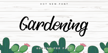 Gardening is a stylish, fun, quirky, whimsical, and incredibly distinct script font. Its friendly feel makes this font incredibly versatile, fitting a wide range of contexts. Whether you’re using it for crafting, digital designing, presentations, or greeting card making, it’s perfect! This font is PUA encoded which means you can access all of the awesome glyphs with ease! It also features a wealth of special features including ligatures.
 - Orion Radio NF by Nick's Fonts,
$10.00A 1930s ad for—believe it or not—Orion radios provided the inspiration for this ultrabold and slightly sassy face. The radio brand didn't make it into the twenty-first century, but its signature typeface has, ready and willing to add a little pizazz to your next project. This font contains the complete Latin language character set (Unicode 1252) plus support for Central European (Unicode 1250) languages as well. - Bleeding Ink by Mvmet,
$20.00 Bleeding Ink is a rough hand-drawn display font but still fun and playful in the same time. It works great for creating cool designs that scream for attention. It’s ideal for anything ranging from t-shirts, book designs, restaurant menu, blog writing, greeting cards to stickers, or anything that needs a casual touch. Fall in love with its incredibly cool style, and use it to create lovely designs!
 - Logx 20 by Fontsphere,
$12.00 LOGX-20 is a geometric, all-caps display typeface. This is the brother of the LOGX-10 font. It obviously refers to the previous one, but considering the construction it is a different typeface. LOGX-20 is designed to create elements of visual identification, various creative projects and outstanding graphics. It looks great in arrangements with different text sizes, headers, sentences and longer texts. Both on websites, print or applications.
 - Chilidog PB by Pink Broccoli,
$16.00 Looking for a real fun whack-a-doodle typestyle? You may have just found your match with the Chilidog PB typeface. Chilidog PB began as a digitization of the film typeface called Nectar by LetterGraphics. This font is filled with irregular shapes, shifting weights, and a collection of ligatures that give it real personality. It's a real eyecatcher, but don't take my word for it, give it a spin for yourself.
 - Azest by Pesotsky Victor,
$10.00 "AZEST" FONT — NEW, GROTESQUE This is a simple font, with a small number of accidental elements. The proportions are slightly stretched in width. One regular font. It can be put in interfaces or in communication materials, it will not be too active, but it will not slip into neutrality. Supports Cyrillic and some other scripts. Lowercase and uppercase characters, numbering, punctuation and diacritics, in general: all the necessary signs.
 - Scriptys by Atom,
$14.00 Scriptys is a beautiful and light handwritten font with a romantic twist. Use it to add an authentic spark to any design project. It includes 1-10 amazing alternates, which gives you the opportunity to create multiple unique designs with just this one download. It is suitable for logos, web, stationary kits, banners, greeting cards, quotes and every other design which needs an elegant touch. Have a great day! Thanks :)
 - Beach Sunshine by Mozatype,
$13.00 Beach Sunshine – Clean Version is a fresh and sweet handwritten font. A little bit quirky, this font looks incredibly adept on a wide variety of contexts. Fall in love with its incredibly versatile style and use it to create spectacular designs! This font is ideal for crafting, branding and decorate your any project. This fonts are perfect for wedding invitations or your blog. Also with their help, you can create a logo or beautiful frame for your home. Or just use for your business, book covers, stationery, marketing, magazines and more. Fall in love with its incredibly versatile style and use it to create spectacular designs! Use this font for any crafting project that requires a personalized look! What’s Included : – Works on PC & Mac – Easy to use ( Installations ) – Easy Convert to webfonts – Compatibility Windows, Apple, Linux, Cricut, Silhouette and Other cutting machines Thanks for downloading, and I hope you enjoy it!
 - Restora Neue by Nasir Udin,
$25.00 Restora Neue is an evolution of its precursor, Restora. While the Restora has an authentic imperfect letterforms, Restora Neue comes with a neater shape and higher contrast. It’s a mix of old-style roman serif styles. Its sharp and longer serif with a bit touch of medieval, makes Restora Neue a versatile type family that can be used in many different themes of design projects, from classic style to modern. It comes in nine weights from thin to black with matching italics. Its mixture of weights provide a wide range of styles that will help you find the best vibe for your projects, for headlines or a short paragraph. The set of special ligatures and stylistic alternates can be perfect mates for your brand. It is well suited for book covers, editorial, branding, advertising and more. To see the complete presentation please visit my Behance profile.
 - Crystal Sky by Set Sail Studios,
$16.00 Add a little sparkle to your designs with Crystal Sky! A clean & modern signature-style font set, perfect for creating authentic hand-lettered text quickly & easily. With exaggerated strokes and an extra bouncy baseline, Crystal Sky has an unmistakable charm; perfect for logos, wedding stationery, cards, gift designs, product packaging and handwritten quotes. ★ New Update • Crystal Sky Hearts! Add some passion to your Crystal Sky text with Crystal Sky Hearts, a new font included in your download! These bonus designs add a beautiful, flowing decorative heart at the beginning, middle & end of your Crystal Sky Script text at the click of a button. Crystal Sky is packed full of great features to give you plenty of customisation options; Crystal Sky Alt • This font includes an entire alternate lowercase glyph set. If you wanted to avoid letters looking the same each time to recreate a custom-made style, or try a different word shape, simply switch to this font for an additional layout option. Crystal Sky Caps • Have you ever noticed that script fonts tend to be a bit tricky when it comes to typing in all-caps? 'Crystal Sky Caps' includes a totally separate set of A-Z letters - designed to work in harmony with each other during those moments when you need to hit your caps-lock button and go a bit wild! ★ New! Crystal Sky Hearts • Simply install this as its own separate font, and type any a-z or A-I character in this font to generate 1 of 35 heart decorations, designed to pair beautifully with the Crystal Sky Script font. (Please see the image above for a use guide).
 - LT Staircase - 100% free

- Fartitudo by Tour De Force,
$25.00 A bit provocative, catchy and bouncy family for modern package designs, posters, labels, t-shirts etc.
 - KG Be Still & Know by Kimberly Geswein,
$5.00 Inspired by typewriter-style lettering, this font is legible and still has a bit of flair.
 - Bedaax - Personal use only

- roinert - Personal use only

- pixcoose - Personal use only

- wmxyo - Personal use only

- renvem - Personal use only

- Selectric Melt by Indian Summer Studio,
$45.00 A classical 20-th century's (1900s to 1980s) typewriter font for both text and large display usage, titles, signage... A new thicker version of Selectric (2016), as if typed using not a thin carbon ribbon but a coarse fabric one. Both are available on a different models of Selectrics. Made after rare enough samples of the same style used during 1980s in the USSR. Based on the actual letter proportions of the original typewriter Selectric (2016) (Cyrillic ball). This time not monospaced as before, but proportional. The single known so far previous typewriter vector typeface with this 'ink blotting' effect (similarly expanded serifs) as in Dodo (2008) is ITC American Typewriter (1974; by Joel Kaden and Tony Stan) and all its hand drawn analogs from 1980s (and perhaps before). Which, in turn, is resembling ATF Bulletin Typewriter's (1925, 1933; by Morris Fuller Benton) overall proportions, geometry, and even had some natural ink expands in its paper sample (but not by design, as I see it).
 - ITC Johann Sparkling by ITC,
$29.99ITC Johann Sparkling is the work of Austrian designer Viktor Solt, a perfect imitation of the handwriting of an educated person of the 18th century. ITC Johann Sparkling is intended to close the gap between highly formal copperplate scripts and the scribbled look of 'true' handwriting," says Solt. "I am not very interested in highly formal and perfect calligraphy, but rather in quick, personal-looking scripts. Usually I start with some historical samples in mind, but I do not try to copy these sources. Instead, I incorporate them into my own handwriting. It takes up to two weeks, and many sheet of paper, before the respective script becomes my own. Of course, this would not be an economic approach for individual lettering jobs, but I can conserve the custom script for future use by digitizing it." ITC Johann Sparkling should be used in fairly large point sizes and its capitals only as initials. - FS Pele by Fontsmith,
$50.00 Iconic Conjuring memories of chunky typefaces from the late-60s and early-70s, and named after the world’s greatest footballer of that and probably any other era, FS Pele is one of a set of Fontsmith fonts designed specifically for headlines and other prominent applications. “We wanted to create fonts that could be integral to the design of posters, album covers and magazines,” says Jason Smith. Welcome to FS Pele, iconic, like its namesake (though, perhaps, a little less nimble). Big Pele, little Pele There was only one Pele. But there are two sizes of FS Pele. FS Pele One, with the finer counters and details, adds considerable weight and style at large sizes, especially in big block headlines on posters. FS Pele Two’s thicker “slots” make it a better choice for smaller-sized text. A load of blocks FS Pele began as an exercise by Phil Garnham in turning squares into legible letters, via the least means necessary. The idea extended his ideas about logo-making, and the search for a stamp-like brand mark that lends authority, stability and instant identification. “The thought that the type was a 2D/3D jigsaw of slotted, architectural pieces was almost an after-thought. I wanted to create a strong, stacking, block aesthetic for the most contemporary poster design. “At the time there were a lot of designers creating their own versions of the same thing but I wanted to take the blocker forms to the next step, and infer a more legible text without sacrificing the idea.”
 - FS Pele Variable by Fontsmith,
$199.99Iconic Conjuring memories of chunky typefaces from the late-60s and early-70s, and named after the world’s greatest footballer of that and probably any other era, FS Pele is one of a set of Fontsmith fonts designed specifically for headlines and other prominent applications. “We wanted to create fonts that could be integral to the design of posters, album covers and magazines,” says Jason Smith. Welcome to FS Pele, iconic, like its namesake (though, perhaps, a little less nimble). Big Pele, little Pele There was only one Pele. But there are two sizes of FS Pele. FS Pele One, with the finer counters and details, adds considerable weight and style at large sizes, especially in big block headlines on posters. FS Pele Two’s thicker “slots” make it a better choice for smaller-sized text. A load of blocks FS Pele began as an exercise by Phil Garnham in turning squares into legible letters, via the least means necessary. The idea extended his ideas about logo-making, and the search for a stamp-like brand mark that lends authority, stability and instant identification. “The thought that the type was a 2D/3D jigsaw of slotted, architectural pieces was almost an after-thought. I wanted to create a strong, stacking, block aesthetic for the most contemporary poster design. “At the time there were a lot of designers creating their own versions of the same thing but I wanted to take the blocker forms to the next step, and infer a more legible text without sacrificing the idea.” - Duos Pro by Underware,
$50.00 Duos Pro, a script for illusionists, comes in 10 styles. Whatever style you pick: apply this speedy monolinear handwriting font in large sizes, because it is made for catching the attention. Take Duos Sharp, which comes with speedy strokes and sharp endings in light, regular and black weights. Or pick Duos Round, and its 3 styles with a softer voice and round endings. Some people call those endings “funky ball noses“, an odd but appropriate description. Round styles look more like round tip speedball lettering, but contrary to most speedball letterings they're written with a very high speed. Especially Duos Round Black is more cuddlesome than its sharper counterpart. For an even more intuitive feel, we added two more sets: Duos Brush & Duos Paint. Duos Brush combines monoline strokes with brush beginnings and endings, for that graphical, freshly lettered touch. A closer look will reveal how its brushed tails vary all the time. Duos Paint is made up out of rough & artistic painted strokes, with all its accompanying shortcomings. In contradiction to the finesses of lighter weights, Duos Paint Black scores in being the most nonchalant and impressionistic. Poésie brutale! As well as having the option to choose between (or mix) these 10 styles, Duos Pro has additional hidden functionalities. For example, every style has many alternate lettershapes and ligatures, offering various different results and lengths to display every single word. Or manually add one of the swashes for more emphasis. A bonus font, Duos Tools, includes tool icons, strokes and banners. If that ain’t enough, throw in some polysemic letters for smart, ambiguous communication if you like. Want to become a signpainter? Then be a signpainter. Always wanted to be an artist? This is your chance! Duos Pro boosts your look. Make your visual vocabulary as grandiose, dramatic, sensitive or picturesque as you want. But whatever you do, don't hesitate to apply Duos Pro “short & big”!
 - FS Neruda by Fontsmith,
$80.00 A literary font FS Neruda takes its name from Chilean poet Pablo Neruda, described as “the greatest poet of the 20th century in any language”. As such, it’s a font that references the very best literary typeface traditions. Smart, sharp and classical, FS Neruda bridges the gap between the classical and the offbeat. This font started life in the world of newspapers and books and is the perfect storytelling typeface for savvy, inquiring readers whether in printed journals, hard news, short online missives or poetry. Idiosyncratic precision FS Neruda is clear and legible in body text, while also being a space-saver fitting in more characters on each line than the typefaces that inspired it. In larger sizes it becomes a different beast – livelier, quirkier, but no less sharp. This is a truly classic typeface designed with long text setting in mind, thanks to its large x-heights, and short ascenders and descenders. FS Neruda mixes suave, sharp confidence with a sense of fragility and quirkiness. It’s knowledgeable, informative and idiosyncratic; one for readers and enquiring minds. Subtle weight modifications The construction and details of the letterforms differ across each of the five weights, with each cut separately to evoke different flavours: Thin is typewriter-like, Light is classy, Regular is canonical, Bold is robust, Black is magazine-esque. FS Neruda also boasts a radiant italic companion, a wide set of small caps, lower and uppercase ligatures, case punctuation and spacing, four sets of figures, and some ageless typographic symbols such as manicules, fleurons and teardrop crosses. Suggestive simplicity “The key to success in the current type design landscape is to design a typeface which looks conventional at text sizes but has a few small, suggestive touches visible at bigger sizes that make it distinct,” says designer Pedro Arilla. “Another thing we wanted to achieve with this typeface is simplicity.” FS Neruda is available in ten carefully crafted styles: it’s designed to work perfectly at text sizes, but still glows as a display typeface.
 - Rush by Canada Type,
$24.95Follow us to the future. It is in your face. It is fashionable. It is friendly. It is fly, far-out, funkadelic, fun. But first of all, the future is fast and full. Named after the most famous Canadian rock group of all, Rush is a typeface that wants your full attention. It is square like a bodybuilder's jaw, round like a football player's muscles, and tight like an abdomen after a thousand sit-ups. It gives you plenty of attitude. It commands your respect and lets you know that if you've been thinking of giving up on macho in this brave new world, think again. It tells you that everything has an underlying engine, that every engine hums clockwise, that adrenaline is the name of the game, and if you don't like it, get your sensitive self back to your silly scripts. Rush comes in two fully interchangeable variations: Rush One and Rush Two. While Rush Two is the somewhat predictable, determined pedal-to-the-metal contemporary brute, Rush One is sharper, smarter and more sophisticated in the way it affects a design. While Rush Two's message is a straight-forward one of strength and speed belonging in an overall design, Rush One calls attention to itself first then turns on the wonder about everything surrounding it. Expertly mixing shapes from both fonts in the same word or line can achieve just that perfect form a design needs for its message. Such flexibility and distinction in character design and degree of message relay makes Rush the perfect font package for any design that has anything to do with speed, strength, and proud pursuit of adrenaline. - Sharp End by Asritype,
$18.00 Sharp End fonts support Latin Based Languages only (see Tech Specs). Sharp End's creation is inspired by Gothic sharpness shape but only applied to the ends of normal letters. Make the font look beautiful and elegant, look as semi-serif, as calligraphic touch or others. The base of the Capital Characters is set a little bit lower than the small cases/lowercases. On small/normal size typing, the difference is less visible (obscure), but will be more visible/more clear as the typing set larger. Thus, Sharp End fonts will work well for both text and display. The fonts has also character variants. The character variations (in PUA) set in 5 stylistic sets ss01 ... ss05 (see Sharp End opentype features poster). So, these character variations will be easier accessible in more common application such as MS Words, Text Edit or the others. The glyphs may also be accessed via Character Map, Character viewer, insert character, insert symbol or other similar tools. You can use Sharp End for most of typing and design means such as: greeting, invitation, wedding and other cards; books, magazines, news, banners, logos, Pamphlets, advertising etc., for printing or digital/web display. As addition, with 3 weight variants, the regular will fit for longer text for normal use, while the bold and semi-bold is more suited for the covers, impressions, titling, Logos, design or other usage. With its smoothness curve and sharp ends, Sharp End will pairs well to most fonts of various kinds: Sans Serif, Serif, Handwritten, Scripts and others. As the example in one poster, Sharp End is paired with Astonice and Apresia Script (ornamented script font, one of the richest letter variations and ornaments). Thank you for visiting. Again, thank you very much for downloading this awesome fonts.
 - GretaDS by FontAle,
$9.00 One day, when I was walking with my daughter Greta, I stopped in front of the windowshop of a bookshop, that caught my attention, but Greta was pretty irritated, as always when it comes to books: she is dyslexic. All things written are basically a nightmare for her!So one thing came to my mind: if the great Louis Braille, with visual impairment, invented an instrument that allowed blind people to read, write and play,there had to be a tool that made it easier for dyslexics to do the same things. So, I proposed to Greta to create together a font to help her and other dyslexics. We worked on it, becoming a bit of graphic designers, inventors and guinea pigs at the same time.We brought some initial changes to the mirror letters "pq bd", based on some examples already available on the market, that improved reading times, strenghtening our willing to go ahead. That's how "GretaDS" is born, a completely new font, from the "handwritten" family, which marks a difference on the mirror letters, making them easily recognizable, as well as the lowercase couple rn (RN) which can be confused with the letter "m", not to mention the capital "I" (vowel i) indistinguishable from the lowercase "l" (L)We hope, that other graphic designers will follow its flow, modify and improve the path, and make the most of its energy, to offer dyslexics a tool that make reading as easy as drinking a glass of water.
 - Jantar Flow by CAST,
$45.00 Jantar Flow is a humanist sanserif type family tailored for continuous reading for both printing and screen. With its large x-height and low contrast it also performs very well in captions, side notes, and short paragraphs set in small sizes. Jantar Flow Italic is distinct and readable. Following a proper italic construction, it shows the fun side of the family yet keeps the features of the upright. Jantar Flow – as well as its teammate Jantar Sharp – comes in seven weights from ExtraLight to Heavy, each with accompanying italics. It has a tabular and proportional set of figures in both old style and lining options, and also a special set of hybrid figures sitting between x-height and capitals. Superscripts and subscripts are provided together with a vast collection of diacritics covering all European languages as well as a set of case-sensitive characters. Jantar, the pairing superfamily. ‘Jantar’ is an old Polish name for ‘amber’, a fossilised resin – a substance that is robust and organic at the same time. These qualities somehow reflect the feeling behind the Jantar families, ‘Flow’ and ‘Sharp’. Jantar Flow was designed along with Jantar Sharp. As part of the Jantar superfamily these two faces are perfectly paired: though not based on the same skeleton, they share the same design parameters and the same character set, but each one works independently with its peculiar features. Designed for publishing for print and web, as well as for branding, the Jantar superfamily was inspired by common font pairings of the digital age like Helvetica/Times or Verdana/Georgia. Jantar Flow and Jantar Sharp communicate with individual yet complementing voices, just like two trained acrobats can perform alone but also know well how to perform together.
 - Circe Rounded by ParaType,
$40.00 Circe Rounded is an extension for a popular Circe typeface, with rounded terminals. Bold and ExtraBold faces have two variants with different radius of the roundings. Circe Rounded is even more friendly than the original Circe. The typeface is designed by Alexandra Korolkova and Alexander Lubovenko and released by ParaType in 2015. It is known that the Circe typeface is distinguished by mild and humanist nature being formally a geometric sans-serif. However, as an experiment we decided to make it even softer: Circe now has a version with rounded terminals — Circe Rounded. Rounding is generally regarded as a mechanical operation, but in this case a lot of manual adjustment was needed because of the humanist nature and peculiarities of type design. Moreover, the two bold styles now have two options: a basic one is slightly rounded and an alternate one is fully rounded. In Circe Rounded we decided to dismiss characters with swashes that are rather inappropriate in such a rounded font, but the stylistic sets and alternate characters are remaining. Rounded terminals make an open and friendly typeface even more childish. For example, in quite large point sizes (because the x-height is still not big) it can be used as a body type in infant books. Circe Rounded, similar to Circe, has alternative forms of lowercase characters, which are called “infant” and are used in publications for children’s reading. However, a humanist basis is preserved alongside with its softness and it does not allow it to be as “plasticine” as many other rounded fonts. Two of the most obvious areas of possible application of Circe Rounded are everything for children and everything edible, especially all that is sweet and puff. However, we believe that there are other options.
 - QuickType by Wiescher Design,
$39.50 QuickType is a typeface I designed for demonstration purposes. I used it to illustrate my first book about type design. It has crooked slab serifs and looks very much like a typewriter font. But in order to make things clear I had to overdo some curves and so QuickType turned out a very distinct typewriter typeface. Since those days I worked on the shapes from time to time, so it got better and I extended it to include several neccessary cuts. Now it is a full fledged very usable font. Yours very quick Gert Wiescher.
 - Moritat by Comicraft,
$39.00 It's unpredictable! It's enigmatic! It has a winning smile and a devil-may-care personality. It can be charming and obliging and yet also elusive and impractical. It is the doer of deadly deeds, it is the dextrous hand of ELEPHANTMEN artist Justin Norman. It is swift and decisive, hesitant but packed with Talent. Ladies and... uh, More Ladies... Moritat has entered the building. Whoops, actually Moritat has LEFT the building. Moritat is the alias of Justin Norman, comic book artist and illustrator. The font is based on his pen lettering.
 - BAQ Metal by Thinkdust,
$10.00 Another font for the BAQ family, BAQ metal brings back the classically solid, sturdy form of its predecessors with a rough and ready finish. The roundness of this font doesn’t take away from its impact, but does keep it from being too harsh, while the texture creates extra legibility at smaller sizes. Really though, BAQ metal works better when it’s bigger, standing out with its coarse appearance and rotund fullness. Use it to create outstanding headlines and catch people’s attention without being aggressive, even in a variety of different languages.
 - AlbertBetenbuch by Ingrimayne Type,
$14.95 The inspiration for AlbertBetenbuch came from a typeface drawn by Albert Dürer and an interpretation of that face in Arthur Baker’s Historic Calligraphic Alphabets (Dover, 1980). It is not a recreation of either. The characteristic common to AlbertBetenbuch and the faces inspiring it is the decorative zig-zag with the upper-case letters. In late 2018 the inside of the shadowed style was separated out. It looks very much like the plain face but its spacing matches the shadowed version. It can be layered with the shadowed version to easily create two-colored letters.
 - Digideco by astroluxtype,
$20.00 Retro-futuristic robot terminal type. The 1930s Moderne Streamline decade meets the digital domain in this weird font. Use it in an ad for Ford Tri-Motor Airplane or a story about an out of control 1980s computer monster. Which? Help it find its place- as it is lost in time. Digideco is a minimal font set that includes upper and lowercase letterforms which can be used at various sizes but, we consider it a headline/display font, best applied larger than 36 points in size. Shall we play a game?
 - Tea Biscuit by Fenotype,
$39.00 Tea Biscuit is a classy upright script family with its roots in the past. It’s inspired by hand lettering of the 1950s, but finished with a modern, smooth appearance. The Tea Biscuit Family contains four weights, each of which contains more than 1200 glyphs, to fulfill the tasks of modern design challenges while retaining a customised look. Tea Biscuit is equipped with plenty of features to achieve a custom-designed look. When the Standard Ligatures function is on, the font automatically chooses different letterforms on the fly, depending on which characters appear first. For a bit of extra flavour, turn on Swash, Stylistic or Titling Alternates in any OpenType-savvy program for even more extra swirls and swashes. The Tea Biscuit family comes with a set of matching Ornaments to support your designs. In addition, Small Caps are included within the fonts: a complete set of frisky block letters that can be used on their own or to support the Script font. Enjoy!
 - Prored by Tour De Force,
$25.00 Prored is an avantgarde sans serif typeface that contains 5 weights – Light, Regular, Bold, ExtraBold and Black. It is small and compact font family with own characteristic expression, constructed to be safe choice for all kinds of typographic tasks. With specific curved endings that are adhered on baseline, Prored includes tiny note of singularity – just enough to make it’s own identity recognizable and catchy. Taller x-height gives an afterimage of a bit narrowed look, but with rational proportions and well balanced weights, 5 of them are really sufficient and capable to handle extreme typographic issues. Especially charming is Black which can be used also as display typeface in situations where elegant solutions are required in combination with stronger visibility. Beside Central Europe, Prored also contains glyphs for Turkish and Baltic languages. Highly neutral impression recommends Prored as an excellent choice for branding campaigns or new identities. Recommended for use in: branding campaigns, identities, editorial publications, packages, web design, as web font and many more.
 - Reading by Atlantic Fonts,
$26.00 Reading is fun; legible with a playful wiggle, a bit of texture, and a lively set of double-letter ligatures. Reading wants to be read aloud and sounded out - lightened by comic relief and sweetened by a bit of style. The upper case is relatively straight, the lower case - slightly jumbled, and Reading’s numbers have excellent curls.
 - Deco Redux JNL by Jeff Levine,
$29.00 A long-set aside Art Deco typeface design begun (but not completed) may or not have been from a vintage source, but its roots go well back into Art Deco lettering. Taking the existing letters and thickening their weights, removing the counters and ending up with a completely new, solid alphabet design resulted in Deco Redux JNL, which is available in both regular and oblique versions.
 - Otari by TK Type,
$25.00 Otari is vibrant and contemporary, but serious and built to last. Its character shines in display type, but doesn’t interfere at text sizes. Otari aims to capture the essence of Wellington, New Zealand in a single typeface. The contrast of a colorful art scene and the conservative colonial British aesthetic, which is still evident in the capital city, laid the groundwork for this design.


