10,000 search results
(0.026 seconds)
- Degrading Morals - Unknown license

- Copycat - Unknown license

- Bitstorm - Unknown license

- Spylord - Unknown license

- Mediaeval Caps - Unknown license

- Steepidien - Unknown license

- Gothenburg Fraktur - Personal use only

- Powell Antique - Personal use only

- Mirisch - Personal use only

- DornspitzGrotesk - 100% free

- Kahless - Unknown license

- Trebble - Unknown license

- Nervous - Unknown license

- SirQuitry - Unknown license

- Batarde - Unknown license

- Carolus - Unknown license

- Theuerdank Fraktur - Personal use only

- Melon - Unknown license

- sB Cross - Unknown license

- Butterfly Letters - 100% free

- XperimentypoThree-C-Square - Unknown license

- Phrixus - Unknown license

- Gebetbuch Fraktur - Unknown license

- Abuse - Unknown license

- Jules Text by DSType,
$40.00 Jules Text is the perfect companion to the previously released Jules family.
 - Skinny Joe by Creativemedialab,
$20.00 Inspired by Bell Bottoms pants which are trending through the disco days of the 80s Skinny Joe features a reverse contrast style with a retro and vintage look. That’s simply ideal for summer theme concepts such as posters, book covers, t-shirts, branding, logo, and many more. Consists of 5 weights from thin to bold and a variable format. Skinny Joe also has alternatives for more decorative and unique looks.
 - STROKIN by AdultHumanMale,
$15.00 STROKIN is an inky, messy, Omnicase display font. It’s part charcoal part paint strokes, reversed in lighter tones it looks like chalk, add a splash a red and it starts to look like blood. It has over 250 glyphs including all those extra pesky foreign features. OpenType coded, It has various letter pairings that interlock automatically to create a more randomized, bespoke feel to your copy. Hope you like it.
 - Portland by Fenotype,
$25.00 Made you look? There’s a peculiar feel to the letters – achieved by the reversed contrast. Perfectly legible yet there’s something about the characters that makes them stand out. As Viktor Shklovsky once coined, ”Habitualization devours objects” – the everyday world becomes invisible until we are forced to see it otherwise. The Portland font family is a tool of choice when you want to effortlessly make your designs stand out.
 - Supertall by wearecolt,
$11.00 Supertall, ultra condensed and very large. Supertall is a massive statement display font designed to command a page by filling a lot of space. Taking inspiration from hard-hitting movie titles, Supertall brings some 80s video game vibes with a modern touch. The Supertall type family features Regular and bold weights with obliques and reverse obliques for added speed and style. Features: 357 Glyphs Fractions Extensive language support.
 - Quick Remarks by Sarid Ezra,
$17.00 Quick Remarks is a reverse and modern serif that comes with stylish and noticeable contrast. With unique uppercase and lowercase, this fonts will make your presentation, poster, or logo even more stunning and stand out! You can mix and match the uppercase and lowercase for unlimited form. This font also include many beautiful ligatures. This fonts support Multi Language. Features Uppercase with unique lowercase Ligatures Number & Symbol Multi language
 - Lishbona Naskh by Vanarchiv,
$66.00 This font family is simplified Arabic which was inspired from the modern Naskh style, where the reverse contrast is low and the counter forms are open. The original design is from the Lisboa Sans typeface (Latin), published on 2005 and after some years, this multi-script family is the compromise and balance between these two different scripts. This typeface contains characters for setting Arabic, Persian and Urdu languages.
 - Alpharain by Supfonts,
$18.00 Alpharain is a modern and at the same time absolutely incredible Serif with reverse contrast. A bright font will give the mood to your project Thanks so much for checking out my shop, and please get in touch if you have any questions! Alpharain Font Features: - Full Set of standard alphabet and punctuation - Handwritten ligatures - PUA Encoded - no special software needed to access extra characters - Multilingual Characters AÁĂÂÄÀĀĄÅÃÆBCĆČÇĊDÐĎĐEÉĚÊËĖÈĒĘẼFGĞĢĠḠHĦIIJÍÎÏİÌĪĮĨJKĶLĹĽĻŁMNŃŇŅÑ OÓÔÖÒŐŌØÕŒPÞQRŔŘŖSŚŠŞȘẞTŤŢȚUÚÛÜÙŰŪŲŮŨVWẂŴẄẀXYÝŶŸỲỸZŹŽŻ aáăâäàāąåãæbcćčçċdðďđeéěêëėèēęẽfgğģġḡhħiıíîïìijīįĩjȷkķlĺľļłmnńňņñoóôöòőōøõœpþ qrŕřŗsśšşșßtťţțuúûüùűūųůũvwẃŵẅẁxyýŷÿỳỹzźžż
 - Yoga Studio by Outside the Line,
$19.00 15 poses as line drawings and the same 15 in reverse, plus the OM graphic and a lotus flower. Yoga Studio, a set of detailed yoga poses that are both useful and elegant. Tadasana, trikonasana, savasana -- from mountain pose to relaxation pose you will find what you need to put together a sun salutation vinyasa, basic instructions for beginning students or a visual guideline for your own personal practice.
 - Mormont by Letterhend,
$17.00 Mormont is a reverse display font with classic looks. This type of font perfectly made to be applied especially in storybook children or child theme which is need a standout font, and the other various formal forms such as invitations, labels, logos, magazines, books, greeting / wedding cards, packaging, fashion, make up, stationery, novels, labels or any type of advertising purpose. Features : Uppercase & lowercase Numbers and punctuation Alternates & Ligatures Multilingual PUA encoded
 - Hatchira by Maulana Creative,
$13.00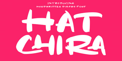 Hatchira is a Japan vibes handwritten display font. With reverse contrast stroke, fun character. To give you an extra creative work. Hatchira font support multilingual more than 100+ language. This font is good for logo design, Social media, Movie Titles, Books Titles, a short text even a long text letter and good for your secondary text font with sans or serif. Make a stunning work with Hatchira font. Cheers, Maulana Creative
 - Cabrito Inverto by insigne,
$- Life’s always more fun when you reverse the stress. The same goes for the new member of the Cabrito family. Cabrito itself is a recently developed slab serif made for the kid’s book The Clothes Letters Wear. Cabrito proved to be more popular than I thought, and I promised I would create an inverted style for this new addition to the font world--a variant that would pair well with the original or even stand well on its own. And so now, here it is. Cabrito Inverto, which features the reversed stress of the strokes from a font’s “normal” traits. Inverted stress fonts are most often associated with cowboys and the Old West. The inverted stress gives it a happy-go-lucky appearance, not to be taken too seriously. It’s a pleasantly rounded, not-so-strictly geometric typeface with handwriting-inspired forms. Whew, that’s a mouthful! Inverto’s bundle of alternates is accessible in any OpenType-enabled program. It contains a workforce of alternates, swashes, and alternate titling caps to embellish the font. Also bundled are swash alternates, aged design and style figures, and compact caps. Peruse the PDF brochure to examine out these solutions in action. OpenType-enabled purposes such as Adobe suite or Quark will allow ligatures and alternates. This font family also includes the glyphs for 72 different languages. Cabrito Inverto does pair well with Cabrito. There is even an extra font weight, Black, for when you want to punch it up a bit. Jeremy Dooley designed Inverto to be a welcoming, day-to-day font family. Use it to express friendliness on just about anything, from candy to food to children’s toys. Cabrito Inverto’s one-of-a-kind visual appearance brings a bundle of fun to the party. Buy Cabrito Inverto to give a boost to your designs every day of the week.
 - Reina Neue by Lián Types,
$29.00 Hey! See Reina Neue in action here! INTRODUCTION When I designed the first Reina¹ circa 2010, I was at the dawn of my career as a type designer. The S{o}TA, short for the Society of Typographic Aficionados, described it as complex display typeface incorporating hairline flourishes to a nicely heavy romantic letterform². And it was like that; that’s what I was pursuing at that time since I was very passionate about ornaments and accolades of Calligraphy. Why? I felt that Typography, in general, needed more of them. These subtle flourishes could breathe life into letters. Maybe, I thought it was the only way I could propose something new into the field of type. However, after some years, I came across a very interesting quote: –Beautiful things don’t ask for attention– Wow! What did this mean? How could something be attractive if it’s not actually showing it. Could this be applied to my work? Sure. I think every type-designer goes through this process (aka crisis) regarding his or her career. At the beginning we love everything. We are kind of blind, we only see the big picture of a project. And that’s not because we are lazy. We actually can’t see the small mistakes nor the subtleties that make something simpler beautiful. We are not able. But, the small subtleties… They are actually everything: With experience, one puts more attention into the details and learns that every single decision in type has to be first meticulously planned. Here I am now, introducing a new Reina, because I felt there was a lot of it that could be improved, also the novelty of Variable Fonts caught my attention and I had to take that to my type library. THE FONT A thing of beauty is a joy forever Now, a decade later, I’m presenting Reina Neue. This font is not just an update of its predecessor: –A thing of beauty is a joy forever– is the first line of the poem ‘Endymion’ by John Keats, and despite the meaning of “beauty” may vary from person to person, and even from time to time (as read in the last paragraph), with Reina I always wanted to bring joy to the eye. In 2010, and now, in 2020. I believe the font is today much better in every aspect. It was entirely re-designed: Its shapes and morphology in general are much more clean and pure. The range of uses for it is now wider: While the old Reina consisted in just one weight, Reina Neue was converted into a big family of many weights, even with italics, smallcaps and layered styles. The idea behind the font, this kind of enveloping atmosphere made out of flourishes, is still here in the new Reina. This time easier to get amazing results due to the big amount of available alternates per glyph and also more loyal from a systemic point of view. However, and as read in the introduction -Beautiful things don’t ask for attention-, if none of the flourishes are activated the font will look very attractive anyway. Reina Neue is ready to be used in book covers, magazines, wedding cards, dazzling posters, storefronts, clothing, perfumes, wine labels and logos of all kind. Like it happened with the previous Reina, I hope this new font satisfies every design project around the world if used, and can be a joy forever. SOME INSTRUCTIONS Before choosing the right style for your project, hear my advice: -Reina Neue Display was meant to be used at big sizes. If you plan to print the font smaller than 72pt, I suggest using Reina Neue, not Display. Otherwise, if the font will be BIG or used on a digital platform, Reina Neue Display should be your choice. For even smaller sizes, use Reina Neue Small. This style was tested and printed in 12pt with nice results. (Note for variable fonts: Print them in outlines) -Reina Italic is not a slanted version of the roman, and this means some flourishes are different between each other. The Italic version has other kind of swirls. More conservative, in general. -All the styles of Reina Capitals have Small Capitals inside. -Reina Capitals Shine should be used/paired ONLY with Reina Capitals Black. The engraved feeling can be achieved if Reina Capitals Black and Reina Capitals Shine are used as layers, with the same word. Variable fonts instructions: -For more playful versions, choose Reina Neue VF, Reina Neue Italic VF or Reina Neue Capitals VF: With them you can adjust between 3 axes: Weight (will change the weight of the font) – Optic Size (will thicken/lighten the thin strokes and open/close the tracking) – Accolades (will modify the weight of the active flourishes). SOME VIDEOS OF REINA NEUE VF https://youtu.be/8cImmT5bpQM https://youtu.be/1icWfPmKAkg https://youtu.be/YC9GkJDL1a8 NOTES 1. The original Reina, from a decade ago: https://www.myfonts.com/fonts/argentina-lian-types/reina/ 2. In 2011, Reina received an honourable mention by S{o}TA. “Great skill is shown in the detailing, and an excellent feel for the correct flow of curves and displacement of stroke weight.” https://www.typesociety.org/catalyst/2011/ Reina was featured in the “Most Popular Fonts of the year” in MyFonts in 2011 https://www.myfonts.com/newsletters/sp/201201.html In 2012, the font was also selected in Tipos Latinos, the most prestigious competition of type in Latinoamerica. https://www.tiposlatinos.com/bienales/quinta-bienal-tl2012/resultados Also, chose as a “Favorite font of the year” in Typographica. https://typographica.org/typeface-reviews/reina/
 - Chilly Medium - Personal use only

- Nova SOLID - Personal use only

- Sweetheart Script - Personal use only


