10,000 search results
(0.147 seconds)
- HWT Unit Gothic by Hamilton Wood Type Collection,
$39.95 The Unit Gothic series was released by Hamilton Manufacturing Co. in 1907. This sans serif family features one of the first multi width/weight type 'systems' anticipating the Univers font system by 50 years. This set of 7 fonts was designed to aid in press room efficiency and with its incremental variation in widths gave poster printers unprecedented flexibility in fitting copy while using consistently harmonious fonts. This HWT release is the first ever digital version of these fonts. Each font contains 600 glyphs including Greek and Cyrillic character sets as well as alternate characters which are based on the actual special character production patterns from the Hamilton Wood Type Museum collection. HWT Unit Gothic system features: •HWT Unit Gothic 716 - 50% wider •HWT Unit Gothic 717 - 25% wider •HWT Unit Gothic 718 - (Standard width which others are based on) •HWT Unit Gothic 719 - 25% narrower •HWT Unit Gothic 720 - 50% narrower •HWT Unit Gothic 721 - 62.5% narrower •HWT Unit Gothic 722 - 75% narrower
 - Churchward Newstype by BluHead Studio,
$20.00 Originally released in 2008, Churchward Newstype is a workhorse text family, designed by the late Joseph Churchward back in the early 2000’s. If you’re familiar with Churchward’s typefaces, you might know that he always brought a little something quirky to his designs. Churchward Newstype doesn’t disappoint. The exaggerated concave serifs make a statement that is subtle, yet gives the typeface a unique flavor. The proportions and scale of the letters lend themselves to very good legibility in text applications, and the Bold weights are strong enough for headlines. Churchward Newstype is good for text copy, and headlines, and at giant point sizes, great for adding emphasis to posters! The Churchward Newstype family has four weights, Light to Bold, with 13 degree slanted italics. Each font has a second set of tabular figures. In this updated release, each weight now has an extended character set that supports most Western and Eastern European languages.
 - Dancin' Pixel by LomoHiber,
$19.00 Why is this typeface 'Dancin'? Because It consists of 3 styles each represents one frame of animation. And you can easily create a nice pixel typography animation using Dancin' Pixel. Animation preview: https://www.behance.net/gallery/85743031/Dancin-Pixel-animated-typeface How to make the animation and add a sharp corner stroke in Photoshop: https://youtu.be/ZbVFzvXwqkw If you are not interested in making animation, you can also use Dancin' Pixel as a regular font. I combined hand-drawn bold letters with pixel style, and it perfectly fits for stylish pixel game headers, prints, posters, websites, and anything connected with pixel art. The Frame Three is great for glitched pixel designs, it has distorted shapes. Dancin' Pixel Features: Pixelated letterforms 3 Styles each representing one frame of animation 3rd and 2nd frame may be used as glitched pixel typeface Wide language support (Western European, Central European South Eastern European) If you have some issues, questions, please let me know: lhfonts@gmail.com Hope you'll enjoy using Dancin' Pixel!
 - FingerSpeller BF by Bomparte's Fonts,
$40.00 Many years ago I studied American Sign Language in an effort to better communicate with some friends of mine within the deaf community. I found ASL to be a beautifully expressive language from a vibrant and active culture. Out of that attempt came this stylized depiction of the manual alphabet used in finger-spelling. Until recently it had only existed in analog form, born of pen and ink on paper. So now I'm glad to say it’s turned digital. Typing a period (.) will reveal the sign for “I Love You” (a combination of the letters I, L and Y), which fits nicely within the shape of a heart. Holding down the shift key while again typing period (greater symbol) will reveal the heart in its filled-in form, which can serve as an underlay. Use these in an application that supports layering in order to create different color combinations. There’s a stylistic alternate letter “S” and an “OO” ligature which can be accessed in OpenType-savvy apps.
 - Andron 2 EIR Corpus by SIAS,
$34.90 SIAS opens a new chapter in Irish vernacular typography: the Andron-2-Irish font family. The genes of the insular typographic heritage have been blended with the timeless classical style of the versatile Andron series. Whereas most Irish-style fonts available more or less stick to ancient designs, Andron-2-EIR is different: it’s an entirely new design in which Irishness meets the beauty of a matured Venetian Roman text face. Envision a new horizon for setting Irish text in its own visual mode! Now you can utilize Italics, Semibold and Small capitals for Irish just as you have been doing in other languages for a long time. But the icing on the cake is the fifth font: Andron Irish Middlecase honours the rich medieval tradition of Ireland by a special uncial-style glyph set. It corresponds to the Andron MC series. Last but not least the Irish type connoisseur will relish this font package for it’s unique utilization of Opentype functionality. In Opentype-aware applications, by just ticking a box you can switch to the special insular forms of s and r. By ticking another box you can transform the text from modern-day orthography to the traditional spelling with lenited consonants. This built-in intelligence has never been implemented in any Irish font before. Briefly, the Opentype substitution features are: [Ligatures] – default basic f-ligatures; [Descretionary Ligatures] – more ligatures for typographic reason, mainly t- and long-s-combinations; [Style set 1] – turns all lowercase r and s into their insular glyph variants; [Style set 2] – replaces all consonant-h digraphs by dotted consonants (ḃċḋḟġṁṗṡẛṫ, ḂĊḊḞĠṀṖṠṪ), works for lowercase, uppercase and upper-lowercase alike; [Style set 3] – provides another range of additional special ligatures (for Regular and Italic only); [Oldstyle figures] – turns the default lining figures into proportional oldstyle figures. Andron Irish will also perfectly combine with every other Andron product in mixed settings. For an overview please go to the SIAS main page. For a quick reference go to Andron Latin, Andron Greek, Andron English or Andron MC. For more wonderful new Irish fonts look at Hibernica and Ardagh!
 - Glypster by Ardyanatypes,
$15.00 Glypster - Bold Aesthetic Serif Fonts is a font that has boldness in every line. This font's robust and bold style conveys a luxurious, elegant, retro, and aggressive feel. The serenity afforded by this font's blend of boldness and subtlety makes Glypster suitable for a wide variety of design choices. Apart from that, the strengths of Glypster are its ability to support multiple languages and additional features that can add interest to every design you make. In terms of marketing, Glypster is very suitable for purposes such as logos, posters, business cards, and many more, so you can explore the potential of this font for various designs. Glypster's simplicity, but still elegant and luxurious, makes it the right choice for all procedures.
 - Migoove by Twinletter,
$14.00 Migoove is a script font that is attractive and has powerful characteristics in every letter. You will find it easy in your work since this font will beautify your every project. There are many different options in this font, making it simpler for you to create a blend for your creative requirements. Let’s get started using this typeface to complete the job. Not only that, but this font has a genuine handwritten feel to it, which has been developed to create a portion and composition that matches your demands. As a result, this typeface is appropriate for craft projects, children’s writing, adventure posters, food banner titles, wedding invitations, product packaging logos, quotations, social networking page covers, and furniture banners, headlines, book covers, and much more.
 - Afrobeat by Resistenza,
$39.00 Inspiration The pounding tribal rhythms of Afrobeat music is expressed through this psychedelic brand new font, Afrobeat. Every letter becomes art as every letter is elegantly placed side by side, like music notes, creating music for the eyes. Afrobeat is a musical style performed by many African artists such as Fela Kuti, Femi Kuti, Antibalas and many more, which is a fusion of jazz,funk, and psychedelic rock, originating from the 60s and was based on the political movements of Nigeria. The Font This font is perfect for when you want to use eye-catching big texts for anything from posters and flyers for concerts, events, parties, to CD covers, advertisements, and art, but it’s especially striking for printed projects. Check out also ‘Afrobeat light’
 - Giallo Rossa by Remedy667,
$18.00 Step into the chilling world of 70s Italian horror with Giallo Rossa, a giallo inspired typeface. This macabre creation captures the essence of classic Italian giallo films, evoking a sense of foreboding and terror in every letter. With its sharp edges and jagged lines, Giallo Rossa has an unsettling energy that will leave you mesmerized. Immerse yourself in a typographic nightmare as you unleash the power of Giallo Rossa. Its letters embody the twisted beauty of giallo cinema – every curve reminiscent of a shadowy figure lurking in the dark corners. No matter what you’re designing, Giallo Rossa is your perfect accomplice. This horrifying typeface will set your creations apart from the mundane. Beware though: once you delve into Giallo Rossa‘s sinister embrace, there’s no turning back!
 - LOVE-BOX - Personal use only

- Indulta SemiSerif - Personal use only

- Monserga FFP - Personal use only

- Disoluta - Personal use only

- Lucemita - Personal use only

- Snare by In-House International,
$5.00 A typeface that celebrates marching to the beat of your own drum. Snare is a jazzy little display type that presents like a stencil but behaves in its own way.Featuring angled section breaks and variable heights, Snare keeps each character’s footprint steady as as its heights change, revealing unique crossbars, periscoping capitals and deep-sinking descenders. Because each character follows its own rules, the more each word grows, the more it shows the beautiful rhythm of variety. Or stretch individual characters to shape the contours of your words. Beyond just being playful, fun to dress in colors, and delightfully useful for tight spaces,Snare’s lanky verticals and nervous energy reflect the time it was created. In this second pandemic spring, Snare brings up the drumroll-expectant heartbeat of our uncertainty, and the wish that when we can all meet again, our newfound weirdnesses will find a home in the world. The Snare font family includes one uppercase alphabet with two lowercase variants and comes in ten standard weights-which-are-just-really-heights (.otf) and as a variable type(.ttf) for designers using compatible platforms. Snare was designed by Alexander Wright and In-House International and developed byRodrigo Fuenzalida at FragType. In-House International’s foundry was launched in the summer of 2020 to offer bold, experimental, display typefaces that tell a story. Our previous releases have been featured on Design Milk, DesignBoom, Slanted and all sorts of exciting places.
 - Soho by Monotype,
$29.99 Soho is the latest addition to the growing range of typefaces from Sebastian Lester. This grand opus of a project resulted in a typeface that comprises nine weights and five widths of precision engineered OpenType. 40 fonts, 32,668 characters and 24 OpenType features. Hot on the heels of the popular Neo Sans and Neo Tech range, and his first typeface release Scene, Soho represents three years of work by Lester. As a type designer I'm preoccupied with finding ways in which I can address modern problems like good legibility in modern media, and create fonts that work precisely and efficiently in the most technically demanding of corporate and publishing environments." Slab serif typefaces are enjoying something of a renaissance, offering versatility whether for corporate identity, product branding, text or display use. With 40 weights to choose from Soho gives designers endless possibilities from the ultra chic lines conveyed by the lighter weights to the rock solid statement made by the heavier weights. Soho is cross-platform compatible. The Pro version provides extended language support for Central European languages. Used in conjunction with software applications that support OpenType many useful features like "stylistic sets" can be leveraged -- in which a wide variety of alternative characters can be introduced at the click of a mouse button giving one font several "tones of voice" from conservative to cutting edge. The wide range of glyphs includes ligatures and small caps."
 - Tripper Pro by Underware,
$50.00 Tripper is a rock-hard display font family. The six styles – from Light to Black – of this robust stencil typeface will assure your text grabs all the attention it can get. Instead of settings large amount of texts, just use this font for a small amount of words. Or even better: just one word. But most importantly: make it really, really, really big. The lightest weight is pretty condensed, and slowly expands when the weight increases. The bridges – essential to a stencil font – have the same width across all styles, so you can safely apply all styles in the same size without the risk of stencils falling apart. Due to the absence of curves throughout the whole family, Tripper is suitable for more limited, industrial applications too. Tripper comes in several flavours. Next to the basic flavour, there is a stencil family which automatically creates borders around every letter, word or line. Then there is Tripper Rough, a textured version with that intelligent random, grungy look. Together with the previously released multi-colour font Tripper Tricolor, the complete family consists of 24 styles. Tripper is equipped with a bunch of OpenType features, like different figure styles, fractions, superiors, etc. But if all the OpenType ding-dong is not enough for you, just try the ornaments. The separate ornament font comes with icons, indicators, manicules, banderoles and patterns.
 - Deberny by Typorium,
$15.00 The Deberny typeface is an interpretation–carrying a contemporary imprint–of a typographic style which appeared and spread at the end of the 19th century until the begining of the 20th. These typefaces were named Italian, Venetian, Veronese and were classified in the Hellenic category, a spontaneous typographic movement caracterized by triangular and heavy serifs. They found their inspiration among numerous references, from incised to slab serif typefaces and their extreme expressions in wood type letterforms. The Deberny font family is made of 26 styles in 3 complementary sets of style, offering a wide palette of visual resonance: • Deberny Line is ideally suited for editorial, branding, posters and billboards. It has sharp contrast between thick and thin strokes. Heavy horizontal strokes are not frequent in roman letters, but here they fit naturally with the italic letters. • Deberny Open is a stylish outline declination of Deberny Line Medium and Medium Italic. • Deberny Text is an adaptation of Deberny Line made for broader use. Its shapes are less contrasted, which makes it perfectly legible for print or screen reading in small size text. Old style figures and small caps complete Deberny Text in all its 8 styles. The Deberny typeface family supports Latin-based languages and will be available soon in Cyrillic and Greek. Deberny Narrow will be released this year in all its 26 styles.
 - Weiss Rundgotisch by Linotype,
$67.99The German designer Emil Rudolf Weiss originally created Weiss Rundgotisch for the Bauer typefoundry in 1937. In their catalog for the typeface, Bauer began with this quote from Leonhard Wagner: The round gothic (rundgotisch) script is the most beautiful kind of script; she is called the mother and the queen of all the rest." While designing Weiss Rundgotisch, Weiss was inspired by Renaissance types cut by the Augsberg printer Erhard Ratdolt. Ratdolt had spent some time in Venice, which is most likely where he became familiar with round gothic letters. This sort of letterform was never as popular in Germany as Fraktur or Gotisch may have been, but round gothic types were used there for centuries to represent arts and craft feelings, as well as old-fashioned handwork. For a blackletter typeface, Weiss Rundgotisch is very similar to normal serif and sans serif designs, especially its uppercase letters, which seem to have some uncial influence in them as well. Therefore, Weiss Rundgotisch is more legible for contemporary readers, making this an excellent choice for anyone looking to set text, logos, or headlines with in blackletter. Weiss Rundgotisch was apparently quite a difficult typeface to design, even for a master designer like Weiss. He began work on the face in 1915; Weiss Rundgotisch's development took over 20 years to complete." - X Ruffian by ThoroughBR&,
$9.00 X RUFFIAN Ruffian was a champion thoroughbred horse who won 10 consecutive races. A feat worth mentioning & repeating. Her tenacity & steadfast approach established the basis for this variable based font. The X represents both the Roman numeral 10, but also the X-factor for creating bespoke works of art. It is quite befitting that this font be named after a legendary champion. Which begs the question...Do you champion variety? X Ruffian's design motif uses a broad tipped chiseled marker that was set at an angle for that extra bit of vigor. Identical letter forms defeat that truly "hand rendered" look that we ultimately strive for. Each uppercase letter offers 10 (X) or more stylistic alternatives, the lowercase and number sets have 3+ options and an over under for those special characters that yield a long bottom or top (see images). Ligatures & bonus characters can add that unique offering to your already individual style & can easily be found via the glyphs panel in any open type program. With a gigantic glyph count of 688, you'll never run out of options. As a right of passage, we felt obliged to include a roman numeral set as the name beckons, which differs from the standard letter form in which you would use to create. This is a variable winner. See you at the races!
 - Sashay Script by Ivan Angelic,
$19.99 Sashay Script is an elegant yet friendly script font. It is a rich smooth voice that gives an immediate human connection to any design. Do you need to display: speech; thought; emotions; desires…Sashay Script says it all in a clear legible script. It struts down the runway with panache, accompanied by: 13 Icons, 42 Ligatures and 21 Alternates. Although it is clearly a font that represents handwriting, it is very versatile and usable in that it is: easy to read; has good flow and looks great in both paragraph form or as a standalone word or line. As a bonus, since each and every letter was crafted from the ground up, Sashay Script can be used at larger sizes without losing any of its elegance as its edging is well groomed, without the raw edges that can be the terror of handwritten fonts at larger sizes. Sashay Arrows & Underlines was designed to match with Sashay Script. Often a font such as Sashay is used descriptively and the flow and line-weight of the 68 arrows and underlines match Sashay Script in look and feel. Please take a look at the gallery posters that show both Sashay Script and Sashay Arrows & Underlines, in use. We just know you'll have a perfect project for this little model of a font 'Sashaying' down the font runway.
 - Metro Office by Linotype,
$50.99The Metro Office family is designed after the model of the original sans serif family – Metro No.1 – produced by W.A. Dwiggins and Mergenthaler Linotype’s design studio during the late 1920s and 1930s. A distinctly new interpretation of the sans serif idea, Metro was a thoroughly “American” sans serif when it was released. However, over the ensuing decades, it became a favorite the world over. Moreover, it is one of the first “humanist” sans serif typefaces designed. While redesigning Metro in 2006, Linotype’s Type Director Akira Kobayashi drew from his own knowledge of humanistic letterforms. The result is a redefined Metro; a typeface that is finally ready for heavy text setting. The original Linotype Metro No.1 never had italic variants. Kobayashi has created oblique variants, extending its use in document setting. A double-storey a and g, as well as a wider w were features of Dwiggins’ original Metro design that were filtered out by Mergenthaler Linotype in the 1930s. Kobayashi remedied this historical slight, retooling Dwiggins’ original forms and optimizing their legibility. Kobayashi has additionally retooled some of Metro’s more troublesome letters, which has black elements that became too dense. By opening up the troublesome joins (like that on the Q), Kobayashi has given his new Metro a more even color in text, improving its legibility while retaining its original spirit. - Altheria by Ardyanatypes,
$23.00 Altheria Font is a script font with an exquisite handwriting style. Designed with meticulous attention to detail, Altheria offers various alternate characters that allow you to create unique, captivating, and embellishing letterforms in your designs. With its diverse character collection, Altheria provides numerous options to add a personal touch to your design works. The ability to choose from different letter variations grants unlimited flexibility and creativity, making it perfect for crafting attractive and distinctive visuals. One of Altheria's main features is its abundance of ligatures, which enhance the font's appeal and aesthetic quality. Ligatures are specially designed character combinations that produce a smoother, more harmonious impression in writing. Thus, Altheria offers not only beautiful letter shapes but also provides exceptional visual balance among interconnected characters. Furthermore, Altheria supports multiple languages, allowing you to utilize this font in various multilingual projects. This makes it an incredibly versatile option for design purposes that aspire to exude a luxurious and elegant impression. Altheria is highly suitable for a wide range of design projects, including but not limited to book covers, fashion magazines, business cards, wedding invitations, and much more. The font imparts a unique luxury and elegant appeal to every applied design. With Altheria, you can create attention-grabbing works that elevate the aesthetic value of each design project you undertake.
 - Visitor BRK Ten Pro by CheapProFonts,
$10.00 This is the first true pixel-font released by CheapProFonts. It may not be the first font based on a 5x5 pixel grid, but it probably has the best language support. The glyphs have all been optimized for Flash (by making the pixel shapes slightly overlapping) and should render sharp and perfect when set in 10px size (or multitudes of 10). As with all pixelfonts: make sure to place the text at coordinates with whole numbers, and always use left (and NEVER centered) alignment. ALL fonts from CheapProFonts have very extensive language support: They contain some unusual diacritic letters (some of which are contained in the Latin Extended-B Unicode block) supporting: Cornish, Filipino (Tagalog), Guarani, Luxembourgian, Malagasy, Romanian, Ulithian and Welsh. They also contain all glyphs in the Latin Extended-A Unicode block (which among others cover the Central European and Baltic areas) supporting: Afrikaans, Belarusian (Lacinka), Bosnian, Catalan, Chichewa, Croatian, Czech, Dutch, Esperanto, Greenlandic, Hungarian, Kashubian, Kurdish (Kurmanji), Latvian, Lithuanian, Maltese, Maori, Polish, Saami (Inari), Saami (North), Serbian (latin), Slovak(ian), Slovene, Sorbian (Lower), Sorbian (Upper), Turkish and Turkmen. And they of course contain all the usual "western" glyphs supporting: Albanian, Basque, Breton, Chamorro, Danish, Estonian, Faroese, Finnish, French, Frisian, Galican, German, Icelandic, Indonesian, Irish (Gaelic), Italian, Northern Sotho, Norwegian, Occitan, Portuguese, Rhaeto-Romance, Sami (Lule), Sami (South), Scots (Gaelic), Spanish, Swedish, Tswana, Walloon and Yapese.
 - AW Conqueror Std Sans by Typofonderie,
$59.00 AW Conqueror Sans was born out of this desire to fuse geometric and humanistic sans. It remains a typeface fundamentally influenced by both Bauhaus spirit — with its simplified geometric forms — and Jan Tschichold’s attempts to link this modular spirit to Eric Gill’s humanist sans serif. AW Conqueror Sans is a claimed French synthesis of Germanic Modernism and English classical tradition. Spheres of influence The core set of capitals are based on the proportions of the Roman capitals like Futura, Erbar, Nobel, Johnston, Gill Sans. During the 1930s, the Futura was a true success. Since then, Monotype offered a geometric version of the Gill Sans, and Linotype added Futura-like variants to WA Dwiggins’ Metro. AW Conqueror Sans is kind of a “fusion” of this approach. The lower case “b, d, p, q” are also directly influenced by Eric Gill’s, while the “y” is influenced by some of Jan Tschichold’s alphabets. In italics, drawn narrower, AW Conqueror Sans reinterprets Gill’s idea: a rigorous italic like a roman but which sometimes reveals some aspects of a Renaissance italic. AW Conqueror Sans and its extensions AW Conqueror Sans is the initial reference point for an extended family, including AW Conqueror Inline, Slab, Carved, Didot. The potential of these mixed families is powerful. Because AW Conqueror typefaces are based on an identical structure, and compatible proportions.
 - Nomadic Dreams by Shakira Studio,
$19.00 Nomadic Dreams: Modern Serif Elegance with Infinite Possibilities Nomadic Dreams is meticulously crafted with sleek, well-defined letterforms that convey a contemporary charm. The serifs are thoughtfully designed to bring a touch of class and readability to every character, making it suitable for a variety of design applications. What sets Nomadic Dreams apart is its diverse range of alternates and ligatures. These design elements offer a playground for creativity, allowing you to customize and tailor your text to evoke different moods and styles. Whether you're looking for a classic look or something more whimsical, Nomadic Dreams provides the tools to bring your vision to life. This font is not just a static typeface; it's a dynamic expression of your design narrative. Nomadic Dreams is perfect for editorial design, branding, invitations, or any project where the seamless integration of modernity and classic elegance is paramount. Here's what you get: Regular & Italic All Multilingual symbol Opentype features ( ligature, alternate ) Accessible in the Adobe Illustrator, Adobe Photoshop, Adobe InDesign, even work on Microsoft Word. PUA Encoded Characters - Fully accessible without additional design software. Multilingual character supports : (Afrikaans, Albanian, Catalan, Croatian, Czech, Danish, Dutch, English, Estonian, Finnish, French, German, Hungarian, Icelandic, Italian, Lithuanian, Maltese, Norwegian, Polish, Portuguese, Slovenian, Spanish, Swedish, Turkish, Zulu) Follow my shop for upcoming updates, and for more of my work, Thank you!
 - Tuesday - Unknown license

- Sallsa by AEN Creative Studio,
$12.00 Sallsa is a sweet and delicate handwritten font. It looks stunning on wedding invitations, thank you cards, quotes, greeting cards, logos, business cards and every other design which needs a handwritten touch. This font is PUA encoded which means you can access all of the glyphs and swashes with ease!
 - Vintage Rotter by Din Studio,
$29.00 Vintage Rotter is monoline script font. Made for any professional project branding. It is the best for branding, printing, wedding and quotes. Every letter has a unique and beautiful touch. Features: Alternates Standar Ligature PUA Encoded Multilingual Support Numerals and Punctuation Thank you for downloading premium fonts from Din Studio
 - Gledek by Differentialtype,
$10.00 Gledek is a lightning display font that comes in two styles. The regular and outline styles complement each other perfectly for any purpose such as logos, sports, games, club branding, posters, labels, comic books and more. Add this font to every project you create to make it brighter and stand out.
 - Film Noir JNL by Jeff Levine,
$29.00Film Noir JNL is a classic Art Deco Alphabet from the brush of the late master sign painter Alf R. Becker, and appeared in Signs of the Times Magazine. Thanks to Tod Swormstedt of ST Media and the American Sign Museum for providing the reference material to make this font. - Love Aster by Nahda Creative,
$16.00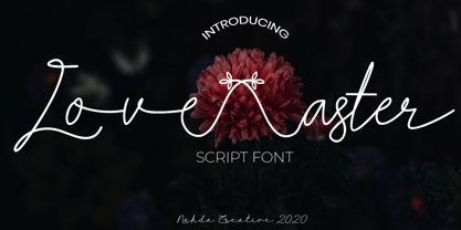 Love aster is a sweet and friendly script font. It looks lovely on wedding invitations, signature, thank you cards, quotes, greeting cards, business cards and every other design which needs a handwritten touch. This font is PUA encoded which means you can access all of the glyphs and swashes with ease!
 - Angela Cute by Sipanji21,
$16.00 Angela is a Cute and charm script font with a relaxed theme, featuring a lovely style. No matter the topic, but this font is awesome for every kids or child project, this font will be an incredibly asset to your fonts’ library, as it has the potential to elevate any creation.
 - Only You Sexy Icons by LeType,
$19.90 The Icons developed to the font Only You Sexy make reference to hipsters concept a recurring nostalgia and a recovery of an almost forgotten romanticism. Bring all that romance back. Bring the sensuality in your works and projects. The font has more than 300 icons. Also available Only You Sexy.
 - Lord Mayor by Solotype,
$19.95We know very little about this font. A printer in Lisbon had it, but said it came from England. Nicolette Gray shows it in her Nineteenth Century Ornamented Type Faces as Lord Mayor from the British Typefoundry. We never got the complete font, but drawing the missing letters was not difficult. - Hardiness by Beary,
$14.00 Hardiness is an amazing hand lettered font. Every single letter have been carefully crafted to make your text looks beautiful. This font is suitable for invitations, branding, advertising, classic design, poster design, and more. This font is PUA encoded so you can access extras from character map in most design software.
 - Hello Dove by Beary,
$14.00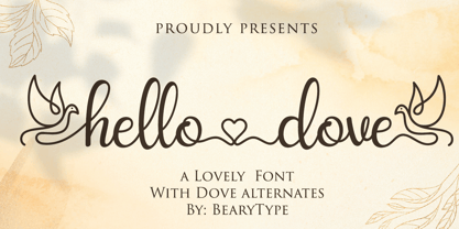 Hello Dove is a sweet and angelic handwritten font. It looks lovely on wedding invitations, thank you cards, quotes, greeting cards, logos, business cards and every other design which needs a handwritten touch. This font is PUA encoded which means you can access all of the glyphs and swashes with ease!
 - Airone by Cititype,
$17.00 Airone is an authentic & organic hand-drawn script font . Every single letter has been carefully crafted to make your design look natural. This style is perfect for branding, photography, watermark, quotes, blog header, poster, wedding, Airone Featuring ligatures and alternates, Supports Western European, Central/Eastern European, Baltic, Turkish, Romanian Language.
 - Amtera by Prioritype,
$15.00 Handwritten font with an elegant and minimalist impression are ready to accompany your project. Can be applied to business cards, social media posts, branding, wedding invitations, logos, photographer watermarks, food packaging, beauty products, crafts and many more. See some examples the preview above for reference. Features: -Uppercase -Lowercase -Numeral -Punctuation -Multilingual
 - Ussr by Indian Summer Studio,
$20.00 The main 20-th century handwritten display font in the USSR, usually performed with a flat brush or a wide poster pen for all kinds of signage during 1920-1990s. It had also many analogues in other countries, but never was that popular as in the Soviet Union, used everywhere.


