10,000 search results
(0.033 seconds)
- Ramose by Kulokale,
$19.00 Ramose is a experimental display serif font. Ramose is well-suited for advertising, branding, logotypes, packaging, titles, headlines and editorial design. This font comes in two styles, Regular and Oblique Version. This font is encoded with Unicode PUA, which allows full access to all additional characters without having special design software. Mac users can use Font Book, and Windows users can use Character Map to view and copy one of the extra characters to paste into your favorite text editor / application. We highly recommend using a program that supports OpenType features and Glyphs panels such as Adobe Illustrator, Adobe Photoshop CC, Adobe InDesign, or CorelDraw, so you can see and access all Glyph variations. We hope you enjoy the font. Thanks and have fun!
 - British Castilla by Ergibi Studio,
$19.00 British Castilla Luxury Font Duo, these fonts are of two types serif and script. This typeface has been made carefully to make sure its premium quality and luxury feel. The ligatures on serif makes this typeface unique and stands out rather than the regular serif font, perfectly for headlines, logos, posters, packaging, T-shirts,coffee shops, restaurants, magazine’s headers, signs or gift/post cards,cafe’s and weddings or any type of advertising purpose. British Castilla Luxury font includes over 94 ligatures to make it more natural and has a beautiful characteristic hand lettering What's Included British Castilla* include, numbers, punctuation, alternates, and it also supports other languages British Castilla* it also supports multilingual if you have any questions, don’t hesitate to contact us
 - Lirio by Eurotypo,
$48.00 Lirio is a decorative and expressive typeface, it’s elegant yet eccentrically handwritten font. Lirio is presented in two versions: Regular and Slanted. They have many advantages of the OpenType futures to choose from: stylistic alternates, swashes, contextual alternates, and a full set of standard and discretional ligatures. Lirio supports all diacritics for CE languages; they come also with a huge variety of ornaments, underlines, beginnings and word endings that will allow you to work in a creative way. Lirio can fit into many clients’ design brief. They've been specially thought to use in packaging design, children books, advertising, logotypes, greeting cards, restaurants, web sites and much more. These fonts may enlarge your graphic capabilities and your work can be more competitive.
 - Zoelander by Locomotype,
$15.00 Zoelander is an experimental geometric font. The distinctive feature of this font is having an irregular x-height. This will look unusual, but if you are looking for something unique and looks different, Zoelander can be an alternative to making an attractive typography. Zoelander comes in two versions, Zoelander Regular and Zoelander TF. Each has a bold and rounded style. Zoelander Regular is a sans serif font with irregular x-height but if you want the same x-height size, the stylistic alternates feature allows you to do it. While Zoelander TF is the development of a regular version where each letter is connected in a line at the baseline. Some of the other opentype features make it easier for you to explore more interesting typographic designs.
 - Nidex by Aah Yes,
$10.50Nidex is a caps-only industrial distressed font, ideal for titles, display and headlines, rough and ready, and coming with all the usual accented characters and an extensive set of punctuation. The misprinted effect is central to the font’s design and is built-in, simplifying the work for posters and flyers, and the example above is made with Regular and Condensed. Upper and Lower Case present 2 different sets of characters, and just a few letters are distinguishably more misprinted. Also there’s a full set of ligatures to make double-letter combinations print two different letters rather than the same one twice, from upper case A to lower case z. The zips contain both OTF and TTF versions - install either OTF or TTF, not both. - The Upstairs by Redy Studio,
$10.00 Dear friends, we are so excited to share with you our brand new font! Just check out this new typeface called the Upstairs Font. Cool looking and unique typeface that gives your work an awesome look. This font is great for books, magazines, logos, branding, photography, quotes, blog header, poster, advertisements, etc. the Upstairs is a display typeface that comes in two styles: Regular and Wide. This typeface gives your work a cool-looking and unique style also this typeface is great for awesome headlines. So take a dive into “The Upstairs”, it’ll be awesome! Feel free to give me a message if you have a problem or question. Thank you so much for taking the time to look at one of our products. ~Redy
 - Big by Walking Fearless,
$20.00 BIG is an elegant condensed display font created for strong and impactful headlines. It comes from a series of hand printed specimens taken from wood type found in Andrew Howard’s Studio in Porto (Portugal). A wooden type that reassembles the industrial victorian style which has now been expanded to 20 cuts, ranging from ExtraLight to Bold, with Italics and a stencil version, covering all your needs for a striking visual effect just with plain type with distinctive features and personality, standing out from the crowded world of display sans serif. The font was engineered with essential OpenType features, that allows the user to compose the headlines in two different heights, with case-sensitive punctuation, symbols and special ligatures such as “the”, “of” and “le”.
 - As of my last update in April 2023, CounselorScript is not a widely recognized or standard font, and its characteristics might not be universally agreed upon or formally documented. However, let us p...
- Ah, COM (sRB) by sRB-Powers, a true enigma wrapped in a digital font file. Imagine if a group of pixels woke up one day, decided to become fonts, and then went on a wild, adventurous spree guided by ...
- Raleigh Gothic by Red Rooster Collection,
$45.00Based on the ATF typeface by Morris F. Benton, circa 1934. Steve created two additional new weights. - The Far Cry series, a popular franchise of first-person shooter video games, inspired the creation of the Far Cry font, encapsulating the adventurous and intense spirit of the game. This font is not ...
- Summer Flower by Letterara,
$12.00 Summer flower is a dazzling script font with a lovely atmosphere and spotless form, inspired by a timeless classic calligraphy. Not too thin and not too thick, balanced and varied, summer flower was designed to enhance the beauty of your projects. summer flower will turn any design project into a true stand-out. Add it to your most creative ideas and notice how it makes them come alive! This font is PUA encoded which means you can access all of the amazing glyphs and swashes with ease! It also features a wealth of special features including alternate glyphs and ligatures.
 - Rollgates Victoria by Cotbada Studio,
$16.00 It's too much fun! Of all the fonts I have designed, this is my favorite. Thin strokes and delicate embellishments really do it for me and I hope it's for you too! You won't find curves like this in regular fonts. This is modern meets the classic, minimally meets the decorative. Look at the numbers ... then, look again. They have curves of all kinds of unusual places. If you want to stand out then this is the font for you. Logo or title, fashion distribution to masthead, monogram or Instagram, create beautiful art with this font. Rollgates Victoria can do it!
 - Hercules by Storm Type Foundry,
$26.00Where Modern is too fragile and Century too boring, Hercules comes with its elegant forms and, at the same time, with sufficient firmness to be usable for longer texts. In its heavy, bold designs it approaches Falstaff, while in the light ones it has some features which are taken over from Didot or from Modern. The text designs have been corrected for small sizes. The range of its use is, therefore, quite extensive - from dictionaries and technical literature through magazines to art posters and advertising materials. Suitable combination: Splendid Quartett (especially recommended), Excelsor Script, Plagwitz, but also Zeppelin and Compur. - Hop Serif Hand Lettering by Joanne Marie,
$10.00 Here’s another font family for your hand lettering projects. Hop Serif Hand Lettering is a font family consisting of 3 styles: 1.) Hop Serif Hand Lettering Regular 2.) Hop Serif Hand Lettering Lines 3.) Hop Serif Hand Lettering Shadow This font family is all authentically hand drawn from pencil and paper to the digital screen and is perfect to include on designs for apparel such as mugs, t-shirts, bags, notebooks, inspirational quotes for the home and office, and more. Each font is multi-lingual too! I love using this font in my hand lettering designs and I hope you will too!
 - Albireo by Cory Maylett Design,
$25.00 Albireo is a typeface for those times when you have more to say than space to say it. It also looks fantastic spread out across the page as though space doesn’t matter. Expertly crafted with a high level of attention to detail, Albireo is an immensely practical and flexible typeface that’s neutral enough to be used almost anywhere a highly condensed, sans-serif face is needed. Despite its down-to-earth functionality, this is a typeface that definitely isn’t lacking in style. It really shines when used for headlines or subheadings in magazines, brochures, posters, newspapers, flyers or on the web. With 42 weights, widths and italics, there’s enough flexibility to make every word fit perfectly. You may buy one font at a time or save money by purchasing packages consisting of the 14 fonts in each width (Extra Condensed, Condensed or Semi Condensed). Save even more by purchasing the entire collection and, in addition to the 42 separate fonts, you'll receive two variable fonts (upright and italic) that cover all the weights, widths and everything in between. So where does the name come from? Well, look upwards at night. Albireo is a binary star in the constellation Cygnus. Through a backyard telescope, Albireo (the star) resolves into two brilliant component stars — one orange and one blue. The beginnings of the typeface were the result of me needing a newspaper feature headline about space exploration. I couldn’t find the right typeface, so I drew my own letters and eventually expanded it out into an entire mega-family. Given its origins, naming it after my favorite star seemed totally appropriate. Check it out. I think you’ll love it. Albireo deserves its place as a shining star in everyone’s font collection. It’s that good — really.
 - ITC Aram by ITC,
$29.99Jana Nikolic was finishing her degree program at the Faculty of Applied Arts, in Belgrade, with a final project that would combine her two majors: type and book design. Three stories from William Saroyan's My Name Is Aram would provide the text for the book, to be set in a typeface that Nikolic would design. Nikolic knew something special was happening the moment she put pen to paper. The letters just emerged," she recalls. "I started to explore a few new pens and found one I loved. I was able to make its tip bend with pressure." Like the family Saroyan writes about, the design flowing from Nikolic's pen would be simple but a little quirky. "When there were a whole bunch of little black letters around me," continues Nikolic, "I saw that this was going to be a very interesting typeface family." Nikolic drew Latin and Cyrillic letters, lowercase and capital letters, wide letters and narrow letters. She was surprised at how quickly and easily the design came. "There were no badly written letters," she says. "I hardly had to rework them and they fit together remarkably well." ITC Aram's standard character complement consists of one set of lowercase letters and two sets of capitals: one narrow and the other wide. The wide caps can be used with the standard lowercase, or mixed with the narrow caps for a variation on "cap and small cap" copy. The ITC Aram create the opportunity to mix and combine the letters into playful typographic expressions. Words and sentences that twinkle; text that seems light and alive - one runs the risk of creating work that is both delightful and charming when setting copy in ITC Aram." - Zapfino Extra Paneuropean by Linotype,
$103.99ZapfinoExtra is an OpenType format typeface available in two versions. The Contextual version contains a treasure-trove of extra contextual features. When created in 2004, this was the most advanced OpenType font released to date. By purchasing the Contextual version, users of OpenType-supporting applications, such as Adobe InDesign, may access all of the features available in the entire Zapfino family through just two fonts, Zapfino Extra LT Pro (Contextual), and Zapfino Forte LT Pro! Unfortunately, most non-Adobe applications currently do not support the contextual features made possible by recent OpenType developments. Users of Quark XPress and Microsoft Office should instead purchase all of the non-contextual fonts of Zapfino Extra Pro family, in order to access all of the Zapfino family's 1676 glyphs. The Zapfino family's character set supports 48 western and central European languages. More Zapfino History: Today's digital font technology allowed the world-renowned typeface designer/calligrapher Hermann Zapf to finally realize a vision he first had more than fifty years ago: creating a typeface that could capture the freedom and liveliness of beautiful handwriting. The basic Zapfino™ font family, released in 1998, consists of four alphabets with many additional stylistic alternates that can be freely mixed together to emulate the variations in handwritten text. In 2003, Herman Zapf completely reworked the Zapfino design, creating Zapfino™ Extra. This large expansion of the Zapfino family was designed in close collaboration with Akira Kobayashi. Zapfino™ Extra includes a cornucopia of new characters. It features exuberant hyper-flourishes, elegant small caps, dozens of ornaments, more alternates and ligatures, index characters, and a very useful bold version-named Zapfino™ Forte. Use Zapfino to produce unusual and graceful advertisements, packaging, and invitations. Zapfino Extra is so joyously abundant that it's tempting to over-indulge, so be sure to check out the tips for working well with the possibilities!" - Celtic Monograms by Kaer,
$24.00 Here is my next Celtic Monograms font family. I used a lot of authentic knots and curves to imitate Insular art style. The term derives from insula, the Latin term for “island” in this period Britain and Ireland shared a largely common style different from that of the rest of Europe. I've drawn sketches set, manually vectorized it and assemble the font family. In an attempt to replicate the intricate patterns found in Celtic art, I endeavored to create a design that embodied the essence of true Celtic knot work. The interweaving lines, which were prominent motifs in Celtic art prior to the arrival of Christian influence around 450, served as the foundation for my creation. Over time, these designs seamlessly integrated into early Christian manuscripts and artwork, incorporating depictions of various elements from everyday life, including animals, plants, and even human figures. In the beginning, the patterns were intricate interwoven cords, called plaits. This particular style is often linked to the Celtic regions, but it was also widely embraced in England and spread throughout Europe through the efforts of Irish and Northumbrian monks. The utilization of the Celtic knot as a tattoo design gained popularity during the 1970s and 1980s in the United States. Consequently, it has proven to be a highly advantageous font choice for various applications such as posters, banners, and sportswear. You can also create a vintage color shift effect. Please note, you should use graphic applications such as Adobe Illustrator or Photoshop, but not Microsoft Word. All you need is put Two or Three lines style initial on the top of Back style. I’m happy to present you the Rough, Two lines, Three lines, and Back styles for your design. You’ll get uppercase and numbers set. Thank you!
 - Aphrodite Slim by Typesenses,
$57.00 Aphrodite Slim Pro is not just a lighter version of its sister Aphrodite Pro. Aphrodite Slim Pro has duplicated the quantity of characters of its partner, and that means more than 500 new glyphs, reaching a total of more than 1000. More delicate and meticulous, Aphrodite Slim Pro is once more a new typography with deep calligraphic ideals: We immersed ourselves into the world of each calligraphy ductus and each calligraphy masters by studying from decoration to lettering books. This was the key for the logic of Aphrodite Slim’s behavior. The new concept of Aphrodite Slim Pro was to join diverse styles of calligraphy in one in order to achieve an autonomous expressiveness, in fact, this is what calligraphy aims to, and we agreed to bring those ideals to the world of typography: It is justifiable to be inspired in hundred-year-old calligraphies, but it is even better if the results you obtain have a plus. A personal plus. During the creation process we were wondering whether it was possible to mix certain strokes of such rigid styles as uncial, (Li·n’s favourite style), with strokes of the copperplate, (Sav’s favourite style), and also to take and mix cualities of cancelleresca cursiva, formata and moderna; finally giving our creation a roman-transition italic look. So Aphrodite Slim takes ideals and aspects from those formal styles, following its own logic though, and emphasizing the fact of being a decorative typography. Calligraphy masters of our past are who we are in debt with. They are the cause we have lovely letters now. They have been spontaneous at the moment of creation, what differs from the type-designers of nowadays, whose spontaneity is more limited. Digital faces that we are used to see these days are a result of long hours of optical adjustments, grids, macros and inspirations of other existing typography, but without personal contributions. Aphrodite Slim wants to refute this. Its mission is to rescue de spontaneity of the artesanal lettering in order to obtain unique words; those which only calligraphy masters of our past or lettering artists of our present could give us. We have worked hard to achieve this, making Aphrodite the most universal font we could: It was necessary to study the most common words, focalizing more in the ones referring to “sensitivity”, of four of the most spoken languages in the world. Aphrodite Slim has an enormous quantity of decorative characters and special ligatures for phrases and words in English, French, Spanish and German. (See English, Français, Español, Deutsch PDF in the gallery section). We promise there is no existing type that decorates/ligates glyphs and words like Aphrodite Slim does: It is the first time a font like this really considers its purpose. -The way glyphs are ligated is insane- : Aphrodite Slim rescues some ideals of persons like Jan van den Velde (Italian cancilleresca writing of XVI Century) who understands ascenders and descenders as possibilities to beautify the lines of writing with curved strokes that seem to be dancing above and below of the words. This master also creates ascenders and descenders even where they are not necessary, on letters that do not actually need them: Aphrodite Slim takes this ideal. The font counts with a wide range of glyphs that seem not to be satisfied with its more primitive form and prefer to extreme their parts to be decorative. It also existed masters of calligraphy like José de Casanova of XVII Century, who, with a magnificant skill and a really personal mark, had the particularity of ligating words that were actually separated with spaces. This is another innovative feature in Aphrodite Slim. An investigation of the most common beginnings and endings words of the English language was done. Having that feature activated (discretionary ligatures), common words will start to ligate or to be decorated even when they are separated by spaces. Impossible to forget Francesco Periccioli of XVII Century and our experience us designers to face with works of him: His letters, that today are included in the group of cancellerescas modernas, have been a direct inspiration to the oldstyle figures and historical forms variables in Aphrodite Slim. Giovanni Antonio Tagliente (XVI Century) and his particular way of making tails and diagonals longer than usual, qualities that our creation reflects too. Finally, our adventures in Biblioteca Nacional and Barrio San Telmo, Buenos Aires, were essential for us to make Aphrodite Slim more complete and interesting: Sav did an excellent work when studying how the decorative miscellanea and swirls of early XX century were. She also investigated what particularities made those roman titling characters look antique so she could rescue some ideals for the oldstyle figures and historical forms variables. This also leaded her to create the ornaments variable in Aphrodite Slim. We are really proud of presenting Aphrodite Slim Pro, a typography that was the result of days and nights of working hard, because we do love what we do; and we are glad we are living in a present that gives us the possibility to spread this kind of art, because that is the way we consider our job: Aphrodite Slim Pro is Art. Hope you can appreciate the enormous work this type has. Features. Aphrodite Slim Pro is the most complete variable. It includes more than 1000 glyphs. Thanks to the Open-Type programming, it counts with a easy way to change/alternate glyphs if the application in which the font is used supports this. The variables contained in Aphrodite Slim Pro are also offered separately. Aphrodite Slim Text: It is the variable for lines and paragraphs. Thus it is the least ornamental and the most accurate to achieve a satisfying legibility. It has the Standard Ligatures feature in order to improve the possible conflicts some glyphs could have by others. Aphrodite Slim Contextual: It is the one that makes emphasis in decorating. It has the particularity of ligating/decorating words of common use in English, French, Spanish and German. It also has the quality of ligating common beginnings and endings of the common words in English. Aphrodite Slim Stylistic: With similar features of Slim Contextual. It includes a set of decorative numbers for a display use. Aphrodite Slim Swash: This one has special beginnings and endings to decorate words. Aphrodite Slim Endings: It makes words look as a signature. Aphrodite Slim Historical: It adds an antique look to the written word. It also has the special historical ligature function. Aphrodite Slim Titling: This one is the most decorative. Its copperplate inspired ornaments give words a special color, in order to handle the quantity of decoration, it comes with the standard ligature feature, which has the most common ligatures plus others that make decorative swirls not to be conflictive. Aphrodite Slim Ornaments: A set of 52 ornaments. Aphrodite Slim Pro includes all this features plus the Stylistic Set 1; Stylistic Set 2 and the possibility of Slashed Zero. We recommend you to check out the gallery in order to see all these features in action.
 - Bloem by Eurotypo,
$24.00 Bloem, two new fonts with oodles of character designed by Carine de Wandeleer. Its slight bounce and intentional irregularity gives your words a wonderful flow. The thick and thin strokes in this typeface combine balance and harmony. This new font family includes a sans regular and a script font. The script has OpenType features such as Stylistics and Contextual alternates, Swashes, Ligatures, up to nine Stylistic sets by letter that allow you to mix and match pairs of letters and a Central European language support to fit your design. This will help your creativity and make it easier to make the impressive and elegant typographic work. All OpenType features may only be accessible via OpenType-aware applications, or the Character Map to view and copy any of the extra characters to paste into your favorite text editor/app. Bloem Sans is a complementary handmade font, that works in harmony with Bloem script to create accurate typographic designs quickly! Bloem looks lovely on wedding invitations, greeting cards, logos, business-cards, fashion, magazines, food packaging and menus, book covers and whatever your imagination holds!
 - Flirt Script by Positype,
$50.00 Young, playful, loopy, flirty. Flirt Script® carves out a niche for itself by concentrating on natural writing tendencies and not the simplified mechanics of script-to-font type design. A free-flowing monoline, the two weight typeface exploits the common letter-to-letter transitions of the typical cursive hand by utilizing three variable-height strike points controlled within the machinations of OpenType Contextual Alternates. The ease of writing (and the decisions made from letter to letter) is reflected as the structure and cadence of the writing evolves as the user types. To see it in action, click here USE CONTEXTUAL ALTS Flirt Script® is equipped for complex, conscientious, professional typography. As an exclusively OpenType release, these fonts feature over 2700 glyphs and an extended character set to support Central and Eastern European as well as Western European languages. So, to really let the font perform for you, be sure to have Contextual Alternates activated. Flirt Script® received the “Certificate of Excellence in Type Design” at the TDC2 (2014).
 - Dinah by Anastasia Kuznetsova,
$24.00 I present to you the font "Dinah" - an elegant "two-faced" serif with both modern and vintage curves, which creates an incredible vintage aesthetic. Use this serif font to add that special retro touch to any design idea you can come up with! This font is able to take your every creative idea to a high level, providing you with many fascinating custom text compositions! Because of its split personality, Dinah is a very versatile font, covering a wide range of project types, from bold images in magazines to wedding invitations, branding, poster design and more. Font Features A-Z; a-z character set; ligatures 1 language (English); numbers and punctuation marks, symbols A font containing uppercase and lowercase letters, numbers, and a wide range of punctuation marks. Fonts can be opened and used in any software that can read standard fonts, even in MS Word. No special software is required, and to get started. It is recommended to use it in Adobe Illustrator or Adobe Photoshop Made with love ♡ Thanks for checking it out, and feel free to drop me a message if you had any queries! ~ Anastasia
 - Sunday Notes by Jafar07,
$10.00 Introducing Sunday Notes, a unique and beautiful handwritten font crafted with love and precision. This font offers a relaxed and friendly writing style, perfect for your creative projects. Inspired by the calm and cozy vibes of a Sunday, Sunday Notes adds a personal touch and warmth to your designs. Sunday Notes comes in two main variations: Regular and Italic, allowing you to express your creativity even more. Each letter in this font also offers multiple alternatives, providing flexibility to create captivating and eye-catching text. With Sunday Notes, you can bring a warm and friendly atmosphere to projects like logo design, greeting cards, invitations, merchandise, websites, and more. It's compatible with various devices and design software, making it easy to use seamlessly in your creative work. Whether you're a professional designer or an art enthusiast, Sunday Notes is the perfect choice to add a personal touch and beauty to your projects. Let's create stunning designs using Sunday Notes as the captivating handwritten font. Now, you're ready to introduce Sunday Notes to the world and inspire others with the beauty and warmth of this handwritten font.
 - Cucaracha by Characters Font Foundry,
$9.95 Cucaracha is a freaky, crazy, flowery-kinda looking family of two fonts: Cucaracha Font & Cucaracha Wixa. Cucaracha Font is like a plant starting to bloom in spring. It comes with an assortment of 8 additional icons all available through the standard keys. They are easily positioned so you can combine the icons and make an endless variety of patterns, structures and frames. Cucaracha is custom made for the Volcano ‚Bastard Project’ and was published in the project book.
 - Katka by FlehaType,
$28.00 Katka is a informal playful typeface entirely cut-out of paper. With two stylistic variants for each letter it enables your text to appear hand-made. Three layers of the type family – Basic, Contour and Confetti – give its users plenty of opportunity for creativity. By making use of its dingbats and icons you can create distinctive user interfaces, social media campaigns or festive designs. Katka feels at home in branding projects, editorial use, children’s books and packaging.
 - Reffort by Locomotype,
$16.66 Reffort is a new sans serif with a slightly different look as its signature. Customization in certain parts of the letters allows visual changes to look more captivating. This font comes in regular style and its matching italic as well as two variable version. Each version has 7 different weights. Perfect for graphic design and any display use, Reffort can easily work for packaging design, web, signage, advertising, logotypes, even for long paragraphs like editorial design.
 - Burra by Creativemedialab,
$18.00 Introducing Burra, a Variable display font. All capital alphabet with a wavy psychedelic look. Inspired by liquify and water strokes. Burra Consists of 3 widths and 5 weights on each, a total of 15 fonts. It is Variable font, officially known as Open-Type Font Variations. You can generate lots of width and weights with the two available slider axis. Burra will add fresh fun vibes to your designs. This font is perfect for clothing, book covers, titles, etc.
 - Brewery Factory by Larin Type Co,
$15.00 Brewery Factory This is a vintage font collection inspired by old brewery, pubs, bars and the style of their design. This collection includes 16 font styles - Serif and Script has a regular, rough, vintage, halftone style, as well as a regular and rough style for Serif and Script there are shadows in two versions - short and long. The script font includes alternatives for Uppercase and Lowercase, as well as swashes. This font is easy to use has OpenType features.
 - La Portenia by Sudtipos,
$69.00 La Portenia pays homage to the spirit of early 20th-century show card writers and type designers. This face has two variations: La Portenia de Recoleta is slightly more formal and polite, while La Portenia de la Boca has longer, more extravagant flourishes and indulges in more interletter space. This showier variant is reminiscent of signs found in Buenos Aires. Both have been designed by Diego Giaccone and Angel Koziupa, and engineered and expanded by Alejandro Paul.
 - QARVIC by Alit Design,
$12.00 Introducing QARVIC TYPEFACE, a simple and beautiful font made with persistence and passion. QARVIC has a unique character when compared with the others sans serif font, it has two types of letters (plain type and type grunge) and there also has an outline QARVIC icon characters. QARVIC typeface is suitable for simple logo design, website header, wedding design, badges, menu fonts for website, to design fashion and others that have a minimalist and simple concept. Thank you and enjoy :)
 - Last Midnight by The Ampersand Forest,
$45.00 Suggested by J.M.Bergling’s 1917 “New Romeo Initials, Last Midnight is a display face created in a distinctive pseudocalligraphic Belle Époque style that we’ve come to associate with beloved fairy tales. Rich in typographic goodies, with two additional stylistic sets and a host of standard ligatures, Last Midnight now even has a Roman small caps set in both smooth and rough varieties — great for all of your tale-telling, folkloric, swashbuckling, & spellcasting needs! Part of The Ampersand Forest's Sondheim Series.
 - Bushman by Gleb Guralnyk,
$14.00 Bushman a font with capitals and decorative foliage letters. It works pretty simply - just type a word as usual with first capital letter, and it will automatically make the first two letters with growing leaves. The second big part of this set is a supporting font Bushman Sans. It's a modern grotesque font with 7 weight variations. Basically this font is supposed to support a main decorative theme with some smaller text. Thank you and have a nice day
 - Sanelma by Melvastype,
$35.00 Sanelma is a brush script inspired by Hot Rod lettering and sign painting. Sanelma is a very versatile script: It includes two different styles of end swashes, swash caps, small caps, lots of alternate characters and underline option. All in all it has over 1,200 glyphs. Sanelma is bouncy and smooth and has a very organic feel. You have a lot of options to customize it and that makes it perfect for logos, packages and titles.
 - FTY Garishing Worse by The Fontry,
$20.00 Garishing Worse is a multi-language font supporting the complete Latin/Latin-1 character range, as well as Latin-A (Central European), Greek, Cyrillic and Hebrew. In other words, this is more than just the usual line-up of glyphical villains. There’s even a few OpenType features to make things interesting. Just type in a bullet or a hyphen and you'll be presented with some interesting alternatives. A cool ligature or two might even pop up.
 - Ongunkan Rhaetian Script by Runic World Tamgacı,
$60.00 Rhaetic or Raetic (/ˈriːtɪk/), also known as Rhaetian, was a Tyrsenian language spoken in the ancient region of Rhaetia in the eastern Alps in pre-Roman and Roman times. It is documented by around 280 texts dated from the 5th up until the 1st century BC, which were found through northern Italy, southern Germany, eastern Switzerland, Slovenia and western Austria, in two variants of the Old Italic scripts. Rhaetic is largely accepted as being closely related to Etruscan.
 - Air Castles JNL by Jeff Levine,
$29.00 The cover of the 1919 sheet music for "While Others are Building Castles in the Air I'll Build A Cottage for Two" had its title hand lettered in a wonderfully eccentric Art Nouveau serif design that typified the era. Also typical of the time was the habit of various songwriters to come up with wordy titles. This particular one checks in at fourteen words. Nonetheless, the sheet music's title inspired Air Castles JNL and its oblique counterpart.
 - Brignell Big by IB TYPE Inc.,
$40.00 BRIGNELL BIG is a two font family designed by Ian Brignell. Bold and honest, it approaches like a dare: Go Big no regrets. A bold, personable sans serif headline font characterized by a stylized and geometric structure. Creatively, Brignell Big was born in 2011 and was inspired by lettering designs Ian was working on for CO Bigelow packaging that harkened back to early 20th century modern sans serifs. Recommended for headline use especially on packaging. Extended Latin set.
 - Nefelibata by My Creative Land,
$25.00 A new handwritten font collection made by My Creative Land especially for all you dreamers and cloud walkers out there. The collection has everything you might need for your contemporary design project. All of the 9 handwritten fonts and design element can be mixed and matched to tell your story! Brush fonts - scripts and sans serif - come in two styles: clean and canvas - both of them have nice clean edges and can be used in any sizes.
 - Joypops by Panatype Studio,
$9.00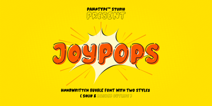 Joypops is a handwritten bubble font, with two styles ( solid & dashed lines) that make the perfect combination, a fun character with a bit of ligature and alternates. To give you extra creative work. Joypops font support multilingual more than 100+ language. This font is good for logo design, Social media, Movie Titles, book titles, short text even long text letters, and good for your secondary text font with sans or serif. Make a stunning work with Joypops font.