10,000 search results
(0.023 seconds)
- YOU ALL EVERYBODY - Unknown license

- Clearblock circular - 3DFX - Unknown license

- The Battle Continuez - Personal use only

- Lil Rhino by Pink Broccoli,
$14.00 Lil Rhino is the more reserved but still slightly offbeat sister to the quirky comic Fat Rhino typeface. You can see the resemblance, they work well together, but they also each hold their own.
 - Western Sans JNL by Jeff Levine,
$29.00 Take a classic Western wood type where the horizontals are thicker than the verticals and remove the slab serifs… The result is Western Sans JNL, which is available in both regular and oblique versions.
 - Electricity Generation by Ali Hamidi,
$10.00 Electricity Generation is a cute, quirky and casual handwritten font. Its informal style and casual vibe will make this font a go-to choice for each of the creations that require a relaxed touch.
 - Jeztec Empire by Ronin Design,
$15.00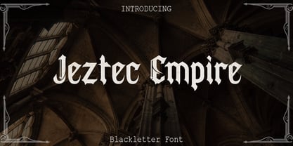 Jeztec Empire is an unique blackletter style, this font will give you stunning design. Jeztec Empire font is ideal for logo design, labels, posters or pretty much anything else that requires a unique touch.
 - Seindah Cinttya by Stringlabs Creative Studio,
$29.00 Seindah Cinttya results out of a stunning pairing of a brush pen that makes it look incredibly endearing and authentic. Use this gorgeous and unique script font to bring any DIY project to life!
 - Sanderyna by Sealoung,
$15.00 Sanderyna is a simple and dainty handwritten font. It looks beautiful on a variety of designs requiring a personalized style, such as wedding invitations, thank you cards, weddings, greeting cards, logos and so on.
 - Candy Cursive by Okaycat,
$29.50 Candy Cursive is a sweet & lovely connected script. Use this flowing cursive wherever eloquence or delicacy is required. Candy Cursive is extended, containing West European diacritics & ligatures, making it suitable for multilingual environments & publications.
 - Splinters JNL by Jeff Levine,
$29.00Splinters JNL is a fun, hand-drawn font emulating letters formed from pieces of wood. Use at larger point sizes for best results. Please note: There is no kerning and a limited character set. - Rushing Pass JNL by Jeff Levine,
$29.00Rushing Pass JNL is the italicized companion font to Forward Passed JNL and Return Pass JNL. This package includes a bonus solid version of the font (Forward Passed Black JNL) at no extra charge. - Bame by Typebae,
$15.00 BAME is a display typeface. Has a distinct curve and a lively personality. Ideal for projects that require a distinct personality. What's Included? Stylish & Standard Caps Numbers & Punctuation 14 Ligatures Multilingual Support PUA Encoded
 - Sangkury by Stringlabs Creative Studio,
$29.00 Sangkury is a unique display font. It features a spooky feel that makes it perfect for any project that requires a horror-themed. Use it for movies, flyers, posters, Halloween’s craftings and much more!
 - Fringio by Rex Face,
$19.99 Fringio is a fun-loving sans-serif display font. Key characters are formed with curved, flowing lines, resulting in some pleasing word forms. Fringio is great for branding, headlines, signage, social media and more.
 - GERALDINE PERSONAL USE - Personal use only

- Sisterhood - Personal use only

- VTC-TribalThreeFree - Personal use only

- Zebbadee - Unknown license

- Splinky - Unknown license

- Mandalay - Unknown license

- Pot roaster - Unknown license

- Bookseller Bk by Cyanotype,
$20.00 Bookseller Bk is a typeface designed for books and legible text at a small sizes, with an old book feeling. This typeface is the reinterpretation of a sample found in a French book, published between 1882 and 1893 and its author —Ernest Michel— lived between 1837 and 1896. This sample has influence from Didot, Scotch Roman and Clarendon (typefaces which were in use at that time). This reinterpretation expands the basic set for the contemporary era. Bookseller Bk includes small caps, old style figures, lining figures, fractions and basic Cyrillic alphabet. Everything in 3 different optical widths. You can save some lines with Reduced weight or fill some lines with Ample weight. All of them with italics, bold and bold italics. Bookseller Bk is also available in Caption size. 12 fonts for legibility at smaller sizes. Subhead & Title sizes are now in development. Finally this typeface was the result of the course Digital Reinterpretation of Classic Typography by Oscar Guerrero Cañizares at Domestika. Do you require additional glyphs? Please contact me to consider your request in order to expand Bookseller in further updates.
 - Plantin by Monotype,
$29.99 Plantin is a Renaissance Roman as seen through a late–industrial-revolution paradigm. Its forms aim to celebrate fine sixteenth century book typography with the requirements of mechanized typesetting and mass production in mind. How did this anomalous design come about? In 1912 Frank Hinman Pierpont of English Monotype visited the Plantin-Moretus Museum in Antwerp, returning home with “knowledge, hundreds of photographs, and a stack of antique typeset specimens including a few examples of Robert Granjon’s.” Together with Fritz Stelzer of the Monotype Drawing Office, Pierpont took one of these overinked proofs taken from worn type to use as the basis of a new text face for machine composition. Body text set in Plantin produces a dark, rich texture that’s suited to editorial and book work, though it also performs its tasks on screen with ease. Its historical roots lend the message it sets a sense of gravity and authenticity. The family covers four text weights complete with italics, with four condensed headline styles and a caps-only titling cut. Plantin font field guide including best practices, font pairings and alternatives.
 - Moneymachine by Mans Greback,
$49.00 Moneymachine is a sans and serif combined display typeface. Inspired by the art of money printing, the typography used for certificate production and classic letterforms, Moneymachine uses a traditional and perfected serif font and blends it together with a modern and clean sans-serif. The result is an original and confident work, which fits perfectly as a logotype or headline in any context that requires that extra touch of coolness. The Moneymachine family consists of six fonts: The Regular that combines sans and serif. Inverted for a white-on-black version. The Serif and Sans for more basic writing. White and Black for a lettering with a banner. The font is built with advanced OpenType functionality and has a guaranteed top-notch quality, containing stylistic and contextual alternates, ligatures and more features; all to give you full control and customizability. It has extensive lingual support, covering all Latin-based languages, from North Europe to South Africa, from America to South-East Asia. It contains all characters and symbols you'll ever need, including all punctuation and numbers.
 - Honey Beachy Sh by Sohel Studio,
$14.00 Honey Beachy is a retro display serif font that exudes a classic charm and bold character. With its design inspired by retro styles, this font brings an elegant touch and evokes a sense of the past. Each letter is meticulously crafted with careful attention to detail and proportion, resulting in a visually appealing and unique appearance. Honey Beachy is perfect for projects that require a vintage feel, such as posters, logos, packaging, and promotional materials that aim to capture a nostalgic and sophisticated atmosphere. This font will add a special touch to your designs and captivate viewers with its retro allure and distinctiveness. Honey Beachy Features: - Regular And Outline - Uppercase And Lowercase - Alternates And Ligature - Numerals & Punctuation - Accented characters - Multilingual Support - Unicode PUA Encoded While using this product, if you encounter any problem or spot something we may have missed, please don't hesitate to drop us a message. We'd love to hear your feedbacks in order to further fine-tune our products. Thanks and have a wonderful day .
 - Bookseller Cp by Cyanotype,
$20.00 Bookseller Cp is a typeface designed for books and legible text at a smaller sizes, with an old book feeling. This typeface is the reinterpretation of a sample found in a French book, published between 1882 and 1893 and its author —Ernest Michel— lived between 1837 and 1896. This sample has influence from Didot, Scotch Roman and Clarendon (typefaces which were in use at that time). This reinterpretation expands the basic set for the contemporary era. Bookseller Cp includes small caps, old style figures, lining figures, fractions and basic Cyrillic alphabet. Everything in 3 different optical widths. You can save some lines with Reduced weight or fill some lines with Ample weight. All of them with italics, bold and bold italics. Bookseller Cp is also available in Book size. 12 fonts for legibility at small sizes. Subhead & Title sizes are now in development. Finally this typeface was the result of the course Digital Reinterpretation of Classic Typography by Oscar Guerrero Cañizares at Domestika. Do you require additional glyphs? Please contact me to consider your request in order to expand Bookseller in further updates.
 - Geometron Pro Angular by Marius Mitran,
$39.00 Geometron has its origin in a custom typeface that I was commissioned to design for an architectural project. The concept was a "back to basics", minimalist typeface constructed mainly with straight lines and circles or circular arcs, but without departing from the classical style of Roman & Greek lettering. Notable requirements were: an extensive character set needed for multi-language documentation, as well as a full collection of symbols and alternate glyph forms (e.g. superiors & inferiors) for scientific use. Special care was taken to obviate the almost identical similarities that were prone to appear between letters like uppercase "i" and lowercase "L" or between Latin and Greek letters such as "a" and "alpha". This was also a prerequisite for scientific notation where ambiguity is not acceptable. All in all, the font would have to blend a modern design with a wealth of functional features. Consequently, all of these were made possible by choosing the OpenType format for development, resulting in a comprehensive and feature-rich font family specifically targeted for use in high-end design/typesetting applications.
 - PF Isotext Pro by Parachute,
$79.00 This typeface is based on ISO 3098, a technical documentation issued in 1974 by ISO (International Organization for Standardization), which proposed a set of characters for use on technical drawings and associated documents. Isotext is based on the original standards but is completely redesigned to fit typographic requirements. This new ‘Pro’ version is further improved and now comes with a complete set of redesigned true-italics. Furthermore, the width of the glyphs has increased in order to establish a more balanced and readable text. The result is a contemporary font which works well in small sentences as well as long texts. Isotext Pro is loaded with all the good stuff a designer needs to create documents with attitude. It supports 19 special OpenType features like small caps, fractions, ordinals, etc. and offers multilingual support for all European languages including Greek and Cyrillic. Finally, every font in this family has been completed with 270 copyright-free symbols, some of which have been proposed by several international organizations for packaging, public areas, environment, transportation, computers, fabric care and urban life.
 - Wink by Sudtipos,
$49.00 Wink has been created as the result of exhaustive research, trial and development. It is an OpenType set of fonts which appears in a friendly and fun way, with a new twist on what Joluvian has previously created. Full of personality, with a brave and strong creative line, it is intended to reflect authenticity when being used in all types of media and styles. The ornaments offered in this font work as a graphic resource that expand all the possibilities for Wink users. Although Wink is inspired by traditional calligraphic flourishes, its modern twist makes it elegant and simple at the same time. It’s not completely a brush type but it has been created with the same calligraphy base Joluvian usually works with. Wink also has a caps version with the same style of the script. Both versions could work perfectly, individually or together. As usual, the type has been developed with Ale Paul for Sudtipos, and the collaboration of Macus Romero has been essential to illustrate the style that Wink represents.
 - Geometron Pro Radial by Marius Mitran,
$39.00 Geometron has its origin in a custom typeface that I was commissioned to design for an architectural project. The concept was a "back to basics", minimalist typeface constructed mainly with straight lines and circles or circular arcs, but without departing from the classical style of Roman & Greek lettering. Notable requirements were: an extensive character set needed for multilanguage documentation, as well as a full collection of symbols and alternate glyph forms (e.g. superiors & inferiors) for scientific use. Special care was taken to obviate the almost identical similarities that were prone to appear between letters like uppercase "i" and lowercase "L" or between Latin and Greek letters such as "a" and "alpha". This was also a prerequisite for scientific notation where ambiguity is not acceptable. All in all, the font would have to blend a modern design with a wealth of functional features. Consequently, all of these were made possible by choosing the OpenTypeÆ format for development, resulting in a comprehensive and feature-rich font family specifically targeted for use in high-end design/typesetting applications.
 - Mosquito Formal by Monotype,
$29.00Mosquito Formal, by Éric de Berranger, takes the original jaunty design of Mosquito and dresses it in a tuxedo. The stressed character strokes, simple, straightforward shapes, relatively large x-height, open counters and hint of Peignot are still there, but the cursive strokes and lively terminals have been replaced with traditional designs. The result is a more serious-and more sophisticated typeface. The idea," says Éric de Berranger, "was to assuage the drawing of Mosquito. To 'calm' it; and eliminate its idiosyncrasies while preserving character structure and general appearance." Although still distinctive, as Éric de Berranger puts it, "Mosquito Formal is more to be read than seen, it is more invisible and thus, more readable than my earlier design." He does, however, use both typefaces in his graphic design projects: Mosquito for headlines and in applications where the lively design is appropriate, and Mosquito Formal for those instances that require a quieter more sophisticated look. Mosquito Formal is available in three weights with complementary italic designs in addition to a suite of small caps and old style figures. " - Ripe Mango by Sohel Studio,
$14.00 Ripe Mango is a retro display serif font that exudes a classic charm and bold character. With its design inspired by retro styles, this font brings an elegant touch and evokes a sense of the past. Each letter is meticulously crafted with careful attention to detail and proportion, resulting in a visually appealing and unique appearance. Ripe Mango is perfect for projects that require a vintage feel, such as posters, logos, packaging, and promotional materials that aim to capture a nostalgic and sophisticated atmosphere. This font will add a special touch to your designs and captivate viewers with its retro allure and distinctiveness. Ripe Mango Features: - 4 Weight (Regular, Slant, Semi Bold, Outline) - Uppercase And Lowercase - Alternates And Ligature - Numerals & Punctuation - Accented characters - Multilingual Support - Unicode PUA Encoded While using this product, if you encounter any problem or spot something we may have missed, please don't hesitate to drop us a message. We'd love to hear your feedbacks in order to further fine-tune our products. Thanks and have a wonderful day .
 - Mestre by Tipotecture,
$19.99 Mestre is a German & Dutch inspired geometric sans-serif designed. Its solid and formal shapes are embedded with a discreet humanist flair resulting in a very versatile contemporary hybrid and a highly functional and flexible font for many of today’s branding & UX requirements. With its rational forms and its large x-height, Mestre is perfect for long texts in small sizes allowing a comfortable reading. Its open forms, moderate & balanced proportions, neutral appearance and solid structure grant a high legibility on paper and on screens. With its extensive 8 weights and corresponding true italics, more than 900 glyphs per font, extended character set to support Central and Eastern European as well as Western European languages and a wide OpenType features set (small caps, case-sensitive forms, lining, tabular & old-style figures, scientific superior/inferior figures, fractions, a set of arrows, etcetera) it is meant to build visual hierarchies of any detail and complexity in editorial design or deliver the best performance for branding purposes. Mestre is a great choice for modern, contemporary and professional typography.
 - Chercán by PampaType,
$28.00 Chercán is a spirited typeface created with a delicate sense of how readability doesn't need to be dull. Chercán wears a uniquely friendly voice, and its mature design makes it highly legible in small bodies as well as in the distance. Its balanced rhythm is the result of a slow pairing of qualities found in old classics admired by Gálvez, such as Copperplate by Frederic Goudy (1905) and Antique Olive by Roger Excoffon (1962). Chercán occupies a unique place in the contemporary type design shelf, by exquisitely combining versatility and elegance. Due to the delicate grey colors it gains within long texts, Chercán is good for immersive reading, where one wants to avoid readers’ eyes fatigue. It can be a great choice for setting texts that require a slightly informal atmosphere without losing authority. Chercán is the Chilean name for the melodious little bird Troglodytes aedon usually found all across the Americas. Available in Std and Pro versions with all the usual OT features, Chercán addresses all modern needs of the demanding typographer.
 - Pepone by Storm Type Foundry,
$43.00 This typeface is primarily optimized for the setting of belles-lettres. The regular styles are balanced to suit small text sizes and enable the reading of long portions of text. The development of the typeface was guided by the goal of creating a contemporary, discreet book serif, with modern expression and numerous functions. Letters feature reduced contrast, the lighter styles may evoke wired letters, while the heavier ones bear distinct slab serif references. The extremes thus work in harmony and fulfil the demanding requirements of advertising and magazine layout. The typeface is suitable for bottle labels, invitations, exhibition catalogs and posters, for printed and online presentations alike. The name Pepone was chosen as an homage to Josef Kroutvor. Of course, the typeface isn’t solely reserved for the setting of the works of Josef K. On the contrary – we’d like to present a universal typeface suited for literature, catalogs and magazines. It wouldn’t be the first and the last example of a typeface created with a specific purpose in mind, which later became used universally.
 - Mystical - Personal use only

- MerryCouple Demo San Serif - Personal use only

- Bikambone - Personal use only

- Edge Of Madness - Personal use only


