10,000 search results
(0.023 seconds)
- Monte Carlo Script NF by Nick's Fonts,
$10.00This elegant monoline script is based on a typeface called "Médicis" from a Deberny and Peignot catalog, circa 1920. Graceful but robust, it is equally suited for invitations, announcements and headlines. Both versions of this font contain the Unicode 1252 (Latin) and Unicode 1250 (Central European) character sets, with localization for Romanian and Moldovan. - Put My Foot Down by Ingrimayne Type,
$14.95 If you grew up in the north, you may have stomped out letters in the fresh snow during the winter. Memories of such winter fun helped inspire this typeface. If one can do the typeface with shoes or boots, one can also do it with bare feet and hands. Non-human variants are possible, such as bird tracks.
 - Dont Bug Me JNL by Jeff Levine,
$29.00Don't Bug Me JNL is a collection of twenty-six of the cutest critters you've ever seen. Originally released as a freeware font in late 1999 to poke fun of the Y2K bug, the art has been cleaned up for more commercial or decorative appeal. - Sofya by Gaslight,
$30.00 This funny script font based on the logo which we did. It will look great on the package, restaurant menus, logos and magazine headlines. A large number of ligatures help you vary your design.
 - El Mayor by Typefactory,
$15.00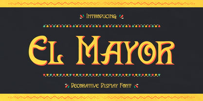 El Mayor is a decorative display font. The font has festival vibes. It will turn any design project into a stand out. El Mayor font is really great for a restaurant menu, business branding, clothing, quotes, headings, birthday invitations, posters, and many others.
 - AdPro by Linotype,
$29.99Roman Sehrer, a seasoned German advertising professional, digitized his handwriting to create this family of three fonts. Sehrer recommends this family for posters, logos, and restaurant menus. It works well with traditional sans serifs such as Helvetica or Univers. - OBO Regular by Wilton Foundry,
$29.00 OBO is a modern interpretation of the classical Italian letterforms with the readability of contemporary sans typefaces. OBO is ideally suited for creating identities for branding, posters, book covers, headlines, logotypes, restaurant menus, beer labels.
 - Muju by Okaycat,
$29.95 Muju is created by classic Japanese calligraphy brush. This casual, friendly yet professional style is perfect for restaurant menus, titling, logos & more. Muju features extended characters, containing West European diacritics & ligatures, making it suitable for international environments & publications.
 - Procent by GRIN3 (Nowak),
$26.00 Procent is an all-caps, handwritten font with two variations for each letter. Procent can be used for scrapbooks, greeting cards, invitations, announcements, signs, menus, restaurant themes and more... Language support includes Western, Central and Eastern European character sets, as well as Baltic and Turkish languages.
- All your font are belong to us - 100% free

- Organic Tuesday by Bogstav,
$15.00 Sometimes you need things organised in a neat way. Organic Tuesday has that, but also a will to break free at the same time. Years ago I was at a restaurant where the menu was handwritten with a clumsy, but characteristic and charming, monospaced font. I must have focused so much on these letters that I can’t recall what I actually ate. But what I do remember is that it was a Tuesday, and the restaurant was organic!
 - La Coupole NF by Nick's Fonts,
$10.00Lettering on a 1927 menu by prominent poster artist Razzia provided the inspiration for this decidely Deco typeface. The restaurant itself was the setting for one of Georges Simenon’s many Inspector Maigret novels. Both versions of the font include 1252 Latin, 1250 CE (with localization for Romanian and Moldovan). - Barbeque Grill by Mvmet,
$12.00 Barbeque Grill is a whimsical skinny bouncy font. You can use it for anything ranging from t-shirts, book designs, restaurant or cafe menu, greeting cards, stickers, and posters, or anything that needs a casual touch. Try it to create lovely designs and feel the good vibes with it!
 - Introduction by Mvmet,
$15.00 Introduction is a casual handwritten font. It is awesome for creating cool designs ranging from t-shirts, book designs, restaurant menu, blog writing, greeting cards to stickers, or anything that needs a casual touch. Fall in love with its incredibly cool style, and use it to create lovely designs!
 - Oak Street by Three Islands Press,
$39.00 There's a little restaurant in an old house on a sidestreet in town (Rockland, Maine, USA) called Cafe Miranda. The staff is friendly, the setting intimate, and the appetizer a basket of hot bread fresh from a brick oven. Its ample menu features such entries as "Quasi-Cassoulet" and "Gentle Sole." It's among my favorite local places to dine out. But the menu got photocopied once too often, and Cindy's personable handlettering got faded and broken. So I took matters into my own hands. And here's what I delivered to the newly computerized folks at the little restaurant on Oak Street. You, too, can travel in rather heavy felt-tip style.
 - Claudia Betta by Matra Creative,
$14.00 Claudia Betta Font is a formal script font with multilingual support. It is ideal for wedding invitations, magazines, social media, restaurant menus, greeting cards, birthday invitations, headers and more. This font is equipped with a complete set of lowercase and uppercase characters, various kinds of punctuation ligatures, numbers and and multilingual support.
 - Joyto Soft by Graphite,
$18.00 Joyto Soft is a slab serif family of five weights. With soft edges and an uneven thickness, it has a quirky, warm and fun character while retaining legibility. It is well suited for display, packaging, restaurant menus, children’s products & books and much more.
 - Charmante by Juraj Chrastina,
$39.00 Let's add a little charm between letters with this sweet and straightforward hand-drawn typeface. Charmante is ideal for save-the-dates, wedding announcements, invitation cards, greeting cards, gift tags, cafe or restaurant menus and for any other lovely and charming design.
 - Meal Ticket JNL by Jeff Levine,
$29.00Meal Ticket JNL follows the same basic letter shapes as Jeff Levine's Flatbush Beanery JNL, but with a much lighter look and feel. This is another perfect typeface for recreating the sign lettering and menus of old-time diners, drive-ins and restaurants. - Mordings JNL by Jeff Levine,
$29.00Mordings JNL is an odd-lot collection of images. These assorted dingbats are leftover art that never quite made it to one particular dingbat font category, but together comprise an eclectic assortment. Topics range from weather to vintage-style restaurant menu icons to decorative embellishments to an old-fashioned telephone dial. - Pumpkinseed by Three Islands Press,
$19.00 The tale of Pumpkinseed began with a bit of hand-printing I noticed on the dinner menu at a local restaurant. I took a menu home for future reference. Several months later, some similar hand-lettering on another dinner menu caught my eye. I became a sort of connoisseur of hand-done menu lettering. After tweaking and adjusting a few of these menu-inspired (uppercase) characters, I placed them -- along with some other designs -- in an online Type in Progress survey. They won. So I finished the caps, drew out the lower case from scratch, created three weights and oblique styles. The result: Pumpkinseed, a full-featured casual hand-lettering face. Comes in Light, Medium, and Heavy.
 - Bamberger by Fontimonim,
$39.00 A bold, vivacious and rough font that includes six weights for widespread use. Bamberger balances the eccentricity of hand-drawn letters with the stability and readability of a basic and neutral sans font. This combination radiates warmth and boldness appeal. It works great on packaging, viral campaigns, restaurant menus, children's books and digital applications.
 - Brandy BF by Bomparte's Fonts,
$39.00 Felt tip-written and full of expressive lines, Brandy BF exudes much verve and energy; and unlike many scripts, sets rather well in all caps situations. Use Brandy BF as a superb choice for everything from upscale restaurant menus to projects requiring a personable touch.
 - Antio by Nantia.co,
$12.00 ANTIO Greek Font is a brush font. ANTIO Greek Font is an all Caps marker font. Also, the font is a multilingual font with Greek (of course), Latin characters and diacritics. The style of this typeface is perfect for your modern graphic design needs. Food packaging, restaurant menus, coffee and bar menus, and food industry branding are some examples of the numeral applications of this typeface. The shabby-chic style of the font is perfect for your graphic design needs like social media quotes, blog headers, posters, art projects and why not packaging, and logotypes.
 - High Tea by Hanoded,
$15.00 High Tea is a handmade typeface, which was inspired by a 1930's menu from a classy restaurant. High Tea is a classy font, with some unique letters and an overall 'Upper Crust' feel to it. It is ideal for headlines and posters. Care for a spot of milk in your Oolong, darling?
 - VLNL Kimchi by VetteLetters,
$35.00 The Kimchi font had its starting point in the making of the film "Cloud Atlas", based on the novel by David Mitchell and directed by Lana & Andy Wachowski and Tom Tykwer. A first version of Kimchi was created for "Papa Song" – an underground fast food restaurant in a futuristic Neo Seoul in the year 2144. It was used for the menus, advertisement and packaging. Kimchi was later further developed to become a useable typeface: it works for headlines, street art stencils and of course as logo font for korean fast food restaurants.
 - Bill of Fare JNL by Jeff Levine,
$29.00 A 1942 menu cover for the restaurant at the Biltmore Hotel in Los Angeles features its name in a stylized Art Deco serif design. This is has been turned into the digital typeface Bill of Fare JNL, and is available in both regular and oblique versions.
 - Sunshine Blossom by Mvmet,
$14.00 Sunshine Blossom is a playful handwritten font with a vintage aesthetic. It is awesome for creating cool designs ranging from t-shirts, book designs, restaurant menus, blog writing, and greeting cards to stickers, or anything that needs a casual touch. Fall in love with its incredibly cool style, and use it to create lovely designs!
 - Wiggly Wavy by Mvmet,
$14.00 Wiggly Wavy is a whimsical display font that took inspiration from french fries shapes. You can use it for anything ranging from t-shirts, kids’ book designs, restaurant menu, greeting cards, stickers, and posters, or anything that needs a casual touch. Try it to create lovely designs and feel the good vibes with it!
 - XXII DONT-MESS-WITH-VIKINGS - Unknown license

- 101! Your FontZ Are Served - Unknown license

- XXII DONT MESS WITH VIKINGS by Doubletwo Studios,
$-
- Sylphide by Scriptorium,
$24.00Sylphide is based on poster lettering from France in the 1890s. It has a very authentic Art Nouveau look with some unusual features, including the decorative-initial style capital letters and the cut-out look of the standard characters. It's an excellent and unusual font for uses like restaurant menu titles, poster designs or other decorative purposes. - Huruvida by Cercurius,
$19.95 A decorative font with descending tails on the capital letters. The design is based on a popular typeface from the 1880s, mainly used for personal names on title-pages, advertisements and stationery. Today, you can use it e.g. on book and album covers, invitation cards, restaurant menus and concert programs to give a fin-de-siècle impression.
 - Zuider Postduif by Roland Hüse Design,
$25.00 Zuider Postduif was my very first font design 3 years ago and I decided to remake and extend it including the Cyrillic alphabet and some OpenType features. It looks pretty cool as printed text(lyrics, poems) and fits best for decorations, posters, menu carts for restaurants, brochures, newspaper headlines or logos. It’s comfortable to read above 12 px.
 - Velouté by Wilton Foundry,
$29.00 Velouté is named after one of the original French Mother Sauces, it is a surprisingly bold and velvety script with delicate flourishes that demand your attention. Velouté's unique mix of classic, contemporary, bold and delicate detail is ideally suited for Special Invitations, Coffee shops, Restaurants, Boutiques and Menus.
 - Sketchino by Mvmet,
$14.00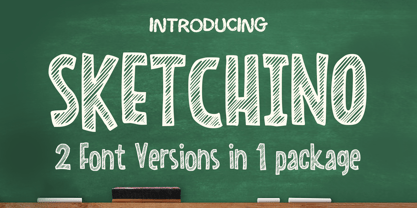 Sketchino is a cool and playful hand drawn font. The font is awesome for creating cool designs that scream for attention. It’s ideal for anything ranging from t-shirts, book designs, restaurant menu, blog writing, greeting cards to stickers, or anything that needs a casual touch. Fall in love with its incredibly cool style, and use it to create lovely designs!
 - Bouncer by Fenotype,
$9.95 Bouncer is an all-caps font family with automatic interlocks. With soft and rounded look and over 150 automatic ligatures and three weights Bouncer is a flexible and easy to use font. It's very suitable for anything from a Jazz poster to a restaurant menu. To access the ligatures you only need to write in CAPS in any OpenType-supporting application.
 - Snowy Days by Mvmet,
$10.00 Snowy Days is a cool and playful snow-themed display font. The font is awesome for creating cool designs that scream for attention. It’s ideal for anything ranging from t-shirts, book designs, restaurant menu, blog writing, greeting cards to stickers, or anything that needs a casual touch. Fall in love with its incredibly cool style, and use it to create lovely designs!


