10,000 search results (0.024 seconds)
  1. Silkscreen - Unknown license
  2. CROWD PERSONAL USE - Unknown license
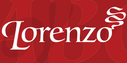
  3. Lorenzo by Canada Type, $24.95
    The lifetime of Lorenzo de Medici (1449-1492) coincides with the rise of metal type as it displaced broad pen calligraphy for the production of books. This revolution marked the end of formal Western calligraphy, as the industry employed metalworkers who designed type according to geometric measurement while calligraphers were forced to become secretaries who practiced handwriting systems. Renaissance Florence should have witnessed the marriage of calligraphy and typography, just as all the other arts and sciences flourished as classical learning was applied to technical advances; but the metalworkers and geometricians measured, dissected and recast the calligraphic letters by crude indirect methods, and in the end took all the life out of them. Here they languished until digital type has made it possible to render the precise motion of the broad pen stroke into type. Lorenzo is a confluence of many strains from the Middle Ages, brought together within the classical harmony of the capitals. It attempts to bypass metal type, using calligraphic means to achieve the precision of type while retaining the life of the stroke: a classical font that would be familiar to Lorenzo himself as well as to the modern eye. The Lorenzo family comes in four weights, ranging from light to bold. Two sets of italics, one with swashed caps and ascenders, complement each weight. The family boasts extensive language support and an offering of over fifty calligraphic ornaments/flourishes included within the character set.
  4. Century Oldstyle by Bitstream, $29.99
    Century Oldstyle is Linn Boyd Benton’s and Morris Fuller Benton’s renovation of Phemister’s Miller & Richard Old Style for ATF forty-five years later, using the Century name for marketing purposes.
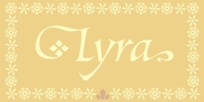
  5. Lyra by Canada Type, $39.95
    Lyra is an Italian Renaissance script that might have developed if metal type had not broken the evolution of broad pen calligraphy. It lies in the area between the humanist bookhand and the chancery cursive, combining the fullness and articulation of the Roman letters with a moderate italic slant and condensation. A steep pen-angle allows use of a broader pen relative to the x-height, giving the letters more contrast with light verticals and heavy curves. Lyra embodies the Renaissance spirit of refining technical advances of the late middle ages with reintroduction of ancient classical principles. Based on the moving penstroke with constantly changing pen-angle, it brings the vitality of handwriting to the ordered legibility of type. Lyra is a formal italic, too slow for copying books. By eliminating the element of speed, digital technology opens up a new level of calligraphy, bringing it into the sphere of typography as would naturally have happened if metalworkers had not controlled the process. If classical Western traditions are respected, digital calligraphy has the potential to recapture the work of the past and restart its stalled evolution. There is of course no substitute for the charm of actual writing, with each letter made for its space; but the tradeoff is for the formal harmony of classical calligraphy as every curve resonates in tune with every other. This three-weight font family marks Philip Bouwsma's much-requested return from a three year hiatus. It also reminds us of his solid vision in regards to how calligraphy, typography and technology can interact to produce digital beauty and vesatility. Each of the three Lyra fonts contains almost three character sets in a single file. Aside from the usual wealth of alternates normally built into Bouwsma's work, Lyra offers two unique features for the user who appreciates the availability of handy solutions to subtle design space issues: At least three (and as many as six) length variations on ascending and descending forms, and 65 snap-on swashes which can be attached to either end of the majuscules or minuscules. The series also offers 24 dividers and ornaments built into each weight, and a stand-alone font containing 90 stars/snowflakes/flowers, symmetric contstructs for building frames or separators, masking, watermarking, or just good old psychedelia.
  6. Paddington - Unknown license
  7. Ashby - Unknown license
  8. Pixeldust - 100% free
  9. Console - Unknown license
  10. BARBEDWIRE PERSONAL USE - Personal use only
  11. JASON PERSONAL USE - Personal use only
  12. A La Nage - Personal use only
  13. Engebrechtre - Unknown license
  14. SF Laundromatic - Unknown license
  15. SF Wasabi - Unknown license
  16. SF Retroesque - Unknown license
  17. SF Speedwaystar - Unknown license
  18. SF DecoTechno - Unknown license
  19. Cloud - Personal use only
  20. Lettering1 - Unknown license
  21. Covington SC Exp - Unknown license
  22. Covington SC Cond - Unknown license
  23. CONFLICT DRIPS PERSONAL USE - Personal use only
  24. SF Intermosaic - Unknown license
  25. SF Chaerilidae - Unknown license
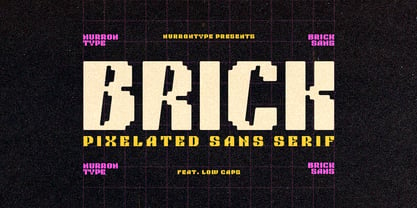
  26. NT Brick Sans by Nurrontype, $17.00
    Back to the future! NT Brick Sans is a pixelated sans serif. Inspired by the Pixel Art phenomenon and Lego bricks, bringing back the good old 16-bit era with open-type features. It's bold, soft rounded, supports multi-language, featuring low caps option. Brick Sans will make your project special. Grab it now.
  27. Regatto by Eaver Studio, $19.00
    Inspired by the beauty and elegance of Old Style typefaces, Regatto was created in high-contrast and bold style. It comes with a lot of alternates and ligatures with their own variants for any purposes from headline to poster. This font also has some letters with diacritics accent to support some other non-English languages.
  28. Strongbox JNL by Jeff Levine, $29.00
    Strongbox JNL is based in part on an incomplete sample of an old wood type alphabet seen on an image sharing site. Commonly known as a grotesk (or grotesque) face, this style of sans serif lettering is well-suited for headlines, display work, price cards or anything where a bold, condensed typeface is needed.
  29. Rough Cut NF by Nick's Fonts, $10.00
    An old Art Nouveau typeface named "Daphne" provided the inspiration for this decidely different font. This version is upright, but the linocut treatment employed visually suggests the slight rightward slant of the original typeface. Bold, unusual and distinctive. Both versions of the font include 1252 Latin, 1250 CE (with localization for Romanian and Moldovan).
  30. Elektronik - Personal use only
  31. Oldbrothers - Personal Use - Personal use only
  32. Megalito Slab ExtCond - Personal use only
  33. Space Age - Unknown license
  34. JUSTICE LEAGUE - Personal use only
  35. BjorkFont - Unknown license
  36. Barbarian - 100% free
  37. ‘DragonForcE’ - 100% free
  38. The Black Box - Personal use only
  39. Candy Pop! - Personal use only
  40. STR - 100% free
Looking for more fonts? Check out our New, Sans, Script, Handwriting fonts or Categories
abstract fontscontact usprivacy policyweb font generator
Processing