4,494 search results
(0.021 seconds)
- Gerakent by Twinletter,
$18.00 Introducing our newest font Gerakent. What a fun font that brings a little sunshine to your day! Bring your next project to life with this retro-inspired typeface and create elegant typography that gives it a retro or vintage feel. You can use it for branding, product packaging, or even editorial work. It’s easy to use in any design program or even as a pre-cut vector and works best as text but you can also mix it with other fonts for added flair!
 - LTC Winchell by Lanston Type Co.,
$24.95 Winchell is the only identified typeface designed in Buffalo, NY prior to the formation of P22 type foundry. It was created by Edward Winchell of the Matthews-Northrup Printing Works and released by the Inland Type Foundry in 1903. The Winchell typeface was also made in Wood by the Hamilton Manufacturing company in the mid 20th Century. The Winchell typeface is a Clarendon styled slab serif that clearly has the look of a pre-modernist design. E.E. Winchell’s Arts & Crafts tendencies show through in this design
 - Ongunkan Old Hungarian Runic by Runic World Tamgacı,
$50.00 It was used in parts of Transylvania until the 1850s, although it was banned by Istvan, the first Christian king of the Hungarians (Szekel), in line with an order to "destroy all pre-Christian inscriptions". Hungarian runic script was usually written on wood-stone pieces in the bustrofedon style. In this method, the writing was written consecutively from right to left and from left to right. This article is available in Bosnian, Carpathian and Glozel editions. Whenever possible, I will present the fonts in these versions.
 - Live by Lián Types,
$30.00 After Bird Script's ballet, Sproviero comes with these fast strokes, resulting in a font full of life and a youthful spirit. The aim of Live was again to see how far calligraphy & lettering could dive into the world of type-design. The font is perfect for logos, posters, magazines, perfumes and all pieces of design related to music, and the feminine world. You can also have a lot of fun with Live More, which contains a set of pre-designed catch words and lovely ornaments.
 - PAG Karogs by Prop-a-ganda,
$19.99Prop-a-ganda offers retro-flavored fonts inspired by lettering on retro propaganda posters, retro advertising posters, retro packages all the world over. This is perfect font for your retrospective project. PAG Karogs is geometric, art-deco font that had been used for a match box. The bowls of this font is based on a positive circle. The contrast of a circle and straight line effective in producing brisk structural rhythms. This is great for branding, packaging and posters or any other kind of display use. - Step Better by Ronny Studio,
$19.00 Step better font Inspired by street graffiti markings, Urban Tag comes with the iconic round tip markers, this style is often used by several graffiti artists around the world because of its very unique style, very fun to write on markers. Perfect if you want a realistic street art or hip hop style for your designs, posters, props, etc. Features : All Caps numbers and punctuation multilingual Swash / Ornament PUA encoded Please contact us if you have any questions. Enjoy Crafting and thanks for supporting us! :) Thank you
 - Cartoon Panel JNL by Jeff Levine,
$29.00 Charles W. "Plot" Plotner was a cartoonist who had developed a template-based cartooning set for kids circa 1952 called "Plot-O". A companion set was called "Plot-O the Clown". "Plot-O" consisted of two plastic templates with pre-cut and numbered cartoon shapes. By following the simple directions and tracing the corresponding parts, any youngster could create basic cartoons of people and finish them off with their own details. The hand-lettered instruction booklet provided the design inspiration for Cartoon Panel JNL.
 - Kwersity by Ingrimayne Type,
$12.95 Kwersity is a boxy, geometric, slab-serifed typeface with strokes of uniform weight. Its circular elements are almost rectangular. The narrower style has a high x-height. Both the narrower and wider variants come in three weights, regular, semi-bold, and bold. (In its original, pre-2020 form, what is now semi-bold was bold. What is now bold is new as of 2020.) There is also a shadow version; Kwersity-semibold can be layered on top of it to color the interior of the letters.
 - PF DIN Text by Parachute,
$79.00 The purpose of the original DIN 1451 standard was to lay down a style of lettering which is timeless and easily legible. Unfortunately, these early letters lacked elegance and were not properly designed for typographic applications. Ever since its first publication in the 1930’s, several type foundries adopted the original designs for digital photocomposition. By early 2000, it became apparent that the existing DIN-based fonts did not fulfil the ever-increasing demand for a diverse set of weights and additional support for non-Latin languages. Parachute® was set out to fill this gap by introducing the PF DIN series which has become ever since the most comprehensive and sophisticated set of DIN typefaces. It was based on the original standards but was specifically designed to fit typographic requirements. Its letterforms divert from the stiff geometric structure of the original and introduce instead elements which are familiar, softer and easier to read. The first set of fonts was completed in 2002 as a group of 3 families which included condensed and compressed versions. With its vast array of weights, the extended language support, but most of all its meticulous and elaborate design, it has proved itself valuable to numerous design agencies around the world. Ever since its first release, it has been used in diverse editorials, packaging, branding and advertising campaigns as well as a great number of websites. It was quoted by Publish magazine as being “an overkill series for complex corporate identity projects”. The whole PF DIN Text type system (with normal, condensed and compressed styles) includes 45 weights from Hairline to Extra Black including true-italics. Additionally, every font in the Pro series is powered by 270 very useful symbols for packaging, environmental graphics, signage, transportation, computing, fabric care. There are 2 versions to choose from: The PRO version is the most powerful. All weights support Latin, Cyrillic, Greek, Central/Eastern European, Romanian, Baltic and Turkish, with 20 advanced opentype features including small caps. The standard STD version is more economic. All weights support Latin, Central/Eastern European, Romanian, Baltic and Turkish, with 18 advanced opentype features including small caps. In 2010 Parachute® released 4 new families DIN Monospace, DIN Stencil, DIN Text Arabic and DIN Text Universal. All these are complemented by the popular DIN Display version. Altogether the Parachute DIN series is a set of 8 superfamilies with a total of 96 weights.
 - Jorgey by Gatype,
$12.00 Jorgey's casual brush script has a nice texture and flow. Jorgey has many alternatives to make it look like real handwriting; four sets of lowercase and two sets of uppercase. suitable for design projects; logos, branding, posters, quotes, beautiful wedding invitations, beautiful stationery art, eye-catching social media posts, and cute greeting cards and other designs. It is unique, very natural and attractive
 - Stop by Linotype,
$29.99Stop is a heavy futuristic sans serif display font, designed by the famed Italian type designer Aldo Novarese. Stop's forms are vaguely stencil-like, and some of them only read as letters when used in combination with each other. Nevertheless, Stop has a real computer-technology" feel to its design. It should be used exclusively for headlines or logo work." - Sail Royals by Mas Anis Studio,
$17.00 Sail Royals! Handwritten font with a personal charm. Each letters was made with brushpen on real paper, then scanned and crafted to vector carefully to add strong characteristic. With quick dry strokes and signature style, Sail Royals is perfect for branding projects, homeware designs, product packaging - or simply as a stylish text overlay to any background image like quote images.
 - Knucklehead by Big Typephoon,
$20.00Once I ate a knuckle sandwich after saying some things about some guy's pregnant girlfriend. It turns out she wasn't pregnant at all. I felt like a real knucklehead. So I made this font. Use the font where ever you like. Just be sure you know what you are talking about, or you too could end up with knuckles flying at your head. - Swoley by Luxfont,
$40.00 Introducing the Swoley family of cool 3D color fonts - where the letters are like a liquid flowing into glyphs, creating an amazing fluid visual effect. This unique type family combines realism and modernity, adding amazing details to your projects. Pairs perfectly with Volufont. Features: - Real Plastic effect - Kerning IMPORTANT: - Check the glyphs in the font before buying! - SVG fonts contain raster letters.
 - Starburst by Resistenza,
$49.00 Starburst is a gestural light script, created initially with an oblique nib for Copperplate and pencil. The idea was to interpret a real expressive energetic and gestural calligraphy, playing with pressures and angles following always a very dynamic flow. Rhythmical and full of grace, Starburst is the best fusion between calligraphy and typography. Every stroke has been sketched first by Giuseppe Salerno.
 - Seluas Handmade by Siwox Studios,
$10.00 Seluas Handmade is a bold and beautiful brush lettered font. It's perfect for using in ink or watercolour based designs or on its own as bold hand brushed lettering. Use it for websites, branding, weddings, social media, product design, stationery and advertising, etc. Seluas Handmade is versatile enough to add that natural nuance to any project where you need that to look real.
 - Kashima Brush by Abo Daniel,
$15.00 Kashima is brush font with Japanese style that made using the real brush pen. It looks very natural. This font is great for apparel, branding, logo, magazine, quotes, packaging, advertising, and more, that need a styling of a Japanese brush feel. Kashima is all capital font and includes punctuation, symbols, and numerals. It also has multilingual support. Thank you abo daniel
 - Relate by Panritype Studio,
$20.00 Relate is modern, elegant, beautiful script. it is made by real pen brush, and shaping carefully. It's perfect for logotype project, wedding invitation, social media headlines, birthday card, quotes, t-shirt and also match with other design project. Relate comes with natural handwriting ligatures and extra final word alternates and swashes that can make your project more beautiful and elegant.
 - Brushlie by Abo Daniel,
$13.00 Brushlie is urban font family that made with real brush and is ideal for logos, apparel, quotes, product packaging, or anything which needs a font with a natural brush taste. There are available 2 version - Brush - Solid and the swash make it compete Even though Brushlie is an uppercase font, the lowercase characters will give alternate for uppercase characters. Thank You Abo Daniel
 - Vtg Stencil Marsh by astype,
$36.00 The Vtg Stencil fonts from astype are based on real world stencils from several countries. The Vtg Stencil Marsh design was derived from 1 inch stencils, cut by a Marsh R machine. Marsh produced stencil machines since 1922 and was one of the most important manufacturers for such marking machines. The design is part of the American industrial heritage. PDF Specimen
 - White Sign by Ergibi Studio,
$20.00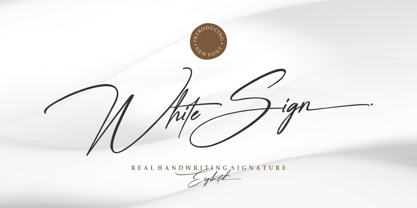 White Sign is Real Handwritting font presentation from Ergibi Studio. Inspired by beautiful writing that has a luxurious feel with additional swash lines perfect for branding, photography, invitations, quotes, watermarks, advertisements, product designs, social media posts, stationery, labels, and more! I hope you enjoy this font. If you have any questions please don't hesitate to drop me a message :) Big Thanks ~ Ergibi Studio
 - Woodwork JNL by Jeff Levine,
$29.00 What sets wood type apart from the lettering designs created in the digital age is the simple premise that it is hand made. Woodwork JNL contains all of the slightly asymmetrical curves, unusual letter forms and incremental letter weight variations that add a "real world" touch to all print and web designs that seek the old-fashioned charm of another era.
 - Murbia by PizzaDude.dk,
$20.00Murbia was written with a glimmer-pen which has left the letters with a grungy look. What's even better is that the font comes with loads of ligatures for both double letters/numbers and the most common letter combinations...just to make the font look more like real scribbled handwriting! You will need to use OpenType supporting applications to use the autoligatures. - Handmade Caslon JNL by Jeff Levine,
$29.00 Handmade Caslon JNL is a somewhat imperfect version of one of the many Caslon faces in use during the late 19th and early 20th centuries. Based on vintage source material, Handmade Caslon JNL is the right typeface for projects reflecting antiquity, a hand-made look or where slightly imperfect lettering adds a bit of the "real world" to the message.
 - Khadash by NamelaType,
$19.00 Khadash is a slick Handwriting Brush Latin and Arabic font, made with natural strokes that resemble real handwriting. Khadash Arabic font is a separate with Latin characters as subfamily to reduce font size. There are two sets of Latin character choices in the form of letters, regular and alternate, Khadash is perfect for branding projects, product packaging, merchandise, advertising, quotes and more
 - dearJoe 3 by JOEBOB graphics,
$39.00 Finally it’s done! The DearJoe 3 ‘Ultimate handwriting’ font, composed of scanned handwriting which makes it look quite convincingly real. It contains over 500 characters, 200 of them ligatures. Typing your text with this font feels like old-school writing with a pen, especially since every word will be constructed of different letter combinations. Give it a try and you’ll probably be surprised…
 - TE Thuluth Golden 2 by Tharwat Emara,
$85.00 Amazing Font of THARWAT which is similar to calligraphy of THULUTH of a real calligrapher. I added many glyphs to get this feature and it becomes easier to a graphic designer to write with Arabic THULUTH font without real calligrapher. Golden2 is beautiful in Headlines of Arabic books and photos. Thuluth font (THARWAT EMARA THULUTH GOLDEN 2) distinguished by its beautiful artistic structures and ready-made sentences to help you design the designer designs and paintings easily. It also retains the beauty of its original Arabic calligraphy. This font can be used in titles of books, magazines and Quranic verses. Also for printing on clothes, Najaf and antiques. It is the first font that you can write complete sentences and Ayat of Quran with beautiful artistic structure like those written by the calligrapher. It also simulates the handwriting and no need to calligraphy it when you have this font.
 - WWFancyHats - Unknown license

- Anahita Extra Bold by Naghi Naghachian,
$95.00 Anahita ExtraBold is designed by Naghi Naghashian. This Headline Font is developed on the basis of specific research and analysis on Arabic characters and definition of their structure. This innovation is a contribution to modernisation of Arabic typography, gives the font design of Arabic letters real typographic arrangement and provides more typographic flexibility. This step was necessary after more than two hundred years of relative stagnation in Arabic font design. Anahita supports Arabic, Persian, and Urdu. It also includes proportional and tabular numerals for the supported languages. Anahita Font is available in ExtraBold. This font is designed to be used as advertising and newspaper headlines. Anahita design fulfills the following needs: A Explicitly crafted for use in electronic media fulfills the demands of electronic communication. Anahita is not based on any pre-digital typefaces. It is not a revival. Rather, its forms were created with today's technology in mind. B Suitability for multiple applications. Gives the widest potential acceptability. C Extreme legibility not only in small sizes, but also when the type is filtered or skewed, e.g., in Photoshop or Illustrator. Anahita's simplified forms may be artificial obliqued in InDesign or Illustrator, without any loss in quality for the effected text. D An attractive typographic image. Anahita was developed for multiple languages and writing conventions. E The highest degree of geometric clarity and the necessary amount of calligraphic references. This typeface offers a fine balance between calligraphic tradition and the contemporary sans serif aesthetic now common in Latin typography.
 - Bamdad by Naghi Naghachian,
$95.00 Bamdad Extra Bold Condensed is designed by Naghi Naghashian. This Headline Font is developed on the basis of specific research and analysis on Arabic characters and definition of their structure. This innovation is a contribution to modernisation of Arabic typography, gives the font design of Arabic letters real typographic arrangement and provides more typographic flexibility. This step was necessary after more than two hundred years of relative stagnation in Arabic font design. Bamdad supports Arabic, Persian, and Urdu. It also includes proportional and tabular numerals for the supported languages. Bamdad Font is available in Extra Bold Condensed. This font is designed to be used as advertising and newspaper headlines. Bamdad design fulfills the following needs: A Explicitly crafted for use in electronic media fulfills the demands of electronic communication. Bamdad is not based on any pre-digital typefaces. It is not a revival. Rather, its forms were created with today’s technology in mind. B Suitability for multiple applications. Gives the widest potential acceptability. C Extreme legibility not only in small sizes, but also when the type is filtered or skewed, e.g., in Photoshop or Illustrator. Bamdad's simplified forms may be artificial 'obliqued' in InDesign or Illustrator, without any loss in quality for the effected text. D An attractive typographic image. Bamdad was developed for multiple languages and writing conventions. E The highest degree of geometric clarity and the necessary amount of calligraphic references. This typeface offers a fine balance between calligraphic tradition and the contemporary sans serif aesthetic now common in Latin typography.
 - Parto by Naghi Naghachian,
$78.00 Parto Font family is designed by Naghi Naghashian. This Font is developed on the basis of specific research and analysis on Arabic characters and definition of their structure. This innovation is a contribution to modernization of Arabic typography, giving the font design of Arabic letters real typographic arrangement and providing more typographic flexibility. It enables, moreover, the use of this typeface for decorative headlines. This step was necessary after more than two hundred years of relative stagnation in Arabic font design. Parto supports Arabic, Persian, and Urdu. It also includes proportional and tabular numerals for the supported languages. Parto Font is available in Regular and Bold. Parto design fulfills the following needs: A Explicitly crafted for use in electronic media fulfills the demands of electronic communication. Parto is not based on any pre-digital typefaces. It is not a revival. Rather, its forms were created with today’s technology in mind. B Suitability for multiple applications. Gives the widest potential acceptability. C Extreme legibility not only in small sizes, but also when the type is filtered or skewed, e.g., in Photoshop or Illustrator. Parto's simplified forms may be artificial obliqued in InDesign or Illustrator, without any loss in quality for the effected text. D An attractive typographic image. Parto was developed for multiple languages and writing conventions. E The highest degree of geometric clarity and the necessary amount of calligraphic references. This typeface offers a fine balance between calligraphic tradition and the contemporary sans serif aesthetic now common in Latin typography.
 - Aban by Naghi Naghachian,
$95.00 The Aban font family was designed by Naghi Naghashian. It is developed on the basis of specific research and analysis on Arabic characters and definition of their structure. This innovation is a contribution to modernization of Arabic typography, gives the font design of Arabic letters real typographic arrangement and provides more typographic flexibility. This step was necessary after more than two hundred years of relative stagnation in Arabic font design. Aban supports Arabic, Persian, and Urdu. It also includes proportional and tabular numerals for the supported languages. Aban Font Family is available in three weights: Regular, Bold and ExtraBold, a three stings outline font. The Aban design fulfills the following needs: A Explicitly crafted for use in electronic media fulfills the demands of electronic communication. Aban is not based on any pre-digital typefaces. It is not a revival. Rather, its forms were created with today’s technology in mind. B Suitability for multiple applications. Gives the widest potential acceptability. C Extreme legibility not only in small sizes, but also when the type is filtered or skewed, e.g., in Photoshop or Illustrator. Aban’s simplified forms may be artificial obliqued in InDesign or Illustrator, without any loss in quality for the effected text. D An attractive typographic image. Aban was developed for multiple languages and writing conventions. E The highest degree of geometric clarity and the necessary amount of calligraphic references. This typeface offers a fine balance between calligraphic tradition and the contemporary sans serif aesthetic now common in Latin typography.
 - Avesta Extra Bold by Naghi Naghachian,
$95.00 Avesta ExtraBoldCondensed is designed by Naghi Naghashian. This Headline Font is developed on the basis of specific research and analysis on Arabic characters and definition of their structure. This innovation is a contribution to modernisation of Arabic typography, gives the font design of Arabic letters real typographic arrangement and provides more typographic flexibility. This step was necessary after more than two hundred years of relative stagnation in Arabic font design. Avesta supports Arabic, Persian, and Urdu. It also includes proportional and tabular numerals for the supported languages. Avesta Font is available in ExtraBoldCondensed. This font is designed to be used as advertising and newspaper headlines. Avesta design fulfills the following needs: A Explicitly crafted for use in electronic media fulfills the demands of electronic communication. Avesta is not based on any pre-digital typefaces. It is not a revival. Rather, its forms were created with today’s technology in mind. B Suitability for multiple applications. Gives the widest potential acceptability. C Extreme legibility not only in small sizes, but also when the type is filtered or skewed, e.g., in Photoshop or Illustrator. Avesta's simplified forms may be artificial obliqued in InDesign or Illustrator, without any loss in quality for the effected text. D An attractive typographic image. Avesta was developed for multiple languages and writing conventions. E The highest degree of geometric clarity and the necessary amount of calligraphic references. This typeface offers a fine balance between calligraphic tradition and the contemporary sans serif aesthetic now common in Latin typography.
 - Bonyad by Naghi Naghachian,
$98.00 The Bonyad font family, designed by Naghi Naghashian, was developed considering specific research and analysis on Arabic characters and definition of their structure. Bonyad is a modern Sans Serif font family.The Bonyad innovation is a contribution to modernisation of Arabic typography; gives the Arabic font letters real typographic arrangement and provides for more typographic flexibility. Bonyad supports Arabic, Persian, and Urdu and includes proportional and tabular numerals for the supported languages. The Bonyad Font family is available in six weights; Thin, Light, Regular, Demi Bold, Bold and Heavy. Its intuitive design arrangement fulfills the following needs: It is precisely crafted for use in electronic and print media. Bonyad is not based on any pre-digital typefaces and it is not a revival. Rather, its forms were created with today’s ever-changing technology in mind. Bonyad is suitable for multiple applications, and gives the widest potential for acceptability. It is extremely legible not only in its small sizes, but also when the type is filtered or skewed, e.g., in Photoshop or Illustrator. Bonyad's simplified forms may be artificially oblique with InDesign or Illustrator, without any degradation of its quality for the effected text. Bonyad is an eye-catching and classy typographic image that developed for multiple languages and writing conventions. Bonyad uses the very highest degree of geometric clarity along with the necessary amount of calligraphic references. The Bonyad typeface is of a high vibration that is finely balance between calligraphic tradition and the contemporary sans serif aesthetic commonly seen in Latin typography.
 - Bi Bi by Naghi Naghachian,
$78.00 BiBi font family is designed by Naghi Naghashian. This font family is developed on the basis of specific research and analysis on Arabic characters and definition of their structure. This innovation is a contribution to modernisation of Arabic typography, gives the font design of Arabic letters real typographic arrangement and provides more typographic flexibility. This step was necessary after more than two hundred years of relative stagnation in Arabic font design. BiBi supports Arabic, Persian, and Urdu. It also includes proportional and tabular numerals for the supported languages. BiBi Font family is available in five weights: Light, Regular, Demi, Bold and Heavy; each of them in two diferent styles including normal and extended. BiBi designs fulfill the following needs: A Explicitly crafted for use in electronic media fulfils the demands of electronic communication. BiBi is not based on any pre-digital typefaces. It is not a revival. Rather, its forms were created with today’s technology in mind. B Suitability for multiple applications. Gives the widest potential acceptability. C Extreme legibility not only in small sizes, but also when the type is filtered or skewed, e.g., in Photoshop or Illustrator. BiBi's simplified forms may be artificial obliqued in InDesign or Illustrator, without any loss in quality for the effected text. D An attractive typographic image. BiBi was developed for multiple languages and writing conventions. E The highest degree of geometric clarity and the necessary amount of calligraphic references. This typeface offers a fine balance between calligraphic tradition and the contemporary sans serif aesthetic now common in Latin typography.
 - Obcecada Serif - Personal use only

- Obcecada Sans - Personal use only

- Gotten Say by Rhd Studio,
$20.00 Gotlen Say, I hope you are interested in this font, if you want to use it for your work This font can be used easily and simply because there are many features in it it contains a complete set of lowercase and uppercase letters, various types punctuation, numbers, and multilingual support. Fonts also contain several Binder and Device Style Style for those of you who have software it can work. Any question? Send me a message! I'm ready to answer any pre-sale or post-purchase questions you may have about this product!
 - HGB Bluesband Two by HGB fonts,
$23.00 The roots of this font go back to 1967. A book title in trendy letters was created in a completely ingenuous way as a film prop for a Super 8 fun film. I drew the letters with felt-tip pen and poster paint without thinking too much about it. It wasn't until a good 50 years later that I realized, this was a first awkward typeface draft. The flower power vibe was captured here subconsciously. In 2019 I completed the few glyphs and created variants that I would not have thought of at the time.
 - Deco Eccentrique JNL by Jeff Levine,
$29.00 The inspiration for Deco Eccentrique JNL was initially hand drawn contoured lettering from a mid-1920s piece of sheet music; the style of the letters showing influences of the upcoming Art Deco movement. This was made into a digital font entitled Poster Contoured JNL. Once all of the excess parts of the previous design were stripped away to only the inner letters, the pre-Art Deco influences remained along with characters of varying stroke widths and shapes. This non-conformist type face is available in both regular and oblique versions.


