10,000 search results
(0.045 seconds)
- SPARKS Scrapbook - Unknown license

- Frigate Katakana - Unknown license

- Control Freak - Unknown license

- Vinyl Smooth BV - Unknown license

- Handmedown - Unknown license

- Evadare Demo - Unknown license

- Orphiel Demo - Unknown license

- Adventure by ParaType,
$30.00 PT Adventure™ was designed by Natalia Vasilyeva and licensed by ParaType in 2001. An original calligraphic script. For use in advertising and display typography.
 - Westkreep by Pedro Teixeira,
$25.00 Westkreep is based on wood type with characters extremely wide relative to their height.
 - Carnival by House Industries,
$33.00 Unlike the modest fonts in your menu content with discreetly imparting information, Carnival is conspicuous by design. Deliberately engineered to attract eyeballs, the typeface’s unmistakable silhouette produces a dramatic visual texture that stands out in print, on screen, or in any environment where your message demands to be noticed. The steady yet vibrant rhythm created by its letterforms also makes Carnival ideal for fashioning alphabet patterns and graphic devices. Flaunting a lean slender body anchored by stout stroke endings, Carnival turns conventional typographic thinking on its head by inverting the relative thickness of its stems and serifs. This reverse-contrast approach stretches all the way back to the roots of modern advertising, when similar types became the favorite for posters, packaging, and loads of consumer products during the 1800s. The striking style prevailed well into the next century, as Harold Horman, co-founder of New York City-based Photo-Lettering. Inc., modernized a version for the company’s popular film-typesetting service in the early 1940s. Digitized and expanded by Dan Reynolds in 2013, Carnival had previously been used exclusively for House Industries projects. Now you can get in on the action, and use this stunning slice of type history anytime you want your work to turn heads. SUGGESTED USES Carnival’s unique character commands attention, making it the perfect voice for promotional pieces, editorial design, labels, packaging, posters, and any other application that needs to strike the right tone. Like all good subversives, House Industries hides in plain sight while amplifying the look, feel and style of the world’s most interesting brands, products and people. Based in Delaware, visually influencing the world.
 - School Days by KA Designs,
$9.00 School Days is a handwritten font collection created for teachers by a teacher (me!) These fonts were made to be easy to read for young readers and writers. There are various styles available - Thin, Regular, Bold, Outline, Dash, Lines The School Days Collection is perfect for creating worksheets, practice pages, school designs, cricut projects, handwriting practice, reading practice, letter formation, personalized items for students and more! School Days includes a ton of variations that will make your designs and worksheets seamless and cohesive!
 - Kimora by Twinletter,
$12.00 Kimora is a sanserif typeface with a relaxed yet elegant tone. It’s a versatile font that can be used in both formal and informal settings. Because this typeface is comfortable to read, every message you send will be readily read and comprehended. of course, your various design projects will be perfect and extraordinary if you use this font because this font is equipped with a font family, both for titles and subtitles and sentence text, start using our fonts for your extraordinary projects.
 - TypographerGotisch Schmuck - Unknown license

- Linotype Authentic Sans by Linotype,
$29.99The German designer Karin Huschka created the fonts Linotype Authentic™ (1999), Chineze Dragon™ (2002) and Picture Yourself™ (2003, with Peter Huschka). The text font Linotype Authentic is part of the TakeType Library, chosen from the entries of the 1999 International Digital Type Design Contest. - Jumbo Sale by Eko Bimantara,
$19.00 Jumbo Sale is a bold and comical display font designed and published by Eko Bimantara in August 2022. This font has fun, bold and loud characteristics. Fit for titles, brand, product packaging and big size display. It has more than 300 glyphs which cover broad latin languages.
 - Monterchi by Zetafonts,
$39.00 In 1459, while visiting his dying mother, Italian painter Piero della Francesca spent seven days creating a fresco of a pregnant madonna in a small country church in the hilltown of Monterchi (Italy). Hailed today as one of the masterpieces of Italian Renaissance, the fresco was given a new branding in 2019 by Art Director Riccardo Falcinelli who asked the Zetafonts team to develop a custom font for the project. The resulting typeface system, designed by Cosimo Lorenzo Pancini together with Andrea Tartarelli and Maria Chiara Fantini as a rework of Francesco Canovaro original Beatrix Antiqua, is a 50-weights ode to the beauty of classical roman letterforms, that pairs elegant alternates and quirky ligatures with an array of design options for clear and effective editorial, signage, logo and wayfinding design. The base display family, Monterchi, allows endless design expressions with a range of six weights from the slender thin to the strong extrabold, all with matching italics and an array of over one hundred discretionary ligatures. A fine-tuned companion Monterchi Text has been developed to excel in body use, with a larger x-height and wider spacing - clear and legible even at small sizes. The use range of the family is enriched by Monterchi Serif and Monterchi Sans that feature different contemporary interpretations of the same classical geometric skeleton, allowing for layered editorial design and variation. All the fifty fonts in the Monterchi Type System feature an extended character set of over 1100 glyphs covering over 200 languages using the Latin alphabet, as well as Greek and Russian Cyrillic. Open Type features include small caps, positional figures, alternate letterforms, stylistic sets and discretionary ligatures. With his elegant, historical aesthetic, Monterchi embodies the spirit of early Renaissance and the humanist obsession with constructed and geometric beauty - still managing to function as a workhorse family, ready to help any designer in need of a timeless classic look, or looking for the right ligature to transform a simple word into a striking wordmark.
 - Fatz by Good Java Studio,
$20.00 Fatz is the perfect font for all your fun designs. The main font file is equipped with ordinary characters. Everything is made with the bold and smooth brush, and everything is the same size as Hello Balls, so you can be sure they will work well together! It is suitable for you to use in making t-shirt design, quote, label, packaging, logo type, or long writing. Because we have compiled kerning and matrices that are tailored to your needs.
 - Hello Hiltown by Good Java Studio,
$20.00 Introducing Hello Hiltown - Playfull Condensed Hello Hiltown is the perfect font for all your fun and minimalism designs. The main font file is equipped with ordinary characters. Everything is made with the funny brush. So you can be sure they will work well together! It is suitable for you to use in making t-shirt design, quote, label, packaging, logo type, or long writing. Because we have compiled kerning and matrices that are tailored to your needs. Caps Only Fonts.
 - Wayfinding Sans Pro by FDI,
$49.00 Ralf Herrmann, the designer of Wayfinding Sans, started this project with extensive field studies, driving tens of thousands of miles to explore the legibility of road signage typefaces in dozens of countries around the world. After building his own theoretical framework of relevant legibility parameters, the design process used a unique custom real-time simulation software, which could simulate difficult reading conditions (distance, fog, halation, positive/negative contrast) while the letters were actually being designed. This process made it possible to optimize even the tiniest details of each letter for maximum legibility. Being made specifically for wayfinding purposes, this type family does not compromise on any aspect of legibility — and yet, the typeface is a beautiful, clean and modern sans serif. With its broad language support and the large number of available styles it is perfectly suitable for any possible signage project anywhere in the world. In an independent empirical study at the University of Applied Sciences “htw” in Berlin different typefaces were recently tested when used on signs and Wayfinding Sans Pro was the winner in all conducted tests, being significantly more legible and therefore superior to all other styles of the tested typefaces. Check out the PDF specimen for more information: wayfinding-sans-pro.pdf
 - Flanker Tanagra by Flanker,
$12.00 In order to give new imput to the art of typeface design in Italy, Nebiolo Company held, in March 1910, an artistic competition for a new alphabet conception, so the best-ranked design would be transformed into a real new typeface. 42 competitors participated and, although the first prize was not technically awarded, "Ancora" resulted as the best typeface, created by the designer-typographer Natale Varetti of Turin. Nonetheless, the new alphabet was transformed into a full-fledged metal typeface in 1924, renamed "Tanagra" in honor of the Greek city in the center of Boeotia. The new font, although not significantly detached from the classical Roman form, introduced decorative elements that allowed its use in both rational and artistic compositions. This font appears very clear and easy to read, with very high ascenders and some decorations that make it distinctly retrò. Finally, after almost 100 years, this peculiar character has been digitized taking it as a model the shapes of the 16 points size (other dimensions have significantly different contrasts and proportions). To adapt it to modern use, some glyphs have been modified, but all the originals are available as Stylistic Alternate OTF, as well as all the swashed variants while the missing ones were added.
 - Sansation - Unknown license

- Pepino by Robert Petrick,
$19.95 Pepino is loosely based on the classic font Hobo but Pepino is a completely new and original drawing. The font is bold, fun, casual, easy to set and read.
 - Crow Bait by Typefactory,
$14.00 Crow Bait is an incredibly elegant, bold and vintage display font. This font reads as strong, confident, and dynamic and can add tons of nostalgic character to your designs.
 - FS Jack by Fontsmith,
$80.00 a, g, k and y It was a forensic examination by Jason Smith of his existing designs that laid the groundwork for FS Jack. Jason made a list of unique characteristics that would give the sans serif font its typographic thumbprint, which included an unusually large x-height and slightly off-the-wall letters like the lower-case “a”, “g”, “k” and “y”. “I wanted to make something that was slightly uncomfortable,” says Jason, “and in doing so simplify the quirkiness down to a few letters.” Fernando Mello did “the rest of the cooking”, filling the design out and making the additional weights. Tipos Latinos Upon its release in 2010, FS Jack was submitted by Fernando, who is Brazilian, for the esteemed type design biennial, Tipos Latinos, where it was selected as a winner in the Families category. It went on to be selected for type exhibitions throughout Latin America and around the world. “FS Jack is a workhorse,” says Fernando, “but also very ownable and distinctive, and available in a good range of weights, crafted by Jason and I.” Corporate “FS Jack took a couple of years to get noticed and is still fairly underused,” says Jason, “which is good in a way, for our Brandfont clients that have adopted it.” FS Jack was chosen as the signature font for The Shard in London, from its signage down to business cards. Fontsmith also worked with Lloyds Bank to customise FS Jack into a bespoke font for the bank’s updated brand identity – part of Fontsmith’s Brandfont service, which you can read about here. Fat Jack Included in the FS Jack family – just – is FS Jack Poster, the super-heavy weight of the range. “That was a last minute addition,” says Fernando, “after Jason and I started talking about how much we liked Gill KO, a typeface that is almost comically fat.”
 - Circe Rounded by ParaType,
$40.00 Circe Rounded is an extension for a popular Circe typeface, with rounded terminals. Bold and ExtraBold faces have two variants with different radius of the roundings. Circe Rounded is even more friendly than the original Circe. The typeface is designed by Alexandra Korolkova and Alexander Lubovenko and released by ParaType in 2015. It is known that the Circe typeface is distinguished by mild and humanist nature being formally a geometric sans-serif. However, as an experiment we decided to make it even softer: Circe now has a version with rounded terminals — Circe Rounded. Rounding is generally regarded as a mechanical operation, but in this case a lot of manual adjustment was needed because of the humanist nature and peculiarities of type design. Moreover, the two bold styles now have two options: a basic one is slightly rounded and an alternate one is fully rounded. In Circe Rounded we decided to dismiss characters with swashes that are rather inappropriate in such a rounded font, but the stylistic sets and alternate characters are remaining. Rounded terminals make an open and friendly typeface even more childish. For example, in quite large point sizes (because the x-height is still not big) it can be used as a body type in infant books. Circe Rounded, similar to Circe, has alternative forms of lowercase characters, which are called “infant” and are used in publications for children’s reading. However, a humanist basis is preserved alongside with its softness and it does not allow it to be as “plasticine” as many other rounded fonts. Two of the most obvious areas of possible application of Circe Rounded are everything for children and everything edible, especially all that is sweet and puff. However, we believe that there are other options.
 - Geometria by Brownfox,
$44.99 Although geometric Sans Serifs have been in vogue for nearly a century, they have never been as ubiquitous. It is not improbable that the old adage would be phrased: “When in doubt, set it in geometric sans”, had it been composed today. Have we not had enough? We think, not. Postmodern times demand a variety of expressions. The vision behind Geometria was to revisit the perennial favorite to lend subtle individuality to its tried and true forms. Geometria stands out in the crowd of similar fonts thanks to its complicated nature. It combines dynamic elements with a certain degree of stability. A slightly higher waistline of the capitals contributes to their distinctive appearance. If the upper case refers to the American grotesques of the 19th century, the lower case tends toward the forms of the Renaissance in its proportions. Geometria is a typeface of clean shapes that is well-suited for continuous reading, and it sets remarkably well. At the same time, it can be friendly, even flirtatious. Its distinct personality combines seeming opposites. At times it may appear serious, at times playful. On occasion, it may be deliberate, other times dynamic. It could seem rigid, then elegant. It is a typeface that could be perceived either as cutting-edge, or as nostalgic. A careful and discerning typographer will bring out and emphasize those aspects of its multifaceted personality that are needed to solve the problem at hand. Geometria consists of 24 fonts — eight weights with matching italics and narrow styles. The font includes multiple sets of figures and currency signs, alternate glyphs, a variety of experimental ligatures, and punctuation marks for the two cases. The 835 glyphs support 72 languages. Granshan 2013 award.
 - Rashford by HandletterYean,
$8.00 Rashford is a brush font that fulfils all your needs, made with a brush pen with a real brush tip that gives result of a rough and distorted font. It contains uppercase, lowercase, punctuation and symbols. Rashford is suitable for posters, graphics designs, quotes, greeting cards, invitation cards, logos, packaging, branding, magazines, titles, advertising, business cards, signs, greeting cards, flyers, kids t-shirts, logos, and every other design which needs a rough look.
 - Skunkling by Jason Mark Jones,
$15.00 Skunkling was born out of a contest, where its initial design won first place. It was inspired by a real-life encounter between a spraying skunk and a defenseless designer. Skunkling is carefully designed to be playful and even awkward. Unique letter forms and ligatures allow the letters to fit snugly together. The two "weights" can be used individually or they have the unique capability to be overlaid to create a two-color font.
 - Gonero by Artisan Studio,
$12.00 Gonero is a sans font belonging to 81 font families, created in a very bold style. Gonero is a type font, comes in 81 upright weights. Gonero works well in all brands, logos, magazines, movies. The different weights give you a wide host of applications, while the outlined fonts give a real modern feel to any project. Multilingual support for multiple languages including: French, German, Spanish, Portuguese, Italian, Dutch, Finnish, Swedish and many more.
 - Kenotaph NF by Nick's Fonts,
$10.00This willowy wonder is based on Morris Fuller Benton’s Stymie Obelisk, one in a series of typefaces he designed for American Type Founders in the 1930s. An obvious choice when real estate is at a premium, its classic forms will add just the right amount of punch to any headline it graces. Both versions include complete Latin 1252, Central European 1250 and Turkish 1524 character sets, with localization for Moldovan, Romanian and Turkish. - Alleghieri by Scriptorium,
$18.00Alleghieri was developed from several different examples of late Renaissance lettering. While it is based on a style which is clearly intended for quick, easy writing, we've preserved many of the unusual character forms and elaborations to give it a lot of personality. The result is stylish and unique, with a real feel of the Renaissance, but great readability as well. The full version includes a large selection of variant character forms and special characters. - Pliser by Luxfont,
$30.00 Get inspired by the world of painting with unique Daub Paint SVG raster font. This font is a real work of art, where each letter is created from strokes of paint, creating a bewitching color. Features: - Ability to adapt letters to other languages - Transparency & Texture - Kerning IMPORTANT: - Check the glyphs in the font before buying! - SVG fonts contain raster letters. - Check it www.colorfonts.wtf - Try a FREE DEMO version before buying. ld.luxfont@gmail.com
 - Hybi17 Legend by Hybi-Types,
$12.00 The name says it: This font is made for usage in story-telling, movies, legends, fairy tales, sagas. It will tell about strength and bravery, forgotten tales and ancient kingdoms. You may use it for headlines, slogans and advertising. The style with real capitals will enlarge your potential of design. The fonts are offering a huge character set for usage in many languages. Also thousands of kerning pairs within both styles are obligatory.
 - Calorie Suit by PizzaDude.dk,
$17.00 Calorie Suit is a clean and super sharp comic font. Actually the use of Calorie Suit is quite wide. I'd like to dare you to use this font for massive texts, even though the real force of the font is for one liners or catchwords. Originally drawn in hand, and then cleaned up beyond recognition - but keeping the characteristics of the original sketch. You may notice influences from graffiti here and there too! :)
 - Senza by Blackmoon Foundry,
$40.00 Senza is a contemporary, neutral, all-purpose sans serif family designed by Elena Albertoni. It was specially designed for the use on screen. With open shapes and large x-heights Senza guarantees high legibility for body text in small sizes. Senza ’s character-set covers all European languages written in Latin alphabet including real small caps, ligatures, proportional and tabular figures. Senza comes in four weights from Light to Black with matching italics.
 - Linotype CMC-7 by Linotype,
$29.00Linotype CMC-7 is a MICR barcode font. It contains machine-readable numbers, letters, and punctuation. These characters are used on checks and for other banking needs in several countries. Linotype CMC-7 can also be used like any other font in visual graphic work; like the Universal MICR Pi or OCR A and B typefaces, this is a real" computer fonts, carrying all of the connotations of the days of early technology." - Brunei Darussalam by HafisHidayat,
$23.00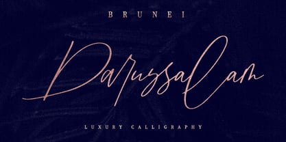 Introducing Brunei Darussalam, a fashionable and luxury handwriting font, which looks like a signature. This font is intentionally made with unique ligatures and alternates. Brunei Darussalam is perfectly suited for branding, logos, business cards, posters, invitations, greeting cards, news, product packaging, blog posters and more. This font is also equipped with unique and interesting ligatures, by using this ligature you can give a real handlettered style. Multi-Language support: ŠÀÁÂÃÄÅÆÇÈÉÊËÌÍÎÏŸŽÐÑÒÓÔÕÖØÙÚÛÜÝßàáâãäåæçèéêëìíîïñòóôõöøùúûüýÿŒœšž Thank you for your purchase!
 - Operapolitan by E-phemera,
$20.00 Operapolitan is inspired by a hand-lettered list of board members to a major metropolitan opera company in the 1920s. The font features special ligatures and a complete alternative glyph set meant for use with OpenType contextual alternates to help create the feel of real hand lettering, along with a complete international character set and built-in small capitals. Elegant but not stuffy, the font has rough edges to capture a vintage, slightly-used vibe.
 - Hamada by Linotype,
$29.99 Hamada is a script typeface based on the powerful work of English calligrapher Gaynor Goffe. Hamada captures looseness and charming irregularities of the pen on the page, allowing ink to edge out from the contours and move across curves and letters. Thanks to OpenType, Hamada creates an impression very much like that of real calligraphy. Most of the letters in Hamada have alternate versions; the typeface comes with ligatures, ending swashes, and more.
 - TE Al Thuluth by Tharwat Emara,
$75.00 This Font is similar to the calligraphic style AL THULUTH. I added many glyphs to each other to get this feature and it become easier to graphic designer to write with Arabic AL THULUTH font without being a real calligrapher. It works beautiful in Headlines of Arabic books and photos and it is Fine Art . It also used in writing on T-shirts and clothes . This Font contains many Glyphs in Latin, Farsi, Urdu, Arabic ).


