3,449 search results
(0.012 seconds)
- PGF Now by PeGGO Fonts,
$24.00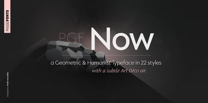 Geometric Sans with Humanistic proportions Typeface (Roman a.k.a. ‘Capitalis Monumentalis’), Inspired on vintage minimalism, with a subtle Art Déco air, where the configuration of the basic and open shape (long ascenders/descenders and a moderate ‘x’ height) star a crisp and luminous look, manufactured under an analytical and handmade process as used to be in ancient times. Among its graphic virtues are a special focus on relaxed and fluid reading rhythm while looking clear and sophisticated, an upright version representing a formal voice paired with an Italic with a more expressive vocal tone, easily distinguished as a second quoted content in Editorial and Branding communicational contexts. Equipped with generous stylistic options controlled by OpenType features as: 17 glyphs variations stored as stylistic sets Standard and Discretionary Ligatures Lining and Old Style Numeral forms Tabular forms Superior and Inferior Scientific Numeric Notation Numerators and Denominators for fractional compositions Pre-Composed Fractions, ordinals Dotted Zero for alphanumeric contexts Circled numbers An Art Déco style Border Set Bullets set for multiple levels ordered list Arrow set Monetary Symbols Mathematical Operators Publishing and Social Media Markers Wide range of Diacritics allowing you to set contents in more than 200 Latin base languages. The access to all these options is also possible via character set panel. With no hesitation, PGF Now is a highly valuable publishing and Branding tool that deserves to flaunt in the more elegant contexts but also daily situations that need a clear and modern voice.
 - Aristotelica Pro by Zetafonts,
$39.00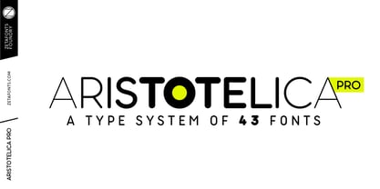 Aristotelica Pro is the 2020 redesign of the rounded geometric sans designed by Cosimo Lorenzo Pancini and Andrea Tartarelli developing the original philosophy of one of the classic and best-selling Zetafonts typefaces, Arista by Francesco Canovaro. Originally conceived as an exercise in restraint and simplicity, Aristotelica is typographic eulogy to the simple beauty of circular shapes, aptly named after the greek philosopher who pioneered formal logic. It shows its strengths mostly in display uses and logo design, with a palette of moods ranging from the stark elegance of the uppercase hairline weights to the playful softness of the lowercase bold weights. True to its universalist calling, it has however been developed in a variant text version that applies slight corrections to design and metrics to allow for better legibility in long body copy. In Aristotelica Pro both the display and the text subfamilies have been complemented with a condensed version, though especially for mobile screens and other situations where space-saving is a concern. Also the original language coverage (extended latin, greek and cyrillic) has been expanded with the inclusion of arabic language glyphs, bringing the typeface to a total of over 1100 glyphs and 200 languages covered. The family is further enriched by the inclusion of Aristotelica Icons, a set of matching variable-width monoline icons that can be used to faultlessly match the typeface line width. OpenType features includes stylistic alternates, old style and lining figures and small caps.
 - Condell Bio by Letritas,
$9.00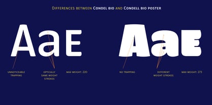 Condell Bio is part of the bigger Condell family: a project that involves series of typographies and whose early conception and development began in 2006. Unlike its Poster version , with its excessive and eccentric forms, Condell Bio tries to adapt itself to a monolinear shape, but conserving at the same time the organic character of its forms and endings. In this way Condell Bio is able to expanse its typographical use fields to a vaster scale. Condell’s endings and organic strokes haven’t been conceived in a structural way but stylistically. This means that Condell’s high readability doesn’t change and its original personality and idiosyncrasy as well. Condell can be said the ideal typography for connoting the corporation and brand identity, because of its high readability; especially its “eatable” forms, who collects images of food, are easily adaptable to food industry. Condell is highly recommended for the following products groups: cleansers, dish soaps, toothpastes, all sorts of personal hygiene products (shampoos, soaps,..), industrial cleanser products and also for products which refer to its softness, volatility and smoothness. Condell’s soft forms and nice endings, inspired through spontaneous brush strokes, give to the typography a very peculiar pleasant connotation. Its Italic (10 degrees inclination) has been produced singularly and not automatically calculated by the software. Condell Bio is composed of 16 fonts: from thin to black, whose weights are in regular and italic. Each singular weight has 600 characters and is composed of 206 languages.
 - Mi Negra by Letritas,
$25.00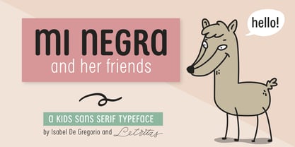 Mi negra is a funny and hilarious typography designed especially for children, thought and created by Isabel de Gregorio. It could be described as an original combination between a semi-handwright and semi sans-serif font. Thanks to its structure and nice endings "Mi Negra" is recommended for composing short texts (logotypes, packing, posters, etc.). It may similarly be used for illustrations and comics, as well as in printing press works for children from 6 to 13 years old for instance. Mi Negra has been conceived to be a useful support in all kinds of illustrations works (please note that Isabel, the type designer, considers herself primarily an illustrator). The font designer of Mi Negra tells that every time she needed to provide some text data (i.e. in children infographies) and needed to make them more understandable and suitable for children, she used this typography. The former idea was than to create a font who could be a second option to comic sans, but as the project started to reveal its forms, it was clear that it was revealing another connotation and its own character. In this way, Mi Negra went on modifying its forms and the more it developed, the more it was showing its new characteristics and concepts. The family is composed of three weighs: Light, regular and black. It provides also interesting functional ligatures. It also includes a dingbat with nice doggies. It has 434 characters and can work with 208 languages.
 - Loxley by Canada Type,
$24.95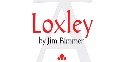 Drawn shortly before Jim Rimmer's passing in 2010, Loxley was designed to be used in a fine press edition of the folklore story of Robin Hood. It was named after the cited birthplace of the story's classic hero. Loxley's shapes were inspired the same early Roman faces (such as Subiaco from the late 1400s) that influenced Frederick Goudy's Aries, Franciscan and Goudry Thirty types. It exhibits the preculiarities of Jim's left-handed calligraphy, as well as his outside-the-box thinking with exit strokes and serif variations. Loxley was remastered for the latest technologies in 2013. Now it comes with a character set of over 450 glyphs, including plenty of stylistic alternates, a full compliment of f-ligatures, a Th-ligature, basic fractions, ordinals, a long s for historic setting, comprehensive class-based kerning, and extended Latin language support. 20% of this font's revenues will be donated to the Canada Type Scholarship Fund, supporting higher typography education in Canada.
 - Guerrer by Wahyu and Sani Co.,
$15.00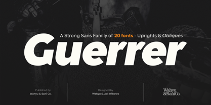 Guerrer is modern sans serif family of 20 fonts, 10 weights from thin to black, consists of uprights and matching italics (obliques). It has 300+ glyphs which covers major western languages and has some features, such as fractions, ligatures, alternates, mixed case (unicase) stylistic set, tabular & proportional lining, etc. The mixed case (unicase) feature would be very useful for logo branding project which will give a unique touch to the logotype. Ink traps for bolder styles were adjusted to maintain the legibility at smaller size for both print and digital needs. The typeface was inspired by the strength and the boldness of warriors (guerrer in Catalan). Designed with high x-height and short ascender & descender. The ascender has the same level width the caps height. The uppercase G was specially designed to resemble the warrior head with his armor/helmet. Guerrer would be great choice for branding project, display poster, website, packaging, and broad range of graphic design projects.
 - Pelegotic by T4 Foundry,
$21.00Pelegotic makes you think of Scandinavian pioneer design, with its functional letterforms and architectural look. It is also a very versatile typeface, and fits easily as headline type for a magazine, or as part of a graphic profile for a company. It looks simple, but that impression is deceptive; the letters are drawn with a flair and individuality that shows the hand of a master typographer. Pelegotic Regular is rather thin, and is useful for big type like signs. Veteran designer Bo Berndal has created Pelegotic: "Pelegotic is a sansserif inspired by the Art Deco of the 20's and the Swedish functional style of the 30's. The slightly condensed design is an attempt to find a somewhat more elegant lettershape than the usually rather technical expression of monoline typefaces", says Bo Berndal. Pelegotic comes in three weights, with roman and italic in each weight. It is an OpenType creation, for both PC and Mac. - Baro B by Our House Graphics,
$15.00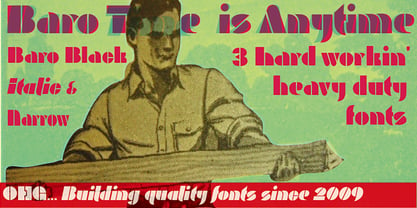 Baro is a powerful, fun and expressive font, great for loud, cheerful and super-fat headlines and packaging for odd novelty toys. With its bold and distinctive stylized geometric forms, it is ideal for logos, heavy machinery and wacky party invites. Baro had its beginning in a handful of rigidly geometric uppercase letters from an unidentified 1960�s or 70�s era press-down lettering font, which in turn was possibly a revival of a 20�s era Art Deco font. The exercise quickly expanded into a complete typeface with 300+ characters, including several catch words (word glyphs), stylistic alternates, discretionary ligatures, multilingual support and both lining and old style numerals. Baro maintains much of the characteristic geometric rigidity of the original handful of letters, but � With the addition of just a little bit of flare, a bit of cheerfulness breaks through, like a wink and a smile on the face of a fat and otherwise stern policeman.
 - Charman Serif by Propertype,
$12.00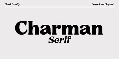 The Charman Serif Font Family Pack is an Elegant serif font that comes in 20 different weights. Designed to reflect nature, creating a sense of softness and natural expression. The concept is pushed in a usability-focused direction, to serve as both a bold tool and a classy communicator. Charman Serif is encoded with Unicode PUA, which allows full access to all additional characters without having to design any special software. Mac users can use Font Book, and Windows users can use Character Map to view and copy any additional characters to paste into your favorite text editor/app. The Charman Serif character set combines many of the features of open type - additional symbols, both standard and optional, as well as punctuation in case and lower case - resulting in a stable workhorse set ready to handle projects of any size. I hope you enjoy using the Charman Serif font and that it will be a perfect addition to your font collection!
 - Royal Bavarian by Wiescher Design,
$39.50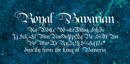 RoyalBavarian was comissioned by King Ludwig the First of Bavaria about 1834. He was probably the greatest king Bavaria ever had, but he fell in disgrace for a short affair with the infamous Lola Montez and subsequently had to resign. He died in 1868, peaceful and happy in Nice on the French Riviera. I happened on an original etching of his type-guidelines for official writers of those days about 20 years ago. I always thought it was a very nice Fraktur (Blackletter), not a sturdy militaristic one as most of them are. Being me, I started with first tests immediately and then just forgot the font on my computer. When I was sorting out old stuff a couple of months ago I happened on the etchings once again and kept on working intermittently on the letters. The Plain cut is pretty much like the king wanted it. The Fancy cut is more to my liking and very decorative. Yours in a royal mood, Gert Wiescher.
 - Mantika News by Linotype,
$67.99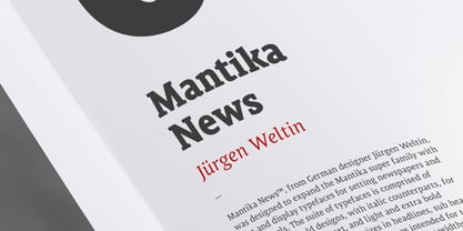 Mantika News™, from German designer Jürgen Weltin, was designed to expand the Mantika super family with text and display typefaces for setting newspapers and periodicals. The suite of typefaces is comprised of regular and bold designs, with italic counterparts, for setting continuous text, and light and extra bold versions for setting larger sizes in headlines, sub heads, pull quotes and decks. The typefaces intended for text copy were designed with shared character widths, so that changes can be made in typeface choice without disrupting line endings or column length. The display designs have a slightly smaller x-height and shorter ascenders creating a more elegant demeanor while ensuring compact multi-line display copy. In addition, fonts of Mantika News have a large Monotype W1G (World Glyph Set 1) character set enabling the setting of Greek, Cyrillic and over 20 Eastern and Western European Latin-based languages. Proportional figures are available, in the OpenType® fonts, as an alternative to the tabular designs.
 - Full Neue by Bülent Yüksel,
$19.00Full Neue is the younger brother of original Full Sans, Full Slab and Full Tools. Ideally suited for advertising and packaging, editorial and publishing, logo, branding and creative industries, poster and billboards, small text, way-finding and signage as well as web and screen design. Full Neue provides advanced typographical support for Latin-based languages. An extended character set, supporting Central, Western and Eastern European languages, rounds up the family. The designation “Full Neue LC 50 Book” forms the central point. The first figure of the number describes the stroke thickness: 10 Thin to 90 Bold. Full Neue LC comes 5 weights and italics also Full Neue SC comes 5 weights and italics total 20 types. The family contains a set of 485 characters. Case-Sensitive Forms, Classes and Features, Small Caps from Letter Cases, Fractions, Superior, Inferior, Denominator, Numerator, Old Style Figures just one touch easy In all graphic programs. Full Neue is the perfect font for web use. You can enjoy using it. - Hyperspace Race Capsule by Swell Type,
$25.00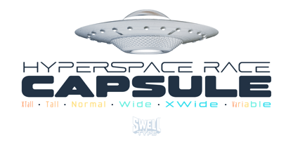 Welcome aboard the Hyperspace Race Capsule! Let the weight of gravity slip away as our interplanetary transport system takes you around the solar system in unparallelled style and comfort. Our reclaimed UFO has been remodeled with soft, luxurious curves on the interior and the latest cutting edge flight technology under the hood, to meet all your typographic travel desires. Each weight and package includes these luxurious five-star amenities: Kick your Capsule into TURBO mode to access eleven sleek, fast-moving alternate letter shapes. Hit WARP SPEED to cross time and space with hundreds of auto-connecting letter pairs. Chat with passengers from all over Earth, as Hyperspace Race Capsule effortlessly presents speech in 224 languages. Use the versatile Variable font to access 20 preset weights plus over 100,000 options between. Hyperspace Race Capsule is a versatile, full-featured font that's perfect for galaxy-wide branding projects, now and into the future.
 - Lucida Sans Typewriter by Monotype,
$29.99Lucida Sans Typewriter adapts the humanized look of Lucida Sans to the fixed pitch of typewriter fonts, in which all letters have the same set width. The vertical proportions, strong stem weights, and crisp details of Lucida Sans are continued in the Lucida Sans Typewriter font family. The result is a strong, clear, fixed-pitch design that can be used wherever a functional, legible monospaced font is needed, in typewritten correspondence, memos, and telefaxes, in commercial forms, invoices, and packing lists, in programming and data processing applications, and in line printer emulations and terminal emulations. Lucida Sans Typewriter is economical in setting: at a 10 point size, it is equivalent to a 12 pitch typewriter font. For improved legibility in long lines of 80 characters or more, users can add extra line spacing, equivalent to 20% or more of the font size. When proportional fonts are needed for text to accompany Lucida Sans Typewriter, then Lucida Bright can be used. - Frigga by Sudtipos,
$49.00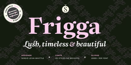 Frigga is a typeface that settles its roots in the Baroque Dutch tradition of text typefaces and northern european type forms. Carefully crafted for an optimum balance between its solid historic structure and a refreshing repertoire of organic forms, where blossoms its contemporary spirit and natural beauty. In the page, spread on long text settings a feeling of comfort and closeness, while in headlines and display use, it reveals itself more exuberant and plentiful of details. Is beautiful, timeless, lush, elegant and smooth like nordic mead. Fully equipped to realize your wildest editorial dreams, Frigga came in 20 styles, with more than a 1000 glyphs per style, alternates, ornaments and borders, old style and tabular figures, small caps and plenty of OpenType features to fulfill any type of editorial need. Named after the nordic goddess Frigga (also called Frejya), taking as a reference the romantic mythos of its cultural representation, the solemn presence and her warm, gentle embrace.
 - Flatline Sans by Up Up Creative,
$15.00Introducing Flatline, an elegant, modern sans serif font family. Meticulously drawn with high contrast between thick and thin strokes with the goal of making even the simplest sans serif letters look sensual, elegant, and warm. It’s perfect for headlines, editorial uses, and advertising projects. Makes beautiful luxe logos and wedding invitations, too. Flatline includes six styles (three weights each in both roman and italic), each of which includes nearly 500 glyphs. OpenType features include 20 standard and discretionary ligatures, a small number of character variants, three figure sets, four ampersand styles, and multilingual support (including multiple currency symbols). The OpenType features can be very easily accessed by using OpenType-savvy programs such as Adobe Illustrator and Adobe InDesign. (You can also access most of these features in Microsoft Word and other similar programs, but you'll need to get comfortable with the advanced tab of Word's font menu.) Find inspiration (and sneak peeks at my next font-in-progress) on: Instagram: http://instagram.com/julieatupupcreative My website: http://upupcreative.com - Selectric Melt by Indian Summer Studio,
$45.00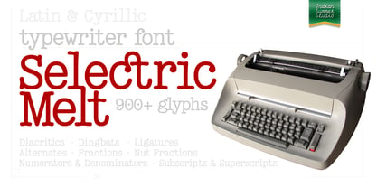 A classical 20-th century's (1900s to 1980s) typewriter font for both text and large display usage, titles, signage... A new thicker version of Selectric (2016), as if typed using not a thin carbon ribbon but a coarse fabric one. Both are available on a different models of Selectrics. Made after rare enough samples of the same style used during 1980s in the USSR. Based on the actual letter proportions of the original typewriter Selectric (2016) (Cyrillic ball). This time not monospaced as before, but proportional. The single known so far previous typewriter vector typeface with this 'ink blotting' effect (similarly expanded serifs) as in Dodo (2008) is ITC American Typewriter (1974; by Joel Kaden and Tony Stan) and all its hand drawn analogs from 1980s (and perhaps before). Which, in turn, is resembling ATF Bulletin Typewriter's (1925, 1933; by Morris Fuller Benton) overall proportions, geometry, and even had some natural ink expands in its paper sample (but not by design, as I see it).
 - Tosia by ROHH,
$40.00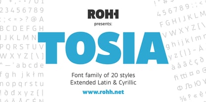 Tosia is a modern, geometric, clean, elegant and versatile font family designed with neutrality, beautiful proportion and excellent legibility in mind. This professional, contemporary sans serif has slightly condensed dimensions, which make it a great typeface for situations, where space saving is needed. Tosia’s broad variety of weights makes it suitable for headlines of all sizes, as well as for long and short paragraphs of text. It is excellent for on-screen use, for web applications, user interfaces, as well as for all kind of print purposes, like branding, packaging and editorial design. Tosia consists of 20 fonts - 10 weights and their corresponding italics. It has extended language support including cyrillic and true italics, as well as broad number of OpenType features, such as small caps, case sensitive forms, ligatures, stylistic alternates, contextual alternates, lining, oldstyle, tabular, small cap and circled figures, slashed zero, fractions, superscript and subscript, ordinals, currencies and symbols.
 - Full Slab by Bülent Yüksel,
$19.00Full Slab is the younger brother of original Full Sans, FullNeue and Full Tools. Ideally suited for advertising and packaging, editorial and publishing, logo, branding and creative industries, poster and billboards, small text, wayfinding and signage as well as web and screen design. Full Slab provides advanced typographical support for Latin-based languages. An extended character set, supporting Central, Western and Eastern European languages, rounds up the family. The designation “Full Slab LC 50 Book” forms the central point. The first figure of the number describes the stroke thickness: 10 Thin to 90 Bold. Full Slab LC comes 5 weights and italics also Full Slab SC comes 5 weights and italics total 20 types. The family contains a set of 485 characters. Case-Sensitive Forms, Classes and Features, Small Caps from Letter Cases, Fractions, Superior, Inferior, Denominator, Numerator, Old Style Figures just one touch easy In all graphic programs. Full Slab is the perfect font for web use. You can enjoy using it. - Muller by Fontfabric,
$47.00 Muller Specimen: http://bit.ly/mullers Muller Narrow Specimen: http://bit.ly/mullerns The very first sketches of Muller were made about four years ago. In the process they changed to the point where they had nothing in common with the original idea. As it is with most work we do, when we seek perfection, changes are inevitable. It was specifically designed with a wider structure for better appearance in small sizes and the extra attention to the detail was needed for the big sizes. We managed to find the right balance for the perfect universal font family. The family consists of 20 weights, ranging from Thin to Heavy with matching Italics. This font family is suited for everything, ranging from advertising, packaging, editorial and branding, to web and screen projects. Muller comes with a complete range of figure options, including proportional and old style figures, each in its tabular version. It also includes advanced typographic features such as ligatures, fractions, alternate characters, case-sensitive forms, superscripts and subscripts.
 - Kaput Black - Personal use only

- Kaput Black Black - Personal use only

- Letterpress Studio by Fenotype,
$15.00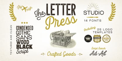 Letterpress Studio -Crafted Vintage Goods Letterpress Studio includes following • 7 fonts - a textured and clean version of each • Ornaments • Catchwords • 25 Logo Templates Letterpress Studios core is seven fonts - textured and clean version of each. Fonts are designed in same proportions and work great together. Here’s a short introduction to the fonts: • Letterpress Script -A connected script with lot’s of OpenType features • Letterpress Script Bold -Bold version of Letterpress Script • Letterpress Condensed -A condensed sans-serif typeface with swash uppercase characters on • Letterpress Gothic -A sans-serif typeface with swash uppercase characters • Letterpress Sans -An extended sans-serif typeface with swash uppercase characters • Letterpress Wood -A woodcut style serif typeface with swash uppercase characters • Letterpress Black -A black woodcut style serif typeface with swash uppercase characters • Letterpress Ornaments -A set of pictograms, ornaments, borders and badges (OTF, AI & PDF) • Letterpress Catchwords -A set of over 100 woodcut-style catchwords (OTF, AI & PDF) All fonts have West European, Central European, Baltic, Turkish and Romanian character sets. Fonts come in OTF format. TTF are also available but OpenType features won’t work with them. Letterpress Templates -25 templates (AI) Letterpress Templates is a set of 25 ready made compositions with font pairings, shapes, ornaments and ready made 2-4 color schemes for each. Templates can be used as such or as a starting point for your own project. Download Letterpress Templates here.
 - Ah, Cable by Phuxer Designs, the font that purportedly could tie the digital world together, or so it claimed, with a wink and a nudge. Imagine if a 1980s sci-fi movie and a contemporary digital art ...
- "Havent Slept in Two Days Shadow" is a font that immediately grabs your attention, not just with its unique name but with its equally distinctive style. Created by Kimberly Geswein, a designer known ...
- Ah, Bubblii, the font that seems to dance right off the page! Designed by the ever-imaginative Philip Lanier, it's the typographical equivalent of a bubble bath — fun, light, and so effervescent, you...
- BobTag is an exemplary display font created by JOEBOB graphics that exudes creativity and brings a unique flair to the realm of typography. It embodies the perfect marriage of whimsy and practicality...
- The font "aaaiight!" exudes an unmistakable aura of relaxed creativity and playful expression. This captivating typeface belongs to the graffiti-inspired category, seamlessly blending the urban grit ...
- Fantique Four - Unknown license

- Spawned - Unknown license

- 3 Prong Tree - Unknown license

- Stay Drips by Ditatype,
$29.00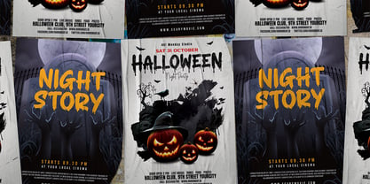 Stay Drips is an interesting, unique font in capital letters with uneven edge lines and ink drop details to give lovely, dynamic visual effects. The letters have soft brush wipes, and the ink drop details on some letter parts show a unique nuance of organic and artistic touch. The font’s unique, flexible characteristics can carry on various design styles such as formal, creative, and experimental ones. Designs with this font will express strong, amazing, unique impressions. In addition, bright and contrast colors will outstand this dynamic font that is more applicable for big text sizes to be greatly legible. You can also enjoy the available features here. Features: Multilingual Supports PUA Encoded Numerals and Punctuations Stay Drips fits best for various design projects, such as brandings, quotes, printed products, merchandise, social media, etc. Find out more ways to use this font by taking a look at the font preview. Thanks for purchasing our fonts. Hopefully, you have a great time using our font. Feel free to contact us anytime for further information or when you have trouble with the font. Thanks a lot and happy designing.
 - Bay Tavern by FontMesa,
$25.00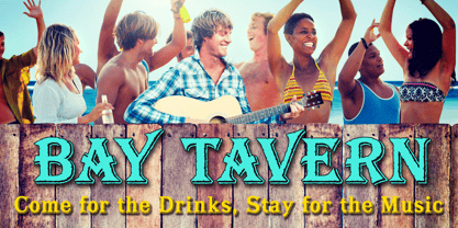 Bay Tavern is the first weathered version of our Tavern font that's based on Algerian. With three weights, open faced and outline versions to choose from you're sure to find the right style for your new project, restaurant menu, logo, t-shirt design or Pirate costume party. Bay Tavern includes all the same alternates as our regular Tavern font family. While our original Tavern font has been increased to include five weights additional weights for Bay Tavern will have to wait for now, adding the notched cut in's were all done by hand which causes a lot of cramping so a long break is needed before creating the extra weights. The Fill fonts in the Bay Tavern family are meant to be used with Bay Tavern Open fonts, if you're using Bay Tavern Open then select Bay Tavern Fill, if you're using Bay Tavern Open L then select Bay Tavern Fill L, if you're using Bay Tavern Open S then select Bay Tavern Fill S, if you're using Bay Tavern Open SL then select Bay Tavern Fill SL, the same rule goes for the Open X version.
 - Tailgates by Ditatype,
$29.00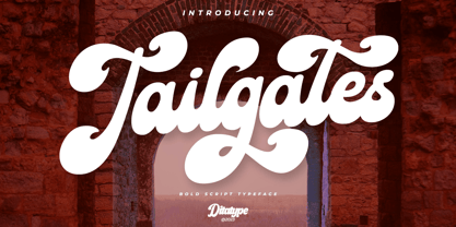 Introducing Tailgates, a script font that exudes a robust and inviting charm. This typeface showcases a substantial weight, offering your text a bold and captivating presence. Tailgates is characterized by its rounded letterforms, contributing to a friendly and approachable aesthetic. With consistent proportions and a relatively high contrast, it achieves a dynamic and eye-catching design. What sets Tailgates apart are the captivating swinging ends that adorn select letters. These elegant flourishes add a sense of whimsy and grace to your text, creating a visual experience that is both lively and engaging. The combination of round shapes and these decorative elements adds a unique touch to your designs. In addition, enjoy the features here. Features: Ligatures Stylistic Sets Swashes Multilingual Supports PUA Encoded Numerals and Punctuations Tailgates fits in headlines, logos, posters, flyers, branding materials, print media, editorial layouts, and many more designs. Find out more ways to use this font by taking a look at the font preview. Thanks for purchasing our fonts. Hopefully, you have a great time using our font. Feel free to contact us anytime for further information or when you have trouble with the font. Thanks a lot and happy designing.
 - Meow Tails by Yumna Type,
$16.00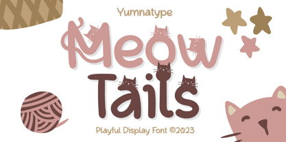 Meow Tails is a cute, adorable display font inspired by cat theme. All of its letters and characters are designed in flowing and round shapes to express soft and smooth nuances like a sleeping cat. Furthermore, the insertion of additional objects to the letters functions to suggest a cat’s characteristics, such as cute eyes, whiskers, and a long tail. Meow Tails, of which available features and a clipart bonus you can enjoy, will live up and charm your designs in order to attract the audience with the theme you have. In fact, it will also help you build up your brand identity to be unique and memorable, particularly brands related to cats or pets. Features: Alternates Multilingual Supports PUA Encoded Numerals and Punctuations Meow Tails fits best for various design projects, such as brandings, headings, magazine covers, quotes, printed products, merchandise, social media, etc. Find out more ways to use this font by taking a look at the font preview. Thanks for purchasing our fonts. Hopefully, you have a great time using our font. Feel free to contact us anytime for further information or when you have trouble with the font. Thanks a lot and happy designing.
 - Nerine by Studioways,
$33.00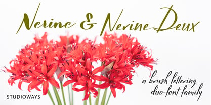 Nerine is a modern brush lettering and handwritten font duo designed by hand lettering artist Eliza Gwendalyn. Both scripts were drawn completely by hand and digitally perfected to bring you these unique script fonts. Nerine is a bold, connecting brush script, with lots of swashes and loops, while Nerine Deux is a lighter, straight stroke semi-connecting script, with a little less flair. Both scripts are ideal for use in a wide range of projects, from branding & advertising to wedding stationery & birth announcements! They also pair well with sans serif and serif typefaces! Each font is packed with ligatures and some alternate letterforms that help text runs appear more natural. The OpenType ligature feature will automatically insert ligatures when certain glyph combinations are typed, and the swash feature in Nerine will replace some beginning and ending letters with nice gentle swash alternatives. Nerinet also boasts five Style Sets that let you swap out groups of letters with interesting alternatives. Both fonts support the extended European character set so language support is extensive. Pick up Nerine or Nerine Deux, or the Nerine Duo Family today, and watch your creativity blossom!
 - Brown Amsonia by Nathatype,
$29.00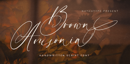 Brown Amsonia is a lovely script font of which letters are in handwriting to express unique, personal nuances in your designs. Such a handwriting font is available in high contrasts having noticeable differences between the bright and the dark letter parts to produce clear, firm displays making the designs look professional and modern. Besides, Brown Amsonia can express personal, artistic displays to create more interesting, noticeable designs. The letters are interconnected and their details show sharp, curvy scratches on the edges. Due to the complex font style details, this font is better to apply for big text sizes. In addition, you may enjoy the available features here. Features: Ligatures Stylistic Sets Multilingual Supports PUA Encoded Numerals and Punctuations Brown Amsonia fits best for various design projects, such as brandings, invitations, greeting cards, name cards, quotes, printed products, merchandise, social media, etc. Find out more ways to use this font by taking a look at the font preview. Thanks for purchasing our fonts. Hopefully, you have a great time using our font. Feel free to contact us anytime for further information or when you have trouble with the font. Thanks a lot and happy designing.
 - Beast Energy by Ditatype,
$29.00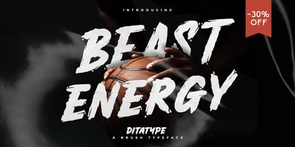 Beast Energy is a brush-copying-script font in letter designs having uneven edges as its artistic and organic characteristics. This brush script font can express dramatic, fun impressions through its capital letters making the brush wipe details clearer. The edges will look wider and thicker on certain parts of the letters. The color applications in this brush script font will also give amazing, artistic effects. For example, brighter colors will live up the letters, while darker ones will have dramatic and mysterious effects. Above all, you need to make sure the letters remain legible even in bigger text sizes. Furthermore, you can enjoy the available features here. Features: Multilingual Supports PUA Encoded Numerals and Punctuations Beast Energy fits best for various design projects, such as brandings, quotes, printed products, merchandise, social media, etc. Find out more ways to use this font by taking a look at the font preview. Thanks for purchasing our fonts. Hopefully, you have a great time using our font. Feel free to contact us anytime for further information or when you have trouble with the font. Thanks a lot and happy designing.
 - Soleil by TypeTogether,
$49.00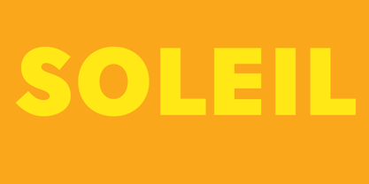 Soleil, designed by Wolfgang Homola, is a geometric sans serif typeface. Unlike most existing geometric sans serif typefaces, it has asymmetrical counters, making it look fresher, more dynamic and more contemporary. Simple geometric forms – such as the circle or the square – played a certain role in the design of the letterforms, but in order to introduce more fluidity into the rather stiff and rigid concept of geometric sans serif typefaces, a lot of optical corrections were necessary. Soleil is based on the modernist ideas of simplicity, clarity and reduction to essential forms. Yet its letter shapes are not the result of geometric construction, but of a design process that brings together simplicity and fluidity, clarity and rhythm. Soleil has a rather large x-height, making it legible also in small sizes or from a bigger distance. The typeface family consists of six weights. The Opentype version also allows for the implementation of typographic features such as Small Caps, lining and old-style figures, both tabular and proportional, ligatures, alternate characters, case-sensitive variants and fractions. Soleil offers a wide range of potential applications: signage and wayfinding systems, book and magazine design, branding and corporate publications.
 - Rubrical by Ditatype,
$29.00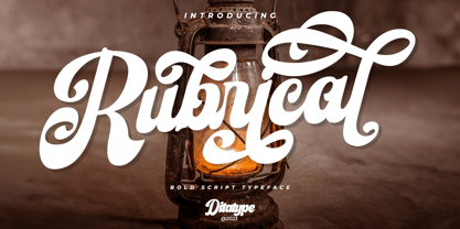 Introducing Rubrical, a script font that gives personalized feel to the design with a confident presence. This typeface is characterized by its substantial weight, giving your design a bold and impactful appearance. Rubrical maintains consistent proportions across all its letters, offering a sense of stability. It also adds a sense of warmth and personality. It has flowing and connected letterforms that are embellished with graceful swings that adorn select letters. These decorative elements, which can include ornate initials or elegant swinging flourishes, add a touch of sophistication and artistic flair to your text. They create a visual journey that is engaging, unique, and memorable. In addition, enjoy the features here. Features: Ligatures Stylistic Sets Swashes Multilingual Supports PUA Encoded Numerals and Punctuations Rubrical fits in headlines, logos, posters, flyers, branding materials, print media, editorial layouts, and many more designs. Find out more ways to use this font by taking a look at the font preview. Thanks for purchasing our fonts. Hopefully, you have a great time using our font. Feel free to contact us anytime for further information or when you have trouble with the font. Thanks a lot and happy designing.


