10,000 search results
(0.045 seconds)
- Fs Ornaments by Cuda Wianki,
$20.00 Fs ornaments are unique modular sets of ornaments that are based on ancient patterns and medieval woodcuts. They work very well on modern layouts as well. What is more You can use them not only as ornaments but also as borders. This complexity gives you a carefully planned tool with high decorative qualities. All this depends only on your imagination! With it you can add a genuine touch of distinction to every sophisticated layout but use them carefully. The basic set is Fs ornament 1 while Fs ornament 2 is a distorted version of it. Fs ornament 3 is a woodcut underlying that could be applied underneath ornaments or without them. The usage is very simple-You type them as you normally type letters but instead you get those great decoration! Easy isn't it?
 - Pepi/Rudi by Suitcase Type Foundry,
$39.00 The superfamily Pepi and Rudi is based on playful experimentation with basic geometric shapes - the circle, rectangle and triangle - elements that laid the foundations for typographic Modernism. The Pepi and Rudi introduces a number of current elements into a time-proven concept of primitively constructed typefaces. The typeface's somewhat uniform character width establishes a more regular rhythm; the character set is expanded, and legibility is improved thanks to taller lowercase. A wide range of ten styles, from hairline-thin to extra-thick with adequate Italics allow for universal use across the whole scope of graphic design. Carefully designed diacritics, clear punctuation marks, table number characters, ligatures, arrows or alternative lowercase characters are standard; this is sure to please everyone needing to work effectively with a neutral, geometric headline typeface.
 - Circe by ParaType,
$50.00 Circe™ is a geometric sans-serif with some humanist qualities. It consists of seven weights from Thin to Extra Bold in both Normal and Italic styles. Circe, like the Greek goddess it is named after, is capable of metamorphosis. While being clean and simple in its basic form, Circe can become intricate and fancy with its numerous decorative glyph variations. The extensive character set provides support for almost all European languages based on Latin and Cyrillic scripts. Abundant alternates and swash variants organized in stylistic sets inspire creative design options. Circe is good for small point size paragraphs as well as for headlines and posters. The typeface was designed by Alexandra Korolkova and released by Paratype in 2011. The Italic styles were added in 2018 by Alexandra Korolkova and Maria Kharlamova (Selezeneva).
 - PeaceNow Basic is a distinctive font that exudes a serene and harmonious essence, perfectly mirroring the ideals of peace and unity that its name suggests. Its design is a blend of soft curves and cl...
- ITC Tyfa by ITC,
$29.99 Some words from the designer, Frantisek Storm... Designed by Josef Tyfa in 1959, digitalized by F. Storm in 1996. This Roman and Italic are well-known perhaps to all Czech graphic artists and typographers ever since their release. Although this type face in some details is under the sway of the period of its rise, its importance is timeless, in contradistinction to other famous types dating from the turn of the sixties which were found, after some time, to be trite. The italics live their own life, only their upper-case letters have the same expression as the basic design. Thin and fragile, they work excellently, emphasizing certain parts in the text by their perfect contrast of expression. When seen from a distance they are a little bit darker than the Roman face. Tyfa Roman was released in 1960 by Grafotechna in Prague for hot setting. Later on, Berthold produced letter matrices - "rulers" for Staromat devices, used for manual photosetting of display alphabets. In the eighties it was available on dry transfers of Transotype and today it is offered also by ITC. The meticulously executed designs of the individual letters in the 288 point size are arranged into a set of signs on a cardboard of about B2 in size. The yellowed paper reveals retouches by white paint on the ink. Blue lines mark the baseline, the capital line, the ascender and descender lines and the central verticals of the letters. With regard to the format of the flat scanner, the designs had to be reduced, with the use of a camera, to the format A4, i.e. to the upper-case letter height of about 30 mm. These were then scanned in 600 dpi resolution and read as a bitmap template to the FontStudio programme. The newly created bold type faces derive from Tyfa's designs of the letters "a", "n", "p", the darkness of which was increased further, approximately by 3%, to enhance their emphasizing function. The text designs have hairstrokes thickened by one third; the contrast between thin and thick strokes has been modified, in order to improve legibility, in sizes under 12 points. We have used electronic interpolation to produce the semi-bold designs. Josef Tyfa himself recommends to choose a somewhat darker design than the basic one for printing of books.
 - Today Sans Now by Elsner+Flake,
$59.00 With the publication of the “Today Sans Now” Elsner+Flake extends its offering of the “Today Sans Serif” type family, developed in 1988 by Volker Küster for Scangraphic, by another cut so that the gradation of the stroke width can now be more finely calibrated. The type complement is available for 72 Latin-based languages as well as Cyrillic. Where available, small caps were integrated, and mathematical symbols as well as fractions were included. In order to make the symbols for text applications in regard to headlines more flexible, the insertions which were formerly added, for technical reasons in order to sharpen the corners, were eliminated, and the optical size adjustments of the vertical and diagonal stem endings (I, v, H, V) to the horizontal bars (z, Z) were scaled back. Already since the end of 1984, Volker Küster experimented with broad sticks of chalk and a broad felt pen in order to develop a new sans serif typeface which, in the interest of easy legibility, would be built on the basic structures and proportions of the Renaissance-Antiqua. Using a normal angle of writing, his experiments lead to the form structure of the characters: a small contrast between bold and light weights, serif-like beginning and end strokes in some of the lower-case characters, and the typical, left-leaning slant of all round lower-case letters and the typical left-leaning axis of all round letter forms. In this way, a rhythmization of a line of type was achieved which created a lively image without being “noisy”. With this concept, Volker Küster has enlarged the Sans Serif by a distinctive, trend-setting form variation.
 - Stablehand JNL by Jeff Levine,
$29.00A vintage Wells wood type was the basis for Stablehand JNL. - Tinta Arabic by NamelaType,
$29.00 Tinta Arabic is the sibling of Tinta, with with additional Arabic glyphs for more international fun with the addition of Arabic glyphs; Arabic, Urdu, Kurdish Farsi and Jawi. Basic form for arabic font is refers to the arabic Naskhi style, with a cute shape to harmony with Latin.
 - Multicross by ParaType,
$30.00 Multicross font was designed by Dmitry Greshnev in 2003-2004 and is licensed by ParaType. Mesh creates the basic structure for this font. Multicross has Regular and Rounded styles. For use in advertising and display typography. Can be used as a screen font with anti-aliasing function switched off.
 - Deco Revival JNL by Jeff Levine,
$29.00 Some time back, a few basic characters were drawn out (possibly inspired by some vintage sheet music) and set aside for a future font project. Despite being incomplete for a few years, this once-forgotten design is now available as Deco Revival JNL, in both regular and oblique versions.
 - Chocolate Chipped by Vintage Type Company,
$9.00 VTC Chocolate Chipped is a modern and minimalist homage to exaggerated woodblock typefaces of the past. It's the perfect little font collection for loud and in-your-face messaging, with 3 different weights in standard and oblique flavours. Adobe Latin 1 & Basic Cyrillic language support are also included.
 - Yariko by Mevstory Studio,
$35.00 Yariko is a typeface that has a modern, bold, clean, simple, and futuristic look. The basic shape of this typeface is like two rectangles arranged side by side with simple, unique joints and accents. Perfect for logo, brand and apparel projects. Airforced Typeface Include : Letters Alternates Numeral Multilingual Support
 - Throll by Skiiller Studio,
$18.00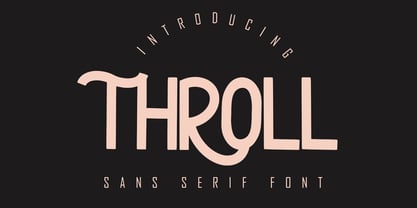 THROLL Modern sans serif font. It has a elegant, classy look and modern. It’s a great font for fashion, apparel projects, signature, album cover, logo, branding, magazine, social media, & advertisements. What's include: Stylistic alternate PUA Encoded Characters - Fully accessible without additional design software. Basic Latin Language Support (AÀÁÂÃÄÅCÇDÐEÈÉÊËIÌÍÎÏÑOØÒÓÔÕÖUÙÜÚÛWYÝŸÆß )
 - Lunar by Etewut,
$20.00 Lunar is a handwritten sans serif typeface that was created for the opera Pierrot Lunaire during Diaghilev festival 2018 in Perm. There are 3 fonts in the family of LUNAR: light, regular and bold. It supports all EUROPEAN languages, basic CYRILLIC and GREECE language. It's enough to make sensation!
 - Wulf Utility by Device,
$29.00 Wulf Utility is a heavily degraded font that evokes information in a utilitarian manner without any pretence to elegance, fuss or refinement. Gruff and direct, it is about as basic as a font can be. The Dirty version can be layered over the Rough version for two-tone effects.
 - Lunch Show by Epiclinez,
$18.00 Lunch Show is a cute, friendly yet thick lettered display font. It embodies playfulness and it's the right choice for product packaging, logotype, games, children, or school projects. So what’s included: Basic Latin A-Z & a-z. Numbers, symbols, and punctuations Multilingual Support. Accented Characters : ÀÁÂÃÄÅÆÇÈÉÊËÌÍÎÏÑÒÓÔÕÖØŒŠÙÚÛÜŸÝŽàáâãäåæçèéêëìíîïñòóôõöøœšùúûüýÿžß Thank you
 - My Gristy by Yohanes Oktav,
$12.00 Rediscover Classic Beauty font style with a Modern Edge taste in Serif Wonder: My Gristy. Catchy ligature upscaled your name into unique logotype. My Gristy also available with basic Latin multilingual. Bring your business to the brighter future with the soul of the timeless of the past era.
 - Spring Ride by Epiclinez,
$18.00 Spring Ride is a cute, friendly yet thick lettered display font. It embodies playfulness and its the right choice for product packaging, logotype, games, children, or school project. So what’s included: Basic Latin A-Z & a-z. Numbers, symbols, and punctuations Multilingual Support. Accented Characters : ÀÁÂÃÄÅÆÇÈÉÊËÌÍÎÏÑÒÓÔÕÖØŒŠÙÚÛÜŸÝŽàáâãäåæçèéêëìíîïñòóôõöøœšùúûüýÿžß Thank you
 - Naveid Arabic by NamelaType,
$29.00 Naveid Arabic is new version of Naveid with the addition of Arabic glyphs, for Arabic, Urdu, and Farsi. Basic form for arabic font is refers to the arabic kufi style, with combining the cuppped serif on top and the tinny Subtle Flaring on the terminal, to harmony with Latin.
 - Inkster by Typadelic,
$19.00Inkster breaks all the rules. The serifs vary from letter to letter, if they have any serifs at all. The upper and lower case letters intermingle and the contrasting characters bounce all over the baseline. Loosely based on the character shapes of Frisco, I developed a tightly spaced calligraphic version and called it Inkster. Use this artistic font when youre looking for a distinctive style! - Codex by Linotype,
$29.99 Codex was designed by Georg Trump and introduced by the font foundry C.E. Weber in 1954. Based on the German Gothic script of the 13th century, this font has the character of handwriting. Its capital letters are extremely big in comparison with the lower case, hence good for contrast in short text, however, this characteristic makes the font better suited to languages which use fewer capital letters.
 - Glence by Nine Font,
$25.00 Glence family is a geometric sans-serif type family with 9 weights, from thin to black,with corresponding italics. Glence is designed based on geometric shapes that looks simple and clean. Each font includes opentype features such as Stylistic Alternates, Proportional Figures, Tabular Figures, Numerator, Superscript, Subscript, Case-Sensitive, Denominators, Scientific Inferiors, Ordinals, Ligatures and Fractions. Glence will make your artworks better with its simple & clean shapes.
 - P22 Larkin by IHOF,
$24.95 This lettering style is unusual in that combines aspects of several lettering styles. It is essentially a Germanic Blackletter but with many romanized capital letters and also features an italic slant along with some italic lower case traits. It is evocative of “old world” craftsmanship and early 20th century romanticism. The font was developed based on the logo of the Lakin Company of Buffalo, NY circa 1900.
 - Waterman by John Moore Type Foundry,
$20.00 Waterman is a display font, its form is based on the figure of a fluid, creating a texture of undulating forms, rhythmic and free to make reading a stream wave experience. Waterman comes in Regular and Bold. The letter shape was developed from the design of the letter "a" and “l” lower case. The curve model is related on a stylized form of a fluid wave.
 - Running Hipster by Hanoded,
$15.00 Running Hipster is a tall, thin and all caps font with a funny name. The upper and lower case letters differ and can be mixed. You don’t necessarily have to use it to market your free range sheep woolen jumpers or organic button squash and soy based sour cream soup, feel free to use it for just about anything. Comes with a vintage amount of diacritics.
 - As of my last update in April 2023, "Basic Map" by Rémi Godefroid is not a widely recognized or documented font in popular databases or among commonly known typefaces. Regardless, let’s explore the l...
- Oddee by Informal Type,
$25.00 Construction period of Anafor deeply inspired by the pioneer of geometric abstract art and the creator of the avant-garde suprematist movement Kazimir Severinovic, Malevich’s suprematist compositions. Anafor typeface is separated from the basic Latin letters in terms of character and letter structure. Furthermore, The forms and main structure are designed together with alternatives by taking into account the relationships between the defined angles.Anafor contains certain aspects of a display typeface, due to the structure of the letter forms that are open to abstract connotations. Typeface family includes 2 styles; Anafor Basic and Anafor Crash. Each individual style has 235 glyphs and it has OpenType encoding. Due to the diversity of three styles, Anafor is providing a wide range of possibilities for the user.
 - Ollivette by Chank,
$59.00The new distressed typewriter font Ollivette is inspired by a beatnik poet sitting on a beach in Mexico pecking away at his brand new, imported, Italian portable typewriter in 1954. That's where the basic letterforms for this font hearken from. The grungey patina has been added over the years and is now available for you to download in font format. If you prefer the basic TrueType or PostScript versions, you'll enjoy a new standard retro typewriter style. Users of the advanced OpenType features will appreciate stylistic alternates for almost every letter, and contextual alternates for a randomizing organic effect. Support for Western & Central Europe? Yeah! We put that in there, too. So go global, and go vintage, here's a classic new type for you. - Anafor by Informal Type,
$25.00 Construction period of Anafor deeply inspired by the pioneer of geometric abstract art and the creator of the avant-garde suprematist movement Kazimir Severinovic, Malevich’s suprematist compositions. Anafor typeface is separated from the basic Latin letters in terms of character and letter structure. Furthermore, The forms and main structure are designed together with alternatives by taking into account the relationships between the defined angles.Anafor contains certain aspects of a display typeface, due to the structure of the letter forms that are open to abstract connotations. Typeface family includes 2 styles; Anafor Basic and Anafor Crash. Each individual style has 235 glyphs and it has OpenType encoding. Due to the diversity of three styles, Anafor is providing a wide range of possibilities for the user.
 - 1470 Sorbonne by GLC,
$21.00 This family was created inspired from the first font carved and cast in France, for the Sorbonne University’s printing workshop (Paris). The characters were drawn by Jean Heynlin, rector of the university - inspired from Pannartz’s - and in all probability was carved by Adolf Rusch. It has only one style, in one size (about 14 Didots points). We have added the U, J, W and Y, some accented characters and others not in use in the original, but the standard and historical ligatures and the numerous Latins abbreviations are these of the original font. The font is proposed in two choices : Basic Latin, MacTT & TTF, free for a private use, and “Pro”, TTF/OTF, available for standard basic Latin plus Central Europe, Baltic, Turkish, Croatian, Romanian, Celtic.
 - Kowalski2 by GRIN3 (Nowak),
$28.00 Kowalski2 is a decorative, serif, hand-drawn font. It can be used for invitations, greeting cards, posters, advertising, weddings, books, menus etc. The inspiration came from the beautiful font Desire designed by Charles Borges de Oliveira. Kowalski2 Pro is the most complete style, it contains all the alternates and ligatures. To get the alternate glyph just add "+“, ”=" or "*" before the letter in any OpenType savvy application or manually select the characters from Glyph Palette. Kowalski2 Basic has the basic character set with 345 glyphs and no alternates. Kowalski2 A, Kowalski2 B and Kowalski2 C have less glyphs than the Pro one, they only contain some selected alternates and ligatures. Language support includes Western, Central and Eastern European character sets, as well as Baltic and Turkish languages.
 - SomaSkript by ArtyType,
$29.00 SomaSkript is a natural extension to the basic Somatype font design, adding more variety to the family, all of which have similar features. Basically, by widening the uprights and maintaining the thin cross-bars it takes on more of a script-like quality, hence the name. Slanting the letters reinforces the script illusion and consequently brings a broader application to the font’s original format. When designing the Somatype alphabet originally, I always envisaged maximizing on its potential by creating an incised version. This variation not only emphasizes the implied script qualities within the name but brings out the softer, feminine side of the typeface. This evolutionary process creates a different looking font altogether and in turn the slanted version emphasizes the elegant quality even more so.
 - Publica Slab by FaceType,
$- ‘Publica Slab’ is the serifed sister of Publica Sans and Publica Play – packed with subtle open type features, tabular options, rare currencies signs and symbols and arrows, ‘Publica Slab’ provides everything you need for big design tasks like signage, corporate design and magazine design. Take a close look at our gallery (especially ‘OpenType Features 1–6’) to discover the versatility of Publica Slab. Alternates Give your typography a certain spin with the variety of alternate letters provided. Currency You need to set prices in exotic countries? No problem: Publica Slab gives you loads of rare currency symbols. Case Sensitive Forms Sometimes you write in all caps and there are some symbols (e.g. brackets) that need some extra treatment to make it look perfect – that’s what case sensitive forms are for. Figures Publica Slab provides 6 sets of figures, like lining, tabular, oldstyle, numerators ... Discretionary Ligatures Ligatures can make your logo or headline look spicy. So there are plenty of them.
 - Halley by Eurotypo,
$24.00 Halley is a modern, funny and casual script with an irregular base line that gives it a unique and modern look. All the glyphs have been carefully painted giving the texts a wonderful flow. A fat and thin blow in this font impresses the harmony. Halley family pack comes in three styles: regular, italic and Shadow. Each font contains 746 “regular or irregular" glyphs, including up to seven alternatives in upper case and six in lower case, standard and discretionary ligatures for a genuine handwriting effect. It also includes a Central European language support with its corresponding alternative characters to have more options in those languages. We have added some useful ornaments that will serve for the most demanding design project! Halley looks good in children's books, fashion, magazines, restaurant menus, book covers, wedding invitations, greeting cards, logos, business cards and is perfect for use in designs based on ink or watercolor, and more
 - Publica Play by FaceType,
$- Publica Play is Publica Sans’ and Publica Slab’s playful sister. It comes with loads of subtle open type features, tabular options, rare currencies signs and symbols and arrows – ‘Publica Play’ has everything you need for playful design tasks. Take a close look at our gallery (especially ‘OpenType Features 1–7’) to discover the versatility of Publica Play. Alternates and Stylistic Sets Give your typography a certain spin with the variety of alternate letters provided. Explore the Stylistic Sets provided. Currency You need to set prices in exotic countries? No problem: Publica Play gives you loads of rare currency symbols. Case Sensitive Forms Sometimes you write in all caps and there are some symbols (e.g. brackets) that need some extra treatment to make it look perfect – that’s what case sensitive forms are for. Figures Publica Play provides 6 sets of figures, like lining, tabular, oldstyle, numerators ... Discretionary Ligatures Ligatures can make your logo or headline look spicy. So there are plenty of them.
 - Marchioness by MKGD,
$13.00 Marchioness is a typeface that was built on the same basic structure as Lady Edith. I considered making it a subset of Lady Edith but felt that its overall appearance projected a uniqueness that allowed it to stand on its own. Although still maintaining a definite Art Deco form, it differentiates itself from its parent font by possessing a more opulent, if not regal, construction. The bones may be that of Lady Edith, but the typeface itself is most certainly Marchioness. There is no lower case for Marchioness as it is a decorative font. The Upper case version serves both the upper and lower case keys. Marchioness has a glyph count of 389 and supports the following languages; Supported Languages: Afrikaans, Albanian, Asu, Basque, Bemba, Bena, Bosnian, Catalan, Chiga, Colognian, Cornish, Croatian, Czech, Danish, Embu, English, Esperanto, Estonian, Faroese, Filipino, Finnish, French, Friulian, Galician, German, Gusii, Hungarian, Icelandic, Indonesian, Irish, Italian, Kabuverdianu, Kalaallisut, Kalenjin, Kamba, Kikuyu, Kinyarwanda, Latvian, Lithuanian, Low German, Lower Sorbian, Luo, Luxembourgish, Luyia, Machame, Makhuwa-Meetto, Makonde, Malagasy, Malay, Maltese, Manx, Meru, Morisyen, North Ndebele, Norwegian Bokmål, Norwegian Nynorsk, Nyankole, Oromo, Polish, Portuguese, Romanian, Romansh, Rombo, Rundi, Rwa, Samburu, Sango, Sangu, Scottish Gaelic, Sena, Shambala, Shona, Slovak, Slovenian, Soga, Somali, Spanish, Swahili, Swedish, Swiss German, Taita, Teso, Turkmen, Upper Sorbian, Vunjo, Walser, Zulu
 - Vaudeville JNL by Jeff Levine,
$29.00 Vaudeville JNL started out as the re-drawing of an angular Art Deco font hand-lettered on some old publications for sale online. After completing the basic alphabet, it was realized that it just didn't look good -- so a more traditional letter form was adapted to represent the style and times.
 - Dissert by Skiiller Studio,
$20.00 Dissert is a playful and unique display font with a charming feel. Get inspired by its unique authentic charm! What's include: Ligature PUA Encoded Characters - Fully accessible without additional design software. Basic Latin Language Support (AÀÁÂÃÄÅCÇDÐEÈÉÊËIÌÍÎÏÑOØÒÓÔÕÖUÙÜÚÛWYÝŸÆß ) How to access alternate glyphs? you can see it on this link ( http://goo.gl/1vy2fv )
 - DigiBo by Volcano Type,
$29.00 Inspired by a scoreboard of the public transport in London our best selling font family is the basic font for the german magazine Starshot and even earned feedback from Sports Illustrated. The technical look of the entire DigiBo family is making the font a worthy member of the Eurostile / DIN -league.
 - Heroes by Skiiller Studio,
$16.00 HEROES a condensed sans serif font. It has a elegant, classy look and modern. It’s a great font for fashion, Ligature Feature Opentype, apparel projects, signature, album cover, logo, branding, magazine, social media, & advertisements. What's include: Ligature PUA Encoded Characters - Fully accessible without additional design software. Basic Latin Language Support (AÀÁÂÃÄÅCÇDÐEÈÉÊËIÌÍÎÏÑOØÒÓÔÕÖUÙÜÚÛWYÝŸÆß )