10,000 search results
(0.041 seconds)
- Sticky Melody by Nathatype,
$29.00 Sticky Melody is a charming display font that combines cuteness with a bold and prominent style. With its thick weight, rounded shapes, and distinct contrast, this typeface is designed to capture attention and infuse your designs with a playful and lively energy. The thick weight of Sticky Melody gives each letter a robust and substantial presence, making it stand out effortlessly. The rounded shapes add a touch of softness and friendliness, creating an endearing and approachable feel. The font's unique feature lies in its prominent contrast, which accentuates the curves and contours of each character, elevating the overall visual impact. Let the thick weight, rounded shapes, and prominent contrast of this font bring your creative visions to life, ensuring that your message stands out in the most charming and captivating way possible. You can use it in big text sizes to be greatly legible and enjoy the available features here. Features: Stylistic Sets Ligatures Multilingual Supports PUA Encoded Numerals and Punctuations Sticky Melody fits in children's books, toy packaging, posters, headlines, logos, social media designs, and any design project that require a touch of delightful playfulness. Find out more ways to use this font by taking a look at the font preview. Thanks for purchasing our fonts. Hopefully, you have a great time using our font. Feel free to contact us anytime for further information or when you have trouble with the font. Thanks a lot and happy designing.
 - Mareline Script by Mega Type,
$10.00 Introducing Mareline Script Font Duo, a sweet handlettered font, casual and dynamic with a bold and irregular baseline. Contains a complete set of lowercase, uppercase, alternates, ligatures, punctuation, numbers, and multilingual support. And additional Mareline Sans, working in harmony with Mareline script to create awesome typographic creations. Get some inspiration from the preview above. This font ideal for use in watercolor design or bold hand lettering style, such as posters, wedding elements, t-shirt, apparel, cover books, business cards, greeting cards, branding, merchandise, invitations and handmade quotes and more. Mareline Script Font Duo features OpenType stylistic alternates, ligatures and International support for most Western Languages. To enable the OpenType Stylistic alternates, you need a program that supports OpenType features such as Adobe Illustrator CS, Adobe Indesign & CorelDraw X6-X7, Microsoft Word 2010 or later versions. How to access all alternative characters using Adobe Illustrator: https://www.youtube.com/watch?v=XzwjMkbB-wQ Mareline Script Font Duo is coded with PUA Unicode, which allows full access to all the extra characters without having special designing software. Mac users can use Font Book , and Windows users can use Character Map to view and copy any of the extra characters to paste into your favorite text editor/app. How to access all alternative characters, using Windows Character Map with Photoshop: https://www.youtube.com/watch?v=Go9vacoYmBw If you need help or have any questions, please let me know. I'm happy to help. Thanks & Happy Designing!
 - Areplos by Storm Type Foundry,
$53.00To design a text typeface "at the top with, at the bottom without" serifs was an idea which crossed my mind at the end of the sixties. I started from the fact that what one reads in the Latin alphabet is mainly the upper half of the letters, where good distinguishableness of the individual signs, and therefore, also good legibility, is aided by serifs. The first tests of the design, by which I checked up whether the basic principle could be used also for the then current technology of setting - for double-sign matrices -, were carried out in 1970. During the first half of the seventies I created first the basic design, then also the slanted Roman and the medium types. These drawings were not very successful. My greatest concern during this initial phase was the upper case A. I had to design it in such a way that the basic principle should be adhered to and the new alphabet, at the same time, should not look too complicated. The necessary prerequisite for a design of a new alphabet for double-sign matrices, i.e. to draw each letter of all the three fonts to the same width, did not agree with this typeface. What came to the greatest harm were the two styles used for emphasis: the italics even more than the medium type. That is why I fundamentally remodelled the basic design in 1980. In the course of this work I tried to forget about the previous technological limitations and to respect only the requirements then placed on typefaces intended for photosetting. As a matter of fact, this was not very difficult; this typeface was from the very beginning conceived in such a way as to have a large x-height of lower-case letters and upper serifs that could be joined without any problems in condensed setting. I gave much more thought to the proportional relations of the individual letters, the continuity of their outer and inner silhouettes, than to the requirements of their production. The greatest number of problems arose in the colour balancing of the individual signs, as it was necessary to achieve that the upper half of each letter should have a visual counterbalance in its lower, simpler half. Specifically, this meant to find the correct shape and degree of thickening of the lower parts of the letters. These had to counterbalance the upper parts of the letters emphasized by serifs, yet they should not look too romantic or decorative, for otherwise the typeface might lose its sober character. Also the shape, length and thickness of the upper serifs had to be resolved differently than in the previous design. In the seventies and at the beginning of the eighties a typeface conceived in this way, let alone one intended for setting of common texts in magazines and books, was to all intents and purposes an experiment with an uncertain end. At this time, before typographic postmodernism, it was not the custom to abandon in such typefaces the clear-cut formal categories, let alone to attempt to combine the serif and sans serif principles in a single design. I had already designed the basic, starting, alphabets of lower case and upper case letters with the intention to derive further styles from them, differing in colour and proportions. These fonts were not to serve merely for emphasis in the context of the basic design, but were to function, especially the bold versions, also as independent display alphabets. At this stage of my work it was, for a change, the upper case L that presented the greatest problem. Its lower left part had to counterbalance the symmetrical two-sided serif in the upper half of the letter. The ITC Company submitted this design to text tests, which, in their view, were successful. The director of this company Aaron Burns then invited me to add further styles, in order to create an entire, extensive typeface family. At that time, without the possibility to use a computer and given my other considerable workload, this was a task I could not manage. I tried to come back to this, by then already very large project, several times, but every time some other, at the moment very urgent, work diverted me from it. At the beginning of the nineties several alphabets appeared which were based on the same principle. It seemed to me that to continue working on my semi-finished designs was pointless. They were, therefore, abandoned until the spring of 2005, when František Štorm digitalized the basic design. František gave the typeface the working title Areplos and this name stuck. Then he made me add small capitals and the entire bold type, inducing me at the same time to consider what to do with the italics in order that they might be at least a little italic in character, and not merely slanted Roman alphabets, as was my original intention. In the course of the subsequent summer holidays, when the weather was bad, we met in his little cottage in South Bohemia, between two ponds, and resuscitated this more than twenty-five-years-old typeface. It was like this: We were drinking good tea, František worked on the computer, added accents and some remaining signs, inclined and interpolated, while I was looking over his shoulder. There is hardly any typeface that originated in a more harmonious setting. Solpera, summer 2005 I first encountered this typeface at the exhibition of Contemporary Czech Type Design in 1982. It was there, in the Portheim Summer Palace in Prague, that I, at the age of sixteen, decided to become a typographer. Having no knowledge about the technologies, the rules of construction of an alphabet or about cultural connections, I perceived Jan Solpera's typeface as the acme of excellence. Now, many years after, replete with experience of revitalization of typefaces of both living and deceased Czech type designers, I am able to compare their differing approaches. Jan Solpera put up a fight against the digital technology and exerted creative pressure to counteract my rather loose approach. Jan prepared dozens of fresh pencil drawings on thin sketching paper in which he elaborated in detail all the style-creating elements of the alphabet. I can say with full responsibility that I have never worked on anything as meticulous as the design of the Areplos typeface. I did not invent this name; it is the name of Jan Solpera's miniature publishing house, in which he issued for example an enchanting series of memoirs of a certain shopkeeper of Jindrichuv Hradec. The idea that the publishing house and the typeface might have the same name crossed my mind instinctively as a symbol of the original designation of Areplos - to serve for text setting. What you can see here originated in Trebon and in a cottage outside the village of Domanín - I even wanted to rename my firm to The Trebon Type Foundry. When mists enfold the pond and gloom pervades one's soul, the so-called typographic weather sets in - the time to sit, peer at the monitor and click the mouse, as also our students who were present would attest. Areplos is reminiscent of the essential inspirational period of a whole generation of Czech type designers - of the seventies and eighties, which were, however, at the same time the incubation period of my generation. I believe that this typeface will be received favourably, for it represents the better aspect of the eighties. Today, at the time when the infection by ITC typefaces has not been quite cured yet, it does absolutely no harm to remind ourselves of the high quality and timeless typefaces designed then in this country.In technical terms, this family consists of two times four OpenType designs, with five types of figures, ligatures and small capitals as well as an extensive assortment of both eastern and western diacritics. I can see as a basic text typeface of smaller periodicals and informative job-prints, a typeface usable for posters and programmes of various events, but also for corporate identity. Štorm, summer 2005 - As of my last update, Pouttu is a charismatic typeface created by Fenotype, a type foundry known for crafting innovative and visually appealing fonts. The essence of Pouttu lies in its seamless blend...
- Mencken Std by Typofonderie,
$59.00 An American Scotch remixed in 27 fonts Mencken has twenty seven styles, divided into three widths, three optical sizes, romans and italics. Generally, optical size typeface families belong to a same common construction. It falls into the same category of type classification, while presenting different x-heights or contrasts. Mencken is unique because it is designed according to different axis and optical sizes. Firstly, Mencken Text is a low-contrast transitional typeface, designed on an oblique axis, asserting horizontal with featuring open counters. Its capitals follow Didots to better harmonize the rest of the family. On the other side of the spectrum, Mencken Head (and narrow variations) is designed on a vertical axis, high contrast, in a contemporary Didot style. The Mencken is therefore a typeface answering to different sorts of uses, whose design is different according to its uses: from oblique axis in small size to vertical axis in large sizes. Vertical proportions (x-height, capitals height, etc.) were calibrated to be compatible with many Typofonderie typeface families. Lucie Lacava and I followed the idea launched by Matthew Carter few years ago for some of his typefaces intended for publications. From Baltimore Sun’s project to Typofonderie’s Mencken It is a bespoke typeface for American newspaper The Baltimore Sun started at the end of 2004 which marks the beginning of this project. The story started with a simple email exchange with Lucie Lacava then in charge of redesigning the American East Coast newspaper. As usual, she was looking for new typeface options in order to distinguish the redesign that she had started. At the time of its implementation, a survey of the newspaper’s readers has revealed that its previous typeface, drawn in the mid-1990s, was unsatisfactory. The Mencken was well received, some reader responses was particularly enjoyable: “It’s easier to read with the new type even though the type is designed by a French.” Why it is called Mencken? The name Mencken is a tribute to H. L. Mencken’s journalistic contributions to The Sun. According to the London Daily Mail, Mencken ventured beyond the typewriter into the world of typography. Because he felt Americans did not recognize irony when they read it, he proposed the creation of a special typeface to be called Ironics, with the text slanting in the opposite direction from italic types, to indicate the author’s humour. Affirming his irreverence, the Mencken typeface does not offer these typographic gadgets. Henry Louis Mencken (1880 — 1956) was an American journalist, satirist, cultural critic and scholar of American English. Known as the “Sage of Baltimore”, he is regarded as one of the most influential American writers and prose stylists of the first half of the twentieth century. He commented widely on the social scene, literature, music, prominent politicians and contemporary movements. Creative Review Type Annual 2006 Tokyo TDC 2018
 - Bello Pro by Underware,
$50.00 Now check this, Underware’s blockbuster type, Bello. Bello Pro is a brush typeface for headline point sizes - it’s big & beautiful. Bello has lots of ligatures and start and ending swashes. They are automatic in Bello Script Pro, which is a cross-platform OpenType font with many OpenType features. Bello has Underware’s world-dominating Latin Plus character set, supporting a total of 219 languages (Latin 1 + 2 and beyond). After a period of hand sketching and lettering, Bello got two main styles: Script and Caps. These two fonts create a strong typographic contrast - while Bello Script Pro is flourished and flowing, Bello Caps Pro provides upright and sturdy capital lettering. As sturdy as brush lettering allows, of course. Careful spacing and kerning ensures* that Bello appears like fluently written handwriting. However, that’s not enough for a hand-lettered feel. Therefore Bello comes with a set of 64 ligatures. Some of them are typographic, some made simply to create a more intimate, natural impression. For the same reasons we have added a few ornaments and a set of snap-on beginning and ending swashes which attach to the lowercase letters of Bello. With Bello Words Pro you can add some two-color words in your text by the pre-designed word logotypes. Trust the brush! *So take care: use ‘metrics’, not ‘optical’ as a spacing setting in layout apps.
 - Evanston Tavern by Kimmy Design,
$10.00 Evanston Tavern is a square typeface and the sans-serif version to Evanston Alehouse. Inspired by the years that prefaced the ratification of the American Prohibition, this typeface mimics the signage commonly seen outside of saloons, taverns and alehouses during that time. Back to the modern era, Evanston Tavern is more than just a vintage inspired typeface. It works in modern and futuristic settings with multiple styles, opentype alternatives and ornamentation. The family provides a robust 61 total fonts, within it's 3 styles of regular, stencil and inline. Each sub family includes 4 weights and 5 widths. It has special features that add depth to the typeface, with discretionary ligatures and stylistic alternatives. It also includes a complimentary set of ornaments, including a vintage graphic set from the era, as well as modern frames, borders and icons. This typeface works great at logos, packaging, and other display settings. Pair this font with Evanston Alehouse and have a great combination of serif and sans-serif square letterforms and a large array of ornaments! Here’s a snapshot of what you get with Evanston Tavern: - 3 Styles: Regular, Stencil and Inline - 4 Weights: Light, Regular, Medium and Black - 5 Widths: 1826 (condensed), 1846 ( narrow) 1858 (regular), 1893 (wide) and 1919 (expanded) - 2 capital Heights: Capitals and small caps - 2 Alternatives: Discretionary Ligatures and Stylistic Alternatives - 1 Ornaments font with over 100 graphic extras
 - Anachrony by Cerulean Stimuli,
$24.00 Reminiscent of circuitry and wrought iron, Anachrony constructs the forms of an Old English Blackletter with the strokes of a Modern Geometric Sans, and lands in the vicinity of Art Deco. For such an unusual chimera, the Anachrony family is legible and versatile. Its glyphs cover pan-European Latin, Greek, and a wealth of symbols including arrows, zodiac, planets, chess, suits, and circled numbers. It is also packed with Opentype features: Small Capitals: Of similar proportions to the default numerals, tall enough to be a suitable choice in place of regular capitals. All Caps Forms: In addition to the four usual types of numerals, there are numerals and currency symbols that match the capitals. Swash: A leading curly swash on capitals, and fancy looped ascenders in the lowercase that are handled by over a hundred standard ligatures where they would collide. Style Set 01: Romanized forms. Especially recommended for all caps. Plainer A/M/T/V/W/Y, J/Q reined in to the baseline, and alternate g. Style Set 02: Masthead forms. Old-fashioned capitals with descenders and that lower left dealy. Also f/x/z/ß in a more traditional fraktur mode. Style Set 03: Mild embellishments. Tall bifurcated ascenders and descenders. Style Set 04: Extravagant swash descenders. Style Set 05: Final swashes for the end of a word. Style Set 06: Converts capital letters into the corresponding connected Roman numerals. Seemed like it could be useful sometime. Easy swooshes: Standard ligatures allow you to type two to seven commas in a row to append an assortment of sweeping or ending swashes. Catchwords: In Anachrony Royale, turn on Discretionary Ligatures for a variety of decorative articles and prepositions.
 - Cranberry Cyr - Unknown license

- Misirlou Cyr - Unknown license

- Macro is a contemporary typeface known for its versatility and dynamic character. It harmoniously marries readability with a unique design aesthetic, making it a favored choice among designers and ty...
- The Héloïse font is an exquisite and versatile typeface, embodying a unique blend of classic elegance and contemporary flair. At first glance, Héloïse exudes an air of sophistication and grace, makin...
- PF DIN Text by Parachute,
$79.00 The purpose of the original DIN 1451 standard was to lay down a style of lettering which is timeless and easily legible. Unfortunately, these early letters lacked elegance and were not properly designed for typographic applications. Ever since its first publication in the 1930’s, several type foundries adopted the original designs for digital photocomposition. By early 2000, it became apparent that the existing DIN-based fonts did not fulfil the ever-increasing demand for a diverse set of weights and additional support for non-Latin languages. Parachute® was set out to fill this gap by introducing the PF DIN series which has become ever since the most comprehensive and sophisticated set of DIN typefaces. It was based on the original standards but was specifically designed to fit typographic requirements. Its letterforms divert from the stiff geometric structure of the original and introduce instead elements which are familiar, softer and easier to read. The first set of fonts was completed in 2002 as a group of 3 families which included condensed and compressed versions. With its vast array of weights, the extended language support, but most of all its meticulous and elaborate design, it has proved itself valuable to numerous design agencies around the world. Ever since its first release, it has been used in diverse editorials, packaging, branding and advertising campaigns as well as a great number of websites. It was quoted by Publish magazine as being “an overkill series for complex corporate identity projects”. The whole PF DIN Text type system (with normal, condensed and compressed styles) includes 45 weights from Hairline to Extra Black including true-italics. Additionally, every font in the Pro series is powered by 270 very useful symbols for packaging, environmental graphics, signage, transportation, computing, fabric care. There are 2 versions to choose from: The PRO version is the most powerful. All weights support Latin, Cyrillic, Greek, Central/Eastern European, Romanian, Baltic and Turkish, with 20 advanced opentype features including small caps. The standard STD version is more economic. All weights support Latin, Central/Eastern European, Romanian, Baltic and Turkish, with 18 advanced opentype features including small caps. In 2010 Parachute® released 4 new families DIN Monospace, DIN Stencil, DIN Text Arabic and DIN Text Universal. All these are complemented by the popular DIN Display version. Altogether the Parachute DIN series is a set of 8 superfamilies with a total of 96 weights.
 - Ah, the Action Man font by Iconian Fonts, you say? Let's dive into its charismatic and spirited design that seems to leap off the page! Created with a nod to adventurous spirits and dynamic energy,...
- Nose Bleed - Unknown license

- Travelling by Ake,
$12.00 Travelling is a captivating display font designed to ignite wanderlust. Perfect for book covers, logos, and lettering, its bold and expressive design adds an enchanting touch to your creative projects. Embark on a typographic journey with "Travelling" and let your designs explore new horizons.
 - Ghost Zone by Sakha Design,
$12.00 Ghost Zone Is a fun, quirky, and spooky decorative font. This font is PUA encoded which means you can access all of the glyphs and swashes with ease! Add it confidently to your favorite creations and let yourself be amazed by the outcome generated.
 - Hello Friday Vector by Sarid Ezra,
$15.00 Introducing, Hello Friday, a handwritten serif! Hello Friday is an organic font with handwritten feels. This organic font also included double ligatures. Number, symbol, and another punctuation also included in this fonts. Support multilingual. Let this font make your project even more organic and natural!
 - Angela by Sealoung,
$25.00 Angela is a modern, bold and highly detailed serif font. This font is PUA encoded which means you can access all of the amazing glyphs and ligatures with ease! Add it confidently to your favorite creations and let yourself be amazed by the outcome generated.
 - Good Father by Andrey Font Design,
$9.00 Good Father is a cool, bold and modern display font. This font is PUA encoded which means you can access all of the amazing glyphs and ligatures with ease! Add it confidently to your favorite creations and let yourself be amazed by the outcome generated.
 - Anayu by Rashatype,
$11.00 Anayu is an elegant, whimsical and uniquely shaped lettered handwritten font. This font is PUA encoded which means you can access all of the glyphs and swashes with ease! Add it confidently to your favorite creations and let yourself be amazed by the outcome generated.
 - Revelio by ArimaType,
$14.00 Revelio is a cool, bold, retro-styled display font. This font is PUA encoded which means you can access all of the beautiful glyphs and swashes with ease! Add it confidently to your favorite creations and let yourself be amazed by the outcome generated.
 - Spooky Place by AEN Creative Studio,
$15.00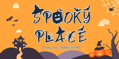 Spooky Place is a cool and quirky halloween display font. This font is PUA encoded which means you can access all of the glyphs and swashes with ease! Add it confidently to your favorite creations and let yourself be amazed by the outcome generated.
 - Jetblack by Tigade Std,
$35.00 Midnight is a cool, bold, and thick lettered sans serif font. It will elevate a wide range of crafting ideas, from cards, to branding, labels, and much more. Add it confidently to your favorite creations and let yourself be amazed by the outcome generated.
 - Black Thunder by Letterafandi Studio,
$14.00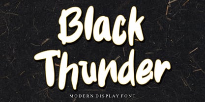 Black Thunder is a Modern and friendly brushed display font. This font is PUA encoded which means you can access all of the glyphs and swashes with ease! Add it confidently to your favorite creations and let yourself be amazed by the outcome generated.
 - Mousony by Sakha Design,
$12.00 Mousony is a bold, vintage styled and thick lettered slab serif font. It will elevate a wide range of crafting ideas, from cards, to branding, labels and much more. Add it confidently to your favorite creations and let yourself be amazed by the outcome generated.
 - Blindshot by Crumphand,
$25.00 Introducing the Wild Brush Style Fonts, Blindshot. Blindshot inspired by vaporwave, graffity. This font have a good shape and texture. Good for your brand, clothing line, company and etc. What's Included Inside The Fonts ? Uppercase Lowercase Symbols Numerals Stylistic Set 1 Stylistic Set 2 Stylistic Set 3 Stylistic Set 4 European Multilingual Thank You, Regards!
 - Oh, nekoFont! Picture this: if fonts were a grand, elegant ball, nekoFont would be the spirited cat that sneaks in, knocks over the vases, plays with the grand chandelier, and yet, somehow, ends up b...
- HT Pizzeria by Dharma Type,
$19.99 Ht Pizzeria is strong looking script for eye-catching part. Holiday Type Project offers retro hand drawing scripts. Inspired by retro script on shopfront lettering, wall paint advertisements in Italy around 1950s. Check out the script fonts from Holiday Type!
 - Iskra by TypeTogether,
$49.00 A practical sans serif need not appear dry, constructed, or derivative. It can excel in its sensible role and yet possess a distinct flair. Iskra (spark or flash) is a new sans serif designed by Tom Grace. It was conceived to challenge the limits between utilitarian and decorative. Sporting a low-contrast profile, it is a study of bridled energy in the Cyrillic and Latin scripts. Its eye-catching forms are an oblique tribute to the less-predictable style of brush lettering, and contain daring, elegant curves, economical proportions, and a slight top-heavy asymmetry. Its warmth comes from the subtle emphasis on the structures and details of individual letterforms, whereas its solidity is demonstrated through its balanced rhythm over long spans of text. Each font supports over 75 languages and is hand-tuned for a pleasing legibility and aesthetic both in print and on screen. This type family makes an excellent choice for presentations, articles, branding, and advertising. Available in 14 styles, Iskra represents a fresh, stimulating, forward-looking perspective on how we see both the vitality of the particular letter and the overall harmony of text. Iskra is available in three different character repertoires: Iskra, complete set — Iskra CYR, Cyrillic-based subset with a Latin supplement — Iskra Cyr, Latin-based subset. Both the LAT and CYR series conform to most standard codepages used by typical software covering their respective scripts. All three series have similar OpenType functionality."
 - Nightales by Trim Studio,
$15.00 Introducing Nightales a simple, bold and light font style perfect for kids' books! With a playful and rounded design, this font is both whimsical and fun, making it perfect for capturing the imagination of young readers. The brush pressure adds a touch of creativity and charm, while still being easy to read and understand. The bold and light variations provide versatility for different design elements, and the rounded edges make it safe and friendly for kids. Let Nightales bring joy and excitement to your next kids' book project! even so contains All Standard glyphs and punctuations Thank you for let us be your design partner, If you have any questions please don't hesitate to drop me a message
 - Van Den Velde Script Pro by Intellecta Design,
$59.95 Van den Velde Script Pro is the definitive edition of the original Van den Velde Script, by Intellecta Design, a free interpretation of the work of the famous master penman Jan van den Velde, to be found in the “Spieghel der schrijfkonste, in den welcken ghesien worden veelderhande gheschrifften met hare fondementen ende onderrichtinghe. ” (Haarlen, 1605). This font has evocative ancient ligature forms from the XVII Century Dutch master penman Jan van den Velde. Your indescritible writing-book was important not only with regard to the specific period it represents, but also in relationship to the entire history of calligraphy as an art: Van den Velde is rightly credited with having introduced and perfected a new trend in Dutch calligraphy. Our font, Van den Velde Script, merges modern necessities or better legibility without loosing the taste of his archaic origins. This enhanced OpenType version is a complete solution for producing documents and artworks whith an evocative and voluptuous style of calligraphic script: Van den Velde Script PRO has - more glyphs than the original Van den Velde Script. We created hundred of new glyphs, deactivated old non-representative glyphs and redesign the remaining library of original glyphs. Van den Velde Pro is more functional, soft and beauty than the original. - to keep the powerful of this unusual kind of script we make a tour-de-force kerning work: 771 glyphs in this font was adjusted in 5400 kerning pairs handly. - hundreds of contextual alternates combinations, some of them with three or more letters, - historical ornaments and fleurons in the typical style (and motifs) from the XVII century at the Lower Countryes accessed with the glyph palette using the Ornaments feature); - an extensive set of ligatures (100s of contextual alternates plus discretionary ligatures) providing letterform variations that make your designs really special, resembling real handwriting on the page; .... and, much better, Van den Velde Scriopt PRO is plus cheap than the original font !!! In non-OpenType-savvy applications it works well as an unusual and beautiful script style font. Because of its high number of alternate letters and combinations (over 700 glyphs), we suggest the use of the glyph palette to find ideal solutions to specific designs. The sample illustrations will give you an idea of the possibilities. You have full access to this amazing stuff using InDesign, Illustrator, QuarkXpress and similar software. However, we still recommend exploring what this font has to offer using the glyphs palette: principally to get all the power of the Contextual Alternates feature. Van den Velde Script PRO has original letters designed by Iza W and overall creative direction plus core programming by Paulo W.
 - Van den Velde Script by Intellecta Design,
$68.90 Iza and Paulo W (Intellecta Design) are proud to announce Van den Velde Script. A free interpretation of the work of the famous master penman Jan van den Velde, to be found in the “Spieghel der schrijfkonste, in den welcken ghesien worden veelderhande gheschrifften met hare fondementen ende onderrichtinghe. ” (Haarlen, 1605). Van den Velde Script has evocative ancient ligature forms from the XVII Century Dutch master penman Jan van den Velde. Your indescritible writing-book was important not only with regard to the specific period it represents, but also in relationship to the entire history of calligraphy as an art: Van den Velde is rightly credited with having introduced and perfected a new trend in Dutch calligraphy. Our font, Van den Velde Script merges modern necessities o better legibility without loose the taste of his archaic origins. This enhanced OpenType version is a complete solution for producing documents and artworks whith a evocative and voluptuous style of calligraphic script: - dozens of stylistic alternates for each letter (upper- and lowercase), accessed with the glyph palette; - historical ornaments and fleurons in the typical style (and motifs) from the XVII century at the Lower Countryes accessed with the glyph palette using the Ornaments feature); - an extensive set of ligatures (100s of contextual alternates plus discretionary ligatures) providing letterform variations that make your designs really special, resembling real handwriting on the page; - a tour-de-force kerning work: over 700 gliphs in this font was adjusted to your kern pairs handly. In non-OpenType-savvy applications it works well as an unusual and beautiful script style font. Because of its high number of alternate letters and combinations (over 700 glyphs), we suggest the use of the glyph palette to find ideal solutions to specific designs. The sample illustrations will give you an idea of the possibilities. You have full access to this amazing stuff using InDesign, Illustrator, QuarkXpress and similar software. However, we still recommend exploring what this font has to offer using the glyphs palette: principally to get all the power of the Contextual Alternates feature. You can has an idea of the power of this font looking at the “Van den Velde User Guide”, a pdf brochure in the Galçlery section. Two last things: take a special look at the Van den Velde Words (ready words) font and another super script font, Penabico. Van den Velde Script has original letters designed by Iza W and overall creative direction plus core programming by Paulo W.
 - Subroc by Typodermic,
$11.95 As I contemplate the beauty of Subroc, my mind drifts to a melancholic state, reminiscing the memories of a bygone era. This debonair joined-marker script typeface embodies a nostalgic charm that is difficult to resist. If your application supports ligatures, Subroc’s custom letter pairs automatically substitute for a more natural look. The resulting effect is akin to a handwritten note from a long-lost lover, carefully crafted with every stroke. But what truly sets Subroc apart is its inconspicuous, granular texture. The grittiness of its design transports you to a different time, evoking feelings of nostalgia and carefree abandon. Subroc’s beauty is not for the faint of heart, as it carries the weight of a thousand emotions with it. But for those brave enough to embrace it, the result is a breathtaking amalgamation of history, art, and emotion. So let Subroc be your muse, and let your words flow freely, imbued with the essence of a bygone era. Let your message carry the weight of history, and leave a lasting impression on all who see it. Most Latin-based European writing systems are supported, including the following languages. Afaan Oromo, Afar, Afrikaans, Albanian, Alsatian, Aromanian, Aymara, Bashkir (Latin), Basque, Belarusian (Latin), Bemba, Bikol, Bosnian, Breton, Cape Verdean, Creole, Catalan, Cebuano, Chamorro, Chavacano, Chichewa, Crimean Tatar (Latin), Croatian, Czech, Danish, Dawan, Dholuo, Dutch, English, Estonian, Faroese, Fijian, Filipino, Finnish, French, Frisian, Friulian, Gagauz (Latin), Galician, Ganda, Genoese, German, Greenlandic, Guadeloupean Creole, Haitian Creole, Hawaiian, Hiligaynon, Hungarian, Icelandic, Ilocano, Indonesian, Irish, Italian, Jamaican, Kaqchikel, Karakalpak (Latin), Kashubian, Kikongo, Kinyarwanda, Kirundi, Kurdish (Latin), Latvian, Lithuanian, Lombard, Low Saxon, Luxembourgish, Maasai, Makhuwa, Malay, Maltese, Māori, Moldovan, Montenegrin, Ndebele, Neapolitan, Norwegian, Novial, Occitan, Ossetian (Latin), Papiamento, Piedmontese, Polish, Portuguese, Quechua, Rarotongan, Romanian, Romansh, Sami, Sango, Saramaccan, Sardinian, Scottish Gaelic, Serbian (Latin), Shona, Sicilian, Silesian, Slovak, Slovenian, Somali, Sorbian, Sotho, Spanish, Swahili, Swazi, Swedish, Tagalog, Tahitian, Tetum, Tongan, Tshiluba, Tsonga, Tswana, Tumbuka, Turkish, Turkmen (Latin), Tuvaluan, Uzbek (Latin), Venetian, Vepsian, Võro, Walloon, Waray-Waray, Wayuu, Welsh, Wolof, Xhosa, Yapese, Zapotec Zulu and Zuni.
 - Enchante Script by Designova,
$20.00 Enchante is the handwritten masterpiece typeface for luxury / branding / logotype / wedding invites / greeting cards / promotional graphics. Enchante typeface is completely handmade with more than 300 hours of artistic craftsmanship bringing perfection and aesthetics at its level best. The typeface comes with the following features: OpenType Features & Stylistic Sets The typeface contains 400 glyphs beautifully handcrafted with perfection. 122 stylistic alternatives with 70 lowercase and 52 uppercase letters. 61 unique Swashes & Lines arranged in separate font file to enhance ease of use and efficiency. Powerful OpenType features including multi-set stylistic alternatives and ornaments. Includes extended language support including Western European & Central European sets. What You Get The typeface comes with 2 fonts (Normal, Swashes) so you can easily add decorative elements by simply choosing the Swashes version of the font. The stylistic alternatives and ornaments can be selected via character options within any editing software such as Illustrator, Photoshop, Inkscape etc. The pack contains Desktop fonts (OTF, TTF) and Web Fonts (all EOT, SVG, WOFF, WOFF2) as licensing options. Advanced Kerning & Essential Ligatures: We have performed advanced, in-depth kerning to make sure the font looks amazing on all possible letter combinations.
 - Runde Wien by Wannatype,
$36.00 Runde Wien Pro, the rounded sans serif by Ekke Wolf. Typeface lovers looking for a modern, well-developed sans serif font with a touch of retro and warm, individual lettering will get excited about a new addition to the font market. The more than complete Runde Wien Pro front comes in three styles and four different weights. In addition to the upright Runde Wien Pro there is the Runde Wien Pro Oblique with a moderate 6° slant and the Runde Wien Pro Superoblique with an 18° slant. Available weights are light, regular, medium, bold and black. These fonts are equipped with extended Latin alphabet for Central and Eastern Europe and also Cyrillic and Greek alphabet. The set of characters includes nine different sets of numbers, plus its own set for the small caps, as well as alternative characters and groovy ligatures. In addition, all Runde Wien Pro styles are also available as unicase with upper case and lower case x-height alignment. The style, metrics and proportions of Runde Wien Pro combine perfectly with the Liebelei Pro and the script fonts of the Calafati Pro.
 - Klatter by Scholtz Fonts,
$19.00Klatter is a font that is "in your face". It can't be ignored, and draws attention to itself no matter how noisy the environment. It is available in three styles: - Klatter Regular is a clean, spunky, non-grunge font that uses a combination of straight lines and sharp angles to make a strong, no-nonsense statement; - Klatter SmallCaps, in which the lower case is a true "small caps" and not a shrunken version of the upper case (generated by the operating system); - Klatter Grunge is based on Klatter Regular but is "dirty" and messy, giving the impression of printing problems and wet ink being smudged. Unlike many other grunge fonts, Klatter Grunge is a font that is full of character. Both styles have a full character set with upper and lower case, numerals and mathematical symbols, as well as a full set of accented and special characters. The font has been carefully letter-spaced and kerned and the vertical spacing has been appropriately set. Klatter Grunge and Regular are appropriately purchased together since they complement one another when used in the same graphic design job. - Schnebel Sans Pro by URW Type Foundry,
$35.99 It took me 12 years to bring this extensive font family to completion. A lot has been changed, transformed, peeled and developed in all those years. For many of my projects I used it as my quarry and so it might have become something like a synthesis of all my imaginations and experiences. To me »Schnebel Sans« represents the optimal design of a contemporary grotesque that perfectly unites dynamics with statics. For copy text the typefaces are very legible, neutrally and remain in the background, but despite this generate the necessary tension when set as headlines. »Schnebel Sans« is available in 48 different styles. It is available as a Pro Font, containing West, East Greek, and Cyrillic or as the Schnebel Sans ME, also containing Arabic and Hebrew. The scripts include small caps and various figure sets. This big range of styles from Thin to Black and from Compressed to Expanded offer many possibilities for design and fulfill all requirements for a professional use. Because of the supplement of several non-Latin character sets, the »Schnebel Sans« is perfectly suitable for global services too. Volker Schnebel, 2016
 - Broadgauge Ornate by FontMesa,
$25.00Broadgauge Ornate originated from MacKellar, Smiths & Jordan in 1869 and was only available as an all caps font with numbers. Today this old beautiful wood type rises again from the archives complete with original numbers and an all new lowercase. An all caps Greek character set has also been added plus accented characters for western, central and Eastern European countries. Included in each font file are two sets of left and right pointing hands located on the Less Than and Greater Than keys and also on the Bracket keys. Because this font works well with a Las Vegas theme I've decided to make the pointing hands gambling related with one set of hands rolling dice and the other holding cards. The condensed versions were created because in today's computer graphics applications people stretch and condense fonts to fit their project but don't notice the change in vertical stroke widths or line thickness. After compressing the letter shapes of each Broadgauge Ornate condensed font the vertical lines were corrected making sure they were the proper width or thickness. The results are balanced condensed versions that weren't simply compressed with out consideration for their appearance. - PF Champion Script Pro by Parachute,
$125.00 PF Champion Script Pro is perhaps the most advanced and powerful calligraphic family ever made. It received an award for Excellence in Type Design from the International Type Design Competition ‘Modern Cyrillic 2009’ which was held in Moscow. Most recently, it received another award from the 3rd International Eastern Type Design Competition - Granshan Awards 2010. This typeface was first presented in June 2007 at the 3rd International Conference on Typography and Visual Communication (ICTVC) and was met with rave reviews. It is based mainly on the manuscripts of the 18th century English calligrapher Joseph Champion. Developed over a period of two and a half years, each one of the 2 weights is loaded with 4300 glyphs(!), offering simultaneous support for all European languages based on the Latin, Greek and Cyrillic scripts. Furthermore, a wide selection of alternate forms and ligatures is included for all languages, in order to accommodate diverse design aesthetics. These alternates are either applied automatically through an advanced programming scheme, or manually through several OpenType features. An attempt was made to design a contemporary script typeface with classic roots, by following certain guidelines, i.e. lowercase characters were designed so they are less inclined, have a higher x-height and are less condensed than the original. Several characters were stripped-off their connecting lines in order to enhance legibility. Four sets of alternate swashed capitals as well as a plethora of ornaments and frames (117) was included. Small caps and their alternate forms were designed to replace the capitals which disrupt the flow of text within a sentence with their extravagant swashes. All characters were carefully designed with the proper weight in order to sustain harsh printing conditions (on special papers), a situation which affects mainly the light connecting parts of calligraphic typefaces. Finally, it was programmed in such a way as to preserve handwriting qualities, by designing an extensive array of ligatures and alternate glyphs in all languages, never before released or incorporated within the same font.


