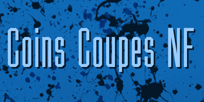
Empire was originally designed in 1937. This version is an all-capitals face with tall condensed characters. The Empire font can be used for headlines and posters where space is tight, or where an empression of height is desired.
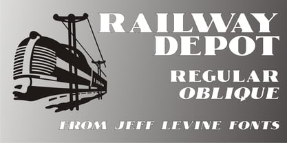
A bold spur serif design found within the pages of the 1934 French lettering instruction book “L'Art du Tracé Rationnel de la Lettre” provided the inspiration for Railway Depot JNL, which is available in both regular and oblique versions.
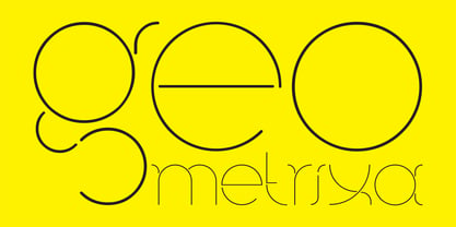
Inspired from geometric curves and circles, an audacious lower case display face with some alternate characters in Upper and Lower case glyphs. Great for Logos and Logotypes, headlines and larger text. Works well with smaller strap lines as well.
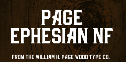
A clean, classic woodtype face from the William H. Page Company, as fresh today as it was over 120 years ago. Both versions of this font support the Latin 1262, Central European 1250, Turkish 1254 and Baltic 1257 codepages.
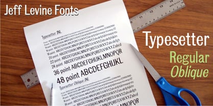
Typesetter JNL is based on an old-style 'grotesk' (or 'grotesque') text face popular with printers and rubber stamp makers since the 1800s. The nonconformist character shapes and line widths are reminiscent of hand-cut type of the era.
Chamfer, released by Barhart Brothers & Spindler in the late nineteenth century, provided the pattern for this simple, elegant headline face. Both flavors of this font feature the 1252 Latin, 1250 Central European, 1254 Turkish and 1257 Baltic character sets.
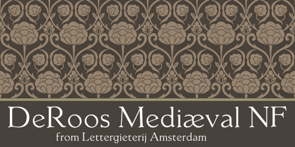
Here’s a classic face from Dutch master type designer Sjoerd H. de Roos. Use it where timeless elegance is the goal. Both versions of this font support the Latin 1252, Central European 1250, Turkish 1254 and Baltic 1257 codepages.
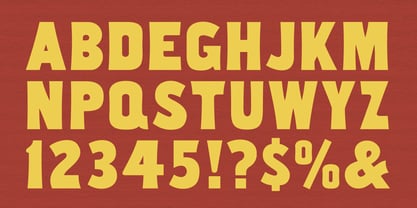
No. 508 is a chunky, friendly, modulated gothic font. Strokes have a gentle inward curve at the median, with the tops and bottoms of the letters slightly wider. The face was introduced by William H. Page & Company in 1890.
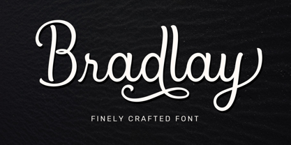
Discover the allure of exquisite script typography with the Bradlay Script Font. Infused with timeless sophistication, this typeface effortlessly captures the essence of graceful hand-lettering, making it an exceptional choice for projects that demand a touch of elegance.
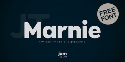
The design is influenced by the geometric style sans serif faces which were popular during the 1920s and 30s. The JT Marnie font family is well suited for headlines and small blocks of text, particularly in advertising and packaging.
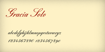
Gracia Solo is a sister design of Gracia. Gracia Solo has left its connection forms without losing the typical look of English scripts. OpenType features: - central European faces - stylistic alternates - proportional, mediaeval numerals & Roman numerals - numerators, denominators and fractions
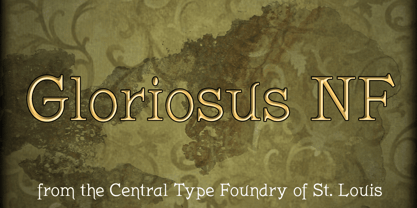
Originally issued as Apollo by the Central Type Foundry of Saint Louis, this face evokes the glamor of late Victorian era. Both versions of this font support the Latin 1252, Central European 1250, Turkish 1254 and Baltic 1257 codepages.
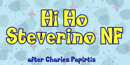
Here's a hipster face that evokes the Beat era, taking its name from Louis Nye's catchphrase on "The Steve Allen Show." Both versions of this font support the Latin 1252, Central European 1250, Turkish 1254 and Baltic 1257 codepages.
A quirky face with a distinct personality, Eclipse is good for logotypes and packaging. The Eclipse font is not recommended for situations where legibility is essential, but more suited where the overall image is more important than the words.
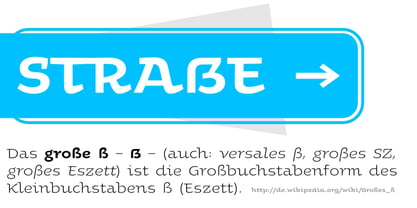
Oksana Std has only the Western Latin characters from multilingual Oksana. It has six weights with real italics, and Alt faces with Old Style figures, alternative characters -a-g-k-y- and ampersand. German großes Eszett is also included.
Dave West's eponymous Futura Casual, designed for Photo-Lettering, Inc. in the 1960s, inspired this loosy-goosy take on a classic face. Both versions of the font contain the complete Unicode Latin 1252 and Central European 1250 character sets.
In 1905, artist and illustrator Will Bradley devised the pattern for this charming face. A little bit quirky and a whole lot of fun. Both versions support the Latin 1252, Central European 1250, Turkish 1254 and Baltic 1257 codepages.
The Roemisch type family is a historic hot metal face with left slanted weights that is used for the german cartographic map production. There are also special typefaces required like the Venus type family and Topografische Zahlentafel type family."
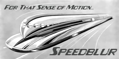
Speedblur - the name says it all really! Want a display typeface that suggests speed and motion? Well this is it. Ideal for all those retro-future designs, anything streamlined or the boy (or girl) racer in all of us!
A single top serif creates a modern look between serifs and a single weight font. SingleTyne contains short ascenders and descenders for tight line spacing designed as a display face that also works well for short sentences and paragraphs.