10,000 search results
(0.042 seconds)
- Hidorka by Bungletter,
$10.00 Hidorka is a very cute, elegant and unique handwritten font. Expertly designed to become a true favorite, this font has the potential to take your creative ideas to the highest level! This font is PUA coded which means you can easily access all the glyphs. Hidorka is attractive because it is sleek, clean, feminine, sensual, glamorous, simple and highly readable, thanks to its many luxurious letter joints. I also offer a number of viable alternative styles for all letters. Classic style is very suitable to be applied in various formal forms such as invitations, labels, restaurant menus, logos, fashion, make up, stationery, novels, magazines, books, greeting cards/weddings, packaging, labels or all kinds of advertisements. for your purposes. . . . . . . Contains full set: -2 Type Font -Uppercase -Lowercase -Alternative - Ligature - Punctuation -Number - Multilingual support. Need help or have questions let me know. I'm happy to help. Thank you & Congratulations on the Design.
 - Glandan by Bungletter,
$12.00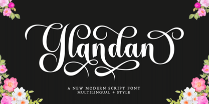 Glandan is a very cute, elegant and unique handwritten font. Expertly designed to become a true favorite, this font has the potential to take your creative ideas to the highest level! This font is PUA coded which means you can easily access all the glyphs and strokes! Glandan is attractive because it is sleek, clean, feminine, sensual, glamorous, simple and highly readable, thanks to its many luxurious letter joints. I also offer a number of viable alternative styles for all letters. Classic style is very suitable to be applied in various formal forms such as invitations, labels, restaurant menus, logos, fashion, make up, stationery, novels, magazines, books, greeting cards/weddings, packaging, labels or all kinds of advertisements. for your purposes. . . . . . . Contains full set: -Uppercase -Lowercase -Alternative -Ligature -Punctuation -Number -Multilingual support. Need help or have questions let me know. I'm happy to help. Thank you & Congratulations on the Design
 - Mongilon Script by Hrz Studio,
$15.00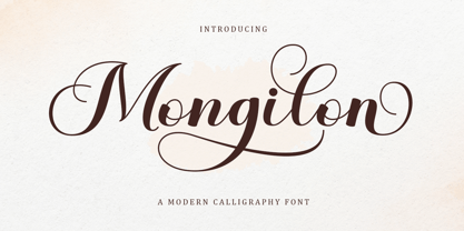 Mongilon is a very Beautiful, elegant and unique handwritten font. Expertly designed to become a true favorite, this font has the potential to take your creative ideas to the highest level! This font is PUA coded which means you can easily access all the glyphs and strokes! Mongilon appeals because it is sleek, clean, feminine, sensual, glamorous, simple and highly readable, thanks to its many luxurious letter joints. I also offer a number of viable alternative styles for all letters. Classic style is very suitable to be applied in various formal forms such as invitations, labels, restaurant menus, logos, fashion, make up, stationery, novels, magazines, books, greeting cards/weddings, packaging, labels or all kinds of advertisements. for your purposes. . . . . . . Contains full set: -Uppercase -Lowercase -Alternative - Ligature - Punctuation -Number - Multilingual support. Need help or have questions let me know. I'm happy to help. Thank you & Congratulations on the Design.
 - Hilender Rhapsody by Bungletter,
$12.00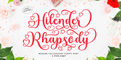 Hilender Rhapsody is a modern script font that has a cute and elegant touch. Hilender Rhapsody is attractive because it is sleek, clean, feminine, sensual, glamorous, simple and very easy to read, thanks to its many luxurious lettering connections. I also offer a number of decent stylistic alternatives for some of the letters. The classic style is very suitable to be applied in various formal forms such as invitations, labels, restaurant menus, logos, fashion, make up, stationery, novels, magazines, books, greeting/wedding cards, packaging, labels or all kinds of advertising purposes. . . . . . . . . Files include: • Hilender Rhapsody Regular • Hilender Rhapsody Bold • Hilender Rhapsody Slant • Hilender Rhapsody Bold Sant Contains full set: -Has 4 font models: Regular, Bold, Slant and Bold Slant -Uppercase -Lowercase -Alternative -Ligatures -Punctuation -Number -Multilingual support. need help or have questions let me know. I'm happy to help. Thanks & Congratulations on the Design!
 - Circus of Letters by Redy Studio,
$21.00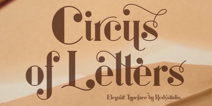 Circus of Letters – Fancy Typeface Take a trip to the circus, exploring the colorful and playful world of our Circus of Letters Fancy Typeface. Inspired by vintage poster art, this set contains upper and lowercase letters, numbers, and tons of alternative characters, swashes, and multilingual characters. Circus of Letters is super versatile – it works great with simple designs or mixed with other fancy typefaces on more complex projects! If you’re looking for a cool, decorative font to add personality to your designs, look no further because you’ve found it! Circus of Letters features: A full set of upper & lowercase characters Numbers & punctuation Ligatures A ton of stylistic alternatives Swashes Multilingual symbols PUA Encoded Characters – Fully accessible without additional design software. Feel free to give me a message if you have a problem or question. Thank you so much for taking the time to look at one of our products.
 - Abongia by Bungletter,
$10.00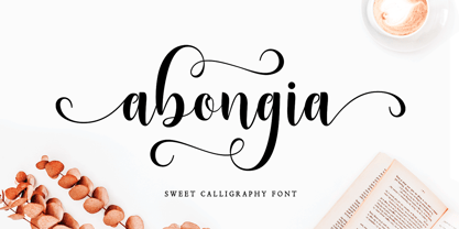 Abongia is a very cute, elegant and unique handwritten font. Expertly designed to be a true favourite, this font has the potential to take your creative ideas to the highest level! This font is PUA encoded which means you can access all the glyphs and sweeps easily! Abongia is attractive because it is sleek, clean, feminine, sensual, glamorous, simple and very easy to read, thanks to its many fancy letter connections. I also offer a decent number of style alternatives for all letters. The classic style is very suitable to be applied in various formal forms such as invitations, labels, restaurant menus, logos, fashion, make up, stationery, novels, magazines, books, greeting/wedding cards, packaging, labels or all kinds of advertisements. for your purposes. . . . . . . Contains full set: -4 Type Font -Uppercase -Lowercase -Alternative -Ligatures -Punctuation -Number -Multilingual support. need help or have questions let me know. I'm happy to help.
 - Play Day Stencil JNL by Jeff Levine,
$29.00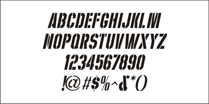 The typography on a 1964 children’s activity book published by Whitman entitled “Build with Stencils” was in a bold, condensed design. The only problem was that the ‘rails’ [the parts that divide a letter into stencil pieces] were too narrow and would disappear at smaller point sizes. Widening the ‘rails’ just a bit greatly improved the appearance of the stencil characters. Play Day Stencil JNL is now available in both regular and oblique versions. In its day, the Whitman Publishing Company of Racine, Wisconsin published dozens of activity books for children, including a number of them with stencils. The company was a division of Western Publishers from the early 1900s through the 1970s, but went through a number of sales and name changes. Currently [as Whitman once again] it is owned by Anderson Press, and is known for its line of coin folders and books on coin collecting.
 - Knoedel by PabType,
$12.00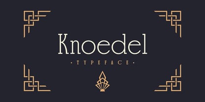 Knoedel is a display typeface with three front-weights: light, regular and bold. Although a conjunction of different styles were a reference during the design process; the art deco style left a more noticeable influence in the final design. Knoedel, also has clear references to geometric and slab serif fonts. The design is intended to be applied on headlines or short text fragments. Knoedel offers full coverage for all languages using Latin alphabet: whole Europe, America, Oceania and on a big number of African and Asian countries. Besides the standard ligatures, Knoedel, additionally, has more than 200 discretionary ligatures and a generous number of borders and ornaments. Knödel (Knoedel) is a traditional dish from Austria and the southeast of Germany; made of dumplings of different ingredients usually boiled in salted water. It is not high-end cuisine but still, it accomplishes its aim of soothing hunger.
 - Costanera by W Type Foundry,
$29.00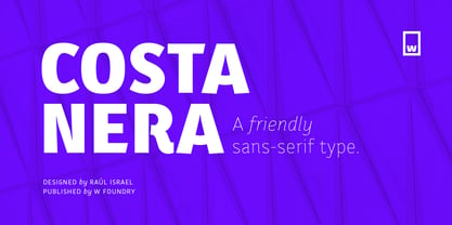 Costanera is a neohumanist typeface with both soft strokes and endings, which is inspired by 90s typefaces. It has an organic aspect and curved finials associated to the early calligraphy, while its straight angles give Costanera a technological and futuristic impression. Costanera weights go from thin to black, thus it can be used in short-impact phrases ideally using Black or Thin weight and extensive texts selecting the Book version. On the other hand, due to its calligraphic-futuristic features Costanera is perfectly suitable for different fields, such as vanguard technology, architecture, and signage topics. This typeface is composed of a Normal and Alternative version, adding 32 weights in total. Stylistic sets, small caps, ligatures, lining and old style numbers, fractions, circle numbers and arrows are part of the Opentype features. Moreover, this project comes with 790 glyphs that allows to write in 219 languages.
 - Steam by Type Forward,
$-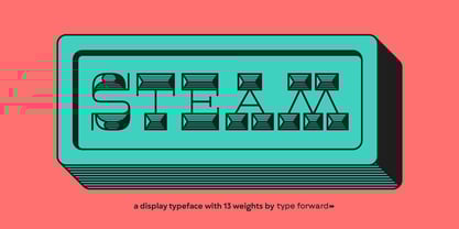 Steam combines the spirit of the old-fashioned wood type with modern flavours. Its distinctive reversed high contrast and extremely bold serifs make it impossible to stay unnoticed. It’s a fun and bold unconventional typeface that we’ve designed with great passion and curiosity! The type family consists of 13 weights that are divided into several packs. Each font in the pack can be layered on top of each other to make a funkier look. Steam is multilingual! It speaks more than 130 languages and supports extended Latin, Cyrillic, punctuation, default and small numbers, symbols and signs. It is also familiar with the OpenType features like standard and discretionary ligatures, stylistic sets, localized forms, small numbers and fractions and more. Steam looks best on logos, posters, headlines, and T-shirts and is perfect anytime you need some bold letters with specific flavour and touch. Have fun creating!
 - Soundboy by Kustomtype,
$25.00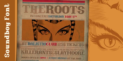 Soundboy is an ode to Elvis Presley and his music. The font was drawn by hand from a number of images from the Blue Hawaii film and finished to perfection. The digitization was done with great care and the font was also provided with a number of extras such as ligatures. Soundboy is a playful and translatable font that at first sight has already caught everyone with a spontaneous and broad smile. Logos, house styles, magazines, covers, vinyl records, book covers, t-shirts, house styles and all kinds of other graphic expressions will look a lot happier. This font is more than welcome in this sour society. The packaging makes the consumer buy and Soundboy certainly contributes to that. Don't wait for someone else to get it in your area, the best designs deserve the most beautiful fonts. Enjoy the "Soundboy font", it will never let you down.
 - Resgold Willgets by Lucky Type,
$16.00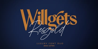 Resgold Willgets is a luxury font duo consisting of elegant script and serif that are very attractive. Also included in this product are more than 20 hand-drawn extras for a variety of your design needs. Included in this set: -Resgold Willgets Script, handwritten script fonts that I wrote using markers, I made it look very clean and attractive containing upper and lower case characters, all punctuation, numbers and support for many languages. This font also also contains several ligature to help the text look naturally. -Resgold Willgets Serif, the latest, stylish and modern Serif that contains uppercase and lowercase characters, also includes alternatives to all uppercase and lowercase letters all punctuation, numbers, and multi-language support. -Resgold Willgets extras, has more than 20 extras made by hand so that it looks natural for a variety of your design needs. Thank you for watching and happy design.
 - Le Mores Collection by Great Studio,
$16.00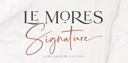 Hi everyone, I want to introduce Le Mores Collection Font Duo, a classy pair of contemporary serif fonts and scripts. With its unique serif ligature font, it is perfect for combining with signature script fonts. This font is perfect for your various design projects , elegant branding, wedding stationery, romantic book cover designs, classy packaging, album covers, handwritten quotes, greeting cards, unique social media posts, and so much more. Le Mores Collection Script A modern and elegant signature script font containing upper and lowercase characters, and a variety of alternative letters, all punctuation and numbers. Also contains 64 automatic ligatures to help text flow naturally like the original handwriting. Le Mores Collection Serif is all Caps stylish & modern containing uppercase characters, all punctuation and numbers. It is also equipped with 32 automatic ligatures and has several alternative letters to enhance your beautiful design. Cheers, Great Studio
 - Biofolio Ultimate by Formatype Foundry,
$30.00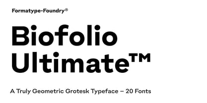 Behance Biofolio Ultimate is geometric Grotesk typeface exploration proportion and simplicity in typeface, Inspired by the elegant plainness seen in many of the less common 20th centuries sans Comes in 10 weights matching Italics —20 fonts in all, Biofolio Ultimate supports around 150 languages in the Latin based languages, Designed with multiple OpenType features, such as powerful stylistic alternates, case-sensitive forms, contextual and stylistic alternates. The standard numerals set encompasses tabular figures and symbols, superiors and inferiors, numerators and denominators, plus fractions.
 - Sombrieul by Greater Albion Typefounders,
$38.00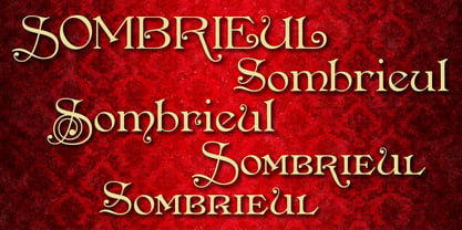 Sombrieul is Greater Albion’s greatest and grandest Edwardian display typeface yet. Just the thing for any project with a late 19th/early 20th century inspiration. Sombrieul has a LOT of opentype features:- stylistic alternates, ligatures, discretionary ligatures, small capitals, title forms, swash capitals, old-style and lining numerals, numeral title forms. Of course, these features don’t allow for infinite variability in appearance, there must be some limits after all! They do allow for a lot of variety, however! There are over 1,000 glyphs...
 - Lumberyard Stencil JNL by Jeff Levine,
$29.00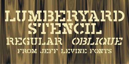 Lumberyard Stencil JNL was inspired by the image of an antique brass stencil that was probably used for marking various wood products by a lumber company. It's available in both regular and oblique versions.
 - TT Trailers by TypeType,
$39.00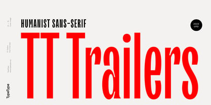 Meet the new TT Trailers! The first version of TT Trailers was conceived as a font suitable for the film industry. The font harmoniously looks in posters, it is ideally suited for setting titles. However, the font has gained wide popularity among designers, and now you can find TT Trailers on the covers of magazines, on restaurant signs and on the main pages of websites. TT Trailers useful links: Specimen | Graphic presentation | Customization options Since 2019 when we released the first version, the TypeType studio team has released dozens of fonts, constantly improving our skills. In 2022, we decided to look at TT Trailers again, improving and expanding the font. In the new TT Trailers, we expanded the character set, corrected the contours, and improved the technical content. We have added extended Latin and Cyrillic characters, new symbols, and additional sets of numbers. The number of glyphs in one style has increased from 1081 to 1242. The inclined styles were long-awaited. The italics in TT Trailers are as eccentric as the upright fonts. The 15-degree tilt looks absolutely harmonious, complementing the character of the font family. We added italics to the variable font, so the new font changes along two axes at once, weight and slant. From the technical point of view, TT Trailers has become more modern and correct, and the number of OpenType features has increased from 29 to 42. We have added new alternative versions of glyphs and created a large number of localized features. The font retained all the qualities thanks to which designers fell in love with it, but became even more convenient. TT Trailers in the new version is suitable for titles and posters, for websites and printed materials. The font will embellish in restaurant and cafe signs and look beautiful in posters. There are 19 styles in TT Trailers: 9 upright, 9 italic and 1 variable font.
 - Allerlei Zierat by Intellecta Design,
$14.90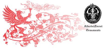 Ornaments family with four different sets plus a decorative capitals font from the rare, valuable and amazing Allerlei Zierat book from Schelter & Gieseck (1902). A research and free interpretation by Intellecta Design. This encyclopedic specimen book of the Leipzig, Germany type foundry and printing supply house J.G. Schelter & Giesecke features, as the title indicates, all kinds of decoration for supplying printing of every type. On the title page, the firm boasts winning grand prize in 1900 in Paris (presumably at the Exposition Universelle). It is hard to do justice in a short description to the variety of styles (traditional, Jugenstil, etc.) and categories (certificates, letterheads, borders, ornaments, exotic motifs, flowers, animals, silhouettes, menus, greeting cards, vignettes humorous and otherwise, images of bicyclists, occupational symbols, portraits, Classical figures, religious art, heraldry, ships, trains, athletes, etc., etc.) offered in this volume. Some of the examples are printed in color, most are in black-and-white. The Jugenstil cover of this copy shows minor wear and soiling. The plate of “Gust. Carlsson & Co., Stockholm” is attached to the front pastedown. A small fraction of pages show minor soiling, a pencil notation or a short closed tear. Two of the fold-outs at the back have a little more damage-one is missing a 1x2 inch piece along the margin, the other has a 3-inch closed tear and an edge which is crumpled. A rare specimen from the Intellecta rare books library.
 - Avenir Next Paneuropean by Linotype,
$99.00 Avenir Next Paneuropean is a new take on a classic face—it’s the result of a project whose goal was to take a beautifully designed sans and update it so that its technical standards surpass the status quo, leaving us with a truly superior sans family. This family is not only an update though, in fact it is the expansion of the original concept that takes the Avenir Next design to the next level. In addition to the standard styles ranging from UltraLight to Heavy, this 56-font collection offers condensed and semi condensed faces that rival any other sans on the market in on and off—screen readability at any size alongside heavy weights that would make excellent display faces in their own right and have the ability to pair well with so many contemporary serif body types. Overall, the family’s design is clean, straightforward and works brilliantly for blocks of copy and headlines alike. Akira Kobayashi worked alongside Avenir’s esteemed creator Adrian Frutiger to bring Avenir Next Pro to life. It was Akira’s ability to bring his own finesse and ideas for expansion into the project while remaining true to Frutiger’s original intent, that makes this not just a modern typeface, but one ahead of its time. Complete your designs with these perfect pairings: Dante™, Joanna® Nova, Kairos™, Menhart™, Soho® and ITC New Veljovic®.
 - Technotyp by URW Type Foundry,
$39.99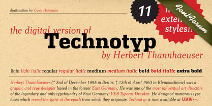 The digital font Technotyp is based on the hot metal typeface created by the German typographer and type designer Herbert Thannhaeuser (1898-1963) for the former East German type foundry Typoart in Dresden. In the typography book ‘Der Schriftsetzer’ (Fachbuchverlag, Leipzig, 1952), by Paul Fritzsche, this absolutely beautiful slab serif design is presented in all its variations. Fritzsche remarked that – because of its rather condensed form and its relatively long ascenders – the 'Werkschrift' of the Technotyp (comparable with our 'Regular') seemed to be very well suited to serve as a text face, and recommended for this purpose that the face be cut for the composing machine. However, this never happened and the entire Technotyp family was made available for hand composition only. This is finally changing and being remedied for good now: URW++ proudly presents the new digital version of this really charming font family with its distinct flavor of the 1950s, adding it to the other digital renditions of Herbert Thannhaeuser fonts at URW++, namely Garamond No. 4 and Magna. The original Typoart family had an italic style for the light version only. The new digital version of Technotyp includes italic styles for the regular, medium and bold weights as well, enhancing the family to meet today’s standards and requirements for professional type setting. To further increase its usefulness, Cyrillic faces were created, too. True to the standard for all digital fonts at URW++, the character set for Technotyp covers all West- and East European languages.
 - Aviano Contrast by insigne,
$22.00 The Aviano series returns, refined and sophisticated with an extended, high-contrast sans-serif family. Aviano Contrast is a contemporary typeface radiating with luxury. It's classic elegance makes it perfect for high-end applications such as cosmetic, jewelry or fashion brands. Aviano Contrast's extended forms give the face a smart look, and the curves are carefully honed to be sinuous and seductive. This high-contrast face is in a class of its own, composed in the style of a classic Didone but lacking the typical serifs. Aviano Contrast comes in six different weights and is packed with OpenType features. Need swash forms? Ball terminals? Art Deco alternates inspired by the inscriptions and signage of the '20s and '30s? Aviano Contrast includes 230 alternate characters. Twelve style sets are available, including four complete sets of art deco-inspired alternates, small forms, swash, titling and a wide array of other alternates to make your designs unique. As a complement to these characters, Aviano Contrast also includes 40 discretionary ligatures for artistic typographic compositions. Please see the informative .pdf brochure to see these features in action. OpenType capable applications such as Quark or the Adobe Creative suite can take full advantage of the automatically replacing ligatures and alternates. This family also includes the glyphs to support a wide range of languages. The rest of the Aviano series pairs very well with this face. These include Aviano, Aviano Serif, Aviano Sans, Aviano Didone, Aviano Flare, Aviano Future and Aviano Slab.
 - P22 Klauss Kursiv by IHOF,
$29.95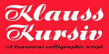 P22 Klauss Kursiv is the first ever digital revival and expansion of the last face Karl Klauß designed for the Genzsch & Heyse foundry in Stuttgart before he died in 1956. Karl Klauß’s classical training in the graphic arts gave him solid chops to use as a springboard for design ideas that remained relevant among the countless trends fleeting around the turmoil of two world wars. By the mid-1950s, a kind of ornamental deco aesthetic was well on its way into mainstream design in post-war Europe, and demand was high for unique, lively and non-minimal ad faces. Klauß, a reliable designer with a proven track record of calligraphic faces, pushed the envelope on his own calligraphy and designed something that packages elegance in a boldness seldom seen before in luxury scripts. Quite a bit of talent is on display in Klauss Kursiv. In spite of the restraint this kind of design imposes on itself almost by default, the interplay between thick and thin never seems forced or challenging. Clear, natural strokes build a compact alphabet that demonstrates the wrist control of a veteran calligrapher. Creative nib angling segues into very clever start-and-stop constructs to make attractive forms that work quite well together, yet stand well to individual scrutiny. P22 Klauss Kursiv comes with a load of built-in alternates and ligatures in a font of over 470 glyphs, providing extended support for Latin languages.
 - Sintesi Sans by FSdesign-Salmina,
$39.00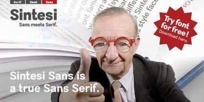 Sintesi Sans. Sans meets serif. Are you looking for a robust, contemporary but nonetheless an elegant font? Sintesi Sans might be exactly what you are looking for. Sintesi Sans builds together with Sintesi (SemiSerif) and Sintesi Semi an extended family. However each of the three member of the Sintesi-family accomplish the «synthesis» between Sans and Serif on its own way. Sintesi Sans scores because of its readability, robustness and contemporary style. It is a true Sans Serif and therefore really flexible, universally applicable especially as a body text font and in a broad number of other applications. Worth mentioning is the particularly slim «Extrathin» style, which elegance is not to be outbalanced. Thanks to the good readability and the wide set of styles and glyphs, Sintesi Sans suits to a wide spectrum of applications. Download a free trial package of the extended family with a reduced character set – check it out! Download a free trial version of Sintesi Sans with a reduced character set. Check it out!
 - Mutamathil by Arabetics,
$32.00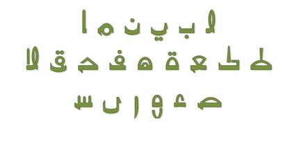 The Mutamathil type family is the mid-size member of the Mutamathil type style. It has only one glyph for every basic Arabic Unicode character or letter. With each glyph being semi-symmetrical around its vertical axis, this family is mainly suitable for right to left ordering. The Mutamathil family includes all required Lam-Alif ligatures and uses ligature substitutions, and marks positioning but it does not use any other glyph substitutions or forming. Text strings composed using types of this family are non-cursive with stand alone isolated glyphs. The Mutamathil Taqlidi family includes both Arabic and Arabic-Indic numerals, all required diacritic marks, in addition to all standard English keyboard punctuations and major currency symbols. The fonts in this family support the following scripts: Arabic, Persian, Urdu, Pashtu, Kurdish, Baluchi, Kashmiri, Kazakh, Sindhi, Uyghur, Turkic, and all extended Arabic scripts.
 - Film P3 by Fontsphere,
$16.00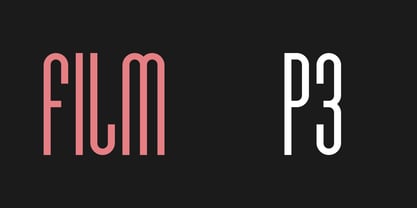 Film P3 - Ultra Condensed sans-serif typeface. It refers to characteristic typefaces such as Film Poster or Film P2 (which were inspired by futuristic movie posters). Film P3 is deliberately more versatile and designed to be used successfully in a huge variety of projects. In addition, the letters retain their unique and distinctive style, which allows them to stand out from the crowd. The Film P3 family has 9 members that are complementary and allow the expression of the projects to be very varied and adapted for appropriate use. They look good in many sizes, single words, slogans, titles, sentences as well as longer texts. Fonts include multilingual support, numerals, and a large range of special characters. Film P3 typeface offers many creative possibilities in graphic design and digital art. For print, brand identity, web design, and much more.
 - iogen by Taner Ardali,
$12.00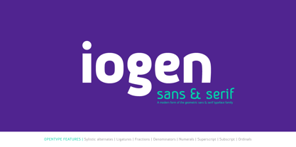 The current design of "iogen" is a result of years of alterations since it's original concept was born in 2010 and it needed a hallmark to make it authentic. The idea of "a typeface speaking pleasantly" is the basis on which "iogen" is constructed. Hereby, the letter forms are based on sharp directional changes and curved vertical strokes, allowing it to speak clearly and pleasantly. The sharp corners, open apertures and open counters of iogen also ensure legibility in smaller sizes. The Iogen family has 6 members with 3 basic weights with sans and serif styles. It supports the Latin extended character set and opentype features like stylistic alternates, ligatures, fractions, denominators, numerators, superscript, subscript and ordinals. Iogen is a good fit for all of design needs with it’s wide range of character sets and features.
 - Mrs Keppel by The Ampersand Forest,
$19.00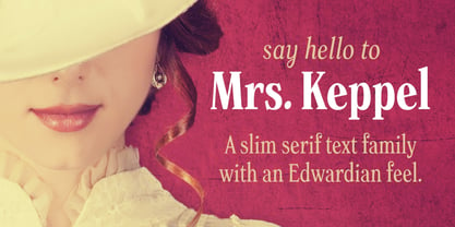 Remember when you first saw the credits of a Woody Allen movie and thought, "I love that typeface!" Well, maybe that was just us. That typeface—Windsor (specifically Windsor Light Condensed)—is a classic. But it has problems. The letterforms are sometimes REALLY wonky. And the ampersand is a tragedy. Plus, there's no italic, and the weights and widths available in digital form are a hodgepodge. That's where Mrs. Keppel comes in. Alice Keppel, one of the most famous illegitimate members of the Windsor household ever, lends her name to this typeface family with numerous weights and a true italic. It's a slim serif with Edwardian leanings. She's approachable, she's refined. She's equally charming and at home in mercantile settings, in elegant settings, in populist settings, and in Polite Society. She's a design response to a genuine need. She's Mrs Keppel!
 - Tool by Suomi,
$30.00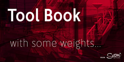 A classic, narrow and clean sans serif family with seven weights, Roman and Italic, all with Old Style Numerals and Small Caps, for both headlines and body text use.
 - Geos by FineDisplayType,
$4.99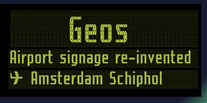 FDT Geos has re-invented airport signage. A stylish font with modern features display tech couldn't afford. FDT Geos features ligatures, fractions, numerals, stylistic sets, and even some symbols!
 - Beatster by MuSan,
$19.00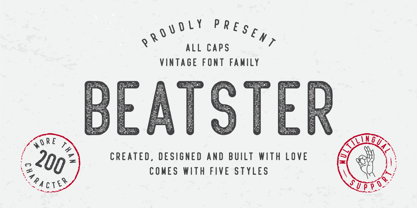 Beatster is handmade modern vintage textured display typefaces. It includes Regular, Outline, Grunge, Rough (with complete uppercase, lowercase, and numerals), and Letterpress (uppercase only). All weights have multilingual characters.
 - Mango Salsa by Haksen,
$11.00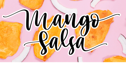 A handwritten font with bouncy script style Specifics: Cute and pretty style with swashes alternate in lowercase and titles alternate in uppercase Numerical, Punctuation, Multi language included Happy Designing!
 - Indian by Supfonts,
$17.00Meet my new font Indian! Indian includes full set of lovely uppercase and lowercase letters, multilingual symbols, numerals, punctuation and ligatures. This is so perfect for invitations, monograms etc - Evita by ITC,
$29.99Gérard Mariscalchi is a self-made designer. Born in Southern France of a Spanish mother and an Italian father, he has worked as a mechanic, salesman, pilot, college teacher – even a poet (with poetry being the worst-paying of these professions, he reports.) “Throughout all this, the backbone of my career has always been design,” Mariscalchi says. “I’ve been drawing since I was five, but it wasn’t until I was twenty-four that I learned that my hobby could also help me earn a living.” It was about this same time that Mariscalchi fell in love with type. He studied the designs of masters like Excoffon, Usherwood and Frutiger, as well as the work of calligraphers and type designers such as Plantin, Cochin and Dürer. With such an eclectic background, it’s no surprise that Mariscalchi’s typeface designs are inspired by many sources. Baylac and Evita reflect the style of the art nouveau and art deco periods, while Marnie was created as an homage to the great Lithuanian calligrapher Villu Toots. However, the touch of French elegance and distinction Mariscalchi brings to his work is all his own. Baylac Who says thirteen is an unlucky number? Three capitals and ten lowercase letters from a poster by L. Baylac, a relatively obscure Art Nouveau designer, served as the foundation for this typeface. The finished design has lush curves that give the face drama without diminishing its versatility. On the practical side, Baylac’s condensed proportions make it perfect for those situations where there’s a lot to say and not much room in which to say it Evita Mariscalchi based the design of Evita on hand lettering he found in a restaurant menu, and considers this typeface one of his most difficult design challenges. “The main problem was to render the big weight difference between the thin and the thick strokes without creating printing problems at small point sizes,” he says. Unlike most scripts, Evita is upright, with the design characteristics of a serif typeface. Mariscalchi named the face for a close friend. The end result is a charming design that is light, airy, and slightly sassy. Marnie Based on Art Nouveau calligraphic lettering, Marnie is elegant, inviting, and absolutely charming. Mariscalchi paid special attention to letter shapes and proportions to guarantee high levels of character legibility. He also kept weight transition in character strokes to modest levels, enabling the face to be used at relatively small sizes – an unusual asset for a formal script. Marnie’s capital letters are expansive designs with flowing swash strokes that wrap affectionately around adjoining lowercase letters. The design easily captures the spontaneous qualities of hand-rendered brush lettering. - Baylac by ITC,
$29.99Gérard Mariscalchi is a self-made designer. Born in Southern France of a Spanish mother and an Italian father, he has worked as a mechanic, salesman, pilot, college teacher – even a poet (with poetry being the worst-paying of these professions, he reports.) “Throughout all this, the backbone of my career has always been design,” Mariscalchi says. “I’ve been drawing since I was five, but it wasn’t until I was twenty-four that I learned that my hobby could also help me earn a living.” It was about this same time that Mariscalchi fell in love with type. He studied the designs of masters like Excoffon, Usherwood and Frutiger, as well as the work of calligraphers and type designers such as Plantin, Cochin and Dürer. With such an eclectic background, it’s no surprise that Mariscalchi’s typeface designs are inspired by many sources. Baylac and Evita reflect the style of the art nouveau and art deco periods, while Marnie was created as an homage to the great Lithuanian calligrapher Villu Toots. However, the touch of French elegance and distinction Mariscalchi brings to his work is all his own. Baylac Who says thirteen is an unlucky number? Three capitals and ten lowercase letters from a poster by L. Baylac, a relatively obscure Art Nouveau designer, served as the foundation for this typeface. The finished design has lush curves that give the face drama without diminishing its versatility. On the practical side, Baylac’s condensed proportions make it perfect for those situations where there’s a lot to say and not much room in which to say it Evita Mariscalchi based the design of Evita on hand lettering he found in a restaurant menu, and considers this typeface one of his most difficult design challenges. “The main problem was to render the big weight difference between the thin and the thick strokes without creating printing problems at small point sizes,” he says. Unlike most scripts, Evita is upright, with the design characteristics of a serif typeface. Mariscalchi named the face for a close friend. The end result is a charming design that is light, airy, and slightly sassy. Marnie Based on Art Nouveau calligraphic lettering, Marnie is elegant, inviting, and absolutely charming. Mariscalchi paid special attention to letter shapes and proportions to guarantee high levels of character legibility. He also kept weight transition in character strokes to modest levels, enabling the face to be used at relatively small sizes – an unusual asset for a formal script. Marnie’s capital letters are expansive designs with flowing swash strokes that wrap affectionately around adjoining lowercase letters. The design easily captures the spontaneous qualities of hand-rendered brush lettering. - Marnie by ITC,
$29.99Gérard Mariscalchi is a self-made designer. Born in Southern France of a Spanish mother and an Italian father, he has worked as a mechanic, salesman, pilot, college teacher – even a poet (with poetry being the worst-paying of these professions, he reports.) “Throughout all this, the backbone of my career has always been design,” Mariscalchi says. “I’ve been drawing since I was five, but it wasn’t until I was twenty-four that I learned that my hobby could also help me earn a living.” It was about this same time that Mariscalchi fell in love with type. He studied the designs of masters like Excoffon, Usherwood and Frutiger, as well as the work of calligraphers and type designers such as Plantin, Cochin and Dürer. With such an eclectic background, it’s no surprise that Mariscalchi’s typeface designs are inspired by many sources. Baylac and Evita reflect the style of the art nouveau and art deco periods, while Marnie was created as an homage to the great Lithuanian calligrapher Villu Toots. However, the touch of French elegance and distinction Mariscalchi brings to his work is all his own. Baylac Who says thirteen is an unlucky number? Three capitals and ten lowercase letters from a poster by L. Baylac, a relatively obscure Art Nouveau designer, served as the foundation for this typeface. The finished design has lush curves that give the face drama without diminishing its versatility. On the practical side, Baylac’s condensed proportions make it perfect for those situations where there’s a lot to say and not much room in which to say it Evita Mariscalchi based the design of Evita on hand lettering he found in a restaurant menu, and considers this typeface one of his most difficult design challenges. “The main problem was to render the big weight difference between the thin and the thick strokes without creating printing problems at small point sizes,” he says. Unlike most scripts, Evita is upright, with the design characteristics of a serif typeface. Mariscalchi named the face for a close friend. The end result is a charming design that is light, airy, and slightly sassy. Marnie Based on Art Nouveau calligraphic lettering, Marnie is elegant, inviting, and absolutely charming. Mariscalchi paid special attention to letter shapes and proportions to guarantee high levels of character legibility. He also kept weight transition in character strokes to modest levels, enabling the face to be used at relatively small sizes – an unusual asset for a formal script. Marnie’s capital letters are expansive designs with flowing swash strokes that wrap affectionately around adjoining lowercase letters. The design easily captures the spontaneous qualities of hand-rendered brush lettering. - Ah, the 20th Century Font by Ray Larabie, a typeface that's as ambitious and forward-looking as its name suggests, yet marinated in the nostalgic vibes of the past century. Imagine a font that decide...
- Microbrew Unicase by Albatross,
$19.00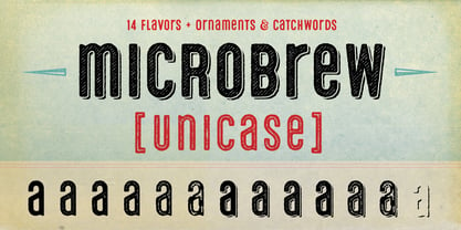 Microbrew Unicase is the latest addition to the Microbrew family, a versatile retro display family. Microbrew Unicase has 14 individual styles plus a very functional set of catchwords, and a fresh and eclectic set of retro-style ornaments. Microbrew Unicase sports a nice mix between wood type poster style, and vintage letterpress. The more detailed styles work well at large sizes, and the cleaner styles add legibility at smaller sizes. Microbrew Unicase is an all caps display font, but the lowercase act as alternates. The uppercase are all uppercase letter forms, while the lowercase is mixed. Type in all caps to be a buzz-kill. Mix upper and lowercase to have a little fun. Or type in all lowercase to have a party! (more informal) For super-easy alternates, just mix uppercase and lowercase letters. To add to the realism, Microbrew Unicase includes double-letter ligatures. Microbrew Unicase also includes a set of extremely intentional and eclectic ornaments and symbols. Designed to give a vintage feel, the ornaments and symbols compliment Microbrew nicely to round off the family. The ornaments also include old style numbers, and lots of retro symbols. Don't let the name fool you, Microbrew Unicase is very versatile and works great for almost any subject matter, including weddings, birthdays, restaurants, coffee shops, music, and many more. Opentype features include automatic fractions, subscript numbers, superscript numbers, and double-letter ligatures.
 - Coptic Alphabet by Deniart Systems,
$10.00Based on the writing used by the Copts in ancient Egypt, the font includes alphabet and numeral symbols. NOTE: this font comes with a comprehensive interpretation guide in pdf format. - Bandage by Kyooti Bun,
$11.00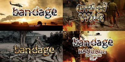 Bandage font is very emotional and innovative products! unique look to company branding, logos, greetings, magazine layout, homeware, prints and invitations. I hope you like it Available : uppercase, lowercase, numerals
 - Dantalia by Just Lett,
$13.00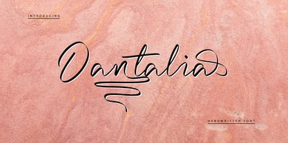 Dantalia is a handwritten font. It is perfect for project designs such as wedding invitations, posters, logos, typography, lettering, and more. Features: Uppercase Lowercase Numerals & Punctuation Stylistic Alternates Stylistic Sets