10,000 search results
(0.141 seconds)
- Ratatam by alphabeet.at,
$40.00 Ratatam is a variable egyptian font face. There are eight weights from thin to black, but a lot more opportunities with the variable font, and a decor style with inner elements. Useful open type features, which are optional as well as contextual alternates and positions, are defined, all small caps integrated.
 - Capaldi by Lunas Type,
$19.00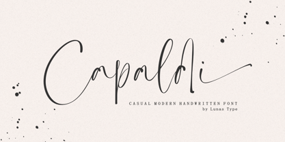 Introducing, Capaldi! Capaldi is a casual modern handwritten font. Capaldi comes with a lot of ligatures and ending swash that make your text is more charming and more expression. Capaldi brings natural element to your design, it's perfect for wedding, stationery, logos, social media quotes, branding identity, and many more.
 - Bromrose Sands Signature by Rillatype,
$15.00 Bromrose Sands Signature is a lovely signature font that comes with LOTS of ligatures that makes this font look natural. Bromrose Sands is perfect for quotes, logos, branding, magazines, wedding invitation, packaging, stationary, or any advertising purpose. To access the underline just type _+(number 1-8). Example: woodland_1 woodland_2 etc.
 - Stylized Deco JNL by Jeff Levine,
$29.00 In their book "Lettering of Today" by W. Ben and Ed C. Hunt, an Art Deco "thick and thin" alphabet with some stylized characters (which leaned a lot toward a calligraphic style) stood out from the rest. This is now available as Stylized Deco JNL, in both regular and oblique versions.
 - New Victoria by Gartype Studio,
$10.00 A modern blackletter typeface, designed by combining an old english style & modern style. It can be used for textbook, display text, headlines, logotype, and more. Within support by multilingual glyphs (characters), & lot of punctuations to support many people around the world with their unique languange and accent. Thank you very much.
 - Minomu by Owl king project,
$37.00 Minomu consists of twenty sans serif font families, With a thicker weight, Minomu can be applied as an attractive and bold appearance for title letters, not only that, but Minomu's family with lowercase letters can also be used in designs with use as body text, to create more detailed descriptions.
 - Display Art Two by Gerald Gallo,
$20.00 Display Art Two is a display font inspired by the art nouveau fonts popular at the turn of the 20th century. It is not intended for text use. It was designed specifically for display, headline, logotype, branding, and similar applications. Display Art Two has an uppercase alphabet, numbers, and punctuation.
 - Carbonara by Hanoded,
$20.00 Carbonara. Nope, it's not the pasta sauce, but a nice, grungy typewriter font, made using a pre-war typewriter, some oil and a stack of old-fashioned carbon paper sheets. You can use it to give your designs some oomph. Comes with a whole bunch of contextual and stylistic alternates.
 - Display Art Three by Gerald Gallo,
$20.00 Display Art Three is a display font inspired by the art nouveau fonts popular at the turn of the 20th century. It is not intended for text use. It was designed specifically for display, headline, logotype, branding, and similar applications. Display Art Three has an uppercase alphabet, numbers, and punctuation.
 - Perkly by Dyslexica,
$20.00 The theme of Perkly came from trying to envision a font that was easy to read yet had a distinctly unique look. Another neat feature of Perkly is that all its weights have the same overall spacing, meaning different weights can be layered over each other, allowing a lot of versatility.
 - Rataczak by Ingrimayne Type,
$9.00 Rataczak is a stiff, awkward serifed font that was inspired by similar fonts from the 19th century. It is legible as a text font but not graceful. In addition to plain, italic, bold, bolditalic, extrabold, condensed, and condenseditalic styles, there is a striped style and a font of swash capitals.
 - Scissorgirl by Type-Ø-Tones,
$40.00 Scissorgirl by Julia Friese and Clare Keogh OpenType, 1 style Scsissorgirl is the crafty work of Ms. Julia Friese and Clare Keogh with the unselfish help of Josema Urós. Following Cortada path, this is a new fresh cut-out typeface, made not with vectors but real scsissor strokes on cardboard.
 - Mordings JNL by Jeff Levine,
$29.00Mordings JNL is an odd-lot collection of images. These assorted dingbats are leftover art that never quite made it to one particular dingbat font category, but together comprise an eclectic assortment. Topics range from weather to vintage-style restaurant menu icons to decorative embellishments to an old-fashioned telephone dial. - Frakturus by MAC Rhino Fonts,
$49.00 A modern fraktur briefly based on the typeface Deutschmeister originally designed by Berthold Wolpe in 1934. With a lot of blackness and playful style it is well suited for posters, signage on windows or a book cover. Only one wight for now, but it may be expanded in the future.
 - Phantaztik by PintassilgoPrints,
$27.00 Phantaztik is a bold and groovy font packed with stylish interlocks, uncommon alternates, extended language coverage, and clever OpenType programming. Full of cheer and optimism, it's a fantastic option for packaging projects, book covers, game titles, apparel, and many more creative applications. Feel-good designs just got easier, check it out!
 - Healthy Freak by Vozzy,
$10.00 Introducing original font named Healthy Freak. All available characters you can see at the screenshots. This font has two styles: Regular and Rough. Main feature is a lot of ligatures for both styles! This font will look good on any street styled designs like a poster, T-shirt, label, logo, etc.
 - Bithead by Comicraft,
$19.00 INFO DUMP: Get jacked into cyberspace direct feed, no buffer with this hotwired font by John 'Son of a Glitch' Roshell. Initial upload to Ghost Rider 2099 was prematurely aborted, but not before the downramp pusbag Ozymandias pirated a jagged beta version and assaulted the Uncanny X-Men during 'Onslaught.'
 - Priock by Holis.Mjd,
$10.00 Priock is an expressive display font with lots of ligatures as features in it which will produce a design that stands out and is unique. The Priock font is also available with a shadow style which will make it easier for you to design if you want to need it.
 - Bunny Hop by Larin Type Co,
$10.00 Bunny Hop - funny playful bold typeface. Will not leave you indifferent, thanks to its brave forms. It is great for creating your project, it can be used to create beautiful inscriptions on t-shirts, children's books, branding, book covers, stationery, marketing, color, toy branding, a blog, magazines and much more.
 - Caliber by Loaded Fonts,
$15.00A highly decorative slab-serif that is combat ready. The steady contrast and sharp angles make it great for titles and posters. Mechanical and aggressive but can easily be used for static background text and shapes. May keep Bodoni and Niagara Solid company if not for just a short while. - Everleigh by Gleb Guralnyk,
$14.00 Everleigh is an elegant thin typeface inspired by antique old school fonts. It includes lots of ligatures and stylistic alternates helps to create an authentique and original lettering compositions. Also this font has multilingual support. Check out all available characters on the previews. Thank you and have a nice day!
 - MPI French Antique by mpressInteractive,
$5.00 French Antique was first shown in the specimen books of William H. Page & Company in 1869. The font is extremely tall and thin, with serifs taller than many character's widths. Lines are straight and clean with no fuss. French Antique can fit a lot of headline into a small space.
 - Chevalier LP by LetterPerfect,
$39.00 Chevalier LP is a revived decorative face with a European lineage. Its patterned and shaded 'fatface' letterforms exhibit the continent's 19th century fascination with elaborate engraving techniques, often used on currency as a deterrent against counterfeiting. It is not without reason that Chevalier conjures up images of bank notes and finance.
 - Karmilla by Akufadhl,
$25.00 Karmilla is a Didone upright script styled typeface. Strong contrast between thick and thin lines. Presenting a luxurious and Feminine character and creating more elegant, classical design. With a wide range of Latin based language support and a lot of features such as Swash, Stylistic Set, Small Caps and more.
 - Ragtime by ITC,
$29.00Ragtime was designed by Alan Meetks, an all capital condensed sans serif typeface. It features thick/thin weight variances and fine line casing adornment which recalls magazine styles of the 1940s. This typeface should not be letter spaced too closely. Ragtime is excellent for anything requiring an elegant, refined look. - Arista 2.0 by Zetafonts,
$29.00 Arista is a soft round font, perfect for 2.0 logos and contemporary headlines. Arista 2.0 is the definitive release of Arista, with extra characters and corrected kerning. It includes a light version, a extrafilled version for 2.0 style fat borders, and an Alternate version with a lot of style changes.
 - Ahimsa by Satori TF,
$12.00 Ahimsa is a dynamic humanist sans serif family. It comes in 6 weights with matching italics. It contains a lot of contrast in the connection to the stems in order to give it a more dynamic feel, and also has low descenders and a large x-height and great legibility.
 - Insigne Display by Gian Studio,
$15.00 Insigne Display A bold, modern and fun display font that lives up to its name. The way you can uniquely combine the different parts of this font makes it a lot of fun to use! Perfect for all purposes. , Suitable for magazine design, logo design, headlines, posters, packaging, cards etc. Enjoy!
 - Tuskcandy by Ingrimayne Type,
$7.95 Tuskcandy is a decorative Tuscan font in which the prominent split serifs are made of two balls. It is available in two weights and also an inline style. It has a nineteenth century feel to it though it is not a copy of any particular font from that time period.
 - Evil Laughter by Hanoded,
$10.00 I am working on my Halloween font collection and realised I did not have a ‘blood drip font’. So, I bought a second hand typewriter and typed all the glyphs. Then I made the blood drips using syrup, paper and gravity! The result is a halloween font with a twist!
 - FS Albert by Fontsmith,
$80.00 The x factor How do you make a font like FS Albert unique, distinctive? “When designing a font I try to question every letter,” says Jason Smith, “but all you need is a few that have an x factor. With FS Albert, they’re the lowercase ‘a’ and ‘g’ and the uppercase ‘I’ and ‘J’. “I remember a friend saying, ‘Why on earth have you designed the ‘a’ like that? Isn’t it too friendly for this kind of font?’ And, in a way, that’s what I wanted – honesty and warmth, because a lot of big brands at the time really needed to show a more human side.” Range of weights and styles FS Albert is a charismatic type: a warm, friendly sans serif face with a big personality. Open, strong and amenable, and available in a wide range of weights and styles, FS Albert suits almost every task you put it to. Fontsmith has crafted five finely-tuned upright Roman weights and four italic weights, as well as a special Narrow version to provide the best coverage and give headlines and text an easy-going character. The chunky kid “FS Albert was inspired by – and named after – my son, who was a bit of a chunky kid,” says Jason Smith. “I designed an extra bold weight because I always felt that the really big font heavy weights had the most personality. “I recently told Albert this story. He laughed, and forgave me for thinking he was a fat baby. He liked the big personality bit, though.” 1000s of glyphs Not content with a character set that covered Europe and the whole of the Western world, the studio decided to go further afield. There are now FS Albert character sets that cover western and eastern European languages, including those of Russia, as well as Cyrillic, Arabic and Greek scripts. In fact, the font now covers more than 100 languages, making it ideal for bringing a consistent typographic style to the communications of global brands.
 - FS Albert Paneuropean by Fontsmith,
$90.00The x factor How do you make a font like FS Albert unique, distinctive? “When designing a font I try to question every letter,” says Jason Smith, “but all you need is a few that have an x factor. With FS Albert, they’re the lowercase ‘a’ and ‘g’ and the uppercase ‘I’ and ‘J’. “I remember a friend saying, ‘Why on earth have you designed the ‘a’ like that? Isn’t it too friendly for this kind of font?’ And, in a way, that’s what I wanted – honesty and warmth, because a lot of big brands at the time really needed to show a more human side.” Range of weights and styles FS Albert is a charismatic type: a warm, friendly sans serif face with a big personality. Open, strong and amenable, and available in a wide range of weights and styles, FS Albert suits almost every task you put it to. Fontsmith has crafted five finely-tuned upright Roman weights and four italic weights, as well as a special Narrow version to provide the best coverage and give headlines and text an easy-going character. The chunky kid “FS Albert was inspired by – and named after – my son, who was a bit of a chunky kid,” says Jason Smith. “I designed an extra bold weight because I always felt that the really big font heavy weights had the most personality. “I recently told Albert this story. He laughed, and forgave me for thinking he was a fat baby. He liked the big personality bit, though.” 1000s of glyphs Not content with a character set that covered Europe and the whole of the Western world, the studio decided to go further afield. There are now FS Albert character sets that cover western and eastern European languages, including those of Russia, as well as Cyrillic, Arabic and Greek scripts. In fact, the font now covers more than 100 languages, making it ideal for bringing a consistent typographic style to the communications of global brands. - IM FELL FLOWERS 1 - Unknown license

- Breaking Bread by Missy Meyer,
$12.00 This font came to be when I was creating a cake topper mockup (see the promo images) and didn't have a thick script font that I liked for it. So I got to work writing out some fun chunky cursive letters that could top a cake! The concept of breaking bread is an old one, often meaning two parties working together. In the Breaking Bread font, I've combined that heavy connecting script with a hand-lettered sans-serif uppercase set. It works in all lowercase, all uppercase, and title case with equal ease! I've also included a number of alternates and ligatures, so you can have a truly hand-written look when double-letter words show up, plus a few extra characters and swashes to add some pizzazz to your work. It's great for crafting a mug or t-shirt, creating a logo, or making product packaging! And all of those alternates are PUA-encoded, so they're easy to access in any character map. Breaking Bread also comes with over 300 extended Latin characters for language support, including but not limited to: Catalan, Czech, Danish, Esperanto, Estonian, Finnish, French, Gaelic, German, Icelandic, Irish, Italian, Latvian, Lithuanian, Norwegian, Polish, Portuguese, Romanian, Serbian (Latin), Slovak, Slovenian, Spanish, Swedish, Turkish, Welsh, and more!
 - Nanami Handmade by Thinkdust,
$10.00 Can we get a drum roll please? It’s not every day that a new link in a best selling chain is forged. First, there was Nanami, a font which took the world of type by force, storming to the top of MyFonts Hot New Fonts list; then there was Nanami Rounded, the most successful follow-up since Terminator 2. Well, say Hasta La Vista to boring design because now, there’s Nanami Handmade. With all the geometric, Japanese inspiration and style of the first two iterations, Nanami Handmade carries a quirky, mischievous charm. The font has a charisma matched by roguish anti-heroes; bad guys you love to love and good guys the other good guys hate, but everyone knows they’re what the audience turns up to see. Nanami Handmade comes in two styles, a solid and a hand-drawn, each of which has eight weights. Mix and match between these options to create a balanced piece which makes good use of the tactile, warm, earthy nature of the font. With these sans-serif styles working well in small and large sizes, both on and off screen, Nanami Handmade’s applications are virtually endless. Get your own piece of typography’s elite now, with Nanami Handmade, by Thinkdust.
 - Sedona by Jeff Kahn,
$29.00 Sedona is a quirky, all capitals, display font that evokes the American West, Native Americana, vacations, travel, campgrounds, rustic lodges, needle point, Christmas, holidays, Arts and Crafts movement, quilts, tiles, and alpine resorts. It is based on an isometric grid and individual shapes that conform to the grid's structure. Each letter or glyph is made up of numerous triangular shapes. The letters have gaps of space that create a dynamic texture. Our mind connects the triangles to complete the letter and recognize the familiar letterform. Sedona will create a unique identity for book cover titles, editorial headings, packaging, logotypes and signs. Create multicolored letters by selecting individual shapes within each letter and apply various colors. Simply convert type in Adobe Illustrator or InDesign with these two steps: 1. "Creating Outlines", 2. "Release Compound Path". You may also want to "Ungroup" the letters. Great care was taken to align the shapes perfectly. There are no overlapping or misaligned shapes. Sedona includes punctuation, numerals, and basic math glyphs.You will find some additional and alternate glyphs in the "Glyph Palette". Sedona does not include a lowercase or diacritics for foreign languages. You may type in lowercase but the letters will appear as uppercase.
 - LeDrôle Lettering Pro by Ingo,
$40.00 The Comic-Script by ingoFonts In the past cartoons used to be lettered by hand. Hardly anyone does this today. The reason is, because hardly anyone has nice handwriting these days, so there are practical advantages in having a special font. However the font should still look like it’s been written by hand. Well, most script fonts don’t meet this requirement. The LeDrôle Lettering is a computer font, but closely resembles genuine handwriting. The model for the LeDrôle Lettering is my personal handwriting, as can be seen on the example of the Biró Script, which is also an ingoFont. The habit of capitalization comes from the Romanic and Anglo-Saxon countries. Depending on the purpose they are designed in three significantly bolder weights. In order for the typeface to actually look handwritten, it needs to have clearly visible irregularities. These are not found only in the shapes of the individual letters. Even though LeDrôle Lettering is all in capital letters, the characters of uppercase and lowercase letters are clearly different. Additionally, many alternative shapes are used, which are automatically applied when the OpenType “Ligatures” feature is activated. Thus, there are no identical double letters or numerals, and many character combinations are defined as ligatures with alternative forms.
 - Alizé by TypeTogether,
$49.00 Alizé is a three-weight typeface inspired by the chancery italic of the 16th century. It is a high-contrast face, created with syncopations in axes and proportions and subtle irregularities that form a lively and delicate weave, suitable for setting a single word, a special expression, or a short block of prose. The family does not contain a roman, and instead promotes the italic as a primary style, a common printing convention in the 16th and 17th centuries. The italic lowercase predates inclined capitals by about twenty years, and as a nod to this typographic evolution, Alizé’s capitals, small capitals, and figures are very slightly inclined to match the energy of the lowercase. The low x-height and long ascenders and descenders, features associated with finesse and luxury, are reminiscent of the Venetian-style italic, but are further emphasised. Unlike the Venetian italic, however, Alizé has a sharp slope, giving a prominent sweep across the page (alizé is the name of trade wind). Each font of Alizé has a character set count of exceeding 700, and contains an abundance of ligatures, dynamic fractions, ornaments, and pan-European language support. They have also been manually hinted for the highest-quality display on both print and screen.
 - Sihmittree by Ingrimayne Type,
$9.00 Sihmitree is a gimmick typeface in which all glyphs have reflective (mirror) or rotational symmetry (or both). Sihmitree has two weights and is caps only, with most of the lower-case letters identical to the upper-case letters. It includes only those accented characters that are symmetrical. The letters of the alphabet are often used to explain symmetry. BCDEK are given as examples of shapes that can easily be formed with symmetry over a horizontal line. AMQTUVWY can easily be formed so that they mirror over a vertical line. Letters HIOX can be formed so they mirror over both horizontal and vertical lines, and as a result they will also have rotational symmetry. Letters NSZ can be formed so that they reproduce themselves with a rotation of 180º. That leaves letters FGJLPR, which are usually considered examples of asymmetry. However, there are script versions of J, L, and R that can be formed with symmetry, and variants of lower-case f and g can be made that are symmetrical. P looks a lot like the thorn character. Some of the numbers also present challenges when trying to form them symmetrically. The symmetrical alphabet is not stylistically harmonious and has limited use other than as an exploration of symmetry.
 - Mehdi by Arabetics,
$39.00 The Mehdi type family follows the guidelines of the Mutamathil Taqlidi type style. It has one glyph for every basic Arabic Unicode character or letter and one additional, final-position, glyph for each Arabic letter that is normally connected with other letters from both sides in traditional cursive Arabic strings. Mehdi employs variable x-height values. Its design uses full curves with variable distributed weights. Mehdi family includes all required Lam-Alif ligatures and uses ligature substitutions and selected marks positioning but it does not use any other glyph substitutions or forming. Text strings composed using types of this family are non-cursive with stand-alone isolated glyphs. The family employs our "natural Arabic input" method where first glyph is displayed in its non-isolated form. Tatweel (or Kashida) glyph is a zero width space. Keying it before any glyph will display that glyph isolated form. Keying it before Alif Lam Lam Ha will display the Allah ligature. Mehdi family includes both Arabic and Arabic-Indic numerals, all required diacritic marks, Allah ligature, in addition to all standard English keyboard punctuations and major currency symbols. The fonts in this family support the following scripts: Arabic, Persian, Urdu, Pashtu, Kurdish, Baluchi, Kashmiri, Kazakh, Sindhi, Uyghur, Turkic, and all extended Arabic scripts.
