287 search results
(0.012 seconds)
- Quartz by URW Type Foundry,
$35.00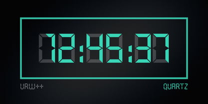
- Quartz by SoftMaker,
$9.99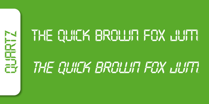 Quartz is a decorative typeface published by Softmaker.
 - Quartz by ITC,
$29.99The figures of Quartz font are based on those on digital clocks and LCD displays. All strokes are set at right angles to one another to create abstract characters. Fonts created for electronic displays gained in popularity at the same time as the computer became an everyday object. The standard is still around today and is the model for numerous interpretations. Fonts like Quartz have already won a firm position in trend typography. They embody the spirit of the late 20th century. Quartz font is a good choice whenever a marked contrast to everyday alphabets is the goal. - Quart - Unknown license

- Quartz Grotesque by Hustle Supply Co,
$18.00 Quartz was originally published on the shop Font Forestry, but they are planning on closing - So now Quartz will live on Hustle Supply Co. Quartz is a minimalist All-Caps Sans Serif typeface that comes in 7 different weights. It's perfect for projects looking for that minimalist / clean aesthetic. Quartz includes regular, oblique, thin, bold & outlined versions. Western European Characters are included. Thanks!
 - Quartz EF by Elsner+Flake,
$35.00 - Quartz MS by Microsoft Corporation,
$39.00Quartz MS captures the display of text on an LCD (Liquid Crystal Display) and LED (Light Emitting Diode) screen. Quartz MS was designed by Terrance Weinzierl of Ascender Corporation for Microsoft. The Quartz MS has a technical, industrial quality. It can be used to good effect when a futuristic, scientific or technical impression is desired. - TS Quartz by TypeShop Collection,
$24.80 - Quardi - Unknown license

- Quanta by Alphabets,
$17.95Quanta was designed without reference to existing sansserif faces. As an original design, Quanta draws on principles of letterform developed during my studies of lettercarving (in Wales with Ieuan Rees) and Roman proportion. My intention was to produce a highly legible and adaptable sans-serif, initially intended to be a TrueType GX font, then as a Multiple Master font, later as a five weight range from extremely thin to extra black. A related uncial design will be released shortly. - Quartan by Linotype,
$29.99Quartan is an industrial, unicase sans serif family, with three weights. The Austrian designer Maria Martina Schmitt developed this series of typefaces for designers to use when setting chunks of text en masse. Being a unicase design, Quartan¿s letterforms have no ascenders or descenders; lines of text may be stacked virtually on top of one other. This offers a multitude of possibilities for headline, logo, or corporate identity design. - Quarca by insigne,
$24.75 Quarca's masculine power runs strong across the page with bold self-assurance and a raw energy that courses through its thick veins. Don't think the continuous, smooth geometry of this semi-modular face is captively chained to the grid, though. Quarca has been cautiously optimized to engage the reader's eye. Achieving an attractive balance to its sturdy design, the open forms of this "rounded square" geometric sans -together with a tall x-height- make the font legible even when using the compact widths. This high-impact typeface definitely doesn't sacrifice versatility for style. These compact widths, with their raw heart and strength, are perfect for callouts, while the extended widths provide you with the platform for a punchy and extremely efficient headline. The font has a thinner weight and transcends to an intense bold. The face's geometric or technological construction also tends to make it right at home on the web. The family consists of 36 fonts -six weights plus italics. Where Quarca truly stands out, though, is its wide number of OpenType typographic choices and optional glyphs, allowing you to design your piece with a personal, one-of-a-kind variant touch. These variations consist of Experimental Capitals, Angled Capital Terminals, and "Future Stencil". In all, you can find more than one hundred of these alternate glyphs. Quarca is well-suited for anything you are able to throw at it. Devised for today's multi-disciplined designer, this clear and infinitely versatile family provides tremendous value to your toolbox.
 - Quarry by A New Machine,
$19.00 Quarry is a beefy slab-serif display font. It is all hand drawn and will give your designs a unique handmade feel. Two complete sets of letter glyphs give a more natural random feel. Contextual alternates will switch out letters automatically in open type-friendly programs. Also included are a number of ligatures for an even greater feel of hand made-ness. Great for use on posters and in headline copy.
 - Quartal by ParaType,
$25.00 Quartal is a family of stylish sans serif typefaces of condensed proportions. The family consists of 5 regular weights, 4 condensed ones and 13 extended styles (7 upright and 6 italic). At first there was intention to release just 4 condensed weights for headlines and advertising texts, but later 5 styles of wider proportions were added. As the result the area of applications becomes much wider due to possibility to use the font for smaller point sizes. The name "Quartal", which in this case means city quarter, according to author's associations emphasizes the advertising nature of the design most suitable to the urban environment. Character set of the fonts covers alphabets of Western Europe and basic Cyrillic languages. In addition, it includes a range of alternatives, especially in Cyrillic part. Design was done by Oleg Karpinsky. Released by ParaType in 2010. In 2011 13 new styles of extended proportions were added to Quartal family by the same author. 7 new weights and 6 corresponding italics make Quartal useful for setting not very long texts in advertising and display matter, and for magazines as well.
 - Quanty by Slava Antipov,
$29.00 Quanty is a new modern sans serif with a geometric touch and with some special, display forms. This modern font has unique fresh features. It is versatile in its use: suitable for headings and typing large amounts of text. Quanty has great uses in advertising, packaging, branding, posters, magazines, logos, web sites. Will go well with the Phonk typeface. OpenType features: Access All Alternates, Glyph Composition / Decomposition, Discretionary Ligatures, Denominators, Fractions, Standard Ligatures, Localized Forms, Numerators, Ordinals, Proportional Figures, Scientific Inferiors, Superscript, Tabular Figures
 - Quarzo by Corradine Fonts,
$39.95 This script font is inspired by the flexible nib strokes to create a concatenation of refinement with character mixing the contrast with pronounced but rounded angles. This angles along with the inktraps give the font a better performance when printing. Texts will have a very even rhythm due to its consistency on the stroke’s angle and spacing. The words can receive a dramatic touch by using the wide range of glyphs with curly and refined ornamentation. There are lots of caps and number variants dressed up with a variety of swashes. Also, two sets of versatile ornaments will be found: a first set of ending flourishes that match with any lowercase letter and a second set of independent flourishes to be placed around the words. Quarzo will give a great sophistication level to invitations, cards, tags, menus, advertising and packaging. Its character map covers Western and Central European characters.
 - Suarez by GRIN3 (Nowak),
$24.00 Suarez is a handwritten, fully connected script with ligatures to help with flow and readability. It can be used for invitations, greeting cards, posters, advertising, weddings, books, menus etc. Language support includes Western, Central and Eastern European character sets, as well as Baltic and Turkish languages.
 - Quarpa by Pasternak,
$9.00 Name: Quarpa Styles: 6 styles Glyphs: 394 Year: 2021 This lofty font features a compact structure as well as a unique combination of rounded corners and square contours. The collection includes six styles: Extra Light, Light, and Semi Light that will ensure elegance; Regular, Medium, Semi Bold and Bold suitable for a solid design. Each of them also has Italic variation. It’s an ideal option for outstanding corporate images, logos, promos, or video presentations. Quarpa has proper kerning, multi-lingual support, and ligatures. Languages: Afrikaans, Albanian, Asu, Basque, Bemba, Bena, Bosnian, Catalan, Cebuano, Chiga, Colognian, Cornish, Corsican, Croatian, Czech, Danish, Embu, English, Esperanto, Estonian, Faroese, Filipino, Finnish, French, Friulian, Galician, German, Gusii, Hungarian, Icelandic, Ido, Indonesian, Interlingua, Irish, Italian, Javanese, Jju, Kabuverdianu, Kalaallisut, Kalenjin, Kamba, Kikuyu, Kinyarwanda, Kurdish, Latvian, Lithuanian, Lojban, Low German, Lower Sorbian, Luo, Luxembourgish, Luyia, Machame, Makhuwa-Meetto, Makonde, Malagasy, Malay, Maltese, Manx, Maori, Meru, Morisyen, North Ndebele, Northern Sotho, Norwegian Bokmål, Norwegian Nynorsk, Nyanja, Nyankole, Occitan, Oromo, Polish, Portuguese, Romanian, Romansh, Rombo, Rundi, Rwa, Samburu, Sango, Sangu, Sardinian, Scottish Gaelic, Sena, Shambala, Shona, Slovak, Slovenian, Soga, Somali, South Ndebele, Southern Sotho, Spanish, Swahili, Swati, Swedish, Swiss German, Taita, Taroko, Teso, Tsonga, Tswana, Turkmen, Upper Sorbian, Vunjo, Walloon, Walser, Xhosa, Zulu
 - Quartro by Brainware Graphic,
$12.00 Quartro typeface is a reverse contrast display typeface, stylistic, and uniquely humanist sans. It's design influenced by modern typography and contemporary art. Quartro typeface comes in single-weight. Multi-lingual Supported (Latin Extended).
 - MOGTAHID AUTHENTIC QUARTZ by Mogtahid,
$38.00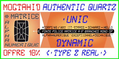
- Quarz 974 by Domenico Ruffo,
$40.00 Quartz 974 is a typology of font inspired by simple and geometric lines as triangle. It is very suitable for titles, logos, posters, that’s why it is composed by only capital letters and numbers.
 - Quarts Pachino by Allouse Studio,
$16.00 Proudly Presenting, Quarts Pachino a Bold Marker Font. Quarts Pachino is perfect for any tittles, logo, product packaging, branding project, megazine, social media, wedding, or just used to express words above the background. Quarts Pachino come with many ligatures, ending swash and come with Multi-Lingual Support. Enjoy the font, feel free to comment or feedback, send me PM or email. Thank You!
 - Quark - 100% free

- Quarx - 100% free

- Quarx - 100% free

- Quark - 100% free

- Quaro by pentagonistudio,
$19.00 Quaro Is Modern Display Sans Inspired By Stylish Round Font. SOFTWARE REQUIREMENTS : Fonts and alternate : No special software required they may be used in any basic program /website apps that allows standard fonts That's it folks! You can go ahead and get cracking :) Follow My Shop For Upcoming Updates Including Additional Glyphs And Language Support. And Please Message Me If You Want Your Language Included or If There Are Any Features or Glyph Requests, Feel Free to Send me A Message. Have a Good Day !
 - Quatie by insigne,
$24.00 Originally a conceptual approach from the Chatype project of Jeremy Dooley and Robbie de Villiers, Quatie has been restructured to add a new industrial element to Insigne’s offerings. Like the Official Font of Chattanooga, Tennessee, Quatie definitely carries a contemporary, hipster feel. Quatie similarly draws much of its inspiration from the industrial brawn of the railroad and the unique characteristics of Cherokee letterforms, giving it an atypical form not usually found in an industrial slab. While the Quatie concept was originally set aside for the more technological look of Chatype’s final image, Jeremy revived this face from its dormant state and refined it for its commercial release in 2013. This bracketed slab with its slightly rounded, soft edges adds a warm, retro, industrial element to Insigne’s offerings. The resulting quirky, ‘hipster’ vibe of Quatie lends its voice to give an unparalleled edge to your designs.
 - Quant by Hoftype,
$49.00 Quant is a contrasted typeface with a fresh and well-reasoned appearance. It owes allegiance to classical structure but is a free design and does not refer to any historical model. Although it has strong qualities as a reading type, its distinct and powerful ductus makes it superb for headlines and in display sizes. Quant is well-equipped for ambitious typography. The Quant family consists of 8 styles, comes in OpenType format with extended language support for more than 40 languages. All weights contain small caps, proportional lining figures, tabular lining figures, proportional old style figures, lining old style figures, matching currency symbols, fraction and scientific numerals.
 - Quatre by Blank Is The New Black,
$15.00 Quatre is a clean, friendly, monoline display script with a number of subtle but significant features. Originally based on the style of cursive you may or may not have been taught in middle school, Quatre has a clean geometric flow to it while containing a robust set of OpenType features such as ligatures, swash capitals, and stylistic alternates that give it a unique look. With over 700 glyphs, coverage for over 30 languages, arbitrary fractions, contextual alternates and more, Quatre will have you covered for whatever situation you may run into. I mean, probably. I can’t know every single weird way you might be trying to use it. The point is, it’s got all of the bells and whistles you could reasonably hope for. Make sure you open up the OpenType panel in Illustrator, Photoshop, and InDesign to make use of all of those features.
 - Hurtz by Crumphand,
$9.50 The new Comic Style Font is Called " Hurtz " Comic style make your design Pop up, Retro, Stand out. Perfect Reading, Good Readability. What's Included ? Uppercase Lowercase Symbols Numerals Multilingual Support : Afrikaans, Albanian, Asu, Basque, Bemba, Bena, Breton, Catalan, Chiga, Colognian, Cornish, Czech, Danish, Dutch, Embu, English, Esperanto, Estonian, Faroese, Filipino, Finnish, French, Friulian, Galician, German, Gusii, Hungarian, Indonesian, Irish, Italian, Kabuverdianu, Kalenjin, Kamba, Kikuyu, Kinyarwanda, Latvian, Lithuanian, Lower, Sorbian, Luo, Luxembourgish, Luyia, Machame, Makhuwa-Meetto, Makonde, Malagasy, Manx, Meru, Morisyen, North, Ndebele, Norwegian, Bokmål, Norwegian, Nynorsk, Nyankole, Oromo, Polish, Portuguese, Quechua, Romansh, Rombo, Rundi, Rwa, Samburu, Sango, Sangu, Scottish, Gaelic, Sena, Shambala, Shona, Slovak, Soga, Somali, Spanish, Swahili, Swedish, Swiss, German, Taita, Teso, Turkish, Upper, Sorbian, Uzbek (Latin), Volapük, Vunjo, Walser, Welsh, Western, Frisian, Zulu.
 - Quara by Delve Fonts,
$39.00 Quara is a typeface that takes its cues from cutting edge technology and new gadget lust. Quara enjoys short downloads on the web, long walks on mobile devices, and romantic dinners by LED light. An avid gamer (esp. MMORPG) and science fiction fan, Quara longs to be the first font in space and have its pixels scattered among the stars. Designed by Delve Withrington in 2009, this slightly rounded square sans has a generous x-height and low contrast.
 - SF Quartzite - Unknown license

- SF Quartzite - Unknown license

- SF Quartzite - Unknown license

- SF Quartzite - Unknown license

- Quarter Braille by Echopraxium,
$20.00 Presentation QuarterBraille (Abbreviated as "QB" thereafter) is a decorative, steganographic and lattice font. Its core design concept is that Braille dots are represented as "quarters of a square"[1]. This is illustrated by posters 1 and 2 (NB: these glyph parts will be called "QB dots" thereafter). The other glyph parts (see poster 3) are purely decorative and meaningless in terms of Braille dots encoding[2]. All glyph parts are meant to generate a wide variety of patterns from horizontal and vertical combinations of glyphs. There is also a graphic convention to differentiate uppercase from lowercase letters with the presence or absence of shape subparts (in the "endings", "quarter of a circle with a ring" and "quarter of a diamond with a small square in the middle") like shown by poster 4. This font is suitable for very short texts (e.g. logos, acronyms, quotes, ambigrams, pangrams, palindromes, etc...) but on the other hand it may be used for steganographic purpose like geocaching as well as fictive alphabets (e.g. Alien/SciFi/Fantasy/Antique civilizations). Posters 1. Font Logo: the displayed text is " Quarter " followed by " Braille". There's a rainbow layer above the text to highlight the "QB dots", this is achieved by A..Z glyphs with "only QB dots" (codes 230..255) 2. Anatomy of a Glyph (L) and "QB Dots" (quarters of a square) 3. Glyphs Parts: Square and Cross (Inverted square), Circle and Inverted Circle (with or without the small circle in the middle), Diamond (with or without the small square in the middle), Inverted Square and Circle, Shape combos, Ending 4. Uppercase vs Lowercase (tiny shape subparts are shown in red) 5. Sample 1: Bathroom sink with QB tiles on the credence 6. Sample 2: Hands knuckle tatoos: "LOVE/HATE"[4] 7. Sample 3: Poker Hand: pocket Aces. It's an Ace of Hearts (Ah) on the left and an Ace of Spades (As) on the right. Like in regular cards, the card value (e.g. Ah) is displayed twice: at the top and rotated by 180 degrees at the bottom. This poster also illustrates that QB could be used to print embossed playing cards with tactile and visual display of card values. 8. Sample 4: Pangram: "Adept quick jog over frozen blue whisky mix" 9. Sample 5: Latin Magic Square: "SATOR AREPO TENET OPERA ROTAS" (NB: for compensation of the 2/3 glyph ratio, letters on each line are separated by a space: "S A T O R", ...). 10. Sample 6: Quote of Mahatma Gandhi: "Learn as if you will live forever, live like you will die tomorrow.". This is also a demonstration of border glyphs combinations. 11. Sample 7: Steganography use case: the text is a sequence of 64 aminoacids (1 Letter notation), this protein was described in a research paper "The complete Aminoacid sequence of an amyloid fibril protein AA of unusual size (64 residues) 1975". 12. Sample 8: Border Glyphs with the provided styles and mixed styles. The words are the same than in poster 9 ("SATOR AREPO TENET OPERA ROTAS"). Despite the 2/3 glyph ratio, the "TENET cross" was achieved by both inserting spaces in horizontally ("T ENE T") and by using the "thin borders glyphs". Notes a. Border glyphs[3] are meant to enhance the esthetics of text samples displayed with QB b. Special characters (e.g. *$()[].,;:&@# ...) are provided and follow the NABCC (North American Braille Computer Code) convention. c. A..Z Glyphs with only the "QB dots" are provided as demonstrated by posters 1 and 2 (A/N: this was very useful to create them). d. Glyph Map: 32..64: Special characters - 161..187: "Thin variant" of Border glyphs, 192..229: Border glyphs, 230..255: A..Z with only the "QB dots" - Codes 176 an 181 are "regular SPACE" (empty glyph). Footnotes 1. There is indeed two shapes which represent the braille dot: the "quarter of a square" and the "quarter of a cross". It's because a cross may be considered as an "inverted square" because the square corners are merged in the center. 2. That's why the SPACE glyph is only made of decorative/meaningless glyph parts (i.e. no "QB dots"). 3. For other fonts with border glyphs, please take a look at my other "decorative Braille fonts" (GoBraille, HexBraille, KernigBraille, StackBraille, MaBraille, DiamondBraille, LorraineBraille). 4. LOVE/HATE knuckle tatoos are inspired by the anthology scene from "The Night of the Hunter" movie (Charles Laughton 1955), it also appearead in "Do The Right Thing" movie (Spike Lee 1989). Disclaimer This font is not appropriate and not meant to print text documents in Braille for the blind readers audience.
 - Quarter Arabic by syria arabic,
$25.00 Arabic and English font, designed according to font standards, based on quarters and a half circles. The font will add a wonderful touch to your visual works.
 - Winter Quarter by Mvmet,
$12.00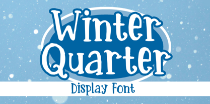 Winter Quarter is your perfect winter and season font. You can use it for anything ranging from t-shirts, kids’ book designs, and greeting cards to stickers and posters, or anything that needs a casual touch. Fall in love with its incredibly versatile style, and use it to create lovely designs!
 - PGF Qualta by PeGGO Fonts,
$24.00 "Qualta" was initially designed in 2017 as a submission for a type design assignment while at typography school, originally launched under Alt-A Foundry, "PGF Qualta" was developed specially for Publishing Agency under the supervision of Peggo Fonts Foundry, now with a complete Small Caps set, classic and old style numeric figures, lining and tabular forms, scientific and fractional notation set, arrows set, light parenthesis set. Set on producing a geometric sans, it started with the circular form drawn from a 50s television screen. The bloated shape gave an illusion of protrusion and so much open space to the rounded letters. A broken stem was then added to the lowercase to provide a notch that allowed the typeface legibility in smaller sizes. The typeface was then developed into eight cuts with their corresponding italics. The lower case g includes a variation with a transitional link derived from the upper case Q’s tangent tail. Qualta’s original concept was designed by Isabel Gatuslao and was developed by Pedro Gonzalez.


Page 1 of 8Next page